Context in Power BI is a huge part of data storytelling because it involves thoughtful planning in order to present your story in a clearer manner.
In one of my tutorials, we learned several tips and tricks that can be implemented easily inside your Power BI reports. Today, we will discuss the best practices around context in Power BI that can help your audience achieve a better experience.
Improve Your Context In Power BI Reports
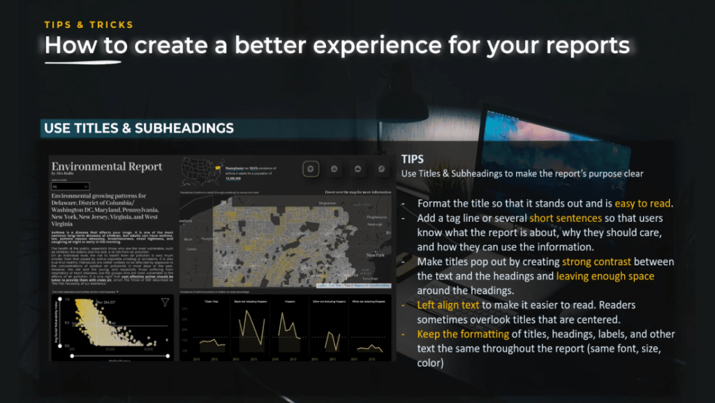
Use titles and subheadings. Titles and subheadings are extremely important in designing reports. Using titles and subheadings correctly can make your report’s purpose clear.
Format the title so that it stands out and easy to read. The title should be the first thing your audience should see. It should be positioned on the top part of the screen, ideally on the top left corner.
Add a tagline or several short sentences so that users know what the report is about, why they should care, and how they can use that information. Make it as easy as possible for your audience.
Make titles pop up by creating a strong contrast between the text and the headings. Of course, we should leave enough space around it.
Ensure to left-align text to make it easier to read. This is because readers might sometimes overlook titles that are centered. This can also be applied to the text used inside a report, and even the alignment in tables and metrics.
For titles, headings, labels, and other texts, keep the same format throughout the report. For example, use the same font, the same size, and the same color.
Be careful about the tone of your report. In order to be a great designer, you need to be careful about the tone you use inside your report because your audience is human and has feelings. They will be subjective, so pay attention not only to the message and the story you want to tell but how you tell it.

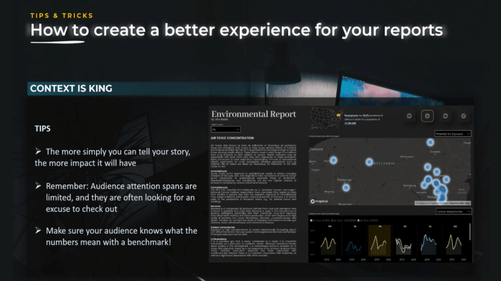
Context is king. It is important to provide sufficient context in Power BI to frame your data. Effective data visualization relies on not just the type of information visualized, but the amount.
If you show some figures, always think about the context in Power BI. For example, compare what is the budget to the forecast last year or benchmark between different dimensions like geographies.
In the example you see on the screen, the user selected the state of Pennsylvania, and the selected state is highlighted at the bottom right corner.
It will not filter out the other states for a good reason and it allows the user to compare the values against the other states. Also, it provides more context in a report and helps the user understand if the values are good or bad.
Charts can lie – start from a zero baseline. As a simple rule, you should consider creating your visual graph from a zero baseline.
If it is not what you want, only then change the baseline, but by default, start with a zero baseline. You will need to have graphs that do not start at zero, but you need to have the eye and training to see if your report brings clarity or confusion.
In this example, you can see the body temperature over time. On the left, we start at 96. On the right graph, we start at zero. In this case, it is very clear the best choice is not to start at zero but notice the fact that we see the axis with the values, which starts at 96.

Let’s look at another example.
You can see how big the difference seems to be because the numbers are 35% and 39.6%. In addition to that, the axis is shown, but the position is on the right side of the graph. This makes it much harder to see it at first glance.

The problem with this graph is not that the axis does not start at zero, but the lack of context. We only have two values, and it is hard to make an idea with such a cut short view. If we put things in perspective and show the historic values, we realize that the initial visualization is poorly built.
As a takeaway, pay attention to the context you show and to the message you send to your audience. Misinformation corrupts your narrative and can also threaten your reputation.
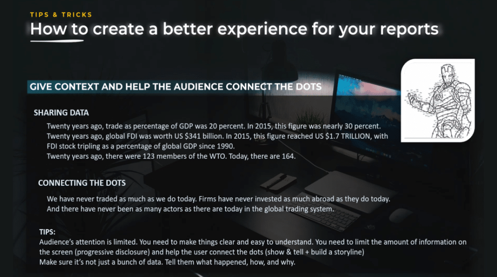
Give context and help your audience connect the dots.
Remember that the audience’s attention is limited and the amount of information they can digest from a single screen is also limited. You need to use progressive disclosure techniques and effective navigation in order to keep the user engaged.
The viewer needs to make their own conclusion from the information displayed, but the message you want to pass needs to be extra clear. So, in addition to the text where you tell, use effective graphs where you show and anticipate users’ questions as much as possible.
Difference Between Sharing Data & Sharing Insights
Simply sharing data is like bombarding the users with the information where they need to work to make sense of it. On the other hand, connecting the dots shows the conclusion analysis you took out of the data and wants to make it clear to the user.
Using these techniques where you clearly say the message you want to pass and a clear graph that shows the user the data that made you arrive at the conclusion are the best way to engage the user and pass your message.
This is why the technique of 2+2 – also called the technique of connecting the dots – works so well in data analysis.
***** Related Links *****
Best Practices For Power BI Report Development
Dashboard In Power BI: Best Design Practices
Effective Data Storytelling: Asking The Right Questions
Conclusion
To truly improve our context, we have to inculcate in our minds that the primary goal of creating a report is to communicate clearly so that our audience can connect the dots. The more simple we can tell our story, the more impact it will have.
Feel free to incorporate everything you’ve learned from this tutorial into your Power BI projects. Remember, learning new things is not enough, you should follow through with practice.
All the best,
Alex Badiu


