
In this tutorial, we’re going to dive into frequency tables in Excel as well as proportion tables. We’ll look at what they are and when to use them. You can watch the full video of this tutorial at the bottom of this blog.
Categorical variables measure “what kind of something” whether it’s a customer’s buying state, country of origin, or something else. To summarize these types of variables, we can count the frequencies of each type, comparing quantities in frequency tables. But sometimes it helps to compare these values as percentages, and that’s where proportion tables come in. I’ll show you how to do both in Excel with the help of PivotTables, along with the pros and cons of comparing raw quantities of categories versus their proportions.

How To Use Proportion And Frequency Tables In Excel
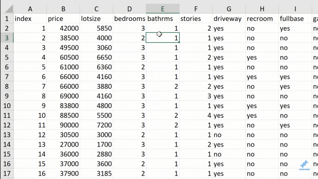
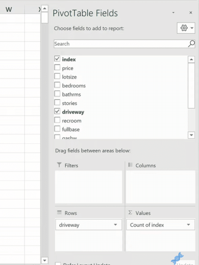
The first thing I’m going to do is create an index column. What I’m trying to do here is count, let’s say, how many of these homes have a driveway or not. And the thing with pivot tables is that they will want to aggregate the data. And we don’t want to aggregate the data. We want to count the number of observations.
The other thing I’m going to do, and it’s not necessary in this case, but I really prefer and insist that my data in Excel be kept in a table. So, I’m going to click OK.
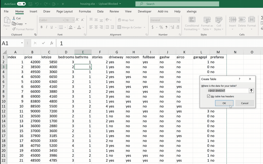
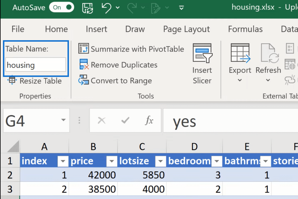
We can then rename the table. Let’s call it Housing.
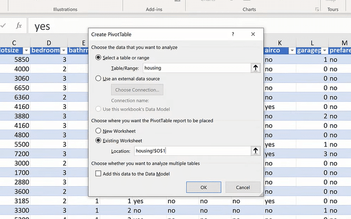
Now, I’m going to insert a pivot table. Our data range is housing. There’s already one benefit. It’s very clear what our source data is, so let’s put it in an existing worksheet.
So, how many homes have a driveway? Well, we can find that out. I’m going to move “driveway” over to the Rows, and then take my index to Values. I’m going to go to the Values field settings, and I make this a count.
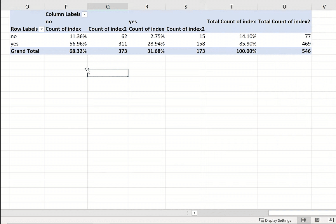
What we’re seeing now is of 546 homes, 77 don’t have a driveway and 469 do. Those are our frequencies.
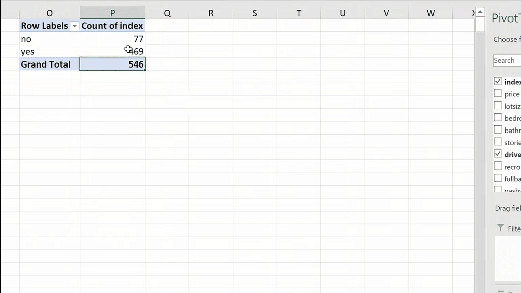
We can’t necessarily divide the yeses by the no, but we can count whether each is a yes or a no. Then, we end up with this number. This is called a one-way frequency table in Excel because we are counting the frequencies one way by one variable.

Now let’s make this a two-way frequency table.
I’m going to take, say, air conditioning and drag this over to the Columns. You could drag it to the Rows, but it’s more common to have your two-way frequency table put in this manner, where we’ve got one of the variables in the columns and another down the rows.
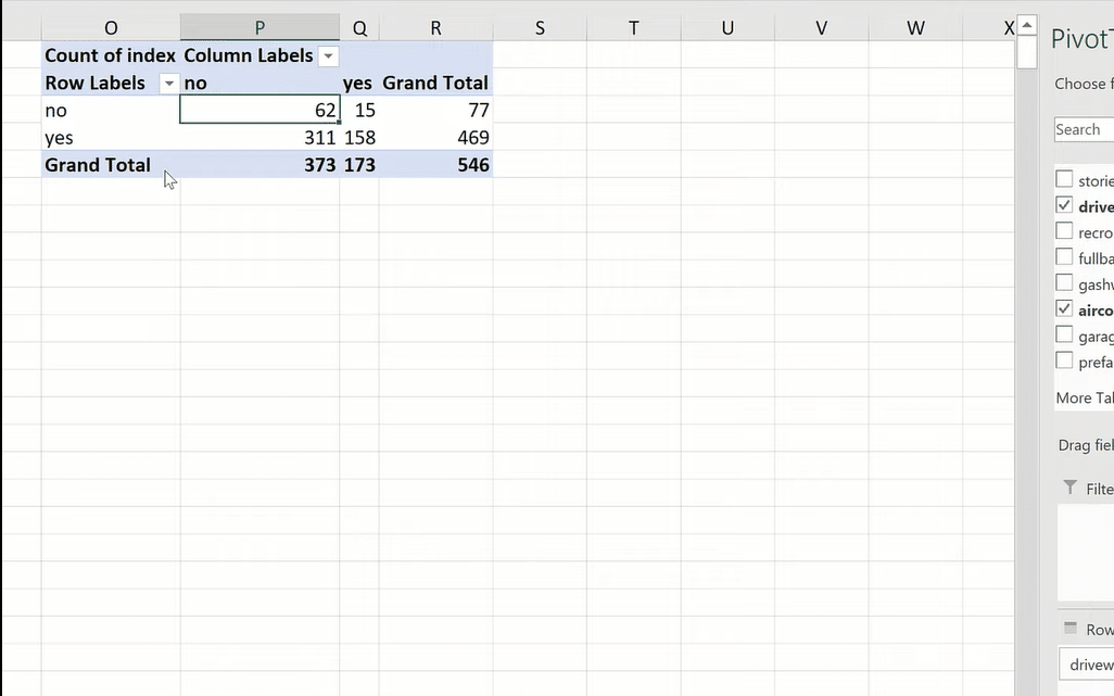
If you think about this, we still see the 77 and the 469, except we’ve bifurcated it with the homes’ air conditioning, no or yes. So, we can say that of the 546 homes, we’ve got 158 that do have air conditioning and a driveway, 62 of them do not have either, and then either or for those other values.
This is called a two-way frequency table, which is also called a contingency table.
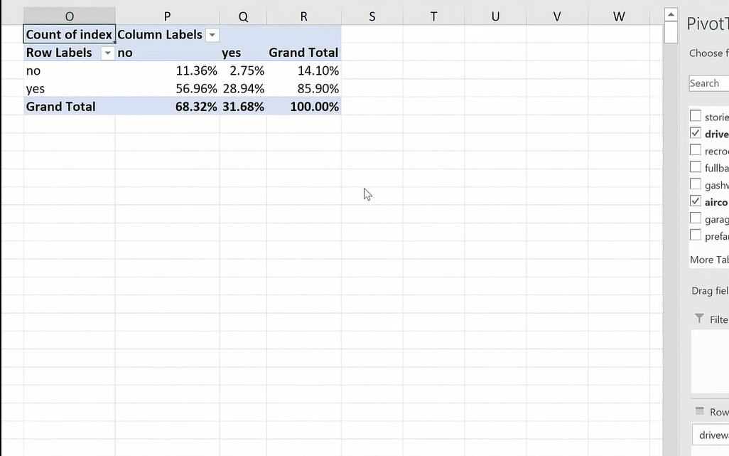
We have 546 homes, but it’s hard to know exactly what per cent of values are in each of these buckets, right? Unless you’re really good at mental math, it might be hard to divide 62 into 546 very quickly and understand what percentage of each is in these buckets.
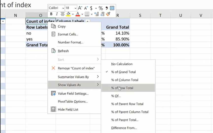
So, I’m going to click on Count of Index, go to Show Values As, and then I’m going to make this a % of Grand Total.
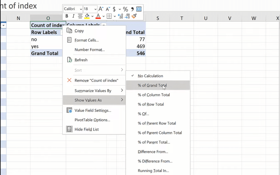
By doing this, we have turned those raw values into percentages. These numbers are easier for us to comprehend in some ways. This is a more intuitive way for us to look at the data.
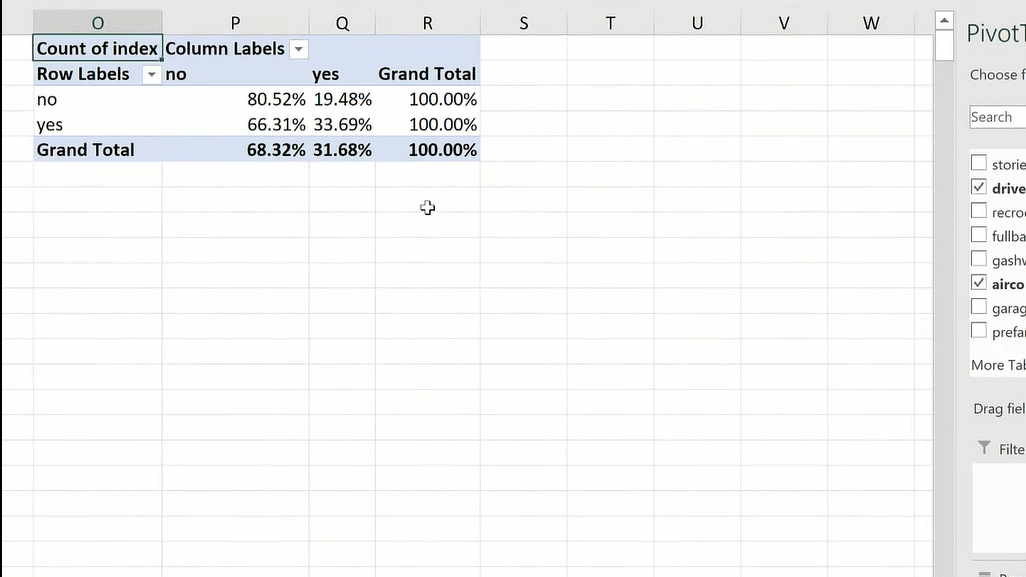
Maybe we want to know what percent of the records don’t have a driveway, and what percent of them are in the no and in the yeses for air conditioning. Then, we could change our values. We would make that a Row Total.
So, we are slicing each of these rows, finding out what percent are in each of those.
One thing that’s hard with these percentages is that we’ve kind of artificially scaled-down the data. We don’t know 2.7, 5% of what that would be important to know. If it’s really small, if it’s 2.7, 5% of 120 observations, then that’s a small number, right? If it’s 2.7, 5% of a thousand observations, that’s still a sizable number.
We’re lacking context when we just look at things in percentages. So, I’m going to drag my index here, double-drag it, and change it as a count.
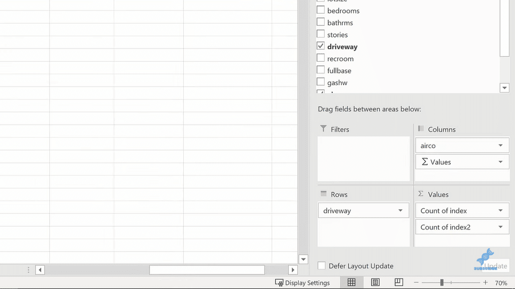
And now, we’re seeing both the proportions and the frequencies. I could even actually type right over this. There’s some extra formatting we can do.
Frequency tables in Excel and proportion tables are for categorical variables. We have to count them. There’s no other mathematics we can do. We can look at the raw numbers. We could also look at the proportions.
***** Related Links *****
Appending Several Sheets In Excel To Power BI
Unpivot And Pivot Basics In Power BI – Query Editor Review
Power BI And Excel: Difference In DAX Formulas
Conclusion
I hope that you learn something about frequency and proportion tables and how to do it in Excel using that index column.

The raw frequencies give us a lot of information about the data because we’re not scaling it down artificially, but it can be hard to compare the relative magnitude of each of those figures. Whereas, with proportion tables, it’s a lot easier to look at things when they’re sliced into 100. But in a way, we can say that we’re losing context when we do that.
I hope that you enjoyed this tutorial. Make sure you check out the links below for more related content.
All the best,
George


