With the recent Power BI challenges that we run in Enterprise DNA, I’ve become a huge fan of the Power BI tooltips. I’ve seen them being used in so many ways and they just add so much value to your reports and insights that you can show in a really compelling way. You can watch the full video of this tutorial at the bottom of this blog.
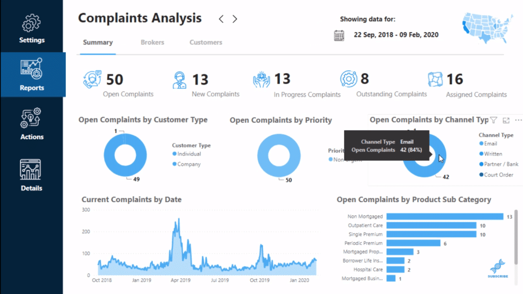
In this tutorial, I’m going to show you how you can add tooltips in any way that you like and anywhere on your page. It doesn’t have to be just on a visual. I’ll go through how that works.
Overlaying Power BI Tooltips On Report Images
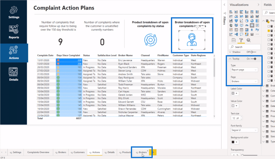
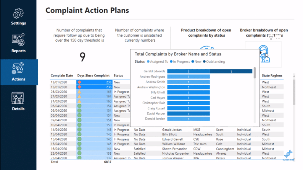
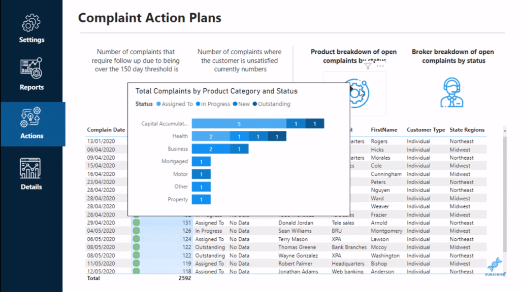
This is a really comprehensive report that I developed for one of the challenges. In the Actions section, you can see that I’ve overlaid a tooltip onto an image or what looks like an image.
With Power BI tooltips, you don’t need to embed a chart into your page. Instead, you can embed a chart into a tooltip in a hidden page that just appears when you hover over an image or visualization.
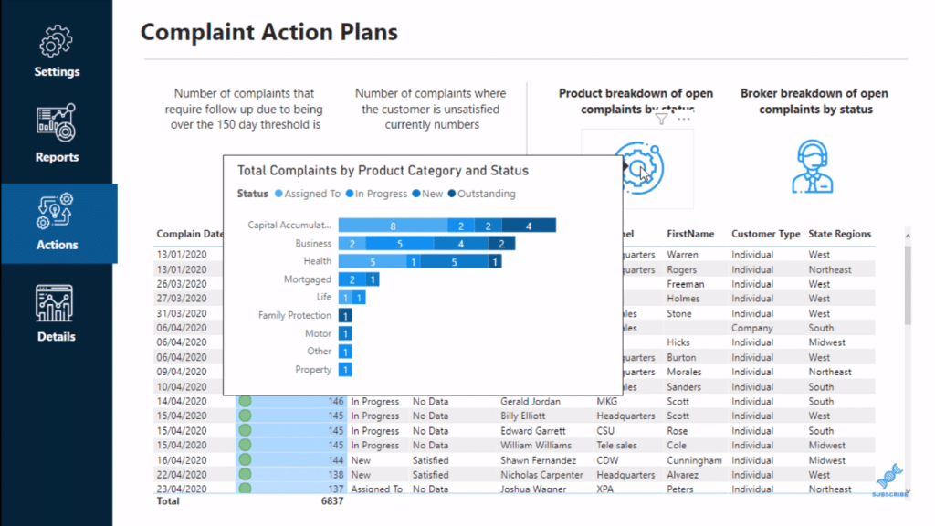
I got these icons or images from a website called Flaticon, and then I just inserted the icons or images into my report page. Then I edited the color of the icons to match the color palette of my report.
Note that you can’t actually put a tooltip into an image. So what I did was I’ve overlaid an element on top of the image.
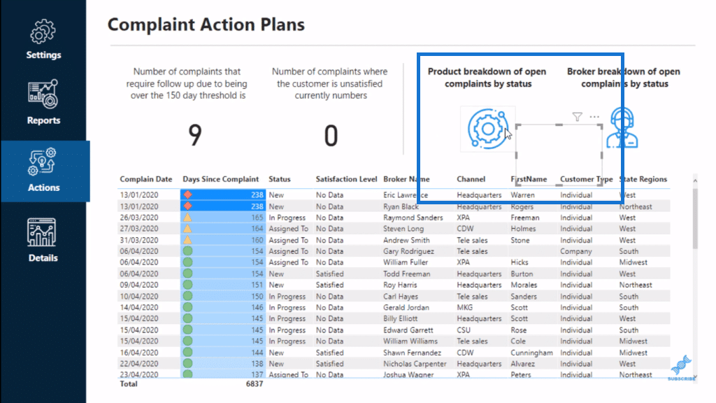
Overlaying A Card Visualization Onto An Image
I overlaid a card visualization with a random measure, and I placed it over the image. Then, I made the background 100% transparent so that the background couldn’t be seen.
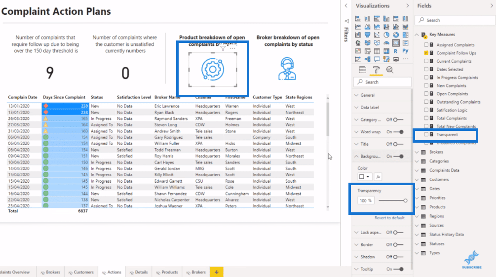
To do that, inside the Paint roller area, go to the Data label, and then create a conditional format for the measure in the card visualization.
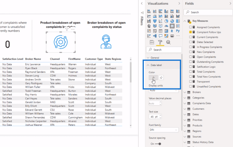
Click on the icon and select Field value for Format by, and then make a field value based on a measure.
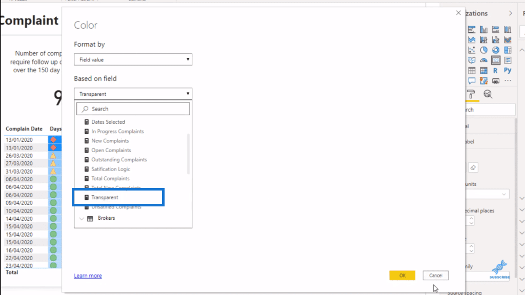
But within this measure, Transparent is not a calculation, but a color. It’s a hex code for clear or transparent.
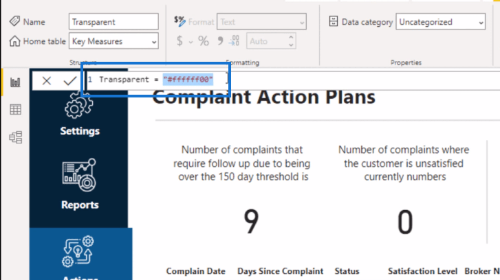
Adding Power BI Tooltips
Once the card visualization is done, you can then embed a tooltip. In this case, I put the Report page as the Type and the Page is Products.
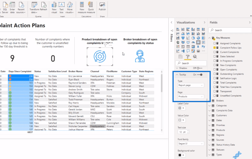
And I did the same to the Brokers page.
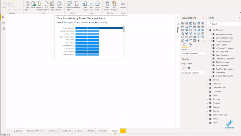
If I go to the Brokers page, you’ll see that I have a chart embedded on the Brokers image.
You’ll see this page or chart pops up if I hover over that image on the report page.
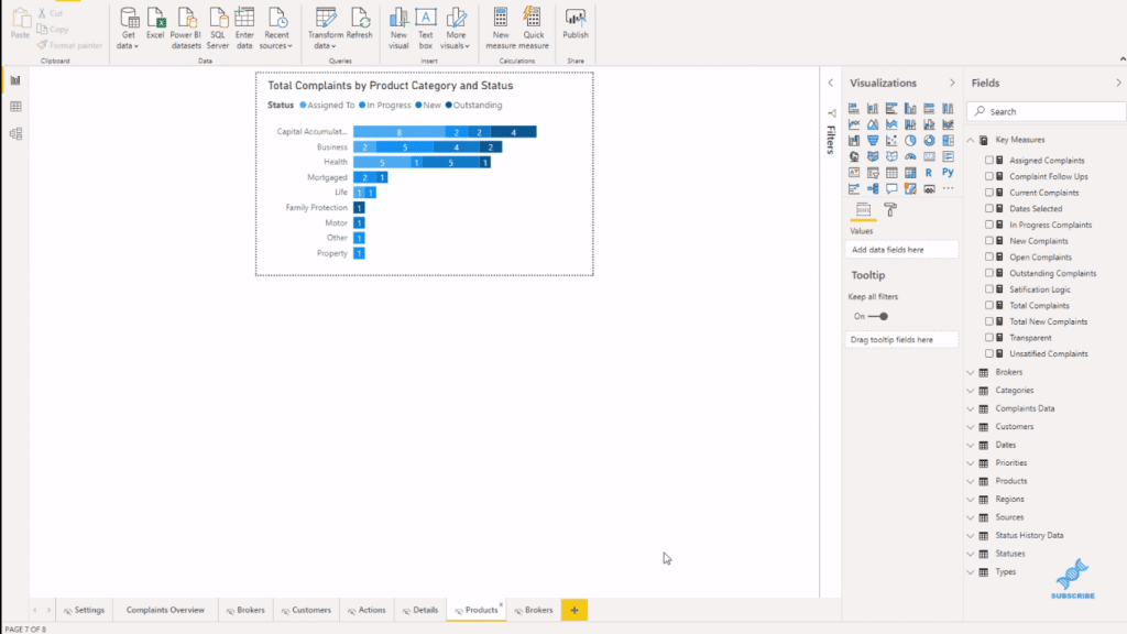
This is the chart I did for the Products page.
Sync Filters Across The Report & To The Tooltips
The great thing about this is the way I’ve set this up. I have some filters here, which sync across all my reports.
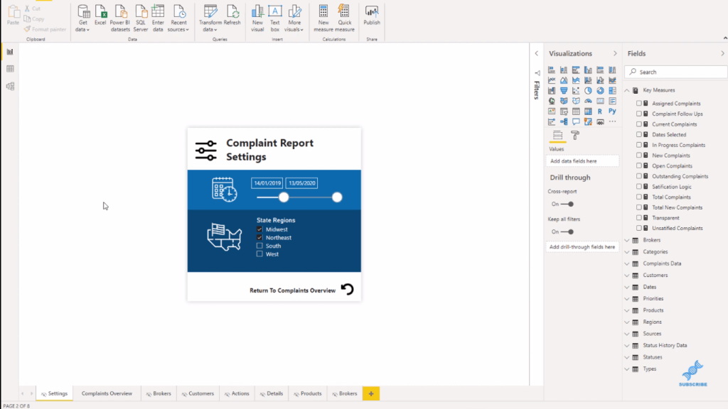
If I select Midwest and Northeast, for example, you’ll see that these filters or settings are shown on the report page.
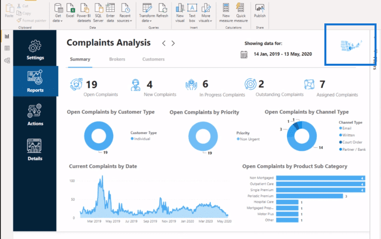
They sync across the tooltips as well, showing only those regions I selected.
***** Related Links *****
Creating A Visual Tooltip In Power BI
Data Visualizations Power BI – Dynamic Maps In Tooltips
Dynamic Tooltip In Power BI With Embedded Charts
Conclusion
You can use the Power BI tooltips in many ways. In this tutorial, I’ve shown you a technique on how you can add tooltips to anything within your report. It only takes a little bit of creativity.
If you want inspiration, definitely check out our Showcase. Check out our forum as well as our challenges for more Power BI techniques. You can also come to our Knowledge Base, where we have a report design inspiration section.
I hope you enjoyed this one and have fun implementing this in your own scenarios with your own twist.
All the best,
Sam


