In this blog, I’m going to highlight an incredible example of Power BI reports design. It’s such a unique design, which is different from the normal way that you would think Power BI can do it. You may watch the full video of this tutorial at the bottom of this blog.
This Power BI reports design will show you the unlimited possibilities in developing reports engaging your team and your consumers. So let’s jump into it.
How A High-Quality Power BI Reports Design Look Like
This report was done for Power BI Challenge 6 and was completed by one of our members, Alex, in Enterprise DNA.
This was created related to some data from insurance complaints. What Alex did was he summarized the KPIs (key information) on the right side and built a simple chart on the distribution of those complaints throughout the network of the channels that an insurance company sells through.
The little things that have been embedded here make the report really compelling. One is the color palette, which is great. It’s simple, but it’s not overdone. The colors have been used in a really creative way.
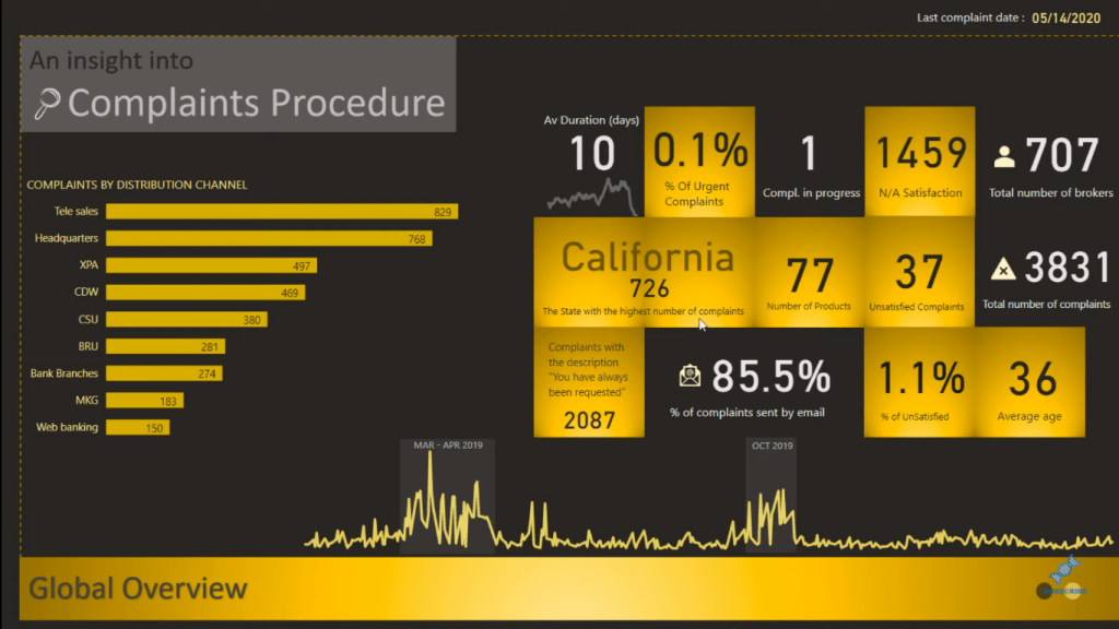
I’m also big on grids; I think they’re an important part of the Power BI reports design. You need to make sure your report sits within the grids, so everything is aligned and organized, and the way that the grid framework has been used here is impressive.
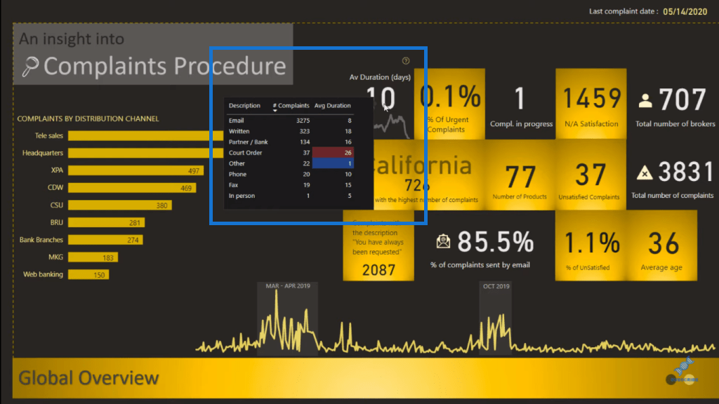
There’s also a lot of logic embedded behind just this one page. You can see here that we have some interesting tooltips based on the selection we make or the visuals we hover over.
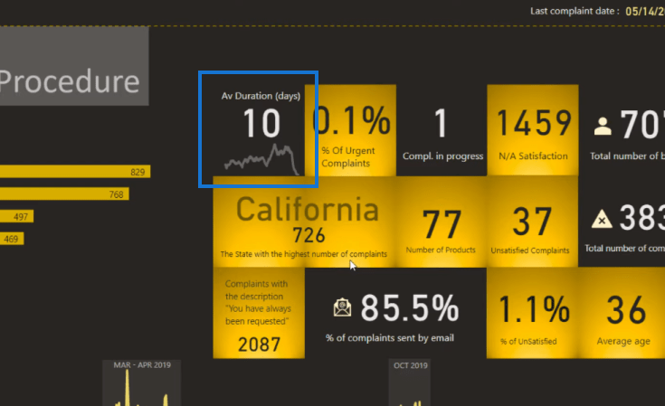
We have a simple line chart embedded into a square, so it looks like it’s one visualization where it’s actually just a transparent line chart hidden in the background.
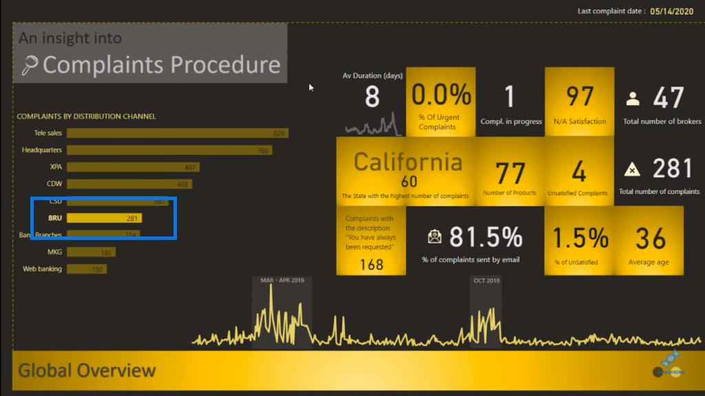
This is a dynamic report so all the details (on the right side) are going to change based on the selections that we make. For instance, when we select BRU, you can see that the numbers change.
In this visualization, there’s a question mark up on the upper right corner.
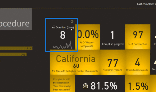
And when we hover over that, it brings up another tooltip, which highlights some other really interesting insights.
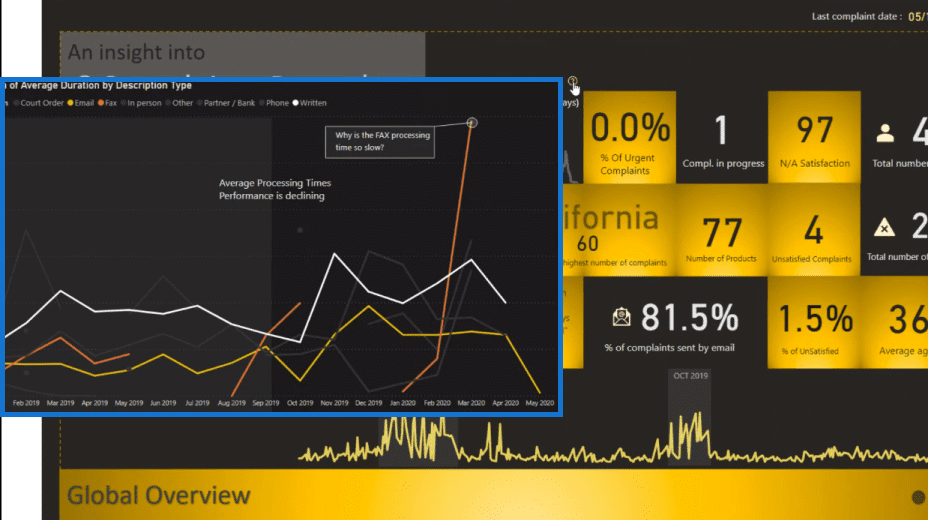
Outlier Investigation Feature
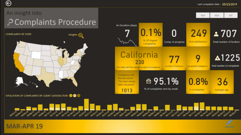
Another great thing about this report is the graph below that features outlier information.
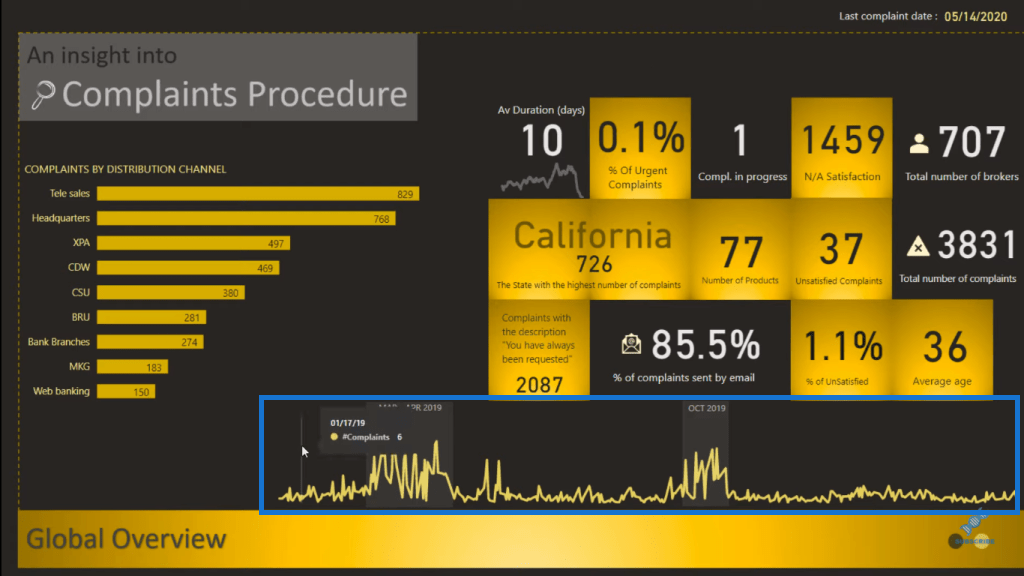
This shows the complaints by day. But Alex also enabled the ability to click on the outlier by utilizing a bookmark. This is a static chart, but Alex created a way that enables a user to click through it and really drill down into a specific aspect of the data.
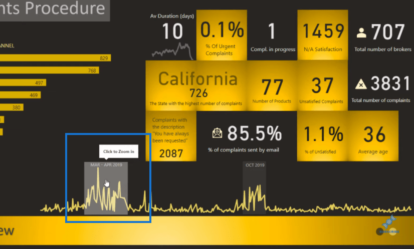
So we can click on this, and it takes us to another page where we can investigate just that timeframe.
Report Navigation Feature
As you can see, Alex labeled the page as well. At the bottom left corner, we have Global Overview. And then, we also have these two circles on the other side to navigate to a different page.
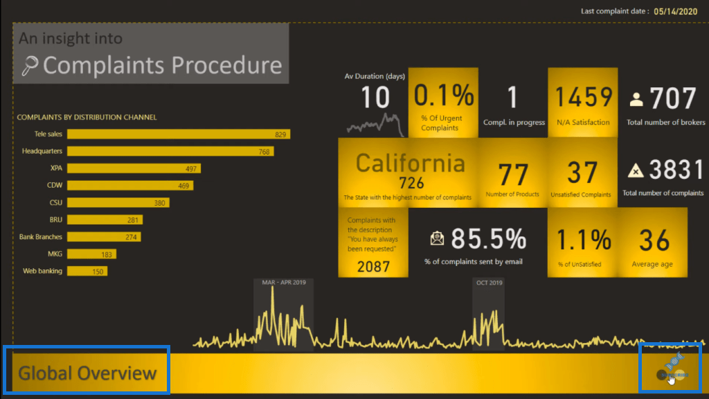
If we click on one of these circles, it takes us to another report page.
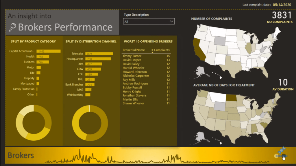
And here, we are also able to drill into specific information.
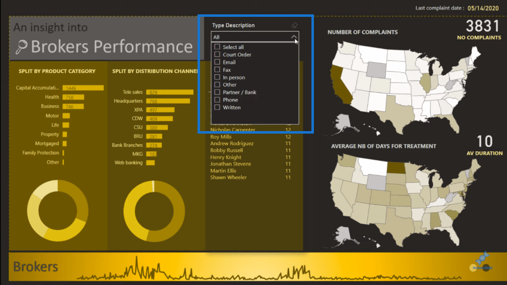
There are no page selections in this Power BI reports design. It’s all done with navigation. Here’s another tooltip that’s embedded on the main page for more navigation experience.
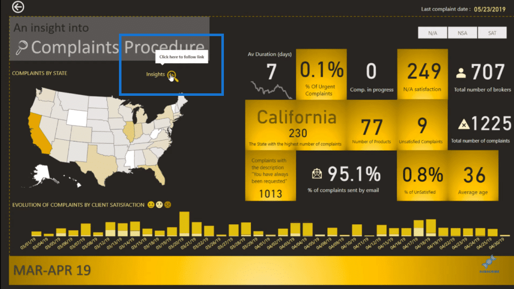
If we click on this visual, we can see more details about the underlying timeframe.
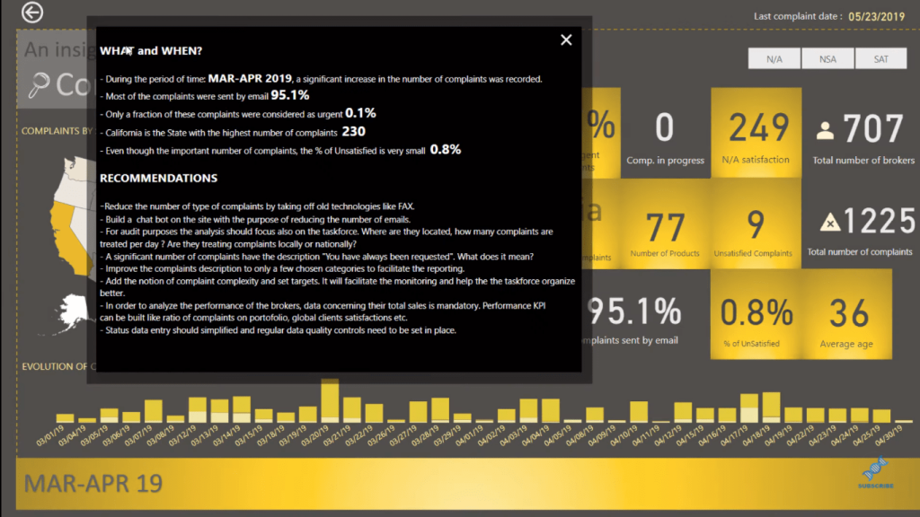
These tooltips and bookmarks utilized in the report create this seamless and superb navigation experience. And to me, this is just awesome!
Conclusion
This Power BI report design is one of the most epic ones I’ve seen so far. I hope that you get inspired by this and I highly recommend that you try and create something like this as well.
A lot of effort has gone into the visual aspect of this report, and that’s what keeps the consumers engaged. If you were to throw this up on a big screen in a meeting within your organization, everyone would be looking at this all the time, because it is so engaging. It’s so informative and it’s easy on the eye. It’s easy for you to find the insights that you want.
If you’re trying to report on something and you want to make it compelling, you want to really dive into the information and the parts that are most important. The brilliant navigation in this report provides all of this.
You can watch the full video tutorial below or check out the challenge entry on the Enterprise DNA forum.
All the best,
Sam
***** Related Links *****
High-Quality Power BI Report Navigation Experience
Data Visualizations Power BI – Dynamic Maps In Tooltips
Power BI Bookmarks To Change Views On Report Page
***** Related Course Modules *****
Data Visualization Tips
Dashboard & Data Visualization Intensive
Power BI Challenge Showcase
***** Related Support Forum Posts *****
Power BI Challenge 6 – Insurance Complaints Entry from Sam M
Power BI Challenge 6 – Insurance Complaints Entry from Zoe
Power BI – Creativity
For more navigation report design queries to review see here….


