In this tutorial, I’m going to show you how I come up with my overall theme, color schemes, backgrounds, and how I put these basic elements together to give my reports a clean and easy-to-navigate look. This has a huge impact on my Power BI report development process because it affects how people navigate through the report and interpret the data I’m presenting.
I’m going to use a report I created for one of the Power BI Challenges as an example to give a clear step-by-step on how I do it.
Choosing The Overall Theme
The moment I receive the brief for a challenge like this, I immediately try to decide what kind of theme I’m going to do. It’s the first part of my Power BI report development process even before I bring in any data, models, or measures so that there’s no need to apply the theme into every element one by one.
I start by going to namelix.com.

You can enter any keyword on the space provided on the homepage. Once you click on Generate, it shows you results based on the keyword you typed in. So if I use the keyword “data”, for example, it gives me these results.
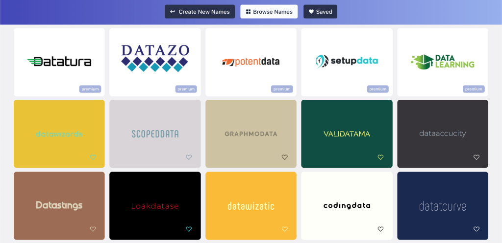
You can scroll through all the results and pick the one that you feel works best with your report. In my case, this is the one I chose.

Just remember that we’re not after the brand name here. All we need is the theme, then we’ll use our own name or title.
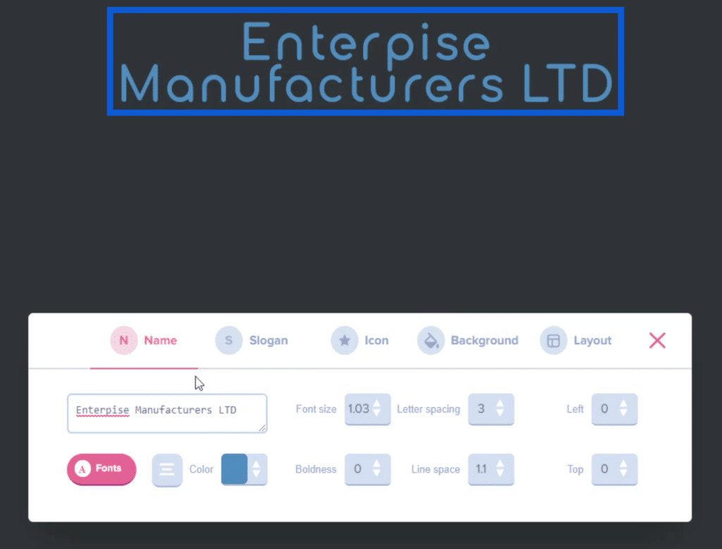
The brief for this report provided a name, so we’ll apply that name to this slide by clicking on edit, then type in “Enterprise Manufacturers LTD” on the space provided.
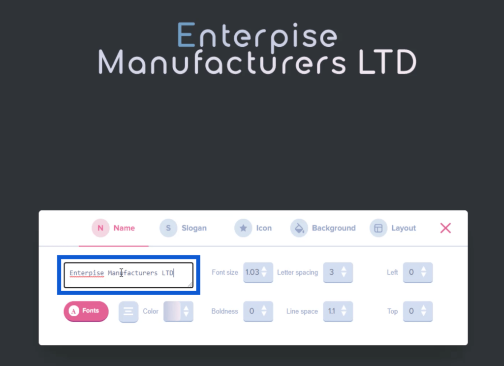
You can also click on Color to make changes to the color of the name that you typed in.
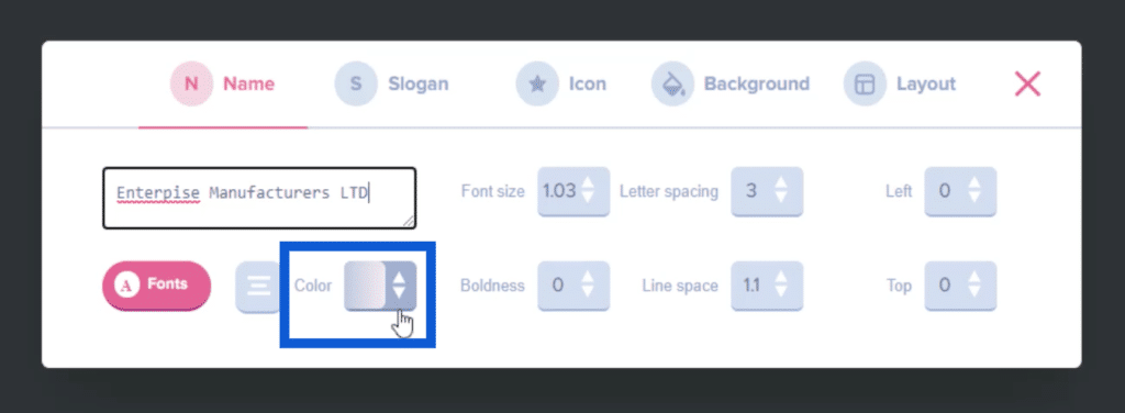
In the original slide I picked, only the first letter was blue and the rest was white. If I want to change that, I can click on a specific color here.
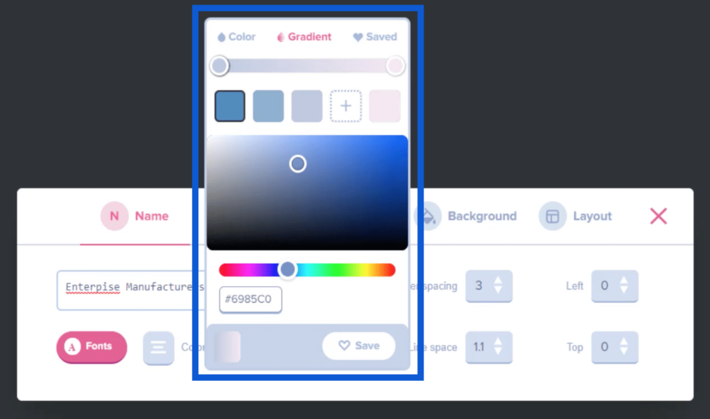
This will automatically change the name on the slide.
Creating a Logo
Now that I like how the name looks, I’m going to choose an icon to add to the name. This will help us create a logo to use for our report.
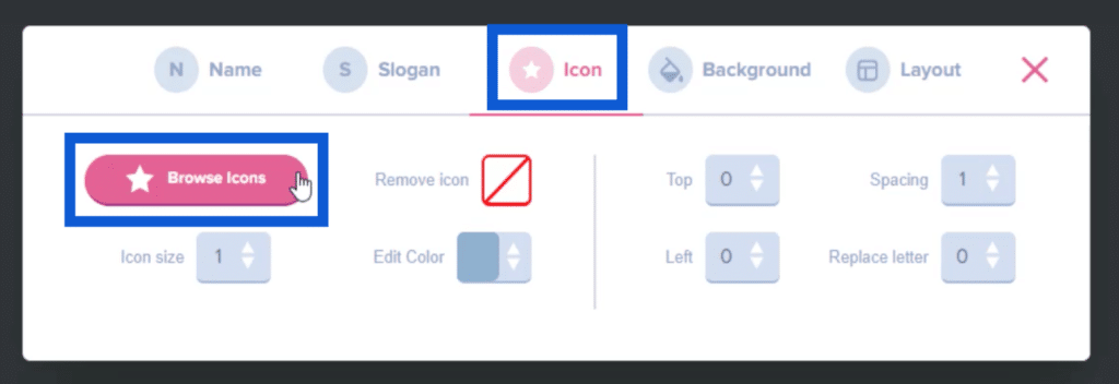
Just go to the Icon menu, then click on Browse Icons.
This will give me an entire page of possible icons I can add to the brand name or title.
I can use the search bar on top to find specific icons that match the theme of the report I’m trying to build. So if I type in DNA, it narrows down the results to the most relevant icons.
Once I see an icon I like, I can just click on it so that it appears on the slide I’m working on.
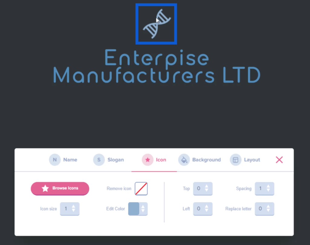
I can also resize this icon by moving the slider on the icon menu.
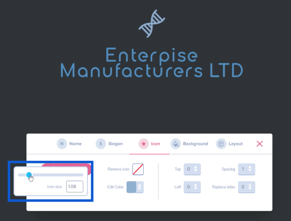
If I want to edit the icon’s color, I can do that through the same menu as well.
Now that I like how my logo looks, I just need to take a screenshot of it and save it to a folder on my desktop.

Creating A Color Scheme
The next step is to come up with a color scheme based on the theme I picked earlier. To do that, I’m going to a website called imagecolorpicker.com.
There’s a button at the bottom of the homepage that says “Upload your image.”
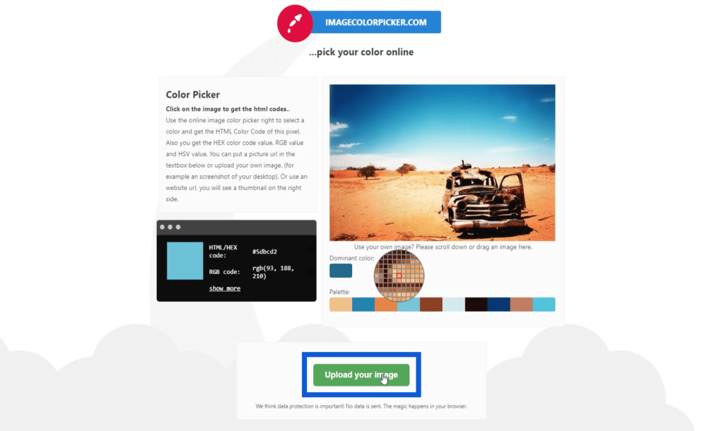
Once I click on that, it opens up my folders. I’ll pick the logo that I saved earlier and click Open.
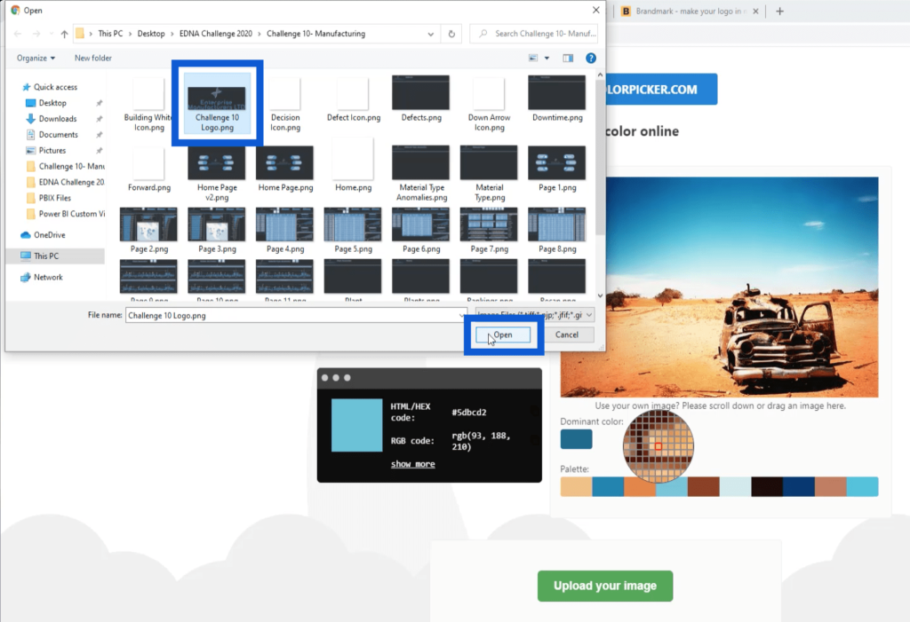
Once the upload is complete, it shows me the image I uploaded together with a palette that’s made up of the colors I used for the logo. The great thing about this is that I can hover my pointer over any part of the image, and when I click on a specific pixel, it gives me the hex code for that particular color.
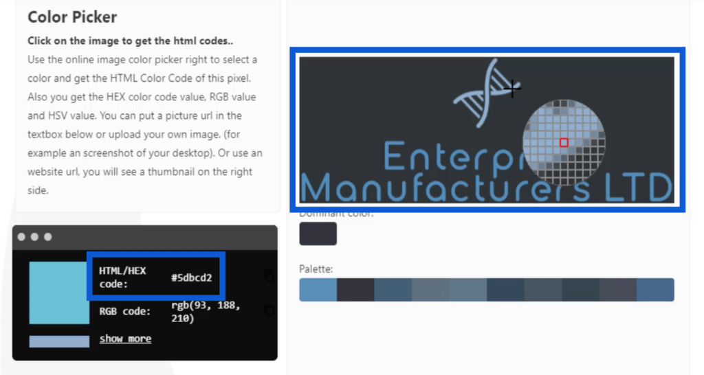
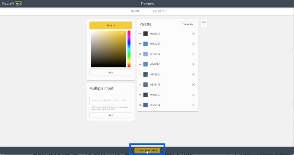
Note that I’m going to save all these hex codes in a JSON file later, which can only carry up to eight colors. Once I’ve picked out those colors, I’ll list down the hex codes and go to PowerBI.tips. I’ll click on the Advanced Theme Generator.
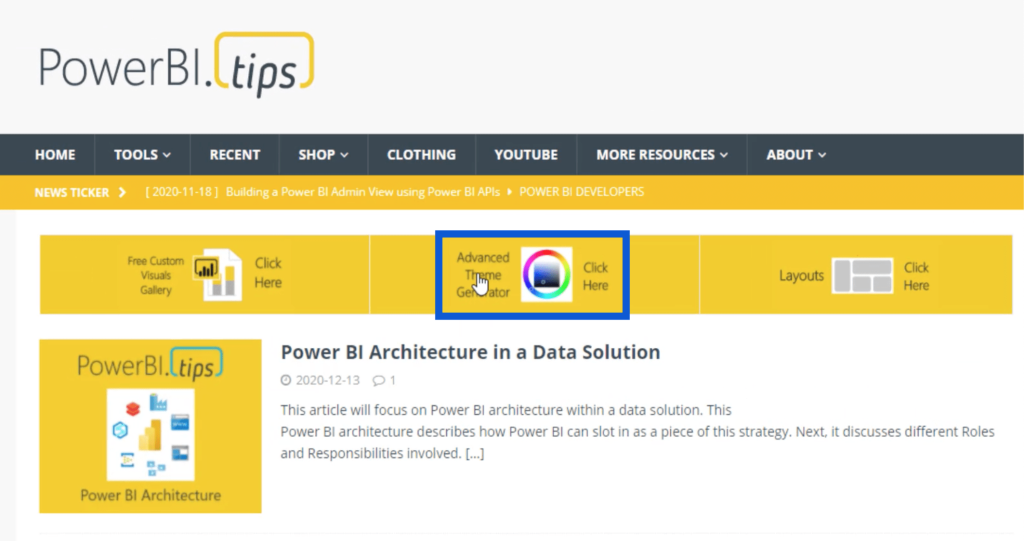
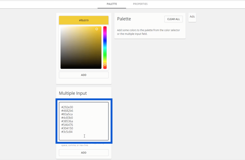
Inside the Advanced Theme Generator, I can enter all those hex codes under Multiple Input.
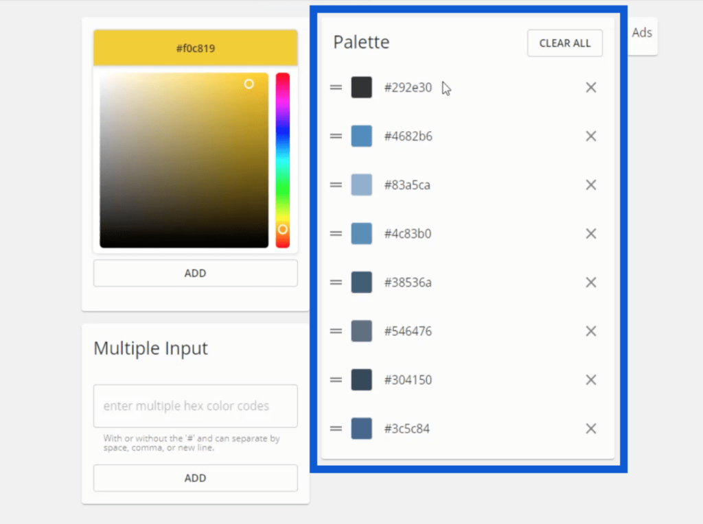
Once I hit add, my palette will show up, with the specific hex codes for each color.
One of the other Enterprise DNA Experts, Brian Julius, also uses this same tool. He mentioned the Properties tab in one of his previous tutorials.
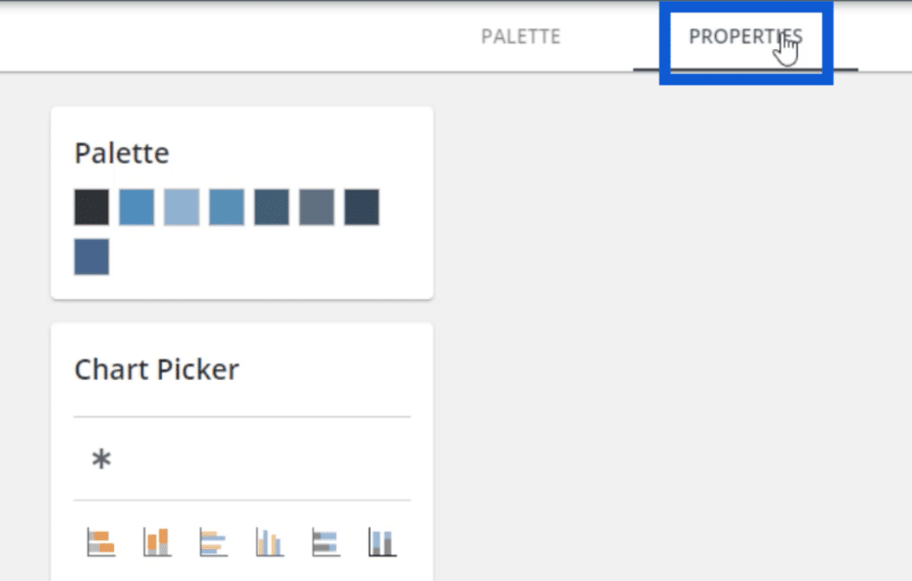
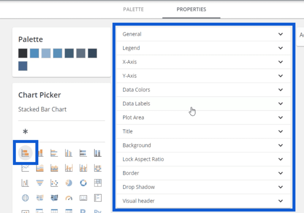
The Properties tab is where I can set how I want certain visuals to look like. For example, if I click on the first chart under the Chart Picker, these different tabs show up, which allows me to customize each part of the chart.
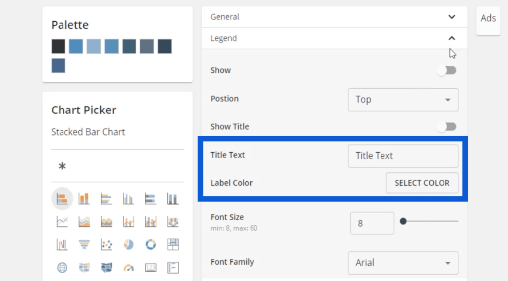
So if I want my charts to have a legend, I can click on Legend and change the title and the color.
I can adjust the font size, as well as do different customizations on the X-axis.
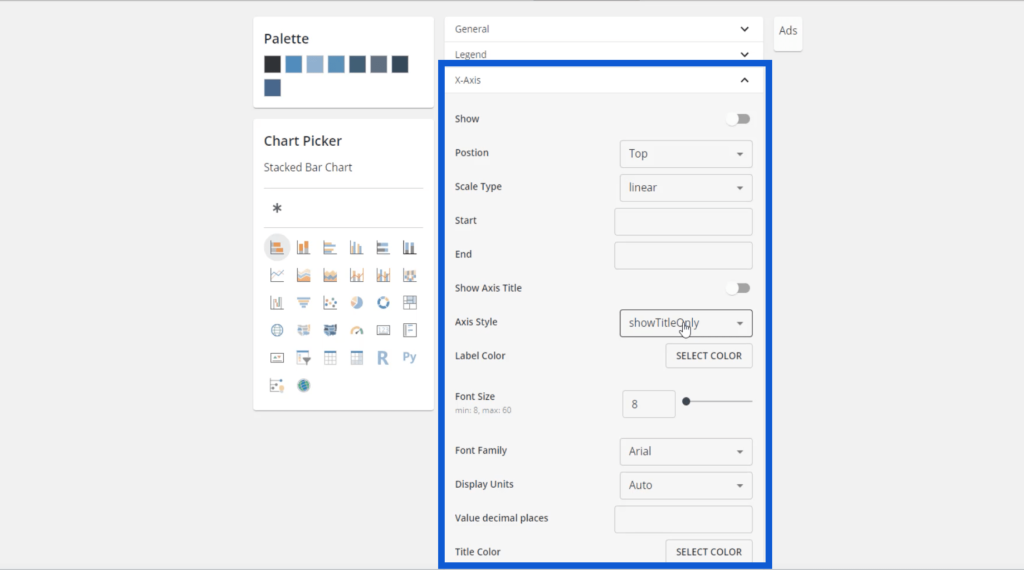
I can select the title, a color for the title, the label color, and the font size. More importantly, I can also adjust my data colors here.
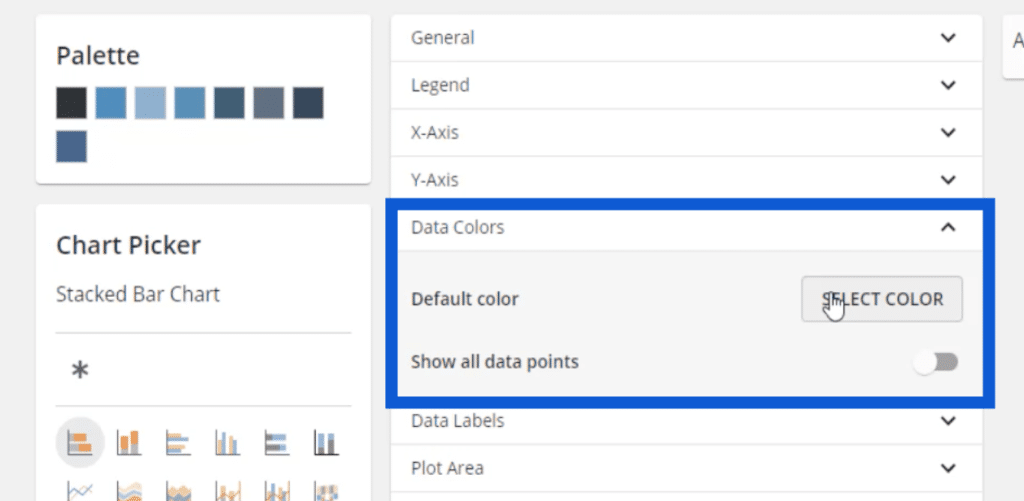
It’s great that I can set all these up here because that means once I place this entire theme into Power BI, I won’t have to adjust the colors one by one as I create entries. Even with the data labels, the moment I turn them on in Power BI, these settings will automatically kick in.
That’s the key to seamless Power BI report development – finding things that could lessen the steps to complete your report.
In most of my models, I would use a darker background, then use white as a data label. You can choose your own colors; just make sure that you have enough contrast between the background and the labels so that they’re easier to read.
The same settings can be changed for the chart title.
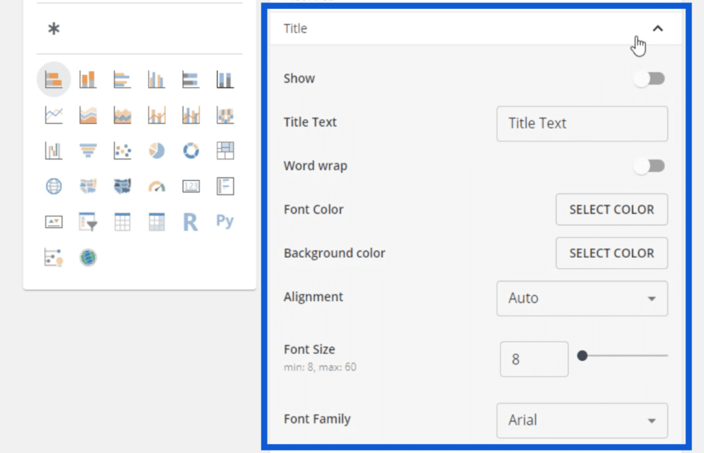
Once all of these are set up, I can go back to the pallete and download the theme by clicking on the button at the bottom.
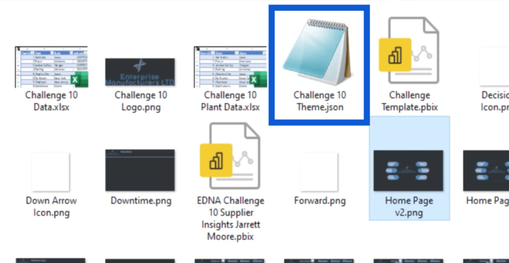
All of those settings will be saved in a JSON file. It shows up like this because my computer reads JSON files using the Microsoft notepad. But it can also be opened using other apps like Visual Studio.
If I open the JSON file, it looks like this.
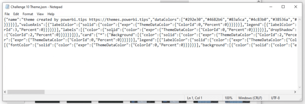
As I look at the code, I can see the eight hex codes here.

Applying The Theme To Power BI
Aside from the color pallete, that JSON file also contains all the settings that I saved earlier. This means that once I import this file into Power BI, I wouldn’t have to do as much detailed work once I get started on my report.
To import that file, I’ll just go to my Power BI desktop and click on the View pane on top. Then, I’ll click on “Browse for themes.”
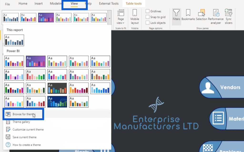
I just have to select this file and click open.
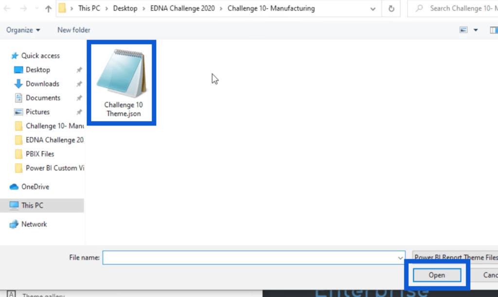
This will automatically import the theme settings into my Power BI. I can verify this by going to Visualizations. I’ll click on the format pane and go to the page background. As you can see, the theme colors I chose earlier are now showing up here.
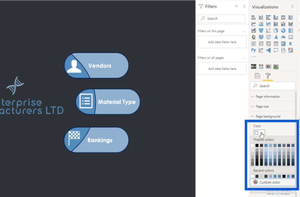
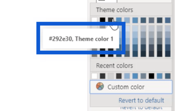
You’ll notice that there are ten rows of colors here, but we only saved eight earlier. That’s because Power BI automatically includes white and black in any color theme. Then, you’ll see that the third row says “Theme color 1”, which means that it’s the first of the eight colors I imported with my theme.
Adding Icons To The Report
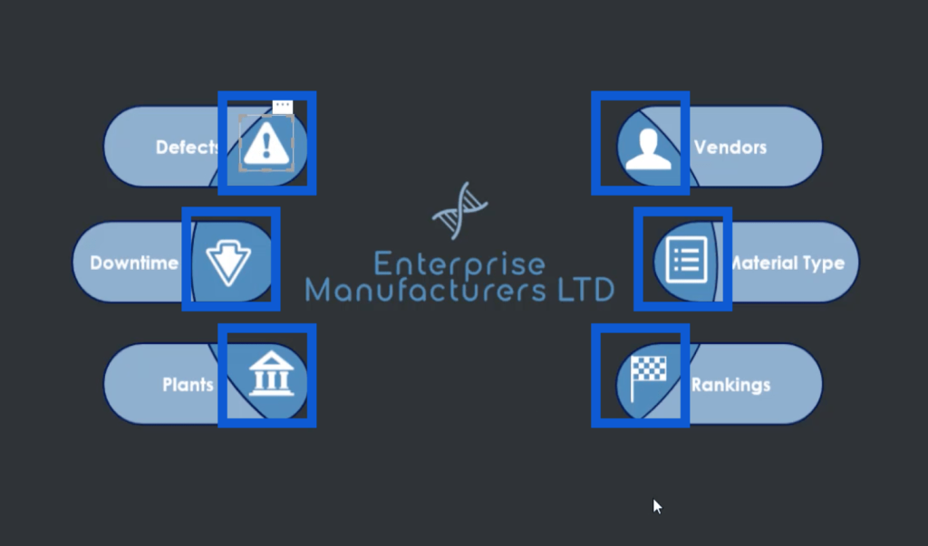
Now that I have my whole theme in Power BI, I’m going to show you how I picked out all these icons I used on the report homepage.
When I did a Google search for white icons, this website was the first thing that showed up in the results.
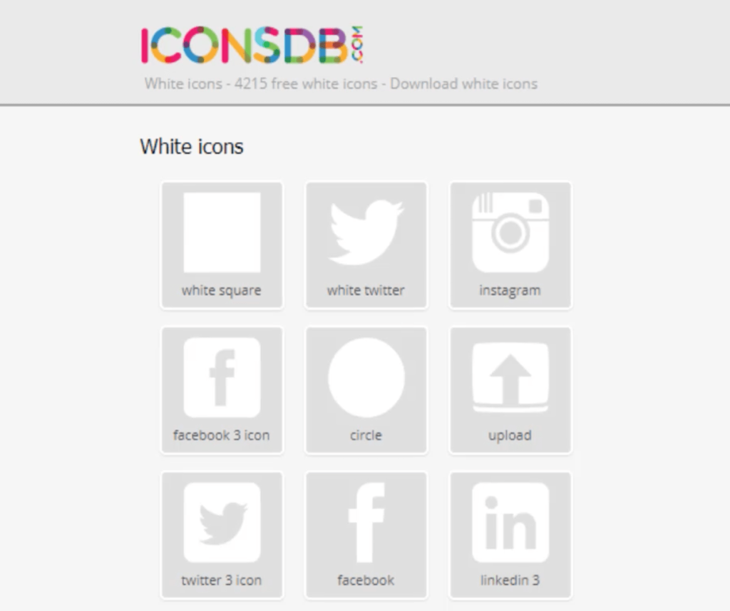
Here’s the link to get to that page.

Remember that I prefer using dark backgrounds in my reports. That’s why I searched for white icons here. There are a lot of other sites where you can get your own icons based on your theme and preferences.
On this website, I just need to type in a keyword to get the most relevant icons in the site’s database. I’m going to use the word “decision.”

Once I click on the Search button, it’s going to show these results.
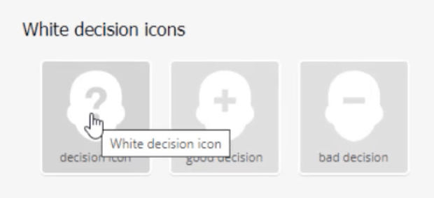
Once I click on the icon I want, all these options on how I can store the file comes up.
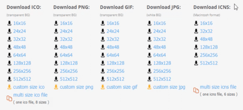
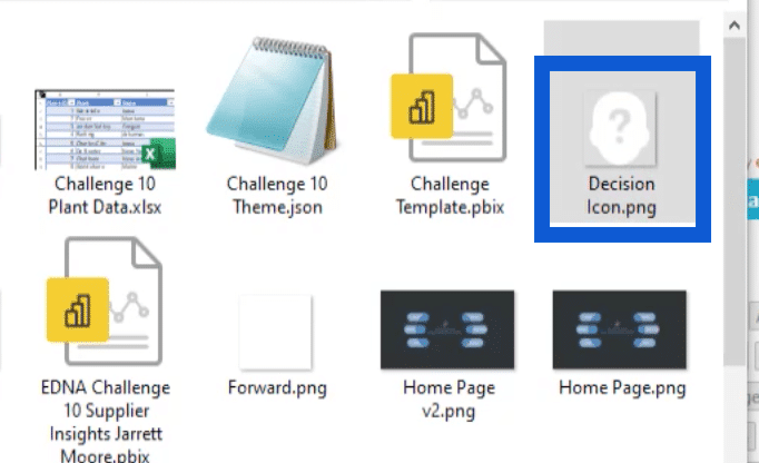
I always download the PNG file. The size I typically download is 48×48. Once I click on my choice, it will ask me to download it and save it to a folder. This is what it looks like once it’s saved in my computer.
Creating Backgrounds In PowerPoint
Once I have all the icons I need, the next stop in this process is creating the slides for my background using PowerPoint.
I usually start with a blank slide, but I’ll just show you the file I created when I was still working on the report in the example I’m using here. Looking at this slide, for example, you’ll see that I’m using the same logo that I created earlier.
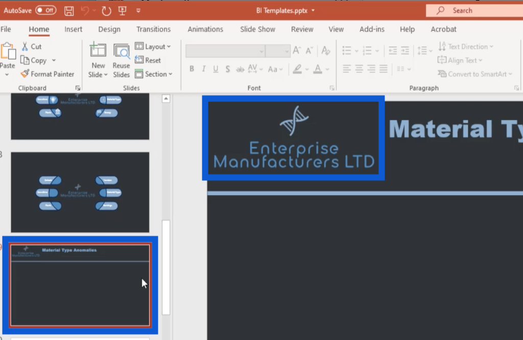
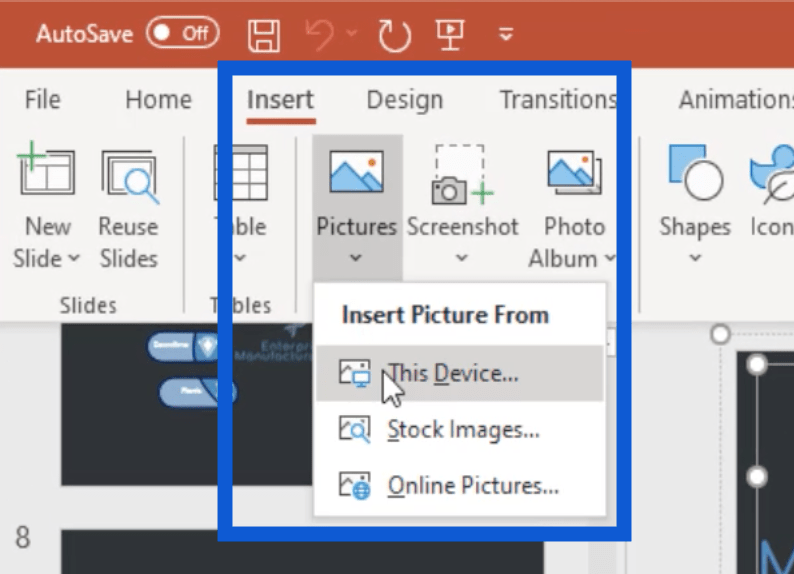
Basically, I just added that image into this PowerPoint file. To do that, I just went to the Insert menu, clicked on Pictures, then chose “Insert Picture From This Device”.
As for the slide header, it’s just a text box where I can type in the name of each slide.
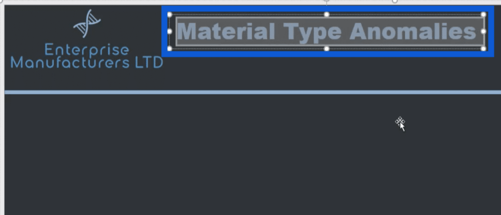
I also added this line that goes across the page to isolate the header from the rest of the content I’ll be adding to the page.

Note that all these elements on the slide have to be saved as a group for them to show up in the image once I save it. Otherwise, these elements won’t show up when I save this slide as an image.
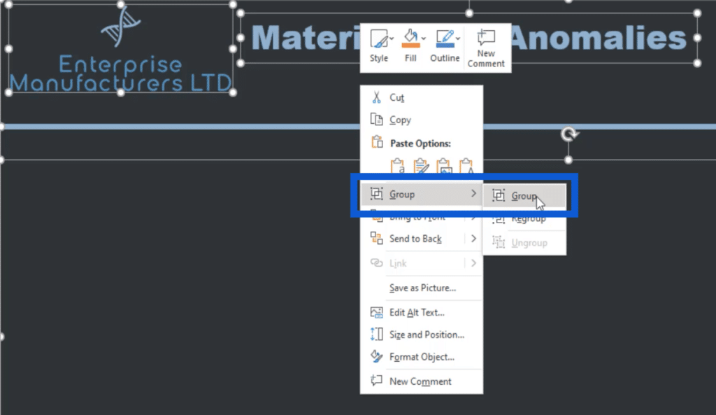
Just select all of these elements by clicking on each one while holding the Ctrl key. You’ll know that they’ve been selected if you see the white dots around each element.

Once everything has been selected, just do a right click then choose Group.
Then, do a right click again and choose Save as Picture.
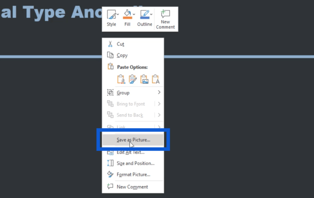
Once the file has been saved, it can now be used as a template for all the other slides needed for the report.
I also made my report’s homepage here.
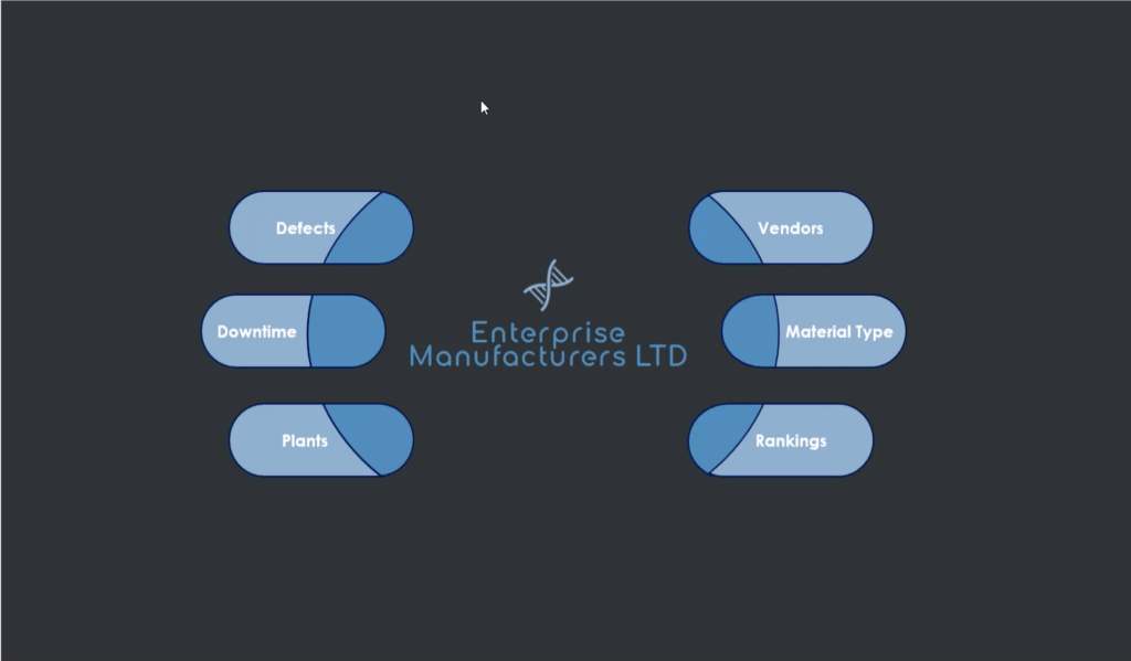
As you can see, this is a little bit more detailed compared to the regular template I worked on earlier. I just used the shapes available in PowerPoint to put this together.
Notice that it doesn’t have the icons that I saved earlier just yet. I’m going to add the icons once I’m in Power BI and use them for page navigation. For now, this is all that my homepage needs.
Adding Page Navigation
Now, I’ll head back to my Power BI desktop to show you how I added all of these into my reports and how I set up the page navigation as well.
I need to go to the Insert menu, then click on Image.
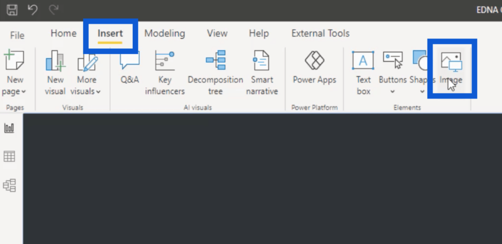
This is going to open up my folders. Once I get the slides and icons into the report, I can resize them as needed so that everything is laid out properly.
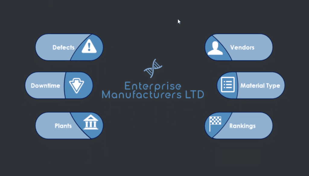
As you can see, the page now shows the slide I worked on in PowerPoint plus the icons that I got online.
Now, I’m going to add some page navigation. I’ll start with this icon for Defects.

Then, I’ll go to the Action section on the right and choose Page navigation under Type.
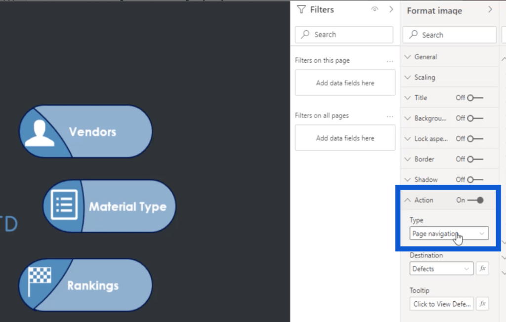
Under Destination, I just need to choose the page where I want that icon to lead to. In this example, I’m going to choose Defects.
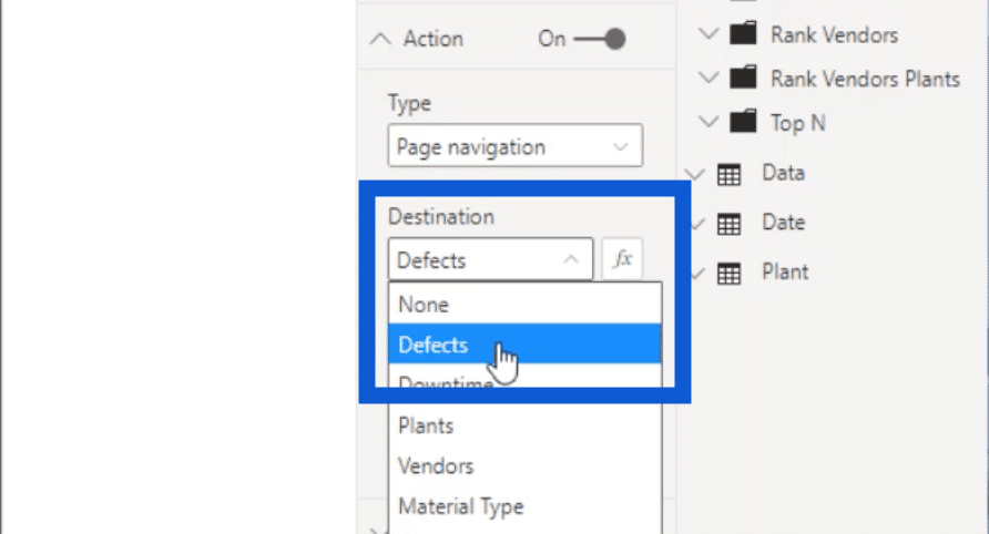
I also added a little note inside Tooltip and wrote “Click to View Defects Slide”.
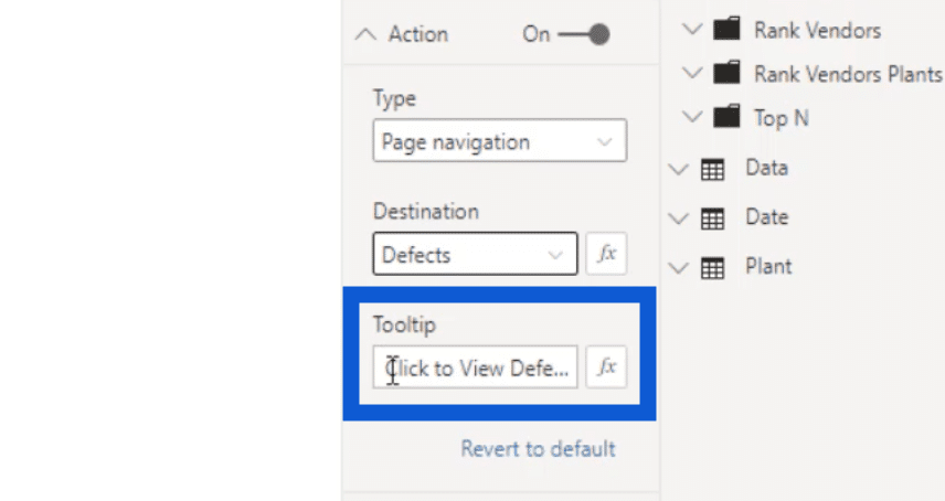
So whenever I highlight my mouse over the icon, you can see that tooltip showing up.

While I’m still inside the Power BI desktop and putting things together, I would need to do a Ctrl+ left click for that to work. But once the report has been published, the user viewing the report only needs to do a left click to be led to the right page.
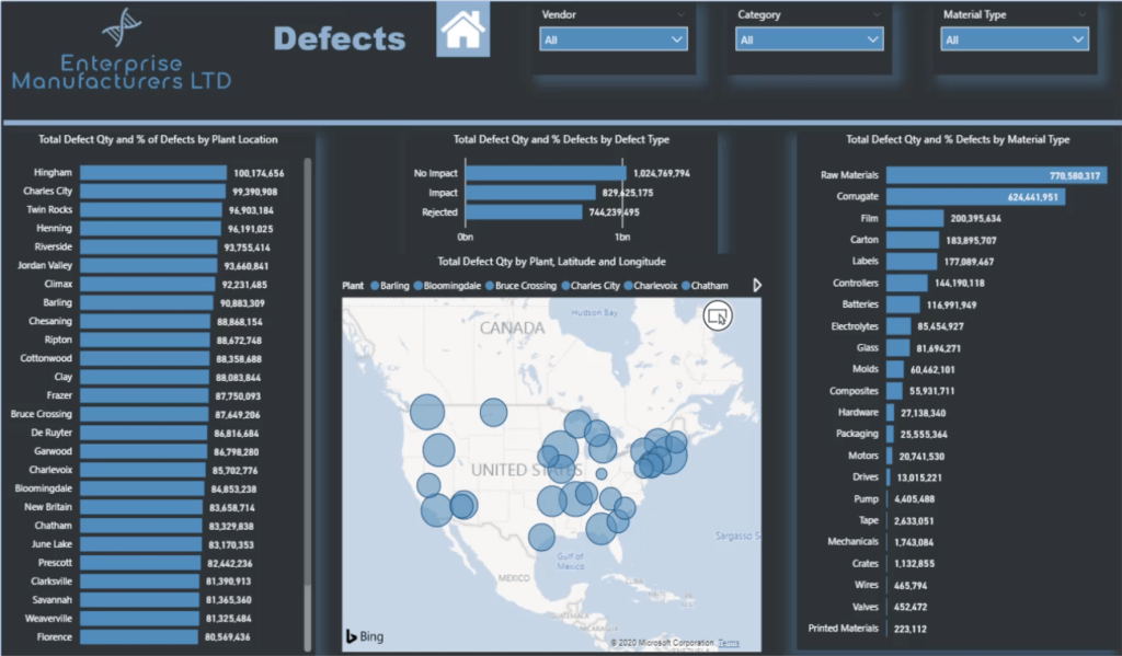
On the Defects slide, you’ll see the template I worked on earlier, but with more content on the page. I also added a home icon on top so that users can go back to the homepage anytime they need to.
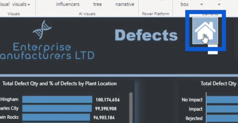
I did the same process with the other icons on the homepage, making it easier for users to jump from one part of my report to another.
***** Related Links *****
Power BI Report Designs: How to Get Inspiration Through Enterprise DNA
Power BI Custom Visuals – Build A Reporting Application
Color Theme In Power BI Reports – Tips And Techniques
Conclusion
The things that I went through in this tutorial are critical to the Power BI report development process because it can have a huge impact on how your report will be interpreted.
Choosing the right color palette alone could make or break your report. Knowing that the wrong choice of colors might leave your labels unreadable or your visualizations hard to understand.
I hope that this tutorial can help you create your own Power BI report development process, too. You can always come up with your own workflow, but this would be a good place to start if you’re just starting to get a feel of what works for you.
All the best,
Jarrett


