One of the most interesting features in the November 2021 Power BI update is the new Page Navigator feature. This feature dramatically expedites the creation of Power BI page navigation buttons throughout your report. In this tutorial, I explain how to access and use this new feature. Also, I’ll go over its strengths and weaknesses. You can watch the full video of this tutorial at the bottom of this blog.
I think it’s a really interesting feature. It provides some shortcuts. Also, it’s easier to use in particular circumstances for page navigation, but it also has some significant drawbacks. And so, I wanted to run through it with you and show you what I like about it and what I don’t. I’ll give you the background to figure out whether it’s going to be useful for your use as well.
Power BI Page Navigation Preview Feature
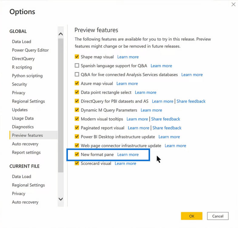
The first thing to know is that it’s a preview feature, so you have to go to Options and Settings. After that, go to Preview Features. You have to turn on the New Format Pane to get the functionality here.
Unfortunately, there’s a major flaw in the format pane implementation. One of the things I’ve found in the list of known issues is that when you create a new button, there’s no way to assign an action to it.
This is a huge problem. Firstly, you can’t attach a bookmark to it. Nor can you attach page navigation or a web URL. In fact, you can’t attach anything that you would normally do with buttons. This is frustrating since one of the recent updates Microsoft gave us was this great functionality for custom buttons. And so now until December, it looks like we can’t really use that in the New Format Pane.
But let’s take some time today to walk through that page navigator because I think it is quite an interesting feature.
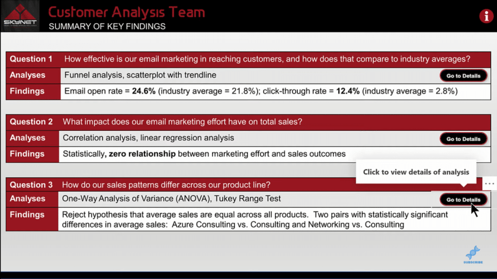
I’m going to use a report I made for one of the Power BI challenges we had at Enterprise DNA as my example in this tutorial. This report is heavily geared toward page navigation. As you can see, I’ve got my initial page of findings, and for each finding, you can go through a detail page and you can go back to the key findings as well.
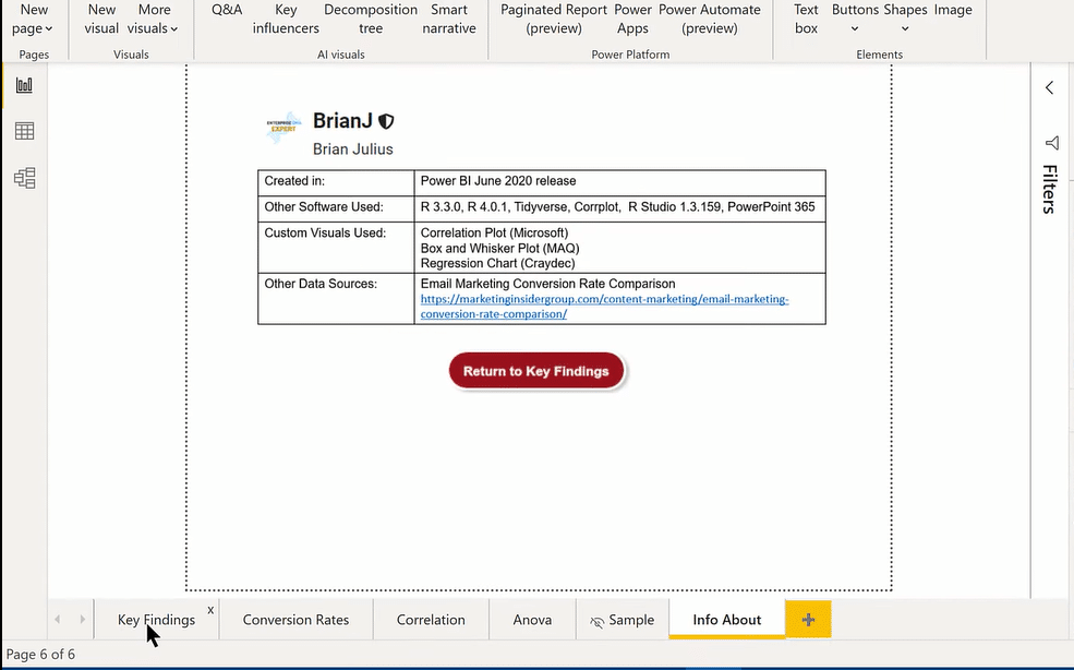
I’ve got a page here that explains what I use to create the report. It’s a tooltip page. Although I use it as a direct page navigation page, I just use a tooltip to scale the page the way I wanted it.
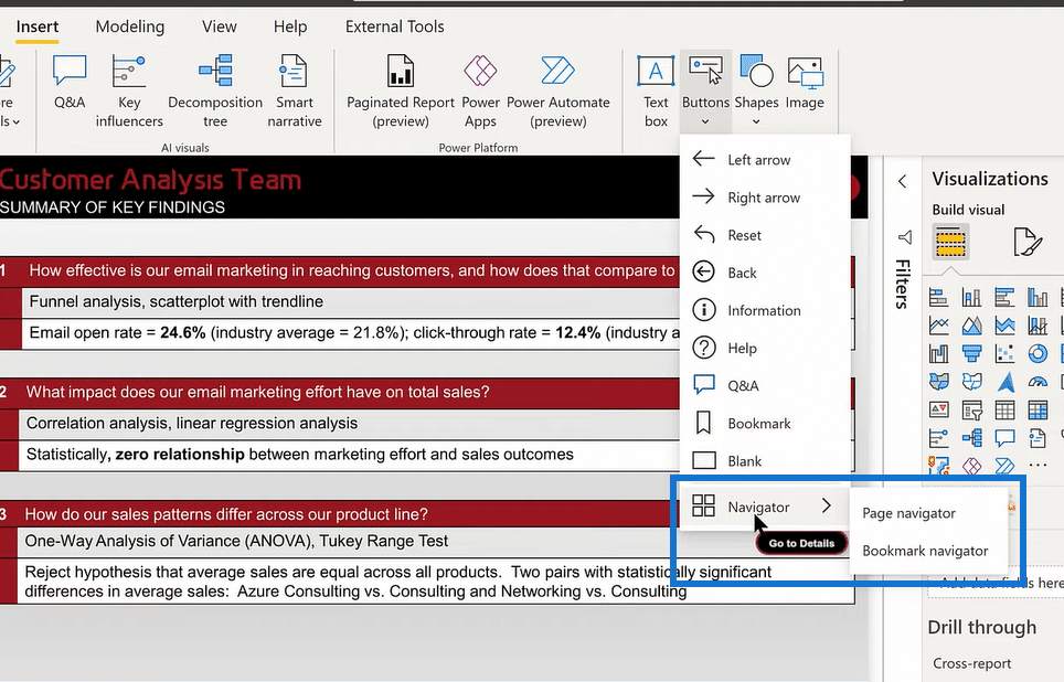
Now, to access the new Power BI page navigation feature you just go Insert, Buttons, and then Navigator. Then you’ll see two options, Page navigator and Bookmark navigator.
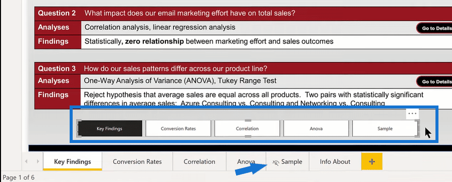
When you click on Page navigator, it automatically creates a group of buttons that correspond to the pages of your report. One thing you’ll notice here is that it created the page for Sample, which is a hidden page. I just put that in here just to illustrate this for the purposes of this tutorial. So note that Sample is a hidden page, but Info About is a tooltip page, and that didn’t show up here.
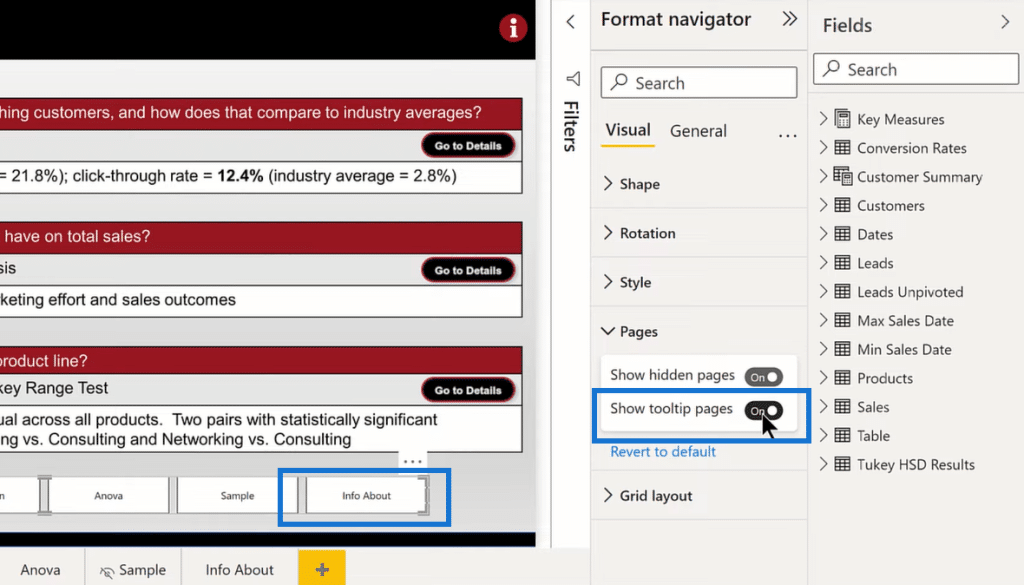
If we want that to show up, just select that, then go to Pages, then click Show Tooltip Pages.
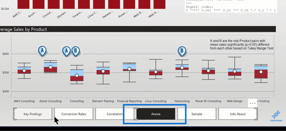
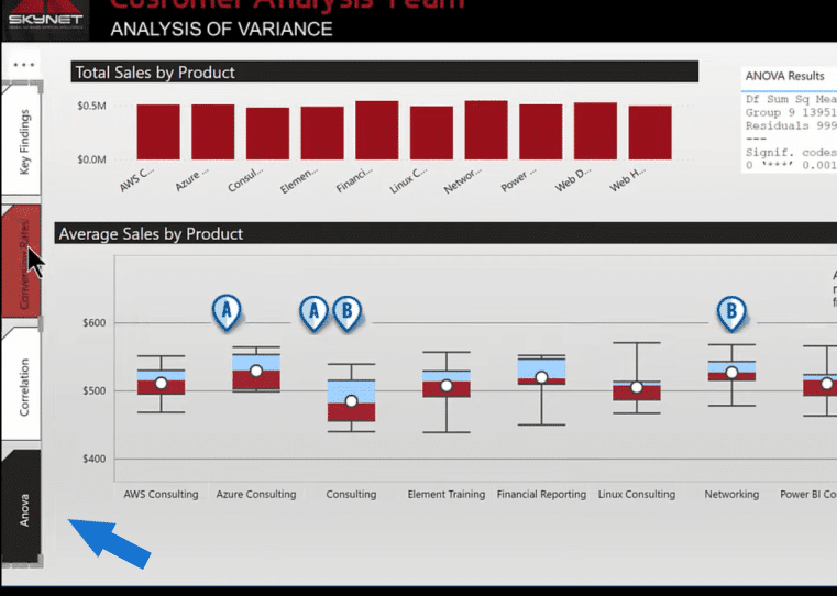
If we want this the way it is, showing both the hidden and the tooltip pages, we can simply copy this to another page (for example, the Anova page). As you can see, it knows its position that it’s on the Anova page. In terms of this copy and paste, one thing to be aware of is that it’s not dynamic though.
One of the nice things about this function is that there is a myriad of formatting options. For example, if we go into Shape, we can automatically change the shape, and adjust the height and the width. We can also go into Style and adjust the hover color or font.
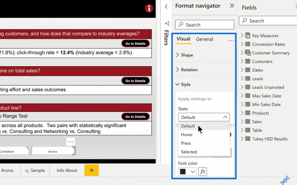
We also have the option to position the pages vertically, rotate them, and drag them to where we want them positioned on the report. I love the fact that we can customize this. However, there are some limitations when it comes to customization.
***** Related Links *****
High-Quality Power BI Report Navigation Experience
Power BI Applications & Brilliant Navigation Ideas
Power BI Interactive Reports: Navigation And Bookmarks
Conclusion
In this tutorial, I showed you what you can do with the new page navigator in Power BI with its strengths and drawbacks. It has some amazing features, but there are some limitations as well from a storytelling standpoint.
But if what you’re looking for is that full button grouping, I think this provides a great way to do it that really saves time and effort. You don’t need to create individual buttons, group them together, align them, and then change them for each page.
So, I hope this tutorial provides you a good overview of the new functionality and gives you some food for thought in terms of how you might use this page navigator feature in your report.
All the best!
Brian


