
Power BI financial dashboards provide a quick and easy way to monitor an organization’s financial performance in real-time. By consolidating data from various sources, financial dashboards can provide a comprehensive view of an organization’s financial health.
A Power BI financial dashboard is a visual representation of financial data and key performance indicators (KPIs) created using Microsoft Power BI, a business analytics tool. It provides a comprehensive view of financial information, enabling users to monitor and analyze financial performance, identify trends, and make data-driven decisions.
In this article, you’ll learn how Power BI financial dashboards cater to the unique analytical requirements of different user roles within an organization and why it’s an essential tool for finance professionals, executives, and decision-makers.

Let’s go!

Key Components of Power BI Financial Dashboards
Financial dashboards provide a quick and easy way to visualize key financial data and make informed decisions. This section covers some of the most important components of financial dashboards.
1. Revenue and Profit
Revenue and profit are key indicators of a company’s financial health. A financial dashboard should include a clear visualization of both total revenue and net profit.
This can be presented in the form of line charts, bar charts, or tables. It may also be helpful to show trends over time, comparing current performance to previous periods.
2. Sales Analysis
Sales analysis can help identify patterns and trends in sales data, enabling sales managers and businesses to make better decisions. Key metrics to include in a sales analysis dashboard are:
Gross sales
Sales growth rate
Average transaction value
Sales by product or category
Sales by region, channel, or customer segment

3. Operating Income
Operating income is an essential metric in assessing a company’s profitability. It represents the profit earned from a firm’s primary business operations, excluding non-operating income and expenses.

In a financial dashboard, operating income can be presented as a standalone figure or compared to revenue to calculate the operating margin, which demonstrates how efficiently a company is generating profits from its operations.
4. Gross Margin
Gross margin is the proportion of total revenue remaining after accounting for the cost of goods sold (COGS). It is an important metric for understanding a company’s profitability and pricing strategy.
Financial dashboards should include the gross margin percentage, possibly with a comparison to industry benchmarks or historical performance.

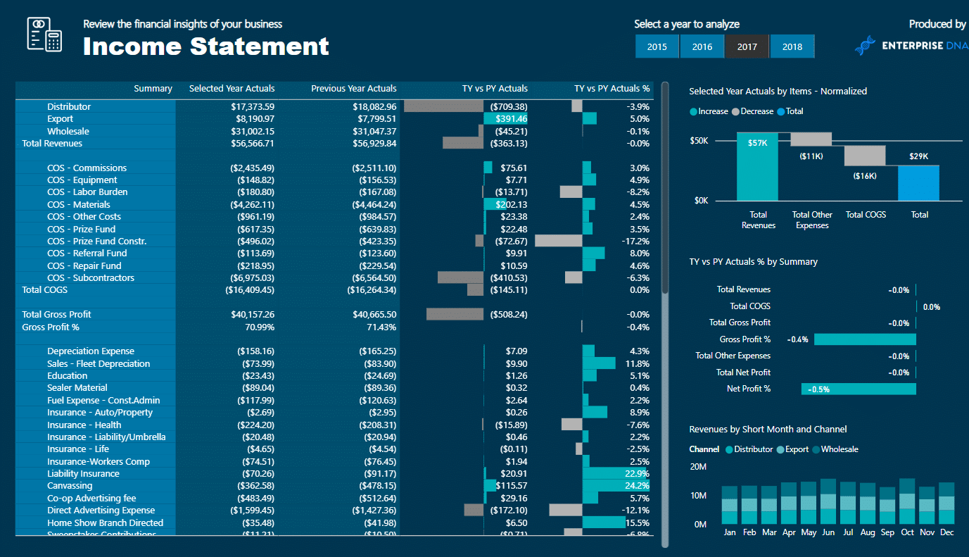
5. Income Statement
An income statement dashboard should provide a high-level overview of a company’s financial performance over a specific period. Key income statement components to include on a financial dashboard are:
Revenue
COGS
Gross profit
Operating expenses
Operating income
Net income
Table or waterfall chart formats can be used effectively to visualize the income statement components and how they contribute to a company’s bottom line.
6. Financial Performance
To gain a comprehensive understanding of an organization’s financial health, it’s essential to analyze various financial ratios and metrics.
Useful examples of financial performance ratios to include in a Power BI dashboard might be:
Return on equity (ROE)
Current ratio
Quick ratio
Debt-to-equity ratio
Earnings per share (EPS)
Price-to-earnings ratio (P/E)
These key components in financial dashboards can help businesses make informed decisions, track financial performance, and identify areas for improvement.
Now that we’ve covered the key components of the Power BI financial dashboard, we’ll move on to building a Power BI dashboard in the next section.
How to Build a Power BI Financial Dashboard With Examples
Building a Power BI financial dashboard involves several steps. Here’s a general outline to help you get started:
1. Data Preparation
Before creating a financial dashboard in Power BI, the first step is to prepare the relevant data first. This includes:
Collecting data from various sources such as Excel, databases, or APIs
Cleaning and transforming the data to make it suitable for analysis
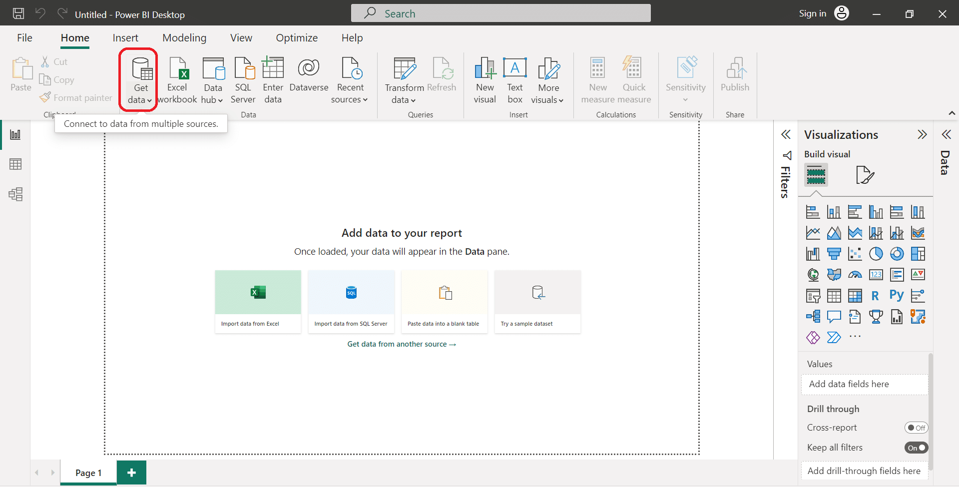
Using the Power Query Editor in Power BI Desktop, you can easily perform data transformations and create data models. Key tasks include:
Combining multiple data sources
Filtering and sorting data
Adding or removing columns
Performing calculations
2. Data Modelling
After preparing your data, the next step is creating a data model in Power BI Desktop. This involves:
Defining relationships between tables within the dataset
Creating calculated columns, measures, and hierarchies for analysis
For an effective financial dashboard, it’s essential to have a clear data model with accurately defined relationships. This allows you to analyze various financial indicators effectively.
3. Visualizations
With your data model in place, you can have Power BI users create visualizations that tell a compelling story about your financial data. Power BI acts as a various powerful data visualization tool for businesses.

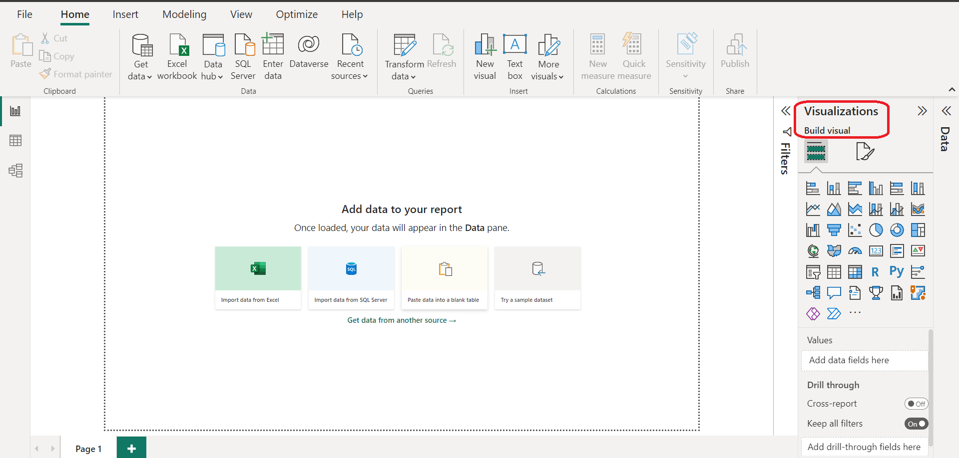
Some visualization options in Power BI include:
Line charts, bar charts, and pie charts for trends and comparisons
Maps and heatmaps for geographical analysis
Tables and matrixes for detailed data representation
To build a successful financial dashboard, consider the following practices:
Choose appropriate visuals: Select visuals that best represent the key financial metrics you want to analyze.
Organize visuals effectively: Place the most important visualizations at the top of the dashboard and use a logical layout.
Use color and formatting wisely: Apply consistent colors, fonts, and styles to make your dashboard visually appealing and easy to understand.
By combining properly prepared data, a well-structured data model, and engaging visualizations, you can create a powerful Power BI financial dashboard to improve your financial analysis capabilities.
We’ll progress by going over sample financial dashboards in the next section.
Sample Financial Dashboards in Power BI
Power BI offers a range of tools and options to create dynamic and interactive financial dashboards that cater to your organization’s needs.
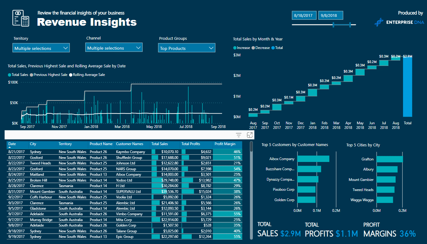
1. Retail Sales Analysis Dashboard
The Retail Sales Analysis Dashboard in Power BI is an excellent sample showcasing key insights made into a retail business’s financial and sales performance throughout.
This sales dashboard typically includes key performance indicators (KPIs), such as sales, profit, and units sold.
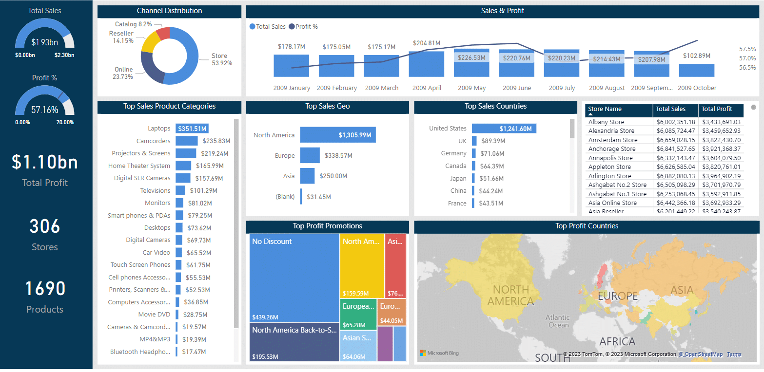
It also allows users to analyze the data across multiple dimensions, such as by product category, region, or time period. Users can use interactive visualizations to explore trends and identify areas of improvement.
The Retail Analysis Dashboard helps managers and decision-makers make data-driven decisions and optimize their financial and business growth strategies.
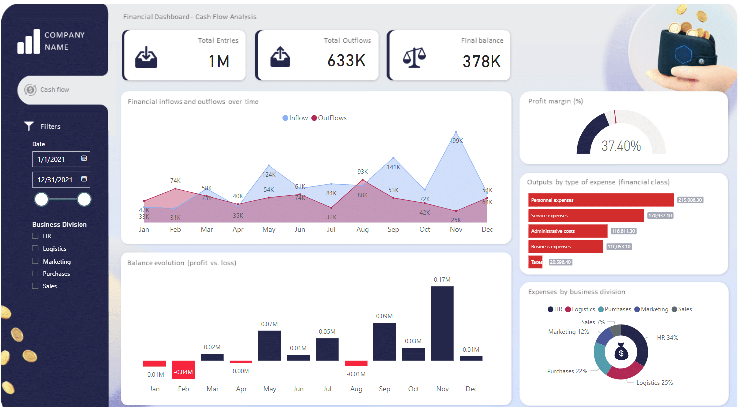
2. Sales and Returns Dashboard
Another useful Power BI sample for financial analysis is the Sales and Returns Dashboard. This interactive dashboard primarily focuses on tracking and analyzing sales data and return rates, which are vital to any retail or e-commerce business.
The Power BI dashboard displays information on:
Total sales revenue
Total returns
Return rates
Sales by product category and customer segment
This visually engaging analytics dashboard allows users to dive deeper into their sales data and identify patterns, such as seasonal trends in sales and returns.
Armed with this information, businesses can better understand customer behavior and target their marketing efforts accordingly.
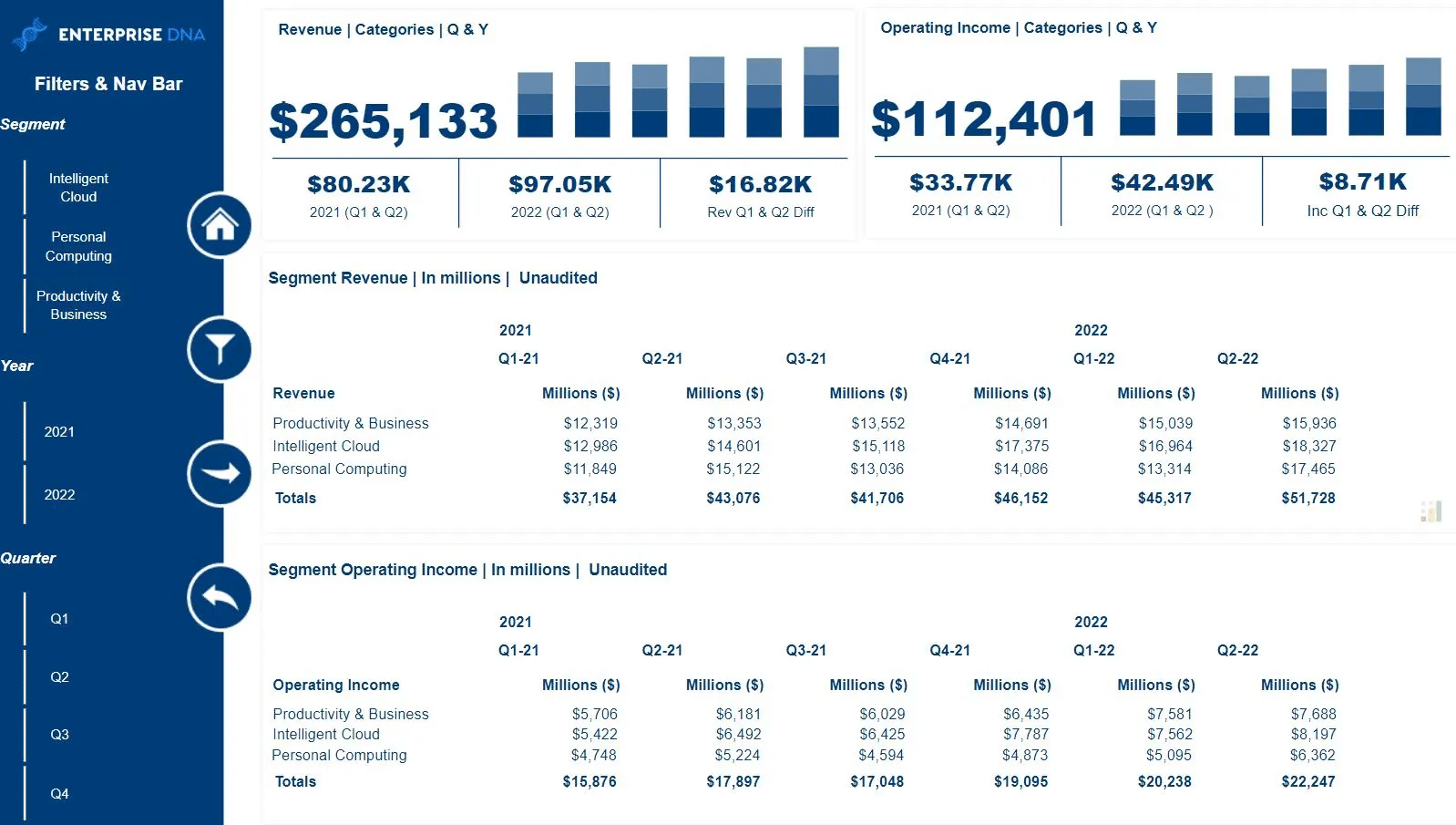
3. HR Finance Dashboard
The HR Finance Dashboard is executive insights dashboard designed to analyze the financial aspects of human resources management in an organization.
This Power BI sample emphasizes the financial side of HR, tracking and displaying key financial metrics such as:
Department budgets
Employee costs
Salaries and wages
Benefits expenses
Turnover rates
Using the HR Finance Dashboard, HR managers and finance teams can better comprehend their organization’s workforce expenses and identify areas for potential cost savings or improvement.
Moreover, it aids in understanding how HR investments contribute to the organization’s overall financial performance. These sample financial dashboards in Power BI showcase the power of data visualization and analysis.
By using Power BI and leveraging these pre-built samples or tailoring them to individual needs, organizations can gain valuable insights into their financial performance, make better decisions, and improve their bottom line.
We’ll go over practices and tips for financial dashboards in the next section.
Best Practices and Tips for Power BI Financial Dashboards
Financial dashboards play a critical role in presenting data in an organized and easy-to-understand manner. To create a Power BI financial dashboard that effectively showcases key metrics and insights, consider the following best practices:


Consider your audience: Design your dashboard to cater to the specific needs and expectations of its intended users. Focus on the most important information and ensure it’s prominently highlighted.
Use the right visualization for the data: Choose appropriate visuals that best represent the financial measures and insights you’re presenting. Bar charts, pie charts, and line graphs are popular choices for displaying financial data.
Tell a story on one screen: Organize your data and visuals in a logical and coherent manner to give users a clear understanding of the financial information. Make use of Power BI’s full-screen mode for an immersive experience.
Place the most important information strategically: Position the key metrics and insights at the top or center of the dashboard to capture users’ attention. This will help users quickly identify and focus on the most critical data.
Keep it simple and clean: Avoid cluttering your dashboard with unnecessary visuals, tables, or text. Stick to a clean design that effectively communicates data analytics and insights.

Some key metrics to include in your financial dashboard are:
Operational Revenue: The total revenue generated from business operations. Track this to assess the company’s financial performance.
Gross Margin: The difference between revenue and the cost of goods sold (COGS). Track this to monitor the efficiency of the business in generating profits.
Gross Margin Percentage: The gross margin as a percentage of revenue. This will help assess the overall profitability of the company.
Net Profit: The total amount of profit after deducting all expenses, including taxes. Track this to gauge the company’s success in terms of generating profits.
Operating Expenses: The total cost of running the business, including salaries, rent, utilities, and marketing expenses. Monitor this to assess the efficiency and cost management of the business.
Advanced Features in Power BI Financial Dashboards
Power BI offers a range of advanced features that can enhance financial dashboards.
In this section, we’ll discuss three main sub-features: Calculated Columns and Measures, Custom Visuals, and Apps and Templates.
1. Calculated Columns and Measures
Calculated Columns and Measures are a powerful way to create custom calculations and metrics in Power BI.
By leveraging the DAX (Data Analysis Expressions) language, you can create advanced formulas to analyze financial data more effectively.
Calculated Columns: These are created by defining new columns in your data model with custom formulas, allowing you to build complex calculations using existing data.
Measures: Measures are the aggregations or calculations that can be used in reports and visualizations. They can represent KPIs (Key Performance Indicators), such as net profit margin, revenue growth, or expense ratios.
Some examples of calculated columns and measures in financial dashboards might include:
Gross Profit Margin: (Revenue – Cost of Goods Sold) / Revenue
Operating Profit Margin: (Operating Income / Net Sales) * 100
Return on Equity (ROE): Net Income / Average Shareholder’s Equity
2. Custom Visuals
Custom Visuals provide an opportunity to create customized visualizations that are tailored to specific financial datasets. You can either create your own custom visuals by using the Power BI Custom Visual SDK or download existing ones from the AppSource Marketplace.
Various custom visuals are available for financial dashboards such as:
Waterfall Charts: Visualizing income statements and cash flow changes
Candlestick Charts: Displaying stock prices, including opening, closing, high, and low values
Heatmaps: Showing correlations between various financial variables
3. Apps and Templates
Power BI apps and templates are pre-built solutions that can be leveraged to save time and effort when creating financial dashboards. These can range from industry-specific templates to apps for specific use cases like financial planning or investment tracking.
Apps and templates can be found either within the Power BI community or on the AppSource Marketplace. Some popular financial dashboard templates include:
Finance Performance Analysis: A comprehensive solution for conducting financial KPI analysis
Balance Sheet Analysis: Analyzing assets, liabilities, and equity on a company’s balance sheet
Profit and Loss Statement: Providing insights into a company’s profitability over time
Power BI’s advanced features can significantly enhance financial dashboards by introducing custom calculations and measures, tailored visualizations, and pre-built solutions. Utilizing these tools can lead to deeper insights and more effective decision-making.
In the next section, we’ll explore industry-specific dashboards.
Exploring Industry-Specific Financial Dashboards
Power BI financial dashboards are essential tools for various industries, helping finance teams monitor critical metrics, make informed decisions, and plan effectively.
1. Retail Industry
In the retail industry, some key financial metrics captured in the Power BI report and dashboards may include:
Revenue by location
Gross margin percentage
Inventory turnover
These key insights will enable the finance team to analyze product performance, identify profitability patterns, and ensure proper inventory management.
2. Manufacturing Industry
Financial dashboards for manufacturing can provide valuable information on:
Production cost analysis
Estimated vs. actual expenses
Return on Investment (ROI) for different projects
With this information, the finance team can allocate resources optimally, ensuring efficient production processes and cost control.
3. Healthcare Industry
Healthcare industry dashboards focus on financial metrics like:
Patient revenue
Expense per patient
Operating margin
Such data helps the finance team to evaluate service profitability, analyze cost allocations, and improve financial stability.
4. Non-Profit Organizations
For non-profit organizations, financial dashboards may include:
Fundraising ROI
Revenue by donation source
Cost per beneficiary
This information guides the finance team in making better fundraising decisions, allocating funds, and evaluating the organization’s financial efficiency.
Regardless of the industry, Power BI financial dashboards provide actionable insights that empower organizations to make well-informed decisions, streamline financial planning, and gain actionable insights to enhance their overall business performance.
In the next section, you will learn how to download and share Power BI financial dashboards.
How to Download and Share Power BI Financial Dashboard
To download and experiment with financial dashboard examples in Power BI, you can start by exploring the official Microsoft resources.
One such resource is the Financial Sample workbook, which you can download from this link. This sample workbook offers a good starting point to understand the various ways financial data can be represented in Power BI.
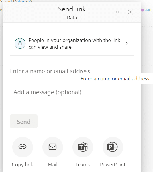
Once you have a dashboard created or downloaded, sharing it with coworkers and others is simple. Here are the steps to share a Power BI dashboard:
In a list of dashboards, or in an open dashboard, select Share.
In the Share dashboard dialog, enter the name or email address of the user or group you want to share with.
Optionally, type a message and select Grant access.
Remember, while the Power BI dashboard can be accessed through various browsers, using Microsoft Edge can offer additional benefits, such as better integration with other Microsoft products and services.
To download and access Power BI through Microsoft Edge, simply navigate to the Power BI website and log in with your Microsoft account.
If you are new to Power BI, you may want to try out the Power BI service for free. Microsoft offers a free trial of Power BI Pro which allows you to test its capabilities before committing to a subscription.
The free trial provides a fully functional Power BI experience, enabling you to explore and share financial dashboard examples with ease.
In summary, downloading financial dashboard examples in Power BI is as easy as exploring Microsoft’s resources, and sharing them with others is just a few clicks away.
Using Microsoft Edge and considering the free trial of Power BI Pro can further enhance your experience while working on financial dashboards.
Final Thoughts

Power BI financial dashboards are powerful data visualization tools that enable businesses to gain valuable insights into their financial performance. They provide a visual representation of key financial metrics, allowing users to monitor trends, analyze data, and make informed decisions.
By consolidating and presenting financial data in a clear and interactive manner, financial dashboards help users understand the current financial health of the organization, identify areas of improvement, and track progress toward financial goals.
They enable users to drill down into specific details, perform in-depth analysis, and identify patterns or anomalies that may impact financial performance.
Using Power BI dashboards for financial purposes businesses to effectively monitor and manage their financial performance, identify trends, and take timely actions to drive success.
By providing a holistic view of financial data, these dashboards facilitate transparency, accountability, and strategic planning for financial goals and objectives.
If you’d like to learn more about Power BI Dashboard examples, you can watch the video below:


