In this blog, I’d like to give you some Power BI design tips on how you can make your reports look more application-like by simply hiding pages. This is a methodology that I’ve seen being used in many of the best and most compelling reports I’ve encountered recently. I think it’d be a great trick to learn for a better-looking report. You can watch the full video of this tutorial at the bottom of this blog.
The ability to hide pages in your reports didn’t exist in Power BI before. And now that this functionality is available, I basically use it in every report that I create because it makes my visualizations and navigation compelling to my consumers.
Sometimes it can be hard to tell the story that you want to tell in your report and enable the user to navigate through if you’ve got a lot of pages to click through. But if you can build a navigation system into your reports, the experience becomes far more application-like, smoother, and more compelling for the consumer.
Power BI Design Tips: Hiding Report Pages & Enhancing Navigation Experience
To hide these pages, first, you always want to have the main page. This is the page that we’ve landed on.
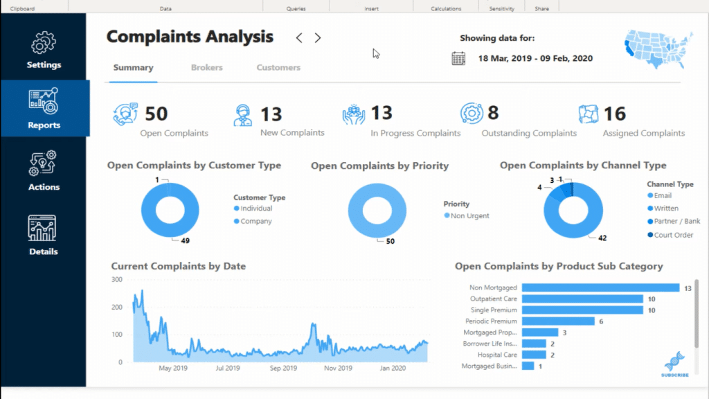
And then, I simply hide the other pages that have the details or other information about the report.
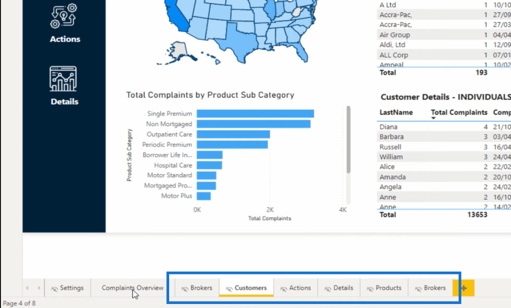
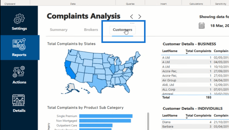
To get to that page (Customers), I built my navigation experience into my report. I’ve used utilized buttons to go to a different page. As you see, I get to the Customer’s page by clicking on the Customer button here. But when I’m online, I don’t actually see the Customer’s page to click on.
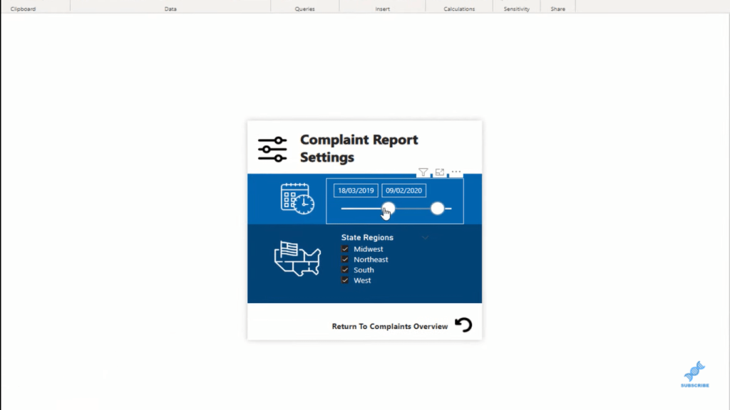
It’s the same with the Settings page that I’ve set up here as well as the other related pages of this report. I’ve also added different icons within the main page and ways that the user can click through to each page rather than physically clicking the page itself.
When it comes to the online experience, you’ll see that the user cannot see and click on a particular page. They only see the main page since the rest of the pages are hidden. They don’t appear inside your report when it’s on the online experience. The only way that users get to a particular page is to allow them via some navigation experience.
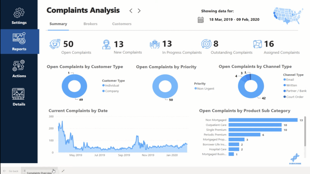
This report is a fully operating application where users can only click around certain insights the way that I want them to navigate through the information.
The same goes for when you create Power BI apps. If you hide certain report pages, they don’t appear in the navigation pane on the left-hand side of those apps. That’s another way to keep your users from getting through a bunch of other reports that you’ve consolidated into one app. These are the things you want to think about, as you’re developing more and more inside Power BI.
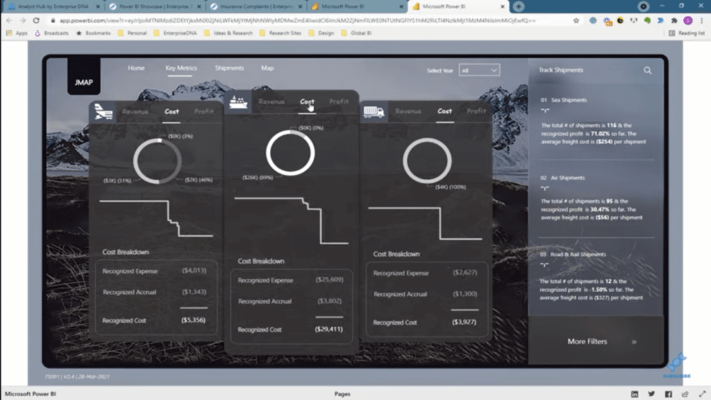
The best examples of Power BI reports that I’m seeing use the navigation toolset that we have inside Power BI to take the user through the information. The example below, which was developed by one of our enterprise DNA experts, is very easy for the user to understand. It’s so easy to navigate and click through the report and see more details and information.
Conclusion
Hopefully, you find these Power BI design tips useful. These techniques create unique and engaging reports and a great navigation experience for your consumers. This is how you do it when you’re building these application-like reports. This opens up so many different ways that you can design your reports.
For more related content, check out the links below.
Cheers!
Sam
***** Related Links *****
High-Quality Power BI Report Navigation Experience
Power BI Interactive Reports: Navigation And Bookmarks
Power BI Applications & Brilliant Navigation Ideas
***** Related Course Modules *****
Data Visualization Tips
Dashboarding & Data Visualization Intensive
Best Practices & Feature Reviews
***** Related Support Forum Posts *****
Power BI Challenge 5 – Optical Data from BrianJ
Navigation Between Reports Inside an App
Synchronize All of the Filters Between Two or More Pages
For more application-like reports support queries to review see here…..


