
In this tutorial, you’ll go through different Power BI design ideas that you can use and implement in your inventory management dashboards.
This is the final step when creating a report in Power BI. You need to clean it up so that it gives off a better impression to its users.
Previous tutorials have discussed how to build an inventory dashboard from scratch starting from the data model to the complex DAX formulas. All you need to do now is to customize its design.

Change Currency Format
To start, make sure that the units of your cards are in U.S. dollars.
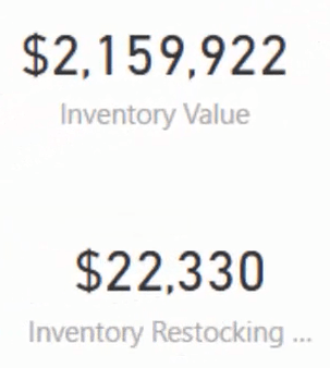
Be strict with the format of the currencies for every report that you’re doing in Power BI.
Add A Background
Next, focus on making your dashboard look compelling. People can see the visualizations effectively if they look good and organized. You have to emphasize what you want the people to look at by adding icons and colors and making the titles readable.
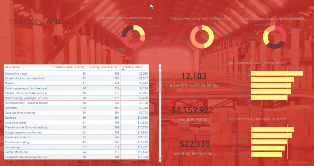
The first thing you should do is put a background in your dashboard. Power BI doesn’t have a built-in theme or color palette, so you have to work on them by yourself. For this example, search for pictures online that are related to a warehouse. It may look like this.

However, you should not put it behind the dashboard directly because the colors are inconsistent which will make it hard for you to get the contrast of the texts in your visuals. So, you need to put a color on top of the picture to cover all the different hues within it. To do that, you have to use Microsoft PowerPoint.
Put the picture in a slide, create a rectangle, and then put it on top. Next, fill the shape with a color and make it transparent so you can still see the background.


The filled rectangle on top normalizes all the colors in the picture. After that, bring in the image to your canvas and see that it covers the entire dashboard.
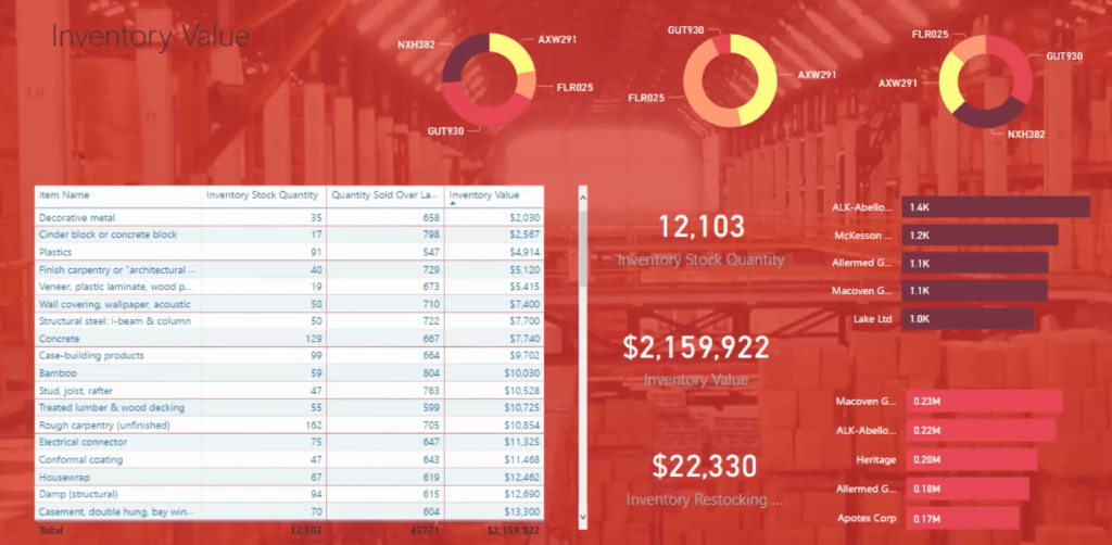
From there, you can add color palettes and build something on top of it to give it more life.
Always remember that people are very visual. If you make your dashboard good and visually relevant, they are going to ingest that information better and faster.
Choose A Color Theme
One of the most important among all the Power BI design ideas is choosing a suitable color theme for your dashboard.
You need to counter the background color to make your visualizations stand out. You need to find and bring in colors that go with it. For that, there are online websites that can help you.
A website called palettefx.com tells you the colors that align with the image that you have. When you upload the background picture, it will give you the colors associated to that image. This includes the image details, such as: the HEX, RGB, and HSL.
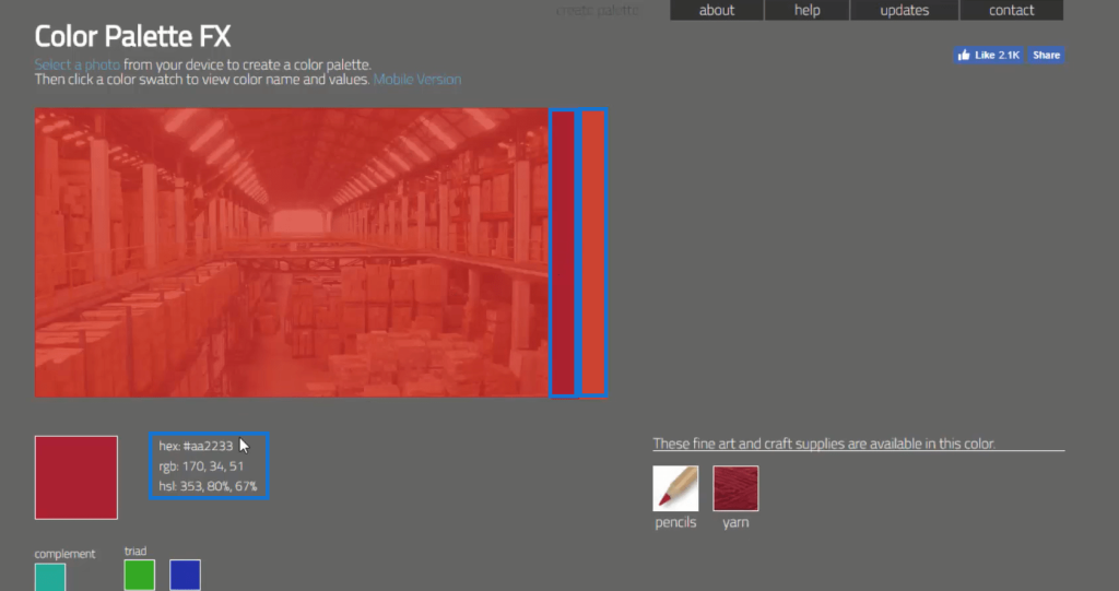
From the colors given, you can now create a palette.
Go to another website called coolers.co and click Start the Generator. Copy the HEX code of the colors given on the first website, paste it on the page, and then lock them.
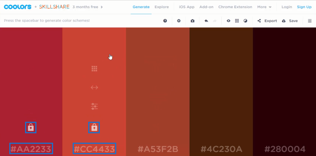
Once done, click the space bar to see more colors that relate to the original colors you gave. If you click space bar multiple times, it will show you different colors that still go with what you input. All the colors shown in the page are workable with the background that you have.
The next thing you should do is get a range of different themes or colors that align with the dashboard’s design. You need to collect the HEX value of each color because that is what you will put in the .json file. This is what you’ll need to bring in to incorporate themes in Power BI.
After that, import the theme to your canvas. You’ll see the changes in your visualizations.
That is a quick and easy way to create a background and color palette for Power BI dashboards.
An in-depth discussion of creating color palettes is available in the previous chapter. Make sure to review it.
Work On The Visuals
Next, you need to work on your visuals.
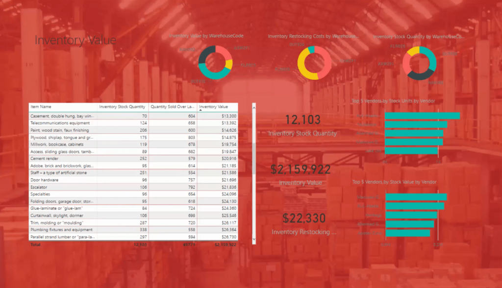
Get rid of all the titles because you’re going to recreate them. Change the color of the data labels to a light color and the charts’ color to a dark one to match the dark background.
To make your visuals pop, create a shape. Get rid of the fill and put a little transparency behind it. Remove the outline and send it to the back of each visualization.

Format The Titles
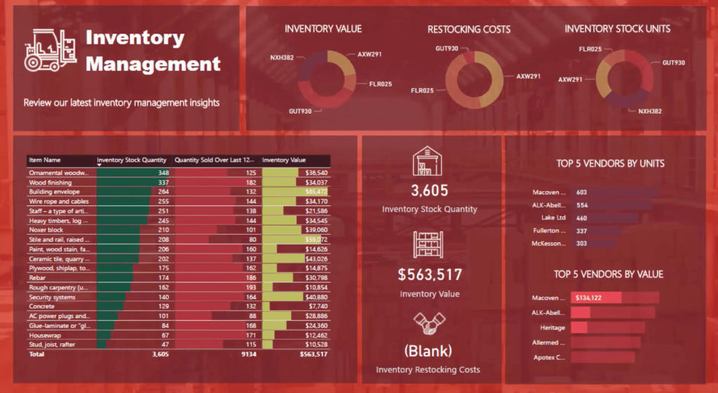
Next, change the title to Inventory Management and the text color to white. This makes it easier to identify what you’re showcasing.

For the table, make sure that the colors of the data labels, values, fonts, and headers are white. Emphasize the header by putting a dark background.
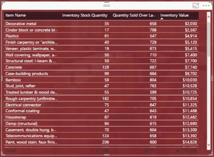
Add Data Bars
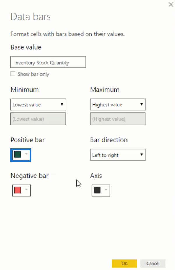
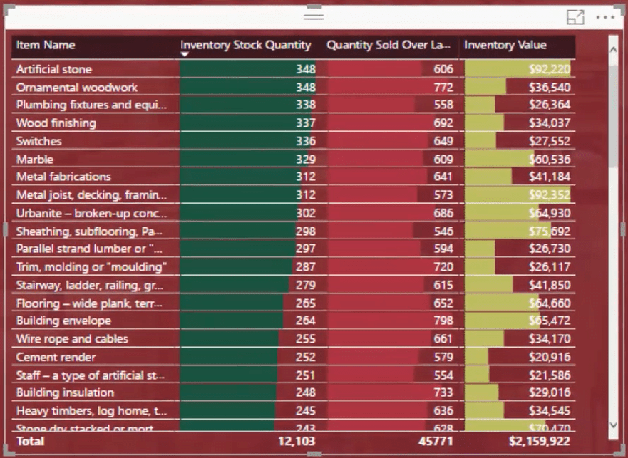
You can then use and add data bars. Data bars are great because it shows you the values inside your column through bars. To do that, click the drop-down button of Inventory Stock Quantity in Values. Click Conditional formatting and then choose Data bars.
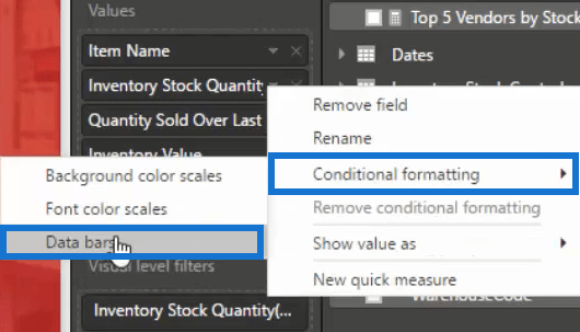
Next, change the color of the Positive bar into whatever matches the palette. Do the same for Quantity Sold Over Last 12 Months and Inventory Value.
After putting in data bars, you can now easily see the results inside the table and extract insights from it.
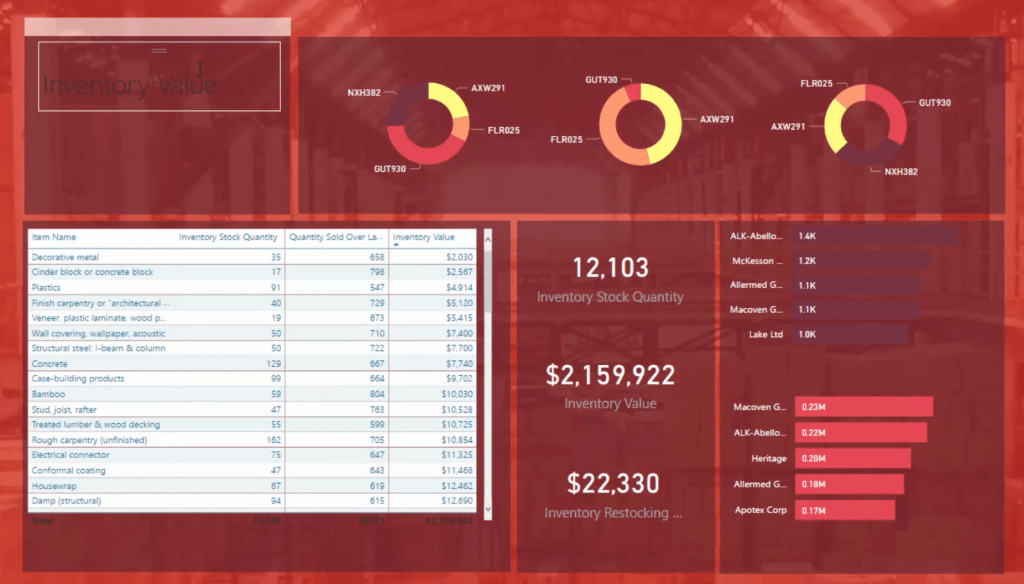
Add Labels For Each Visual
You now need to start putting the titles back because people will wonder what each visualization is for and what’s in it.
Bring in a text box and then input a title. Copy that box multiple times and distribute it to all the visualizations. Change the title so that it corresponds to the visuals.
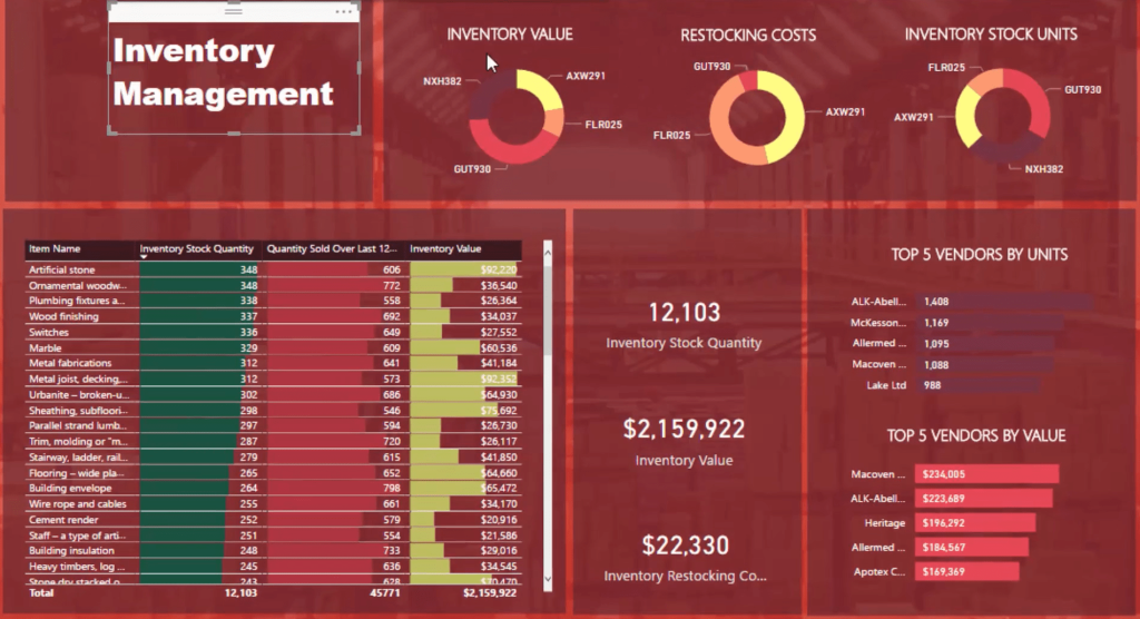
Add a description near the title so that people will quickly understand what they’re looking at.

Use Icons And Images
The last thing to do now is to bring in some icons. This is one of the most underrated Power BI design ideas in the list. A lot of people overlook the value of simple details like these.
There’s a cool website called flaticon.com where you can get icons and vectors. If you try to search warehouse, it will give you multiple icons that you can download and use for free.
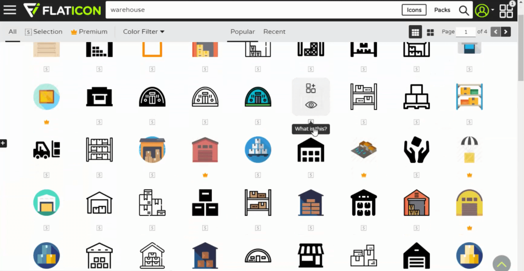
Make sure that you get icons that relate to what you’re showcasing. Once you do, add it to your dashboard and place it near its corresponding visualization.
***** Related Links *****
Using Color Schemes For Power BI Data Visualization
The Importance Of Creating Compelling Power BI Visualizations
Simple Visualization Techniques For Your Power BI Reports
Conclusion
When creating an inventory management dashboard in Power BI, the last step is to always clean up and secure all the details. You should never forget to change the interactions in your report. You need to ensure that everything is properly filtering inside the visuals.
The Power BI design ideas presented in this tutorial has allowed you to transition from a blank canvas to a very compelling inventory management dashboard.
You’ve gone through heaps of visualization techniques and DAX formulas.
The key is to simply utilize the techniques inside your reports and make your visualizations produce useful insights to add value to yourself and your organization.
All the best,
Sam


