Now let’s talk about colors in your reports. This is one area where I constantly see reporting applications fail. Wrong color themes or clashing colors can make a report look messy.
A proper color palette can make it look cleaner. It will also make a big difference to the consumer experience within your organization. You may watch the full video of this tutorial at the bottom of this blog.
Color is a big part of making your reports look put together.
Colors are essential for your visualizations to ensure they work seamlessly. Thankfully, there are many available color themes in Power BI for you to choose from. You also have the option of making your own custom palette.
Themes Functionality In Power BI
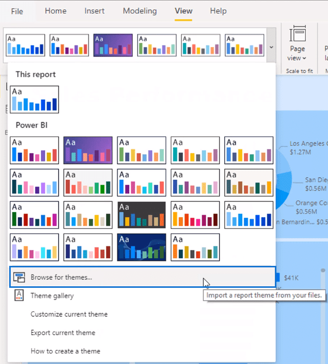
One of the things that Power BI has improved on is how you can generate colors. Before, it used to be a manual process. Now, they have a functionality which enables you to choose a preset theme.
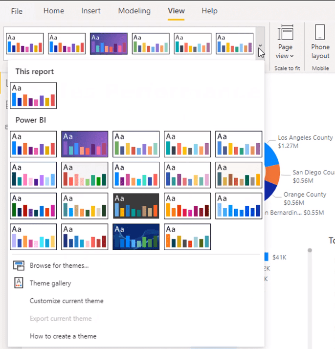
For instance, I want to use this particular theme.
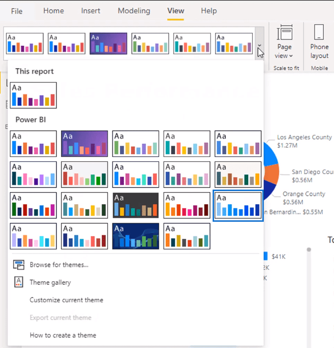
When I select it, my report automatically changes according to the color theme.
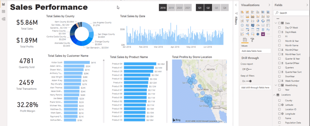
This is just my preference, but I don’t want the same color for different visualizations. So, I would choose a color and use its different shades.
For instance, I want to use blue for my report. Now, all my visualizations will be in a shade of blue.
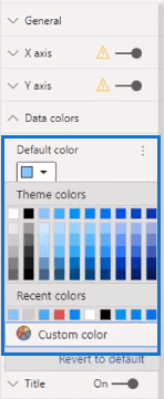
I’ll change the colors by clicking on the visual and pick the color I want to use.
The slicer doesn’t automatically change with the theme. So, I’ll change the background color to a dark blue.
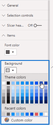
Then I’ll change the font color to white so it shows clearly.
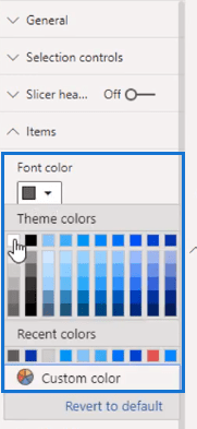
If you take a look at the Enterprise DNA Showcase page, I like to use darker backgrounds. I think that it makes things stand out more.
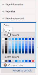
Without any visuals selected, I’ll change the background color in the Format section. I’ll change the color to a light blue in the page background.
Then change the transparency.
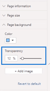
Now I’ve got a light blue shade as the background.
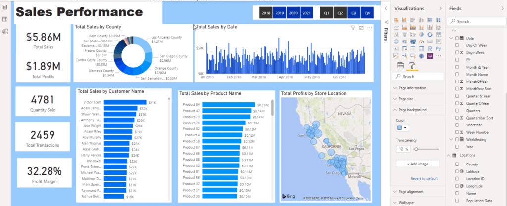
However, the visuals’ background contrasts with the background. I’ll disable them so the visuals will have the page background color instead.
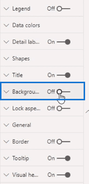
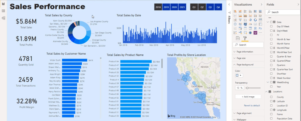
I’ll apply this to every visual, even the title. So now, my report looks like this.
Creating Grids For A Seamless Visualization
Currently, my report’s visuals look more in sync. What I would do next is create grids.
These grids will define my report so the consumer can quickly navigate through visualizations.
First, I’m going to create a rectangle using the Shapes tool in the Insert tab.
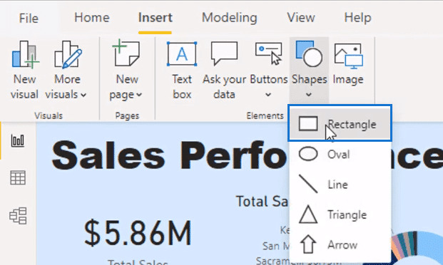
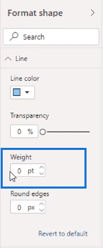
Next, I’ll remove the outline by reducing the line weight to zero.
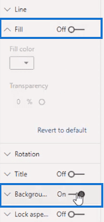
Then I’ll remove the fill and turn on the background.
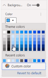
I’ll also change the background to a slightly darker shade of blue.
Then I’ll layer it on top of my visualization.
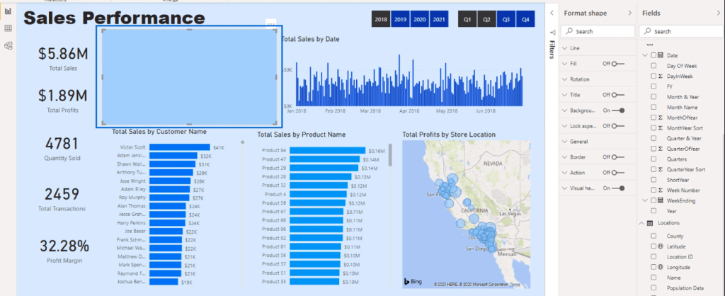
At the moment it’s in front of the visualization. But I’ll send it to the back with this option in the Format tab.

Now the shape is behind the visualization.
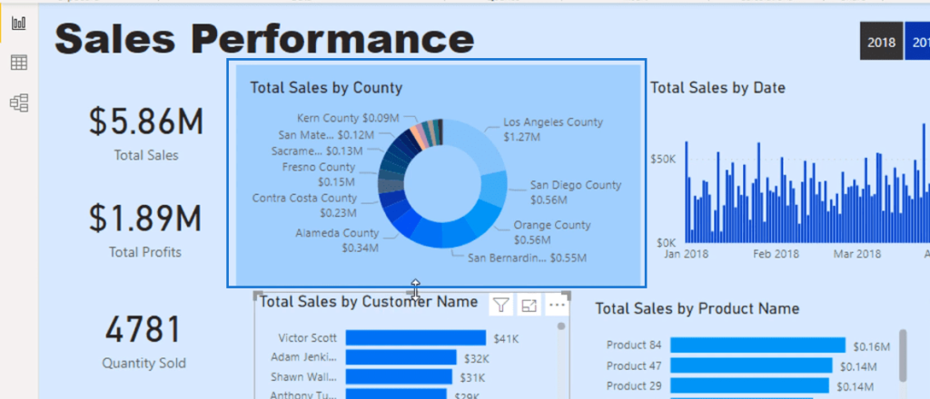
I’ll repeat this for each visualization.
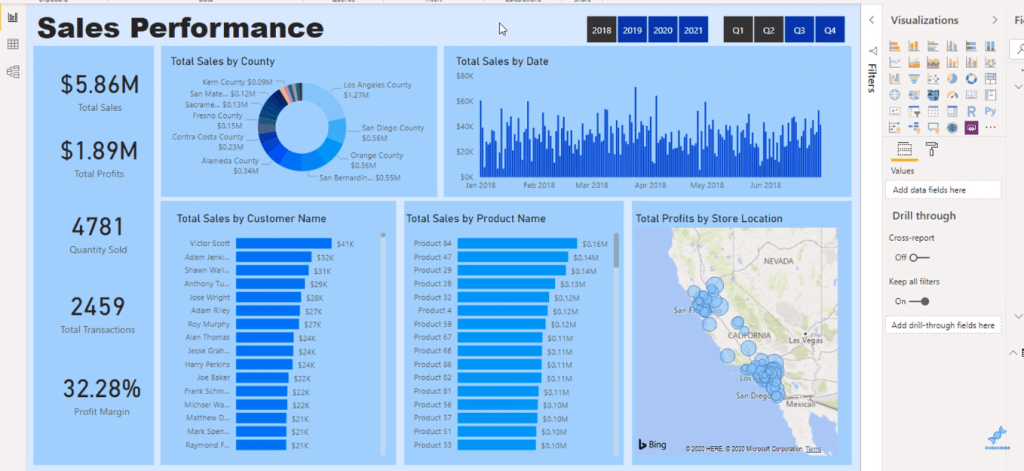
I can also select the cards to change their font color.

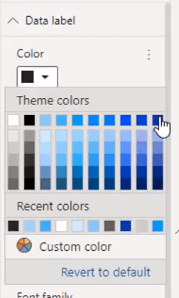
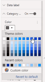
I’ll go the Format section and change the text color to a darker shade of blue and change the category color into a lighter shade.
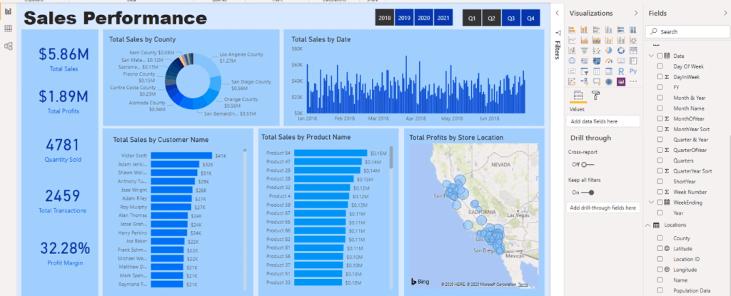
Now I have an all blue report that looks clearer and more defined.
Creating Your Own Color Theme In Power BI
Lastly, I’ll show you how to create a customized color theme. What you need to do is utilize the resources from the resource pack. You’ll find a text document here.
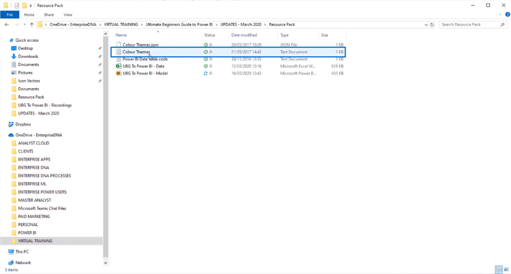
You’ll see that the text file is a setup for a JSON format. This is the format needed for your color theme to be imported into Power BI.
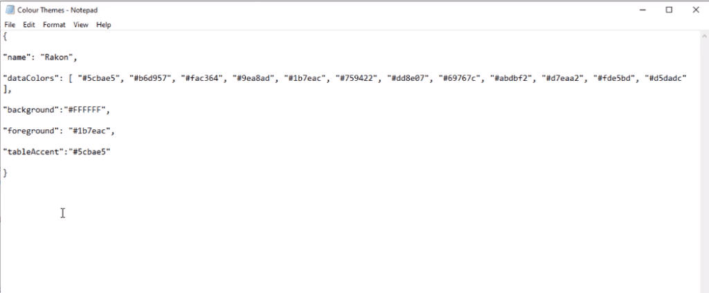
All you need to do is get the hex colors of your custom palette and input them within the text. Then, the colors will appear as your theme in Power BI once you import it.
A good website to use to create a color theme is coolors.co.
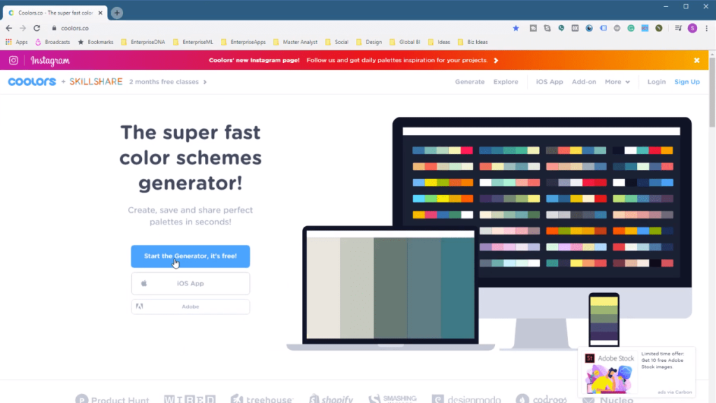
Here, you can make your own complementary palette for your reports.
Once you’ve created a color palette within the text file, save the file with the file name .json at the end.
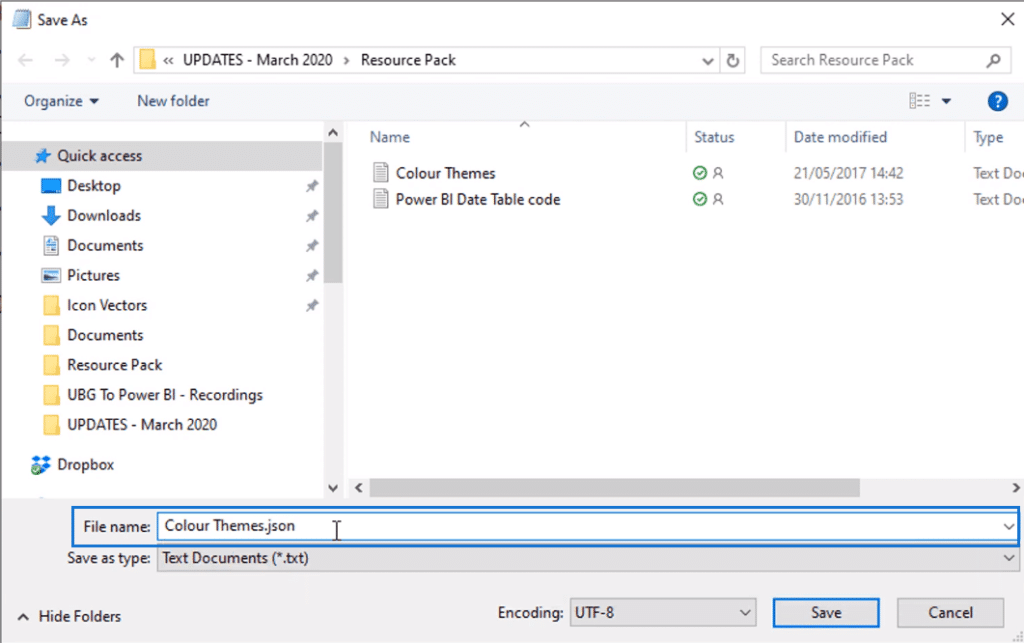
It will then save as a JSON file.
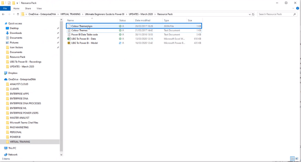
And now you can import your customized theme.
*****Related Links*****
Using Color Schemes For Power BI Data Visualization
The Importance Of Creating Compelling Power BI Visualizations
Considerations For Dark Background In Power BI Reports
Conclusion
And that’s how you can customize your reports however you like with colors. You can play around with how your visuals look – it’s totally up to you! It’s not too difficult to do yet it makes a big difference.
We’ve also gone through a few formatting ideas as well, so hopefully, you’ve got the idea of how to create your own color themes and how to use them.
Good luck with this!
Sam.


