In this tutorial, we’re going to talk about how site maps work in Power Apps model driven apps.
From the name itself, site maps map out the way users navigate through a model driven app. They dictate how users can view, interact and move across different tables.
Let’s see how site maps work and how they make the process of creating a model driven app more efficient.
Site Maps In Power Apps Model Driven Apps
The site map appears at the top part of the app designer. To start working on the app’s site map, you just need to click on the edit button.
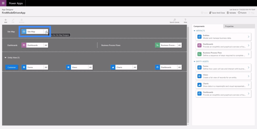
This is how the site map’s work area looks like. Site maps are made up of three main components — the area, the group and the sub area.
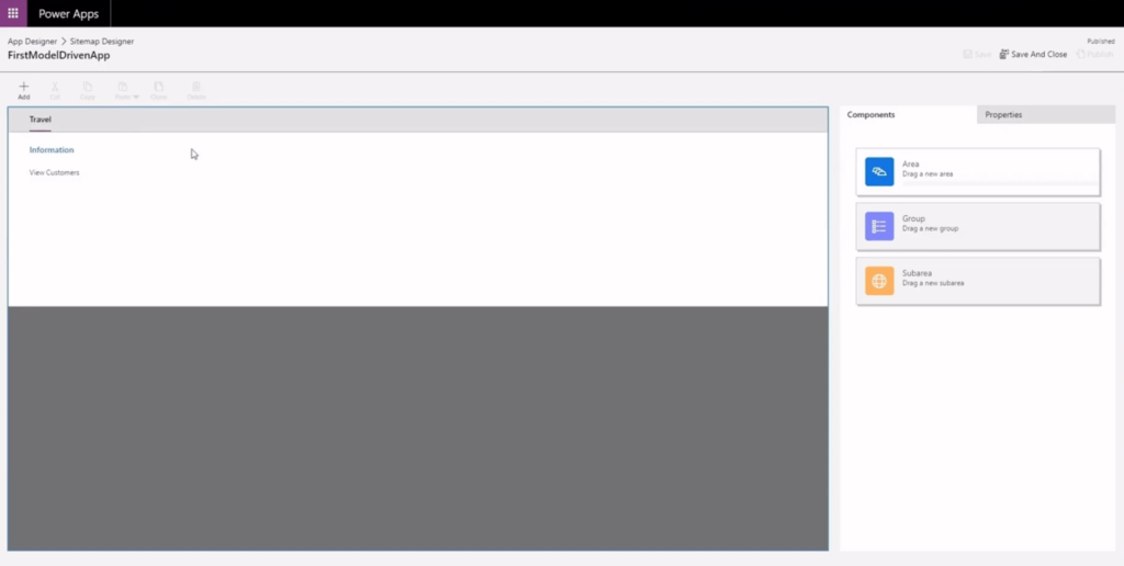
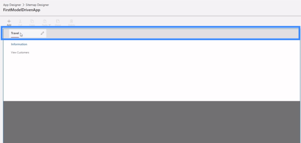
The area appears on the top part. In this example, our area is named Travel.
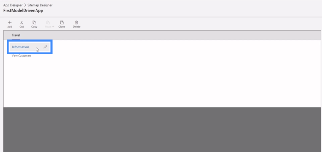
The group comes next. This allows us to group similar or related components together.
The subareas are found with the groups. Here, View Customers is our sub area.
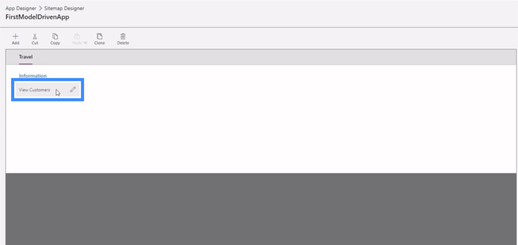
Just like our canvas apps, a Power Apps model driven app also allows us to customize different properties. If we click on Travel, for example, we can see the different properties we can tweak on the right pane.
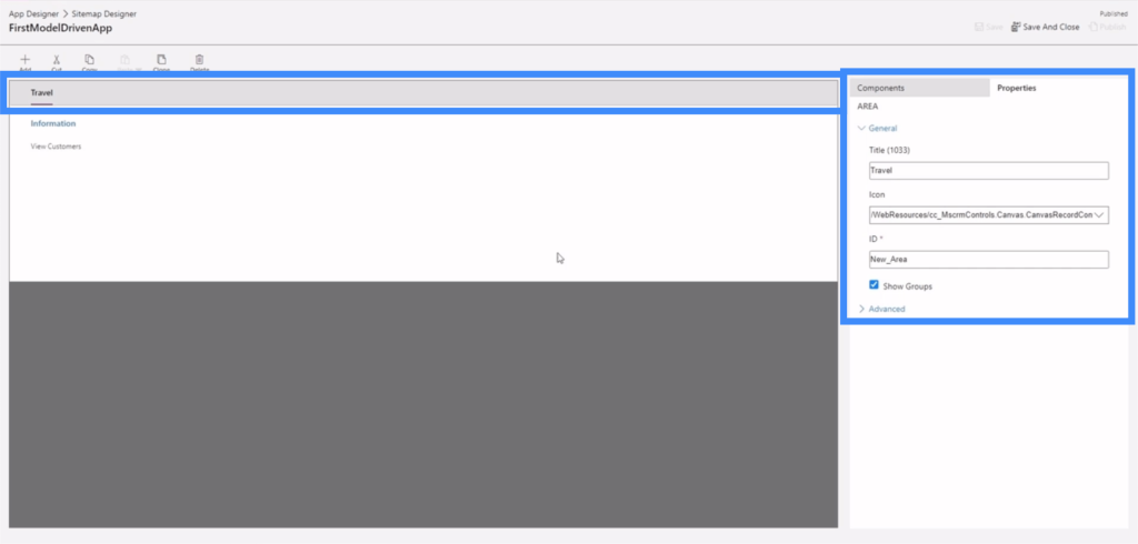
If we click on Information, we also see a group of properties we can edit.
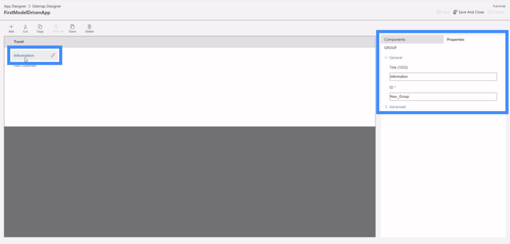
Possibly the most important set of properties would be the one for our sub area.
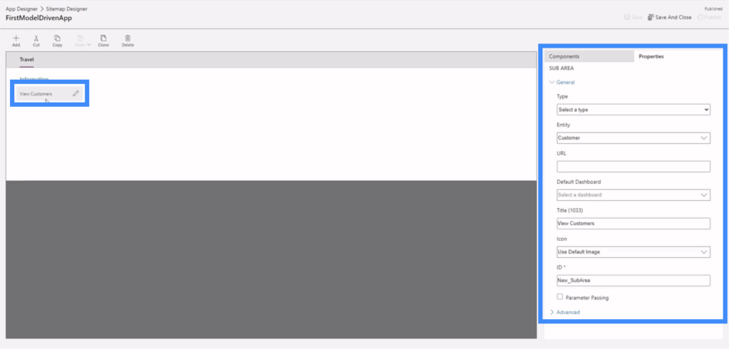
That’s because the sub areas lead the end users to different parts of the app. Going back to the app we’re working on, the sub area we’re talking about contains the link to View Customers found here on the menu on the left side.
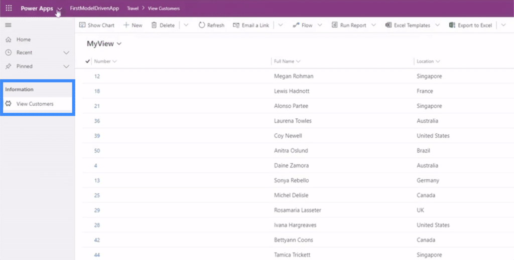
This means that the way we set the sub areas properties can affect the way the end user navigates any Power Apps model driven app.
Setting The Right Properties In Site Map Sub Areas
Let’s dive into the different properties that we can set in our sub area.
If we click on the sub area called View Customers and look at the right pane, the main fields that we need to set here are the type, entity, and title.
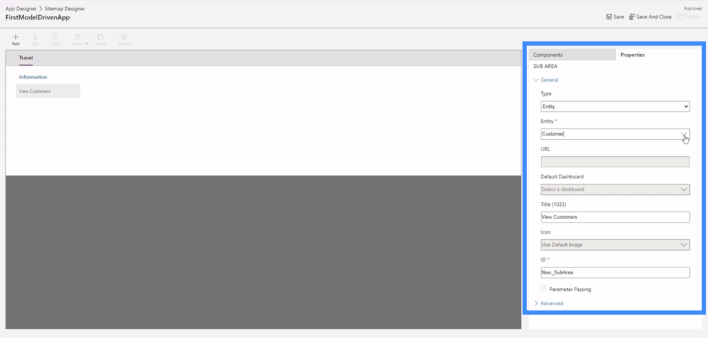
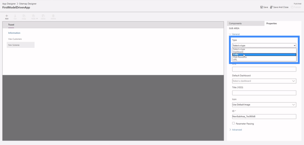
The type gives us four different options — dashboard, entity, web resource and URL.
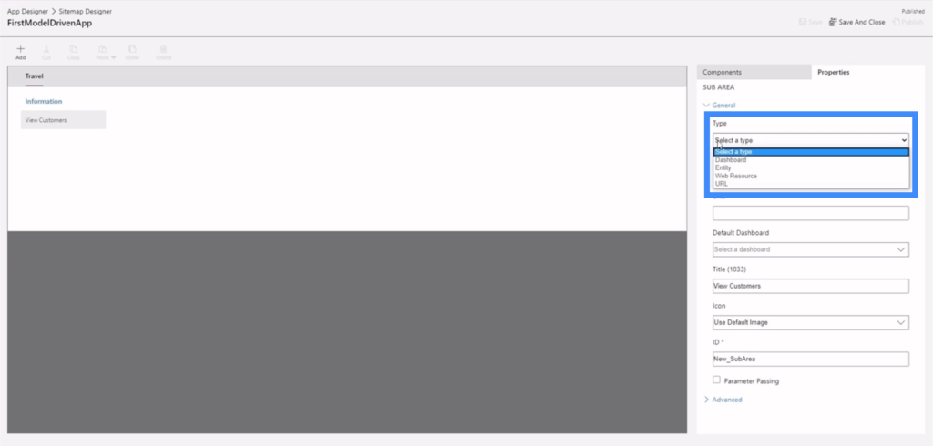
The entity field also gives us a dropdown menu, which includes entities we’ve created in the past as well as some default entities provided by Power Apps.
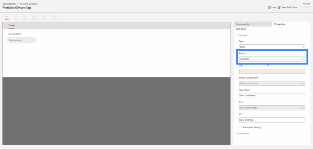
As for the title, we just need to click on the field and type in whatever title we want to use.
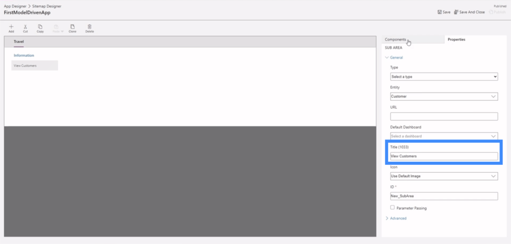
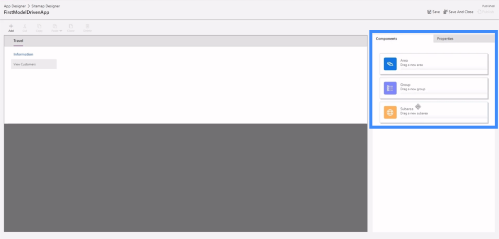
Let’s create a new sub area so that we can have a clear example on how these properties are set. We’ll start with the components tab, where we can drag a sub area from the right pane into the work area in the middle.
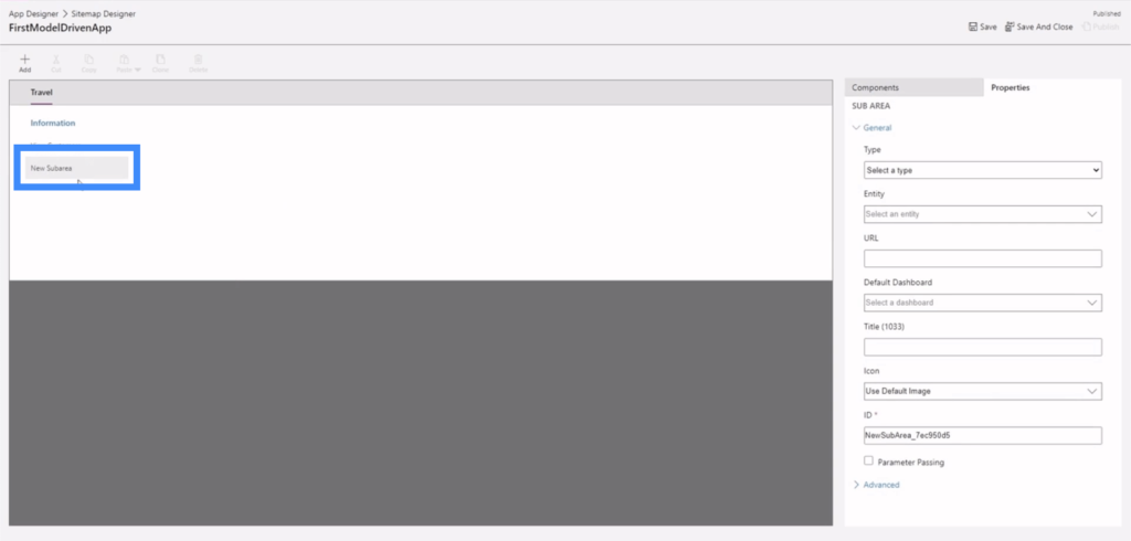
Once we drop the component here, it’s going to show us a new sub area.
Let’s make this an entity.
Next, let’s choose an entity to use. This is a long list of possible entities, so let’s use Address for this example.
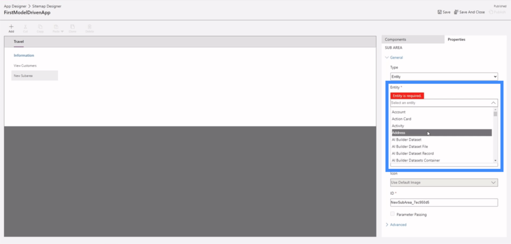
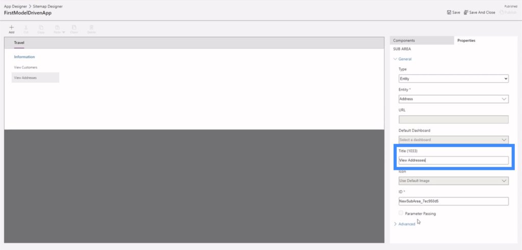
Let’s call this new sub area View Addresses.
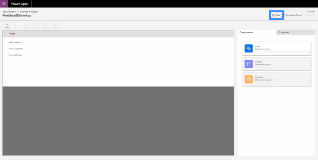
Now, let’s click save here on the upper right.
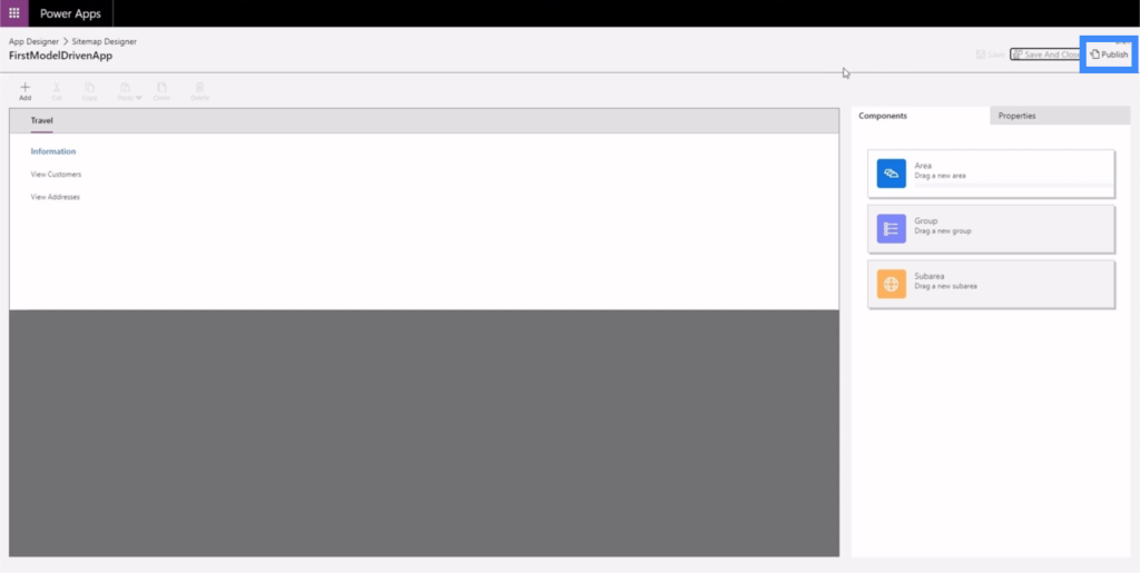
Then, let’s click Publish.
Let’s go back to the App Designer to see what the app looks like now.
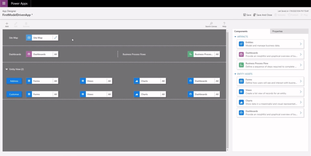
Again, we’ll click Save and Publish here, then we’ll click Play.
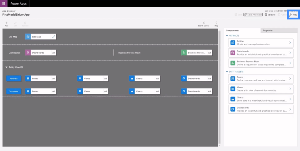
This is how the app looks like now.
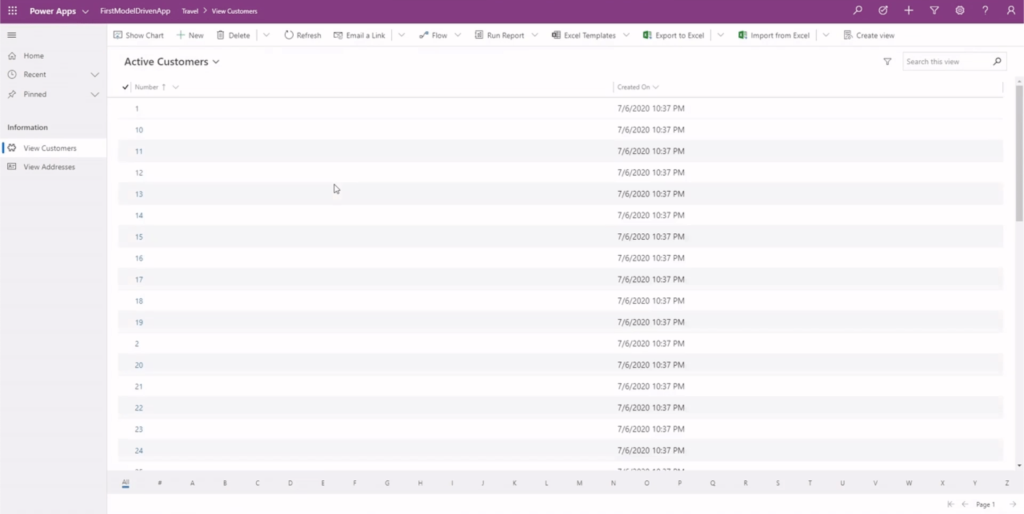
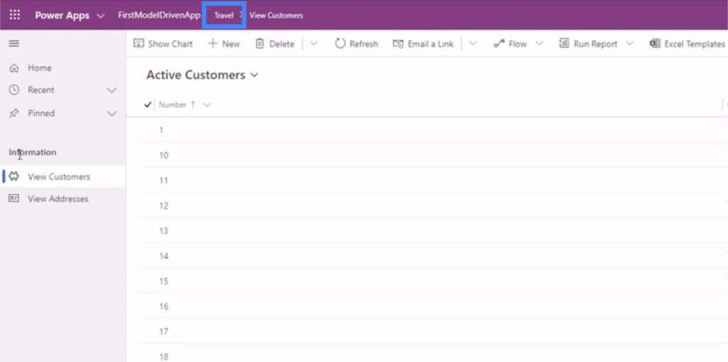
We’ll know that we’re in the Travel area through this bar here on top.
We’ll also see our group and sub areas here on the left pane.
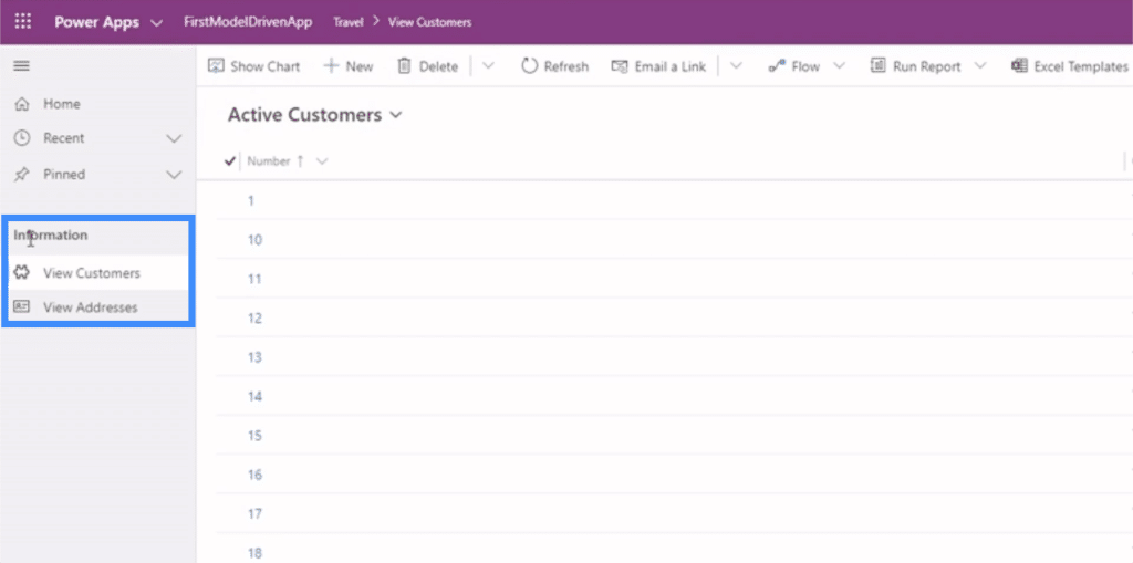
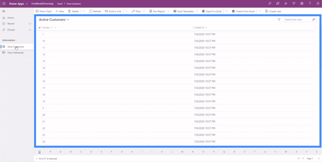
If we click View Customers, we’ll see the first sub area in our example.
There are different options here on top to show charts, run reports, and perform other actions.
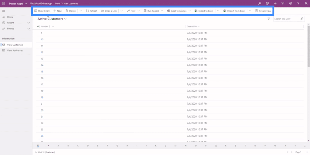
Basically, this example shows us how critical it is to master the site map knowing that this dictates the way your end user will interact with the app. If the site map is not laid out properly, then users will have a hard time finding and interpreting the data they need.
Editing Forms and Views In Power Apps Model Driven Apps
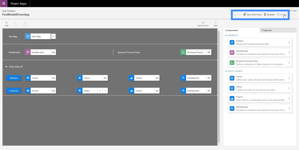
Since the site map lays out the different parts of our app, this is also where we can add elements into our entity view because that’s where all of our data is found. At the moment, we have the address and the customer pages in our app, so we should see the same thing under our Entity View as well.
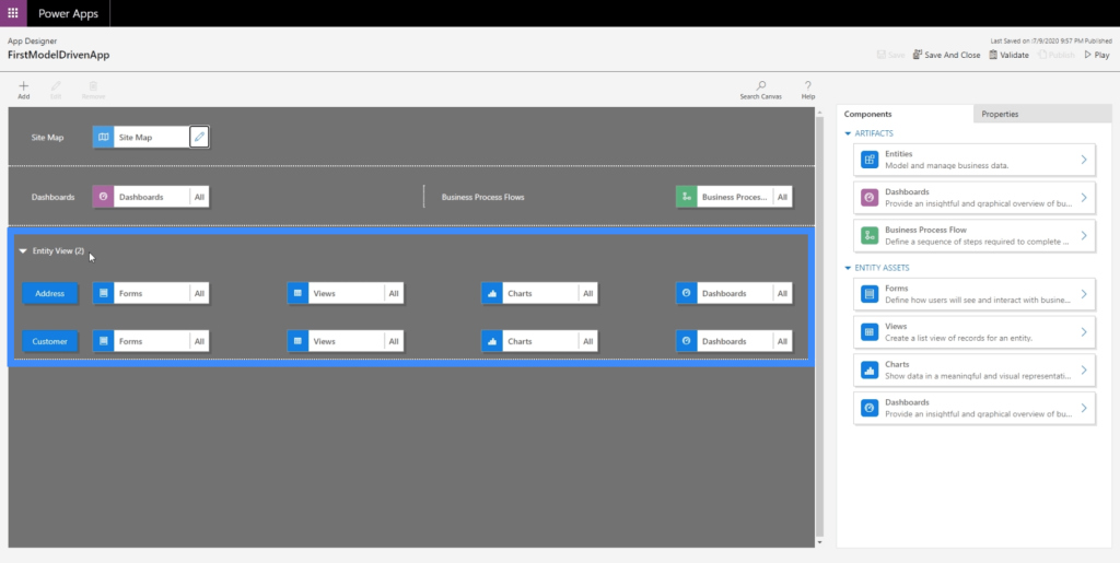
This is also where we can modify our Views. At the moment, we’re seeing a view called Active Customer, but this only shows the customer number and the date they were created.
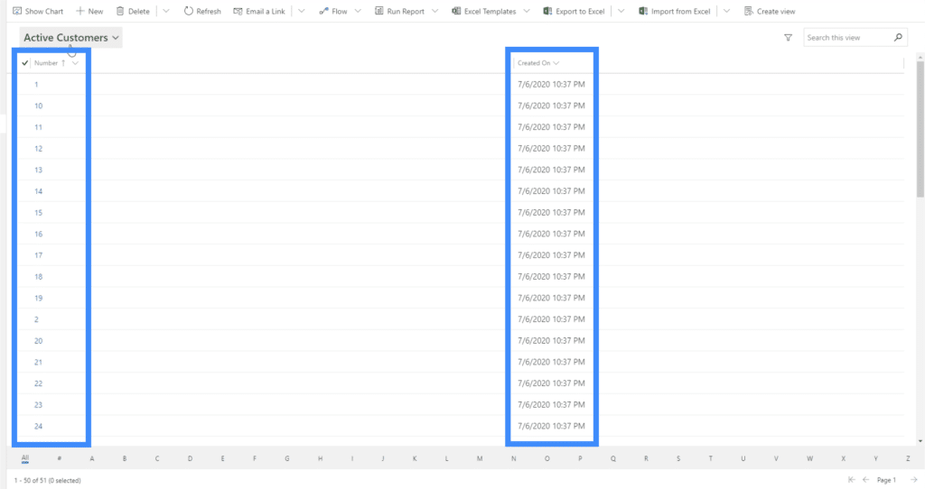
Of course, that’s not what we want our users to see. We want them to see more information about our customers. So let’s click on Views to change that.
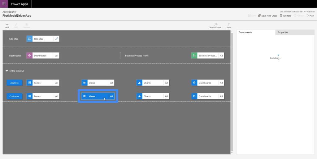
Once we’ve selected Views, we’ll check on the components on the right pane. At the moment, it’s showing all the views possible, which we don’t want either. We want specific users to view only what’s going to be useful for them.
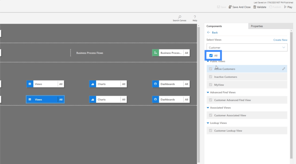
So we’re going to uncheck All and choose MyView instead. This is a view that we previously made in a past tutorial.
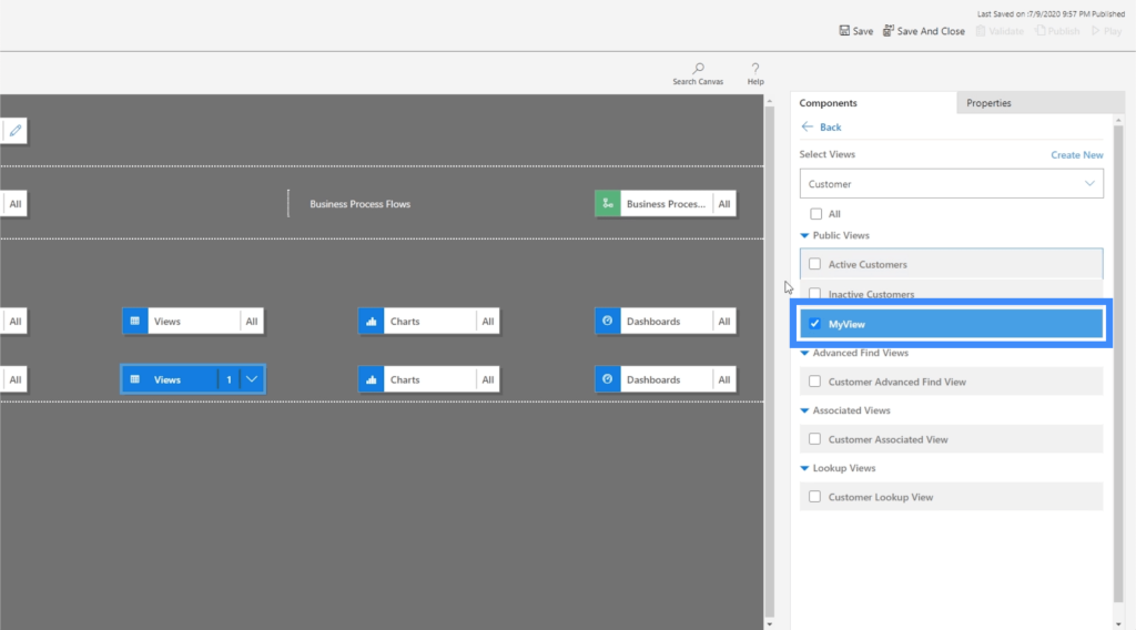
Now, let’s click Save and Publish again, then we’ll click Play to see how the updated view looks like.
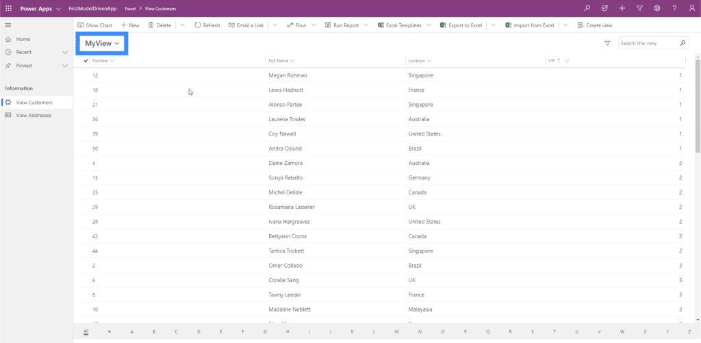
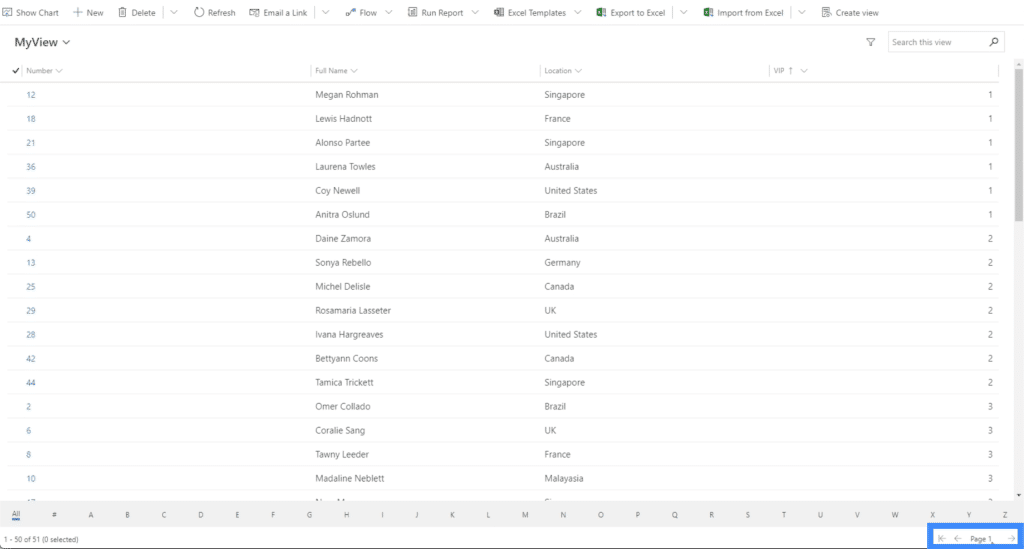
Now, we’re on the same page we were looking at before, but this time, we’re seeing MyView. This shows other columns like Full Name and Location.
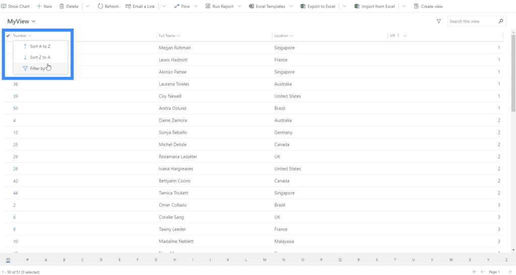
There are also filters that can sort the data depending on your needs and preferences.
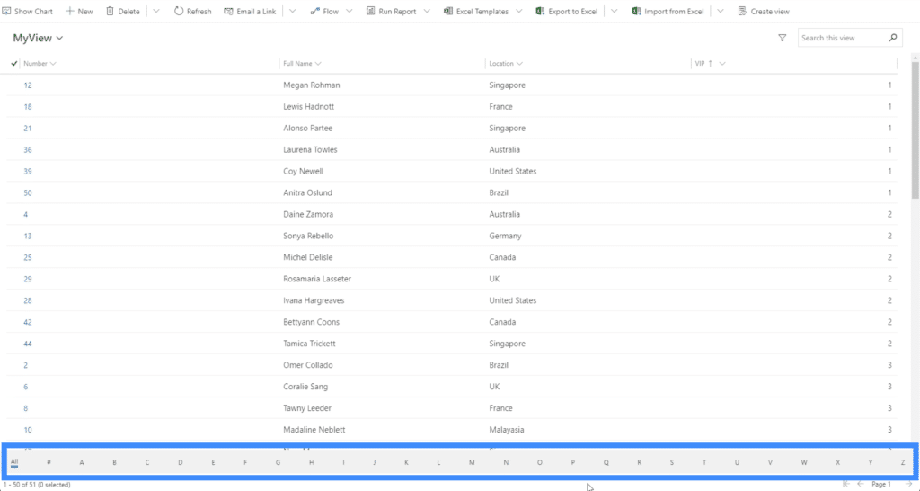
There’s also an option to show information based on the first letter of the item by using the filter here below.
Another filter on the lower right corner allows us to toggle between pages.
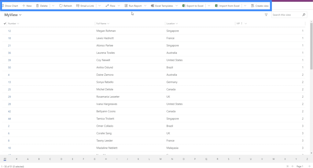
Again, we see different actions available to us here on top.
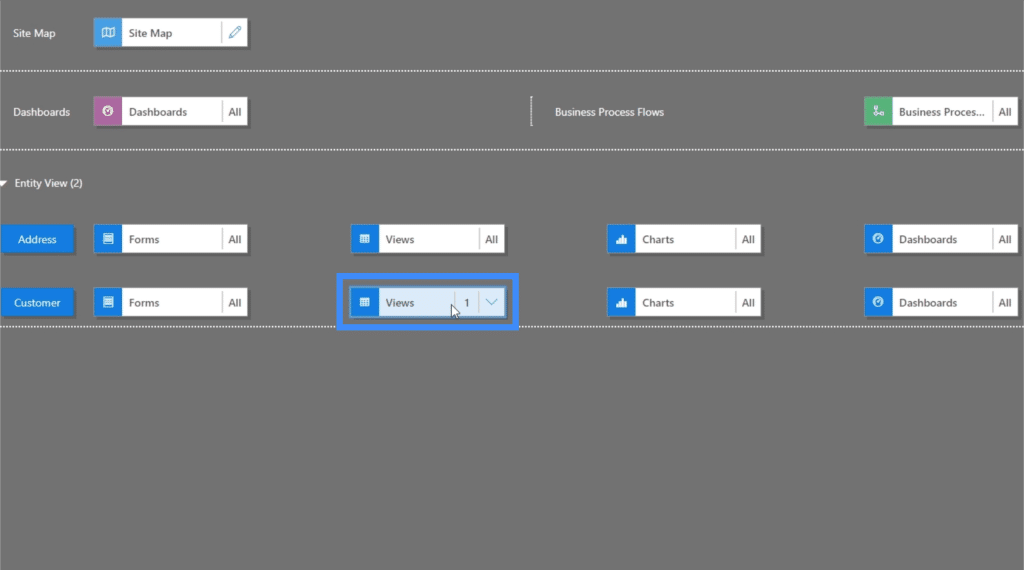
Going back to the Site Map, you’ll also see that it’s now showing only one view instead of all views.
The same thing is true with charts and dashboards. Let’s click on “Show chart”.
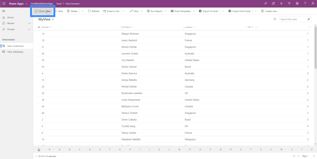
As you can see, it gives us a note that there are no charts available.
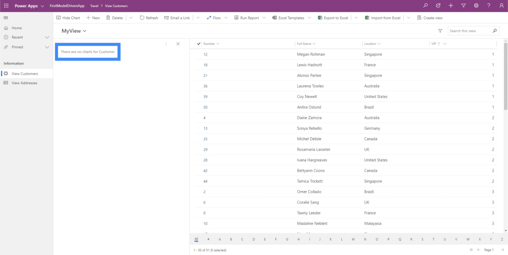
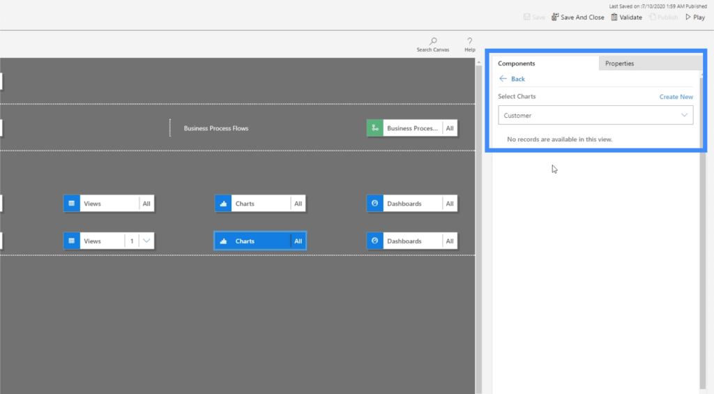
The reason why we don’t have any charts here is because we never made a chart in the common data service. Basically, anything that you make in CDS will always show up here.
In case we do have a chart in CDS, then what we need to do now is click on the Components tab on the right pane, go to charts, and select a specific chart for this entity.
Now, let’s go to Forms because that’s something that we did make within the common data service.
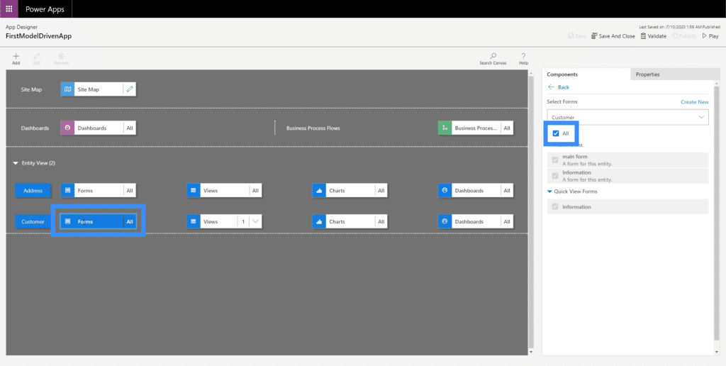
Right now, we’re giving the user the option to select all forms. However, the one that we really want the user to use is the main form.
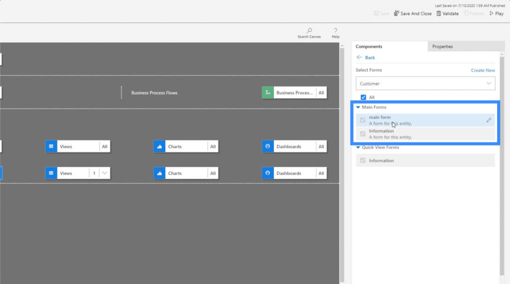
So let’s see how that works. Going back to View Customers, let’s click +New.
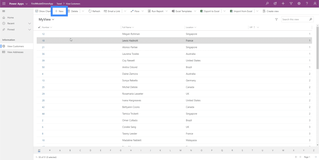
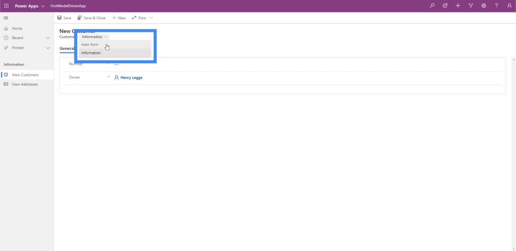
Here, the user can actually select which form they want to use. So they can simply change it to main form if they want.
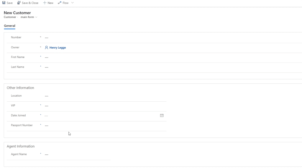
Once they do that, the right form pops into the screen.
The main form is something that we created in a previous tutorial. It’s divided into three sections — General, Other Information and Agent Information.
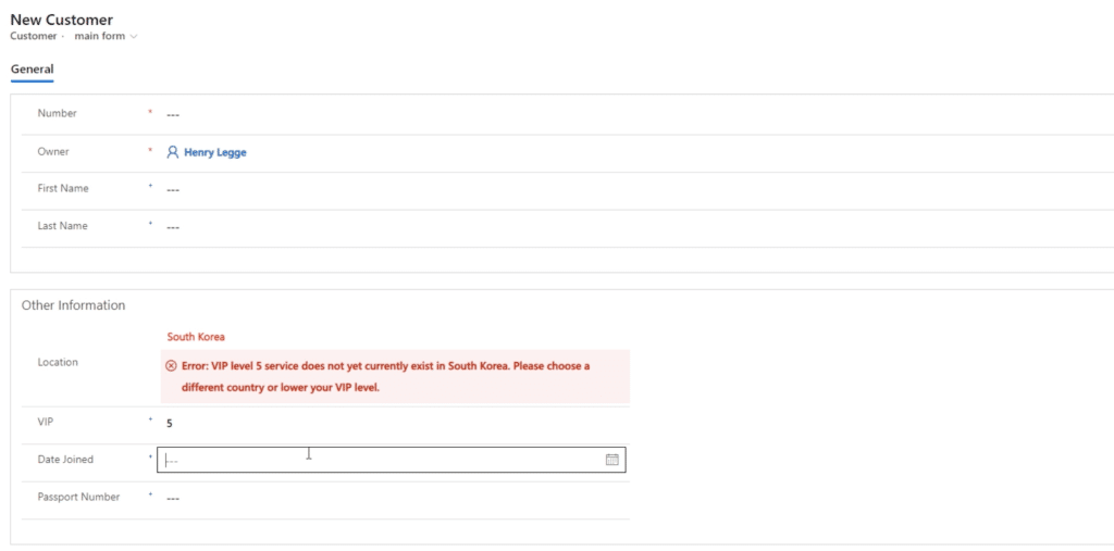
We also created a business rule within this form. We set a restriction that does not allow users to choose VIP Level 5 in South Korea. Since we also created that rule within CDS, then it’s also applicable when we’re working with model-driven apps.
Other Site Map Complexities
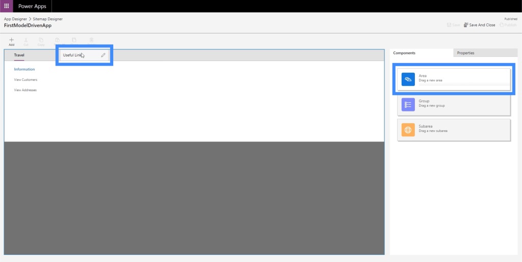
Let’s go back to the site map and explore a few other things we can do. We’re going to start by adding another Area by dragging the box from the right pane into the work area. Let’s call this new area Useful Links.
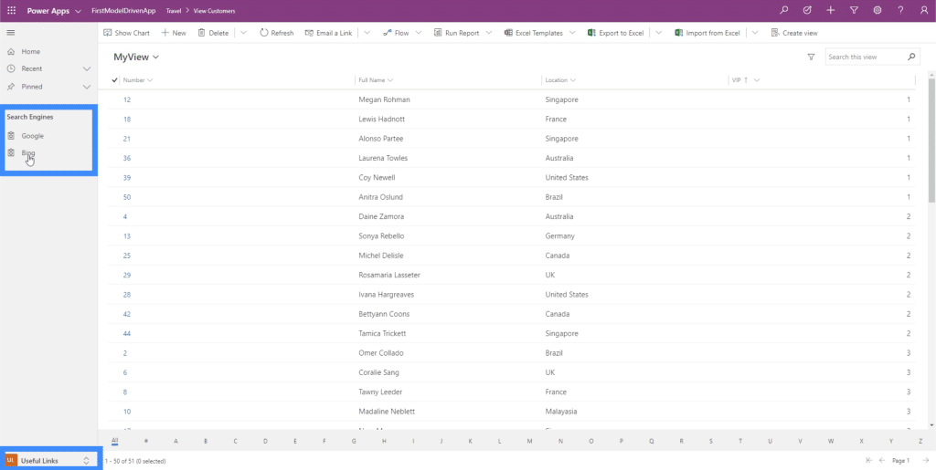
Within the area, let’s create a group called Search Engines and add URL links to Google and Bing.
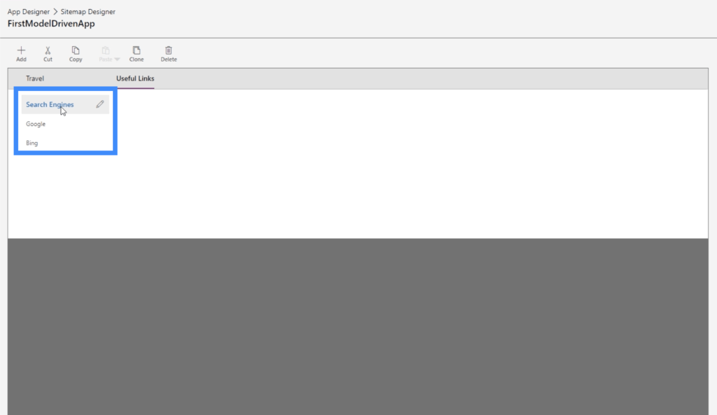
Again, note that these sub areas don’t necessarily have to be entities. They can also be web resources or URLs.
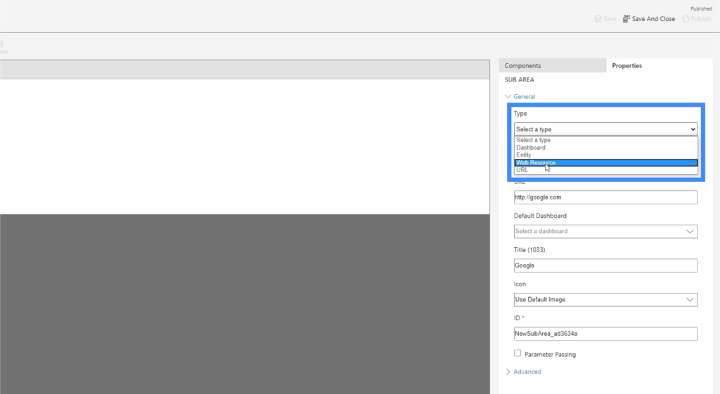
Web resources would be YouTube videos, web applications, other windows, and any other type of web resource that comes to mind. You can even add SharePoint resources or Google Forms.
The great thing about site maps is that we can add as many elements as we want. So we can add another group here under Travel even if we already have one group existing.
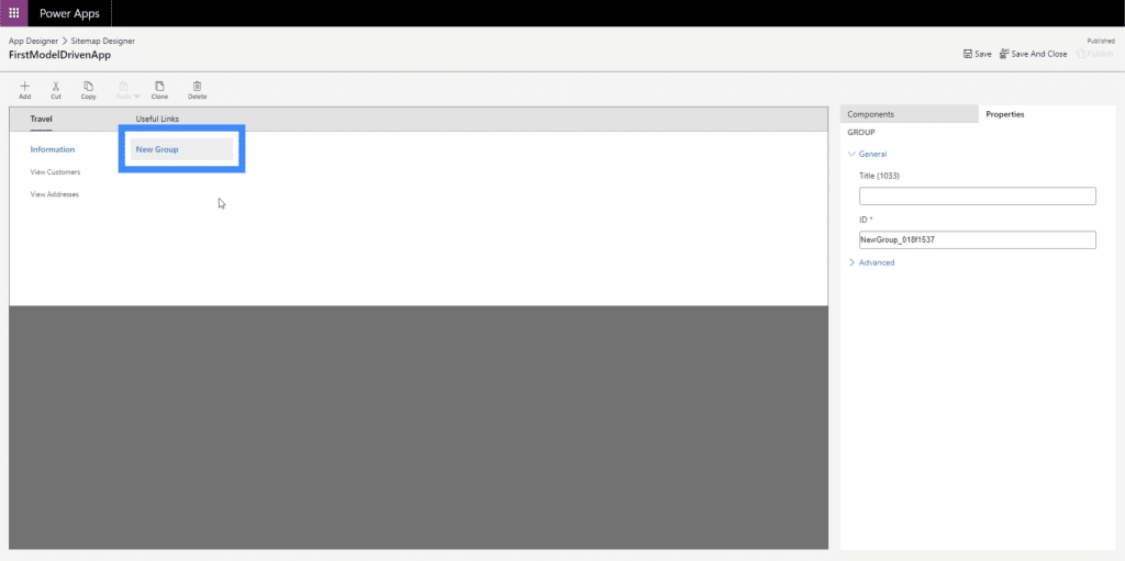
Let’s call that new group Other.
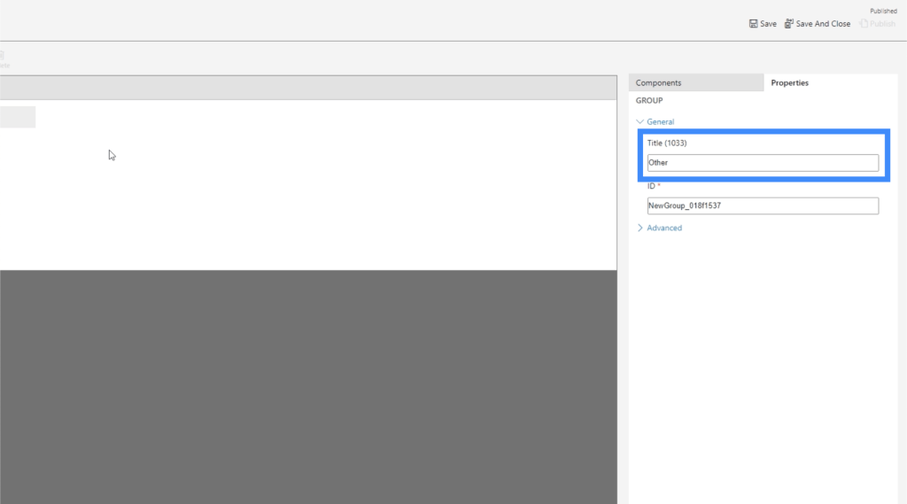
Of course, we can also add sub areas under the new group.
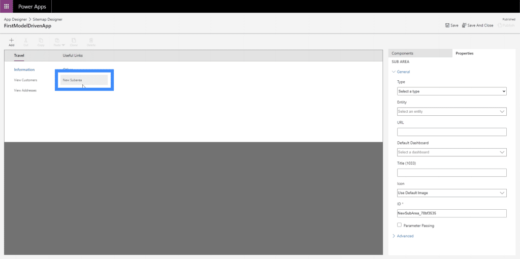
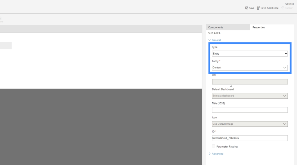
So let’s make that sub area an entity, then let’s use the data for Contact.
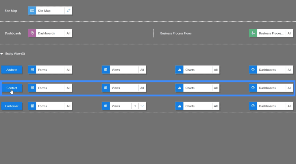
Now, let’s click Save and Publish, then let’s go back to the site map. As you can see, it now contains the new entity we created.
If we check out the app, it now looks like it has more data in it. We can choose among the different pages found on the left pane.
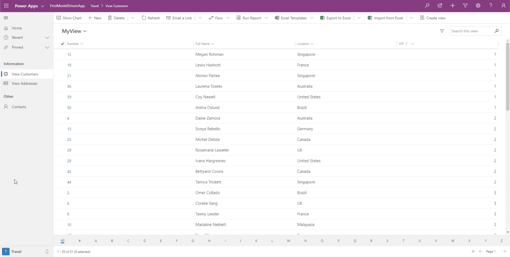
But aside from that, we can also click on this filter on the lower right and select the other areas.
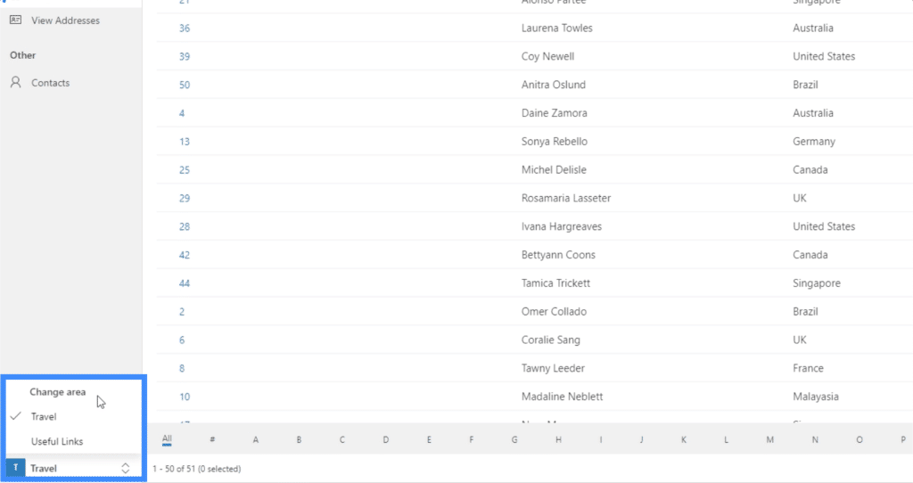
We can choose Useful Links and it will show the links to Google and Bing.
And if we click on Google, for example, it automatically opens us a tab that leads to Google.
You can just imagine how useful the site map truly is. You can create more complex apps with a web of different pages and areas, while also making sure that things remain easy to navigate.
For example, you could build an area for purchases and have different tables and forms under it. Then, you could also create a separate area that leads to the help section of a company website.
This time, let’s check on the last sub area we made for Contacts.
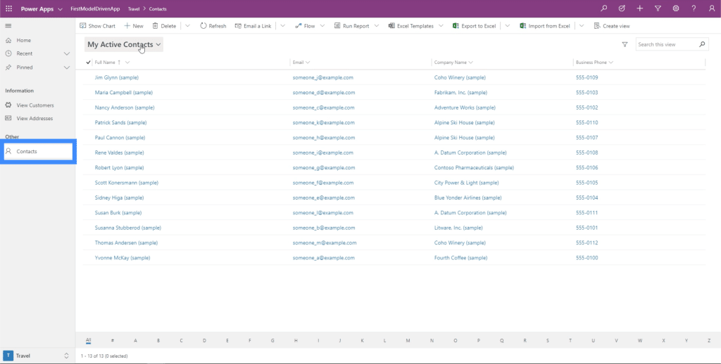
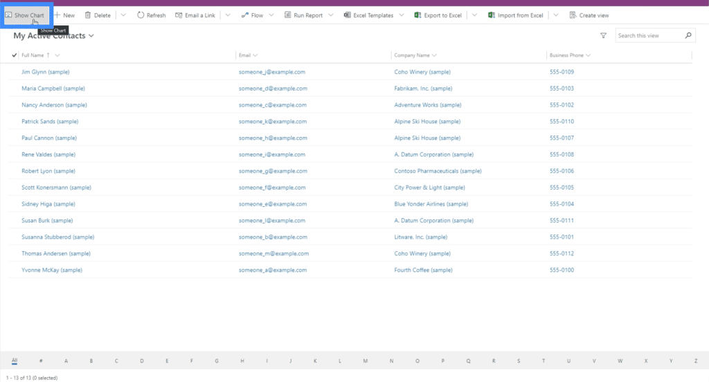
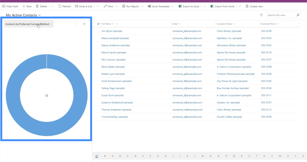
Let’s click on Show Chart.
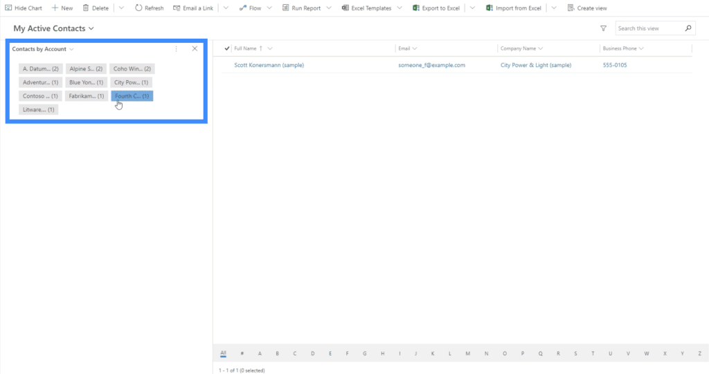
Now, it shows a filter chart that allows us to choose specific accounts.
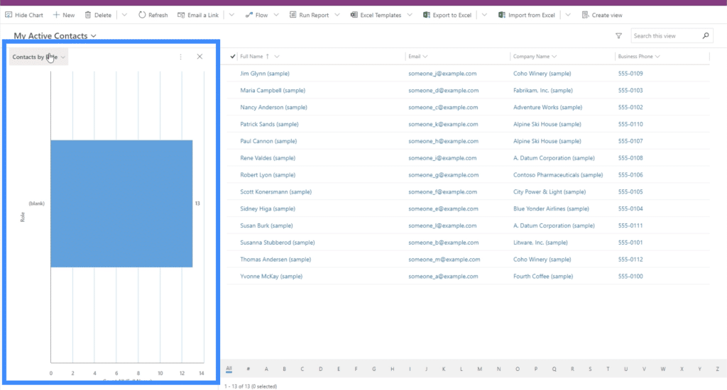
We can also choose other charts using the filter on the upper left part of the chart section. Right now, we’re seeing the chart for contacts by role.
We also have a chart showing contact by their preferred contact method.
***** Related Links *****
Power Apps Introduction: Definition, Features, Functions And Importance
Power Apps Environments: Setting Up The App Elements Properly
PowerApps Functions and Formulas | An Introduction
Conclusion
Site maps are truly helpful when working with model-driven apps. They allow us to build an app that any user can navigate through seamlessly, and let us add as much resources as needed.
Probably the best part about using site maps for model driven apps is the fact that we can insert almost any kind of element we need. Aside from the usual charts and forms, it does help that we can also add web resources and URLs, making each app as comprehensive as possible.
All the best,
Henry


