This brief tutorial highlights the Power BI mobile reporting feature. I’m going to show you how you can develop reports effectively for mobile. You may watch the full video of this tutorial at the bottom of this blog.
The Power BI team have made this very easy to implement, so I’m just going to show you how you can initiate it in your Power BI desktop models. I’m also going to show you some best practice design techniques that I utilize whenever I have to do this for any development work that I’m working on.
Transitioning Power BI Reports From Desktop To Mobile
I’m going to show you how you can quickly transform or switch a compelling dashboard into mobile-friendly visualizations.
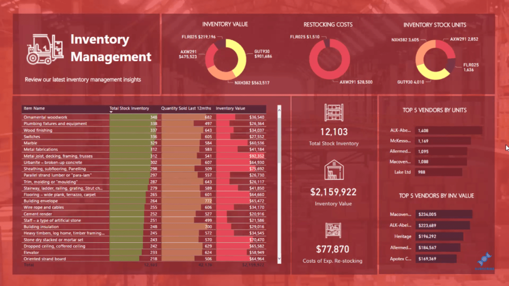
In this tutorial, I’m using this inventory management dashboard. If you want to look at what this dashboard is about, you can just click here and check out the full video about it.
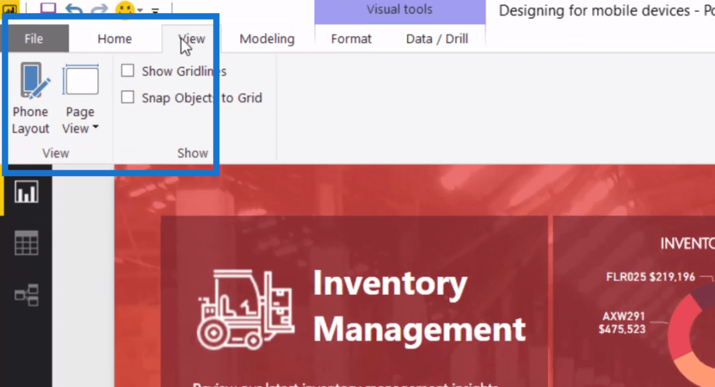
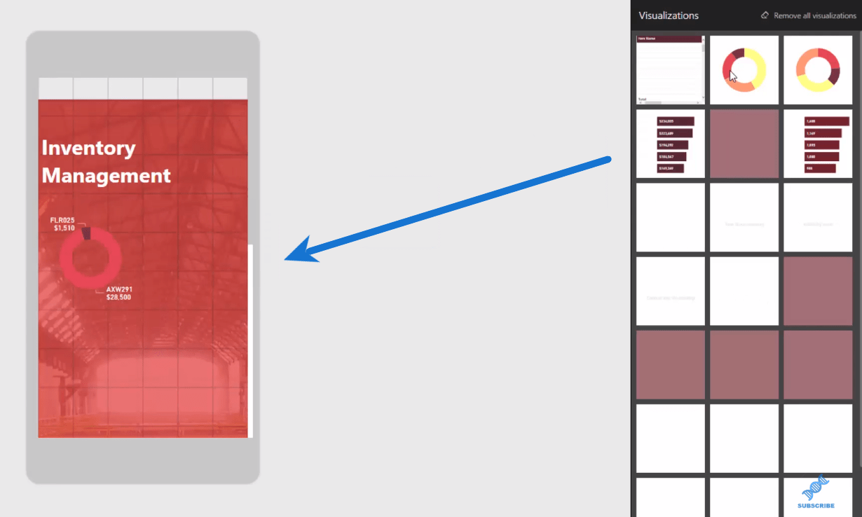
So inside the view ribbon here in Power BI, we can find the Phone Layout option. If we click on it, we can re-position this visualization for a mobile device.
It comes up with basically the background that we’ve already had inside this visualization.
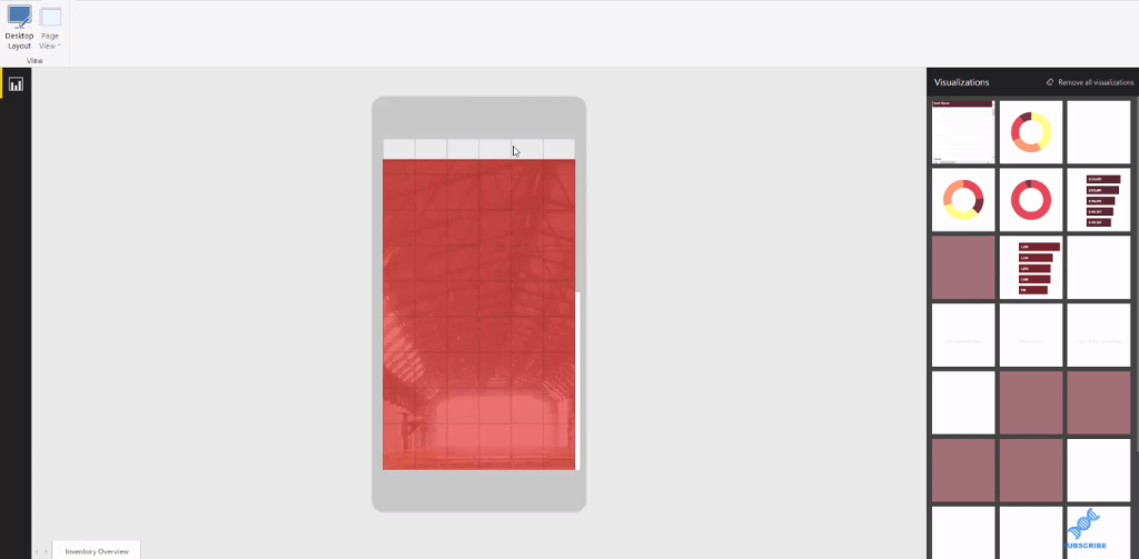
Although there’s a few white marks at the top part, which we can improve later (background set up), it’s really cool how it transitions the visualization from desktop to the mobile setting.
Designing Your Power BI Mobile Report
To create the report, we simply drag in the elements, such as the title, the charts, etc. We can re-position them for a mobile device, depending on how you want them to look.
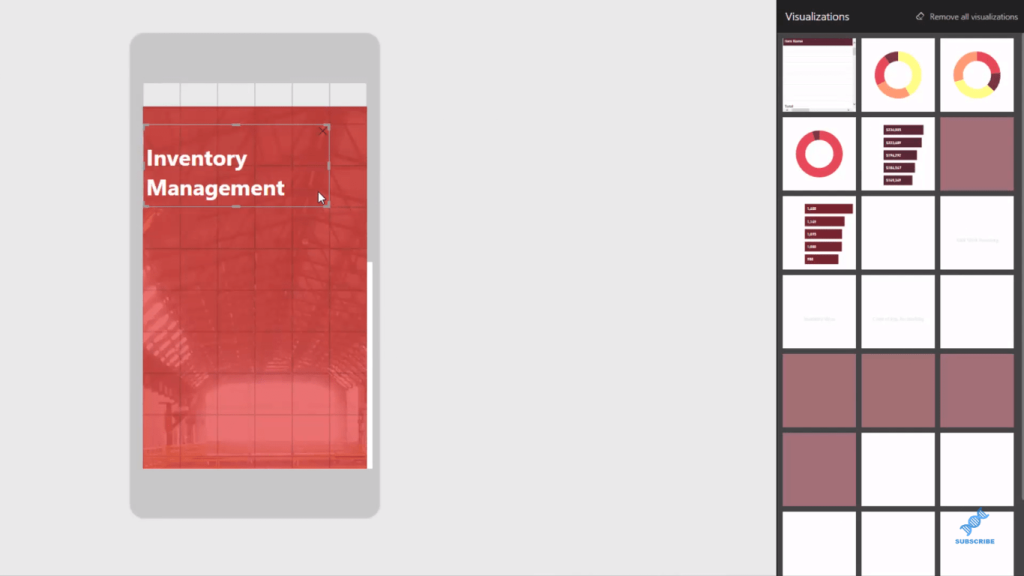
What’s great about this is that Power BI is going to remember these layout. So if someone looks at this report on a mobile device, it’s going to showcase to them what we are doing right now. It’s not going to showcase the actual entire report we see on a desktop view.
We can utilise many different elements here to design our Power BI mobile report. We can use the grid feature and just drag it in here. Then, add our key insights, and probably position them a little bit better, so on and so forth.
We have lots of other things here, but we’ll keep it pretty simple. The key thing is that this Power BI mobile feature solves the issue of those big reports not rendering well on mobile phones.
For the mobile view, the screen is obviously smaller compared to the desktop, which is the number one this we need to consider when making these visuals for mobile.
We need to make the key information stand out as much as possible.
The user experience is still very important if you want to have people engaged in what you’re showcasing to them on a mobile. We need to highlight precise, but simple things. We can’t have too much clutter and information. It should only be the key things that stand out.
The cool thing about this is the speed of which you can create this. In the past, we have to recreate a totally different report, doing all the colors and do everything all over again.
Now with this feature, all we have to do is switch between those desktop and mobile. All of the themes, the colors, the visualizations we’ve already created in our report get carried over into a mobile device.
***** Related Links *****
How To Create Compelling Reports & Dashboards In Power BI
Showcase The Top Result Name Within A Card Visualization Using Power BI
Conclusion
The key thing with mobile development in Power BI is to keep it simple, nothing too complex.
None of the advanced features really work very well on mobiles. You have to just think how you can utilize the visuals you’ve already created and create a very simple design in a mobile.
Things like custom visuals are a big NO. Tables don’t really work. So you need to focus on the key information you want to stand out.
Focus on cards and simple visualizations, which may already be somewhat filtered down to the most important insights.
The consumer is not going to be able to see as much detail as in a report on a bigger screen, so it’s all about thinking about the consumption of your analysis, and then implementing a really simple design in the mobile report section in Power BI desktop.
Best Regards,
Sam


