In this example, we’re going to dive into inventory management data and extract some awesome insights. You may watch the full video of this tutorial at the bottom of this blog.
I’m adding a bit more variety into some of the Power BI development that I showcase here, and this is quite a unique insight around managing your inventory.

All data has it’s nuances so learning a variety of techniques will place any analyst in a great position for the differing data that might get put in front of you.
By going through this inventory management example, I’m hoping to expand your mind around how you can utilize Power BI. The unique analysis comes from where we need to compare our current stock levels to the sales we are actually seeing in real-time at our stores.
What we need to do is compare historical sales to what we currently have in stock because that’s how you need to manage your inventory (if you think deeply about it for a moment).
By understanding this, you can make sure that you keep up with demand or that you have the supply to facilitate any particular strategic promotion or sales event that you’re initiating inside of a business.
I show you how to build your data model, how to implement the correct DAX calculations, and how to showcase this in a visual way that makes sense and highlights the insight well to your consumers.
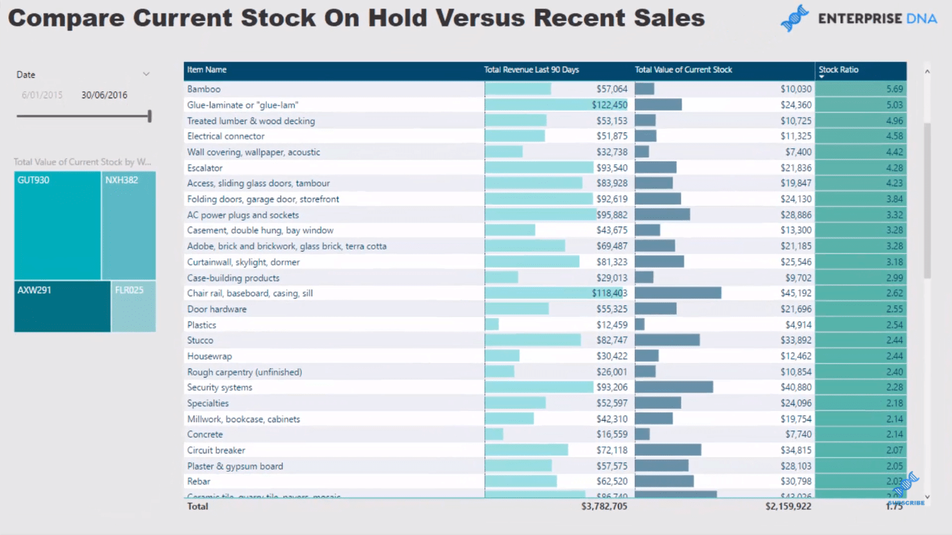
Going Over The Process
One important element to get inventory insights is sales information. In other words, we need to calculate our sales. However, to optimize our inventory, we need to have a table that is a timestamp of a certain period.
For inventory data, we’re going to have different inventory information every single day. On the other hand, sales information is historic, so we want to analyze historic sales information to ensure that we are optimizing our inventory levels at any certain point in time.
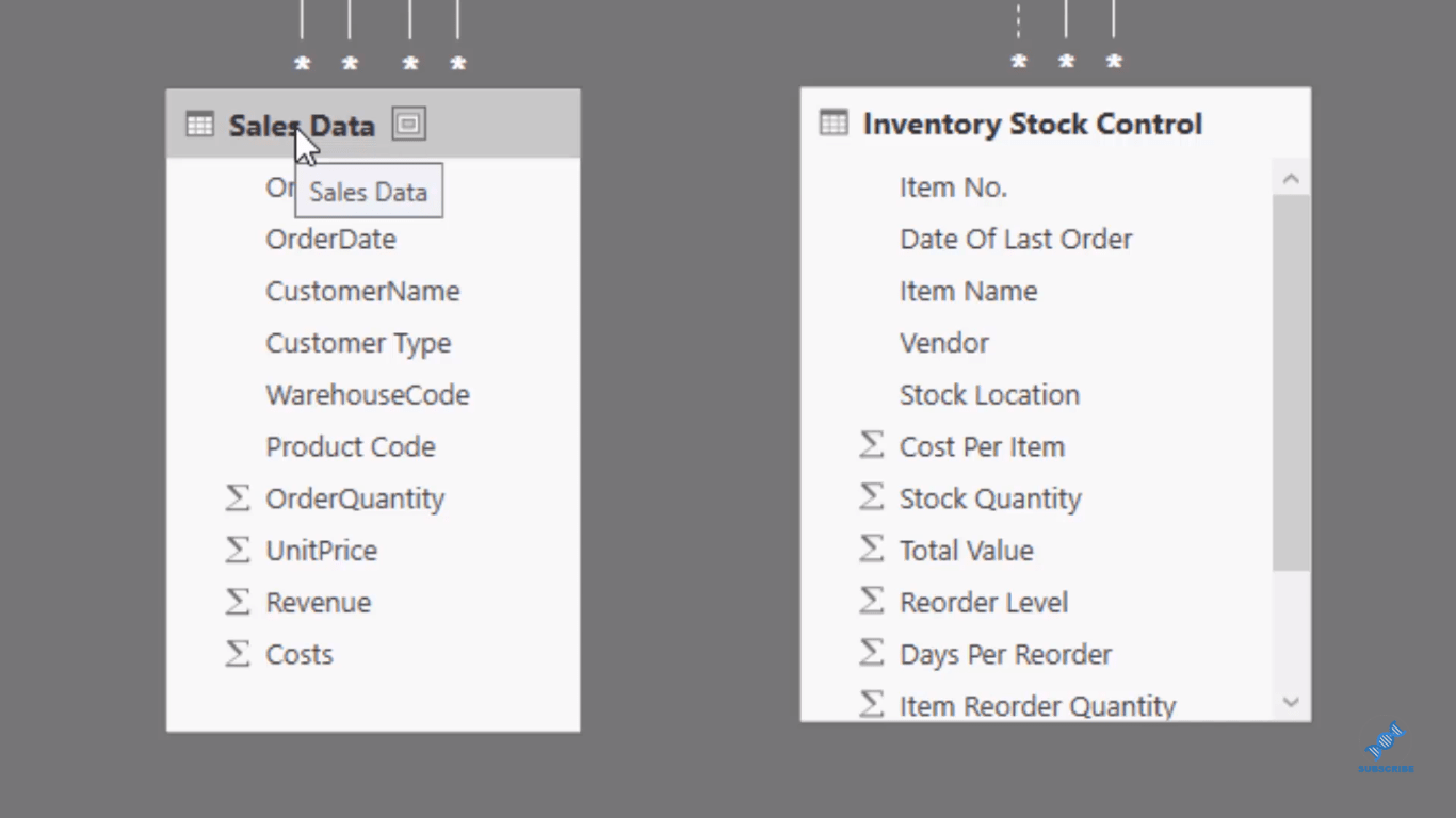
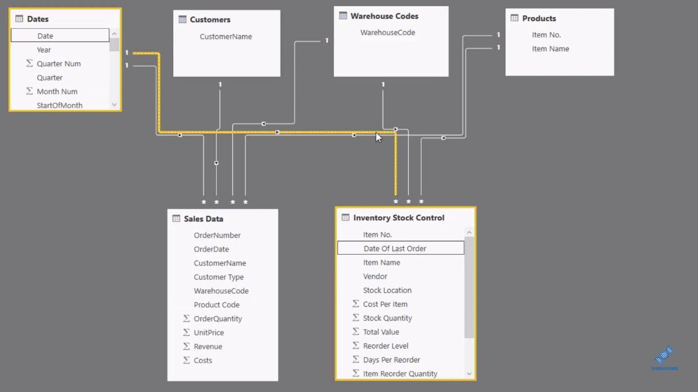
I’ve connected lookup tables to these fact tables, the Sales Data, and the Inventory Stock Control. We have Customers, Warehouse Codes, and Products.
The only difference is the Date. I’ve created an inactive relationship here because I don’t want to filter this Inventory Stock Control table by the date because this is a time stamp.
If we look at the report here, we’ll see that the end of July is the last day of our sales, as the example. So on that day, we know what I we can timestamp, and we can see all the sales we’ve made.
And we want to compare how many sales we’ve made in the last 90 days to how much stock we actually have on hand. To achieve this, we need some formulas.
Going Over The Formulas Used
So I created a measure, wherein I started with Total Revenue.

Then to calculate the last 90 days, I used DATESBETWEEN, which allows us to have a start date and an end date. So here we started at 30th of June 2016, which is last day of the data set. We calculate how much revenue we made in the last 90 days per product based on the two dates.
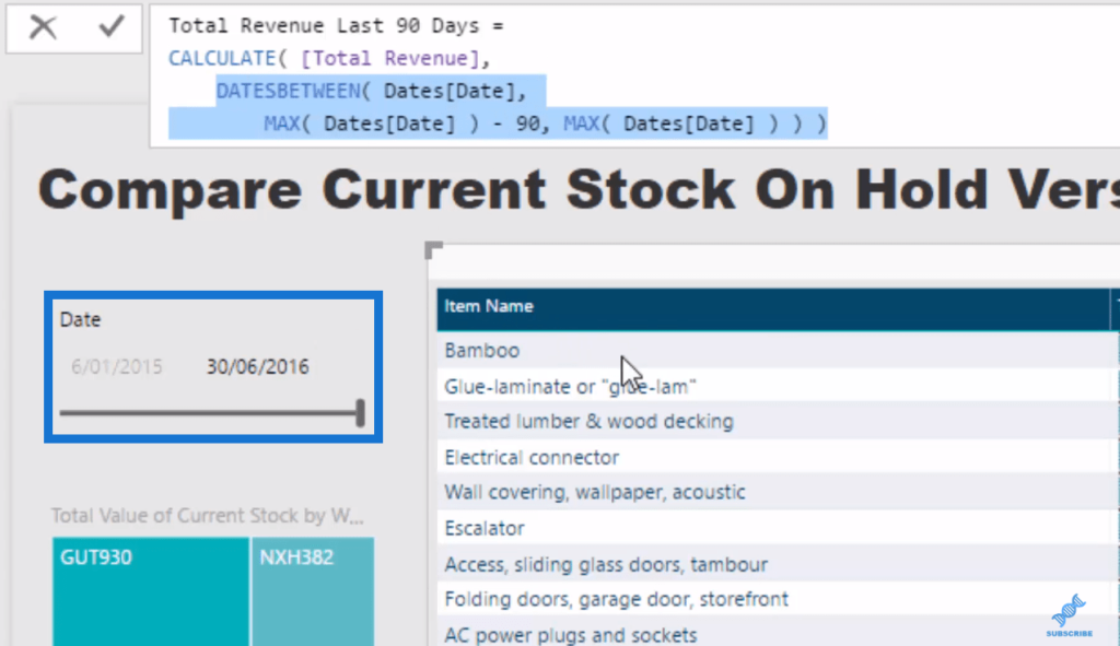
So the MAX Date will always equal to the last date in our data set, which is 30th of June. The MAX Date – 90, on the other hand, has given us that 90-day window to calculate our Total Revenue for that period for each product.
When we look down at our table, we see the products that we sold most in the last 90 days. Then, we can contrast it to the Total Value of Current Stock.
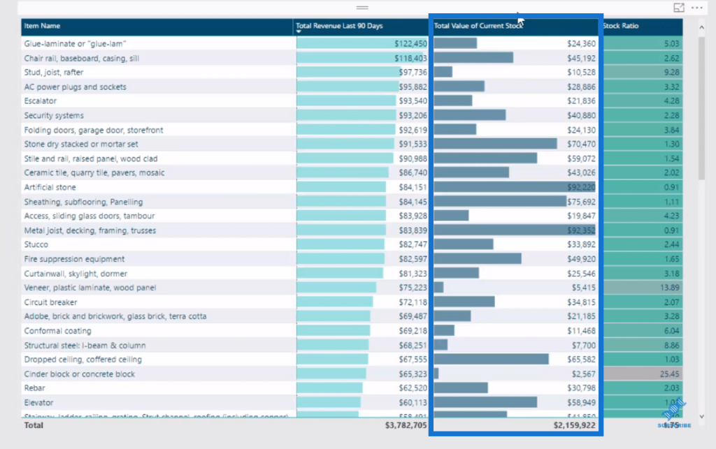
For this calculation, we iterate through every single row in our table, and can’t count up the quantity and the cost per item. Then the SUMX does the sum of the total value.

With this calculation, we can see how much stock we have on hold for each product.
Then, I also ran a Stock Ratio because we might have a ratio level that we want to be at for all our products so that we will always have enough stocks of products to sell. I simply divided Total Revenue in the Last 90 Days by the Total Value of Current Stock.

This gives us a secondary figure that we can analyze and sort by to see what products are selling, and what products are not selling well. And as we use this great table feature, we can sort it well and see clearly the lowest versus the highest stock ratios.
Inventory Insights From The Data Model
From the results in the table, we can get significant insights aside from our stock levels.
Low stock ratios means that we probably don’t have much stock on board and we need to get more, depending on what ratio you want to set to fulfill orders in the future.
On the flip side, high stock ratios are obviously those very poorly selling products. They’re not selling very much, so perhaps we should be discounting them just to get them sold and not sit around, dragging our business down.
These are really great insights that you can get from the inventory data.
Another thing is that this is linked up to our data model, and so we actually have a number of warehouses that the stock could be held at. We might want to optimize that and see our sales in particular regions and the warehouse that are located.
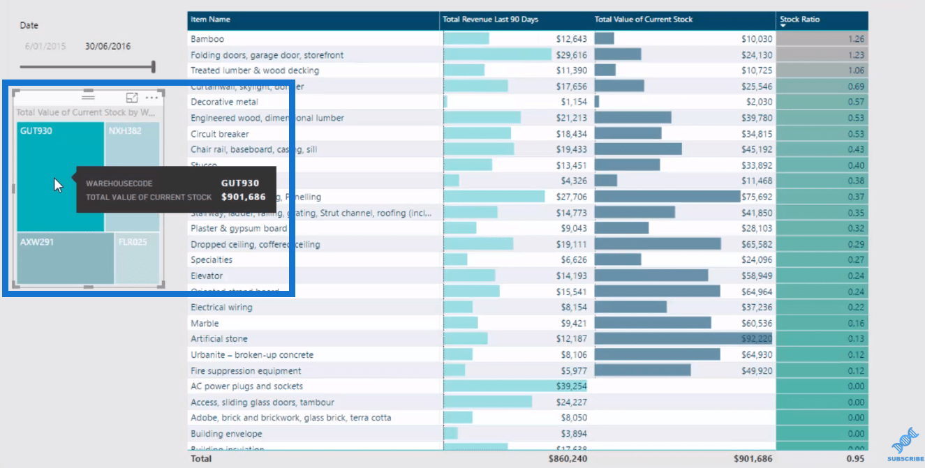
When we can click on the Warehouse, we can see the stock that we currently have at that particular warehouse. We can then match it up to sort of regional information. I haven’t done that yet, in this example, but that’s the power of utilizing the data model, and put these additional filters in place.
***** Related Links *****
Calculate Days Of Zero Stock – Inventory Management Insights w/Power BI
Compare Current Results To The Prior Best Performance Month in Power BI
Inventory Management – Power BI Showcase
Conclusion
The key to great inventory insights is understanding the data model really well.
You need to understand that you have two fact tables here and that you need to link up your lookup tables to these two fact tables in a way that the filters work correctly. This way, when you’ll add some context to your calculations, the filters in place are calculating results that make sense to you.
Combining all of these techniques around various aspects of Power BI is where you really need to get to in order to extract really good insights.
All of these techniques in isolation don’t do anywhere near as much as when you combine the data model, with DAX calculations and really high quality visualizations.
This is where the real power is in utilizing Power BI as an analytical tool.
All the best with working out how you can fit these types of techniques into your own data sets.
Sam


