In this tutorial, you’ll learn how to make a metric selection slicer in Power BI. A selection slicer lets you choose what values you want your dashboard to show.
You can switch to the data you want to see without compromising other results. It organizes the values and visuals depending on what you would like to showcase.
Creating A Key Metric Selection
Another thing you can add in a Power BI dashboard is a selection visualization that can either select Profits or Revenue.
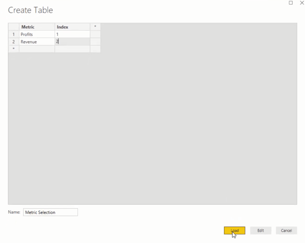
First, go to Enter Data and name it Metric Selection. Change Column1 to Metric and then add the selection Profits and Revenue. Add another column and name it Index.

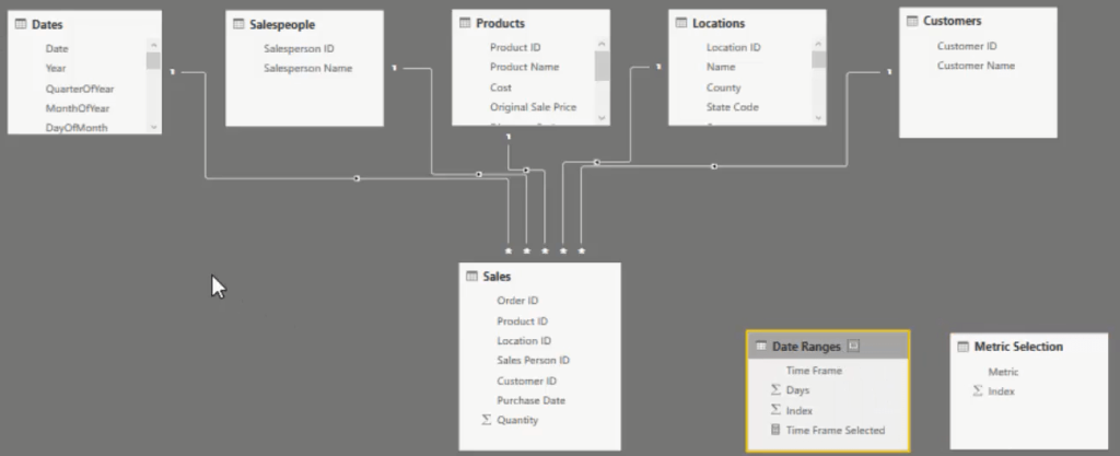
If you go back to your data model, you’ll see that there have been additional tables created. They just sit next to your model and have no physical relationship with the tables. They are supporting tables that you feed into your calculations.

Now that you have a metric selection, go to that table and make sure to sort it by Index.
After that, copy and paste the slicer and drag Metric under the Field section. You will then get a slicer with Profits and Revenue.

Adding Formulas To The Selection Slicer
Next, you need to pick out what is selected in the slicer which changes the visualizations as well.
Create a new measure and call it Metric Selected. Use the SELECTEDVALUE function and input the Metric column. Use Revenue as default so that if nothing is selected, it’s going to show Revenue.

If you want to double check the selection slicer, drag Metric Selected into the canvas and turn it into a card. You can see that if you pick Profits, the card will show Profits.
You then need to bring that into a function so you can change all the visuals based on this chosen metric.
To start off, copy the Revenue within Time Frame measure and then paste it in a new measure. Alter the formula by renaming it Profits within Time Frame and changing the value inside CALCULATE with Total Profits.

Next, you need to bring that into one measure that can be put inside all your visualizations. So, you need to create another measure called Metric Selection Logic. Use the function SWITCH TRUE. In the next line, make a condition that if the metric selected is equal to Profits, it will bring the Profits within Time Frame; if Revenue or nothing is selected, it will bring the Revenue within Time Frame.

You can now bring that measure into all your visualizations by replacing the Size and Value with the Metric Selection Logic measure. Also, make sure that the format and sort order is consistent with the other visuals.
***** Related Links *****
How To Control The Interactions Of Your Visuals In Power BI
Filtering Data By Custom Fiscal Years And Quarters Using Calculated Columns In Power BI
How To Harvest Power BI Slicer Selections To Use Within Other Measures
Conclusion
If your dashboard shows too much information, you can control it with the selection slicer in Power BI. It separates values and data like revenue, profits, and costs from each other and shows you the data of whatever metric you select.
All you have to do is create a slicer visualization and equip it with formulas that enable you to switch from one data to another.
All the best,
Sam


