
I want to talk about the new Deneb custom visual that was recently released for Power BI. This provides an interface for the Vega-Lite language to be used to create an interactive custom visual for Power BI.
The Vega-Lite language is based on JSON syntax. It is easier to implement and understand than lower level programming languages. In addition, the author Daniel Marsh-Patrick has included a few templates to accelerate the design process.
I think this visual is going to be huge as it provides a full code experience and is extremely customizable. I’d like to take this opportunity to showcase a few simple examples of Deneb Vega-Lite visuals and compare it with the standard Power BI visuals. You can watch the full video of this tutorial at the bottom of this blog.

How To Use Deneb As A Custom Visual For Power BI
Deneb is an interface that allows a visual to be fully coded using JSON syntax as per the Vega-Lite language. This presentation is not intended as an introduction to the Vega-Lite language but is rather a small showcase of how the language allows visuals that are like some of the standard Power BI visuals and can be fully customized to suit your scenario.
The base visuals developed in this presentation leverage some of the example templates available in the Deneb interface. The custom visuals are introductory examples of what can be accomplished with a small amount of effort in Vega-Lite through trial and error modifications of other examples that can be easily found online.
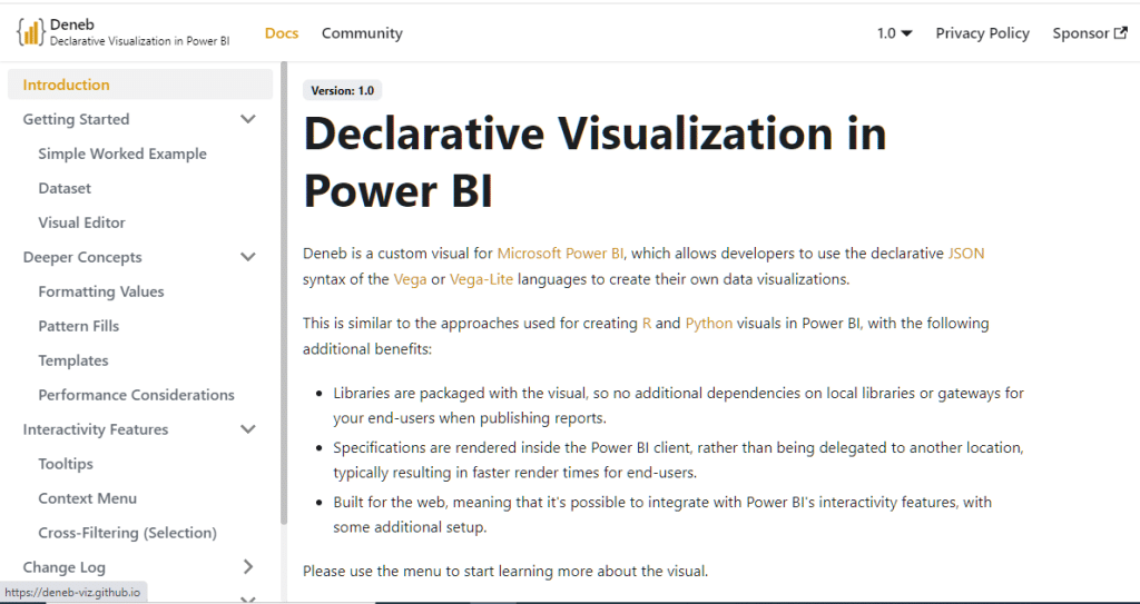
Here’s the Deneb homepage. You can find some reference material here.
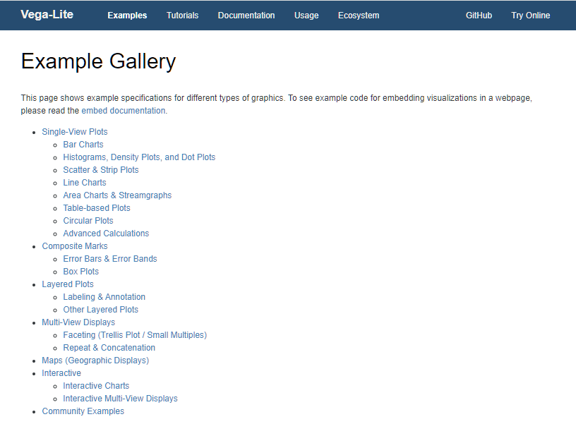
There’s a gallery provided on the Vega-Lite GitHub site that shows examples of things that can be created with Vega-Lite.
Here’s another example of some custom KPI cards that can be created with the Deneb custom visual.
General Points To Learn About Deneb
Here are some of the general points I’ve learned about Vega-Lite during my initial investigations. Data is tied to a mark. There are numerous marks available in Vega-Lite, including bar, line, arc, point, text, and many others. A mark has encoding. For example, the text mark has many encodings available, including alignment, font, size, weight, and color.

Multiple marks can be combined to create a composite visual experience, including layer (multiple marks overlapping each other and sharing the same anchor point or axis), concatenation (multiple marks arranged horizontally or vertically), or facet (small multiples available in many power BI visuals where a series of similar plots are used to display subsets of the same data facilitating comparison across subsets).
Creating A Bar Chart With Deneb
Now let’s take a look at how a custom visual for Power BI is created using templates from Deneb, and how they compare with the standard Power BI visuals.
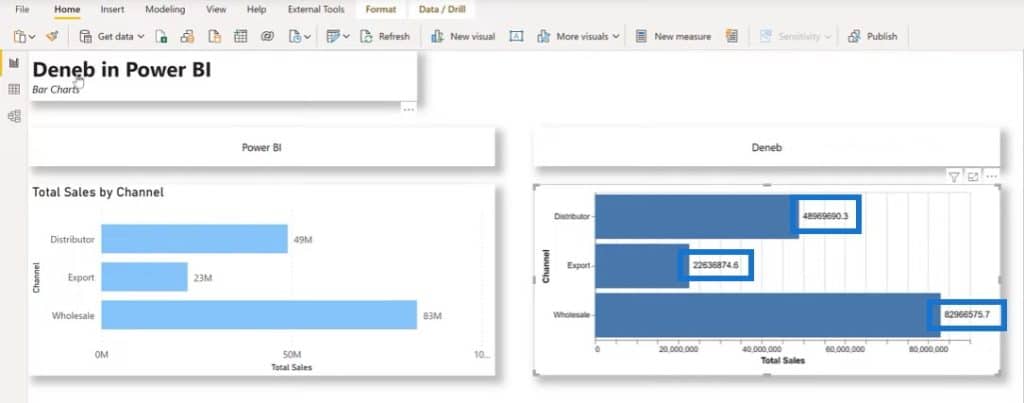
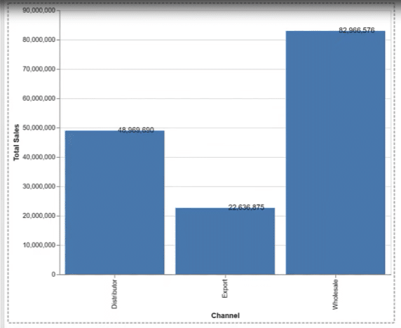
In this example, I’ve added a standard Power BI bar chart to show Total Sales by Channel on the left side. Let’s build something similar using Deneb and Vega-Lite.
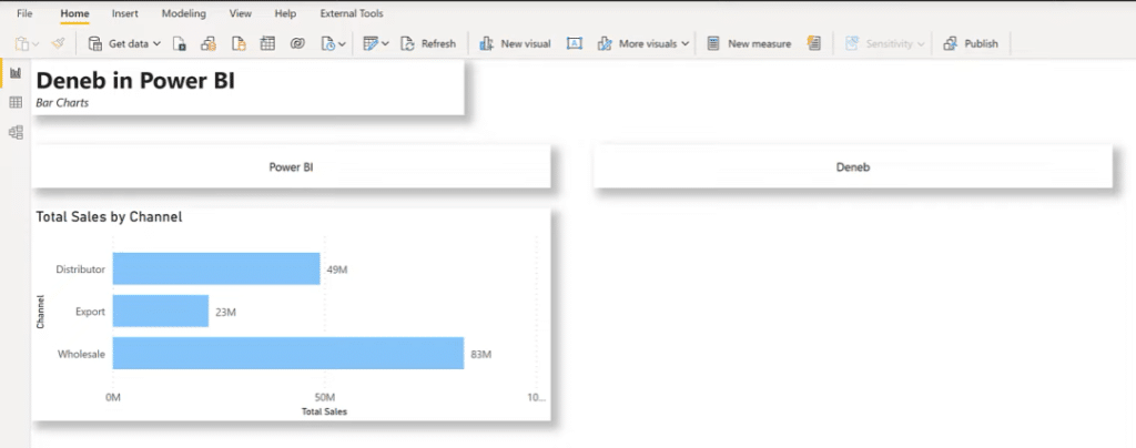
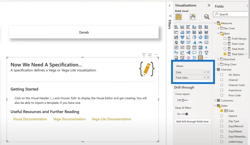
We’ll add the Deneb visual on the right side.
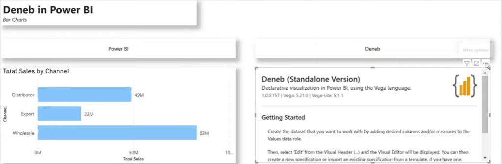
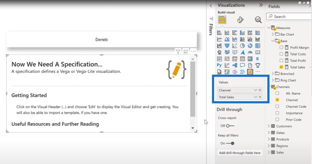
The first thing we need to do is to add in our data, so let’s add our Channels and Total Sales.
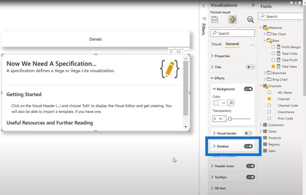
Just for the fun of it, let’s turn Shadow on.
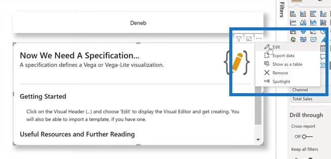
Then we choose Edit.
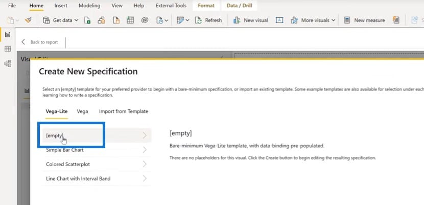
We’ll select the simple bar chart templates provide in the interface. For the category, we choose Channel and for the measure, Total Sales.
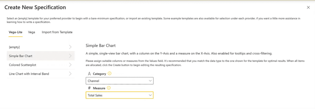
Once we click Create, we can see our Deneb visual.
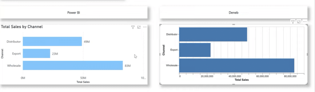
We can see there are many things that are similar between Power BI and Deneb. One thing that’s not similar right out of the box is that we have the data labels shown on the Power BI visual. For the Deneb visual, these data labels can easily be added into the visual, which we’ll do by adding a different layer.
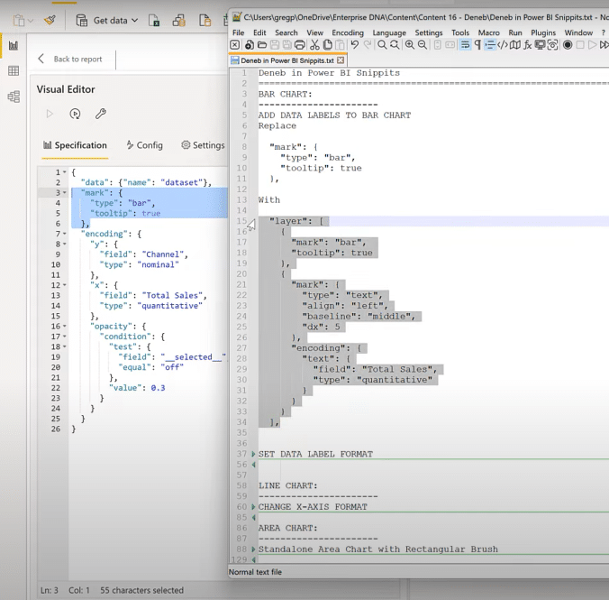
Once we click on Edit from the Deneb visual, we see a single mark here.
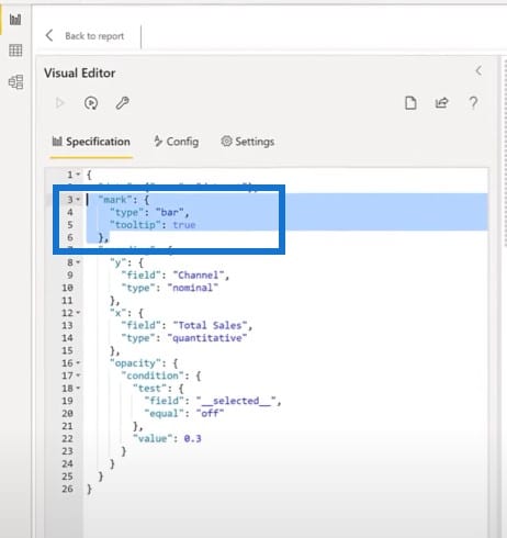
I’ll grab a code snippet to add the data labels and replace the code for the single mark with two marks.
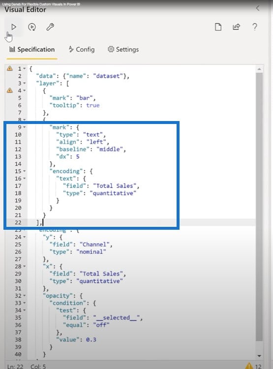
Once we run this, we’ll have data labels.
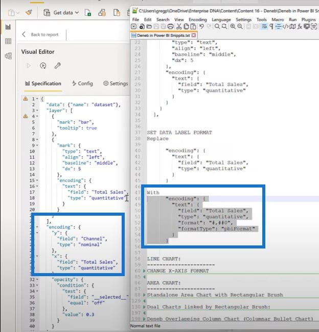
The second thing that we can do is to format these data labels. Again, I have a quote block here that I can put in instead of just using the bare encoding for the Total Sales.
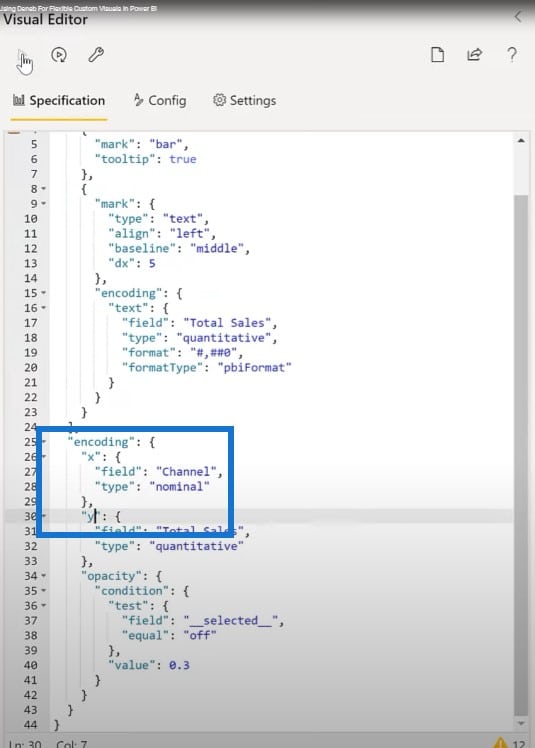
The other thing that’s really cool about Deneb and Vega-lite is that we can easily change a bar chart to a column chart. Let’s click on Edit again. All we need to do is flip the X and the Y.

Obviously, there’s some work to do and adjustments are needed, but I wanted to show how easily things can be changed in Vega-Lite.
Making A Line Chart With Deneb
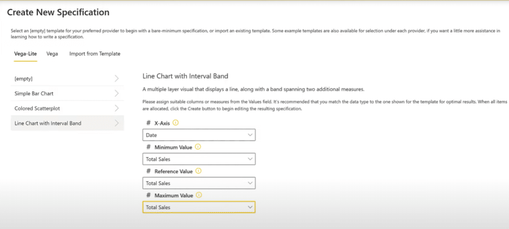
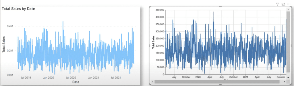
Next, I’ve added a standard Power BI line chart that shows Total Sales by Date. Let’s build something similar using the Deneb Vega-lite. Let’s add a Deneb visual, add in our Date and Total Sales.
Let’s choose a line chart with an interval band, choose Date for our X axis, and choose Total Sales for the next three values.
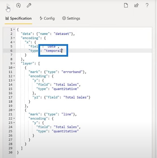
Here’s the resulting base visual for Deneb. You can see there’s a lot of similarities between the two. There are a few differences, such as the X axis being displayed numerically in the Deneb visual.
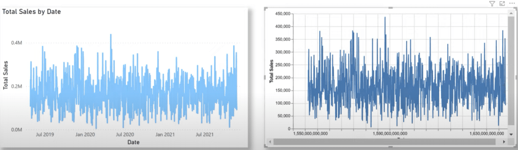
There’s something we can do to easily fix that. Let’s just flip over to Deneb and change the encoding for the X date into temporal.
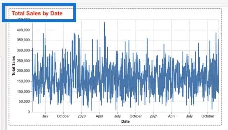
The second difference is the title. Let’s add a title to the Deneb visual. We’ll edit the code one more time, add the title block, and format the JSON.
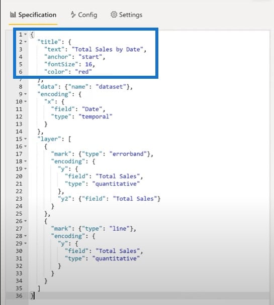
And here’s our title. We have full control over the title’s font, size, color, etc.
Crafting An Area Chart With Deneb
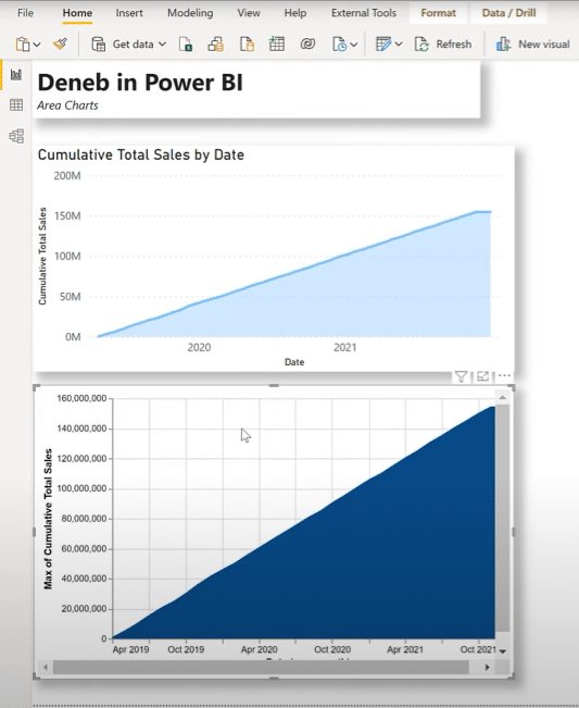
Let’s try an area chart as well. I’ve added a standard Power BI area chart showing Cumulative Total Sales by Date.
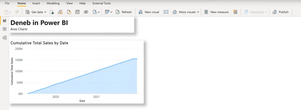
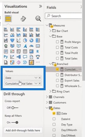
Now let’s build something similar using Deneb Vega-Lite. Let’s put in the Deneb visual, then add in the Date and Cumulative Total Sales measures.
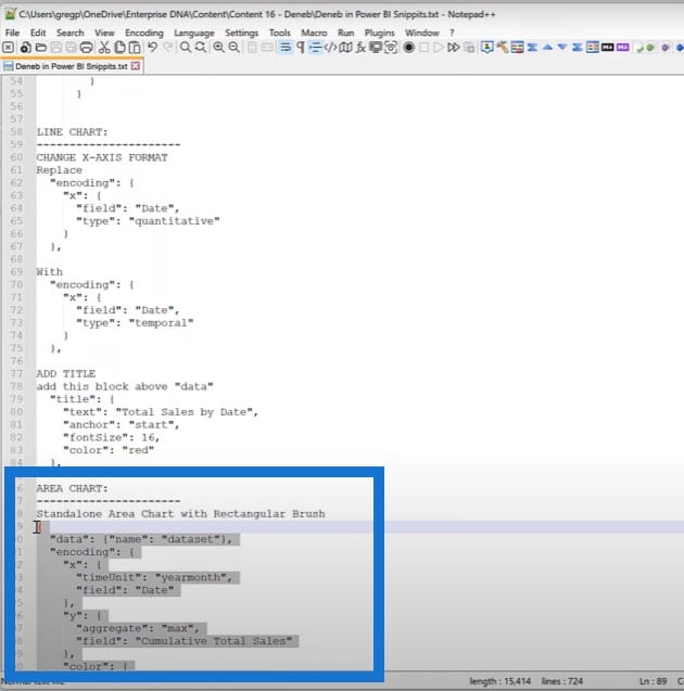
Let’s get the code block for a standalone area chart, and apply it.
The area chart at the bottom is the result.
One of the additional features of Vega-Lite is that you can use brushes. That’s the word they use for selecting a particular interval on your chart.
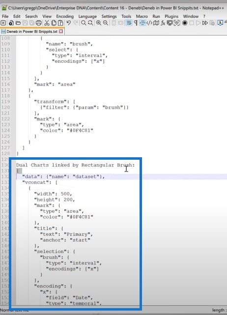
One of the things that’s really cool is you can use brushes on linked visuals. Let’s make a new Deneb visual, add the same data Of Date and Cumulative Sales. Click Edit on the visual, and choose Empty Specification.
Copy the code for dual charts linked by rectangular brush. Then paste and run the code.
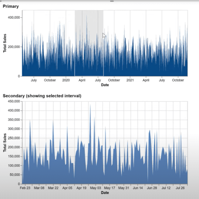
We now have our primary visual, where we can use a brush to display a selected interval from the first into our secondary visual.
Using An Overlapping Column Chart With Deneb
Here’s an example of something I’ve been looking for a while now. This is an overlapping column chart or column bullet chart that showcases a relationship between two values for the same category. I created this in Deneb as well.
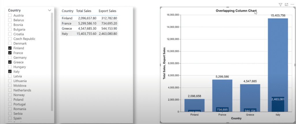
I added some code from Notepad++ to make the overlapping column visual.
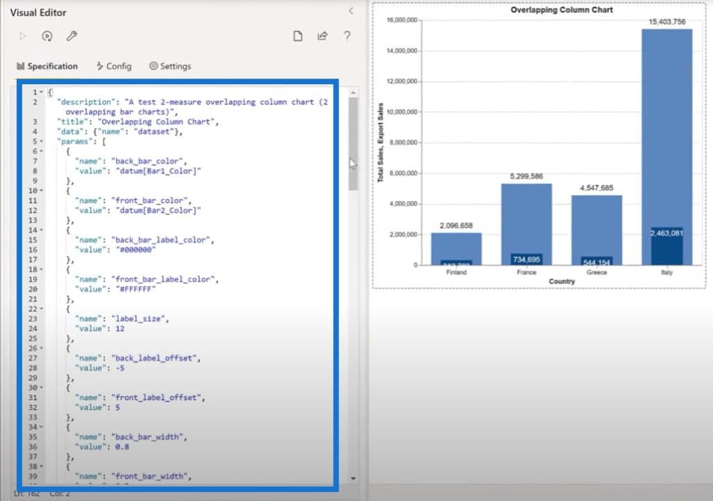
What we have here is a four-layer visual composed of four layers layered on top of each other: one for the back column, one for the front column, one for the back label and one for the front label. We can see that the chart responds with the selections that are made in Power BI, and adjusts accordingly as well.
Producing A Ring Chart With Deneb
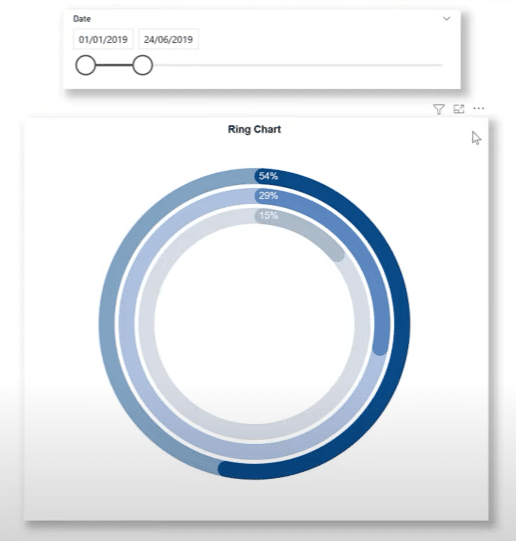
Another thing that I’ve been looking for a while now is a ring chart that is similar to the activity rings on an Apple watch. I did create something like this for the Enterprise DNA Challenge #8 using Python, but it wasn’t as good as I would like it to be.
I tried to do the same thing in Deneb and was very successful with it. In this Deneb visual, we have a nine-layer visual where we’ve added separate measures for rings 1, 2, and 3, values for rings 1, 2, and 3, colors for rings 1, 2, and 3, and categories for rings 1, 2, and 3.

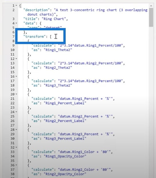
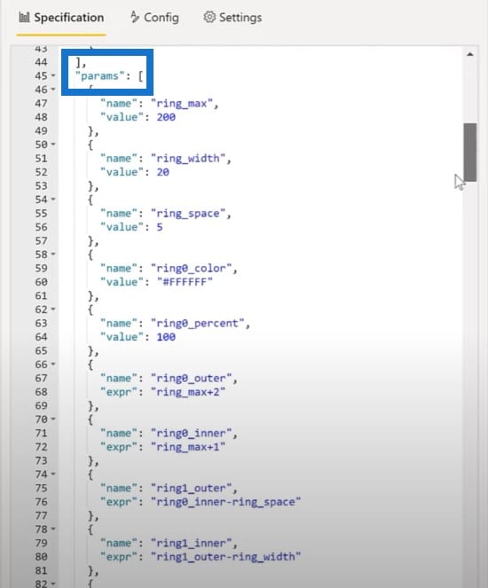
Let’s just have a look at the code I used here. It uses a concept in Vega-Lite called Transform and Params to extend the data that is made available to the various marks. Then I’ve layered nine marks on top of each other using the same axis to create the ring chart. This is fully interactive with Power BI tooltips.
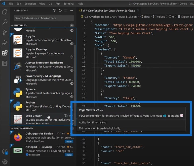
Another thing of interest is that you can use Visual Studio Code to develop your Vega-Lite visuals. First, you’ll need an extension to view the Vega-Lite code. I’m currently using the Vega Viewer extension.
Then you need to set up a tech file with the extension vl.json. Just right-click on the code to preview Vega Graph.
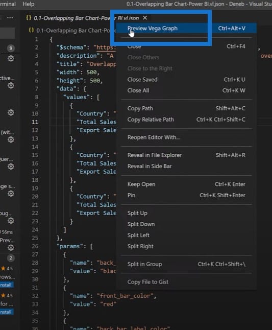
Since the Vega-Lite visual is a full code experience, I actually find the Visual Studio Code environment very useful in my development.
***** Related Links *****
Custom Theming In Power BI
Different Bar Charts In Power BI To Elevate Your Reports
Power BI Desktop Update: The Charticulator Visual
Conclusion
I hope you find this tutorial illuminating, and that it will make you explore the possibilities of using Deneb and Vega-Lite to develop visualizations beyond what is currently available in Power BI.
If you enjoyed the custom visual for Power BI content covered in this particular tutorial, please don’t forget to subscribe to the Enterprise DNA TV channel.
We have a huge amount of content coming out all the time from myself and a range of content creators, all dedicated to improving the way that you use Power BI and the Power Platform.
Greg


