In this tutorial, we’re going to talk about input elements and how to maximize their use in Power Apps.
There is a huge number of input elements you can use to display the data you’re working with while enhancing the overall experience of the app’s end user. What makes input elements different from the rest of the elements is the fact that they allow users to input something into the app.
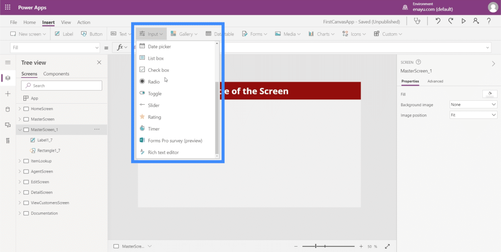
One example is the check box, where users can tick and untick the box to show that they are opting in or are choosing the option that the box represents. Another is the radio button which does the same thing, but would normally require at least two options.
We’re going to go walk through some of the most common inputs that we often see in apps. Since there are so many inputs available, you can check the Microsoft Power Apps docs to learn more specific information about the ones that we won’t be discussing here.
Combo Box
Combo boxes are input elements that present a list of items. This makes them very similar to drop downs. The big difference is that aside from presenting a list, combo boxes also allow you to do a search. It has a search box on top that lets users type anything in.
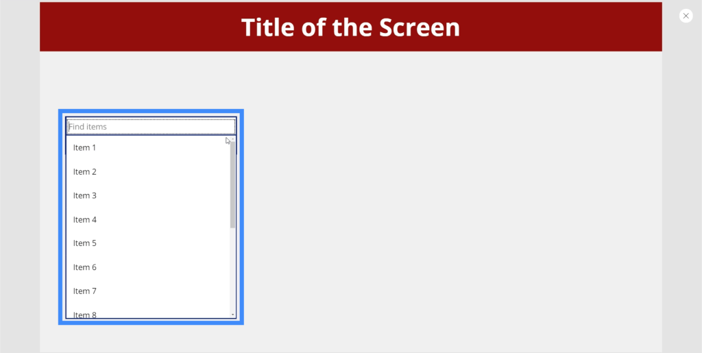
So if we type in 1 for example, it filters the entire list and shows the matching results.
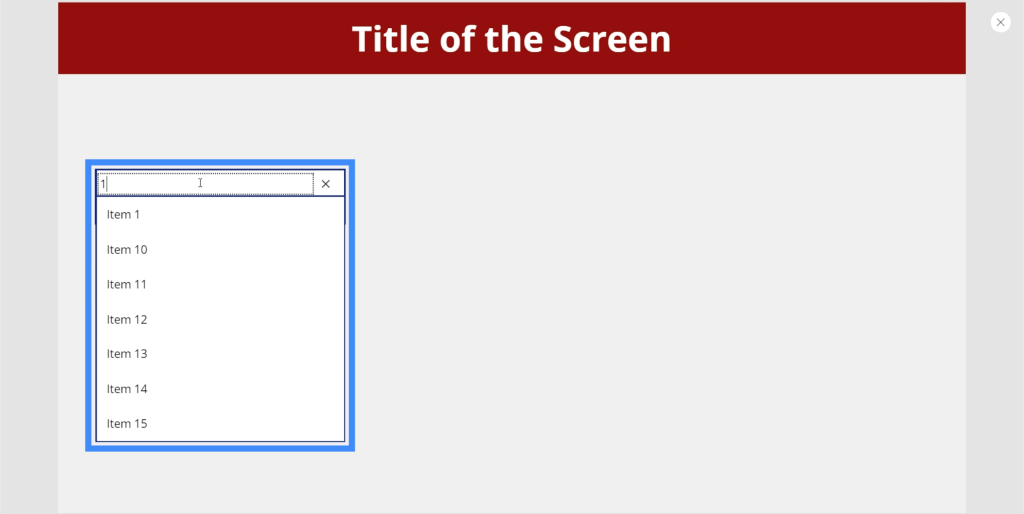
This makes it easy for users to find what they’re looking for especially if there is a long list of items to go through.
Right now, the combo box is showing the default choices built into Power Apps. But we can add a data source through the right pane and choose a specific column that Power Apps will extract the list from. For this example, let’s use Location.
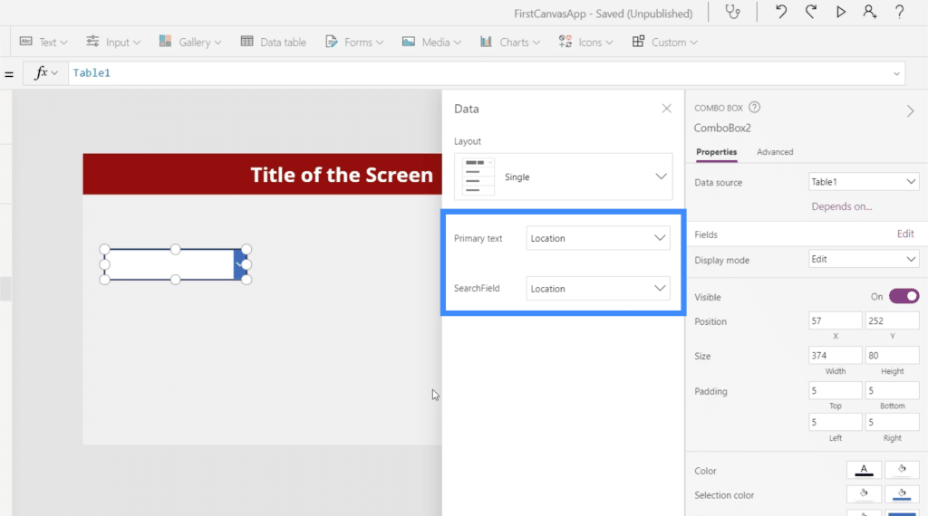
Now, the list shows the different locations from our data source.
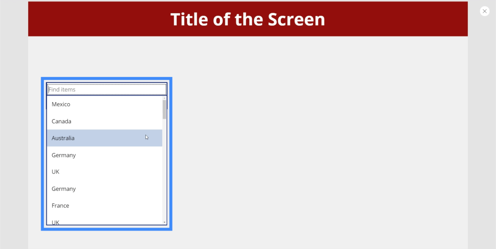
We can type in Canada and the box will automatically filter out the matches.
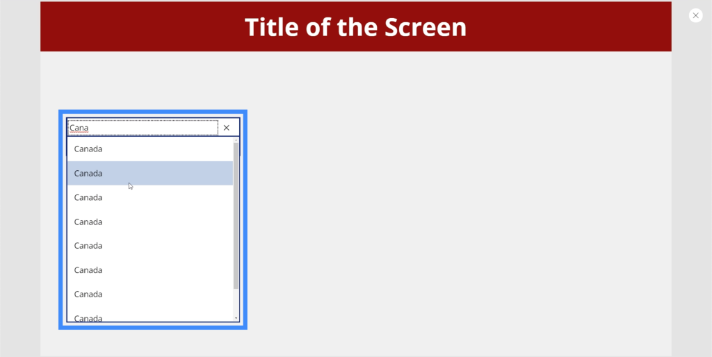
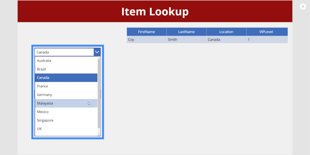
At the moment, it shows multiple results for the same location. That’s because lists with multiple entries of the same item need to use the Distinct function to remove any duplicates. Then, we have to follow it up with the SortByColumn function to sort the list alphabetically. We talked about these functions in a tutorial about cascading dropdowns.
Date Picker
Date pickers are commonly used in apps that require users to choose a specific date.
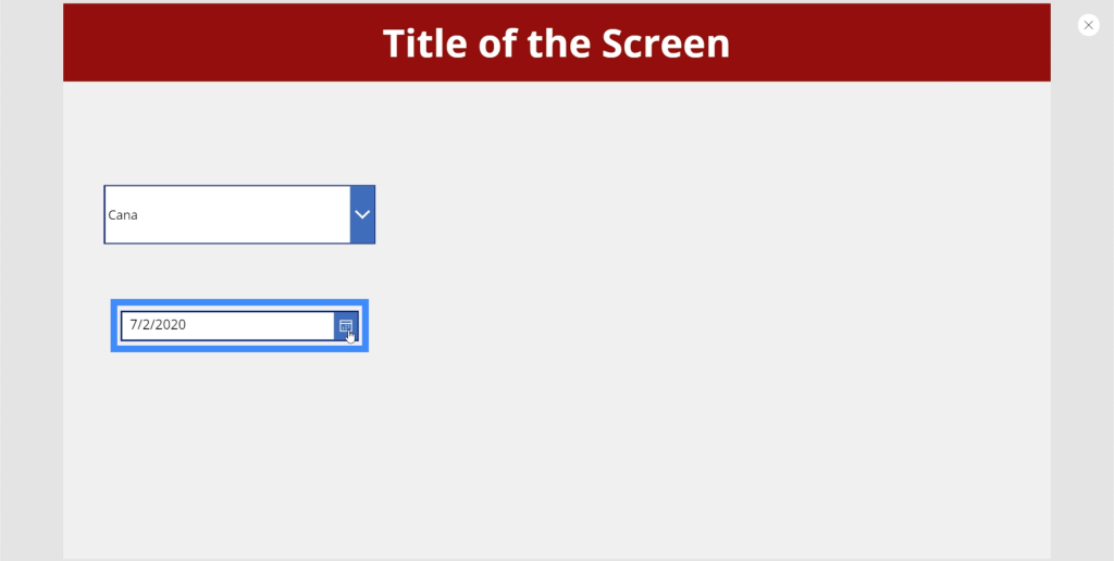
The great thing about date pickers within Microsoft platforms like this is that it allows users to click on an actual calendar to choose the right date.
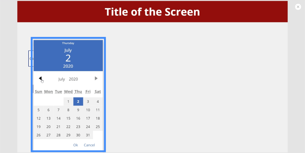
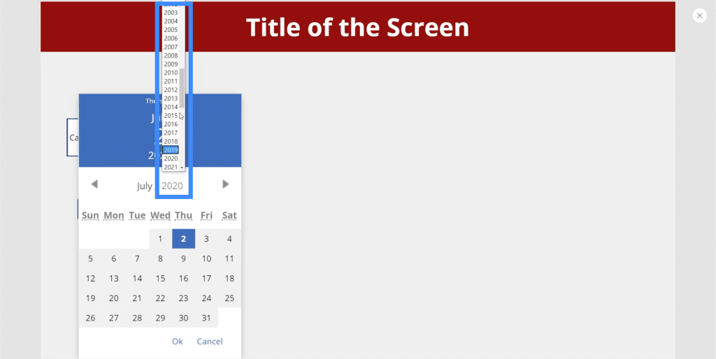
To choose the year, users could simply click on the default year showing up on the screen and choose from the list.
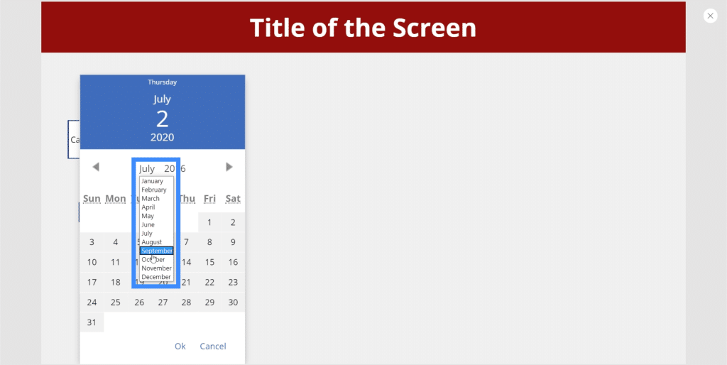
The same thing can be done to choose the month.
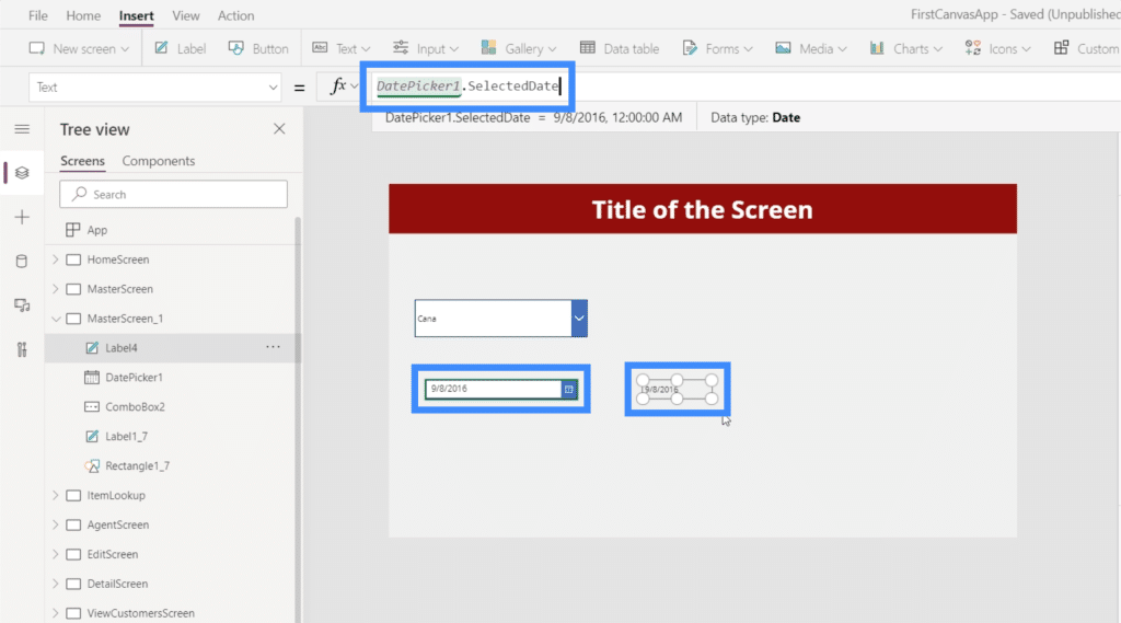
We can also add a label here, then change the text on the label to DatePicker1.SelectedDate. The label will display whatever date the user chooses from the date picker.
List Box
The list box is also very similar to a drop down, but in this case, you can select from a short list of items displayed on the screen. This means that there is no need to scroll up or down to see the entire list.
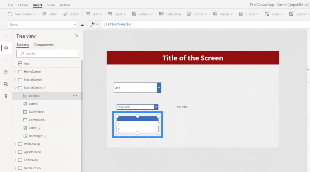
A list box also allows you to select multiple items on the list.
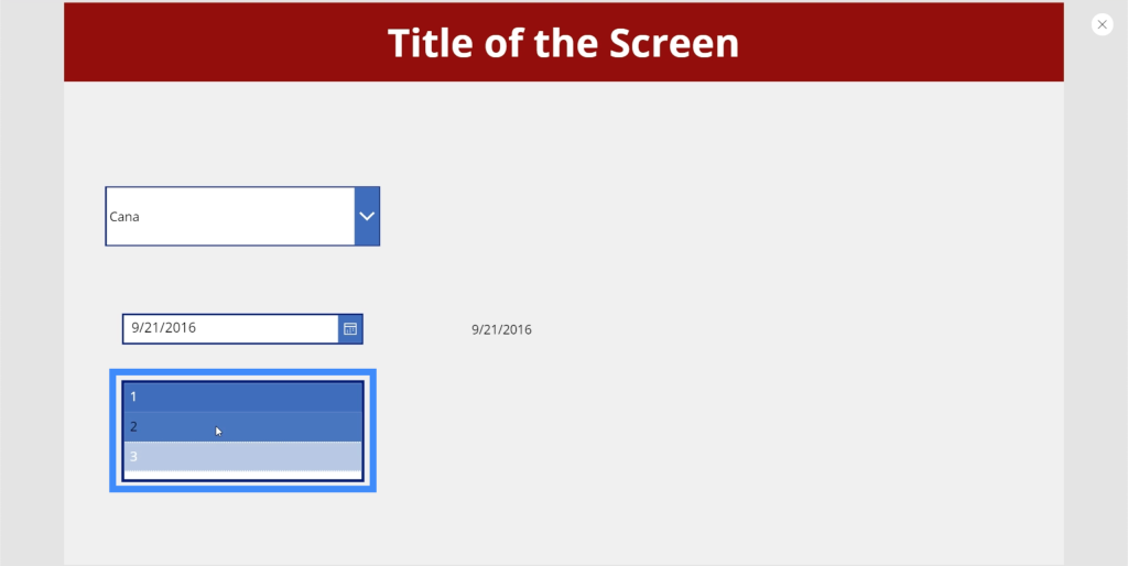
Think of it as a collection of items where you can choose whatever is applicable to whatever you’re trying to do on the specific slide.
Toggle
The toggle input is another useful element you could use in your app. You see this in a lot of applications that allow you to turn an option on or off. Normally, the toggle is highlighted or colored when you turn it on.
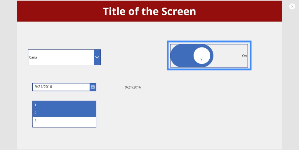
Then, it turns grey when you toggle it off.
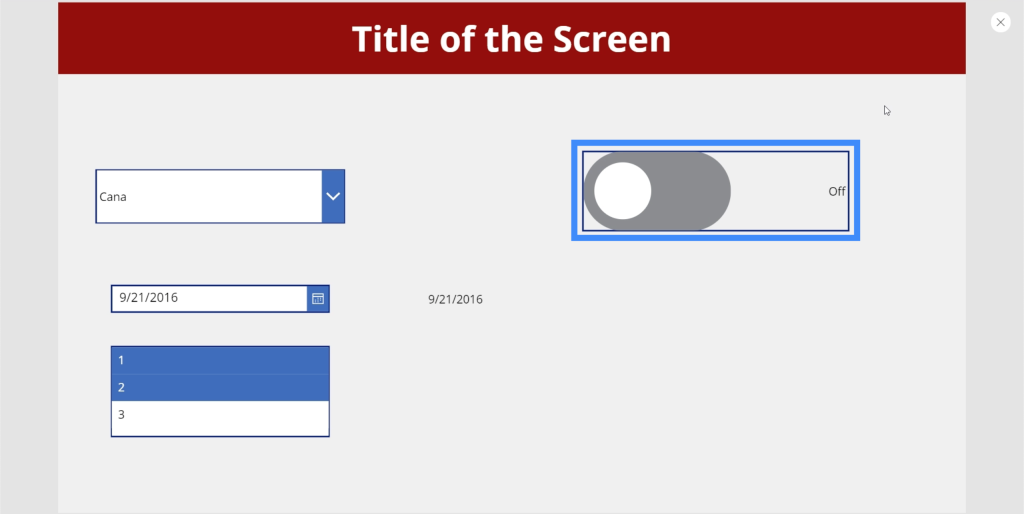
The great thing about toggles is that you can change the text so that you can make it more applicable to whatever you want the user to do on this part of the app. For example, if you want to change the label for the “Off” option, you can simply go to the toggle’s FalseText property.
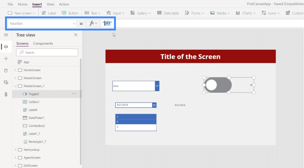
Then, you can change it into the text you want to use, like “Hide Label”.
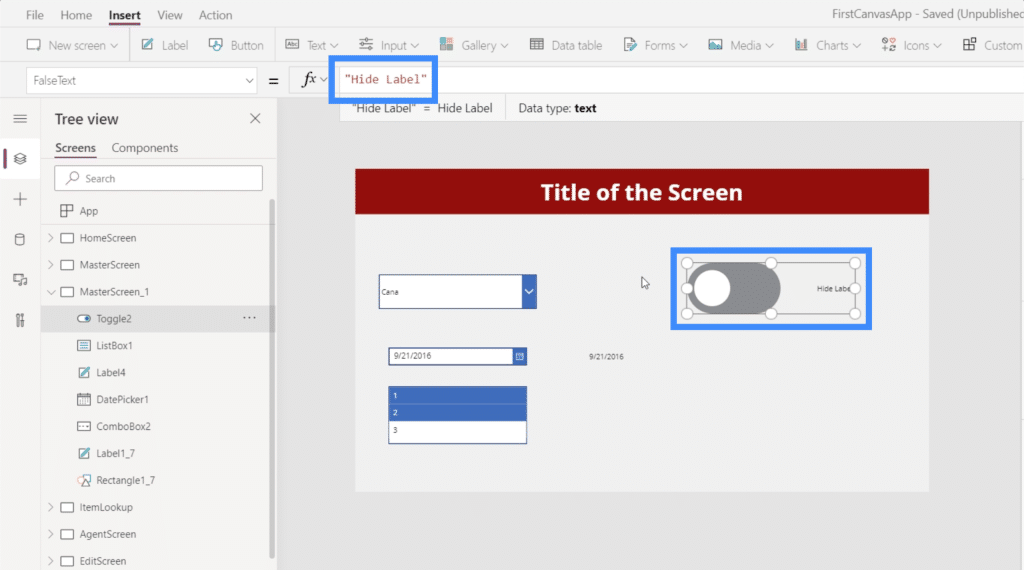
Then, you can go to TrueText and make it “Show Label” so that it reflects the option opposite to when the switch is toggled off.

You can also change other properties. For instance, the color of the toggle can also be changed to something else.
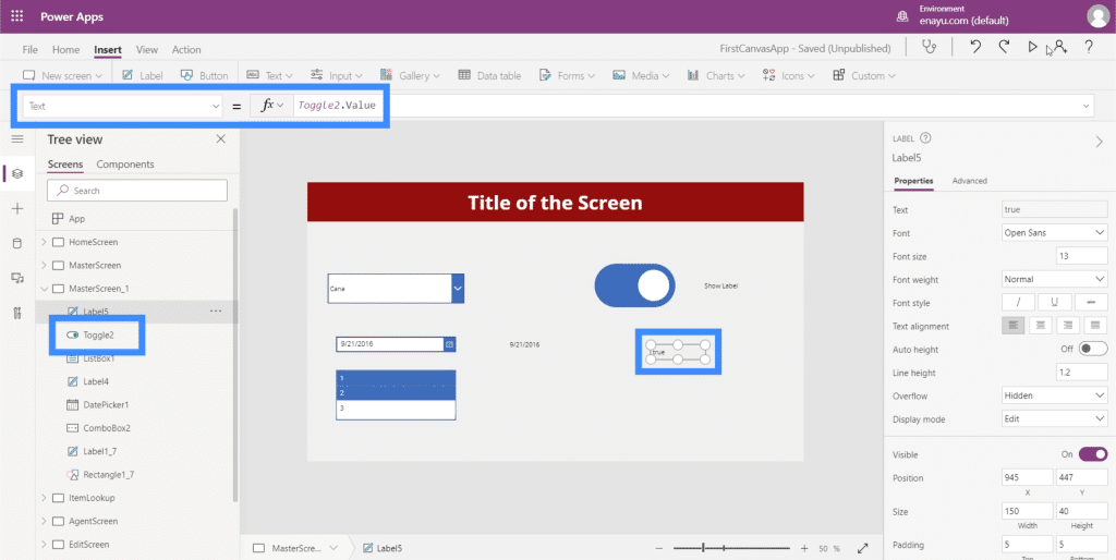
We can also extract the value coming from the table the same way we did with the date picker earlier. We just need to add a label and change the text to Toggle2.Value. In this case, we’re using Toggle2 because it corresponds to the specific element we’re using. This could change if you have other toggles in the app.
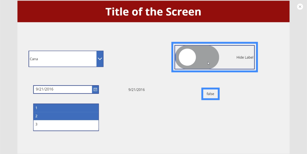
Since the toggle has a True or False value, our label shows True when the element is toggled on.
Then, the label shows False if we turn the toggle off.
Sliders
Next, let’s talk about sliders. Sliders are a common element in apps that use numeric values.
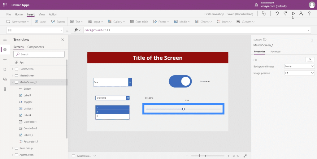
Users can choose a specific number from a range of values given by sliding the switch to the left or to the right.
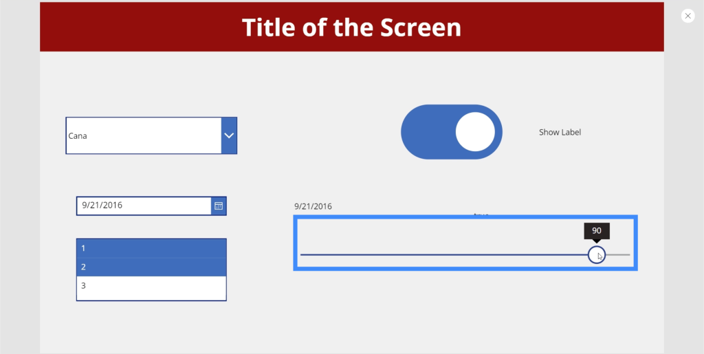
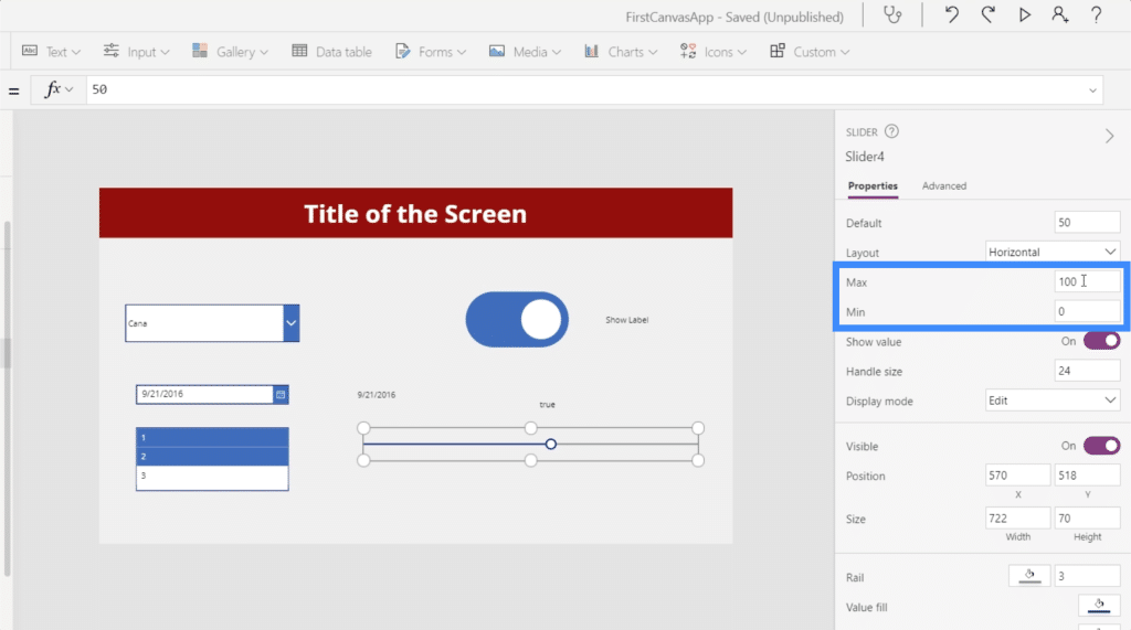
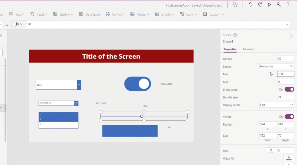
It’s possible to set the minimum and maximum value on the Properties pane on the right. Right now, the slider allows users to choose between 0 and 100. You can set it to 200, for example, if you want users to be able to choose a value over a hundred but less than 200.
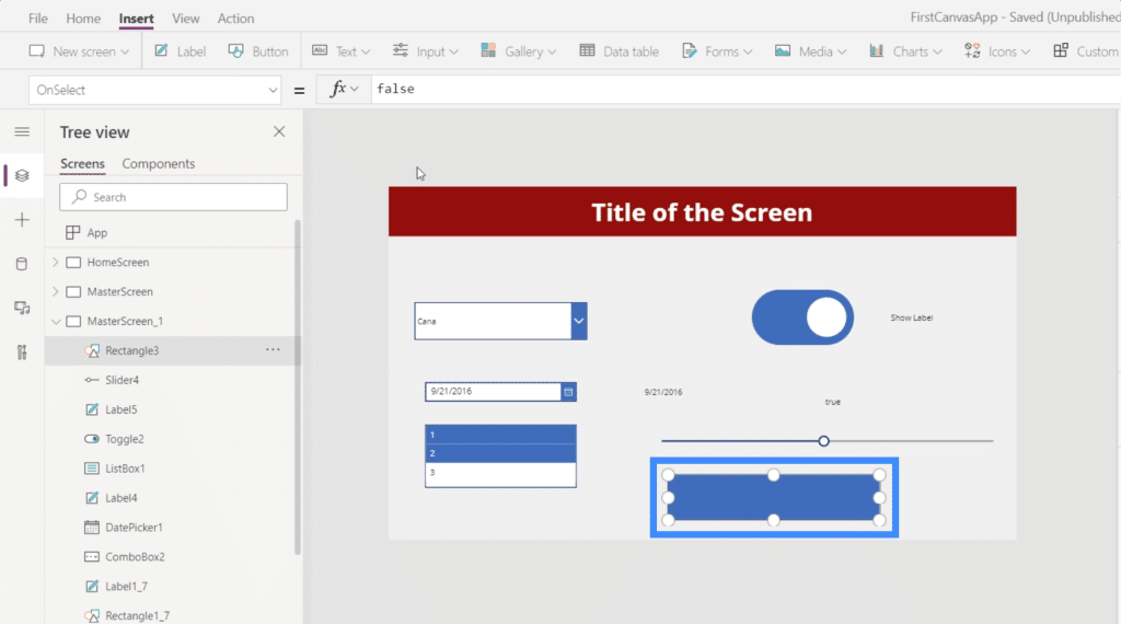
Let’s see how we can further maximize the use of this slider by adding a rectangle icon.
Let’s also add a label here.
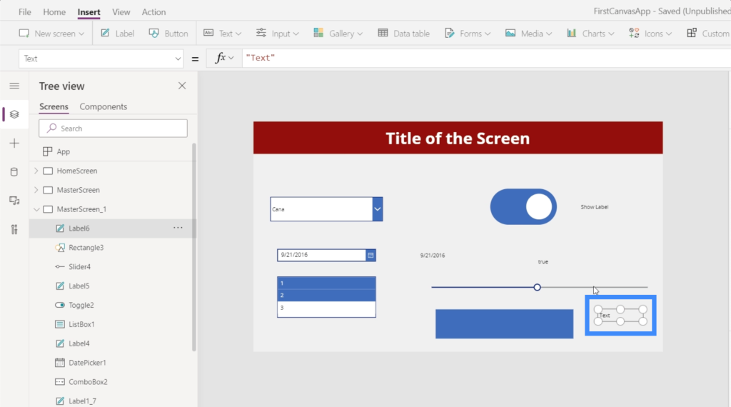
Before we connect those elements, let’s make sure we have the right element name. In this case, we’re working with Slider4.
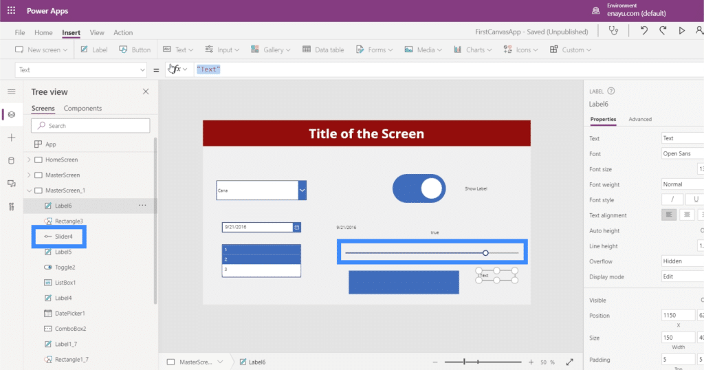
So let’s change the text on our label and make it Slider4.Value.
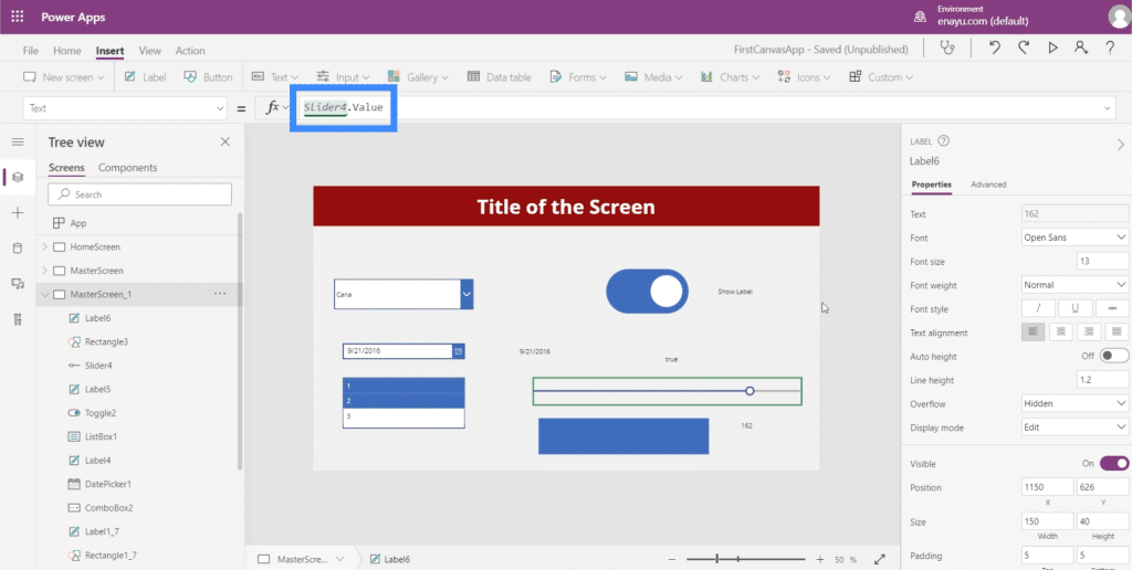
This will make the label display the value that we choose on the slider.
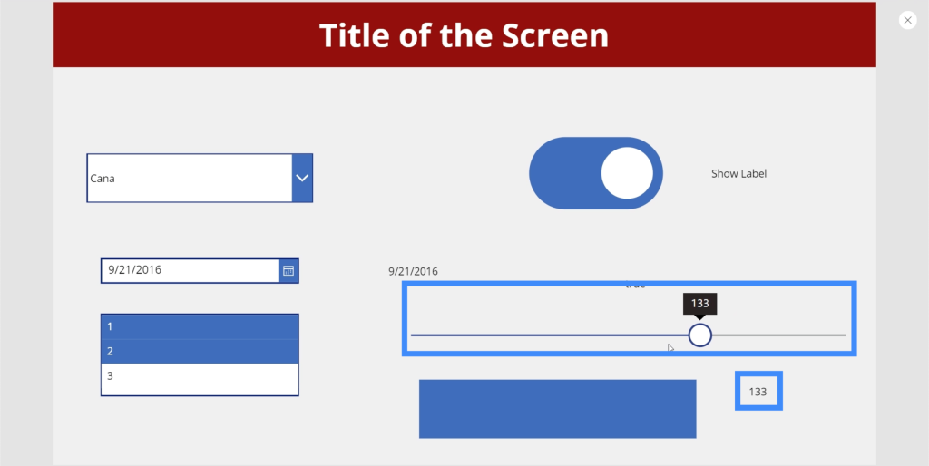
Now, let’s do something cool with the rectangle icon we added earlier. Let’s see how we can make the opacity of the rectangle dependent on the value chosen on the slider.
First, we’ll set the maximum value back to 100.
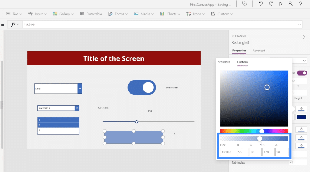
The brightness or opacity level can be found here in the Custom tab in the fill property on the right pane. The goal here is to match the fill’s opacity value to the opacity of the rectangle icon. The opacity can be seen on the last box to the right, which now shows 58. We’re going to allow the user to choose this value using the slider.
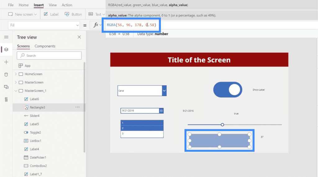
So let’s highlight the rectangle icon and go to the Fill property. Note that the final value showing up is 0.58, which is our fill opacity.
We will then change the final value in the series to Slider4.Value.
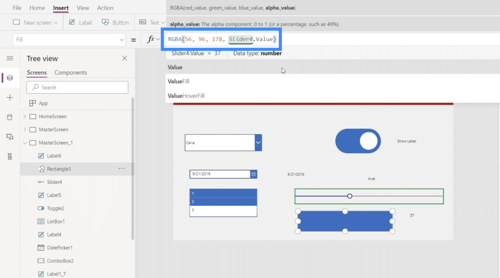
Since the opacity value is now a decimal at 0.58, we need to divide it by a hundred to make it a number between 0 and 100.
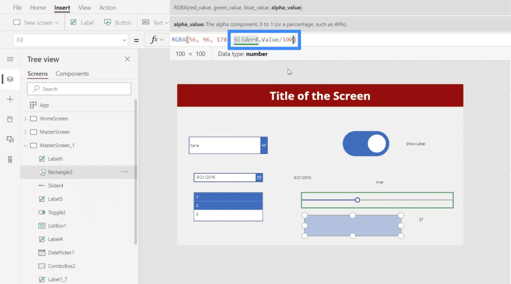
Once that formula’s complete, we can now control how bright the box will look like using the slider. For example, we can slide it down to 4 and you’ll see that the rectangle has almost disappeared.
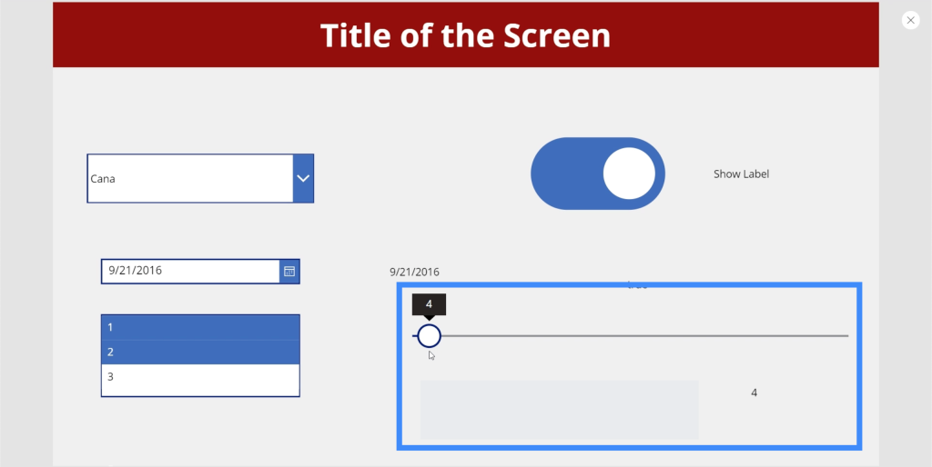
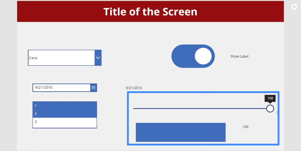
But if we move the slider to 100, you’ll see the rectangle’s maximum brightness.
Rating
Now, let’s talk about rating. We commonly see this in business apps, pages, or sites that allow users, clients, and customers to rate the services and products provided.
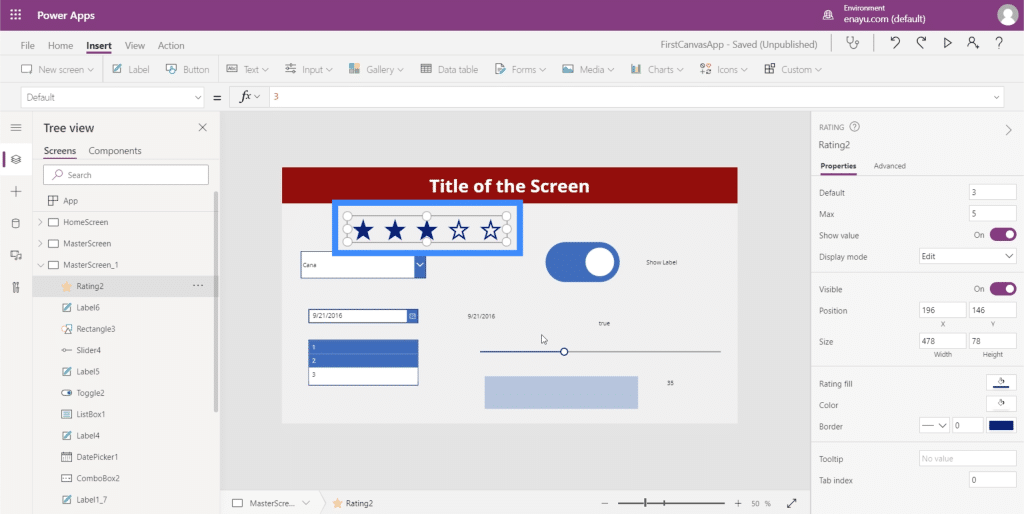
Ratings are almost the same as sliders knowing that they both allow users to pick a specific value. The key difference is the visual format.
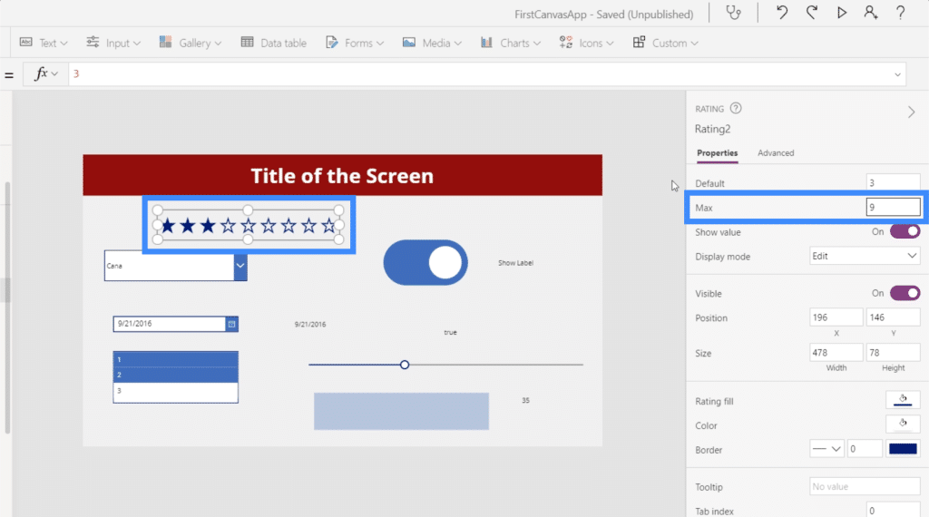
It’s also possible to change the maximum value that a user can choose through the Properties pane on the right. We can make the Max value 9, for example, and we’ll see the number of stars increase as well.
Like the other elements we’ve worked with, we can also get the value from the rating and display it in the form of a label. Before we get started on that label, let’s remember that the rating element we’re going to use is Rating2.
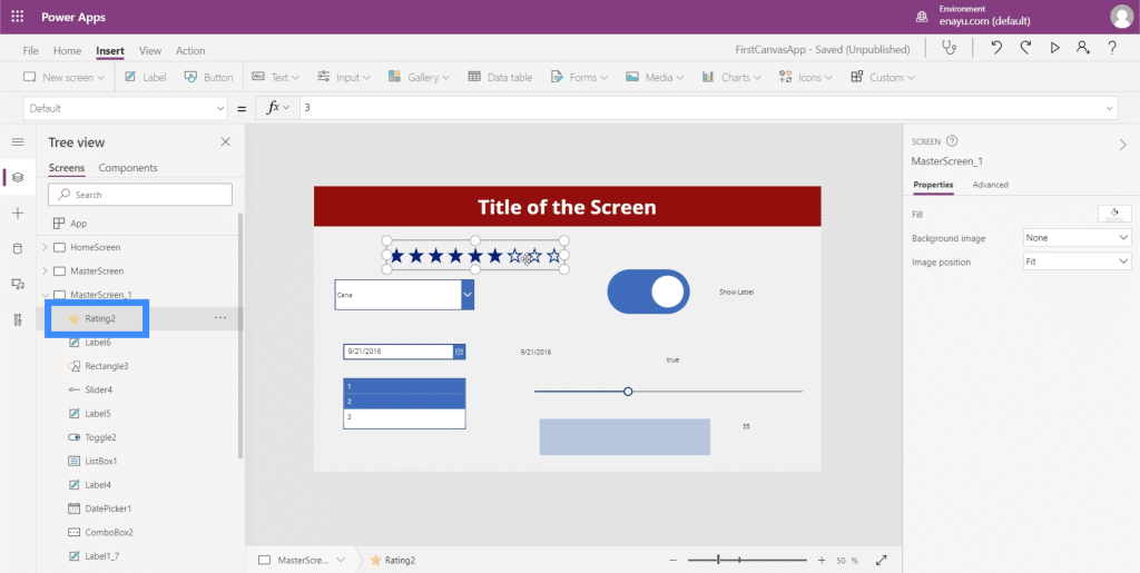
So just like what we did earlier, let’s add a label and change the test value to Rating2.Value.
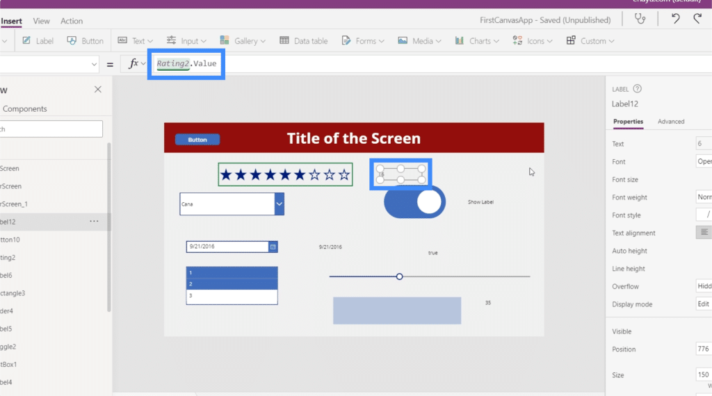
Now, the label shows the numerical value of whatever the user chooses in the rating.
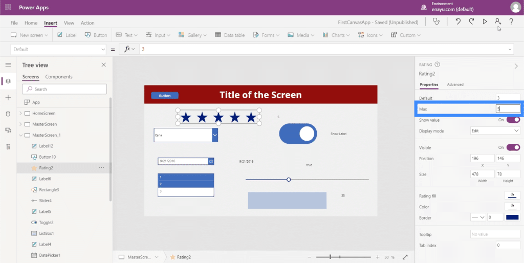
This can be very useful for apps like the one we’ve been developing in these tutorials. Since our data source has a column for VIP level, for example, we could use the rating element since our VIP level goes anywhere from 1 to 5. This could be more fun for users compared to a drop down or slider.
Timer
The last of the different input elements that we’re going to talk about in this tutorial is the timer input.
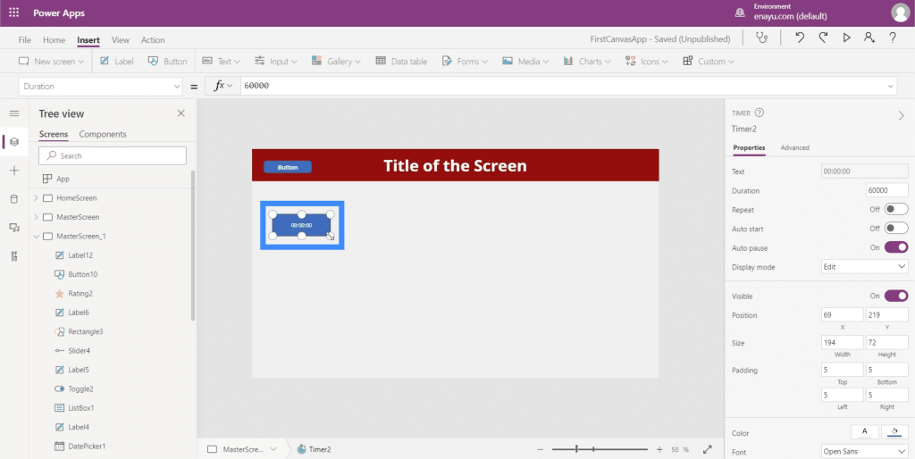
Aside from allowing end users to time something, a timer allows you to execute an action or a piece of code every x number of seconds. According to Power Apps, the timer “controls how your app responds after a specific amount of time passes.
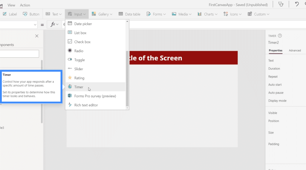
We’ve seen this applied in many different ways. For example, a user who has been on a new form screen for 30 seconds or more might see a popup containing some helpful information that could speed up the process for them. A timer is used to trigger this feature.
Let’s take a look at how timers work and explore a few applications.
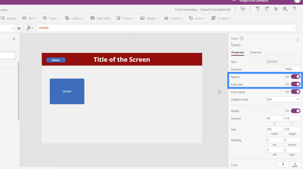
On the right properties pane, you can control the duration of the timer. Note that this is displayed in milliseconds, so the 60000 here is actually equivalent to 60 seconds.
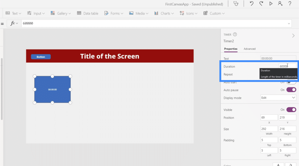
Let’s change it to 10 seconds, which means that we’re going to type in 10000.
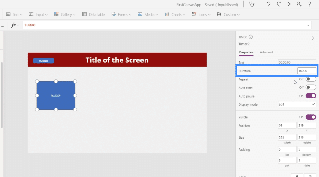
We’ll also set the timer to be on Repeat, which means that it will automatically restart the timer the moment it reaches 10 seconds. Let’s also turn on the Autostart so that the timer starts the moment the screen loads.
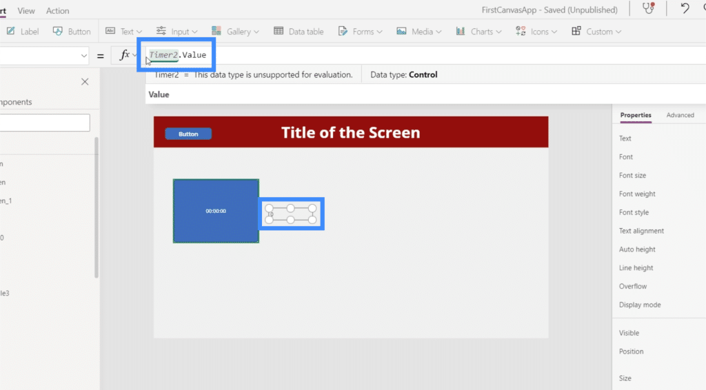
Now, let’s do some cool applications. First, let’s take the value of the timer and have it show up in a label. So let’s add a label and change the text to Timer2.Value.
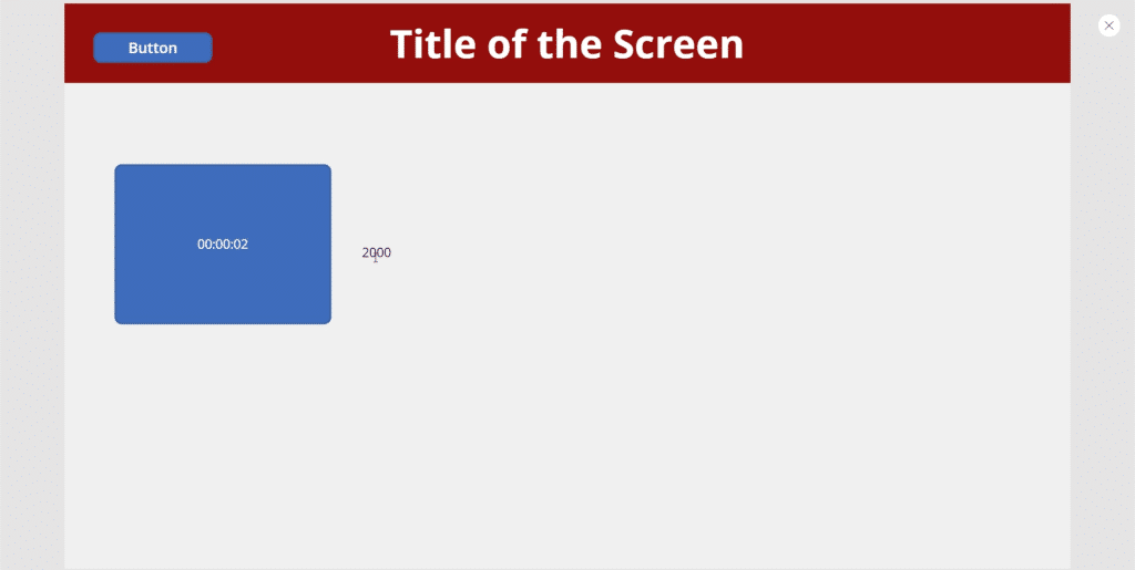
Remember that the value is in milliseconds, that’s why although the timer is showing 2 seconds, the label is showing 2000.
Let’s try to have an icon show up after 5 seconds. We’ll start by adding the search icon.
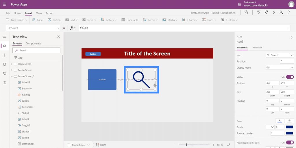
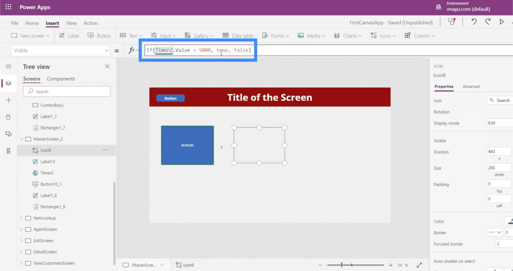
Then, we’ll set the Visible property of the icon to an IF statement that says if Timer2.Value is greater than 5000, then the icon should be visible. Otherwise, it should not be visible.
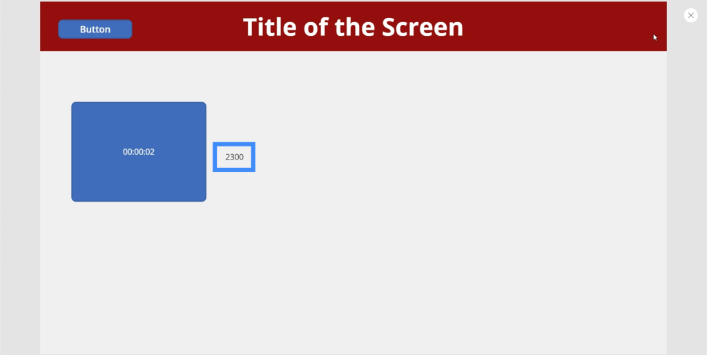
Now, let’s see if that works. Right now, the timer is at 2300 milliseconds. The icon is currently not visible.
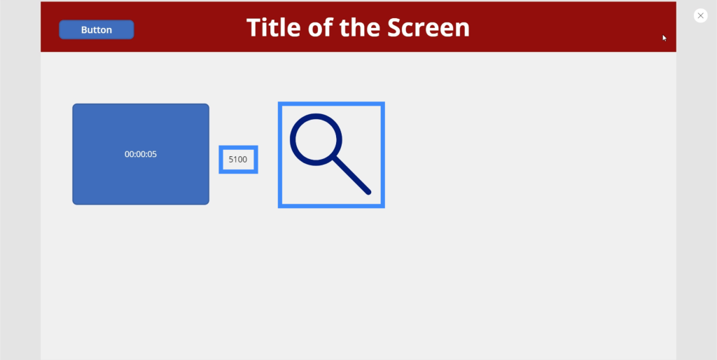
But after the timer hits the 5000 mark, the search icon appeared.
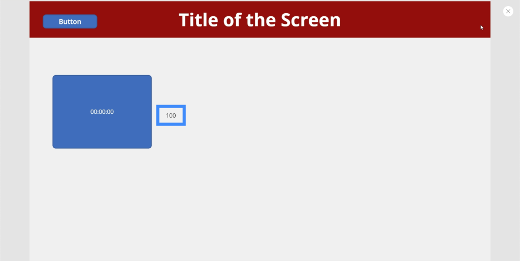
And since we’ve set the timer to go on repeat, the icon disappears again the moment the timer restarts.
Here’s another cool application. Let’s add a circle.
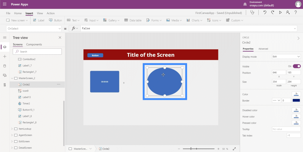
Then, we’ll let the circle’s color change based on the timer. This creates some really cool gradients as the timer runs.
Let’s go to the circle’s Fill property. Notice that the first number here is 56. We’ll edit the color of the circle based on the timer.
We can create some really cool gradients if we do this. For example, let’s go to the color or the fill.
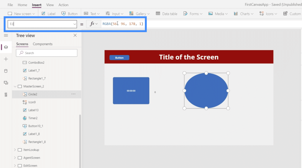
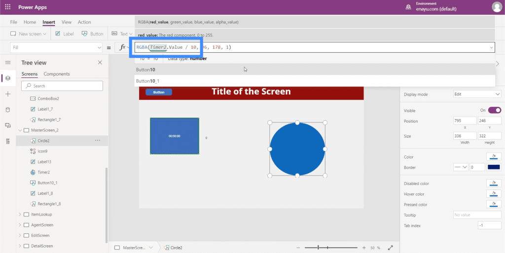
We’re going to change that number to Timer2.Value, then we’ll divide it by 100.
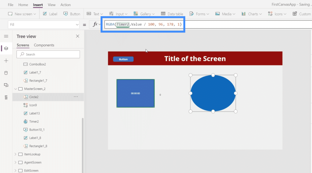
With that formula in place, the circle starts off as blue.
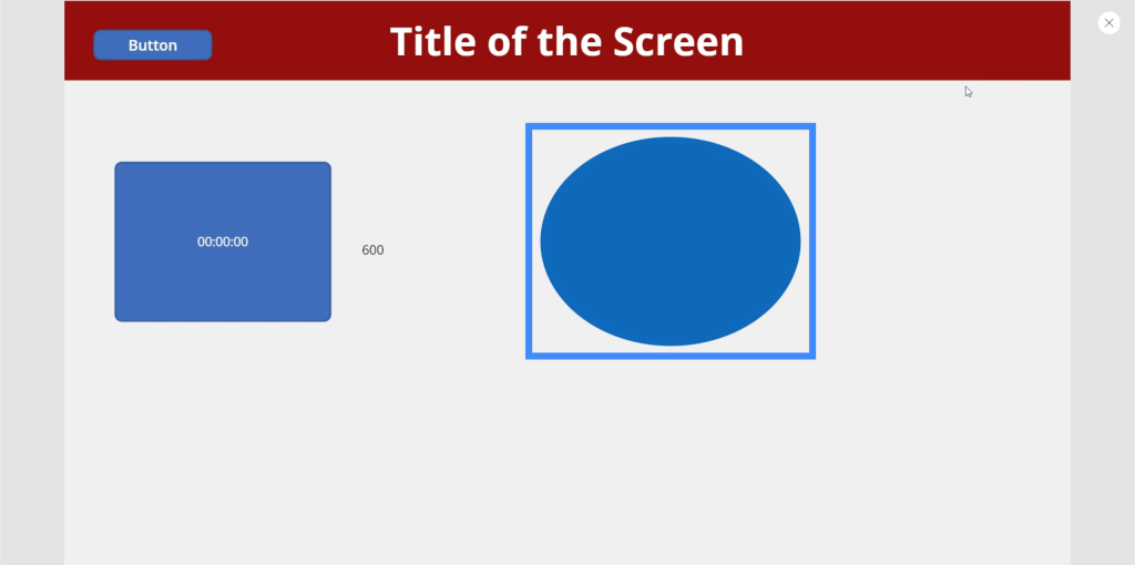
As the timer runs, it slowly changes color and ends up as purple when the timer reaches 10 seconds.
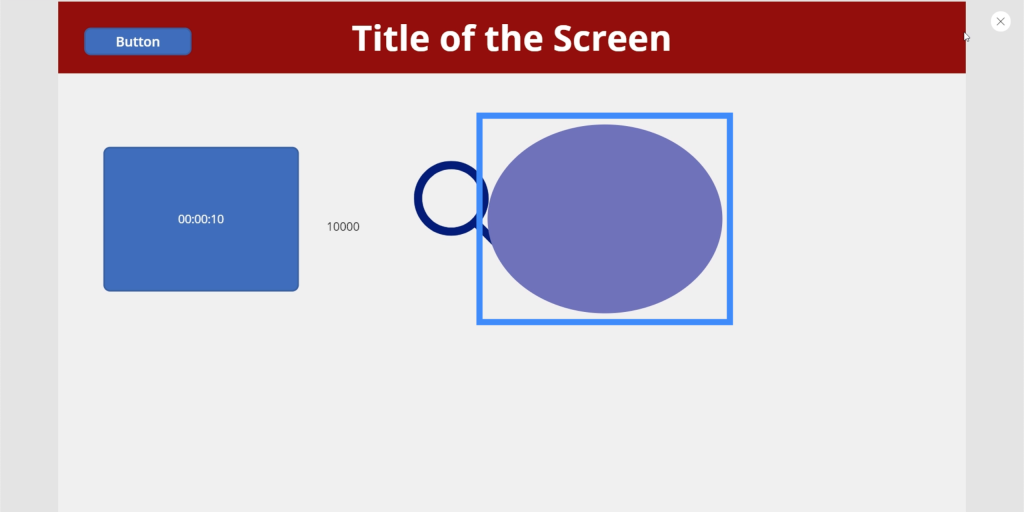
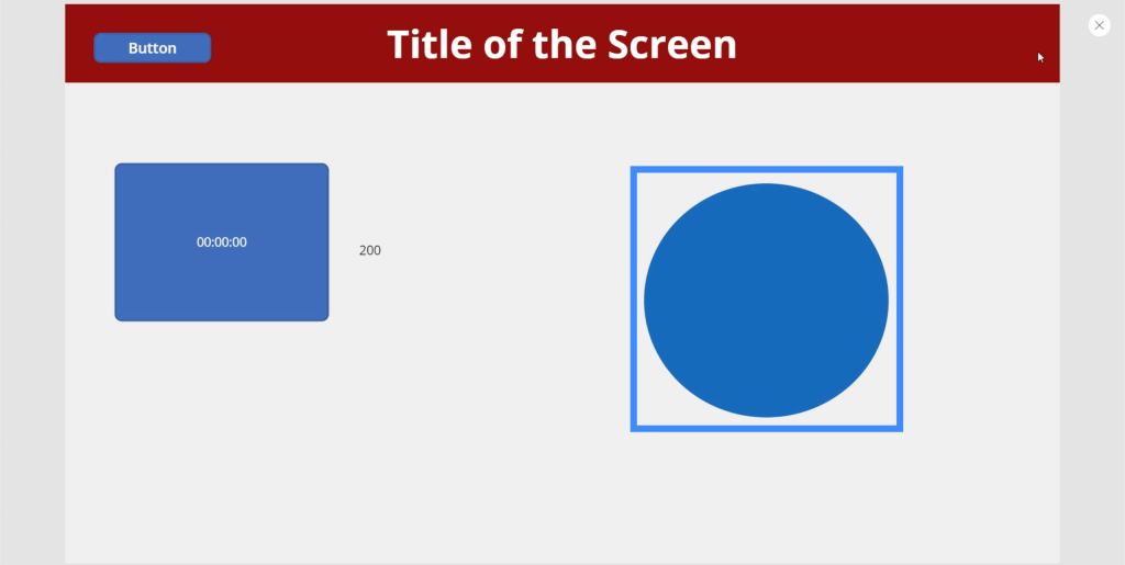
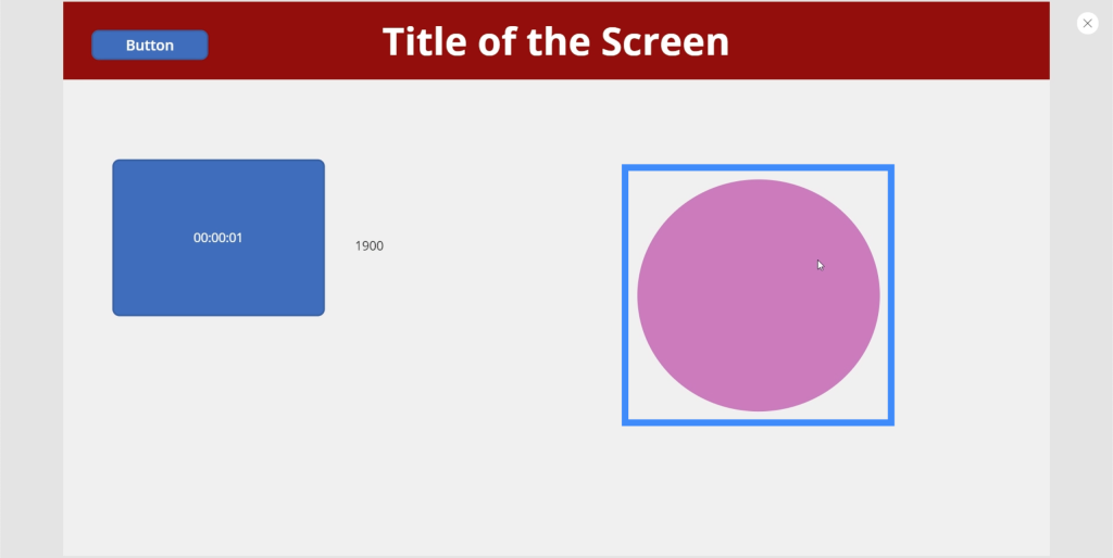
We can make the change faster and more pronounced if we change the number. So instead of dividing that first value by 100, let’s change that to 10.
Again, it starts off as blue.
Then, at just 1900 milliseconds, it has changed into a purplish hue.
And at 5600 milliseconds, it has become bright pink.
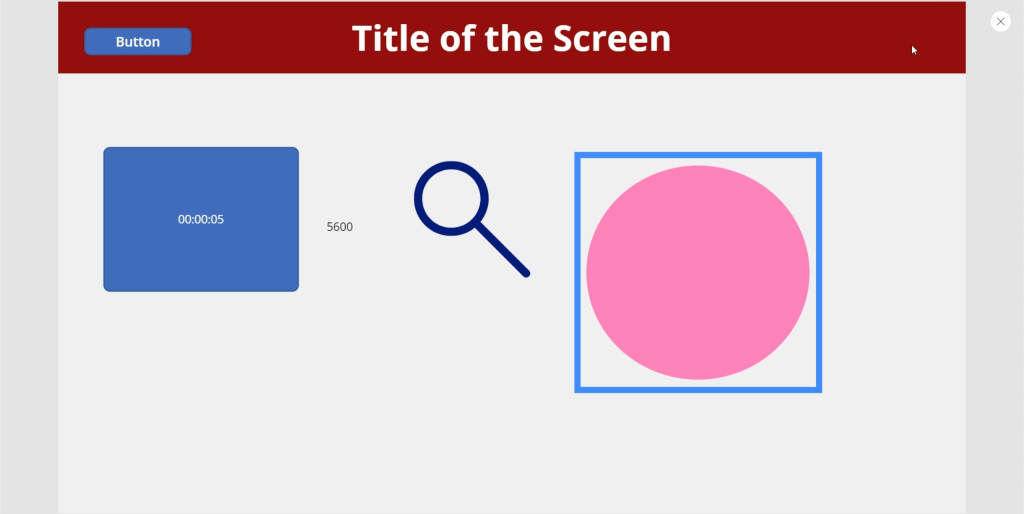
You can be as creative as you want with these settings. You can have the entire screen changing colors, for example. Or you may want something different to happen every 5 seconds.
It may not even be just for the sake of aesthetics. For example, you can have the app ask the user if they need more help the moment it seems like they’re taking too long on a single screen and lead them to a landing page, for example.
***** Related Links *****
Power Apps Introduction: Definition, Features, Functions And Importance
Power Apps Environments: Setting Up The App Elements Properly
PowerApps Functions and Formulas | An Introduction
Conclusion
Input elements are definitely useful no matter what kind of app you’re creating. Not only do they make your app look more professional, they also make the entire experience more convenient for users.
Something as simple as a slider or a combo box can help them narrow down huge amounts of data, and based on what we just did with our timer, you can create a more fun and engaging experience for them, too.
You can explore other kinds of elements aside from these input elements, such as media elements that allow users to use their phone camera or microphone. With these media and input elements working together in your app, you create a truly unique experience for your users.
All the best,
Henry


