In previous tutorials, you learned how to create a consumer goods sales dashboard from scratch in Power BI.
For this session, you’ll learn how to make the dashboard look better and more compelling.
Changing The Background Color
The first thing is changing the background color. A white background doesn’t make things stand out enough.
In your dashboards, putting some color in the background will make things pop out better. You can go for a dark or light background. If you go for a dark background, make sure to change all your visuals to lighter colors.
I’ll show you how this dashboard in Power BI will look like with each color variety.
Let’s start with a light color. I’m going to show you how you can put a dark color over it to make them stand out. Let’s use light gold for this example.
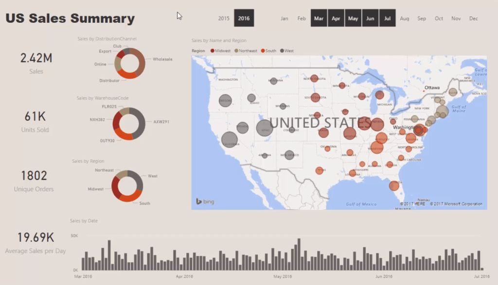
Placing Shapes To Emphasize Visuals
I’m going to create segments of all this information that relate to each other to draw the consumer’s eyes. I’ll change the fill color to something dark for all my key metrics. Then, I’ll adjust the transparency to show the cards.
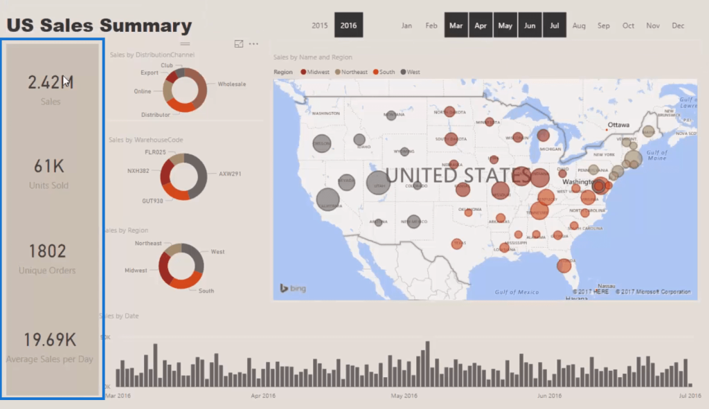
Make sure that the shape is pushed to the back. From there, I can copy and paste that shape and put it under the other visualizations.
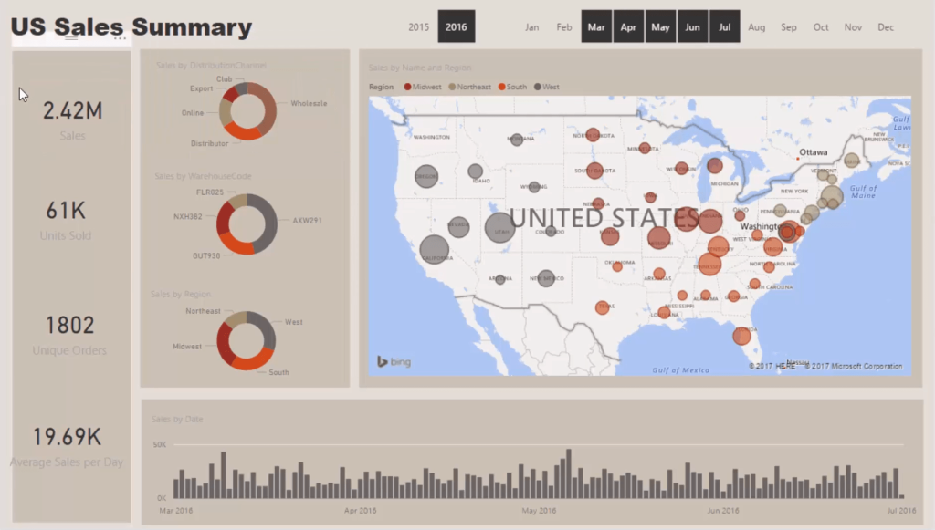
Visuals are very important in Power BI. If things aren’t aligned, they can detract a lot from what you’re trying to showcase. Make sure to always properly space all the boxes and shapes. Once you do that, the visualizations start to come together.
With this, a consumer can move to an area and see things that are of similar nature. That’s what you want with these types of visual implementations.
Adjusting The Size And Color Of Labels
Now, I’m going to clean up some other things. I want to change and alter the category label’s size and color for each visualization.
It’s only a matter of playing around and making sure that they align well with the others.
You want to make sure that there’s nothing to complain about on your report page. Everything must be seamless, intuitive, and easy to understand. Consistency is important in your dashboards.
With this, it’s easier to know where things should be and what exactly you’re looking at. You can see the titles, the legends, and the data labels around. You can also make the data labels darker and bigger depending on your preference.
Another thing to know is that all the titles get automatically made up by the naming conventions that you put into your reports. They can speed up the development of your work because these titles are automatically generated by the measures you create.
For instance, if you change this measure to Completed Sales, you’ll see that it automatically changes all the other titles. That’s an efficient way to change information for all your report visuals.
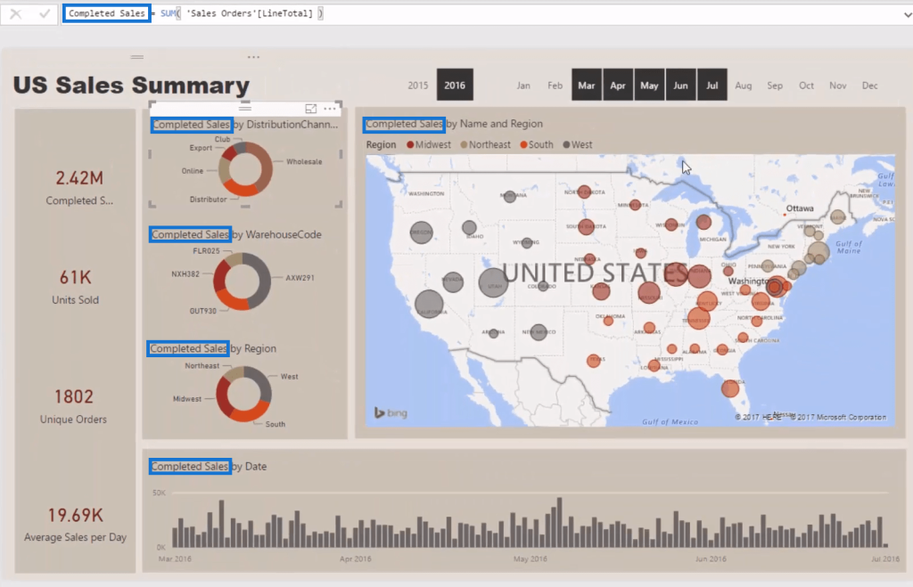
For the slicer, let’s change the background to a slightly darker color to make it stand out. This is simple yet effective.

Adding Icons And Infographics
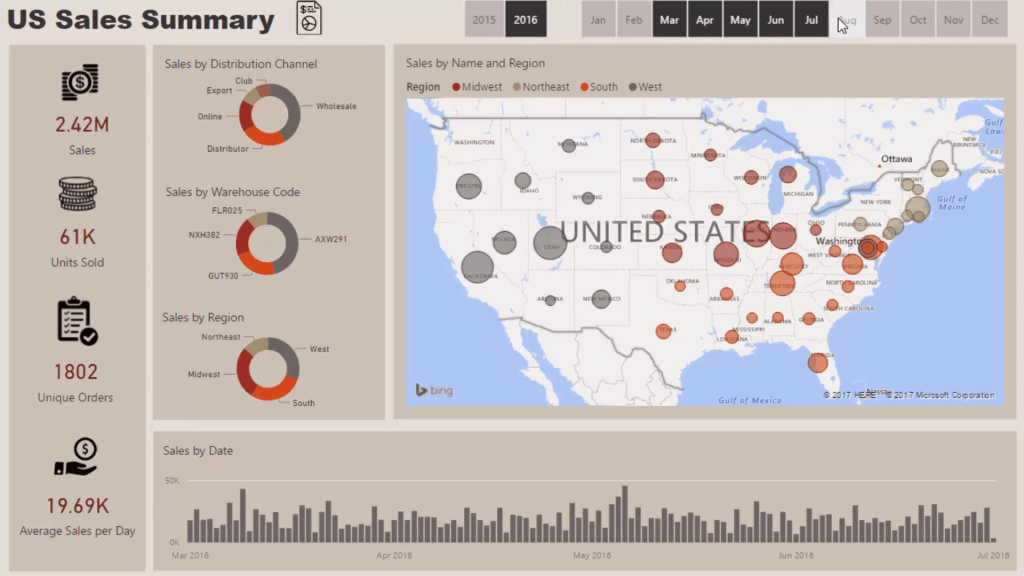
Then, I’m going to bring in icons. By adding icons and infographics, you can see a significant difference to the overall look and feel of your report. You can make it look professional and similar to a PowerPoint presentation. It’s will become interesting when you bring in good colors and graphics.
I’ve already got the icons ready. There’s a lot of these on the Internet that you can find download for free. These icons are not definite; they still depend on your personal preferences.
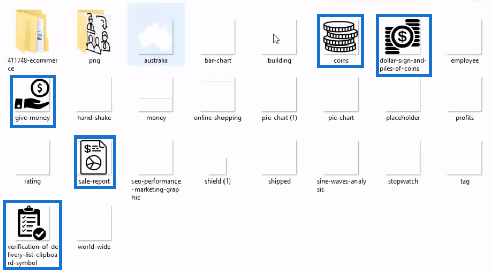
You have to find icons that are relevant to what you’re presenting because consumers are very image-based. It’s easier to look at an image than it is to read numbers and trying to figure out what it is. An image sticks in someone’s mind. So when you build your visuals, try to incorporate relevant icons to make your report look professional and compelling.
Changing The Color Theme Within Charts
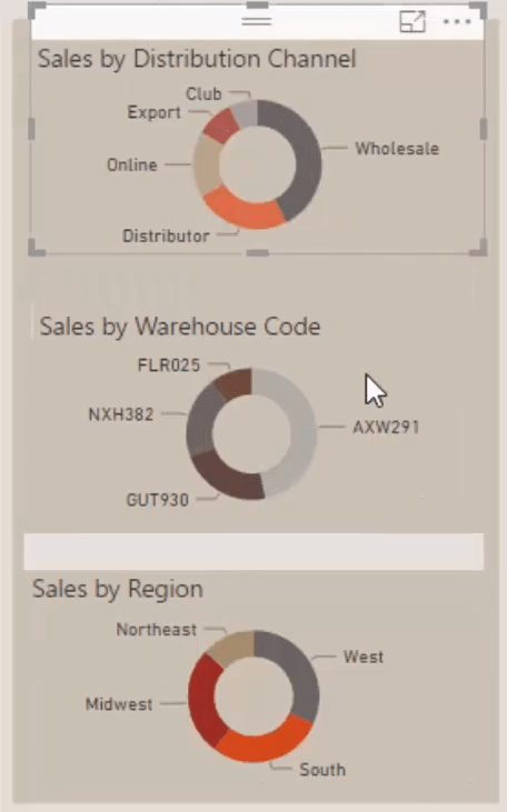
Let’s also change the colors in the pie chart. The colors are in line with the sales regions. There’s a solid color palette already incorporated in the model. I’m going to change a few of the colors to better understand what each represents.
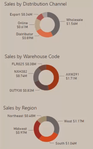
You can also expand on the pie chart’s data labels by bringing in the actual value. This produces additional insight, but you need to make sure that the units are in dollars.
Adding Tooltips In Visuals
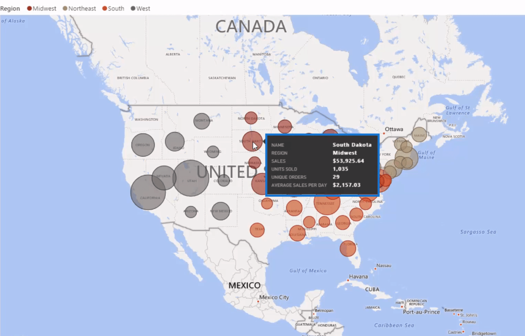
You can also add tooltips to boost the insights derived from a visualization. Drag the Key Measures in Tooltips. After that, select a specific time frame and hover it over a state in the map. You can now see all the insights for that state.
There’s one more additional feature that you need to utilize to make this dashboard complete.
Adjusting The Filter Feature
When you click on something within a visual, it filters out other tables, but it doesn’t do a full filter. That’s because you need to change the interactions between these visuals.
In the Format section change the interactions of every single visualization. You’ll be doing this a lot if you want a full filter.
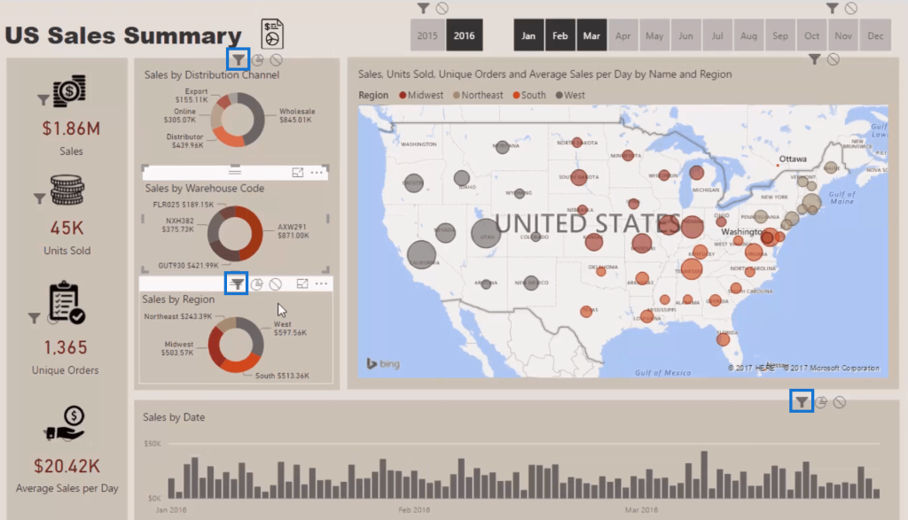
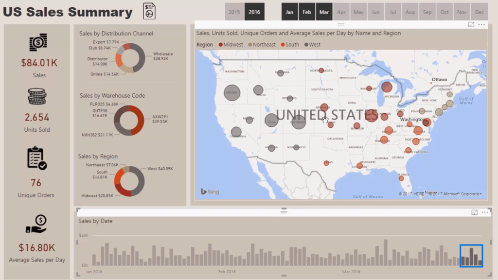
Go to the bar chart and select the last five days of this time period. If you go back to the dashboard, you’ll get insights from a daily perspective.
***** Related Links *****
Creating Compelling Power BI Dashboards With High Quality Insights
The Importance Of Creating Compelling Power BI Visualizations
Using Filter Fields & Visual Interactions To Create Compelling Visualizations In Power BI
Conclusion
In my view, this is a very good dashboard in Power BI. It showcases insights very well. It also has a number of different drilling capabilities. There are heaps of good insights that can be generated from this dashboard.
This is a great place to start when it comes to creating a dashboard in Power BI. It has not yet gone into DAX formula or data model building. You’re able to create a compelling report dashboard through aligning and following some basic best practice rules around how to implement visualizations within reports.
My biggest point with this example is you don’t need to go advanced. You don’t need things to be complex to create compelling reports in Power BI. It can be simple yet effective. Consumers will still love it.
You’ll always be able to find ways to implement some of these simple techniques into your own reporting.
All the best,
Sam


