So, you’ve spent countless hours analyzing data and crafting the perfect graph in Excel. Everything seems to be in place – the numbers, the colors, the labels.
But wait, what’s this? The most important piece of the puzzle, the axis labels, are missing!
Don’t stress, we got you.

To label the axis in Excel, follow these steps:
Select the chart you want to add labels to.
Click the Chart Elements button, represented by a ‘+’ sign in the top-right corner of the chart.
Check the Axis Titles box and choose either Primary Horizontal or Primary Vertical.
Select the text box and enter your desired label.
In this article, we’ll guide you through the process of labeling the horizontal and vertical axes of your Excel charts.
We’ll also discuss some advanced techniques to make your axis labels stand out and provide valuable context to your data.
Let’s dive in and elevate your Excel chart game!
Understanding the Basics of Chart Axis Labels
Before we jump into the step-by-step process of adding labels to your chart axes, it’s important to understand the basics.
Axis labels are essential for clearly conveying the information in your chart, they provide context and guide the reader in interpreting the data.

Horizontal Axis Label
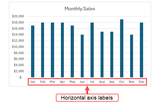
The horizontal axis, also known as the x-axis, typically represents categories or time periods in a chart. Horizontal axis labels are placed along the x-axis to indicate the specific points or intervals being represented.
For example, in a chart displaying monthly sales data, the horizontal axis labels would be the names of the months.
Vertical Axis Label
The vertical axis, also known as the y-axis, represents the numerical values or measurements in a chart. Vertical axis labels are placed along the y-axis to provide the scale and units of measurement for the data points.
For instance, in a chart showing revenue growth, the vertical axis labels might display percentages.
Now that we’ve covered the fundamentals let’s move on to the practical aspects of labeling the horizontal and vertical axes in Excel.
How to Label the Vertical and Horizontal Axis in Excel
In this section, we’ll explore the steps required to add axis labels and customize those labels in your Excel chart. These labels are crucial for understanding the data and presenting it in a clear, easy-to-read format.
1. Select the Chart
The first step is to select the chart that you want to work with. Click on the chart to activate it. This will enable the Chart Tools menu at the top of your Excel window.
2. Access the Chart Elements
With the chart selected, go to the Chart Elements button (represented by a ‘+’ sign) located in the top-right corner of the chart.
Clicking this button will open a dropdown menu with various chart elements that you can add or modify.
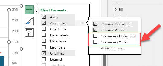
3. Add Axis Titles
In the expanded menu, locate the Axis Titles checkbox. This will display a sub-menu with options for both the Primary Horizontal axis title (category axis) and the Primary Vertical axis title (value axis).
Select the desired axis title (horizontal or vertical) to add a default title to the corresponding axis.
If you want to remove axis titles, just uncheck the axis titles checkbox.
If you have a secondary axis on your chart, you’ll find options for a secondary vertical axis title and a secondary horizontal axis title.
4. Edit the Title
After adding the axis title, click on the axis title text box to select it. You can then directly edit the title by typing the desired label.
To make the title stand out, you can also format the axis title by changing the font type, size, and color using the options in the Home tab. To activate the “Format axis title” pane, click axis titles.

If you want Dynamic axis titles, you can create a reference from the axis title to a cell.
5. Customize Axis Labels
In addition to the axis titles, you can further enhance the appearance and readability of your chart by customizing the axis labels.
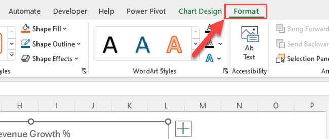
To do this, click on the axis labels to select them. Then, go to the Format tab under Chart Tools in the Excel ribbon.
6. Customize the Text
In the Format Axis pane, you can adjust various settings to customize the appearance of the axis labels, such as font size, font color, and font style.
You can also change the orientation of the labels to make them more readable if needed.
7. Adjust Axis Scale
To ensure that your chart provides a clear representation of the data, it’s important to adjust the axis scale if necessary. The axis scale determines the range of values displayed on the chart.
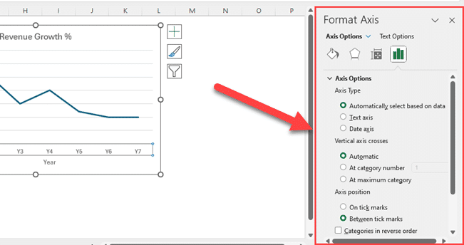
To adjust the axis scale, right-click on the axis you want to modify (horizontal or vertical) and select Format Axis.
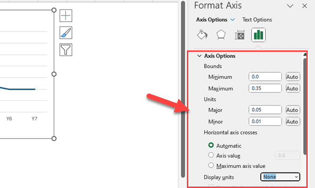
8. Customize the Axis Scale
In the Format Axis pane, navigate to the Axis Options tab and adjust the Minimum, Maximum, and Major Unit values to suit your needs. These values control the starting point, ending point, and intervals of the axis scale, respectively.
By following these steps, you can easily add and customize axis labels in Excel to create professional-looking charts that effectively convey your data.
Advanced Techniques for Axis Labels
In this section, we’ll explore some advanced techniques for customizing and enhancing your axis labels in Excel. These techniques will help you get professional-looking charts that effectively communicate your data.
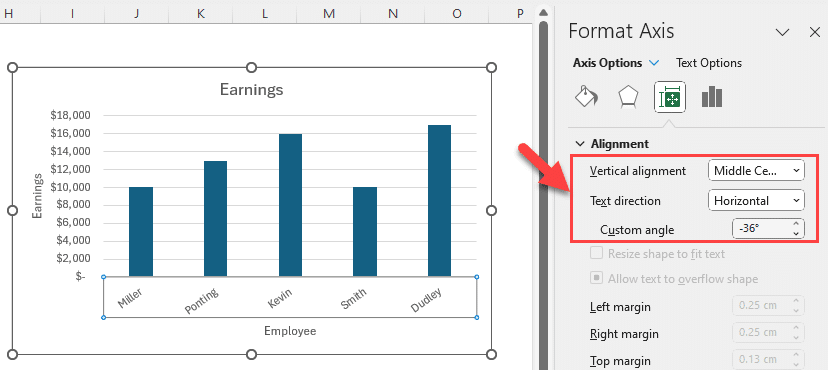
1. Rotating Text
Rotating text is a useful technique for making long axis labels fit better on your chart. To rotate text, select the axis labels, right-click, and choose Format Axis.
In the Format Axis pane, go to the Text Options tab and find the Text Rotation setting. Adjust the rotation angle to your preference.
2. Custom Number Formats
If your chart includes large numbers, you can use custom number formats to make them more readable.
Select the axis labels, right-click, and choose Format Axis. In the Format Axis pane, go to the Number tab, and select Custom from the Category list.
Then, enter a custom number format that suits your needs.
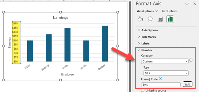
3. Adding Units
To make your axis labels more informative, consider adding units.
Select the axis labels, right-click, and choose Format Axis. In the Format Axis pane, go to the Number tab and add the desired unit in the Format Code box.
4. Data Label Customization
In some chart types, data labels can be used as axis labels. To customize data labels, click on a data point to select it. Then, right-click and choose Add Data Labels.
Once the data labels are added, you can click on them to select individual labels. Use the Format Data Labels pane to customize the appearance, including font size, color, and position.
By using these advanced techniques, you can create professional-looking charts with customized and informative axis labels.

Final Thoughts
Adding and customizing axis labels in Excel charts is a fundamental skill that elevates your data presentation. Clear and well-designed axis labels help your audience quickly understand the context and significance of your data.
Whether you’re a business analyst, student, or researcher, mastering this skill is essential for effective data communication. As you’ve learned, it’s a straightforward process that can be easily implemented in various chart types.
Remember to keep your axis labels concise, use consistent formatting, and consider advanced techniques to enhance the readability of your charts. With these tools in your Excel toolbox, you’re well on your way to creating impactful and visually appealing data visualizations.
To learn more about how to use Excel to improve your business processes, watch the video below:
Frequently Asked Questions
How do I rotate axis labels in Excel?
To rotate axis labels in Excel, first select the axis labels you want to rotate. Then, right-click and choose Format Axis. In the Format Axis pane, navigate to the Text Options tab and find the Text Rotation setting. Adjust the rotation angle to your desired position.
What are some ways to format axis labels in Excel?
You can format axis labels in Excel by changing the font size, font style, and font color. Additionally, you can add or remove bold, italic, or underlined text. It’s also possible to change the number format of the labels, including adding units or adjusting decimal places.
How can I label a secondary vertical axis in Excel?
To label a secondary vertical axis in Excel, first create a chart with a secondary x axis. Then, select the secondary vertical axis by clicking on it. Right-click and choose Add Axis Title. Enter your desired label and customize it as needed.
What is the process for adding a trendline to a chart in Excel?
To add a trendline to a chart in Excel, first select the data series to which you want to add the trendline. Then, right-click and choose Add Trendline. In the Trendline Options pane, select the desired trendline type, such as linear or exponential. Customize the trendline settings as needed.
How do I show the value axis in a chart?
To show the value axis in a chart, first select the chart you want to modify. Then, right-click and choose Format Chart Area. In the Format Chart Area pane, navigate to the Axes tab. Select Primary Vertical Axis or Secondary Vertical Axis and choose Show Axis.
What are the steps to add a legend in Excel?
To add a legend in Excel, first create a chart. Then, select the chart, right-click, and choose Add Legend. Customize the legend by changing its position, font size, or title as needed.
If you’d like to add or remove legend entries, right-click on the legend and choose Select Data. In the Select Data Source pane, you can add, edit, or remove legend entries.