I’m going to show how you can create compelling Power BI dashboards and reports that give you high quality insights. You may watch the full video of this tutorial at the bottom of this blog.
There are a lot of individual techniques that you can use in creating great Power BI dashboards, but for now, I just want to focus on an overall technique. This is a technique that I have used in the Enterprise DNA Learning Summit.
Here, you’ll need to combine a lot of different ideas to come up with truly insightful results. Through these insights, you pursue some quality actions and make good quality decisions within your organization.
Creating A Dashboard On Customer Insights
For this example, I want to focus on insights around your customers.
Obviously, customers are key to your business. You have to stay on top of what’s going on with them. What are they purchasing? When are they purchasing these? Where are these customers found?
All of that can be found in my sample dashboard here.

So we’re going to break down this dashboard bit by bit. This is going to show you how you can create your own dahsboard that’s going to give an amazing insight into your customers as well.
The key to creating quality dashboards that allow you to really drill into data is creating a good model.
In the case of the dashboard above, this is the model that holds it together.

This is how simple the model needs to be. Of course, there is actually a lot more going on in the background. There are other layers underneath this main model.

But as far as the main model is concerned, you want to keep it as simple as possible. You don’t need to have relationships criss-crossing all over the place to come up with a great dashboard.
Now, one of the other things that I’ve implemented in this dashboard is customer ranking. It’s the best way to dynamically select different Customer Groups while filtering the data further.

The ranking isn’t actually in my existing data, so I had to create it.
Now, to create data like this, you’ll have to build out your model using calculated columns.

This is another key factor in creating a good dashboard. It isn’t enough to stick to your raw data. You need to dive further into the data and create different dimensions that weren’t there before.
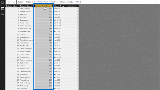
In this case, I used RANKX to rank the customers based on Sales.
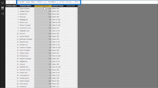
That gave me this column showing the Customer Sales Rank.
Then, I segmented those customers based on their ranking using SWITCH TRUE.
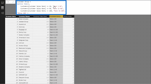
You’ll see how I set the parameters on which ranks go into specific segments. This allowed me to create this column for Customer Groups.
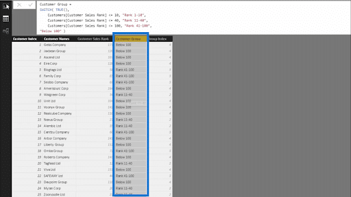
This is a new dimension that sits inside the Customers part of my model.
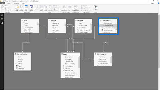
Let’s see how we can dig deeper into our data now that we have those rankings.
Filtering Within Power BI Dashboards
Let’s say I choose the customers ranked from 11 to 40.
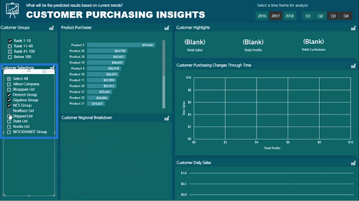
You’ll see that it allows me to further filter my selections on which specific customers I want to drill into through the Customer Selections filter right below the rankings.
Now if I click on some of those customers, I am able to see how those specific customers are making their purchases in a given time frame. Below, for example, I chose to look at data from Q3 and Q4 of 2017. This is a great way to look at how my customers are changing over time.
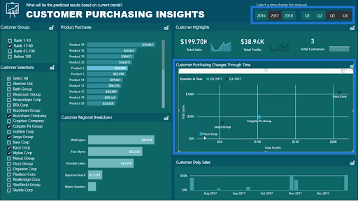
You can also see that these changes are evaluated based on Total Sales and Total Profits.
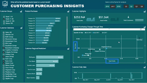
Remember that all of this is possible through my model. So, if you dig deep into your model with these selections in place, you’ll actually see the relationships flowing through the different parts of my model.
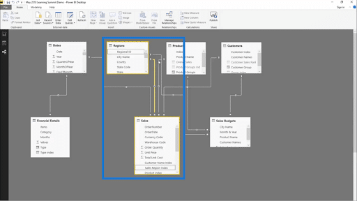
So as long as there’s a relationship there, I am able to filter the data within my visualization.
Here’s another way that I’m looking at customer behavior.

Since I can see the product purchases made by the customers, I’m getting a really good insight into what products are selling well.
This time, let’s look at our customers ranked from 1 to 10. Once I apply that filter, I can immediately see that I have 10 customers within that group.
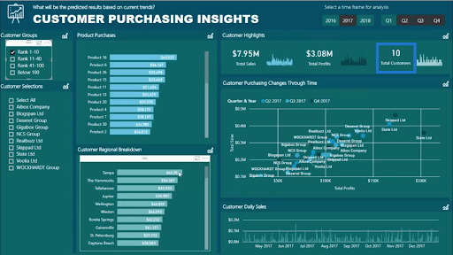
From there, I can click on any of the regions on the Customer Regional Breakdown and get even more insights.

In this case, I’m seeing that for Tampa, I only have one customer.
You can continue filtering further based on the filters we’ve discussed earlier. So you can backtrack and see which quarter that single customer started making purchases, for example.
Other Power BI Dashboards You Can Make
That’s just one example out of the many different dashboards you can create in Power BI.
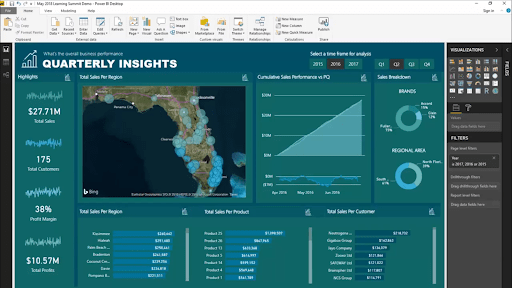
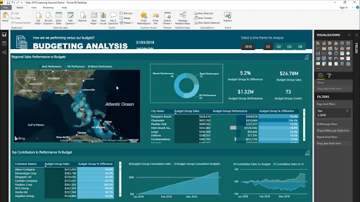
You can also create powerful performance insights like this one.
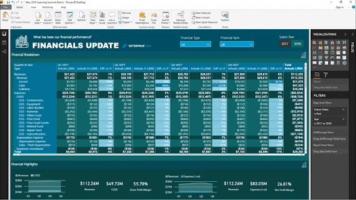
For accountants and other finance professionals, you can also create financial dashboards.
Here’s another dashboard, but this time, it focuses on budgeting.
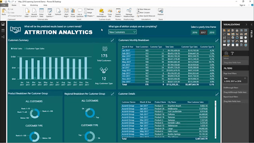
You can also get some attrition insights through a Power BI dashboard like the one below.
***** Related Links *****
Visualization Technique for Power BI: Using Dark Backgrounds
Power BI Shape Map Visualization For Spatial Analysis
How To Control The Interactions Of Your Visuals In Power BI
Conclusion
You’ve seen how much insight you can get from Power BI dashboards as long as you put the right elements together. Again, all it takes is a simple model. From there, you can start adding more dimensions to dig deeper into the raw data.
Remember also that you can’t just rely on your raw data. If you want to gain a better insight, you really have to apply layers of logic and techniques.
Once you’ve covered these key elements, you can get more compelling reports within your organization.
All the best,
Sam


