In this blog tutorial, I’m going to go over some design and color ideas when creating a Power BI color palette. You may watch the full video of this tutorial at the bottom of this blog.
These are some of the more questions people ask me. How do you create your color palettes in Power BI? How do you get such a coherent set of colors on your report? So, I devised this development technique or strategy for Power BI reports. I’m big on colors and I want to make sure that my reports are visually appealing.
In this example, I’m using a report that I went through during an Enterprise DNA Learning Summit session.
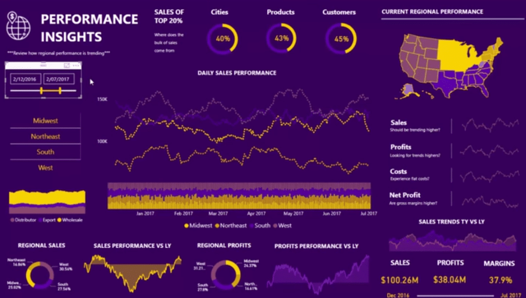
This interesting color palette in this report is certainly not a standard one that you can find from the built-in color palettes inside of Power BI.
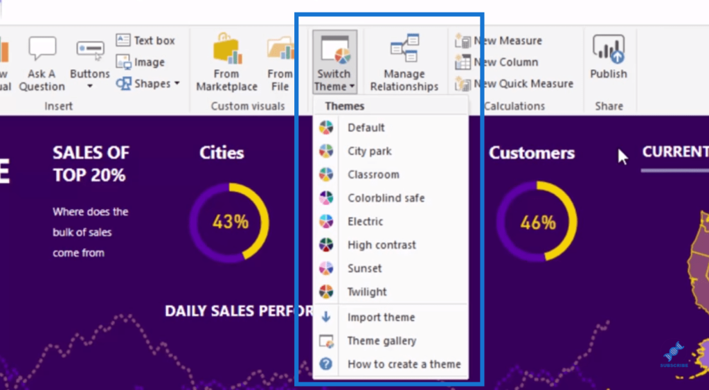
First, I’m going to show you how I easily get this grouping of colors that look good on a page.
Getting Color Palettes Online
I’ll show you a couple of websites that allow me to create this compelling Power BI color palette. The first one is Palette FX.
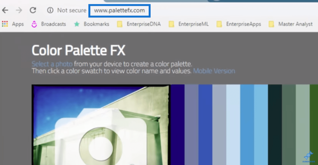
In this website, I can place any picture in here, and then get the colors that are within that picture.
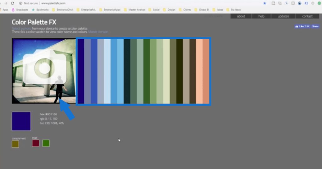
I found this random picture online of this group of colors. I just typed in purple and gold and this is one of the images that popped up in Google.
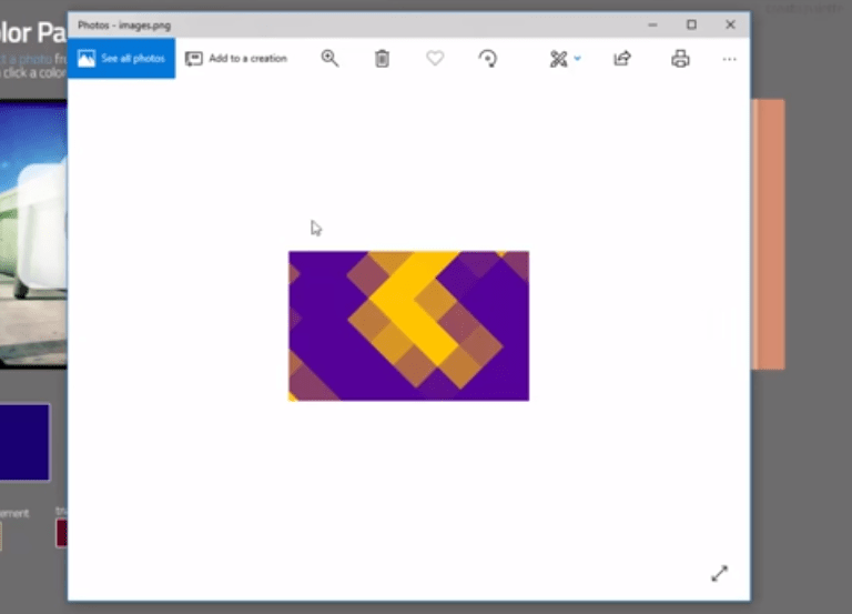
I downloaded this image and I placed it into the Palette FX website.
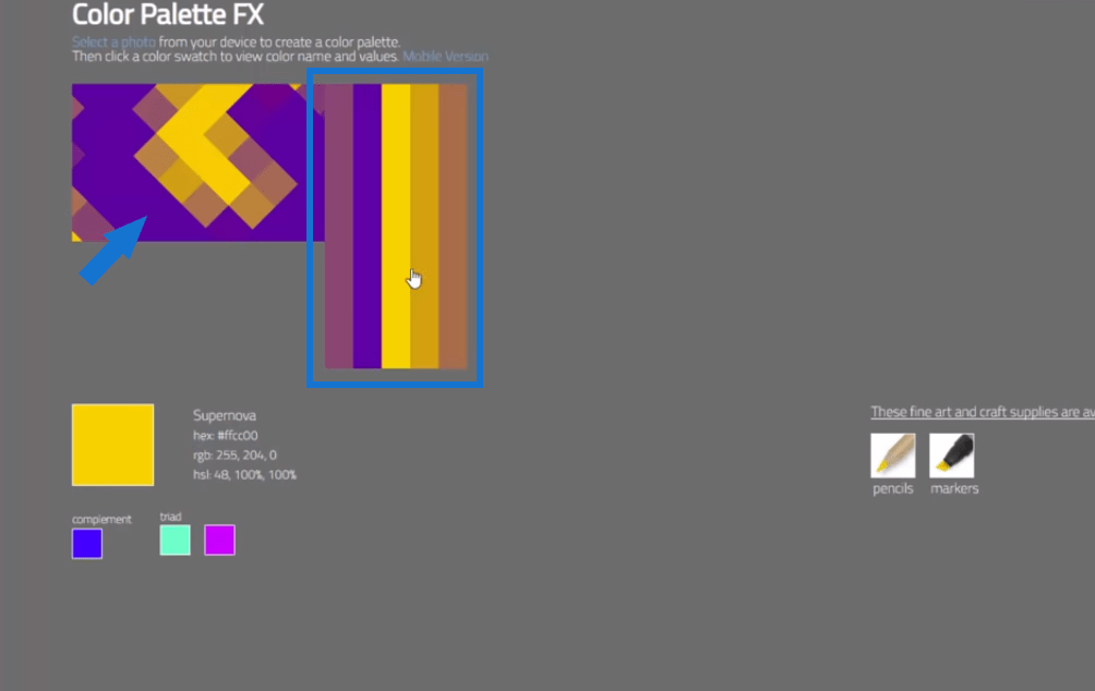
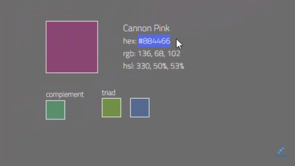
By doing that, I was able to get these hex numbers. I can click on the colors and get the hex number of each color.
Creating A Color Palette In Power BI
Sometimes, you can’t get enough colors to make up an entire palette for Power BI. You’ll need more than five colors to create a palette inside Power BI.
I put the format in a simple text file to set things out. Then, I change the hex values, which will make up my palette. You’ll see here that I have nine that I need to make up.

What I personally do to complete the palette is I go to this website called Coolers.co., which is free to use.

I can create a palette based on the core colors that I choose. I simply input the hex values here, and then it creates the palette with those colors.
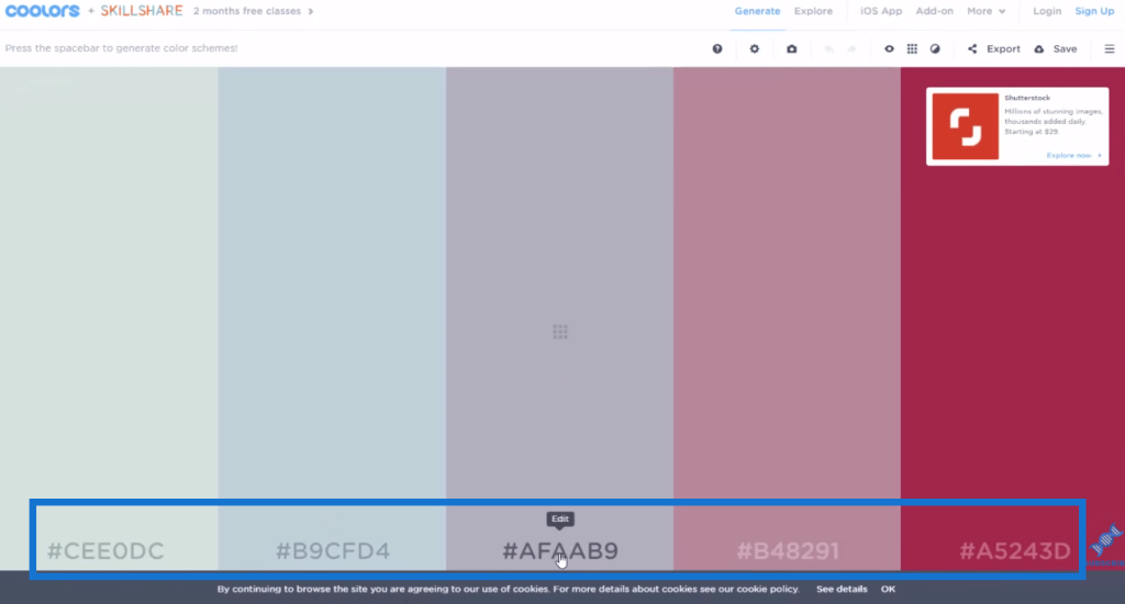
Once I get that done, I input the hex values into my Data Colors, and then import my theme.
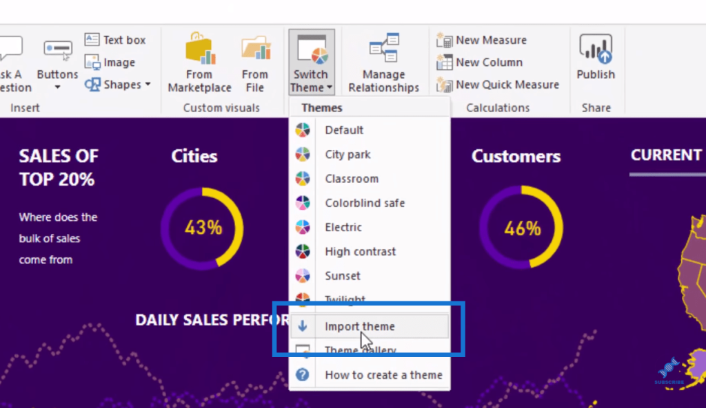
And that’s how I create this grouping of colors that works well together.
More Tips On Power BI Color Palette
Another big tip that I’d like to share with you is that, even though I have this great color palette, I still use only a few of the colors, specifically the top line. These colors on top are the main colors that come out of that palette I created.
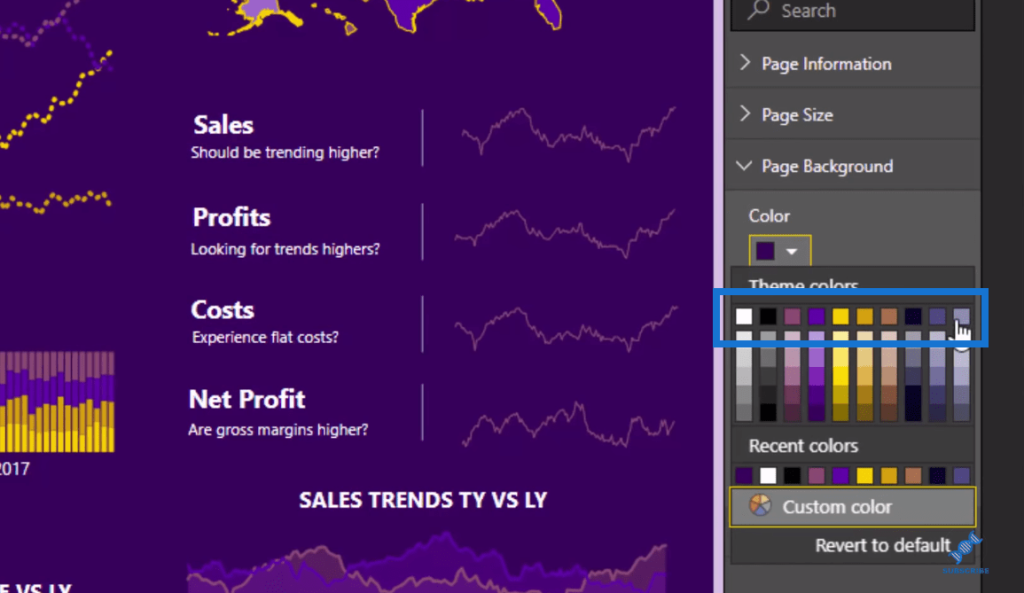
I don’t recommend using a range of different colors on report pages. It will overwhelm the report visuals.
***** Related Links *****
Using Great Color Schemes In Your Power BI Data Visualization
How To Create Compelling Reports & Dashboards In Power BI
Power BI Report Design Tips And Best Practices
Conclusion
In this brief tutorial, I share my best practices and method of creating a Power BI color palette to make reports visually compelling.
I’m big with colors, as they make key information in the report stand out. The report becomes pleasant to the eyes of the users as well. However, I highly recommend that you keep it simple and not overdo the report by using too many different colors. Give this a try and just be creative.
All the best!
Sam


