A lollipop plot, also known as a dumbbell plot, is a data visualization technique that combines a scatter plot and a bar chart to display the distribution of a single numerical variable. It is used to display the changes in a single variable over time or across different groups.
The plot consists of a scatter plot with a single dot for each data point, connected by a line (or “stem”) to a bar chart. The scatter plot shows the distribution of the data, while the bar chart shows the changes in the variable over time or across different groups.
In this tutorial, you’ll learn how to create a lollipop plot visualization using ggplot2 in RStudio.

Creating A Basic Lollipop Plot
For our tutorial, we’ll be using the tidyverse package together with a baseball dataset from the Lahman package. The goal is to compare the number of wins for each team in the 2020 season.
First, use the filter ( ) function to only show data within the year 2020.
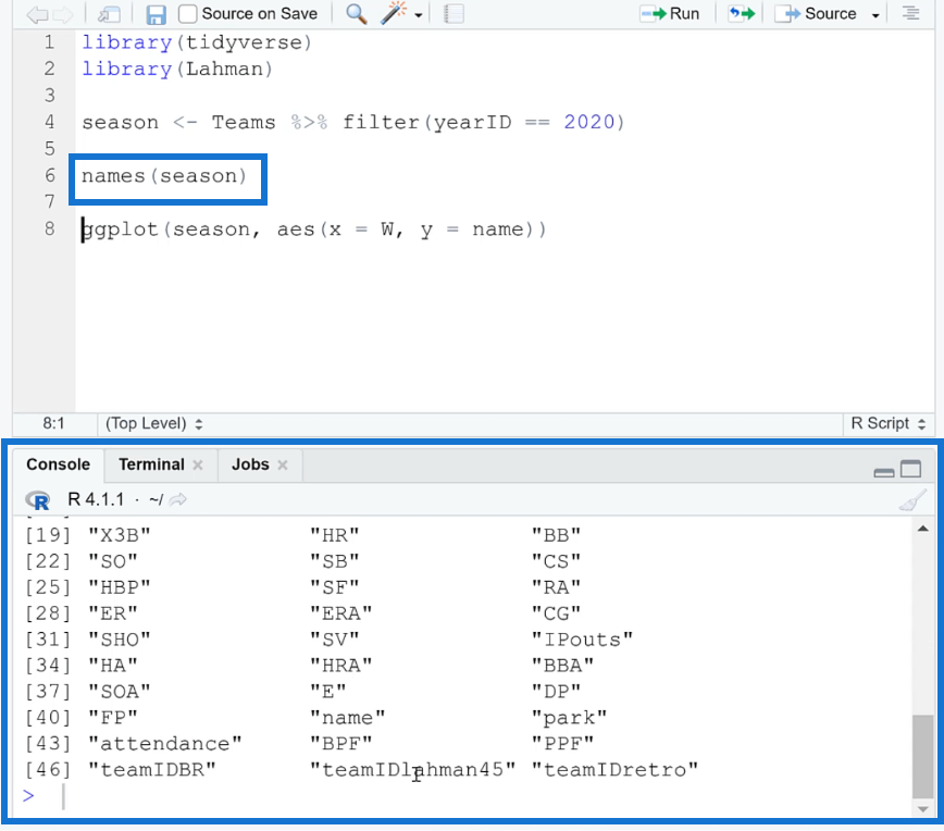
To be more familiar with the column names in the dataset, you can use the names ( ) function.
Next, use the ggplot ( ) function to create the plot. Inside the parentheses, specify ‘season’ as the dataset. The x- and y-axis are also set to ‘W’ (wins) and ‘name’, respectively.
Add a plus sign (+) and then write the geom_segment ( ) function. This will draw a straight line between the stop and start points you specify. When you run the code, you’ll see get a basic lollipop plot.
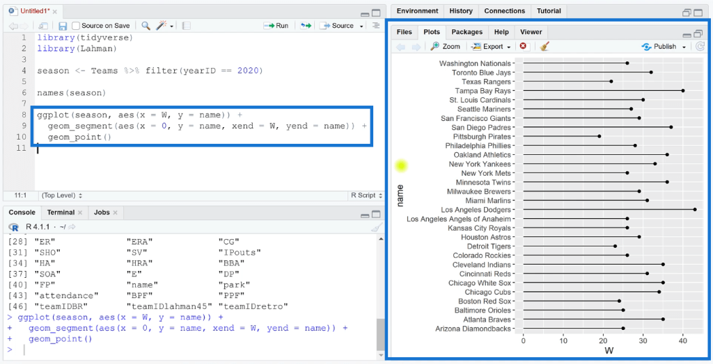
When you look at the visualization, you’ll easily understand why it’s called a lollipop plot. There’s a line drawn starting from the zero of the x-axis and the data point is represented by a circle.

Formatting A Lollipop Plot In R
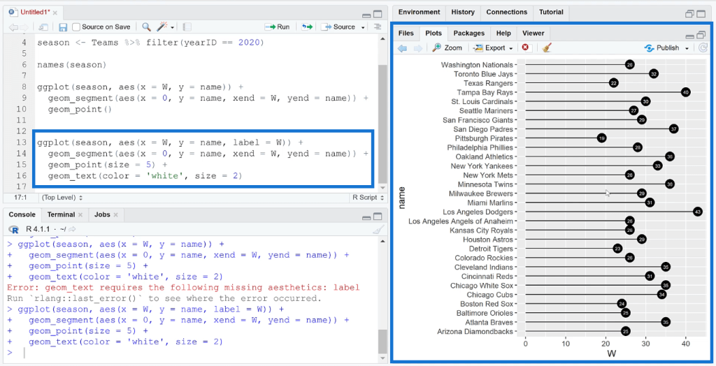
Once you’re satisfied with how your basic lollipop chart looks, you can then add formatting changes to highlight certain information in the visualization.
You can increase the size of the end circle and place a label in it. You can specify the circle size and color label depending on your preference.
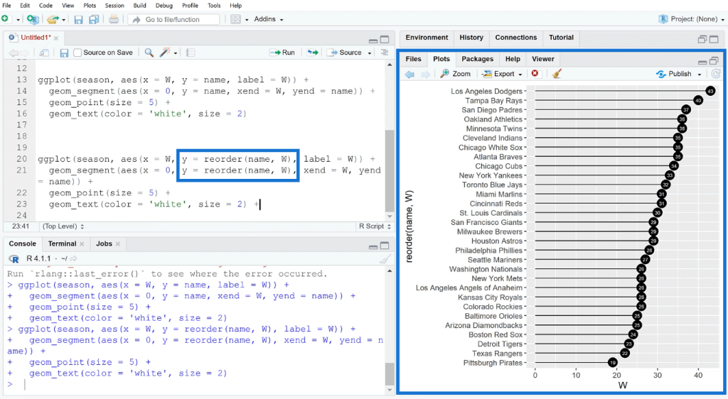
The data in the lollipop plot can also be sorted alphabetically or numerically. To sort the plot, use the reorder ( ) function and then specify the order you want the data to be in.
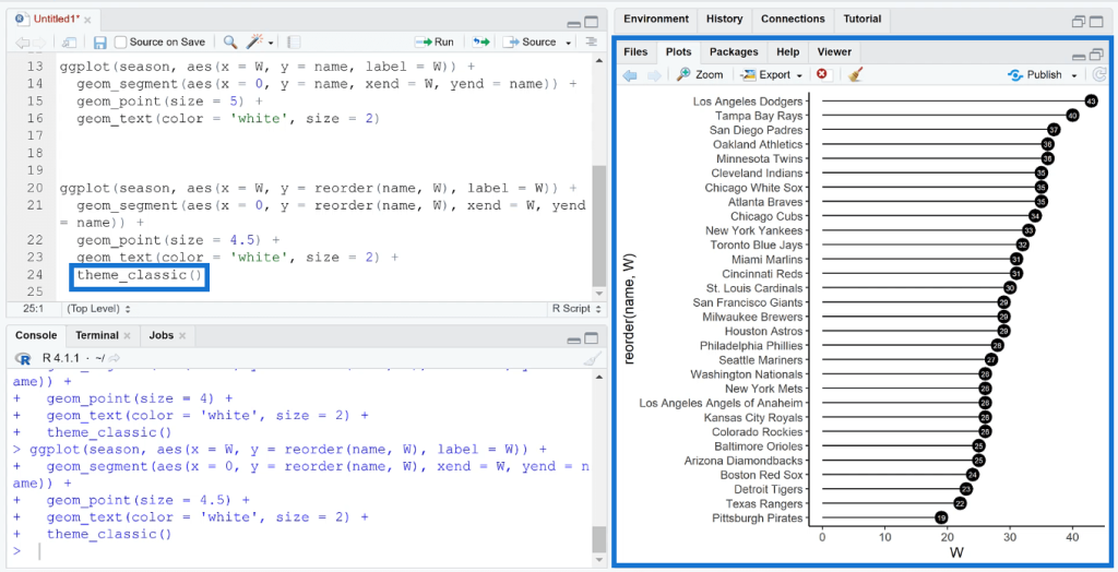
You can also change the visualization’s theme to modify the background color using the theme_function ( ) argument. This is especially useful when you want to import your visualizations into Power BI. Customizing the theme in RStudio will help the plot blend in with the report in Power BI.
***** Related Links *****
Create A Histogram Using The R Visual In Power BI
GGPLOT2 In R: Visualizations With ESQUISSE
ggplot2 Plots In Excel For Advanced Data Visualizations
Conclusion
Creating a lollipop plot in RStudio is a relatively simple process that allows you to effectively display and analyze the distribution of a single numerical variable. You also have the option of customizing the plot by changing the colors, labels, and other elements. Once you have created the plot, you can use it to identify patterns and trends in your data, and compare different groups or time periods.
Overall, lollipop plots are a useful data visualization technique that can provide a clear and easy-to-understand representation of your data, making it a valuable tool for data analysis and presentation.
All the best,
George Mount