Histograms are graphs that allow us to easily understand and visualize the distribution of a dataset. They are used with continuous data to identify patterns and outliers that are not immediately visible in raw data. In Power BI, histograms are generally difficult to create, but using R visual and ggplot2, you only need to write a few lines of code to create it.

In this tutorial, you’ll learn how to create a histogram using Power BI’s R visual and RStudio‘s ggplot2 package. We will use a prebuilt report to create a histogram and compare the distribution between two data groups.You can download this report by accessing the R for Power BI Users 1 course on the Enterprise DNA website.

Create The R Visual In Power BI
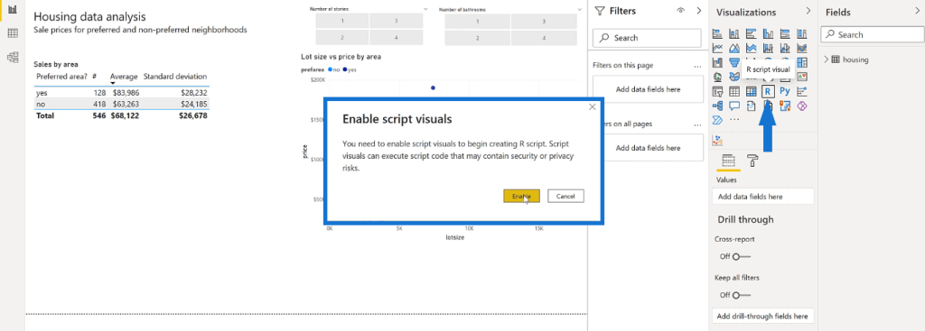
Open the prebuilt report in Power BI. Then, click the R script visual in the Visualizations pane. When a pop-up wizard appears, select Enable.
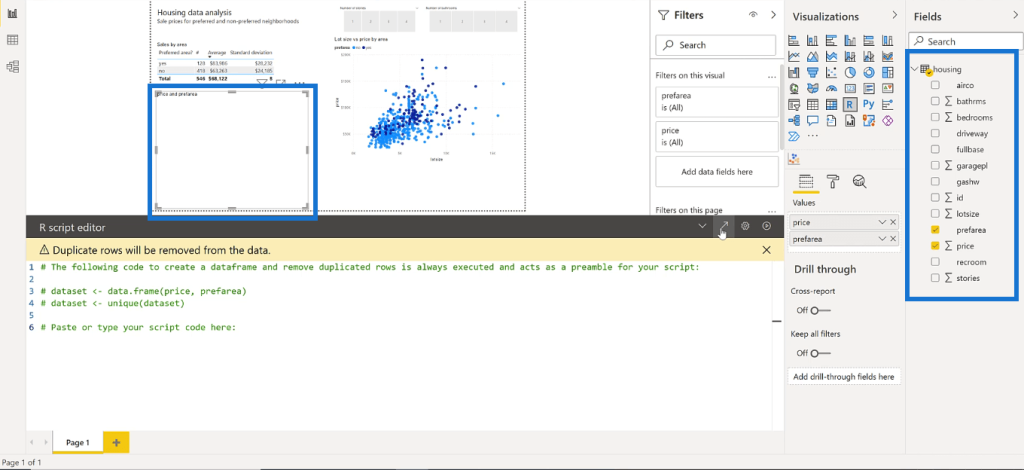
Drag and adjust the edges of the R script visual to where you want to place it in your report. In the Fields pane, check the variables you want to show in the visual.
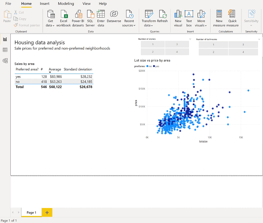
For this example, the histogram will show a comparison between the distribution of the prices for each home in the dataset. The needed variables are price and preferred area.
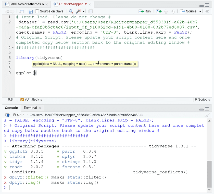
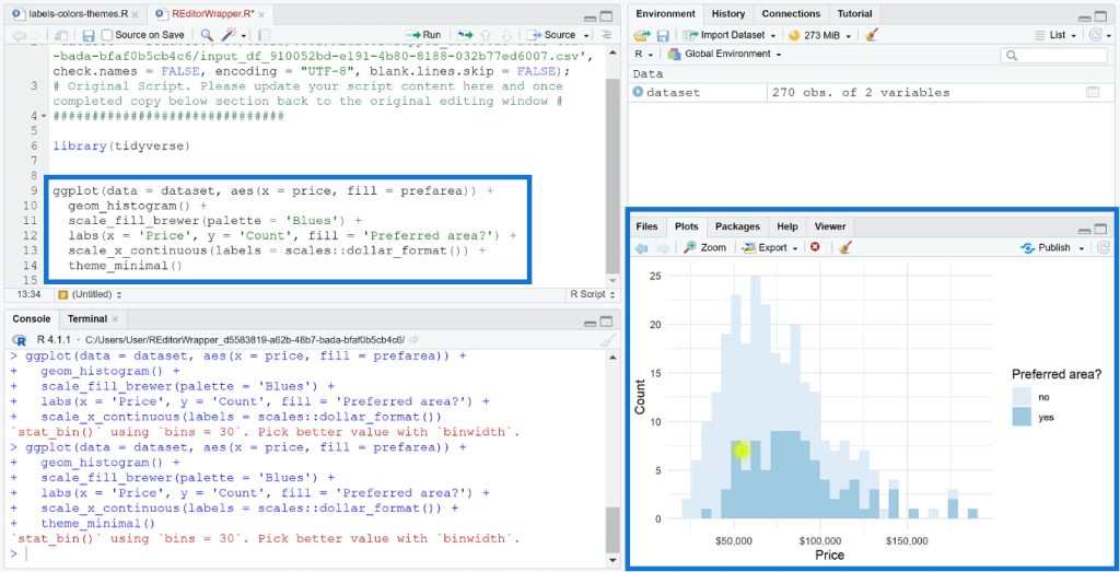
Expand the R script editor in the lower part of your screen. You need to enable the tidyverse library so that you can use the ggplot2 package. You can enable them using the library (tidyverse) and ggplot ( ) commands.
The plot in this example has price on the x-axis and preferred area on the y-axis. To convert the plot to a histogram, use the geom_histogram ( ) function.
The next step is to perform formatting changes on the chart. Use the scale_fill_brewer ( ) function to change the color of the data.
You can also change the theme to your preference. In this case, let’s use a minimalist theme. Remember that it’s important to adjust your chart format to ensure that it follows the theme of your Power BI report.

To add labels, use the labs ( ) function, and then specify the label names you want to be shown in the R visual. You can also change the label format in your visuals by using the scale package. The scale_x_continuous ( ) function is used in this example because the prices are in dollars.
Run The Code In The Power BI Report
Once done, copy the code and paste it in the R script editor in your Power BI report. When you run the code, the histogram will appear in the R visual element.
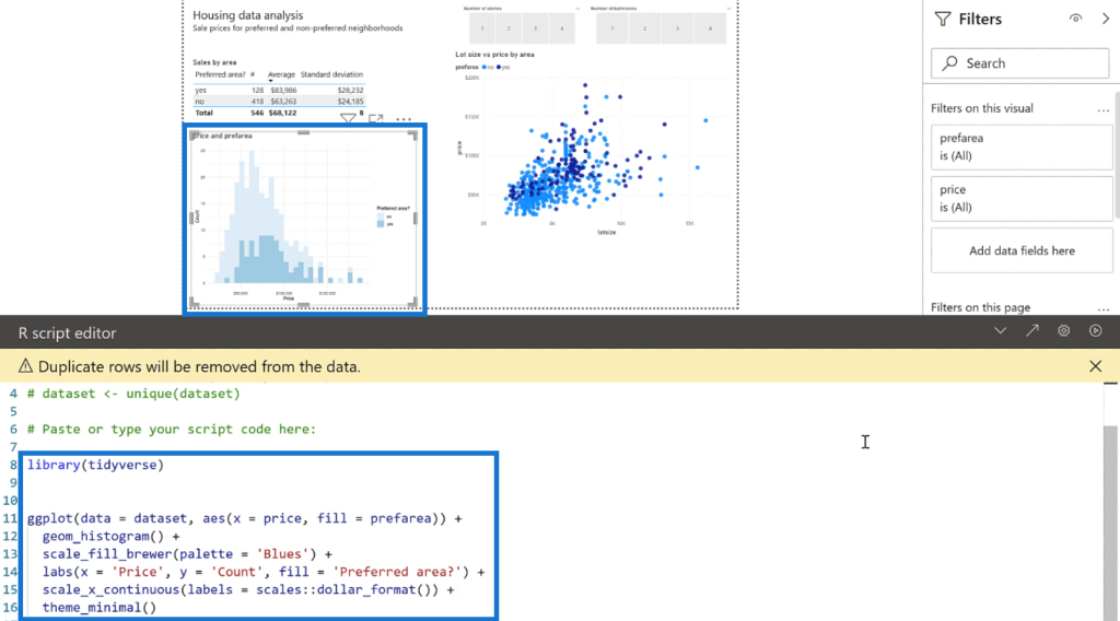
The R visual will then automatically adjust the data it presents depending on the selected filters in the report.
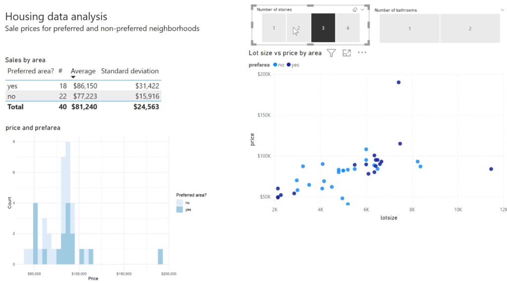
You can format the report by adding a report title and individual chart titles.
Once you have the histogram, you can further include inferential and descriptive statistical information in your report. This is discussed in the How To Perform A t-test In RStudio tutorial.
***** Related Links *****
Create Bivariate Visualizations In R Using ggplot2
Using ggplot2 And esquisse To Build Visualizations In R
ggplot2 Plots In Excel For Advanced Data Visualizations
Conclusion
A histogram is a great visualization tool when you want to show the frequency distribution of a certain dataset. It’s a good addition to your Power BI report when you want to present statistical information to end users.
However, creating this graph in Power BI is a challenging task. But with the use of the R visual option, you can easily create a histogram using the ggplot2 package in RStudio.
All the best,
George Mount