In this tutorial, you’ll learn how to create a heat map visual using Charticulator. It is used to identify outliers and show multiple insights in your data report. You will find this visualization useful in monitoring the performances of retail outlets.
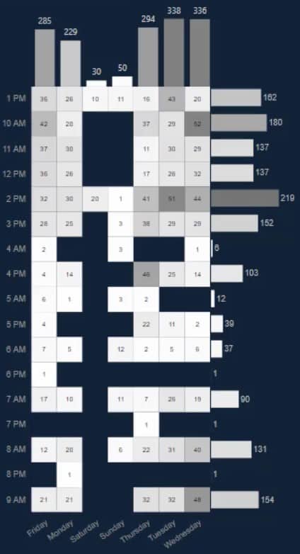
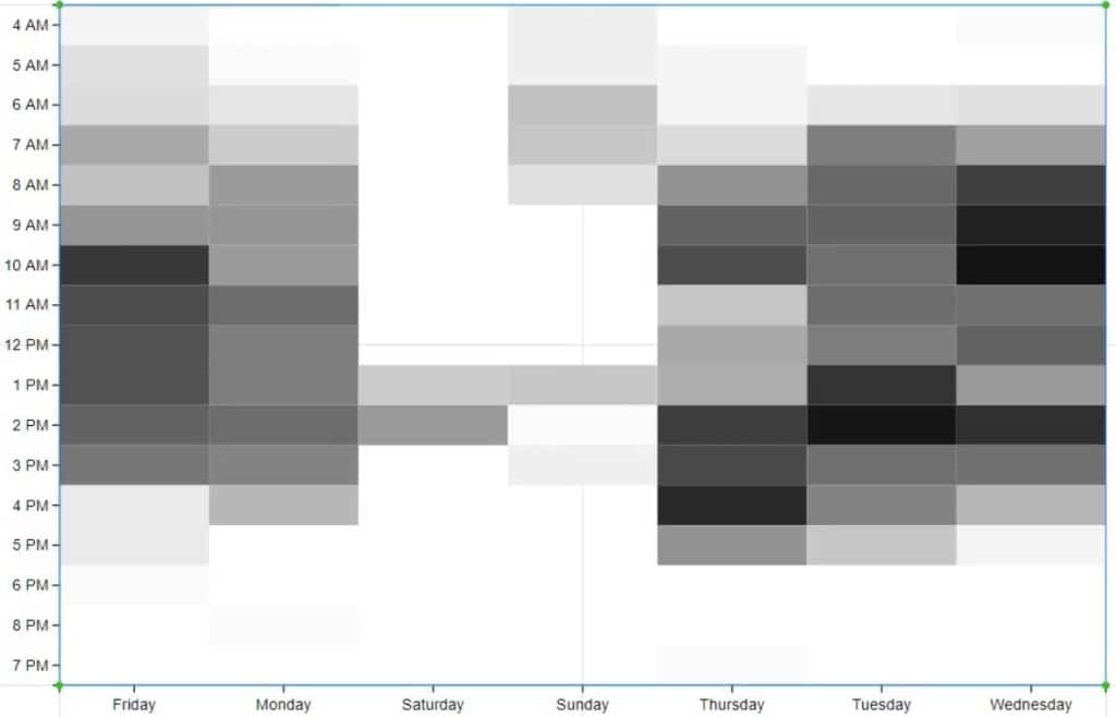
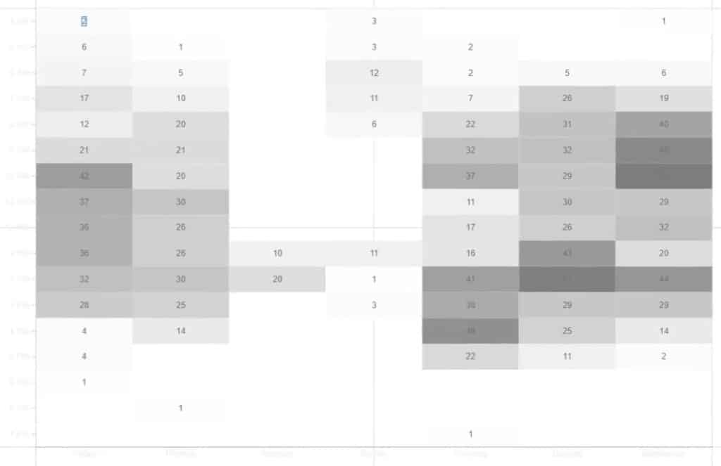
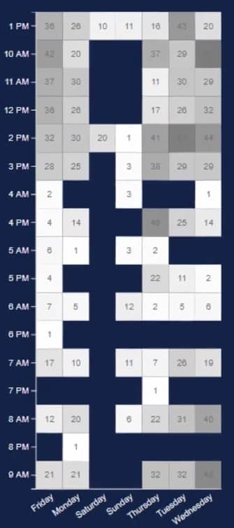
This is an example of a heat map. It shows the data of the peak seasons, days, and times when the tickets are created.
Export A Dataset For Charticulator
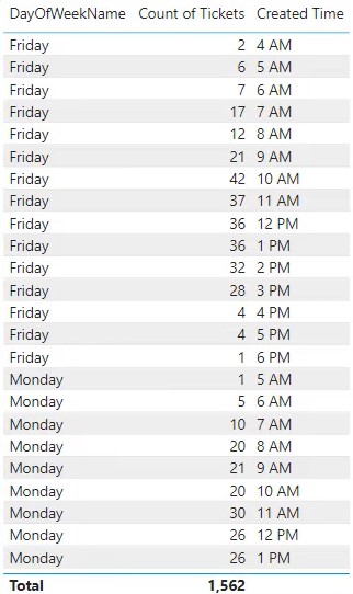
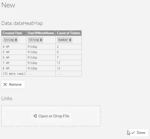
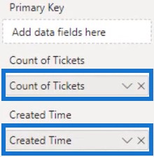
To recreate this visual, you need to create and export a dataset. For this example, DayOfWeekName, Count Of Tickets, and Created Time will be used.
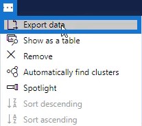
Next, click on the ellipsis and select Export data.
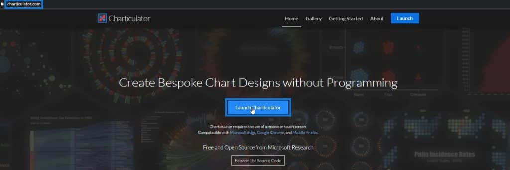
Go to charticulator.com and click Launch Charticulator.
Then, open the dataset that was exported and click Done.
Design The Heat Map
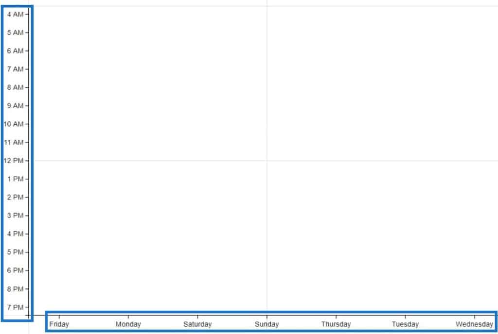
First, place Created Time and DayOfWeekName in the Y and X-Axis, respectively.
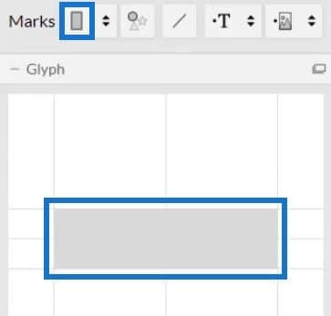
Next, select rectangle from Marks and add it inside Glyph to create the shapes of the visual.
Change the stacking of the bars to Grid.

To add colors to the bars, open Shape1’s Attributes and place Count Of Tickets in the Fill section.
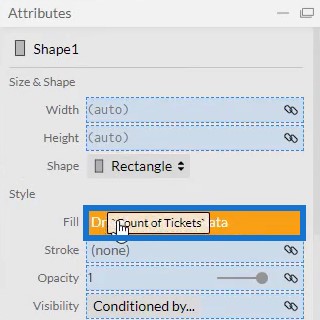
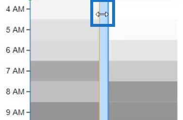
You can then see that it applied the conditional formatting. Remove the spaces between the bars by bringing the bars together.
The visualization will then look like this.
Add Colors And Texts To The Heat Map
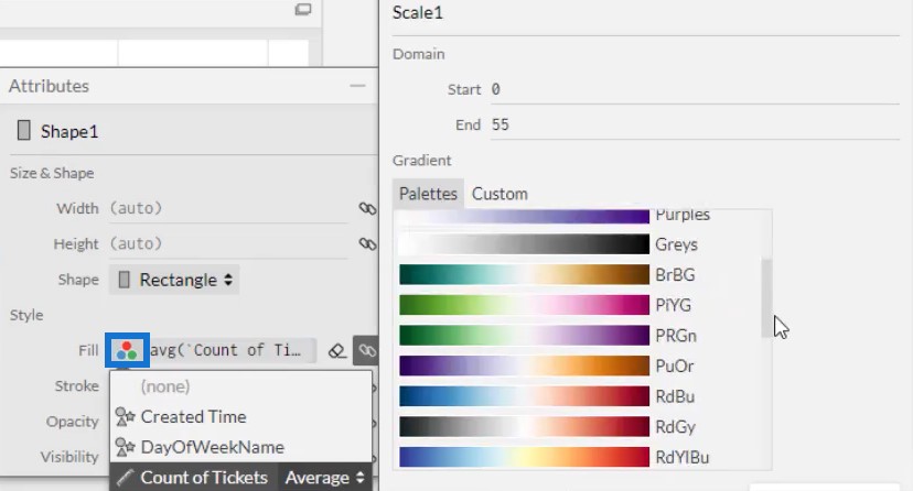
If you want to change the colors of the bars, click the Fill options and select the palette that you prefer.
Next, add the data labels inside the bars. Bring Text inside Glyph and place it at the center of the bar.
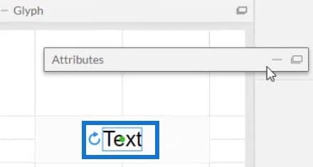
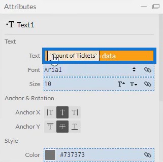
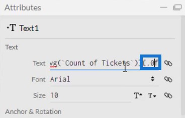
Lastly, bring Count Of Tickets in the Text section of Text1’s Attributes and change the decimal from .1 to .0.
Your visualization will now look like this.
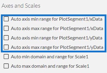
Before you export the file to Power BI Custom Visual, uncheck the auto axis option in the Axes and Scales setting. This makes your axes unchangeable when a context transition happens. After that, input a visual name and export the data file.
Import The Heat Map File In Power BI
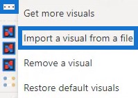
Now, open Power BI and import the file. Click the three dots below Visualizations and select Import a visual from a file.
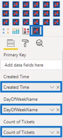
Click the Charticulator icon with the visual name of the file and fill the Fields’ section with the corresponding measures and categories.
Adjust the height, title, and margin of each entity in the visual depending on what you prefer. For this example, the visualization was made to look like this.
Add A Bar Chart From Power BI Custom Visual
Next, create and add a bar chart in the visualization. Launch Charticulator and import a dataset with the Created Time and Count Of Tickets. Put a rectangle shape inside Glyph and change the stacking of the bars to Stack Y.
Bring Created Time in the Y-Axis of the canvas and Count Of Tickets in the width of the bar inside Glyph.

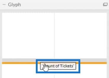
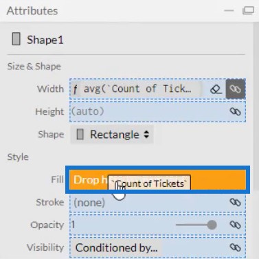
Next, open Shape1’s Attributes and place Count Of Tickets in the Fill section to apply colors to the bars.
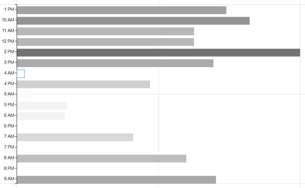
Once done, you will then see this result in your visualization.
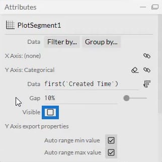
Then, open PlotSegment1’s Attributes and uncheck the Visible box to remove the labels in the Y-Axis.
You can now export the data file to Power BI Custom Visual. Make sure to uncheck the auto axis options in the Axes and Scales setting to make your axes secure from context transitions.
Go back to Power BI and import the bar chart file the same way the heat map was imported. Fill the Fields’ section with the corresponding measures.
Alter the chart’s settings to match with the heat map chart. Once done, place it beside the heat map chart.
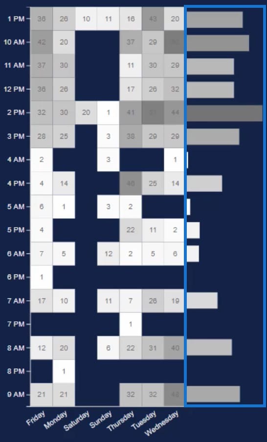
From this combination of charts, you can see and harvest a lot of information. You can see data from different days and times which will help you identify the busiest schedules of the week.
Create A Chart To Invoke Context Transitions
You can also add another chart to invoke context transitions. To do so, create a bar chart with Count Of Tickets and Issue Type using the native visuals in Power BI.
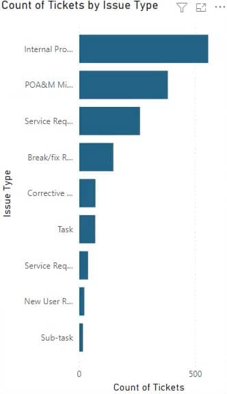
Next, go to the Format tab and click Edit Interactions. Click each visual to create an interaction with the other visuals.
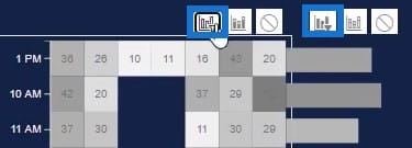
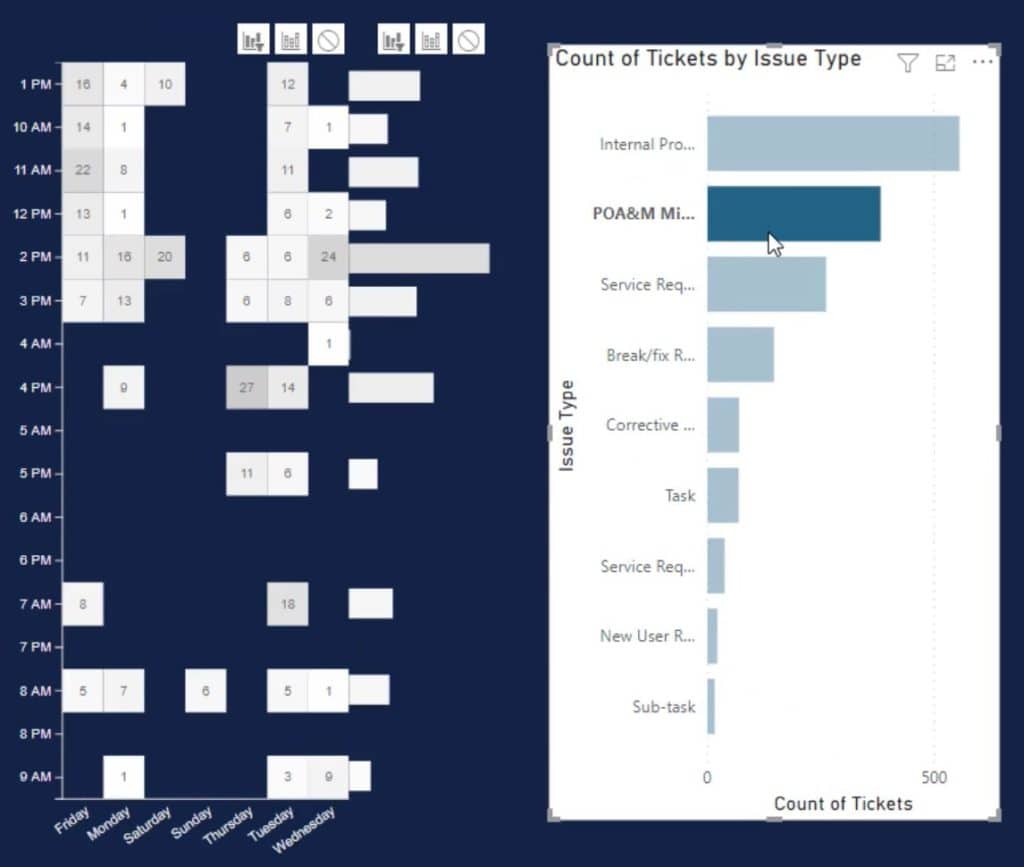
You’ll then see the heat map changes every time you select a bar in the native bar chart.
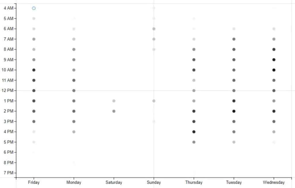
Another way to use a heat map visualization is by using circles instead of rectangles. This is what the heat map will look like using the circle format.
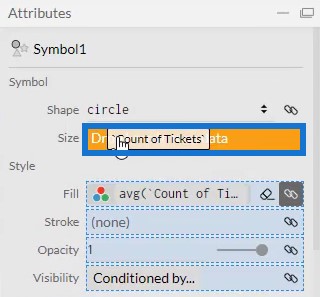
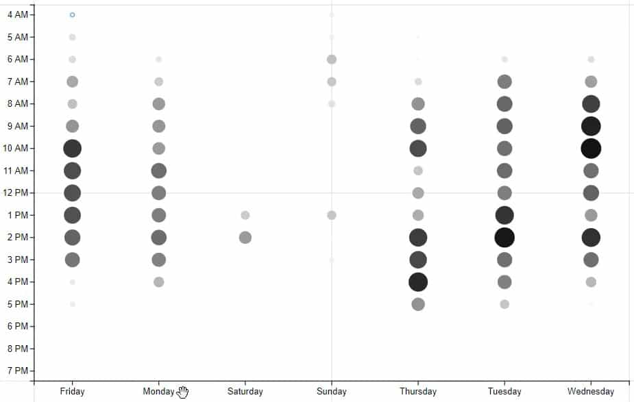
You can also increase the size of the circles by bringing Count Of Tickets to the Size section.
This is the resulting visual.
***** Related Links *****
Power BI Heat Map: A Custom Visualization Tutorial
Power BI Dashboard Designs: Visuals And Effects
Visual Reports Without Advanced DAX Skills In Power BI
Conclusion
A heat map is a visualization that provides a lot of information for different categories. It shows the frequency of any activity being done in a specific timeframe. If you want to monitor the performance of your business activities, this visual is one to consider.
Mudassir


