Today, I will discuss one by one the several main Gestalt principles in design such as proximity, closure, continuation, figure, and ground.

Gestalt Principles In Design | Proximity
Proximity occurs when elements are placed close to each other. The closer they are, the more related they appear. This Gestalt principle is among the first principles to impact our perception and understanding.
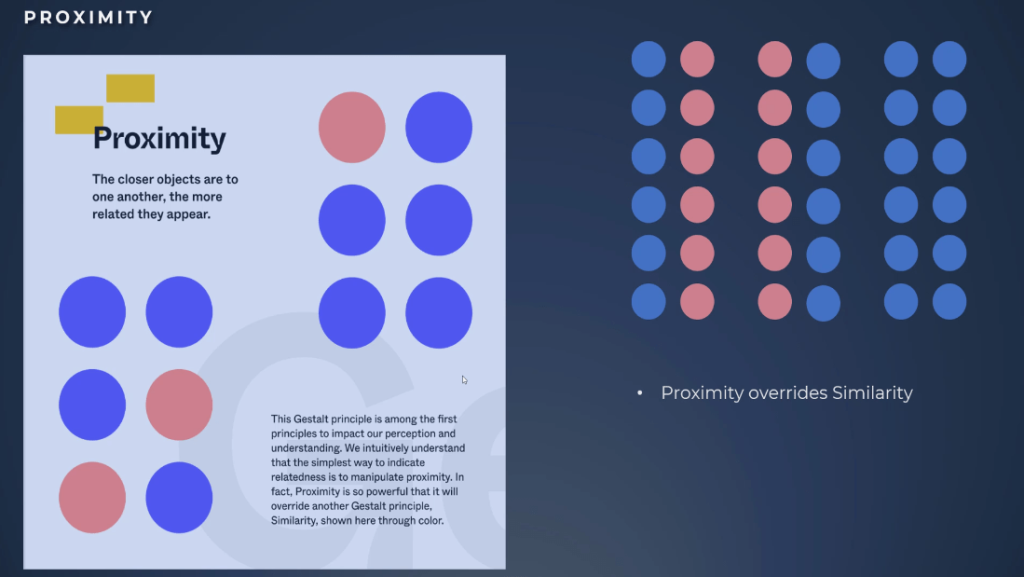
The simplest way to indicate relatedness in your reports is to manipulate proximity. This principle is so powerful that it will even override one of the Gestalt principles in design which is similarity.
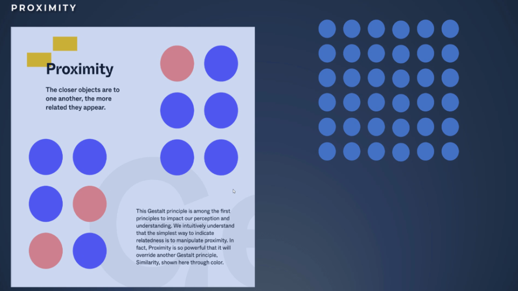
Let’s take the example of the color we previously used. We can see that based on the principle of similarity, we will group elements intuitively based on their color.
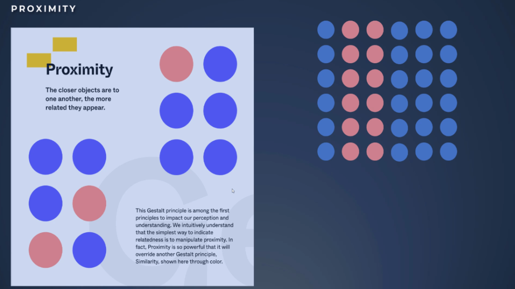
Look what happens if we add some spaces between the elements. Proximity overrides similarity.
Where do we use the proximity principle in Power BI reports? We can use them either to create a relationship between two graphs or to create a chart.
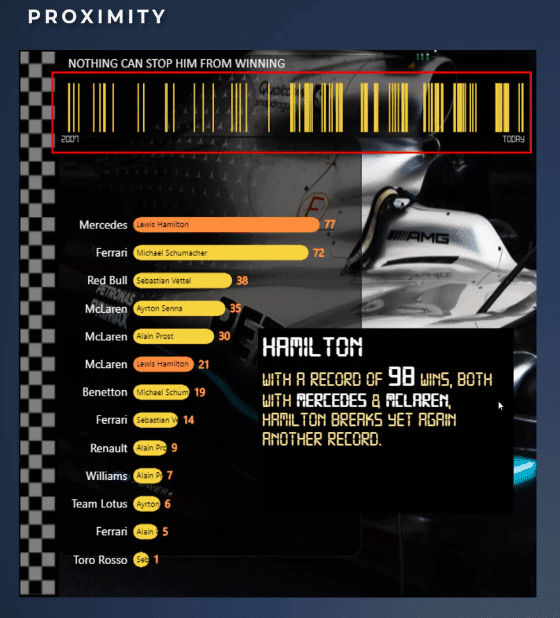
In the report I created for Challenge 17 organized by Enterprise DNA, I made this tooltip. The graph on the top side of the image uses proximity and similarity principles.
What I am showing in this graph is every race won by Hamilton starting in 2007 until today. We can observe easily that the density of the race won by Hamilton from 2015 to 2016 is increasing. We can see this because our eyes interpret distance and group together highly dense bars.
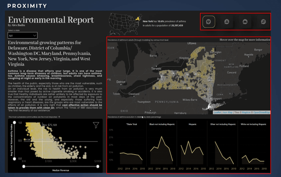
In this example, we also use the same principle to create a relationship between the map showing the prevalence of asthma in adults and the small multiple graphs showing the prevalence of asthma evolution in children by ethnicity.
Likewise, the navigation buttons are using this principle in addition to similarity because we have all the elements at close range. We always use the same distance between the buttons and more important distance for everything else.
Gestalt Principles In Design | Continuity
The principle of continuity shows how elements moving or providing the illusion of movement in the same direction are perceived as related.
Using this principle in design can help with grabbing the viewer’s attention and directing them toward a specific design or information.
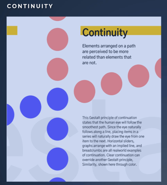
As observed in the example, elements that are arranged on a line or curve are perceived to be more related than elements not on the line or curve.
Another important element to notice is that if the eye starts following an upward trend of line of closed dots or a continuous line, it will continue to do so until it encounters another object that breaks this continuity.
We recognize elements following a continuous line as a group. The smoother the line segments, the more we see them as a unified shape.
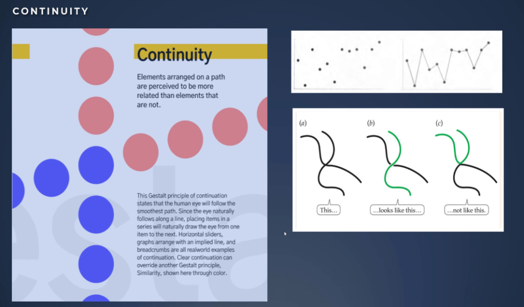
Our minds prefer the path of least resistance. It shows how we try to follow the simplest path for connected continuing elements. Our brain takes the most logical and simplified route. We will perceive these lines as two different lines as in the second example.
How can this principle be useful for us? Continuity helps us interpret direction and movement throughout the composition. It takes place when aligning elements, and it can help our eyes move smoothly throughout the page.
The continuity principle strengthens the perception of grouped information, creating order and guiding users throughout different content segments.
Disruption of continuity can signal the end of a section and draw attention to a new piece of content.
Brands As Examples Of Continuity
As shown on this slide, we can see that the continuity principle applies in design composition. In the first example, we can see how a great title can work marvelously well with the continuity principle.

It suggests that Coca-Cola is an example of a long-standing tradition in quality, and we should trust it. This is a very powerful storytelling technique and something we can all apply when communicated throughout reports.
It lets the user connect the dots to the conclusion we want; hence, this makes the message much more powerful.
The principle will focus the eyes of the user right after the title on the latest Coca-Cola bottle. This is a perfect example of a great story and a magnificent choice of elements and design.
The second and third examples show the impact of continuity on how we see the images. We naturally scan the page in an F or Z pattern. This time, we scanned the page in a completely different way. Disruption of continuity draws attention to a new piece of content.
In the Amazon logo, they used continuity effectively. Our eyes focus when the line starts at A and then jumps to Z. The underlying message is that we can find everything at Amazon every product from A to Z.
In the ProQuest logo example, we can see how the focus is on the message at the end, where the eyes will be based on the continuity principle.

Paintings As Examples Of Continuity
Let’s go even deeper in our exploration of the composition possibilities. We will explore an example that uses both continuity and the common Gestalt principles in design.
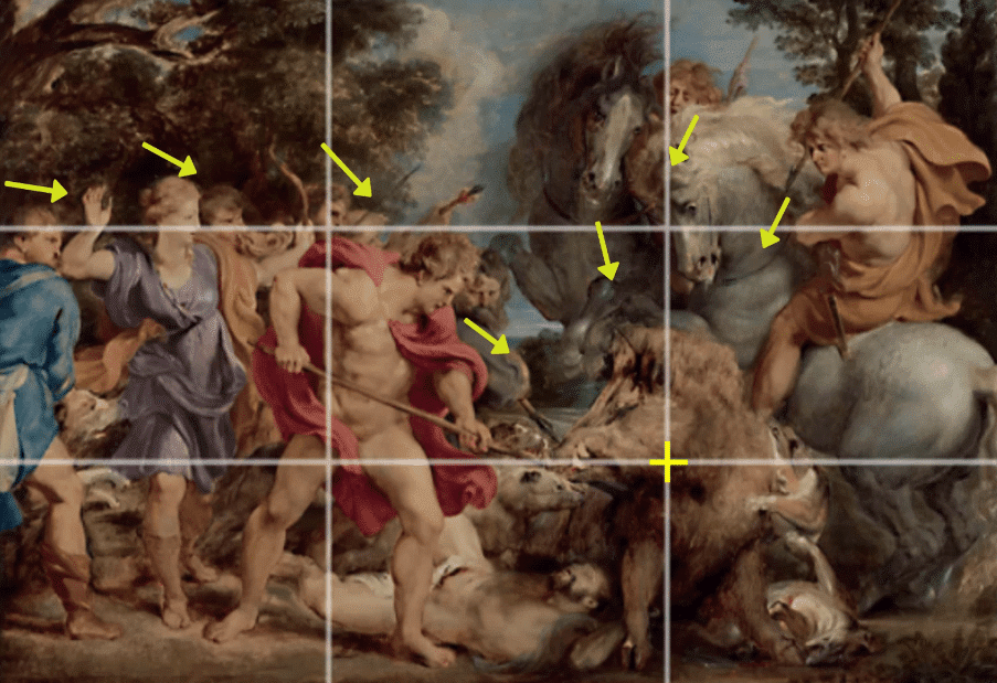
The Calydonian Boar Hunt is a true piece of art and a famous painting by Peter Paul Rubens in 1612. In addition to the rule of thirds, Rubens also used continuity, common fate Gestalt principles, and preattentive attributes to perfection all at the same time.
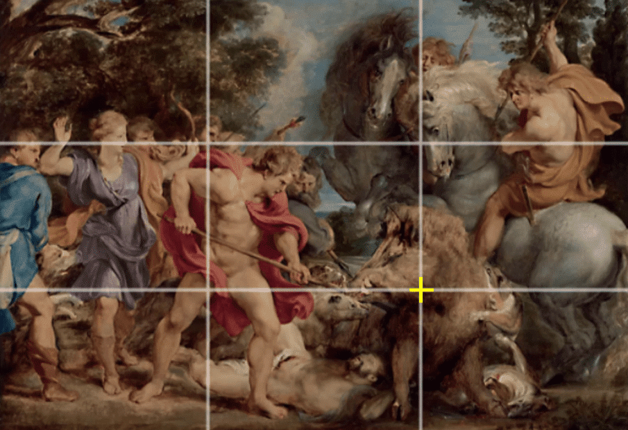
First, let’s look at the painting. What do we look at first?
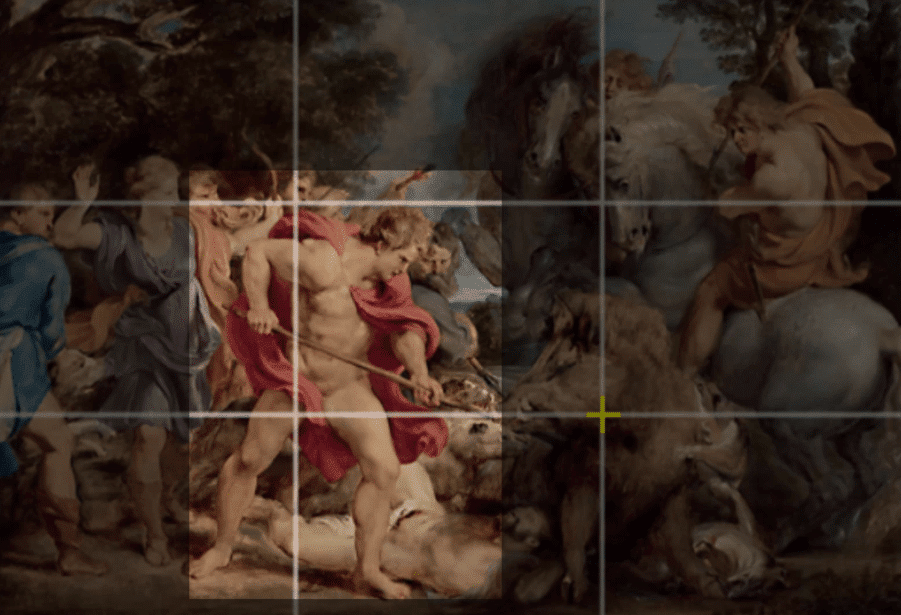
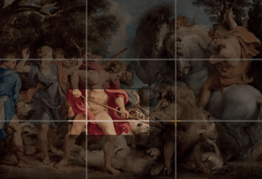
Our eyes draw to the warrior because of the color of the cape. Rubens used the red color as a preattentive attribute. Also, our eyes are drawn to the spear, and we will naturally follow the path until the end towards the shoulder of the boar.
Gestalt Principles In Design | Common Fate
The main subject is the boar, which is the center of attention. Rubens emphasizes this with the use of the rule of thirds and by adding another Gestalt principles in design – common fate.
The Gestalt law of common fate states that humans perceive visual elements that move in the same speed or direction as parts of a single stimulus.
A common example of this is a flock of birds. When several birds fly in the same direction, we normally assume that they belong to a single group. Birds that fly in a different direction do not appear to be included in the same group.
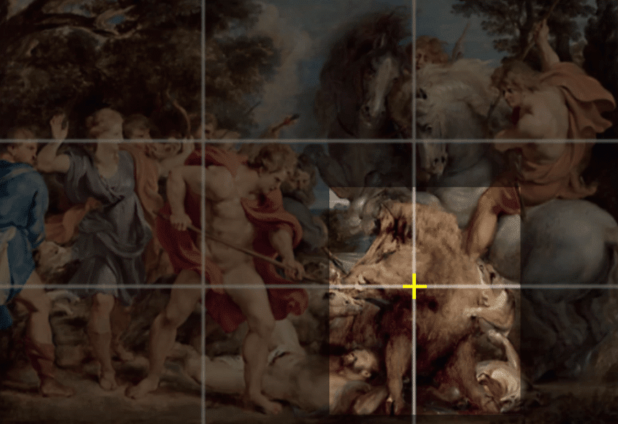
In this case, we can see that every person in the scene is looking and have their heads pointed toward the boar.
The movement of the scene, the use of the rule of thirds, and the Gestalt principles in design are all used to perfect this masterpiece. It gives life to the scene and engages the user’s perception and emotions.
Gestalt Principles In Design | Closure
The closure principle is pretty straightforward. Closure occurs when an element is incomplete or a space is not enclosed. If enough of the shape is indicated, the viewer will subconsciously fill in the missing information.
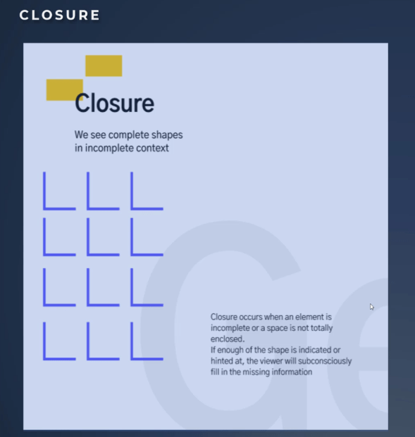
Look at the image on the slide. Do you see many dots or do you see a dog? Are you able to see the panda as well?
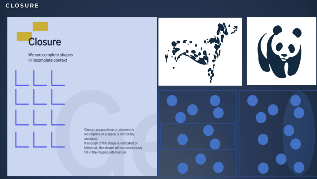
Our mind is filling in the dots. We can see complete shapes in an incomplete context.
The second observation of this principle is that elements that have a boundary around them are perceived to be more related. We perceive a set of objects to be a group when they’re enclosed in any visual area that places a border or shade around them.
For example, the data points in both pictures are arranged identically, but they are perceived as grouped very differently. Your perception of what goes together is completely different. Closure can be used to separate or tie things together.
Applying Closure In Report Design
Based on these observations, how can we use this principle in our report? First of all, we understand now the importance of the background layout. We know that if we put together two charts inside the box, we can imply a relationship.
Second, we know that we can imply the same principle inside graphs as shown in the example. Third, we do not need to completely enclose separate components. We subconsciously fill in the missing information, and this is very useful to unclutter our designs.
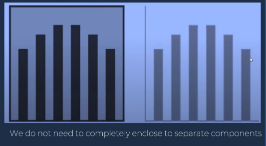
Figure & Ground Principles
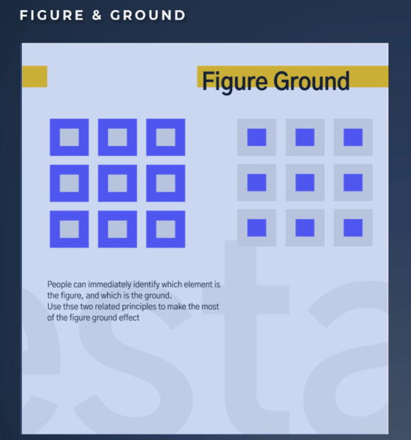
Figure & ground is one of the most difficult Gestalt principles in design, but also one of the most powerful. It is the state in which we perceive elements as either the objects of focus or the background.
Like closure, figure & ground work through the use of positive and negative space. It exists in practically everything we visually perceive, whether seeing a composition, a website, a logo, or an icon.
Our brain separates the foreground from the background in order to see objects and surroundings. It is also called a negative-positive space relationship.
The same shapes can be seen as a foreground or as a background. The color has nothing to do with determining if it is a background or a figure.
Let’s see some examples to clear things out. The Godfather poster is the best example of figure & ground because we see an excellent color contrast.
Placing the focus figure near the central area within the frame gives it balance. The foreground is more detailed than the background. We have an obvious focal point of significance, which is the red rose.
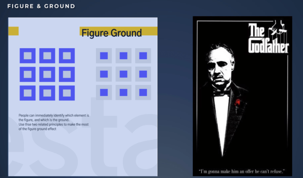
The background does not compete with the foreground for attention. So in this case, it is easy to identify the focal point and the background simplicity of the whole interface, and the importance of details. Keep it simple, and focus on what really matters.
We can replicate this example in our report design. A great deal can happen on the page with very few graphics. In fact, adding more elements without understanding the effect can often make the message confusing. As shown in this example, the poster is just perfect, less is more.
Okay, let’s move on to other examples. Can you easily identify which one is the figure and which one is the ground?
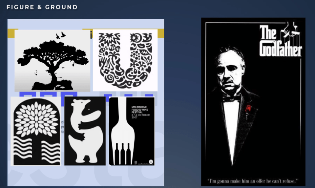
It is hard to know because the images are ambiguous. There is more than one solution to what the figure is and what the background is. These types of images engage the viewer and make them linger longer on your image, which can increase engagement in the story you want to tell.
Unilever: A Great Example Of Figure & Ground
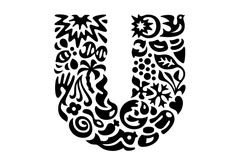
If we look at Unilever’s logo, we’ll understand just how rich a story can be based on the figure & ground, but also closure principle.
Unilever’s logo looks like a big U letter. We tend to see this because it is familiar to us and we easily recognize the letter. Also, the size and the contrast of the shape make us focus on it and the U becomes the figure and the rest, the background.
If we take a closer look, we see the background is ambiguous, and we can identify the details. We can distinguish a bird, a heart, clothes, and a fish.
The user will discover the logo of an engaged company with environmental concerns and more. This logo is great because it is simple, but conveys a very rich story about the company.
This principle is very powerful, and even though it is used more often in graphic design and in informational design, it needs to be understood.
The difference between the background and the foreground is something we need to be aware of in our reports.
***** Related Links *****
Power BI Designs For Compelling Reports
Visuals And Effects: Power BI Dashboard Designs
Dashboard In Power BI: Best Design Practices
Conclusion
Applying the right Gestalt principle techniques in our Power BI reports can produce compelling storytelling that can help the users connect the dots, and make the message more powerful. We have the freedom to choose which principle to use that would best suit the needs of our audience.
All the best,
Alex


