
For this blog post, I will be moving on to the last part of my series on report transparency. The first part of this series talks about layout design, while the second part deals with navigation. I would like to move on to the next part of our series, which will be a DAX Power BI tutorial on how you can significantly increase your report’s transparency using DAX.
Applying Dynamic Text In Power BI
The choices that the end user makes when using a given report mainly comes down to the application of dynamic additional information and placing them in meaningful, visible positions.

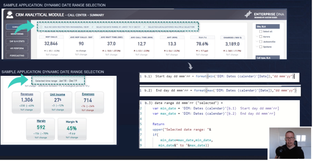
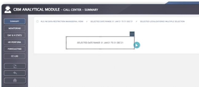
Dynamic texts can be the current date range selection, date of latest invoice, transaction within a given period, or current metrics selection.
Dynamic texts are quite simple to implement, and the added value in terms of reportability is tremendous.
After creating these DAX measures, you can either use them as KPI cards or insert them as a text in a blank button.
The latter option is my favorite way to go. The main downside to this method is that you can’t bolden the text; however, you can control this through text alignment. You can align your information to the left and not have to worry about the length of texts changing as an effect of slicer selection.
When using KPI cards, the text is always aligned to the center of visualization, making this information more difficult to control from the standpoint of visual structuring.
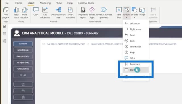
Let me show you how to add new buttons with conditionally formatted text. Go to the Insert tab, click the Buttons icon, and select Blank.
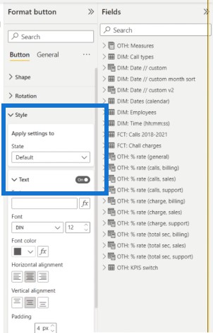
Go to Style and turn Text on.
Then go to the field with conditional formatting, select the specific metric, and click OK.

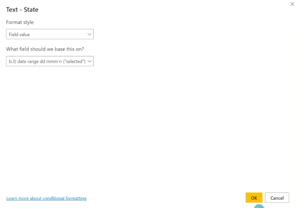
We now have a ready to use button with dynamic text.
Applying Dynamic Titles To Visuals In Power BI
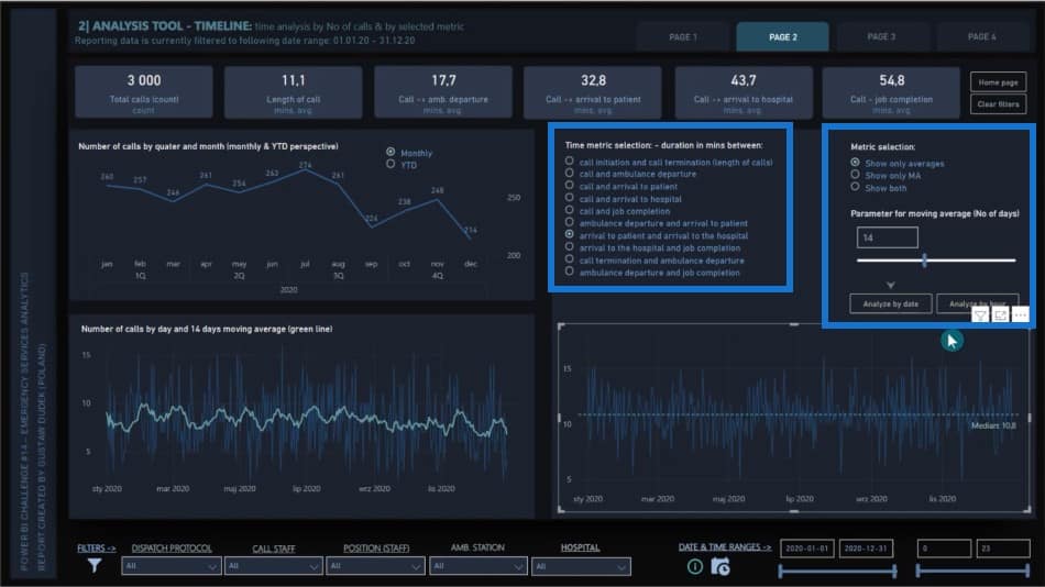
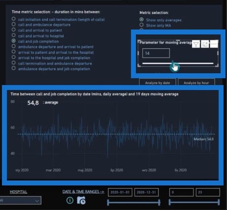
I’d like to show you how you can implement dynamic texts within titles of specific visuals. In this example, I will add a dynamic title on the bottom visual, which is dependent on the slicer selection on top.
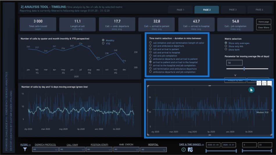
You will also notice that there is another dynamic slicer for the moving average window. We will implement a dynamic title which indicates both the slicer selection on the left and the slicer selection on the right.
Let’s go to the Format pane, choose General, and turn Title on.
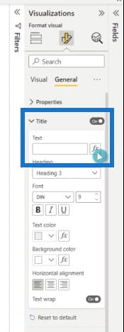
Go to the Formatting pane, select the specific measure, and click OK.
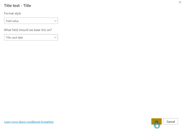
Now you can see that there is a title in the visual. The title is dynamic, and it changes the moment you select different metrics.
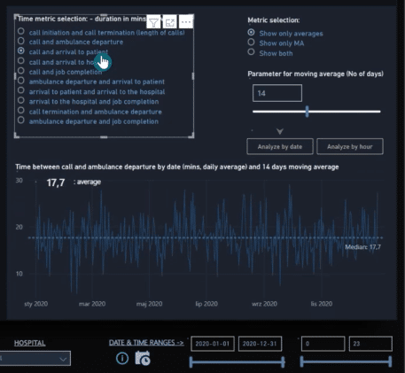
You can also change the day window for moving averages and see changes in the bottom visual below.
Applying DAX Techniques To Save Space
Now let’s take a look at sample DAX techniques that can save us space by showing or hiding different metrics within a visual.
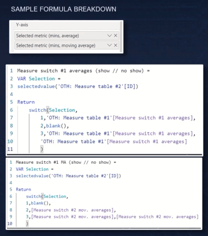
In this DAX Power BI tutorial, we have three different types of dynamic metrics. We can select which measure to show, like the one in the blue line.
Then we have the parameter that can dynamically change the number of days window in moving average, which is the green line.
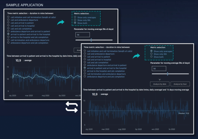
Finally, we have one additional slicer that allows us to show only specific measures in the online chart. We can decide whether we would like to see only the main measure (which is the given average), or if we want to show only the moving average, or maybe both simultaneously.
The logic behind the formula is as follows. There are two separate metrics added to the visual, and the scenario is true in two selections. We want to retrieve blank and the same logic is applied to moving averages, which is either hidden or shown depending on the slicer selection.
Using DAX In A Heat Map
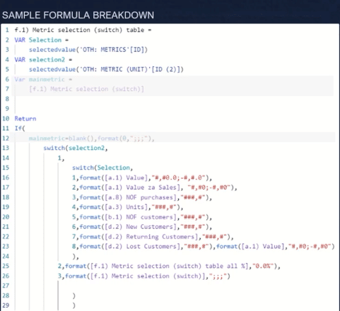
I’ll show another example in this DAX Power BI tutorial, but this time, we’ll use a heat map visual to give value to either visible or hidden metrics. In addition, we can choose whether we would like to see a percentage structure or numeral values. In this case, there are previously created measures, including one for nominal values and one for percentages.
The final measure combines all of them, and the end user checks which type of data he or she wants to display within the heat map. The measure should be checked if you’re analyzing a measure that requires a whole number. For example, volume-based data like purchases or number of units sold, or values in decimal format like revenues or sales.
On the other hand, if the relative value is the choice, the measure brings the appropriate calculation and is put in a percentage format. If the values will be hidden, there will be another format with triple semi-colon, which results in showing only the conditionally formatted backgrounds.

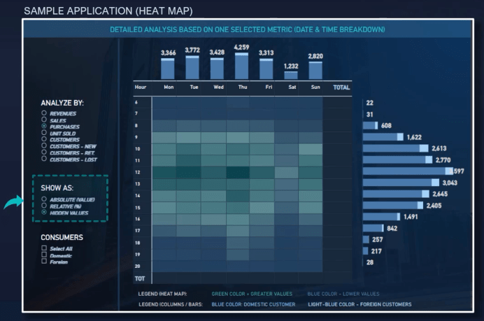
Let me show you an example of how it looks like in an interactive report. We have two different kinds of slicers. The first one is responsible for choosing the specific metrics, while the second one is responsible for choosing specific formats.
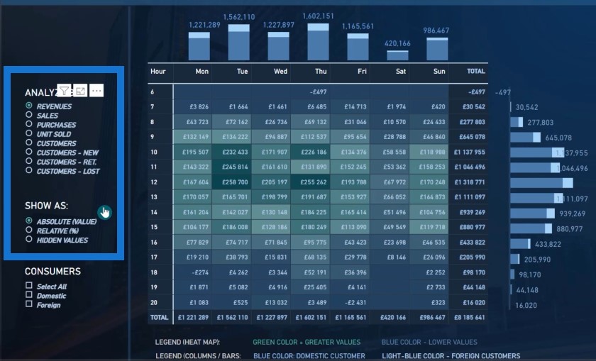
In this particular scenario, we are analyzing the revenues by absolute value, but you can also change the second slicer to relative, which gives you the ability to analyze the structure in percentages.
The first option is to hide all the values so you can see only the colors of the background within the heat map.
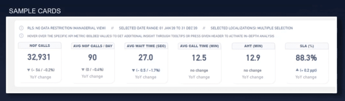
Enhancing Standard KPI Cards
The next technique in this DAX Power BI tutorial is to enhance standard KPI cards with custom metrics to show, for example, period-over-period dynamics.
This is a great way to place extra context on basic KPIs with additional single cards. It’s also more developer-friendly because it is simpler to get the ideal central alignment when using a single card than trying to align three different metrics that are placed side by side, while still being dynamic.
The main logic behind this formula is that if we have created measures with year-over-year comparison both as a nominal difference and as a dynamic in percentage format, we can check if the variance is higher, lower, or equal to zero.
If it’s higher than we have to concatenate unichar, which is in this case, an upper arrow with nominal variants.
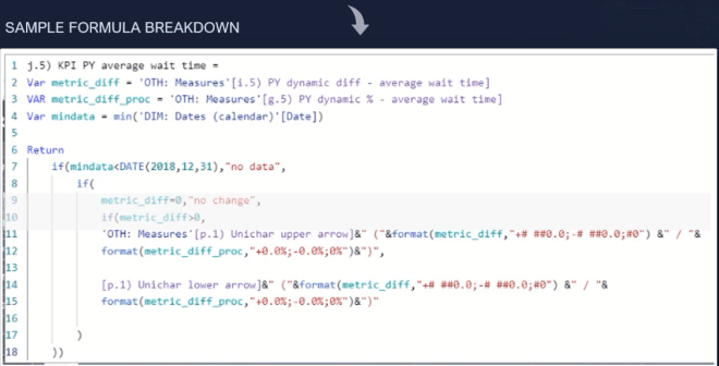
When variance is lower than zero, logic is the same except the applied unichar. If variance is equal to zero, you can retrieve zero.
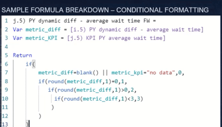
Once we have our main metric created, we should write a parallel measure to enable proper conditional formatting.
Let’s take the average wait time as an example. The year-in-year increase in that specific metric is actually a negative change. Lack of change might be treated as a neutral information, while the decrease in metric value is a positive change.
We’ll create a measure that puts a given number for each scenario ending with zero when metric is blank: 1 (if metric equals to zero because there was no change), 2 (if metric is higher, which means negative change and red color is applied), and 3 (if metric is lower, which means positive change and green color is applied).
With this formula, we have fully functionable KPI cards with year-over-year dynamics and conditional formatting.
Improving Visuals With Setting and Formatting Options
I would like to show a few key settings and format options that can drastically improve how these visuals look like.
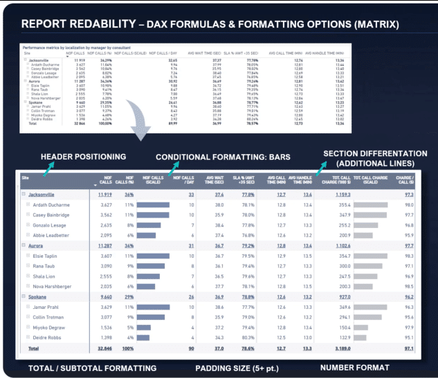
The first element is an optimal header position. In this aspect, row categories, title, and non-value columns should be aligned to the left. All value metrics should be aligned to the right.
The next thing is a data format. It should be adjusted according to the data while cutting all unnecessary number after delimeters.
Then we have the conditional formatting options to be applied when it’s justified.
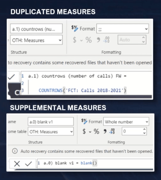
I would also recommend creating duplicated measures for given metrics. This puts bars outside the origin column and makes the data more transparent.
Then we have the title and subtitle formatting options. Some examples in visual formatting include bolded font with optional underlining, font color, and background color.
Then we have inner padding. Anywhere from 3 to 10 points should be great depending on the available report space and number of categories in a given table. Usually, even a slight increasing in padding will greatly improve the visual appearance of the metrics on a table.
We can also apply additional lines to build metric sections and separate similar metrics. This could be done by creating a measure and retrieving a blank value.

In some cases, I recommend adding two separate metrics with blank values and place them side by side. In this case, one blank column will have sections with light background colors, which imitates the vertical lines. The second one has no formatting options applied and artificially controls the width of columns.
What actually works very well in a regular table is applying color on rows. The difference between consecutive rows should be marginal. Here is an example of a white and light grade background in rows.
Dynamically Setting The Y-Axis On Multiple Charts
The last technique that I will present on this DAX Power BI tutorial will help you to imitate small multiple charts without actually using native functionality or visuals from marketplace.
From my perspective, this is a very powerful solution that gives you the best of both worlds. This is the dynamically changed Y axis and all formatting options that are available in native small multiples. What’s more, you can shape structure and place your imitation chart as you like.
The simple scenario you can see here is a comparison of monthly revenues and monthly expenses on separate column charts. It has a Y axis that is dynamic and unified across the visuals.
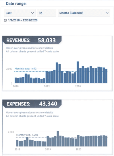
The logic behind this particular technique is as follows. First, you retrieve the minimum value and the maximum value for each category in a given scenario.
In this case, we look for the minimum and maximum value for either monthly revenues or monthly expenses within the selected period.

If we identify those numbers, we retrieve the maximum volume multiplied by some marginal level to get additional space above the max value.
If the mean value is greater than 0, then I would like to retrieve 0 either way to have my Y axis starting from the bottom. We then create a measure which is applied as a dynamic Y axis on the given chart.
Using Tooltips For Power BI Reports
The tooltips are one additional thing that I would like to highlight. I used tooltips to shows details about the circuits in my Formula 1 report.
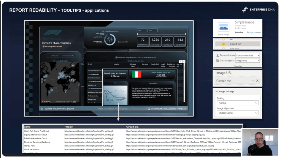
In this report, both the main title and metric with the fastest lap times are standard KPI cards. The description part is just the metrics, while the flag and circuit picture are based on web URL addresses.
I also used an additional visual called Simple Image, which can be downloaded for free from the marketplace. I set the data category for the column as image URL, then chose normal scaling within the image setting section.
***** Related Links *****
High-Quality Power BI Report Navigation Experience
Power BI Interactive Reports: Navigation And Bookmarks
Power BI Page Navigation Updates, Tutorial, & Review
Conclusion
That’s it for my series on report transparency. Hopefully, you’ve learned how to design layouts, improve the navigation, and use DAX measures for your Power BI reports and dashboards.
All the best,
Gustaw Dudek


