Today, I want to talk about the new tooltips in Power BI – the new Modern Visual tooltips. I think has the potential to be pretty great. It’s just in preview right now. It’s in the early stages, but you could see the potential for it. I want to take some time and show you what it does, how it works, and where I think it’s going. You may watch the full video of this tutorial at the bottom of this blog.
Before we get into that, let’s take a look at the old tooltips. This is just a simple report I put together for demonstration purposes.
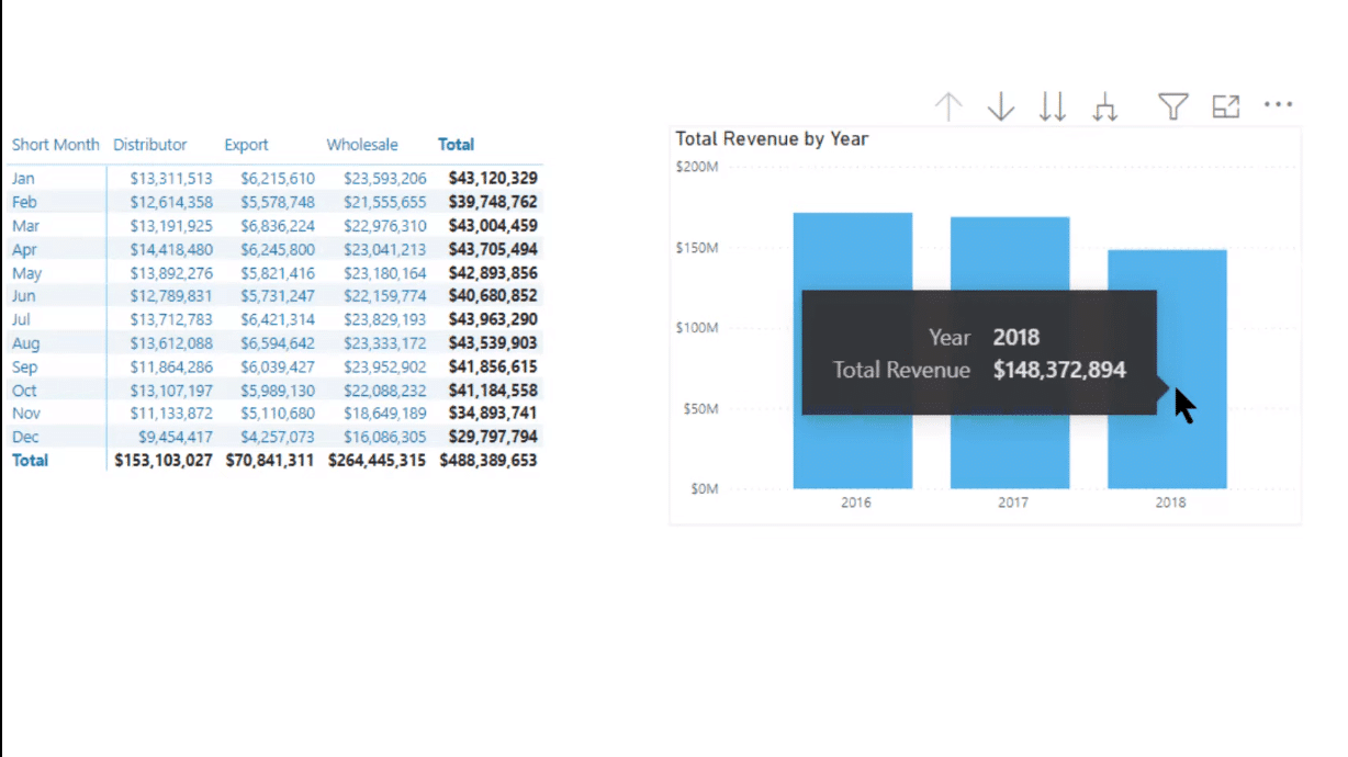
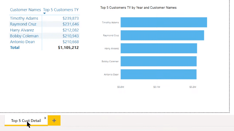
It has a matrix with some different granularities; it’s got year and month, channels, and total revenue. On the right-side visual, I’ve got a Total Revenue by Year, and then you can drill down into month, and drill through in the customer as well. I’ve also got a page with the Top 5 Customer Detail.
As you can see on the report page, the current default tooltip is not very exciting. It’s the standard black and gray and white tooltip, which is pretty minimal. You can customize it, but this is what it looks like out of the box.
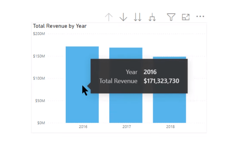
Now, let’s take a look at the modern visual tooltips. I think you’ll see some striking differences right away.
The New Modern Visual Tooltips In Power BI
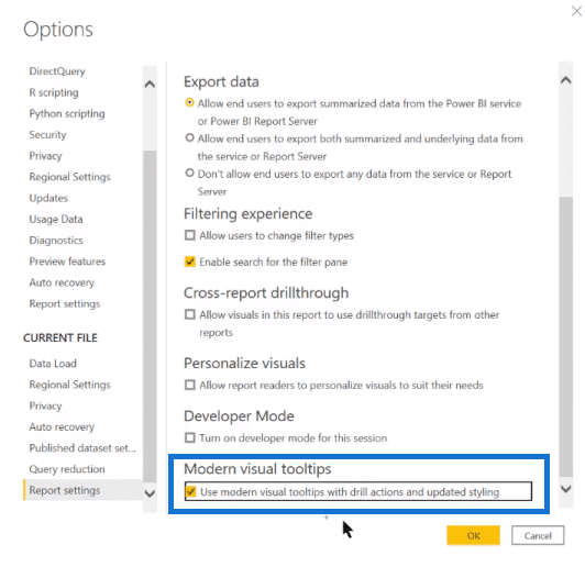
It’s a preview feature, so you need to go to Options and Settings to access it. Go to Preview Features and click on Modern Visual Tooltips to enable it.
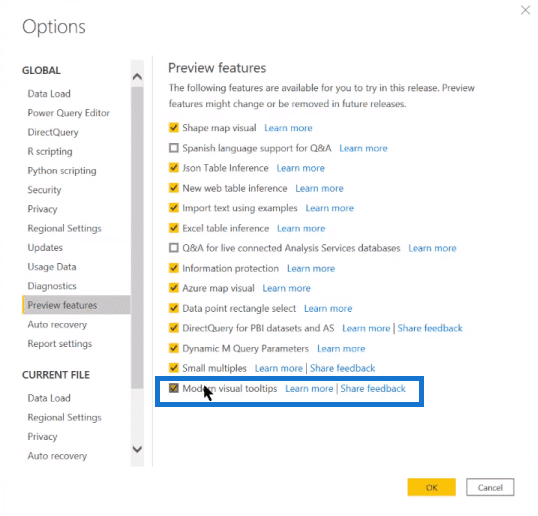
The interesting thing is that for new reports, once you turn that on, it’ll create the new modern visual tooltip in every report you create subsequently. But for old reports, you go into Report Settings and then scroll down. You’ll see there’s a second option where you have to turn on modern visual tooltips in the existing report.
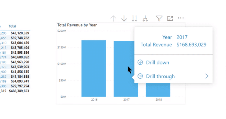
And if you do that, you’ll see some immediate changes in the report. The first thing we see is that the tooltip looks different. It takes on the theme of the report itself.
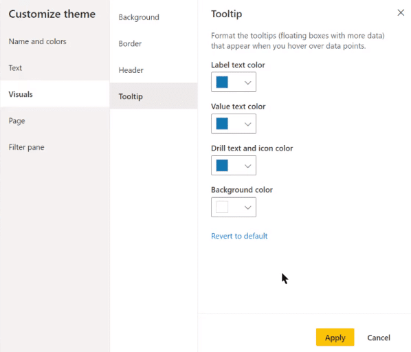
You can customize that at the visual level, just through the paint roller. You’ll see within the tooltip that you can change all the different colors, font, font family, background, color transparency, and all the standard features you’ve been able to change in the past.

You can also go into the View tab, where you can change the tooltip at the Theme level. Just go into Customize Current Theme Visuals.
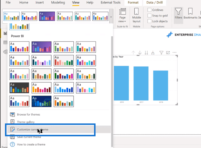
You can change the visual tooltip for the entire report, or you can set it back to default.
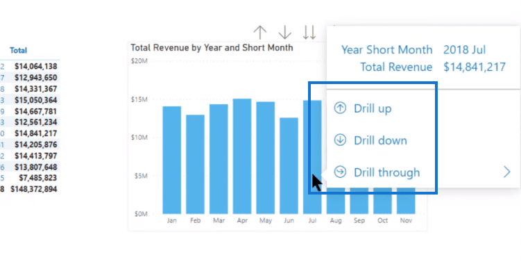
The nice thing about the modern tooltips is that you just hover over the tooltip and hold for a little bit, and you’ll see all the drill down, drill up, and drill through options.
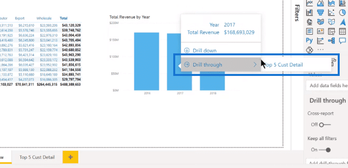
The Drill through option enables you to go to the Top 5 Customer Details page.
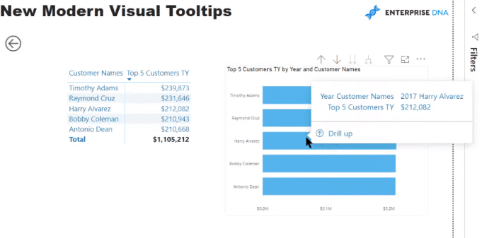
When you get to that page, you can also drill up and drill down.
***** Related Links *****
Creating A Visual Tooltip In Power BI
Dynamic Tooltip In Power BI With Embedded Charts
Power BI Tooltips On Report Images
Conclusion
In this blog, I’ve walked you through the new modern tooltips in Power BI. You can see that it just makes navigation and the transparency of the flow of your report a lot clearer for the average user. I think it looks nice.
The one thing about it that is pretty limited right now is that it’s only the bar chart where you’ve got full control of the drill actions. It’s not available for line charts, custom visuals, area charts, and decomposition trees.
For me, what’s going to happen is that with each successive rollout, we’re going to see more and more visuals and features added to the modern visual tooltips. I think this is just the tip of the iceberg, but it’s a really nice feature. I definitely encourage you to play around with it. If it’s active for the visuals in your report, I think it’s very usable as it is.
All the best!
Brian


