Data story telling is an important part of the report development process. It changes the way the audience views reports and allows them to look at the data being presented in a clearer manner.
To truly understand the importance of data story telling, we need to think about the primary goal of creating data visualization and reports.
Defining Data Story Telling
When we create reports, our primary goal is to communicate information clearly and effectively.
Storytelling is about transmission of information. Our brains are wired to retain information when hearing compelling stories. Stories have always been the most effective way to share information with others.
Stories that incorporate data provide a higher impact and are more convincing than reports without a story.
It limits the cognitive load, sparks the audience curiosity, and delivers a clear message that makes the audience focus on what is essential.
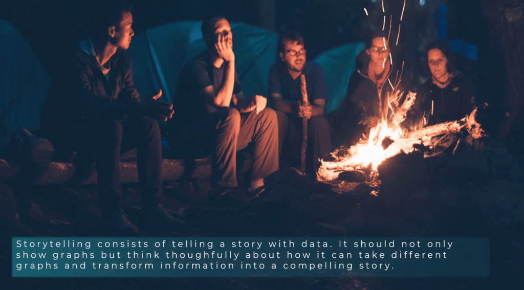
Effective data story telling consists of telling a story with data. It is a way to communicate with the audience through data not just by showing graphs, but also by thinking thoughtfully about how you can take these graphs and transform information into a compelling story.

Through the use of storytelling, we target three main goals. Get the audience’s attention, build credibility, and move the audience towards action.
The problem with storytelling is that it takes time to process because it needs creative thinking. Most analysts spend a large majority of their time exporting and doing repetitive tasks and less time analyzing in order to meet deadlines.
Good analysts also aren’t necessarily good storytellers or designers. But the skills required to tell a good story can be learned and improved through practice. We must all think from the perspective of the audience. Who wants to hear dull presentation with no particular focus, no call to action or conclusion? No one.
This is why whenever we create our reports, we need to ask the right questions that will allow us to tell an engaging story.
Understanding The Enterprise
The first important step in telling a good data story is familiarizing yourself with the technical environment. We need to check the boundaries of what we can or cannot do. In doing this, we need to look at three critical areas – the enterprise, the data involved, and the business.
Let’s start with the enterprise. One of the first questions we should ask is, what specific platforms are in use? Is it Power BI Pro? Does the user have premium capacity? We need to think about how the report will be consumed by the end user.
If you’re using Power BI Premium, for example, you can simply share your report to 100 users without any problem. But if you’re using Power BI Pro, those 100 users should be using a pro license as well before they can view and interact with your report.
The person you’re making the report for might also have different needs. If they need the data to be refreshed a few times each day, then using Power BI Pro might have some limitations knowing that it only allows up to 8 refreshes a day. If you use Power BI Premium, you’re given up to 48 refreshes daily.
Think about the external tools as well. DAX Studio will allow you to create queries effortlessly. You can monitor each query’s performance and adjust your formulas as needed. If you’re using Tabular Editor, you can build calculation groups and create an analytical experience that you couldn’t create if you rely solely on the capabilities of Power BI Desktop.
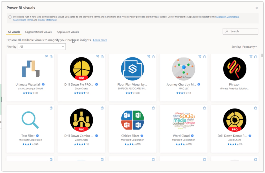
The use of custom visuals is another consideration. The visualization menu within the Power BI Desktop will show you what you’re capable of when you go into the visual library.

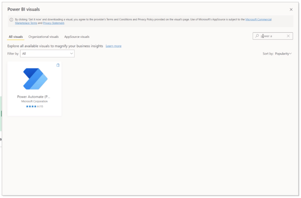
This custom visual library contains many type of visuals that are not native and can be useful in creating more effective reports. This is where you can find Power Automate in case you need to create workflows and work on other kinds of use cases.

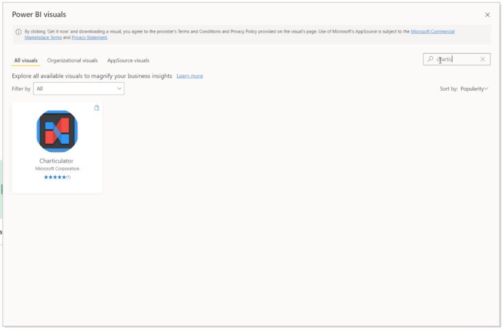
You can also access Charticulator in case you want to create your own custom visuals.

Make sure you also check any graphics standards that need to be followed. Is there a specific color theme to be used? Which icons and fonts are needed? This will impact the branding and overall look of your report.
Understanding The Data To Be Used
To create a seamless story, you need to understand first where your data is coming from. How many data sources do you have? Are you using Excel, SQL, or other data sources? Knowing where your data is coming from gives you better control of the way the data should be consumed.
Data quality is another thing to consider. Is there a need for you to use DirectQuery? Are you supposed to use import mode?
Knowing the ins and outs of your data allows you to prepare everything that you need before jumping into Power BI. Some aspects of the datasets, for example, might have to be tweaked before being imported into Power BI. Importing the wrong type of data into Power BI does not just impact overall performance; it could result in wrong analysis and results as well.
Checking on volumetry also gives you a better idea on how to deal with the data provided. If you’re working in Direct Query, for instance, this means that you’re dealing with a huge amount of data. Find out right away if you’ll be working with 100 million rows of data, because you’d have to make a lot of adjustments to your approach.
Understanding Business Requirements
The last set of considerations would be about the business requirements. This is critical because this dictates what kind of information the end user needs to see and how they want to see it.
Are you working on marketing data? Financial data? Human resources data?
Check on how sensitive the data is as well. Is there a need for anonymity?
This is also where the type of collaboration required should be considered. Are you working with data engineers who will require some SQL integration? Are you working with a data science team? Understanding the kind of people you’re working with allows you to set boundaries and understand what your scope should be.
It would be helpful to understand whether the expected report should be live, where the data is refreshed every few seconds, or if it’s okay to keep the data stagnant.
***** Related Links *****
Business Reporting Using Power BI
Web-Based Report Development Techniques In Power BI
Best Practices For Data Visualization In Power BI
Conclusion
Data story telling truly makes an impact especially if you want to effectively engage your audience. Although data professionals and enthusiasts like us might consume data in specific ways, remember that the audience might not think the same way. This is why it’s important to deliver the data in a way that will pique their interest.
Note that data story telling isn’t just about aesthetics, either. It’s finding the balance between analysis and creative presentation. The goal is to deliver the right type of data to the right type of people in the right way.
All the best,
Alex


