
Customer analysis is a crucial thing to do for any business specially if you have a large number of customers. You may watch the full video of this tutorial at the bottom of this blog.
In this particular tutorial, I work through how we can create some compelling customer analysis overtime.
I’m looking at customer’s purchasing behaviour between different timeframes and put those into a visualisation, highlighting the information in a way that you can make informed decisions on it.

Due to the ease with which we can place filters and slicers over our report pages in Power BI, we can truly create some really compelling visualisations and see what our customers are doing.
We can also dynamically click into customer groups and performance groups.
I talk a little bit about how you can set this up within a report page quite seamlessly and be able to highlight the key information, which will really have an impact on what actions you take with your customers.
Those actions can improve things like putting more resourcing to customers, more money into marketing or advertising and so many things of that nature.
Grouping Your Customers
When you have a lot of customers, your chart can be very busy and it would be quite difficult to see the changes of your customer behaviour over time. You won’t be able to showcase the insights in an effective way.
But, think of it in broader terms of how to set this up, which I will show you.
You’ll just have to think about your current model and how you can build on top of that model to then showcase the insights.

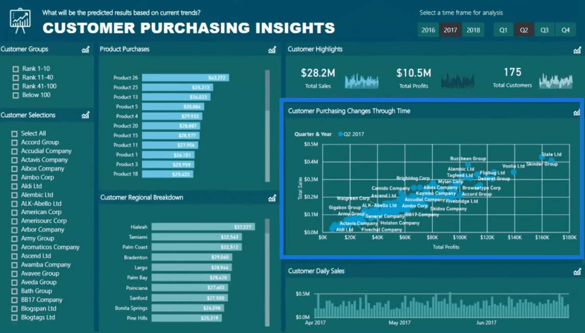
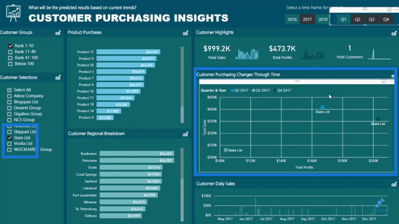
In this example, you’ll see that I have some time selection and I’m trying to show the Total Sales by Total Profits. But, what I also want to show is how this change over time per customer.
And you see how busy this chart is, right?
There’s a lot of customers and we’re NOT really able to see the changes of the customers. We can’t see how they’re moving through time in the performance perspective.
So we need to break it up and segment it. We need to group these customers, which will enable us to drill into a very niche group of customers, and perhaps drill even further.
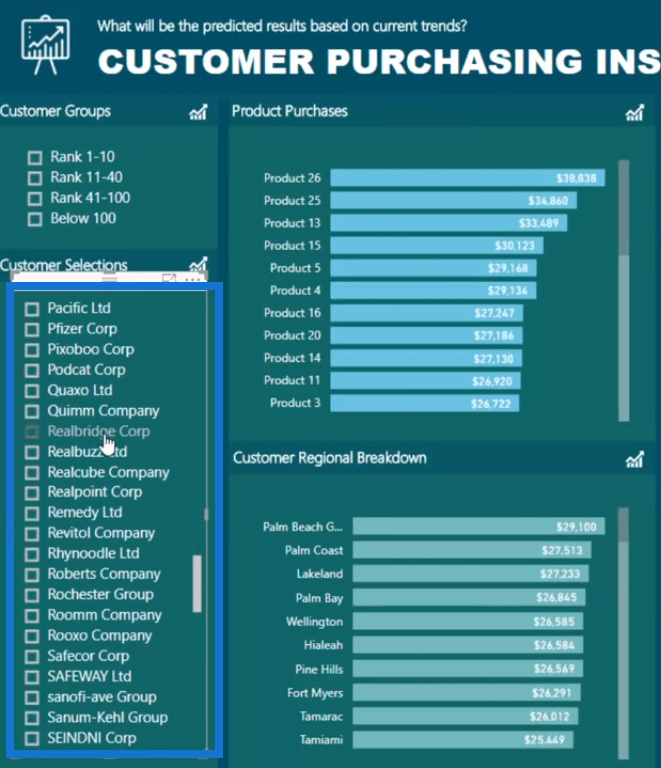
Here, you can see that I’ve set up a list of my customers and it’s actually quite long.
However, we don’t really want to be going down here and select all customers, right? If we do, we can’t really see what we’ve selected after we have done so.
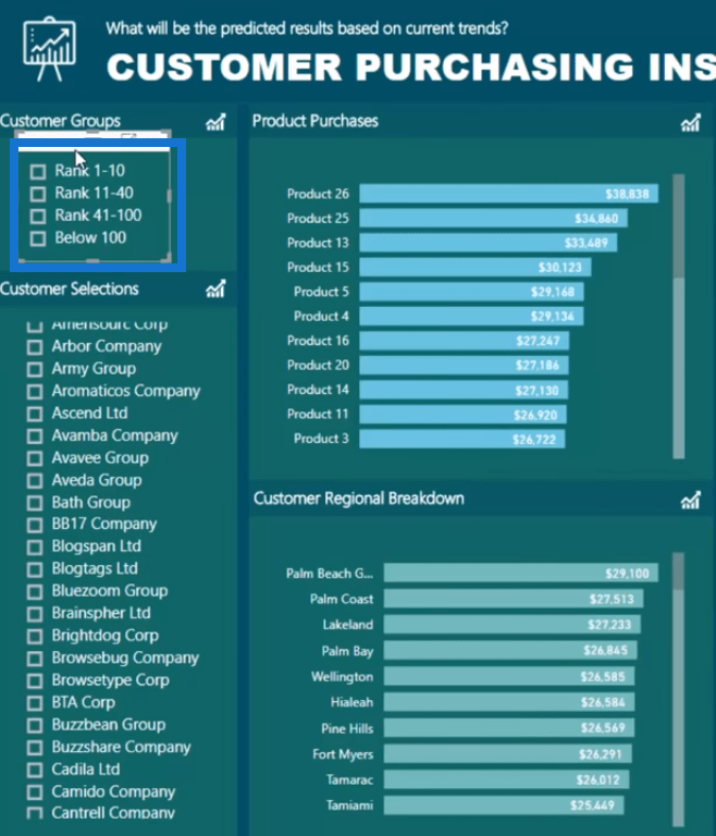
So I have created these groups of customers, where I just built a calculated column that ranks my customers in these particular groups.
Let me show you what I’ve done there. I have my data models here and we will be focusing on the Customer Table.
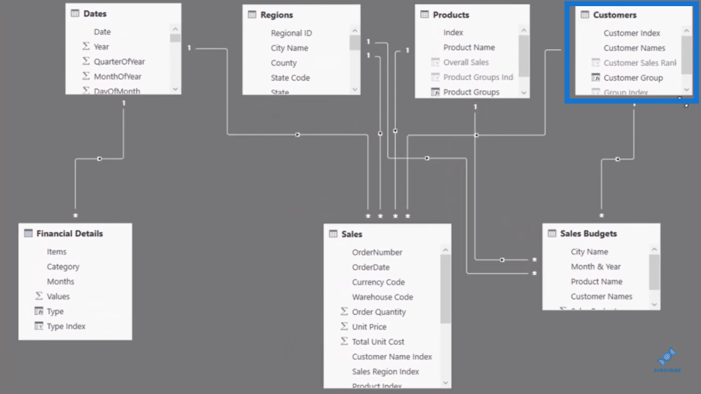
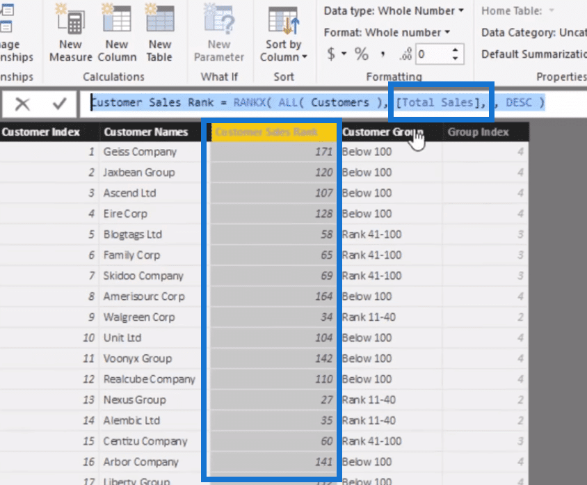
In my Customer Table, you’ll see that I’ve grouped them based on the Customer Sales Rank, which is this one here.
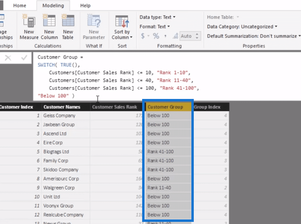
All this is doing really is ranking on Total Sales.
This is Total Sales from the beginning of time, so there’s no time filter on this. In other words, it is ranking all customers through time.
It’s just a way for us to being able to break up or create another dimension that can then drill into specific aspects of our customers or specific groups of our customers.
This would then flow down to all the calculations that we will eventually do over our Sales Table or Budgeting, and so on.
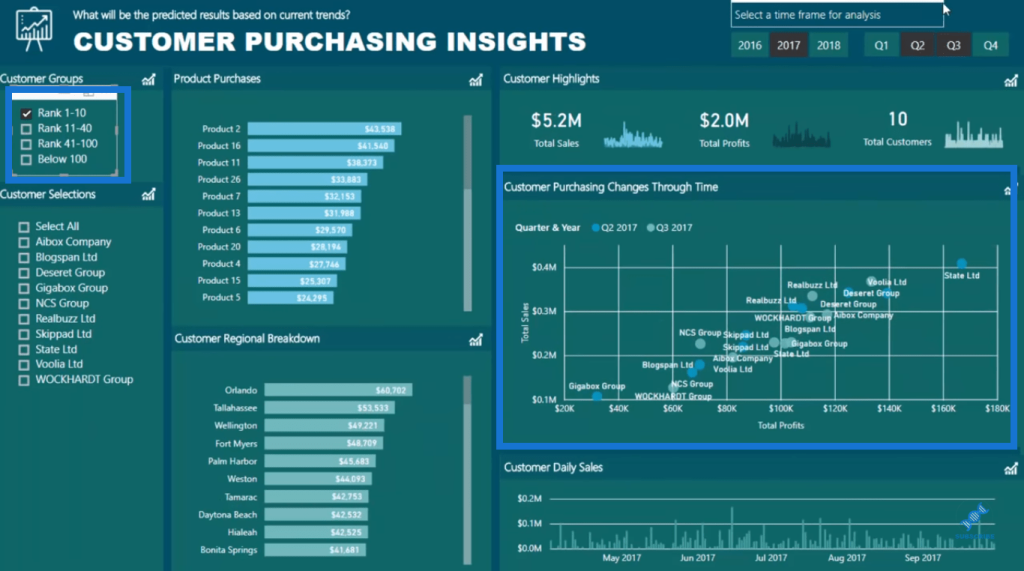
So instead of looking at all of my customers here, I can just go rank 1-10, and you can see in the chart that it breaks down quickly.
Now we can really see or drill into our customers.

Drilling Deeper Into Customers
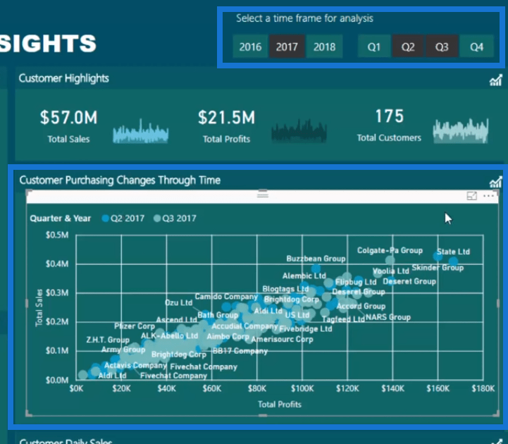
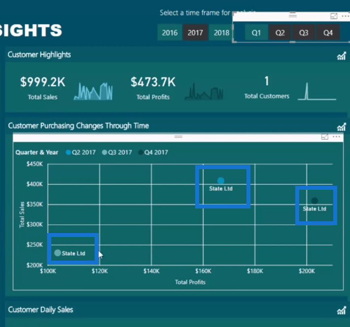
For instance, we want to analyse how our customer performance changes through time for our Profits versus Sales. We can put here Quarter 3 as well.
This enables us to monitor these customers effectively.
For example, we want to monitor State Ltd. We can select it and perhaps we can add another quarter here. We can really start to see and find some pretty decent insights here.
In the second quarter, this particular customer started here. And for some reason, in the third quarter of 2017, it dropped way back here. But then zoomed all the way back up much higher in the fourth quarter.
We started in a very detailed form in terms of the visualization and what the insights are showcasing. But through the functionality that we have built-in, we can progressively move to more unique or specific insights.
This is a really good way to consider specially when you have a lot of customers in your data set.
Moreover, we have the rest of our models to work with to. So for instance, we want to look at just the first 5 products that the individual customer has bought to see if this is what’s causing the difference. And it looks like it probably is.
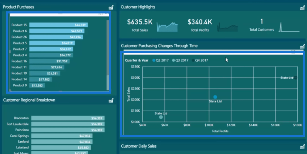
Other things that are showcasing insights are the individual trend analysis and we can see how they are actually made up through time.
There’s a lot of different ways you could do to filter the data eventually and you could drill into various aspects as well.
***** Related Links *****
Customer Trend Analysis in Power BI Using DAX
Segment Your Customers Into Groups – Advanced DAX Example Customer Segmentation Techniques Using The Data Model – Power BI & DAX
Conclusion
This blog showcases the different ways that you can do to make customer analysis easy and effective inside Power BI.
If you set up your model well specially with some grouping techniques, then you can can drill into the specific group you want to look at.
You can set things up where you are already looking at a sub set of your data and quickly drill into specific customers or customers from the initial group.
This is a really good review of what you can do around a reporting scenario based on customer insights. This isn’t exactly about one formula here or one visualisation. It’s in all encompassing tutorial around what can be achieved in a very scalable way with Power BI.
Enjoy working through this one.
Sam
[youtube https://www.youtube.com/watch?v=x6D0dhXfFJY&w=784&h=441]


