
In this tutorial, you’ll learn how to create a three-dimensional (3D) scatter plot using Python in Power BI. Python is a programming language that is widely used for data analysis and visualization. It’s a powerful tool for creating interactive plots and charts. You can watch the full video of this tutorial at the bottom of this blog.
A 3D scatter plot is a visual representation of data points on a three-dimensional graph. It’s useful for displaying the relationships between three variables, and can be used to identify patterns and trends in the data.
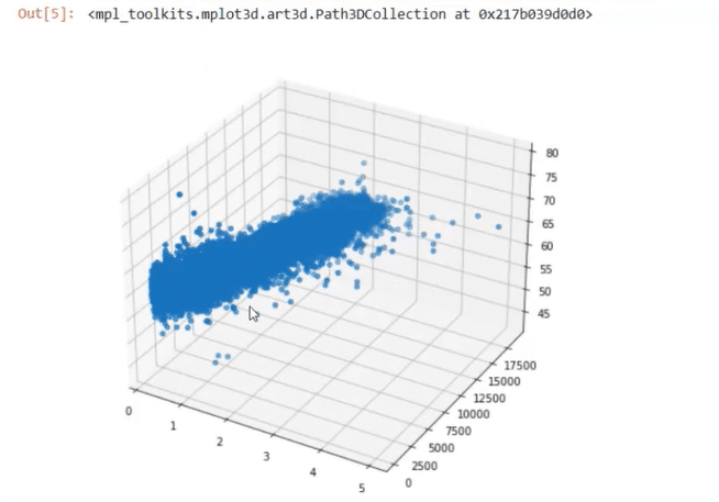
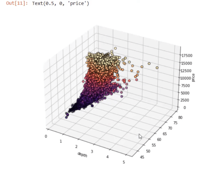
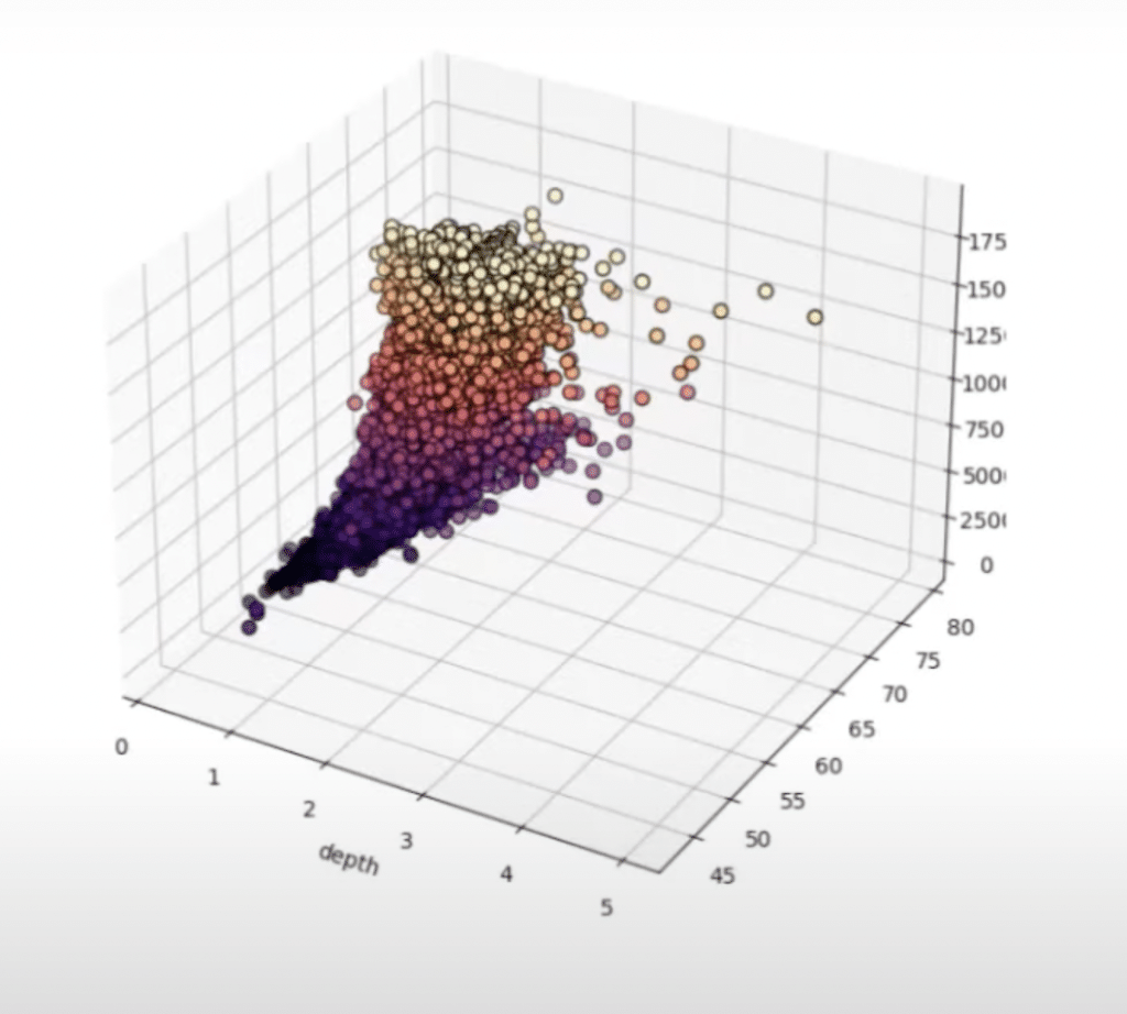
By the end of this blog, you’ll be able to create a 3D scatter plot that looks like this:

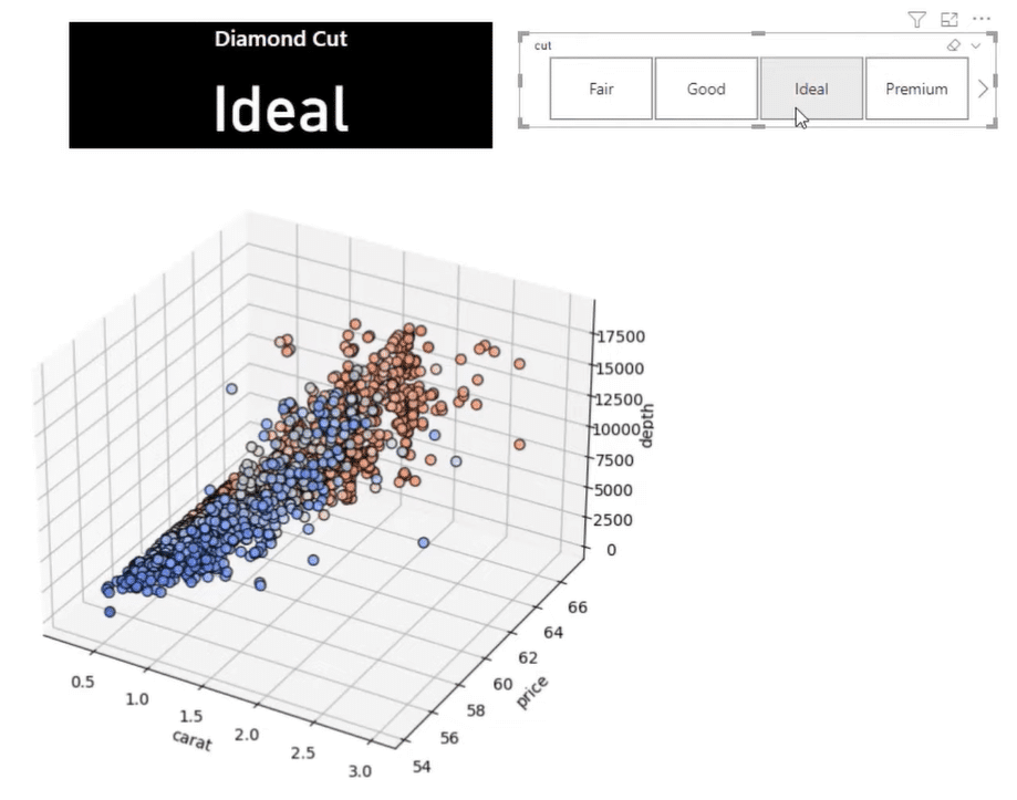
The resulting graph will have a built-in slicer that allows you to choose between different layers of data. The example used a diamond dataset composed of the carrot size, price, and diamond depth.
Build The Dataset & Variables In Python
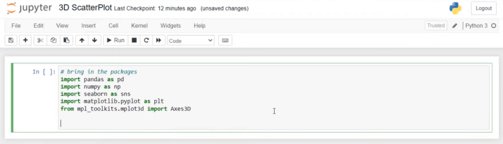
Open your Jupyter notebook.
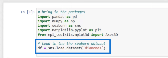
The first step is to import the packages. For this example, the pandas, numpy, seaborn, matplotlib.plypot, and Axes3D packages are used. They’re saved as variables to make them easier to use in the code.
The pandas and numpy packages are fundamental for data manipulation. And seaborn is a data visualization library in Python that provides a high-level interface for drawing attractive and informative statistical graphics.
The matplotlib.plypot package is a data visualization library in Python that’s used to create a wide range of static, animated, and interactive visualizations in Python. And lastly, the Axes3D package allows you to transform the graph as a 3-dimensional figure.
After importing the packages, the next step is to load the dataset. In this case, the seaborn diamond dataset is used and saved as the variable df.

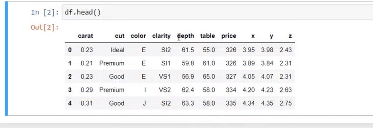
If you want to view what the dataset looks like, create another cell and run df.head( ). You’ll then be able to see the dimensions and metrics inside the diamond dataset.
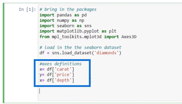
To set the x, y, and z variables of your graph, follow the syntax variable = dataset[‘dimension’] as seen below:
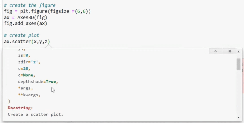
Create The 3D Scatter Plot Figure In Python
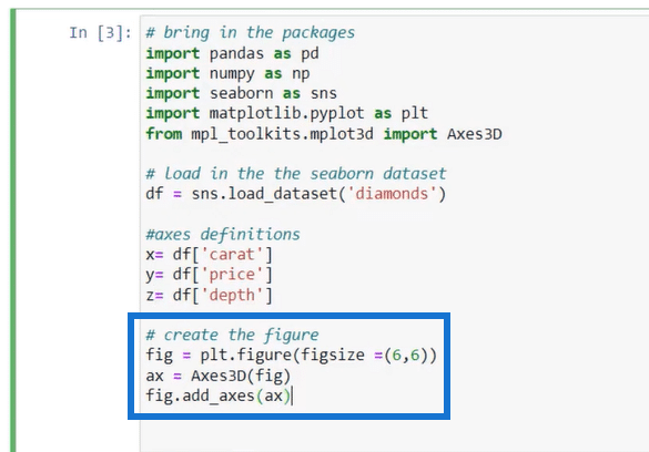
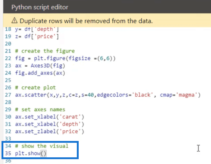
To create the 3D figure, use the matplotlib variable. Then within the parentheses, choose the metrics of the graph that you want to customize.
If you want to format the figure size, for example, you need to use the figsize metric and then specify the size you want.
To define your axes, use the Axes3D dataset and encapsulate the ‘fig’ variable within the parenthesis. Doing so transforms this variable into a function. Then, use the fig.add_axes( ) function to add the axes you defined into the figure.
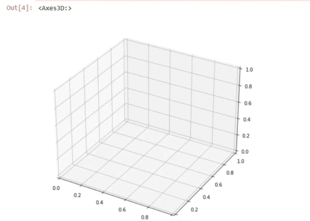
When you run the code, you’ll get a blank 3D graph.
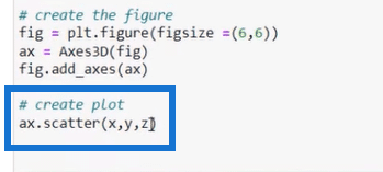
To create the scatter plot, use the scatter function and write the three axes you defined earlier.
If you run the code, you’ll now get a basic 3D scatter plot.
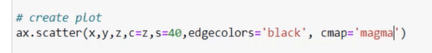
If you want to make formatting changes to your scatter plot, go back to the latest line of code. After the last axis, press SHIFT+TAB. This will open a drop-down menu containing a list of the different formatting changes you can perform on the plot.
You can define the color, size, and shape of each axis. The cmap option allows you to choose a color theme for all of your axes instead of specifying them one by one.
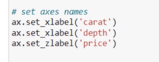
You can also add axis labels by following the syntax below:
The format of the scatter plot entirely depends on how you want the final graph to look like. When you run the code in this example, this is how it’ll appear:
Enable The Scatter Plot’s Interactivity
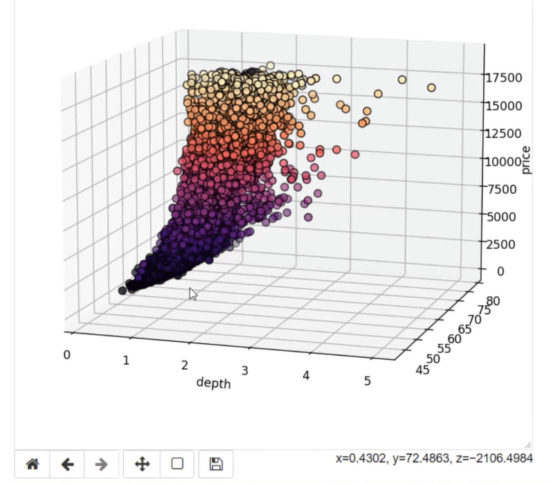
The next step is to make the 3D scatter plot interactive. Note that this feature is only available in jupyter notebook.
To make your graphs interactive, use the %matplotlib notebook command.
When you run the code, you’ll see that the scatter plot has now been added with controls that allow you to change the graph’s perspective and size.

Beside the controls, there’s also information regarding the x, y, z position of a specific plot point depending on where your mouse cursor is placed.
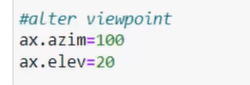
If you want your scatter plot to appear in a specific viewpoint whenever you run it, you can use the ax.azim or ax.elev commands.
Import The 3D Scatter Plot From Python To Power BI
Once you’re satisfied with how your scatter plot looks, the next step is to import it from jupyter notebook to Power BI.
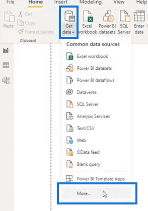
Open your Power BI desktop and go to the Home tab. Select Get Data > More.
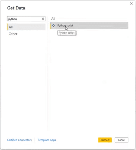
In the Get Data wizard, look for the Python script option and then click Connect.
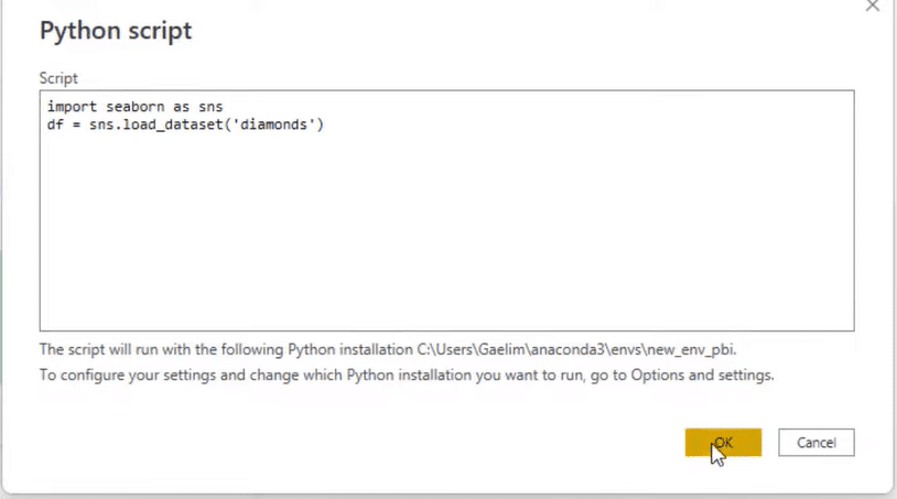
Copy the code from your dataset in Jupyter notebook and paste it into Power BI’s Script text box. Then, click OK.
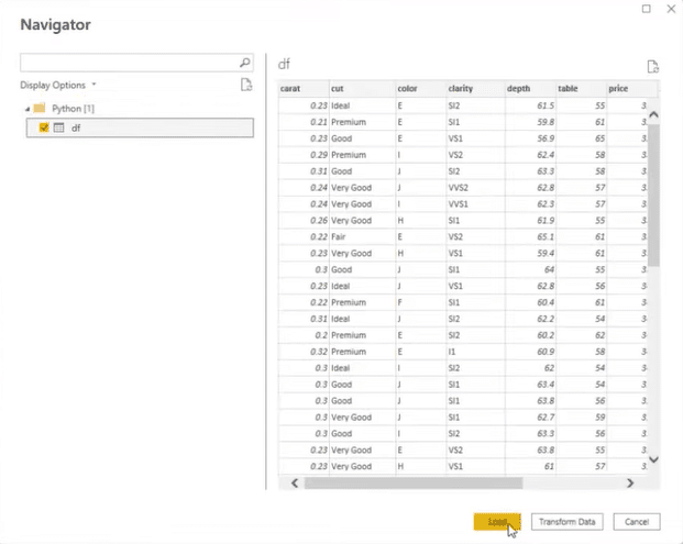
Click the dataset and select Load.
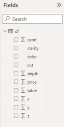
The dataset from your python code can now be seen in Power BI under the Fields pane.
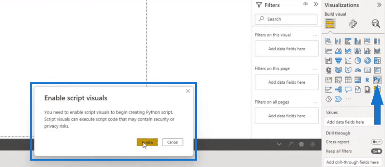
To present them in a visual, click the Python visual option under the Visualization pane and then enable script visuals.
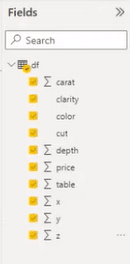
Next, select data from the Fields pane that you want shown in your scatter plot. It’s recommended to bring in all the data as it allows you to expand the dataset and enable other functionalities available in Power BI.
Once done, go back to your Jupyter notebook and copy your code (excluding the viewpoint). Paste this in the Python script editor in Power BI.
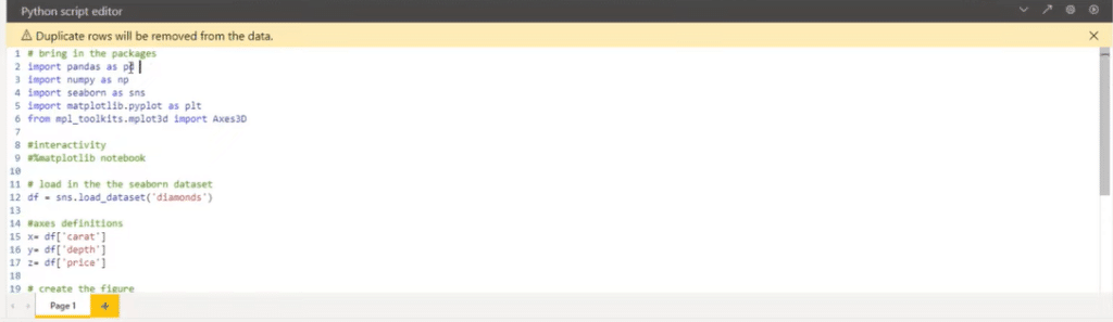
Before you run the code, you need to make a few changes. Since datasets in Power BI are called dataset by default, you need to comment out the df variable and instead, assign df as the dataset.
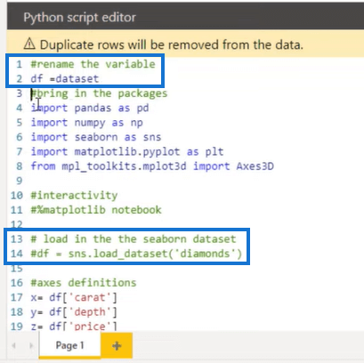
And lastly, write the plt.show( ) function so that the scatter plot can be viewed in Power BI desktop.
This is now how your 3D scatter plot looks like in Power BI.
Adding Dimensional Filters In Power BI
The great thing about Power BI is that it allows you to make dynamic visualizations. You can add dimensional filters to your 3D scatter plot so that you can control which data is displayed in the visualization.
Drag a field of your choice into the Power BI canvas, and then turn it into a filter using the Slicer option in the Visualization pane.
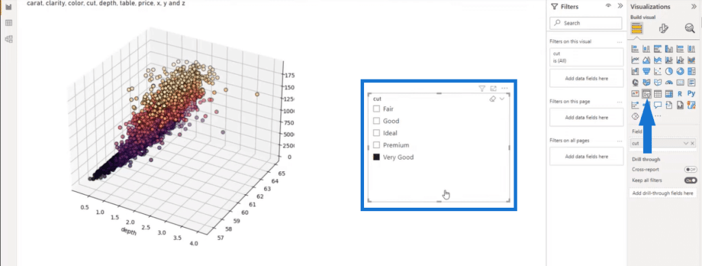
The data in the 3D plot will then vary depending on the option you select in the slicer. You can add other dimensions and filters into your Power BI report visualization depending on your preference or requirements.
Afterwards, you can format your slicer and transform it into buttons. You can also build a text box that shows the slicer option you selected.

***** Related Links *****
Text Analysis In Python | An Introduction
Python User Defined Functions | An Overview
Seaborn Function In Python To Visualize A Variable’s Distribution
Conclusion
Creating a 3D scatter plot using Python in Power BI is a powerful way to visualize data with three variables. It allows you to identify patterns and trends in the data and can be customized to fit the needs of your specific use case.

Moreover, transforming the scatter plot into a dynamic visualization in Power BI is a great way to create interactive dashboards that allow users to explore and view data that is relevant to them.
Overall, using Python in Power BI allows you to customize your visualizations and create custom charts and plots that aren’t available in the built-in visualization options. It’s perfect for data manipulation and analysis, and can be used to clean, transform, and analyze data before its visualized in Power BI.
All the best,
Gaelim Holland


