Showcasing results cumulatively is, in my opinion, the best way to showcase trends in your data. When comparing data versus budget or forecasts, showing the trends or divergence in trend is essential. You may watch the full video of this tutorial at the bottom of this blog.
You want to make sure you can identify when your performance is breaking down as soon as possible and by viewing this cumulatively you can do that very effectively.
This is a continuation of a previous blog post where we went over how you can actually show actual results to budgeted results. Budgets are usually at a different granularity to actuals. Actuals are doing numerous things at a transactional level every day, while your budgets might be at a yearly level. What we did was to work out some logic around how we can divide or allocate the budget over different time frames.
How To Do Forecasting in Power BI: A Quick Recap
We started out with our Total Sales and Total Budget. We had the same number under the Budget Allocation column. The 62 million is actually the total of all the budgets. The reason why it is like this is because the Budget information has no relationship to the Date table, which is where the Date column comes from.
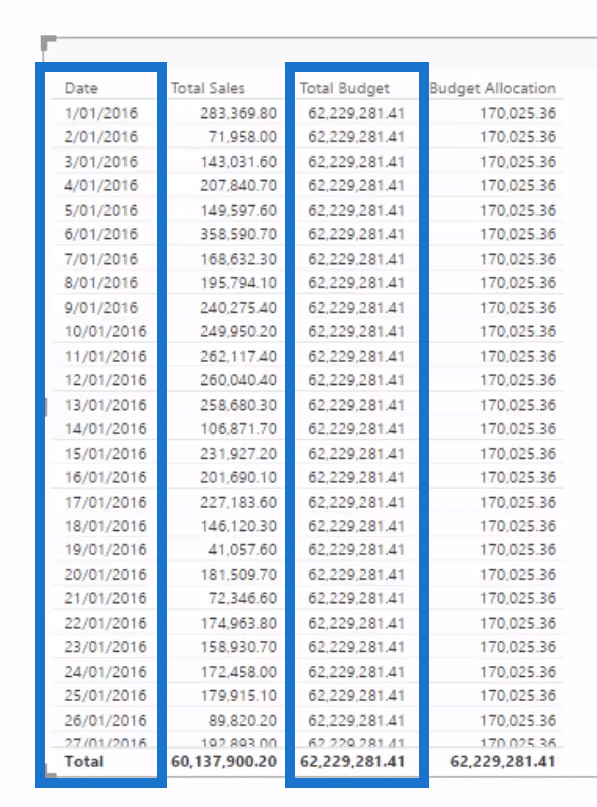
When the Date places a filter on this table, the Budget result doesn’t know what to do because there is no filter flowing down to that table. We had to create the Budget Allocation using DAX measures. We worked out how many Days in Year (366 days), and then created a ratio that will result to 1 / 366 x Total Budget. We also worked out how many Days in Date Context using this simple formula.

What the COUNTROWS function does is it counts up how many rows there are in the Date table. There is only 1 because each individual date is only one row. When we transition to months, the Days in Date Context will change to how many days there are in a month. So this is how you get the correct budget allocation, depending on what date context you currently have.
Determining The Cumulative Sales
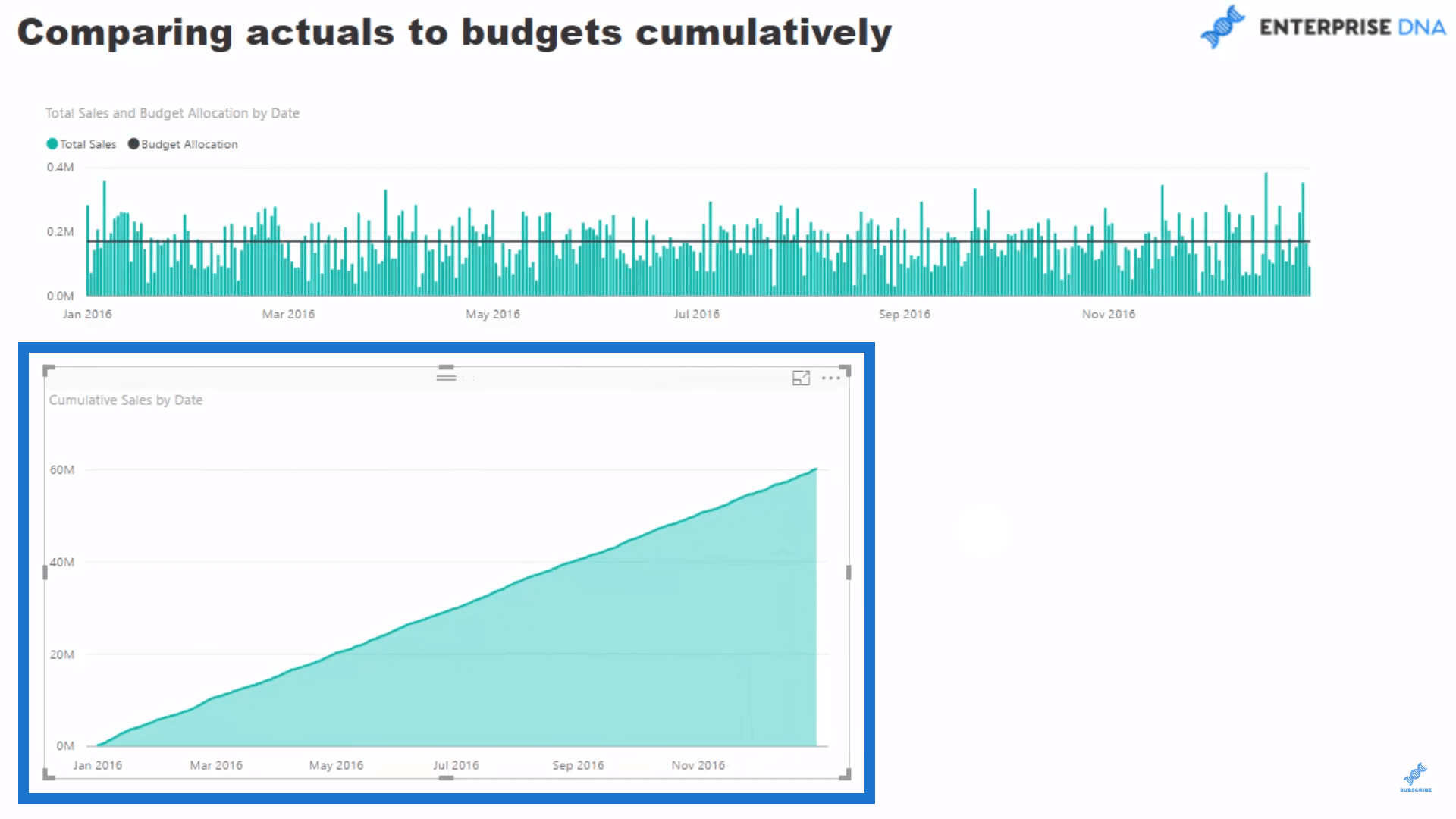
So how do we look at these things cumulatively? We can look at it from a daily perspective, but it will look really cool if we were able to track through time. All we have to do is use the cumulative total pattern to actually showcase our forecasting in Power BI.
We are going to use our Total Sales measure, then create a new one and call it Cumulative Sales. Let’s use the CALCULATE function as our expression to calculate our Total Sales, then use the FILTER function for ALLSELECTED in the Dates table. The date should be less than or equal to MAX Date.
3:56 highlight entire formula, 3:59 highlight Cumulative Sales on right black box, below Key Measures
So now we have our Cumulative Pattern and our Total Sales as the thing to calculate in our pattern. Let’s create another visualization to capture this. Now, we can look at the Cumulative Sales through time.
Getting The Cumulative Budget
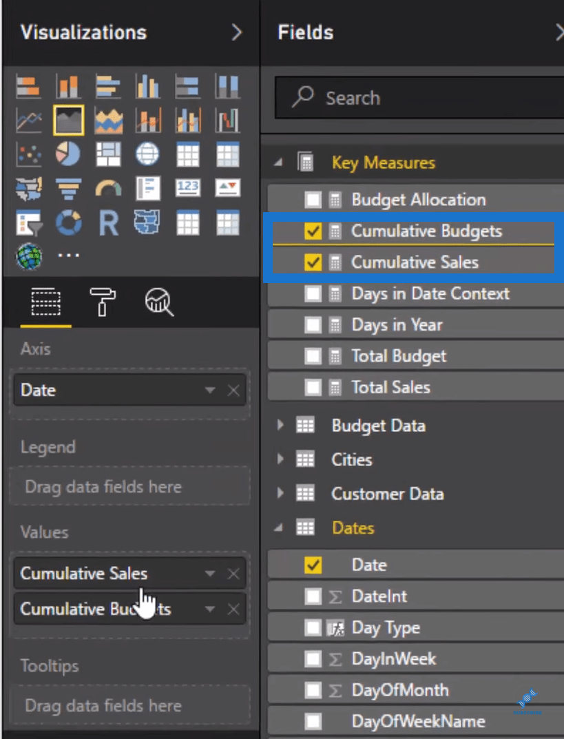
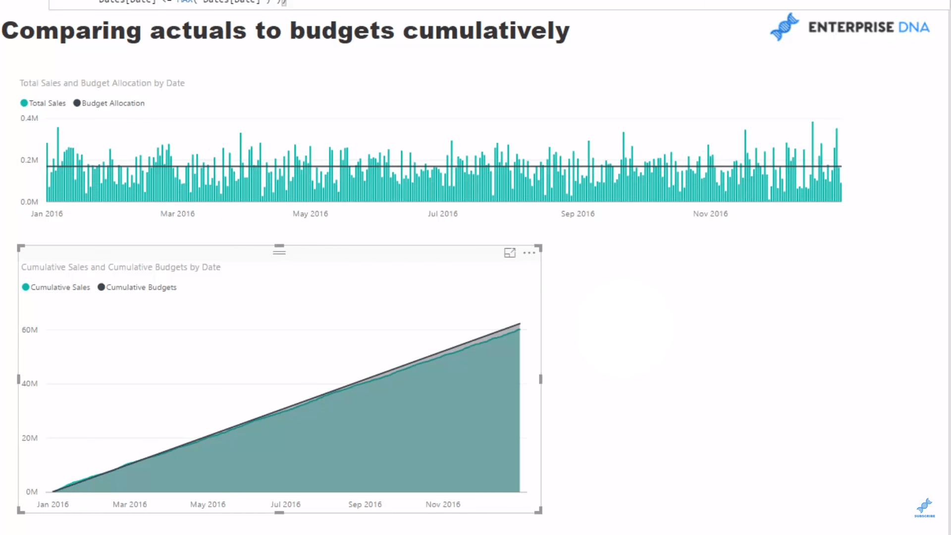
We already have the Cumulative Pattern and Budget Allocation, so all we need to do to get the Cumulative Budget is copy and paste this pattern. Then we change the name from Cumulative Sales to Cumulative Budgets, and then change the expression for the Budget Allocation.

We can now make a comparison of these two things. Pretty cool, right?
Difference Of Actual to Budgets
Just by looking at the charts above, there is a lot of information to take in so we can’t really see that much of a divergence. But we still want to see the difference through time while doing the forecasting in Power BI. How have we been tracking through time? What is the running total, and are we above or below budget? We already have the Cumulative Sales and Cumulative Budgets numbers here so all we have to do is create a new measure and call it Difference of Actual to Budgets. In this measure, we will grab our Cumulative Sales and deduct it with our Cumulative Budgets.

Visualising The Data
We’ll create another visualization where we will use a column chart and bring in our Difference of Actual to Budgets numbers into the canvas. Now we can clearly see how we are performing through time. It looks like we started out okay, but then we drifted off towards the end of the year.
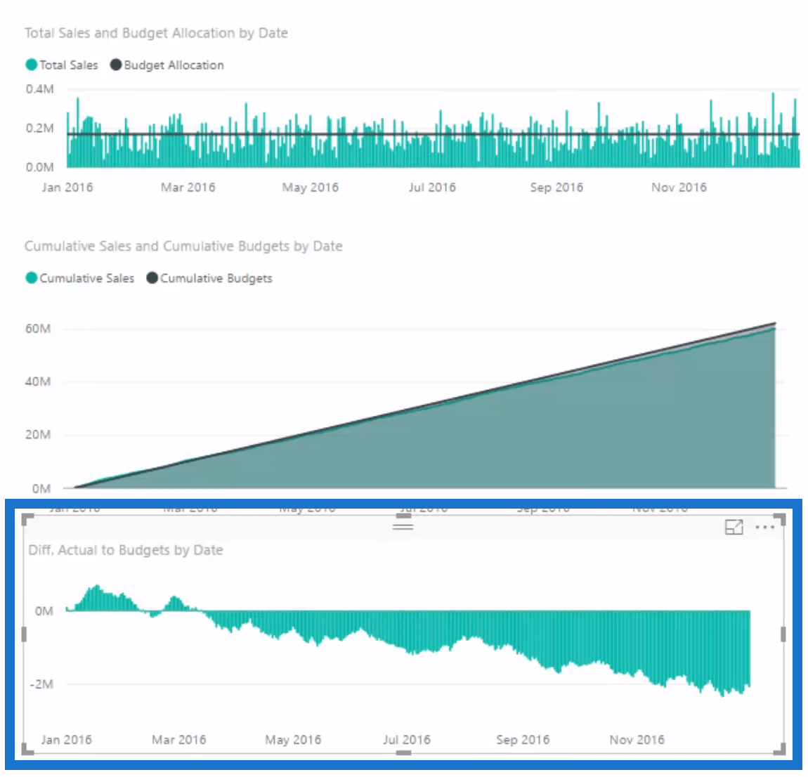
We can do something even better than this, but before we do, let’s take a look at our data model. When we filter our Cities table, it is going to flow down the Budget Data table because of an existing relationship.
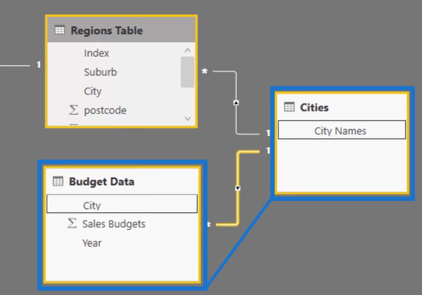
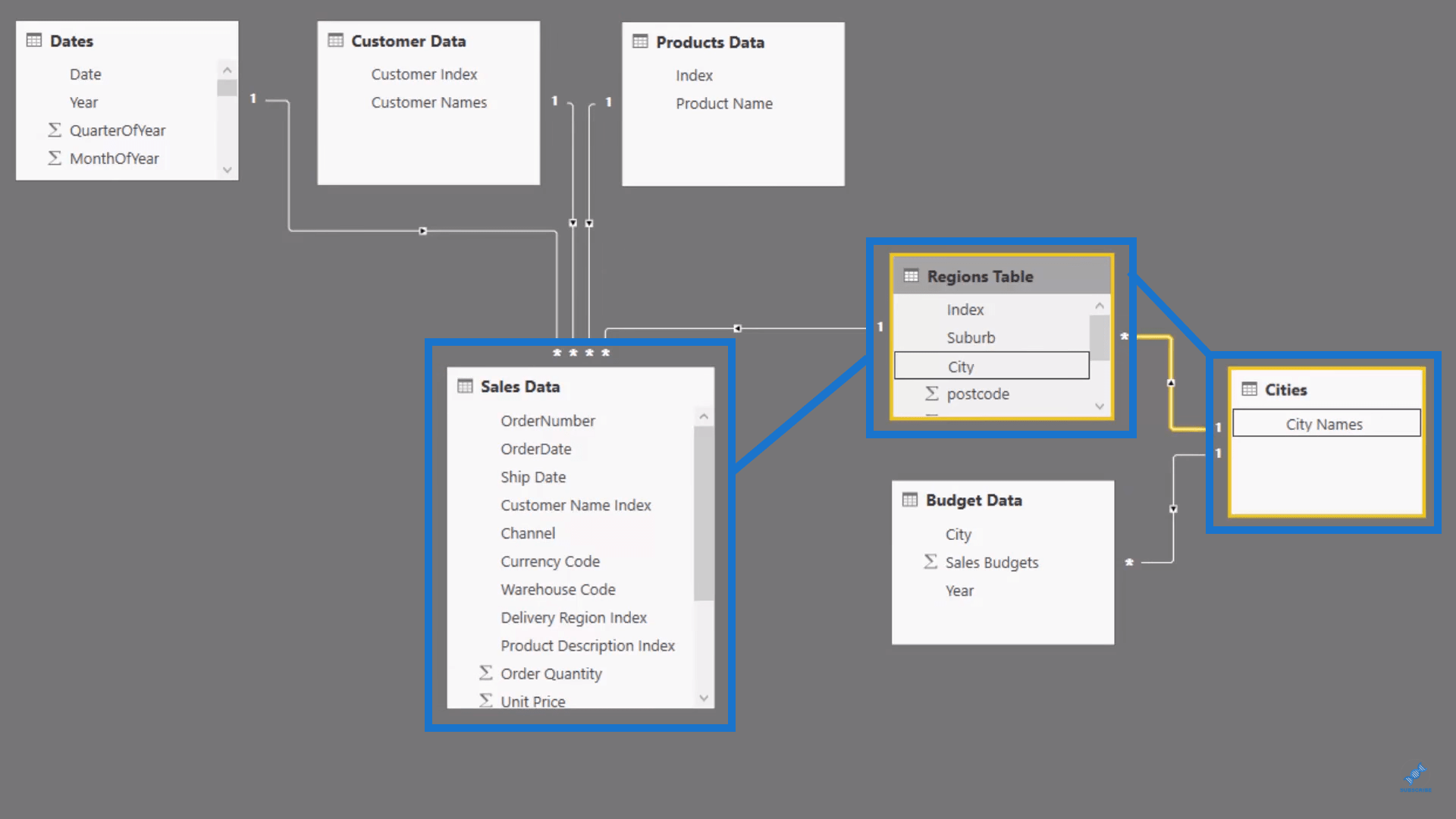
We also used information from our Sales Data table, so we have to flow down the relationship from the Cities table to the Regions table down to the Sales table.
Let’s drag our Difference of Actual to Budgets against our City Names, so we can see the best and worst performing cities. We’ll be able to see which cities performed well, and which didn’t.
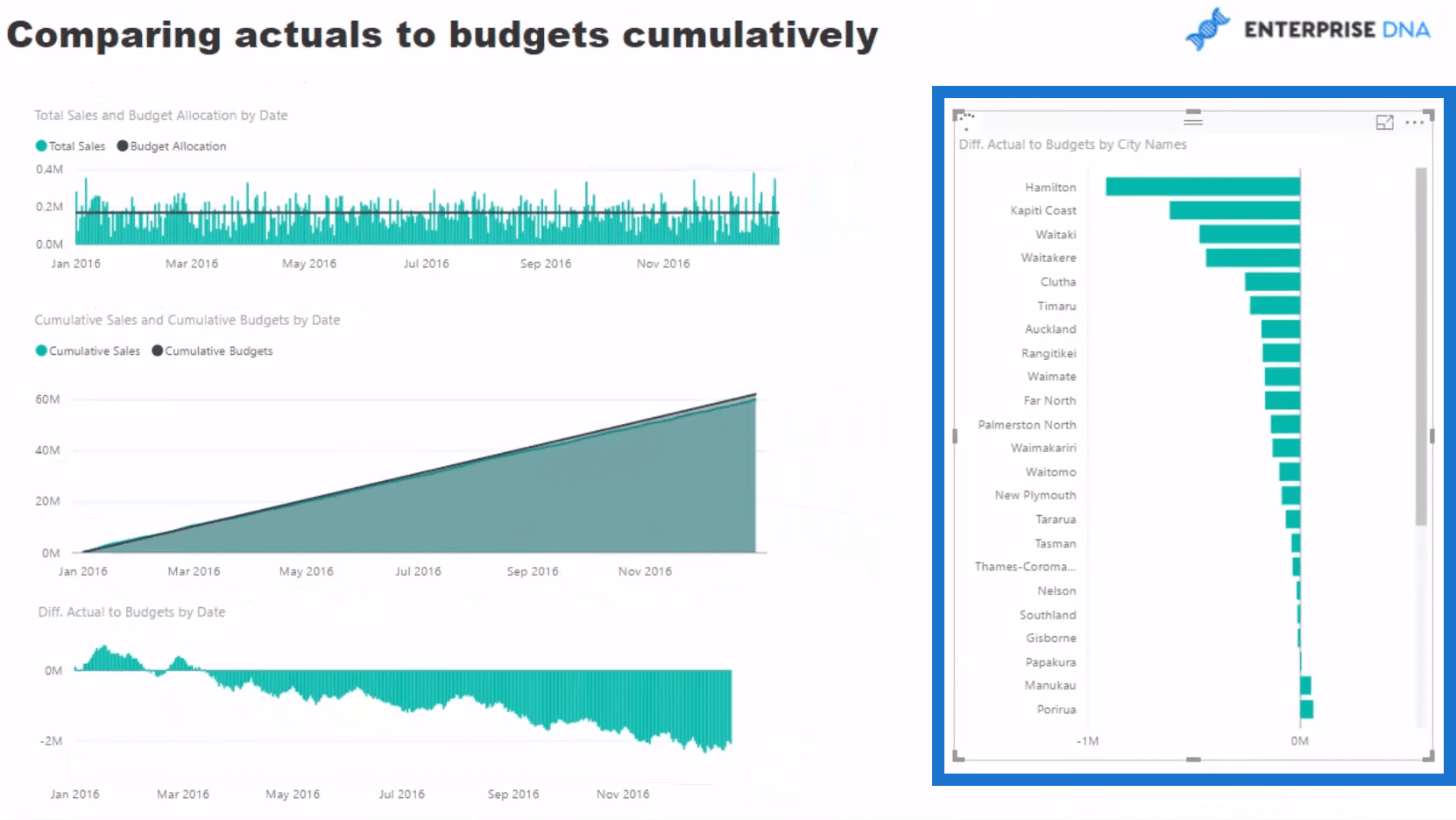
We can now click through each individual city to see how each performed their budget. We can see that the city of Hamilton performed very poorly. Why was that? The other charts will show that the city was ok in the first half and then seriously dropped off in the second half.
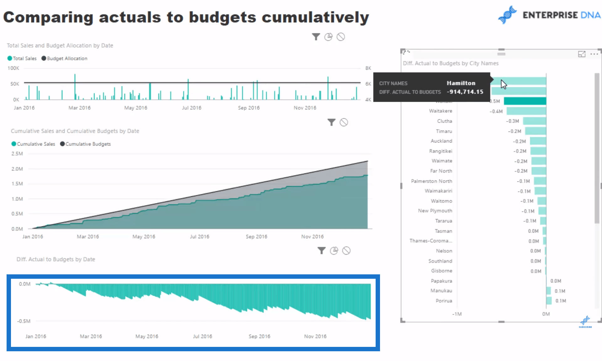
By using some forecasting in Power BI, we can come up with some seriously great insight that you can discuss with your area managers and sales people. There are quite a few steps to go through to get to this point and we have combined a lot of them. By using advanced DAX, the information you generate is just fantastic, and you can take this even further in your own environment.
***** Related Links *****
Compare Cumulative Information Over Different Months In Power BI
Showing Actual Results vs Targets Only To Last Sales Date In Power BI
Explore Forecasting Logic In Your Power BI Models Using DAX
Conclusion
Let’s say you are tracking well versus budget, but then competition in your market heats up through price discounting. If this was to happen, you would very quickly see your actual line dip below your forecasts and maybe even continue to tail off. Perhaps you would want to decrease your prices too, or increase marketing initiatives. Think of all the great insight plus actions that can be derived from analysis of this quality.
In this blog post, I showcased how you can extend your analysis via ‘measure branching‘. Maybe you want to track the exact difference to budget. Maybe you want to see the cumulative difference and see at any point in time what percentage you are trailing your year to date numbers. This is all great stuff.
As I’ve mentioned elsewhere, budgeting analysis is not the easiest to complete in Power BI. If you can implement it well though, you are likely smashing Power BI out of the park. If you want to learn a lot more about Budgeting Analysis and how to solve many other analytical scenarios, check out some of my courses at Enterprise DNA Online. I’m huge on practical application of Power BI, so that’s how I’ve structured all my courses.
Let me know what you think in the comments below. Good luck with this one.


