
Clarity is essential when communicating our story. This will not only enhance the experience of your audience but will also save them time. One key aspect of creating effective Power BI reports is ensuring that the information is clearly and accurately presented. Here are a few strategies you can use to achieve clarity in your Power BI reporting:
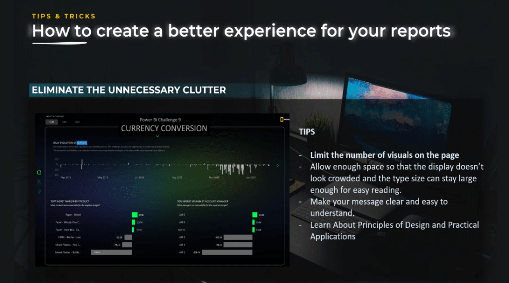
Eliminate the unnecessary clutter
In data storytelling and data visualization, we want to show and tell only what is needed, and when it is needed. In short, we need to be concise as possible.

The more simple you can tell your story, the more impact it will have. You can do this in your design by limiting the number of visuals on the page. This will also have a positive effect on performers.
We should keep enough space so that the display does not look crowded and the type size is large enough for easy reading. Our message should be clear, simple, and easy to understand for our audience.
A good understanding of data visualization and principles of design will help you choose the right visuals to use in your report.
Use callouts for BI reporting
Callouts are essential in reports. It is a technique that will help you with the user journey and the user experience inside your report. By using callouts, you can direct the users to what you want them to see or do next.
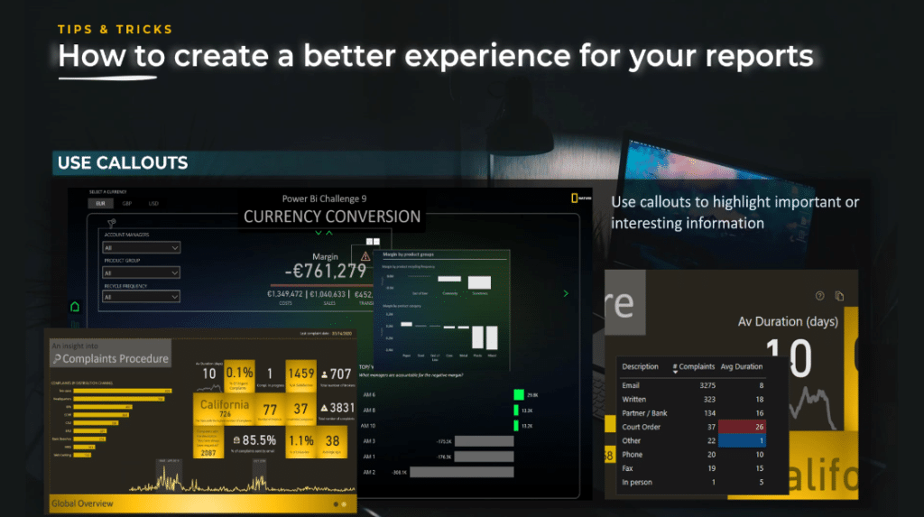
To illustrate, in the Currency Conversion report I created for Challenge #9, organized by Enterprise DNA, I created a warning sign that appears only when the values are negative. This warning sign contains a tooltip that anticipates the question of the audience, “What causes this bad result?”
The tooltip will provide extra information by diving into details. The user will know that the Product Group, Plastic and Mixed are responsible for the results. Once the users know this, they can deep dive and filter the Product Group to specific categories and find out more information.

In the Complaints Procedure report, I used callouts to highlight the months with the highest variations. I highlighted these months for a reason. By clicking on the button, the user can drill down and analyze that specific period.
In the third report, I used callouts to help the user identify easily the best and worst results using a tooltip. Therefore, use callouts to highlight important and interesting information.

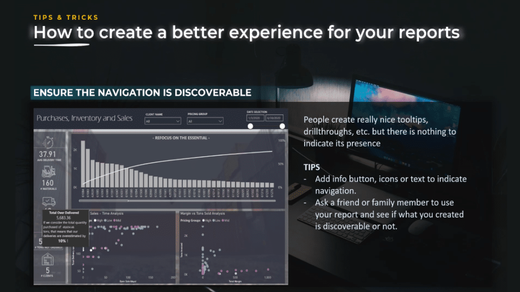
Ensure the navigation is discoverable
People create nice drill through tooltips, but sometimes there is nothing to indicate its presence. You need to ensure your business insights are seen and understood by your audience.
If no one reads them, they won’t be acted upon. Your audience could also miss a very important part of the analysis and doubt your conclusions or call to action.
Follow BI reporting design best practices
Make sure you understand the design and composition best practices. You can do data visualization without data storytelling, but you cannot do effective data storytelling without understanding the fundamentals of data visualization.

Focus on your story and cut to the chase
A report is not a mystery novel so get to the point as quickly as possible. To improve clarity, it is vital to understand how to best communicate in a way that is digestible, accurate, and meaningful.
The true value of data visualization lies in its ability to help you show, not just tell your story.
In this report I created, you can see that from my landing page, I cut to the chase and transformed the downtime cost related to defective materials into dollars. I showed the line I took to create a report from the beginning.
Time lost is money lost. How much do we lose? Where do we lose and how can we improve? That was the core message of my report.

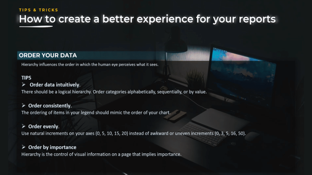
Order your data
Data visualization is meant to help make information make sense. Random patterns that are difficult to interpret are frustrating and detrimental to what you are trying to communicate. Hierarchy influences the order in which the human eye perceives what it sees.
Different ways to order your data
You can order the graphs by following the logical hierarchy. The order can be alphabetically, sequentially, or by value in descending or ascending order. You can also order your legend by ensuring it mimics the order of your chart.
Your graphs should be ordered evenly. For example, your X axis should be 0, 5, 10 instead of uneven increments like 0, 3. 5, 16.
In addition, all your pages should be presented in a specific order. Important information should be displayed in the top left corner. Information is less important in the right bottom corner.
Use consistent colors
Color is one of the most important things you can use as a report designer. It can boost your story or completely destroy it. A beginner in data visualization will tend to overuse color.
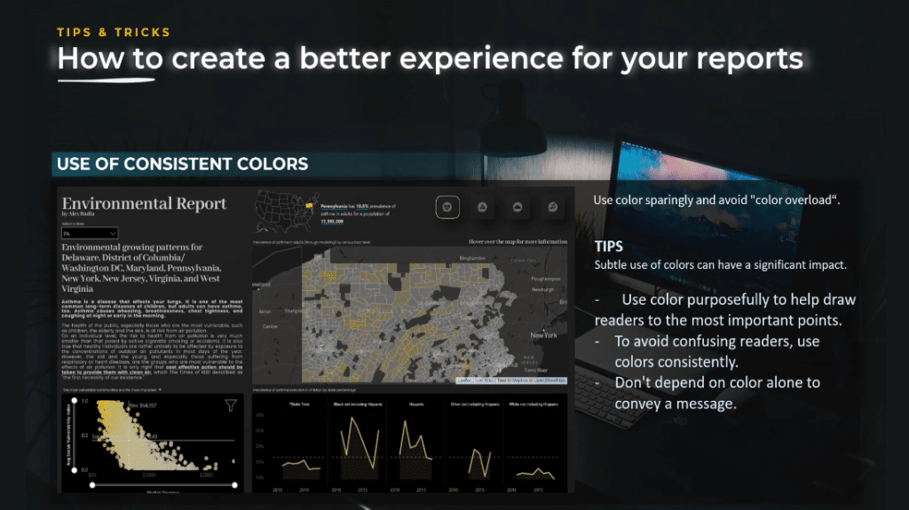
As you can see in the report above, I tried to stay consistent with the color I used, and I created a relationship between the graphs to show the message I will repeat throughout the report.
There is a clear relationship between the average social vulnerability index and the prevalence of asthma, and the subtle use of the color yellow had a significant impact in this report.
Takeaways when using colors in your BI reporting
To enhance the clarity of your report, use color purposely to help draw readers to the most important points. For example, red for negative and blue for positive values. However, sometimes positive values are bad and negative values are good, so you need to adapt the colors based on the context.
Avoid confusing readers and use colors consistently. If I use blue for positive values, I will not use the same color to show something else on the screen.

Of course, don’t depend on color alone to convey a message. If you really want to drive clarity in your report, keep in mind the message I mentioned before, which is to show and tell.
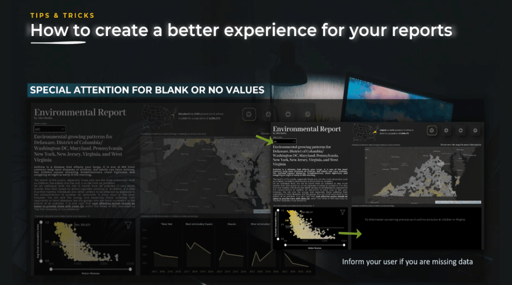
Pay attention to blanks or no values
You will encounter this situation very often when some of the information is missing. How will the end users react when they see blank values or missing values?
The technique is to do the extra work and create a specific message that activates when the data is missing and inform the users.
Let’s take a look at the print screen of my submission for the Environmental Challenge.
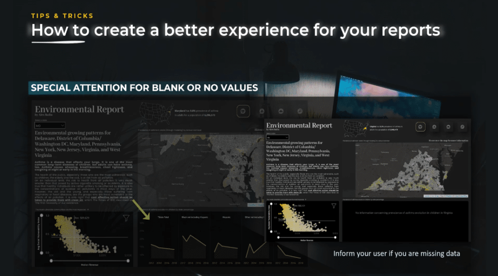
On the lower part of the screen, I showed the prevalence of asthma evolution in children by state percentage. However, when the user chooses Virginia, they will see a huge black box in the lower part of the screen because there is no data provided in the dataset for that particular state.
To have clarity for the end user, I created a card that will be visible only when there is no data. It provides a superior user experience and shows the end user that the creator of the report thought of all details.
Make your BI reporting design reliable and accessible
Below are the tips to make sure your design is reliable and accessible to achieve clarity in your BI reporting.
The most important tip is to pay attention to the interactions and the size of the elements. A mistake can have a considerable impact. It is better not to use interactions at all rather than use them in a poor manner.
When we talk about interactions, we are also talking about the size of the elements. If you have art, pay attention to its size. If the value highlighted is negative, a minus sign appears in front of the number, and the space needed will be more important.
Another thing to pay attention to is the blank rows or infinity values. Sometimes the user might consider there is a mistake in the report you created. Make things as clear as possible to the end user.
We should also pay attention to navigation discoverability. If users do not understand your navigation, they will miss out on a part of your analysis.
Lastly, pay attention to contrast and colors. This will ensure the user can actually read the figures or text. You also need to consider color blind users when creating your report.

***** Related Links *****
Tooltips In Power BI | New Modern Visual Tooltips Review
Data Visualizations Power BI – Dynamic Maps In Tooltips
Effective Data Storytelling: Asking The Right Questions
Conclusion
Without clarity in our reports, it’s impossible to gain the trust of our end users and achieve a better experience.
Therefore, as a designer, it’s our responsibility to use techniques that will help them with the user journey inside your Power BI report, and ensure your business insights are well understood by your audience.
By following these strategies, you can help to ensure that your Power BI reports are clear, accurate, and easy to understand, making them more effective in communicating the message to the audience.
All the best,
Alex Badiu


