
In this tutorial, we’ll discuss a custom visual called Bullet charts. They’re mainly used for measuring performance against target or previous years.
Bullet charts are useful visuals for comparing employee performance, shipment targets, sales targets, production targets, and many more.
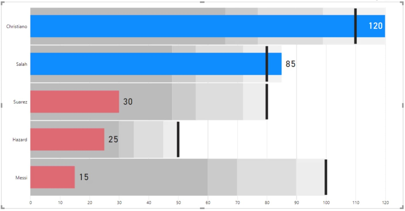
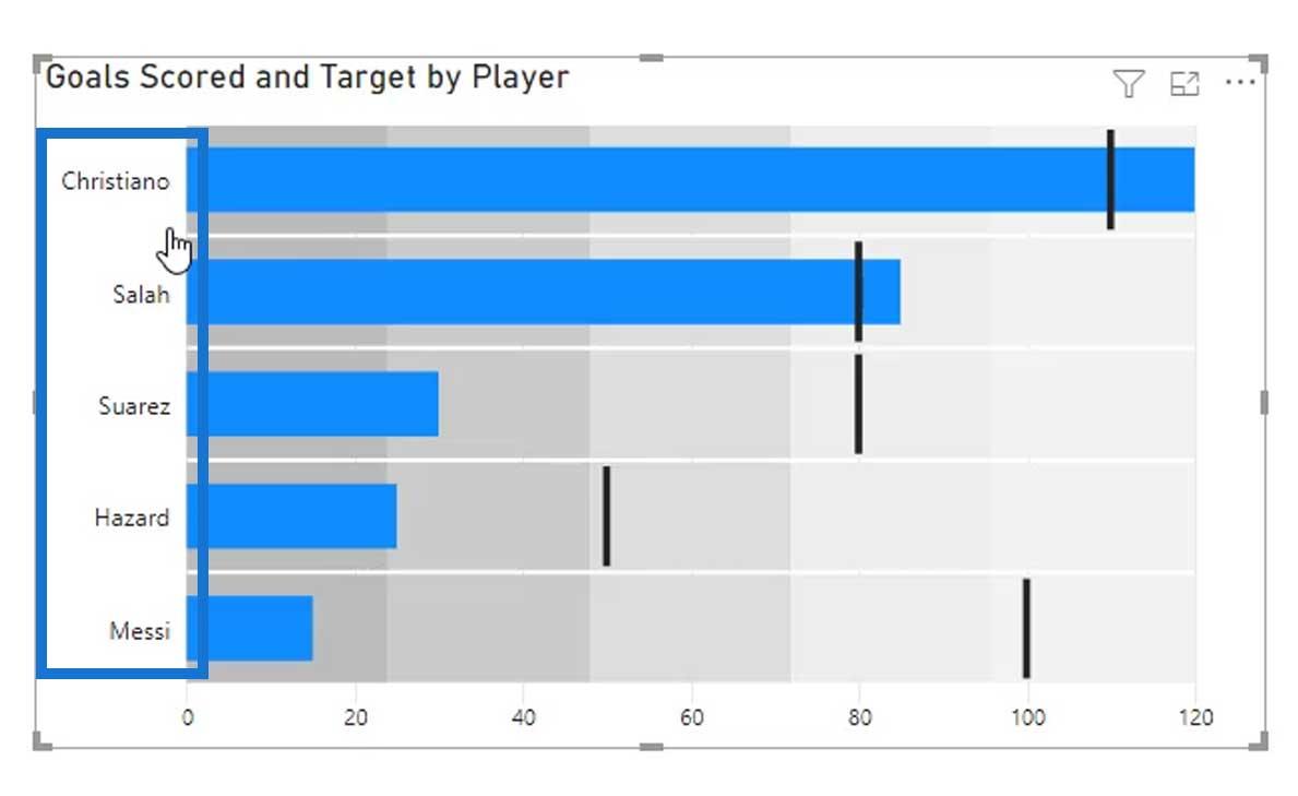
This is a sample bullet chart that I have created. We’ll discuss how I created this bullet chart and the things that we can do in this particular custom visual.
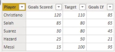
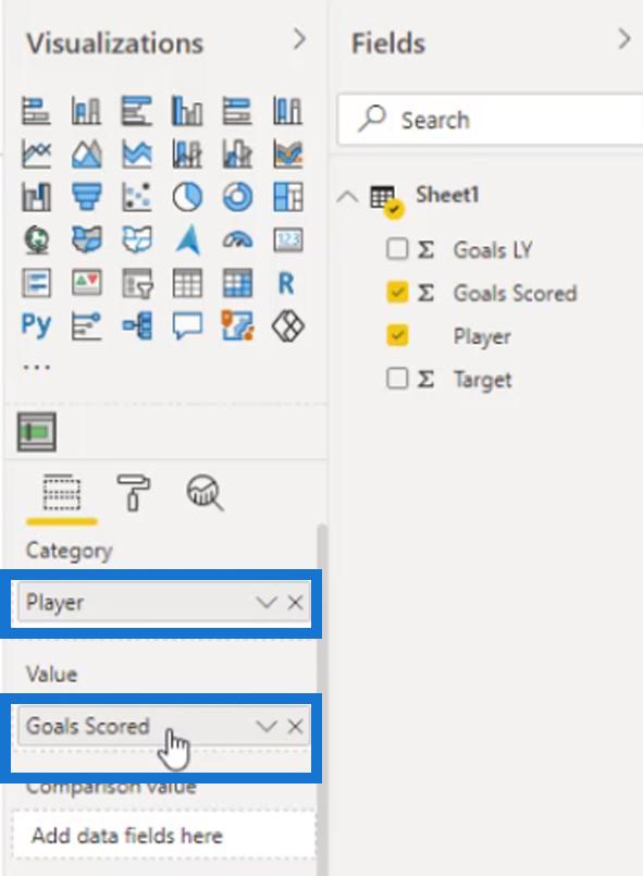
This is the data that we’ll be using in this example. It contains the player names, goals scored, target, and goals for last year. Later in this tutorial, we’ll create measures for the calculated columns.

Creating Bullet Charts In Power BI
The bullet chart that we’ll use in this tutorial will be imported from the marketplace. Click the 3 dots here, then click “Get more visuals”.

Search for “Bullet”, then add the Bullet Chart by OKViz.
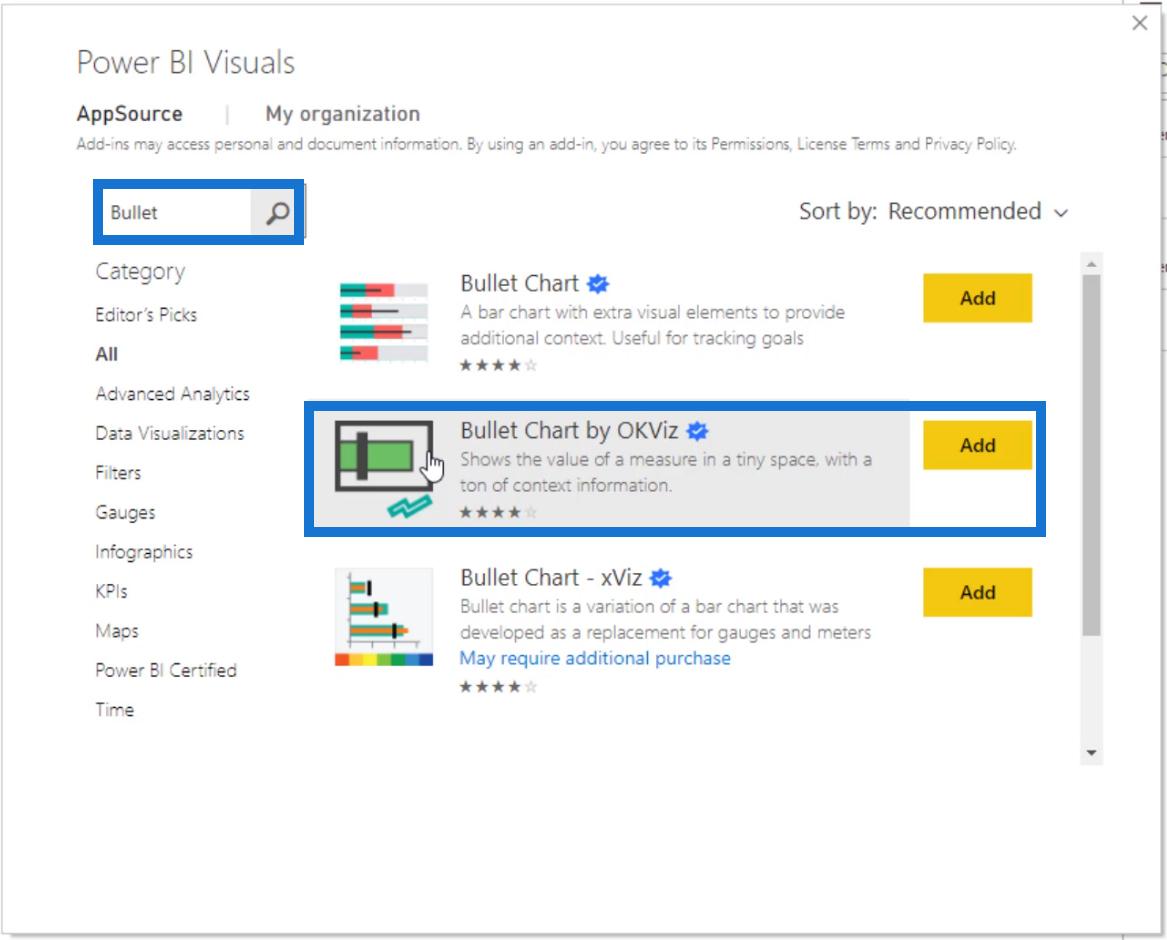
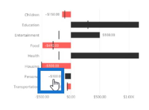
This is the one I prefer because it also shows the negative values on the other side if we have it in our data.
Let’s add this visual on our report page and resize it.
Then, add the Player for the Category field and the Goals Scored measure for the Value field.
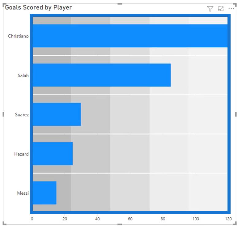
We should get this output. As you can see, we currently have bandings in our bullet chart. These are represented by the different hues of gray.

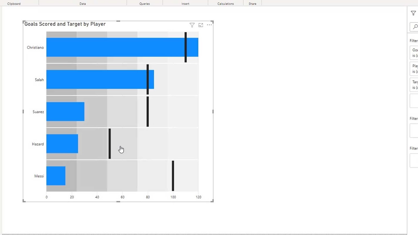
Let’s now drag the Target measure on the Targets field.

It will then add target markers on our output.

Modifying Bullet Charts In Power BI
In the General section of the Formatting tab, we can also change the orientation of our visual to vertical if we want to.

By default, if we resize this visual on our report page, the bars will also be resized automatically.
If we don’t want that to happen, we can just set the minimum or maximum height of the bars.
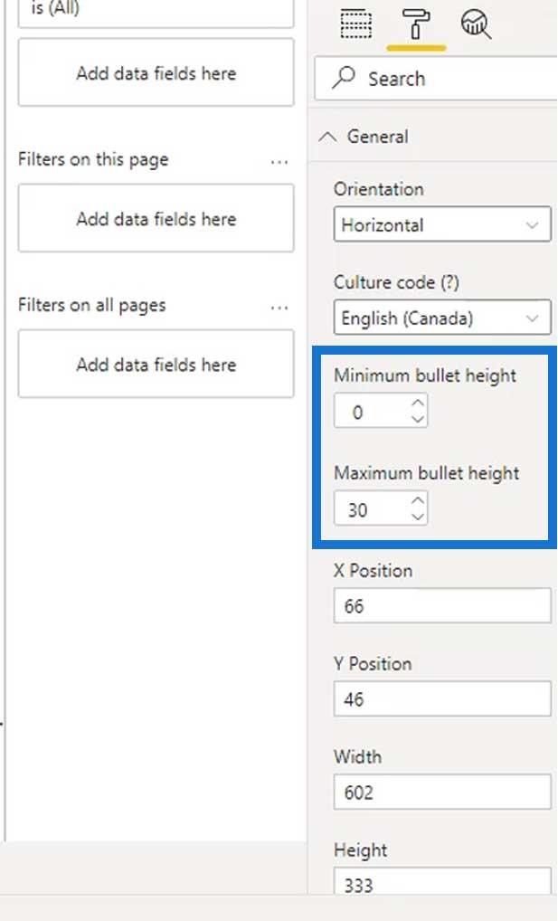
After setting the maximum height of the bars, it will then look like this.

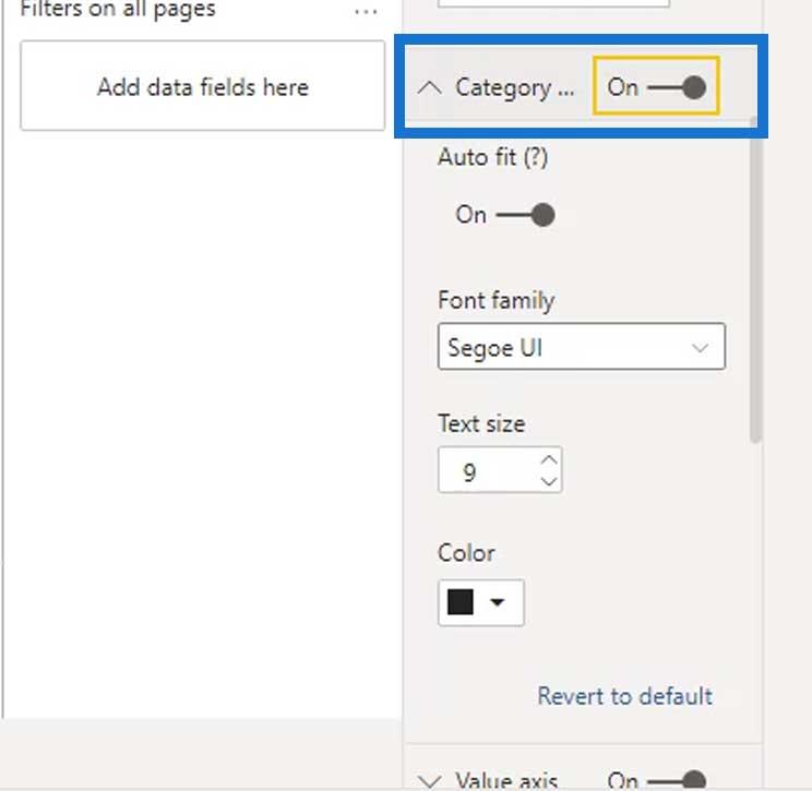
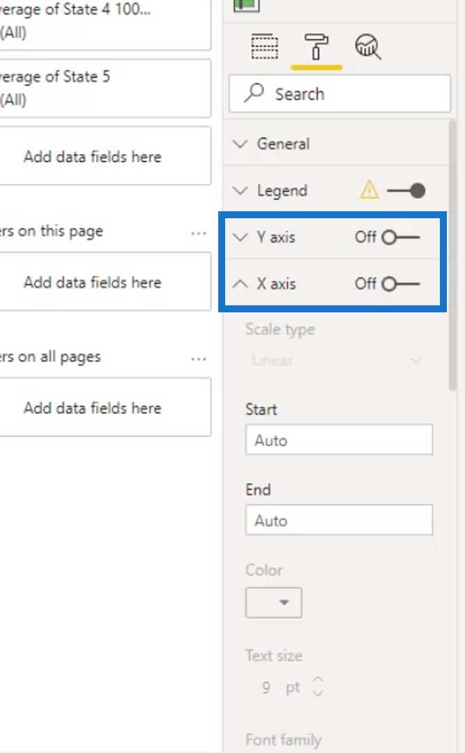
This part of the visual is the categories. If we want to, we can turn them off by disabling the Category.
For this example, it’s better if we leave this turned on.
The Value axis is the X-axis of the visual. We can also turn off this one.
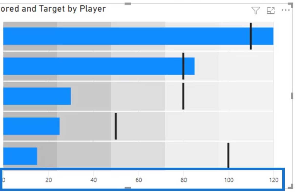
But for this example, let’s just leave it on.
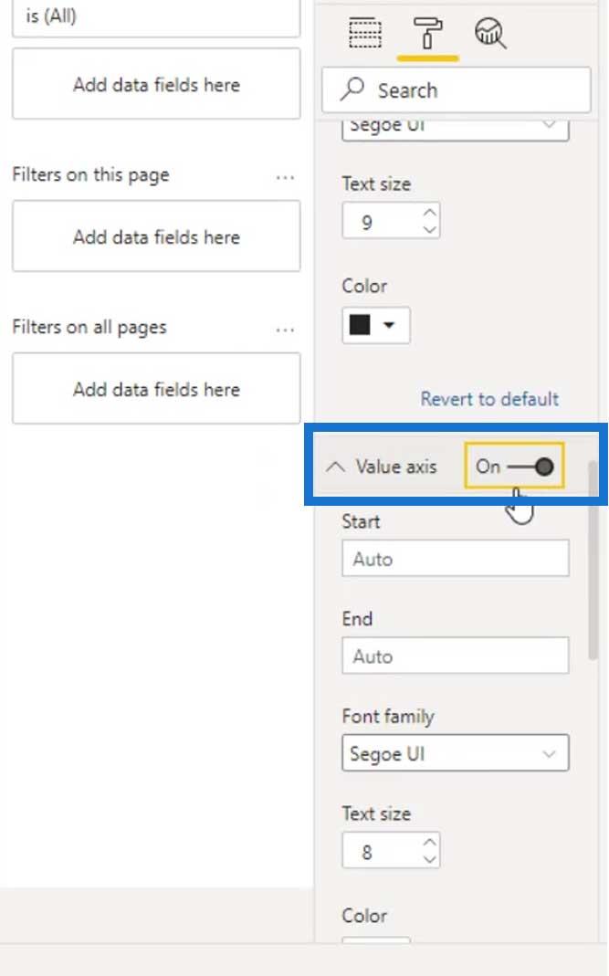
Another feature that would be useful is the Data labels.
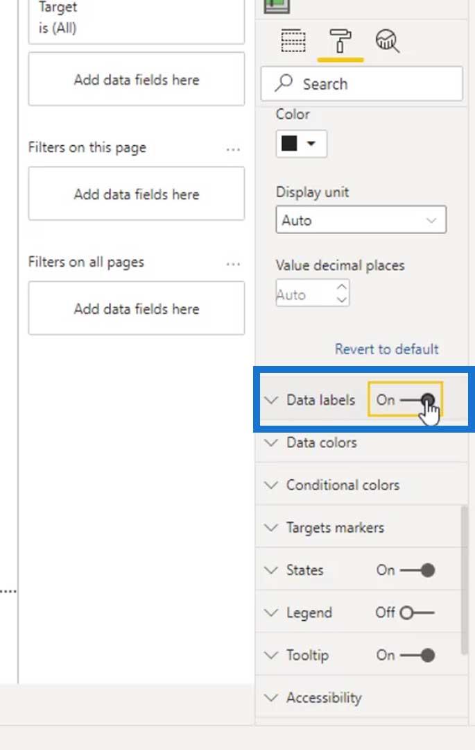
It will then show these labels which are the scores of our categories (the players).

Conditional Formatting For Bullet Charts
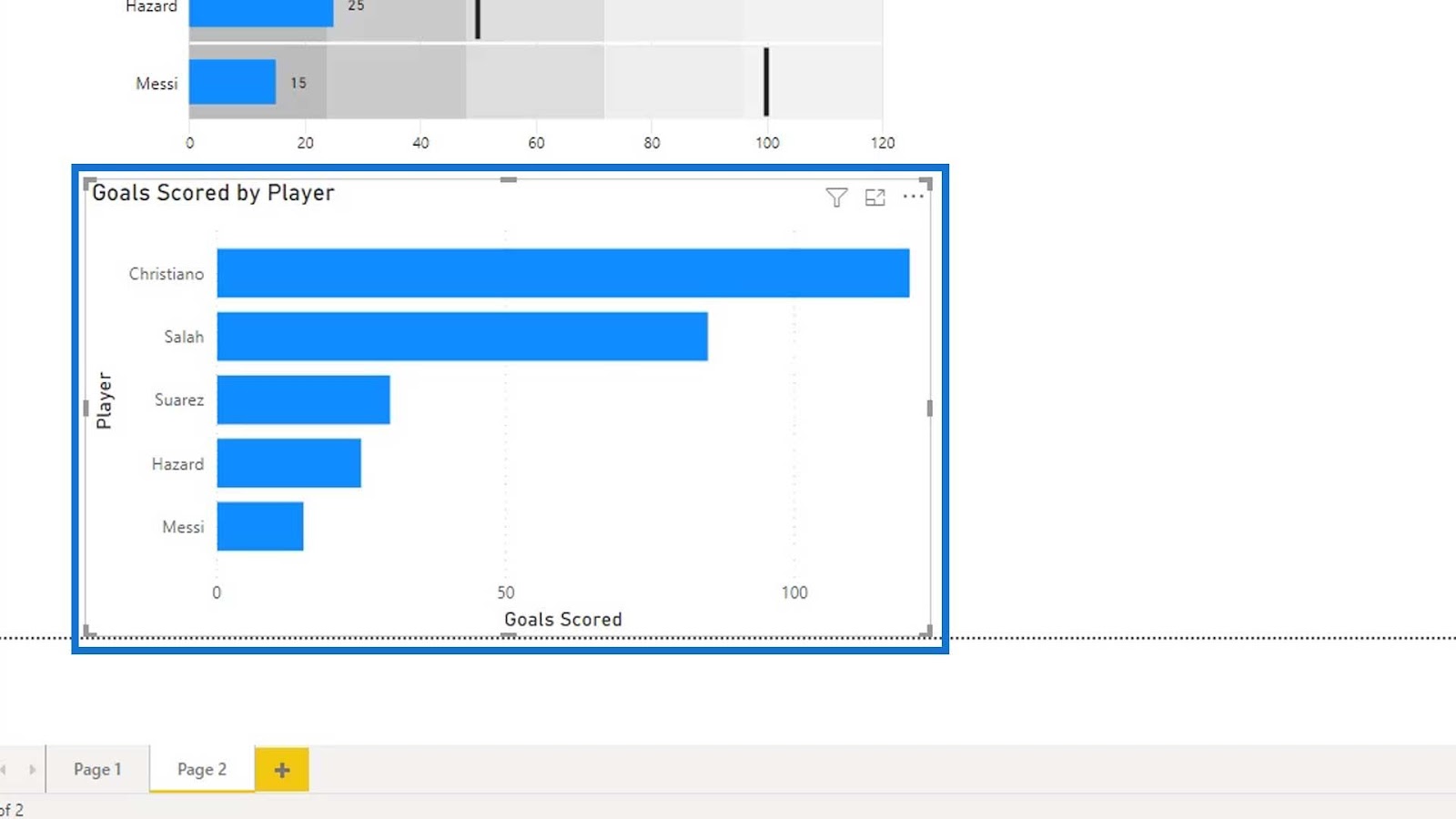
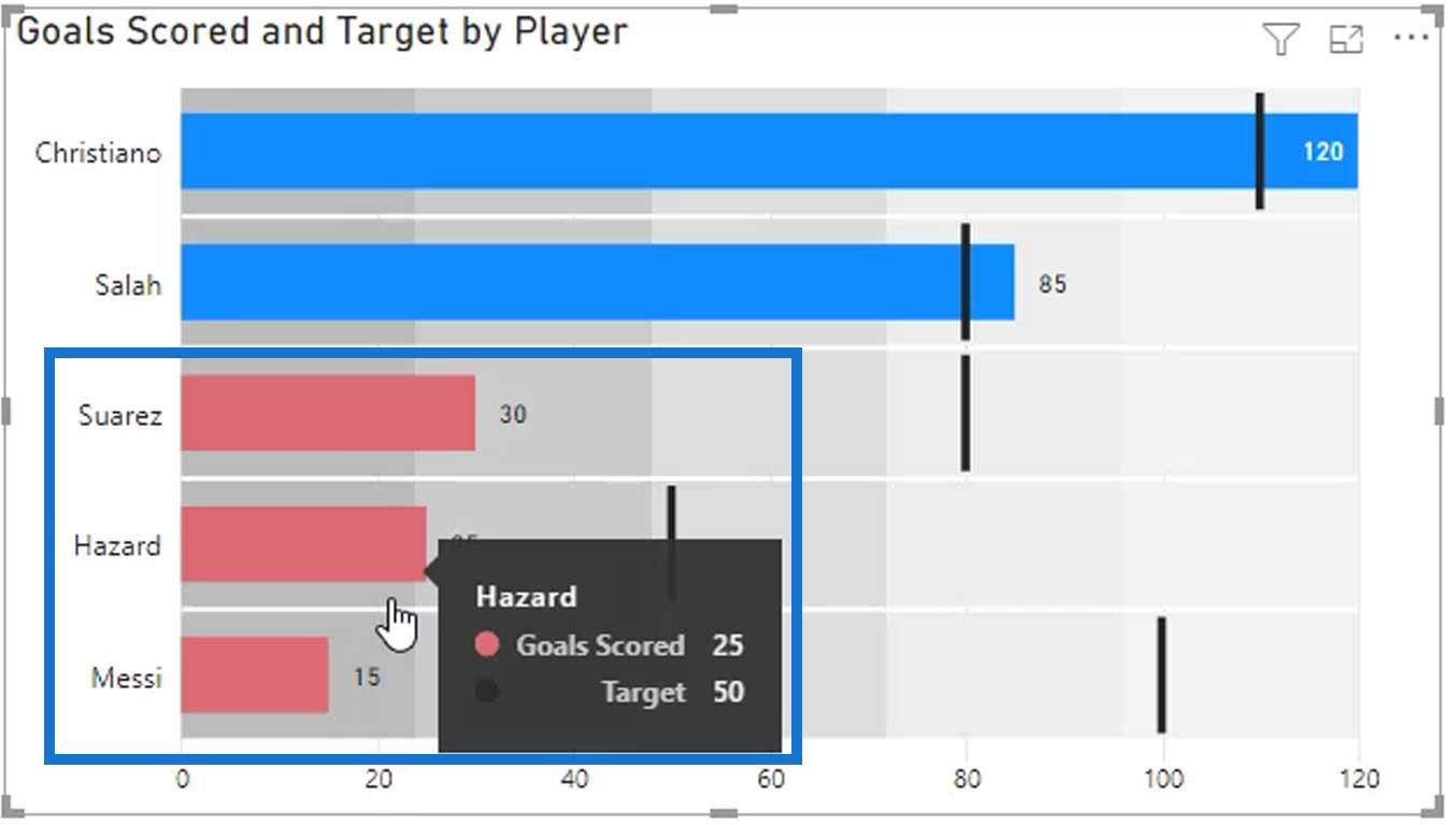
Another cool thing about this visual is the conditional formatting. If we’ll just use a bar chart here, we won’t be able to conditionally format each one of the categories.
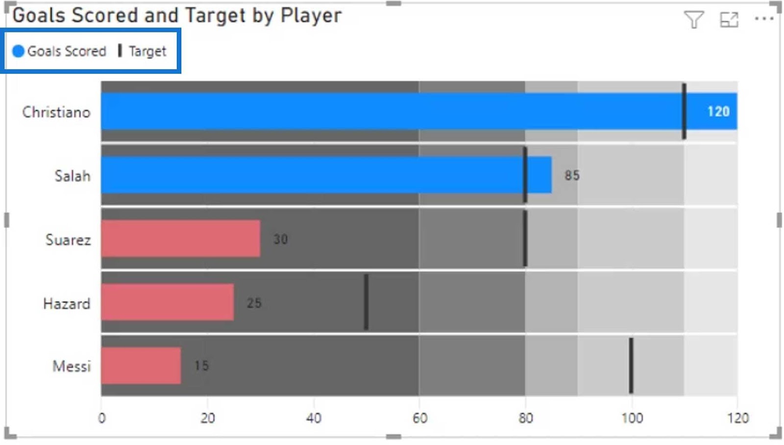
As you can see from the image, only one target was set for all the individual players.

However, in our dataset, there are different targets for each of the individual players.


So, using a bar chart won’t create the visual that we want. That’s the reason why we are using a bullet chart in this particular example.
As you can see, we can now set the if condition.

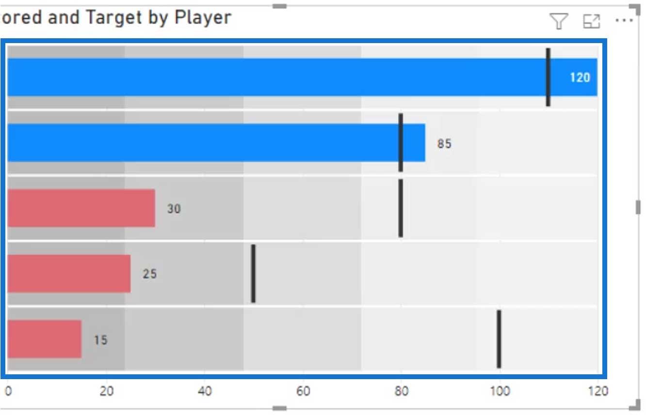
Let’s assign a red color for this condition so we can see which players are behind their target scores.
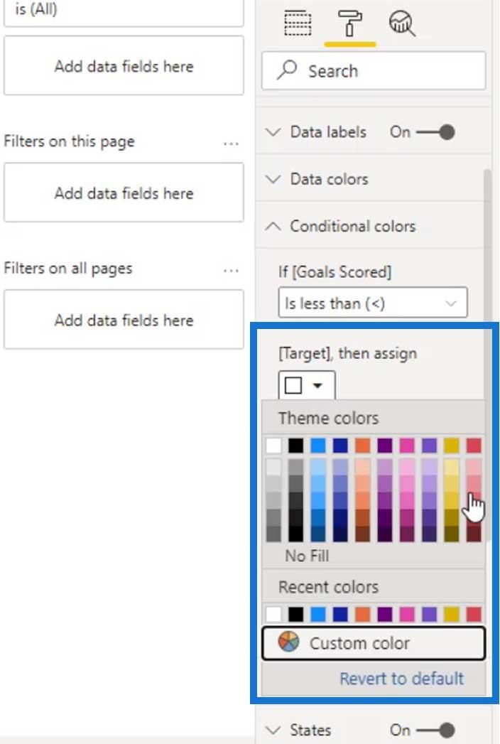
Obviously, these 3 players are behind their target scores.
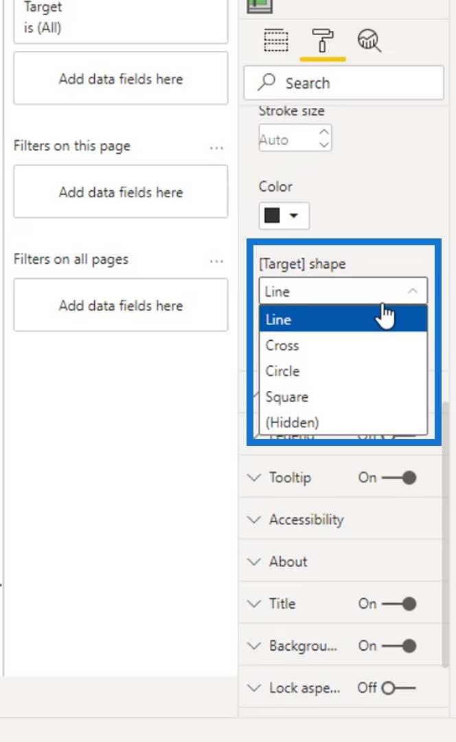
We can also change the color of the target markers. For this example, we’ll just use black.

We can change the shape of the target marker as well. For this example, let’s stick to the Line shape because it looks better than the other shapes.
Power BI Bandings
In this visual, you can see the gray parts behind the bars. These are called Bandings.
We can define static or dynamic bandings. For dynamic bandings, we can do that by creating calculated measures. We’ll be doing that after learning how to define static bandings.
Defining Static Bandings
For static bandings, we can set them here.
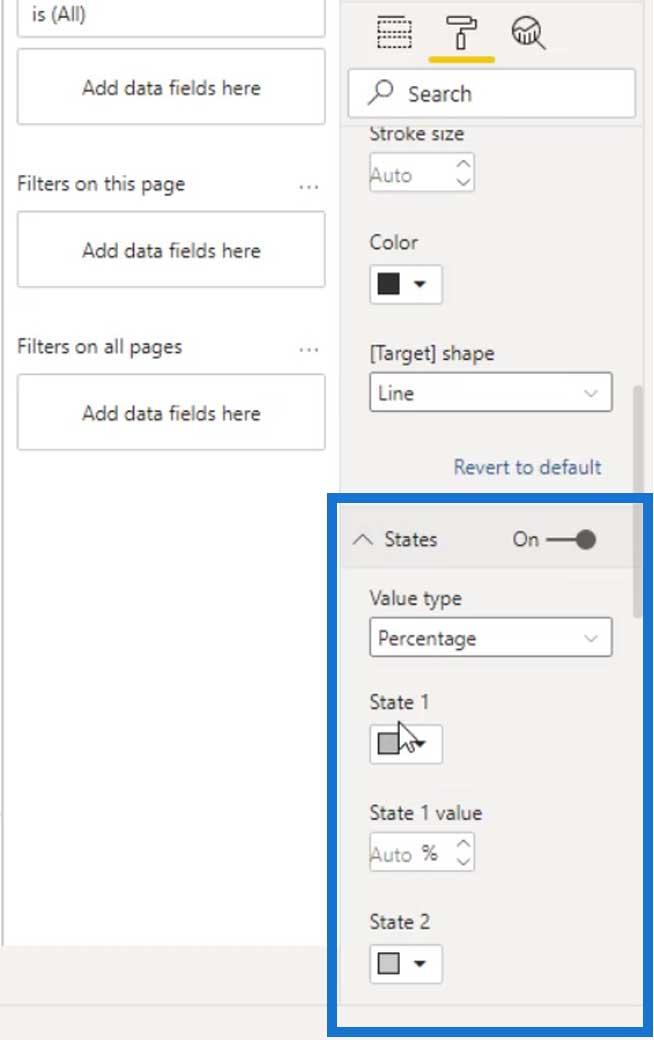
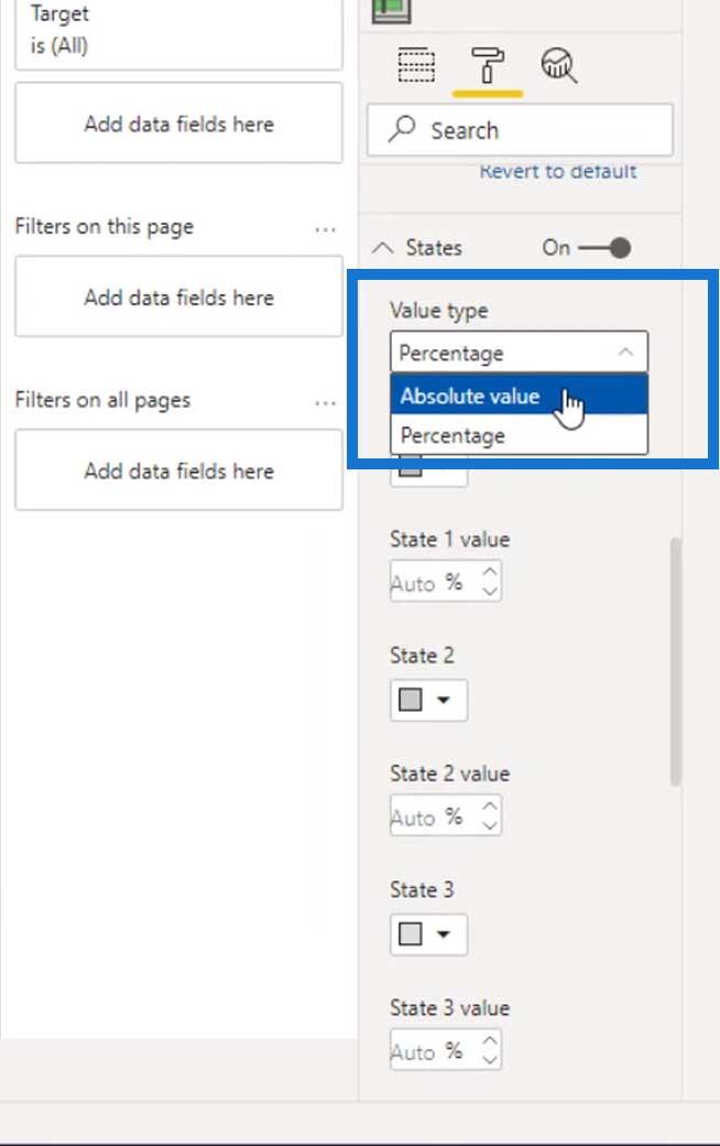
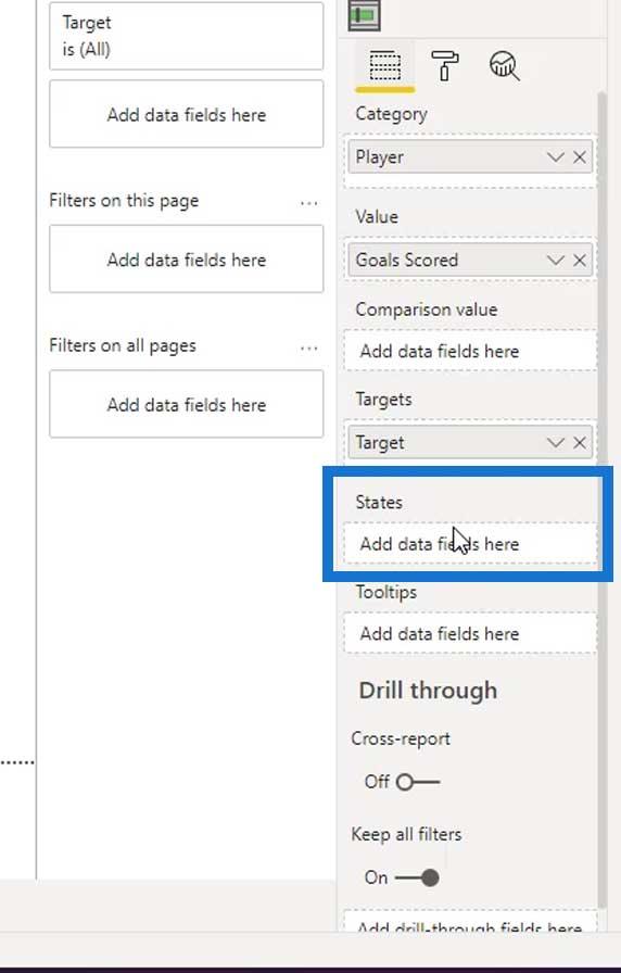
Currently, there are 5 States where we can set a value for each of them.

We can define the State by an Absolute value or Percentage. In this instance, let’s use an Absolute value.
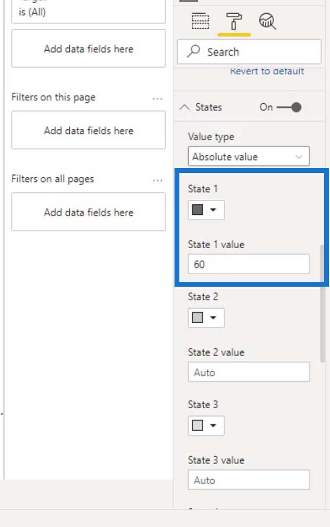
For State 1, let’s set the value to 60 and change the color to a darker gray.
As you can see, the banding changed on our visual.
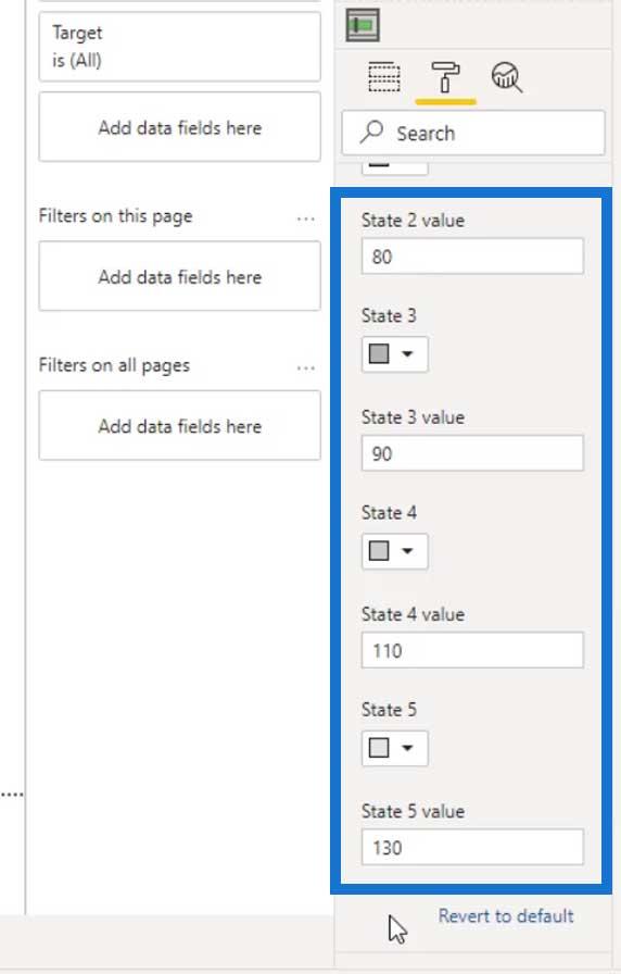
Let’s then set the value and color for the other states. Make sure that the succeeding value you’ll be using is always higher than the previous state values.
As you can see, we also used a lighter gray color for every succeeding state.
Now, the output should look like this.

So, that’s how we can set a static banding.
Defining Dynamic Bandings
For the dynamic bandings, we can place the measures in the States field. This will automatically override the static bandings that we defined previously.
Let’s now display the legends and set their position.

It should then look like this.

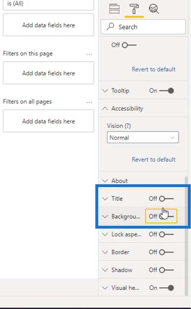
Let’s also turn off the Title and Background.
We can now start creating dynamic bandings. Let’s go to our Table. Then, add a new column by clicking the New column.
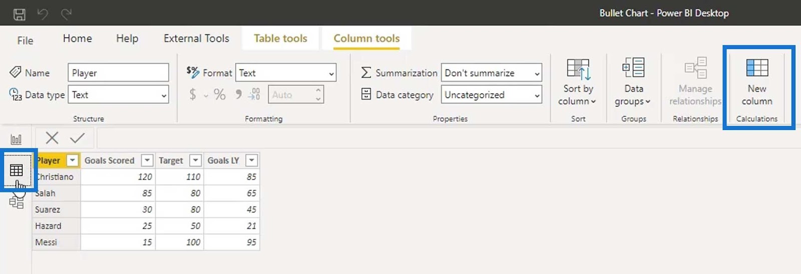
Let’s define a new column as State 1 and set 60% for the target goal. To get the percentage value of the first state, just multiply the Target value to .60. This basically means that if a player achieved only 60% of the target goal, they will be kicked from the team.

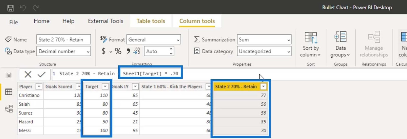
For State 2, let’s use 70% and multiply the Target value to .70. This time, if the player reaches 70% of their target goal, they must be retained on the team.
Let’s add another column for State 3. For this one, let’s set 80% for the target goal and multiply it by .80. If the players achieved 80% of the target goal, their contract price will be raised.

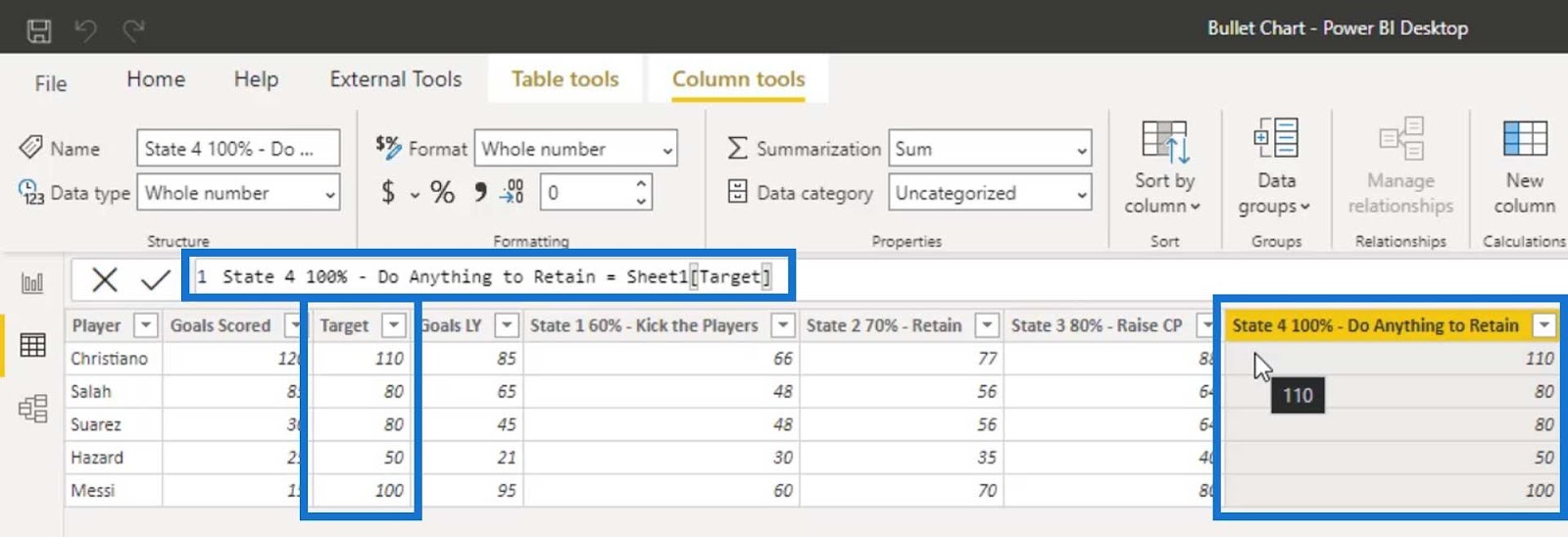
Then, for State 4, let’s set the goal to 100%. If the player achieves 100% of their target goal, we must do anything to retain these players.
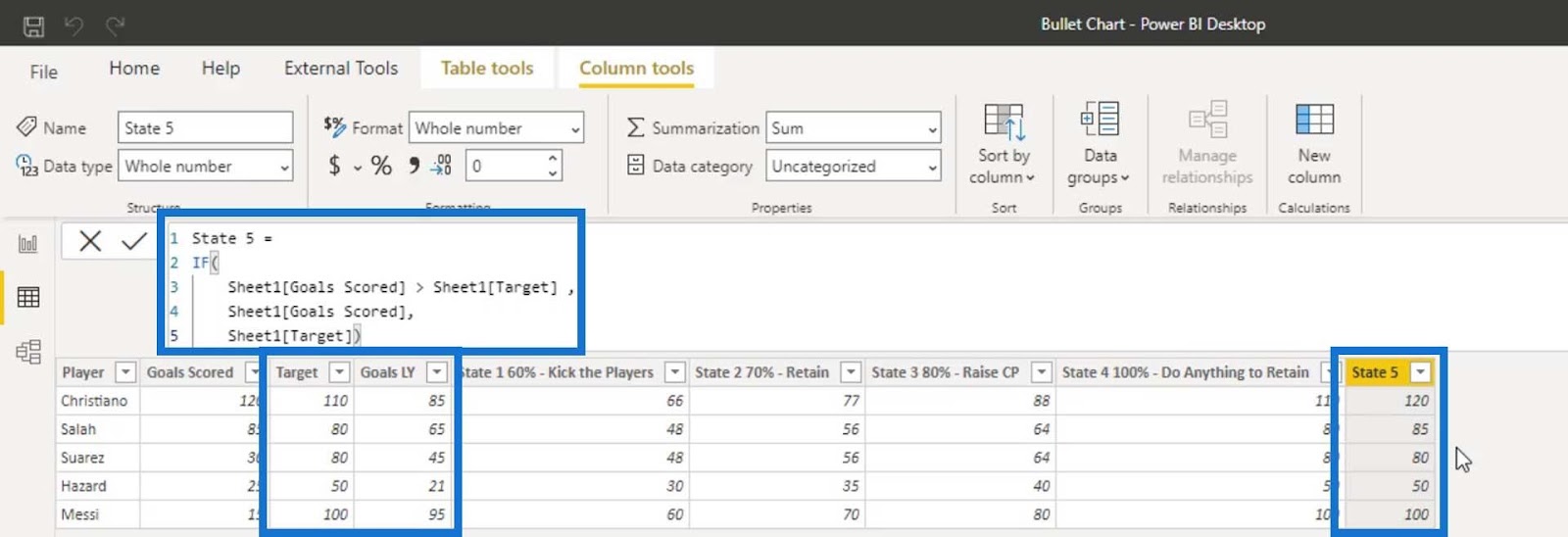
For State 5, we’ll set the maximum value from either the Goals Scored or Target value. So, let’s define this with an if conditional statement wherein if the Goals Scored is greater than the Target, then we’ll get the Goals Scored. Else, we’ll get the Target value.
Before we can use these calculated column measures, we need to change their format to Whole number. Make sure to change each one of them.

Let’s then add the first state on the States field.

As you can see, the first band has changed.
Let’s now add the other states on the States field.

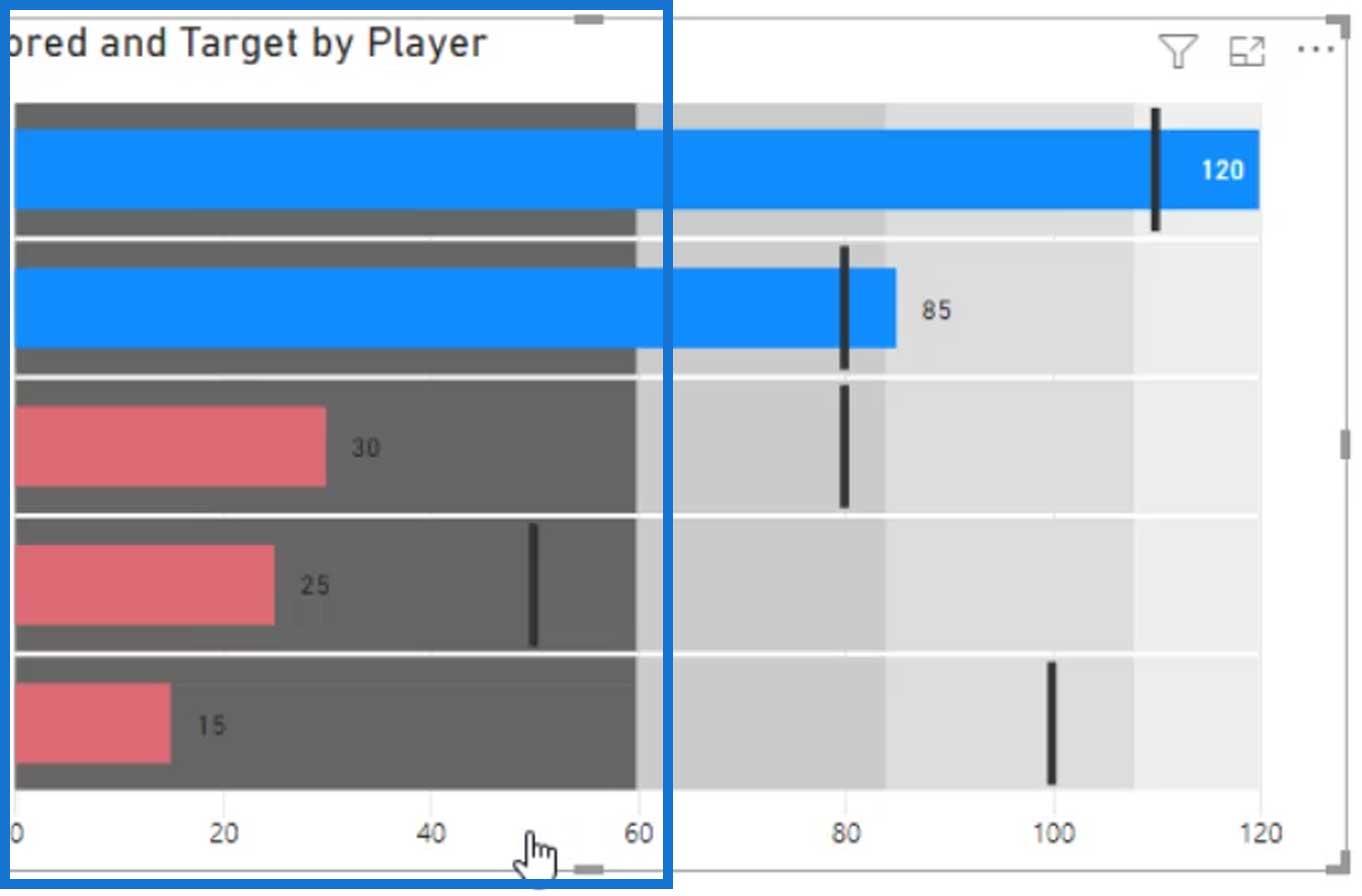
The output should then look like this.

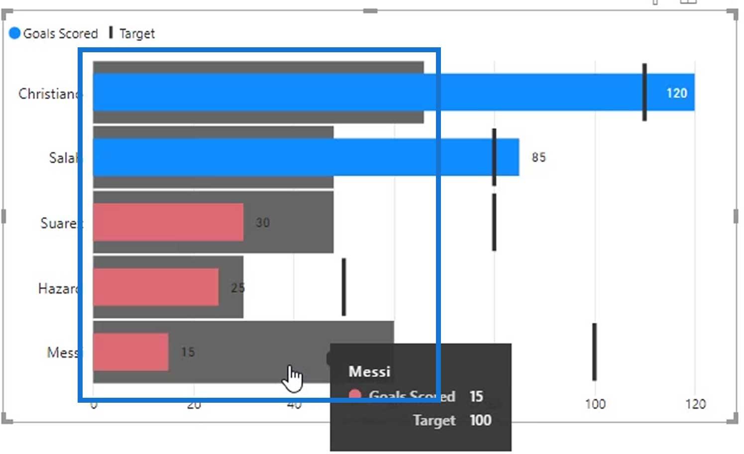
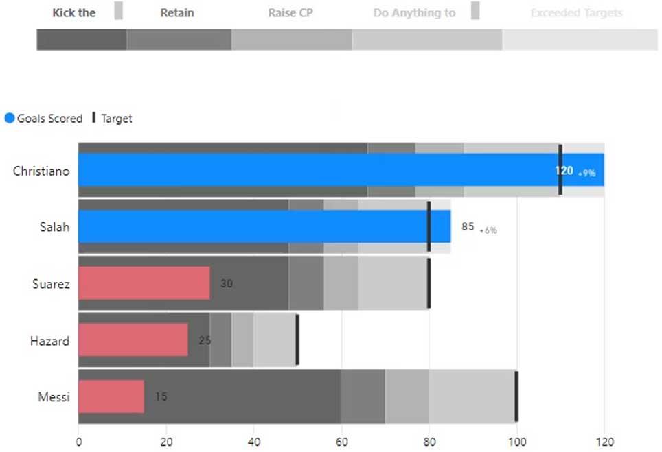
We now have the dynamic bandings on our custom bullet chart. With this, we can easily see who the best players and the worst players are.
Showing Comparisons In Bullet Charts
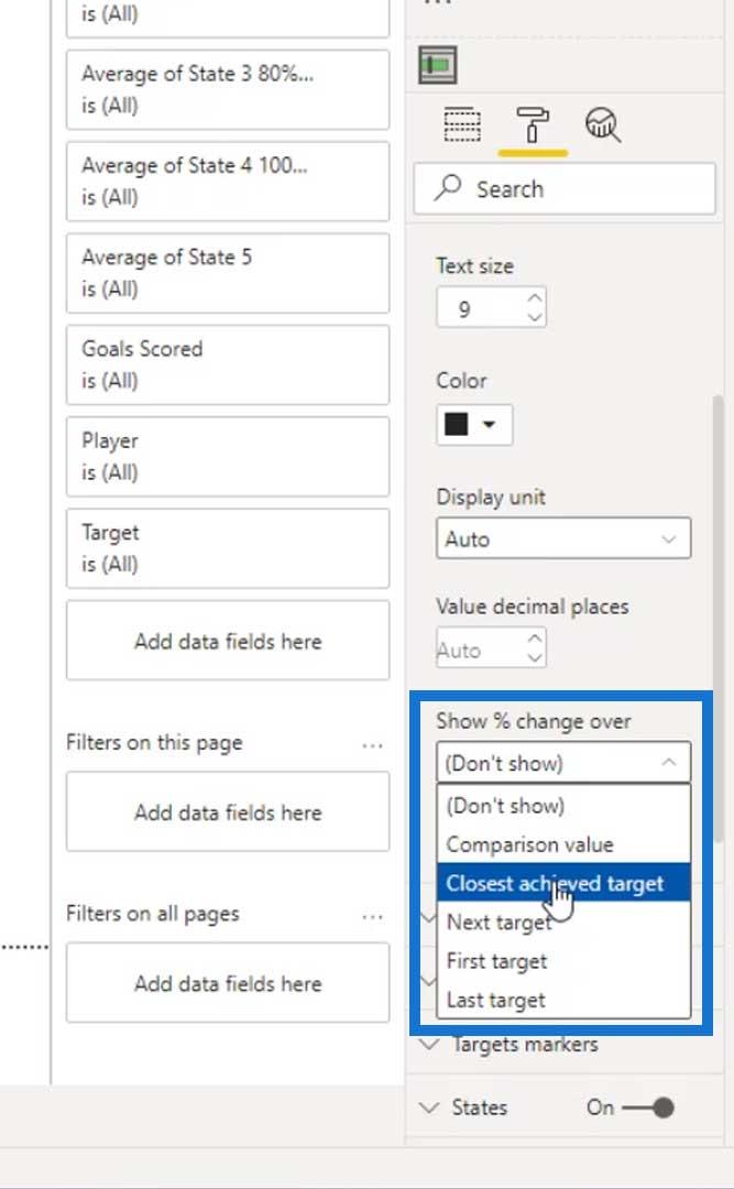
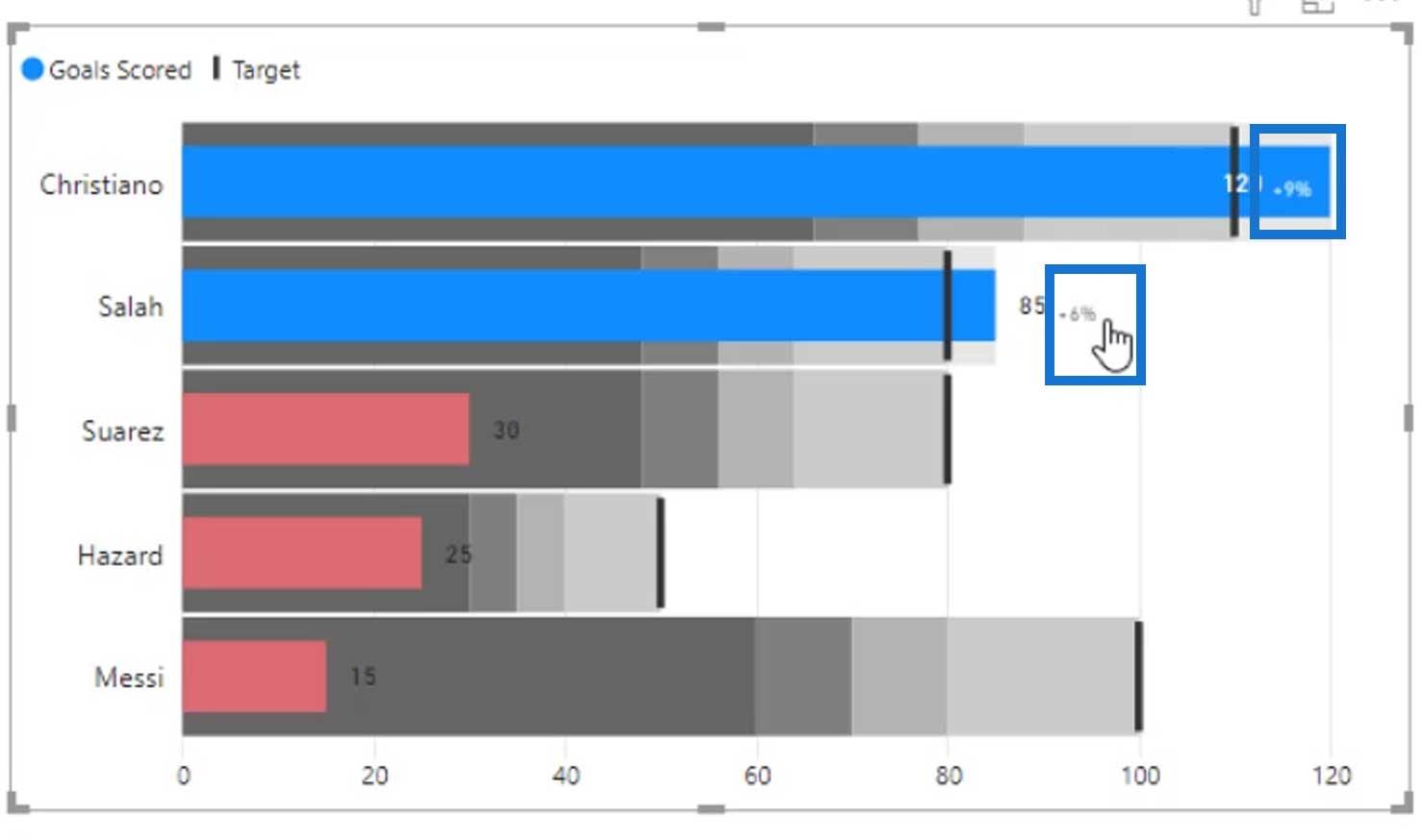
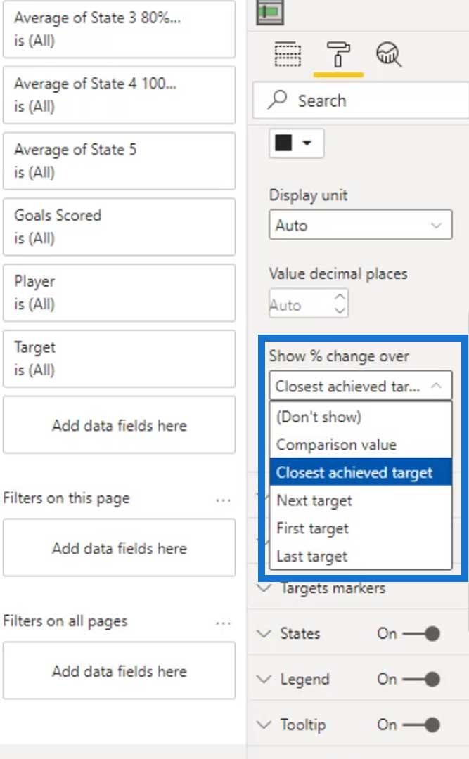
The other thing that we can do with this visual is to use the Show % change over option. We can use this to compare how far a certain individual or player exceeded their target goal. For this example, let’s use the Closest achieved target.
On our visual, we’ll see that Christiano exceeded 9% of his target goal, and Salah exceeded 6% of his target goal.
We can also use the Comparison value. However, we need to add an additional measure for comparison if we will use this.
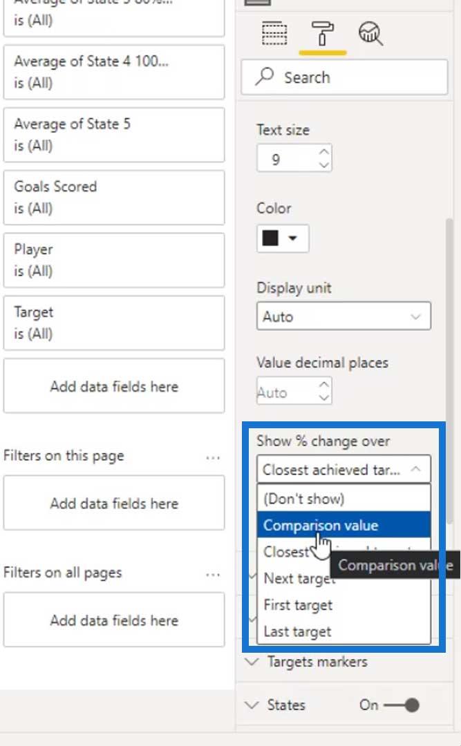
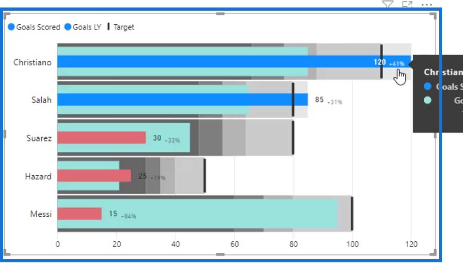
For instance, let’s add the previous year target goals (Goals LY) on the Comparison value field. ‘

As you can see, the Comparison value works now. We can finally see that Christiano already achieved 41% of his target goal last year while Salah got 31%.
Let’s remove the Comparison value for this example.

Let’s keep using the Closest achieved target instead.
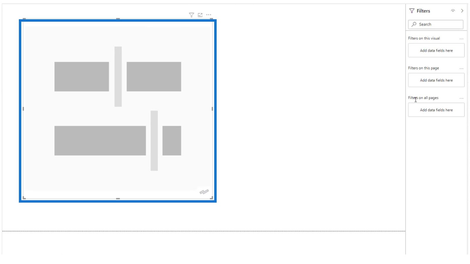
The last thing that we should do is the legends for the bandings. This is because we don’t really know what these bandings mean in our visual.
Creating Legends For The Bandings
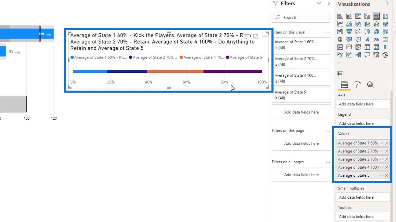
To create the legend for our bandings, let’s add a 100% Stacked bar chart visual.

Then, let’s place our dynamic states on the Values field.
After that, turn off the Title.
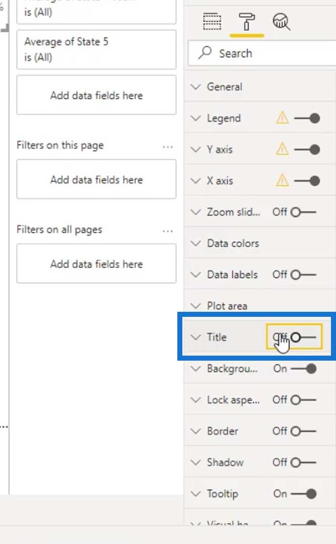
Turn off the Title under the X and Y axis.
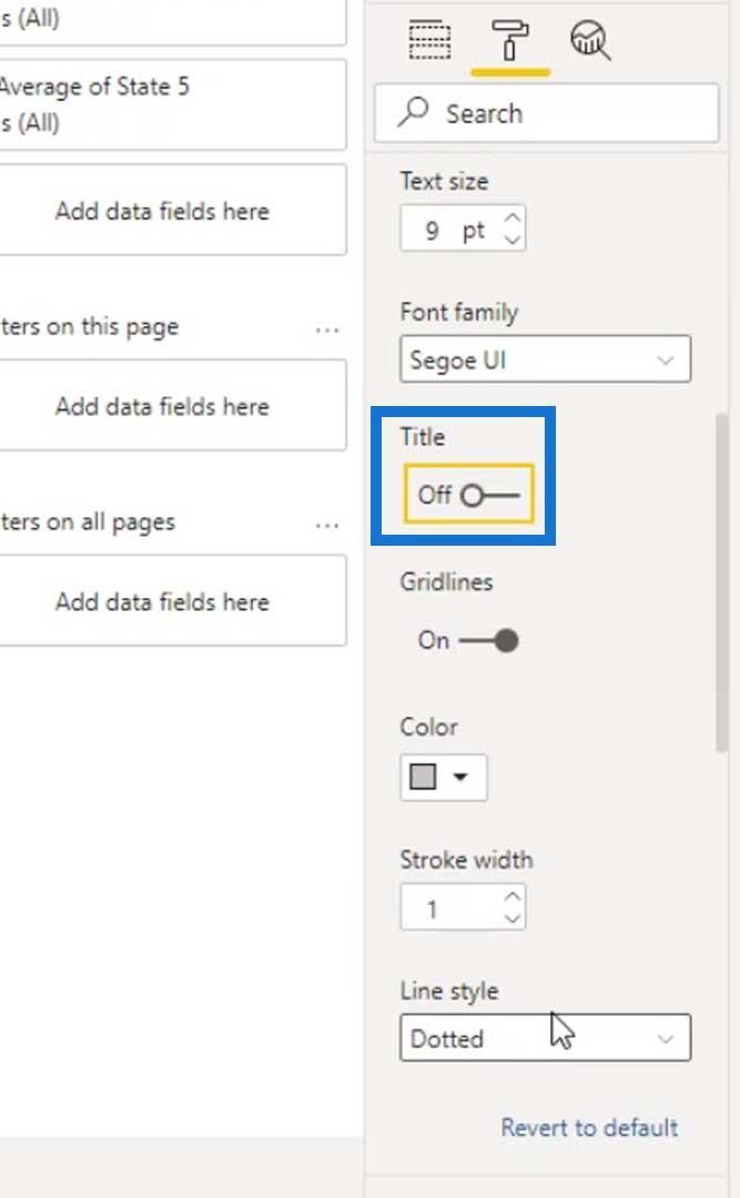
Then, turn off the X and Y axis as well.
State 3 wasn’t added, and State 2 was added twice. So, let’s remove the second State 2 and add State 3 instead.

Let’s change the colors of the states and use the same colors as the bandings on our bullet chart (darker gray to lighter gray).

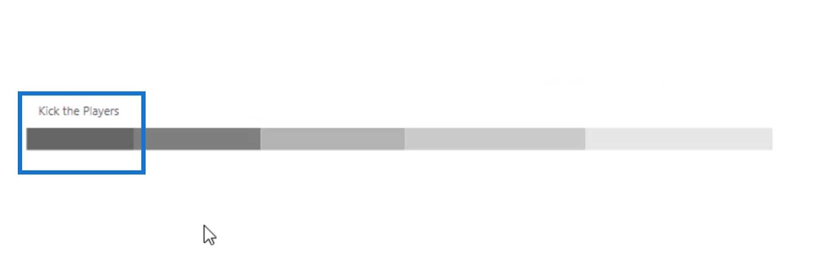
We can also change the names of these states for the legend. For example, let’s change the first state to Kick the Players.

Let’s then change the name of the other states.


We can also create this using PowerPoint to make the legend look more appealing. If we don’t want to use PowerPoint, we can just turn off the Legend option.

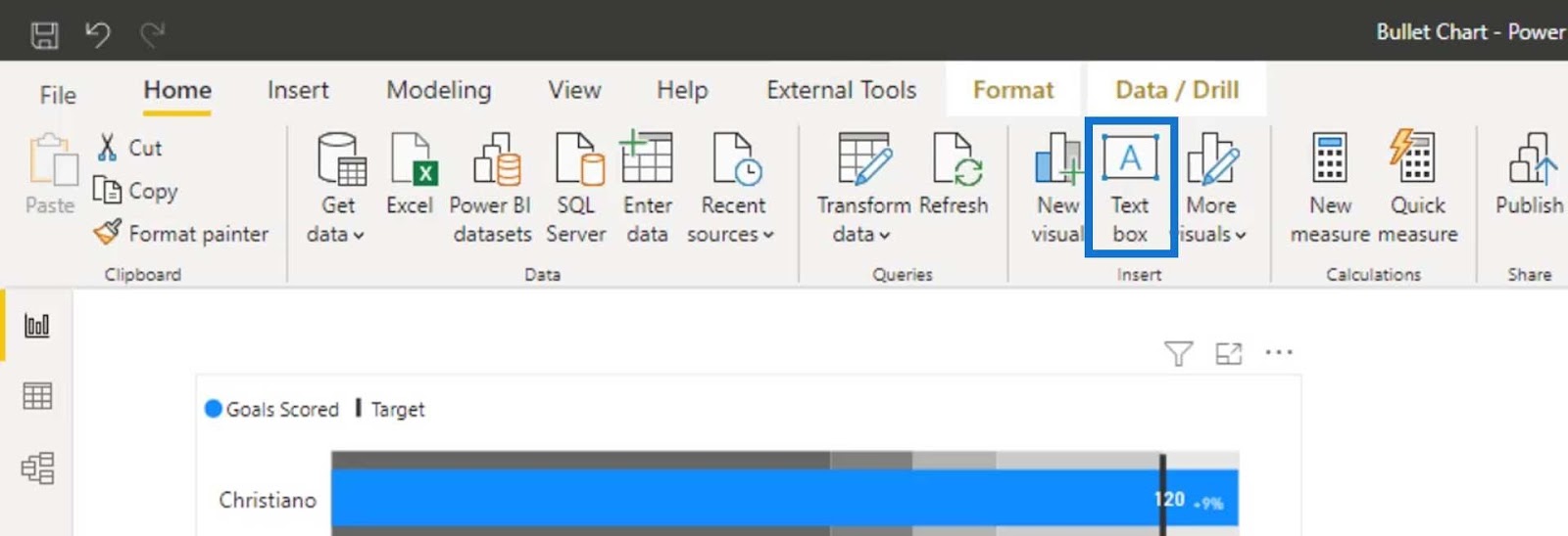
Let’s now add a text by clicking the Text box under the Home tab.
Then create our label as “Kick the Players” and style it using this text box.
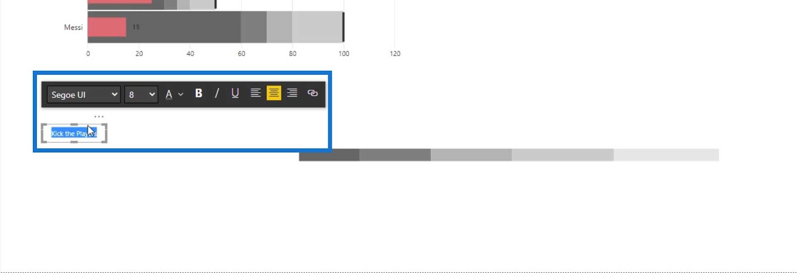
After that, move the text box on top of the bar chart and align it to the first bar.
Then duplicate the first text box to change the text and color that correspond to our legend bars.
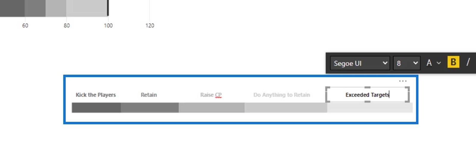
We can now select the text boxes and the bar chart to group them.
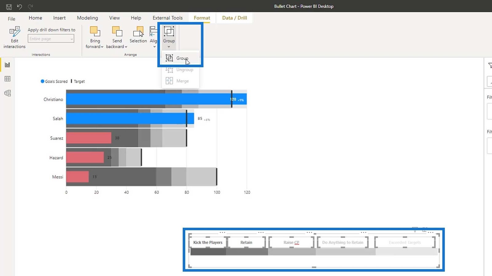
Then, properly position the bullet chart and the bar chart.
***** Related Links *****
New Enterprise DNA Course: Advanced Visualization Techniques
Power BI Banding & Segmenting Example Using DAX
Group Data In A Retail Dashboard In Power BI
Conclusion
To sum up, you’ve learned how to create bullet charts and customize them. You’ve also learned a new technique called Banding, which allows you to group data into chunks based on your underlying data. Static and Dynamic are the two types of bandings in Power BI.
You’ve also gained an understanding of how comparisons can be made possible in bullet charts and how they can elevate the presentation of your data.
I hope you liked this tutorial and found it useful for your data visualizations.
Until next time,
Mudassir


