
In this tutorial, you’ll learn about the comparison of values between Top N and Average Of Others in Power BI. This analysis technique helps add directionality to your solution by seeing how much the Top N and Bottom N customers are above the average of the remaining customers. You can watch the full video of this tutorial at the bottom of this blog.
Setting Up The Model For The Comparison Of Values
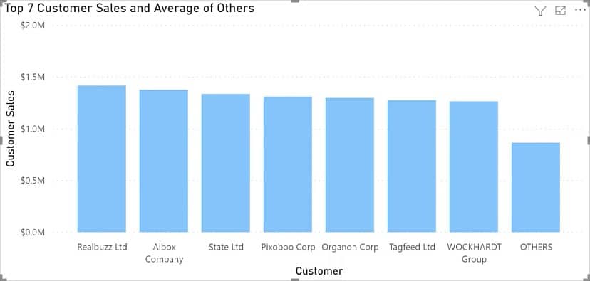
In this tutorial, we will recreate the following report:

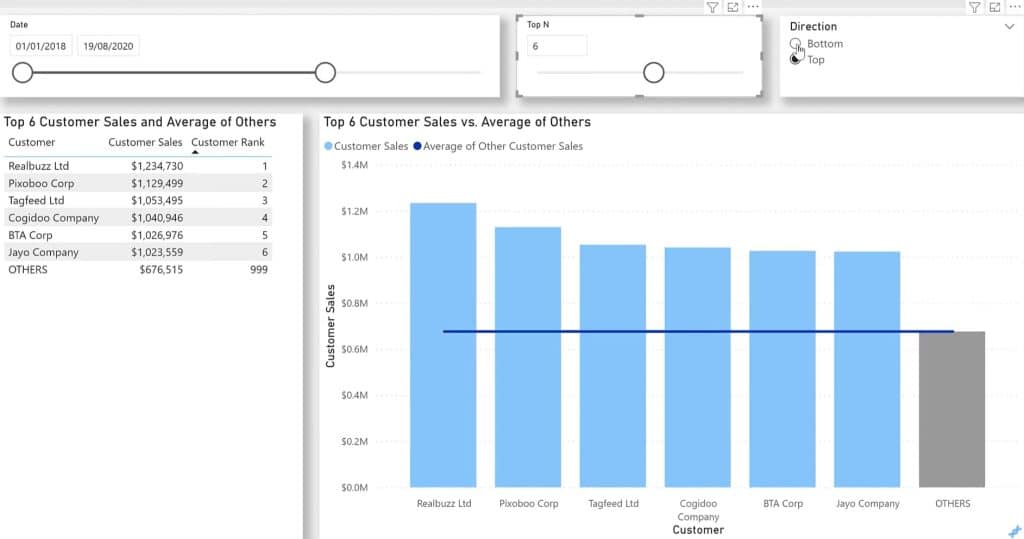
You can see that if you change the context through the slicer, both the customers and the numbers change.
This is a simple sales-based model with a fact table and dimensions table. You can see its data model below:
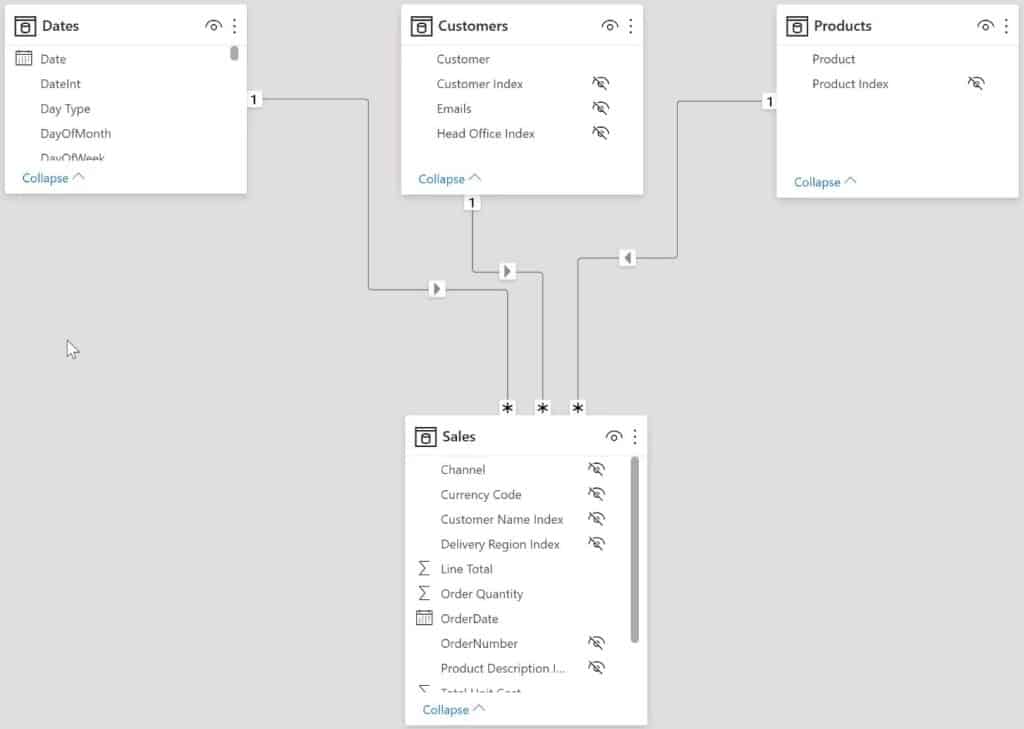
It has a standard waterfall layout with the Dates, Customers, and Products dimension tables on the top and the Sales fact table below.
All relationships are one-to-many with the dimensions on the “one” side and the fact table on the “many” side.
Recreating The Sample Report
With the data set, you’ll need to add a couple of additional tables to use a slicer for the Top N and direction selection.
Creating Tables and Slicers
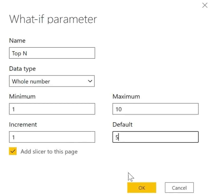
First, go to the Modeling toolbar and add a new parameter. Name the parameter Top N and set the data type to Whole Number.
Input 1 and 10 in the Minimum and Maximum parameters. Then, input 1 and 5 in the Increment and Default parameters.

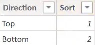
Next, create a Directions table with values of direction for top and bottom, and a sort column. Go to the Home toolbar and click Enter Data.
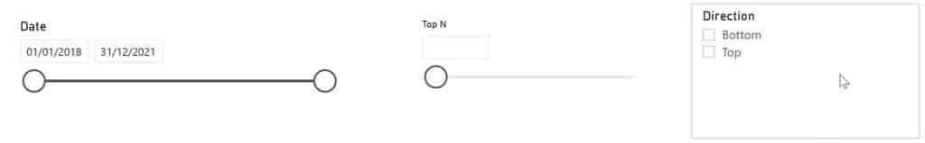
Drag the Date column, Top N parameter, and Direction column to the canvas and turn them into a slicer.
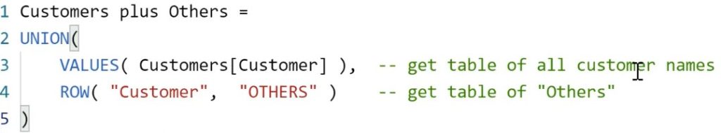
Next, add a calculated table to add an Others row to the list of all customers.
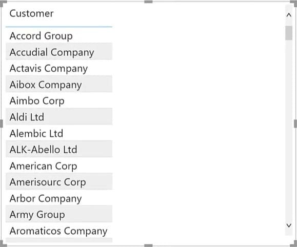
To display the ranked values, add a table to the canvas. Drag Customer from the Customers Plus Others table in the table inside the dashboard.
Building Measures For The Comparison Of Values
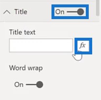
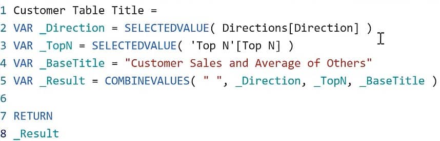
Change the title of the table with the Customer Table Title measure.
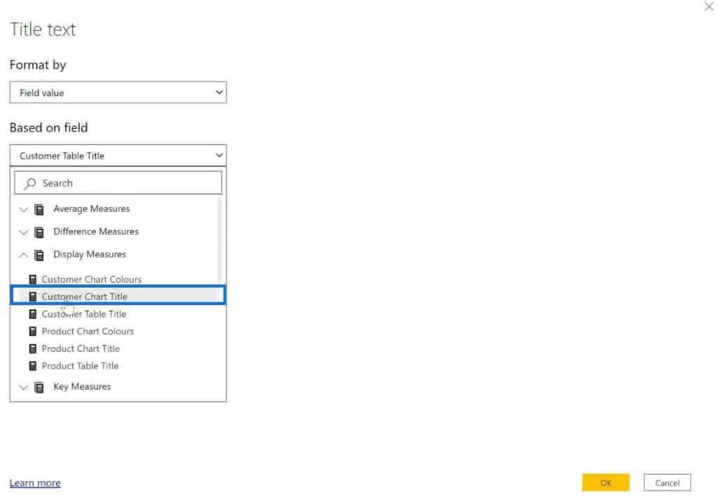
Turn the Title off, and click the button in the Title Text below.
Select Field Value for the Format By parameter. Next, Select Customer Table Title inside the Display Measures for the Based on field parameter.
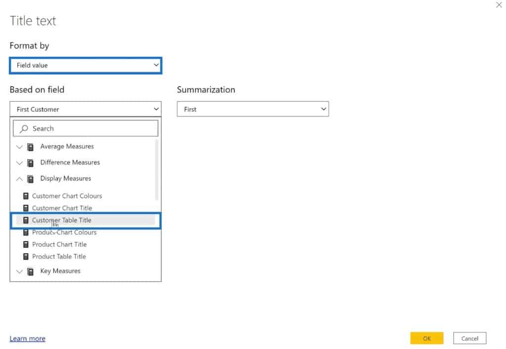
The Customer Table Title measure harvests the direction and the Top N slicers and combines them with static text to generate a result.
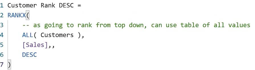
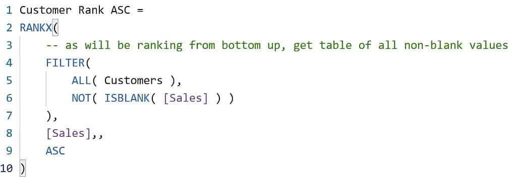
Next, calculate the appropriate ranking value. To do this, you need both the normal top-down descending ranking plus the bottom-up ascending ranking.
This is the descending ranking:
And this is the ascending ranking:
Use the Top N and Direction slicers to return the appropriate customer ranking. Here’s an example of how it should look from the Customer Rank measure:
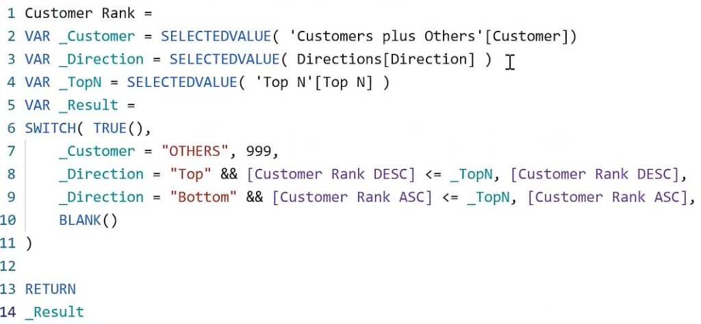
The function harvests the values from the two slicers and uses them to figure out what ranking to display.
Now, check if the ranking measures correspond to the slicer selections by placing the measures in the table.
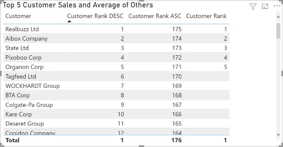
If you change the context with the slicer selections, the values inside the table should also change accordingly.

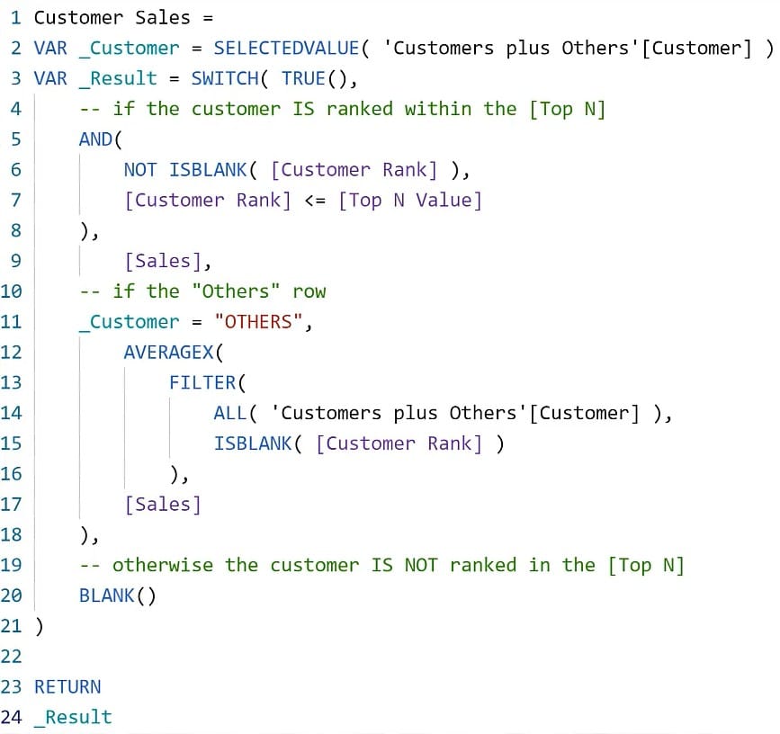
After checking the measures, remove them except the Customer Rank measure and add the Customer Sales measure.
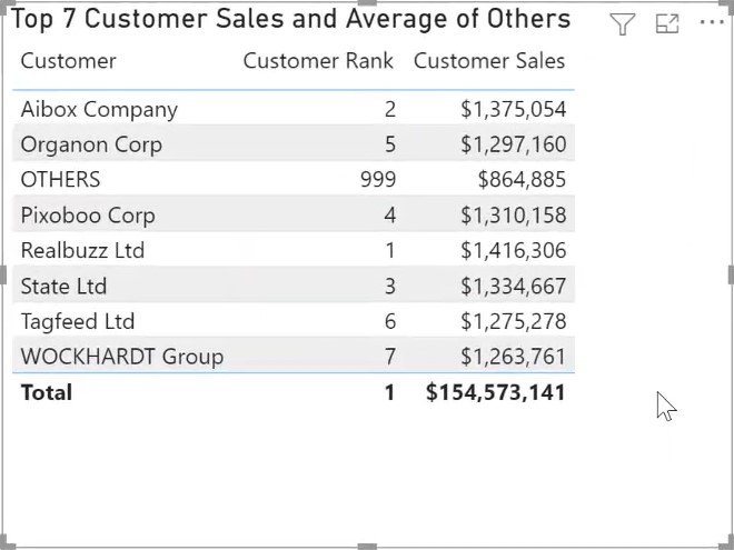
The Customer Sales measure uses a SWITCH TRUE logic to handle three cases.
- #1: If the customer is ranked in the Top N, it will use the Sales value.
- #2: If the customer name is Others, it will use the average of the Sales value for all non-ranked customers.
- #3: If the customer is not ranked in the Top N, it will return as blank.
Creating A Stacked Column Chart
Copy and paste the table and turn it into a line and stacked column chart. Remove the Customer Rank measure (you won’t need it).
Next, add the Average Of Other Customer Sales measure into the line values.
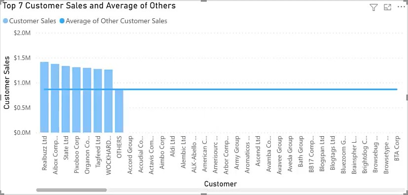
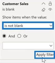
Once done, go to Filters and filter out Customer Sales that are not blank and click Apply Filter.
Lastly, similar to the Customer Table Title measure, change the title of the visual with the Customer Chart Title measure.
This measure harvests the selections of the Top N and Direction slicers and combines them with static text to form the title.
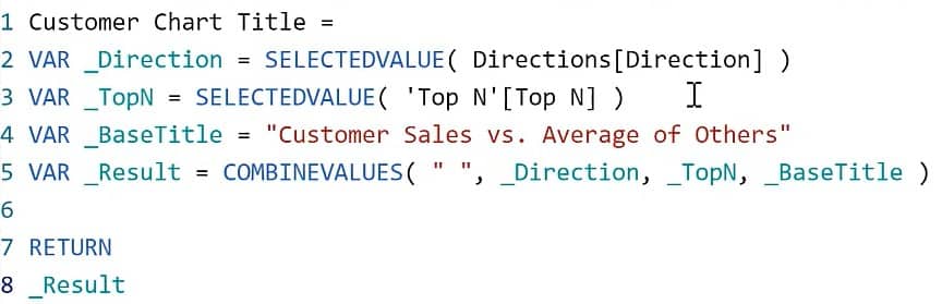
From there, you’ll notice that the table says “and” while the chart says “versus”.
Making The Visuals Stand Out
The next step is to color the columns.
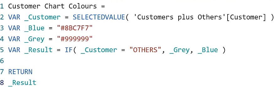
The Customer Chart Colors measure assigns a grey color if the customer name is Others. Otherwise, it will apply a blue color.
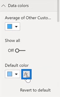
Go to Data Colors and select the button in the Default Color.
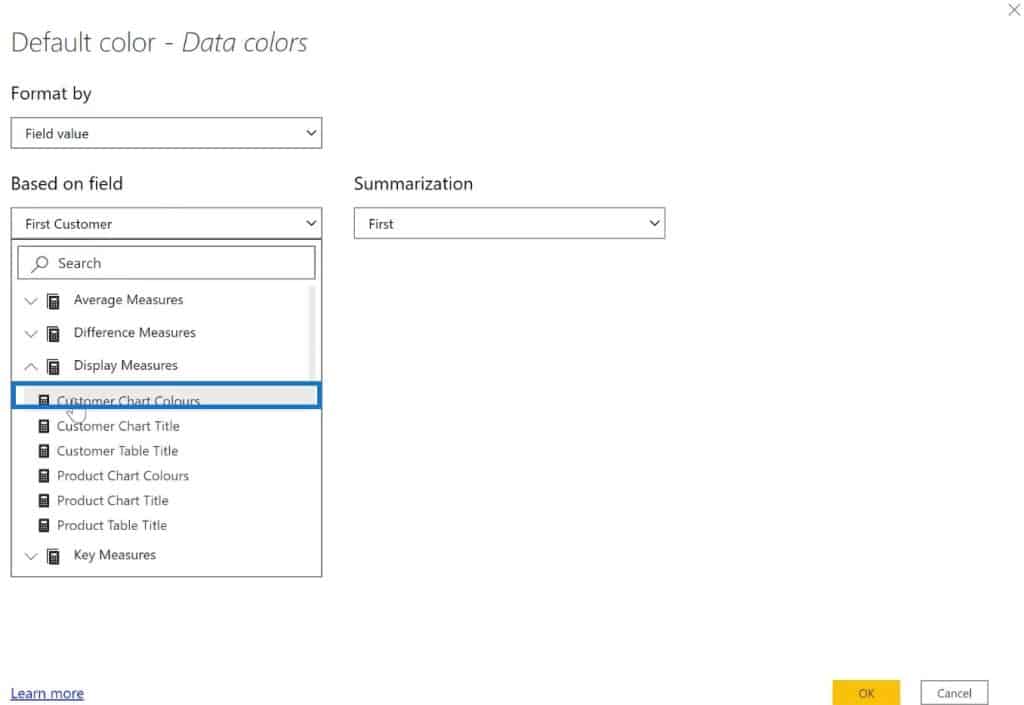
Select Field Value for the Format By parameter and select Customer Chart Colors inside the Display Measures for the Based On Field.
Creating The Final Measures
Now, use math and measure branching to create measures for the difference between Customer Sales and the Average Of Others Sales.
This measure uses subtraction to get the Sales volume.
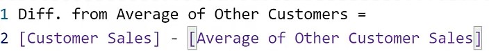
This measure uses division to get the percentage value.

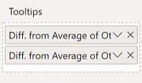
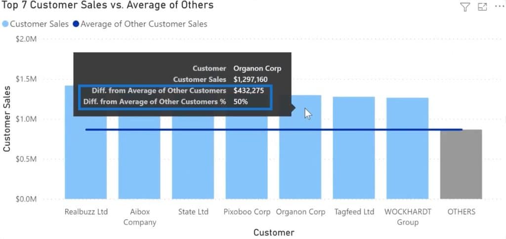
Add the measures into the Tooltips of the chart visual.
After that, when you hover over a customer, you can see how much their Sales were worth and how they compare to the average amount.
These visuals are responsive to the slicers in your canvas. You can utilize them to get data from different time periods and directions.
***** Related Links *****
How To Showcase Top Result In A Power BI Card Visualization
Show Top Or Bottom Results Using Ranking In Power BI
Visualization Technique – Power BI Column Charts & Filters
Conclusion
This tutorial shows the comparison of values between the Top N and Average Of Others values in Power BI.

The difference in the values is essential when monitoring the performance of your products. It helps you create more strategies to improve your sales. You can use this technique to improve and accomplish the sales goals in your organization.
Greg


