
Creating effective and visually appealing Power BI reports is essential for communicating data to stakeholders. However, designing a Power BI report can be a challenging task, especially when trying to balance aesthetics and functionality. In this blog post, we will discuss the best Power BI dashboard design tips that will ensure that your information is clearly and accurately presented.
Best Practices To Achieve The Best Power BI Dashboard Design
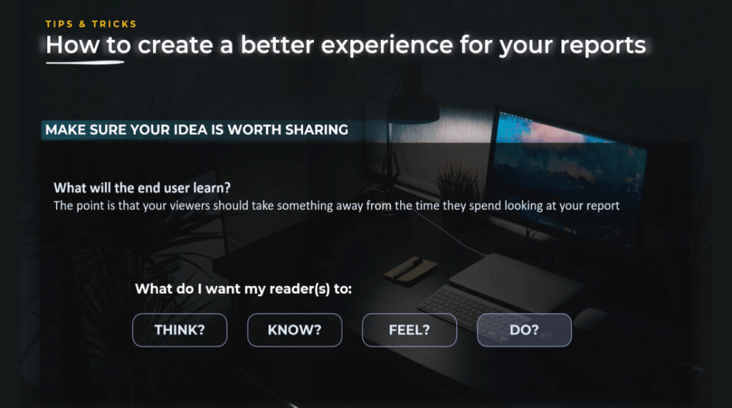
Make sure your idea is worth sharing.
You always want your audience to take something and learn something from your report. In order to be sure your idea is worth sharing, you need to put yourself in the shoes of your audience. Learn and understand their pain points, iterate, and genuinely try to help.

Also, you need to decide what you want your readers to think, know, feel, and especially do about it. If you do not know how to start or what questions to ask, you can check one of my tutorials.
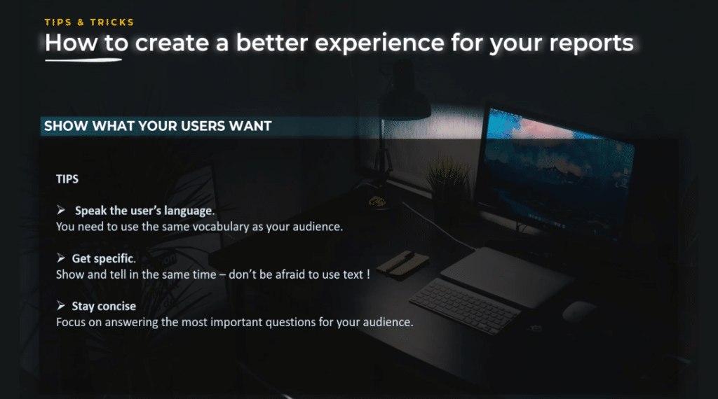
The story you tell needs to be inspired by what the users want.
To improve your design strategy, you need to know how to ask questions, listen to your audience, speak the user’s language, use the same vocabulary, and show & tell.
In addition, propose navigation that will allow a deep dive into the data. You also need to stay focused and answer the most significant questions for your audience. Most importantly, do not try to answer all questions, but concentrate on the questions that matter most.
Don’t rush when planning a design strategy – start with a plan and think about the narrative arc. Effective communication requires a logical structure that is easy to follow.
As you can see below, my logic plan and questions were noted while preparing for a Power BI Challenge participation. In terms of narrative arc, we find the same rules in data storytelling, like the storytelling used in books.
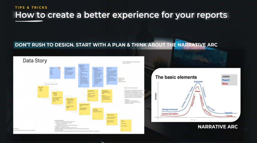
The introduction sets the context and leads to the question. This is your homepage, where the major idea proposes an answer to the previous questions, and is the main purpose of your report.
The call to action says what needs to happen and what needs to change because this is the climax. The resolution is the brave new world where your report has a true impact. The audience lives committed to taking action, knowing it will not be easy but will be worth the reward.

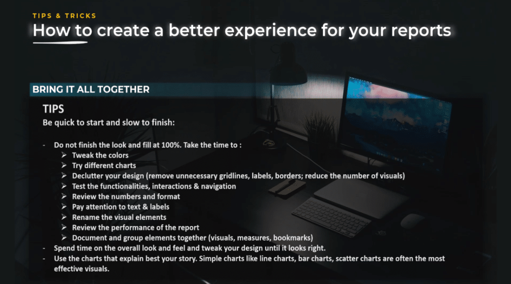
Then, bring all of these together. When you create a report, you need to be quick to start and slow to finish.
Be quick to start
It means that when you start a report, you need to find your story, check your data, try to attack the data from different angles, and search for interesting insights. You do not really think about visuals just yet, since it’s all about data.
I personally use almost exclusively tables in this phase. I do it because I want to summarize with data to make sure I do not commit to a design just yet.
Be slow to finish
On the other hand, this means that you need to take the time for the details at the end. Do not hurry to finish and share your report. Instead, take one step back, look at the overall look and feel, tweak your colors, tweak your report, try to change when necessary a visual element or a different chart, and declutter your design.
The best Power BI dashboard design is the design where you have nothing else to remove. So, take off all the elements that do not bring any value or show the same insight. Remove the unnecessary grid lines, labels, and borders.
Also consider reducing the number of visuals. Test your functionalities, interactions, and navigation. Validate the numbers, check the format, and pay attention to the following: title, subtitle, text, and labels.
Rename the visual elements you use in the report, review the performance of your report, and document your report. You should spend time testing to ensure the design is as good as it can be.
Regarding the use of charts, use the ones that are simple and effective such as line charts, bar charts, and scatter charts. Remember, good design should be consistent, clear, and engaging.
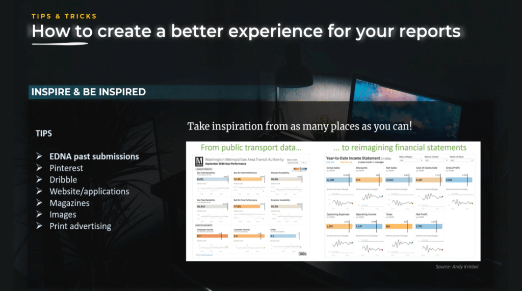
Inspire and be inspired.
One question I often get is where I find inspiration for my reports. I find inspiration in everything, and my first go-to place is eDNA Challenge submissions. I also look for inspiration on Google, Pinterest, and Dribble. I might get inspiration from a website or application, magazines, images, or print advertising when taking the Metro.
Finding inspiration is knowing to search and imagining how to reuse an idea in a slightly different way or different context.
This report is developed by Andy Cribble, where he got inspired by a reported bill for Washington Metropolitan Area Transit Authority and adapted it to a year-to-date income statement.
The takeaway here is to take inspiration from as many places as you can. There is no secret that inspiration is everywhere, and it is up to you to be open and inspired.
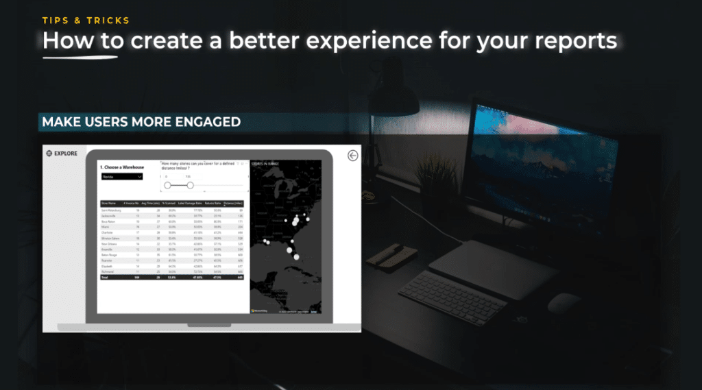
Make users more engaged.
You can use different techniques in order to make users more engaged. You can make the overall story more prominent with your main title and action title.
Also, you can use parameters for simulations and make the report more personal, either with your view or make the story about the user.
In this first example, I chose a warehouse in Florida and used this parameter that shows how many stores you can cover for a defined distance in miles. Also, you can see that when the user selects something different, the map and metrics adapt. We can see all the information such as the miles and the stores.

The next example is my submission for the Power BI Challenge on COVID. In this case, the choice of the title is strategic. I chose this title because it is more positive in the context of those times because every day we were listening about negative aspects, death, and cases.
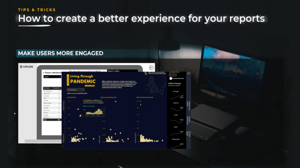
I wanted to change the switch of this analysis to be more positive because during that time the vaccination just started. I wanted to show and compare different countries, the evolution of vaccines, and the cases per million.
The last thing that I created in this report to make it more dynamic was the use of a parameter that shows the number of cases and the trends for the last seven days. So, just by choosing a different number, you can have the report adapted to the view you wanted to see.
Another example is the report where we had to create documentation and this was the report I created to do the documentation based on a Power BI desktop.
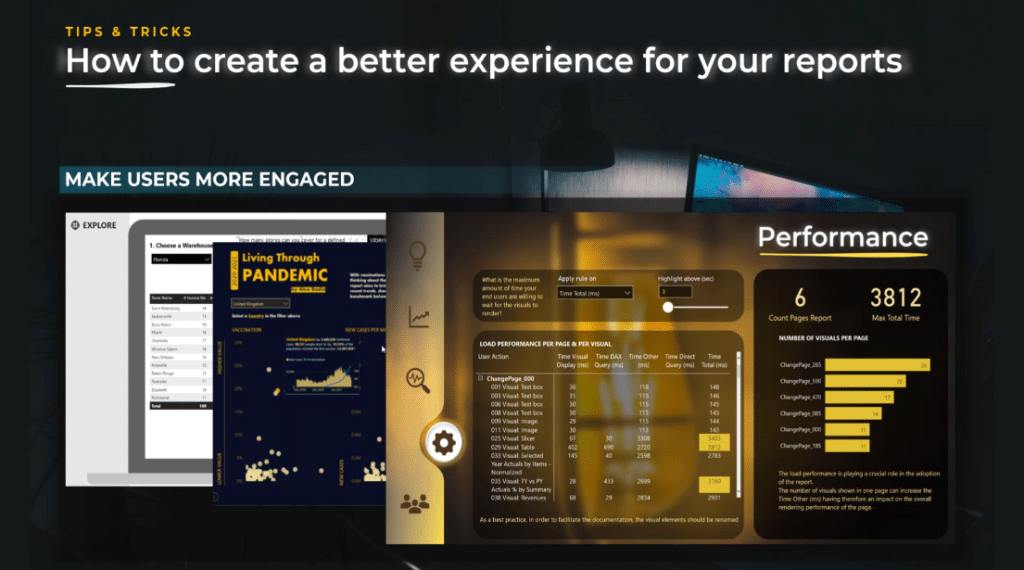
In this case, I created a selection and applied 3 seconds as the loading time on the page. I chose 3 seconds because for me it is the threshold – if you go above it, it starts to slow, but other users might have a different view about this.
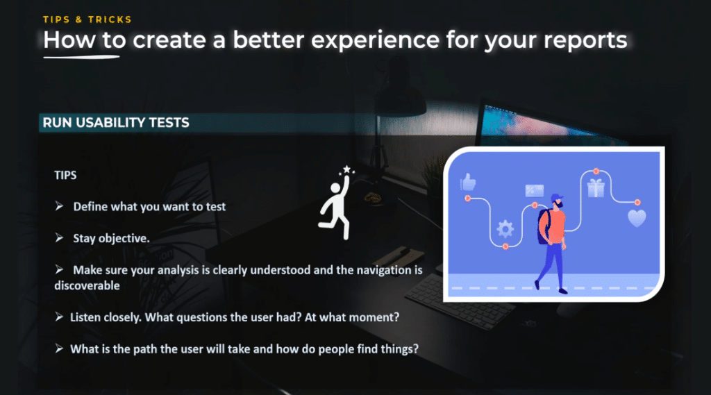
Run a usability test.
Practically in all disciplines, it is a good idea to have other people evaluate your work with fresh eyes. It is true in user experience analysis and reports.
What is usability testing? Usability testing is a method of evaluating the user’s experience while using your report. By testing the usability of the report, you can determine if the navigation you created and the graphs you chose to use are intuitive enough for your audience.
The purpose is to uncover all potential problems and fix those problems as soon as possible. All you need to do is to show your report to someone and without too much explanation, ask that person to talk about what they are seeing and thinking out loud.
You will follow the user’s journey, and find out the following things: how they are using the report, what they are seeing, what they are not seeing, how they find the different things, and how they interpret your story.
Take the time to see how your audience will use your report and you will be surprised by the results.
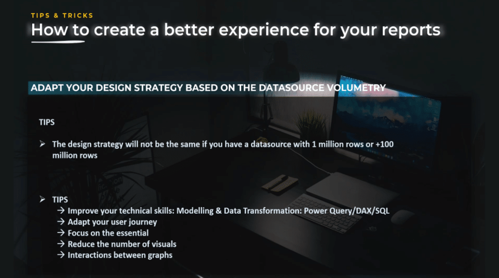
Adapt your design strategy based on data source volumetry.
Even the best Power BI dashboard design will be very different when you work on a database with more than 100 million rows versus a local Excel file with less than 1 million rows.
When you work on a small-sized model, you have more flexibility. You do not have to think about performance that much, nor think about DAX measure optimization because everything runs quickly.
On the other hand, when you work on a complex data model with more than 100 million rows, it is a completely other ball game because the performance will be an issue.
You need to be strategic in the way you present your story and build the user journey. You need to challenge more your users and make sure you focus where you need to focus because every detail counts.
What I particularly like about models with huge volumetry is the fact that it forces you to see the true picture. Everything has a cost, and the key to success is the way you build the model and transform the data in order to work smoothly and build the story you want to tell. It is not a linear process.
The data transformation, data modeling, data visualization, and data storytelling aspect cannot be separated. Everything is related, and it’s a matter of balance.
If you want to become a good storyteller with data, you need to make sure to invest in technical skills such as data modeling, DAX, Power Query, and SQL.
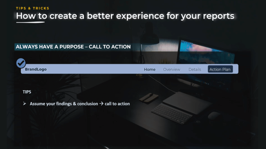
Always have a purpose.
If you are the one who created the report, you are probably the one who knows the data best. Be bold and communicate clearly the findings you found and the recommendations you propose. You are not just a designer, you’re an analyst who uses design techniques to communicate.
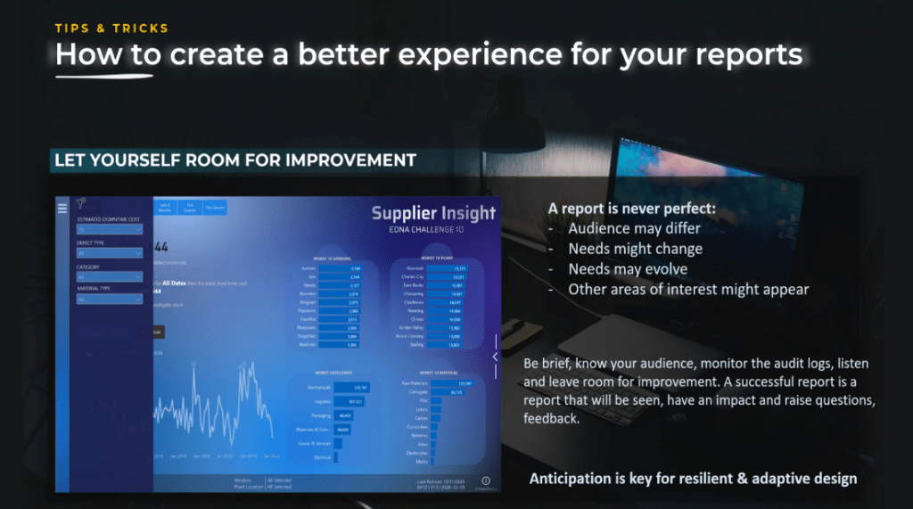
Let yourself have room for improvement.
If you want to have a resilient and adaptive design, a report is never perfect because the audience may differ. The needs might change, or they might evolve because other areas of interest might appear.
The important thing is you need to know your audience, monitor the audio logs, ask for feedback, and learn to listen.

***** Related Links *****
Data Modelling In Power BI: Tips & Best Practices
A Best Practice Implementation Design Strategy for Power BI
Effective Data Storytelling: Asking The Right Questions
Conclusion
In summary, we discussed many tips & tricks around design strategy that will help improve your projects and avoid creating ineffective reports.
As you start your data storytelling journey, let us not forget to practice so we can apply the knowledge because learning from this tutorial is not enough for you to become a better storyteller.
My advice is for you to start incorporating what you learned in your reports and participate in the Power BI Challenges organized by Enterprise DNA. Every month, you will have a new, interesting topic that will push you out of your comfort zone.
By implementing the best Power BI dashboard design strategy, your reports will be more effective at communicating the message to your audience.
All the best,
Alex Badiu


