This blog will show you some of the best tools and tricks to quickly create excellent visuals for your Power BI report. We will focus mainly on creating Power BI SVG visuals, which is typically difficult to do from scratch, and how using Quick Measures Pro can make it easy. You can watch the full video of this tutorial at the bottom of this blog.
Our Data Model
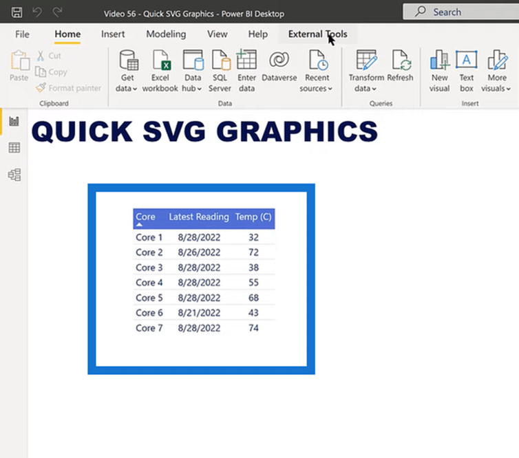
The image above is our dummy data on monitoring computer cores for temperature and the latest reading. The table doesn’t jump out regarding the key facts and findings.
Let’s add some graphics to the table to make it much easier to read. But before that, let’s look at the data model in the image below.
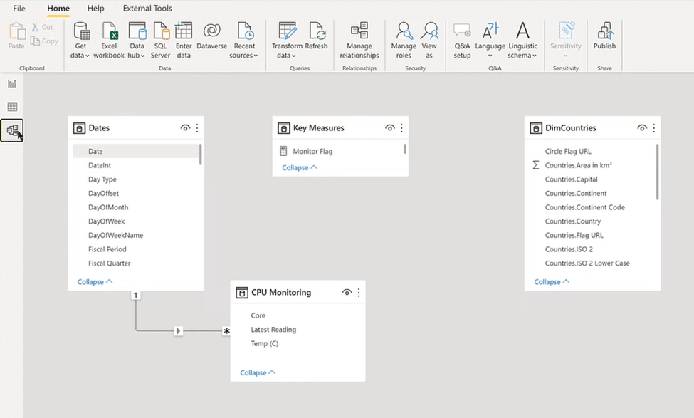
In this simple data model, an extended Dates Table feeds into the CPU Monitoring data for the core, latest reading, and temperature. It also has two key measures: the Monitor Flag and Temp Flag.
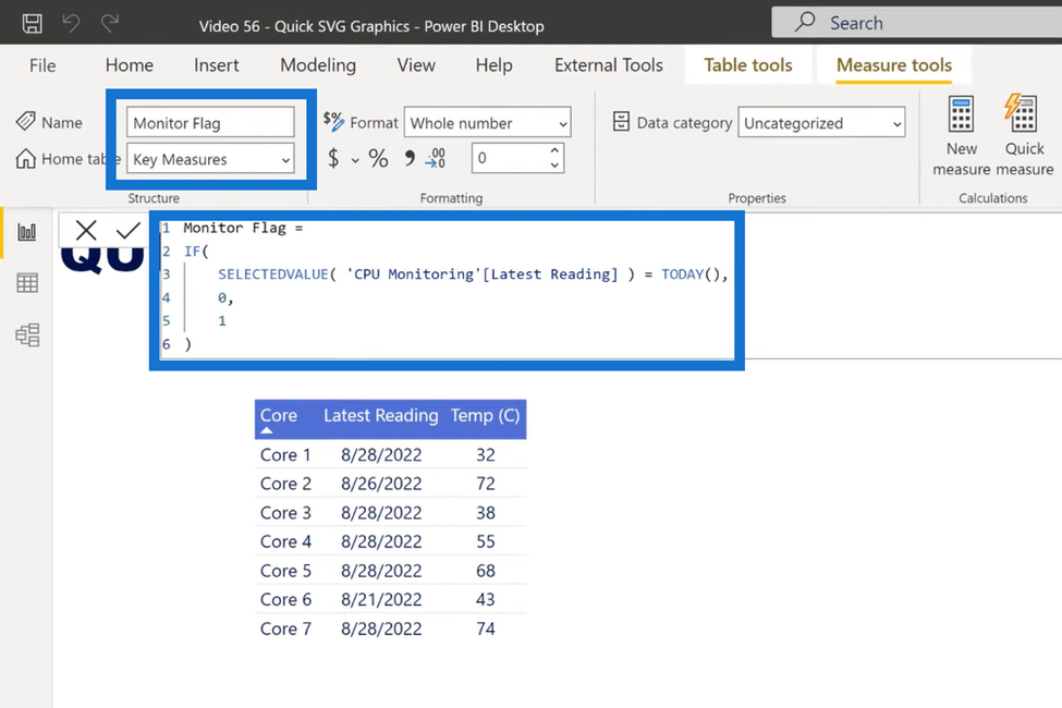
Monitor Flag
The Monitor flag checks if the monitoring data is up to date. Thus, if the selected value of the latest reading is today, it gets zero. And if not today, it gets a value of one.
Temperature Flag
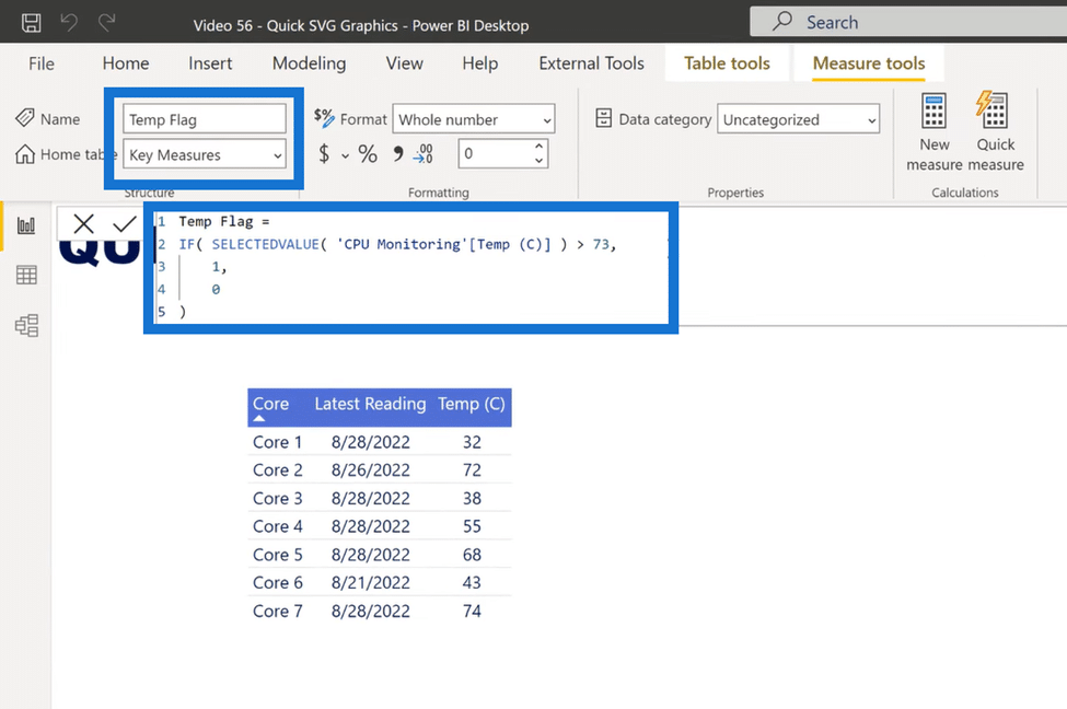
The Temp Flag or Temperature Flag monitors the CPU’s overall temperature to ensure it doesn’t exceed 73 degrees Celsius, which can harm the device. If it’s greater than 73 degrees, it gets a one, and if not, then it gets a zero.
SVG Gauge In A Power BI Report
Now let’s jump into Quick Measures Pro and create three SVGs. The first one is SVG Gauge, which I typically don’t like because it takes up too much room and conveys too little information.
But the one place that I like it is small multiples within tables, so that’s what we’re going to create. First, let’s select our settings and start with our Value column. In this case, it will be CPU Monitoring Temp (C) or temperature.
Next, we’ll select our Category column, which will be CPU Monitoring (Core). Now we’ll move on to the Target settings and opt for something that will start warning anything over 65 degrees and below 40 degrees.
For the Color settings, let’s make it simple and go with blue for Low Color, cyan for Middle Color, and red for High Color. And finally, let’s set the size to 50.
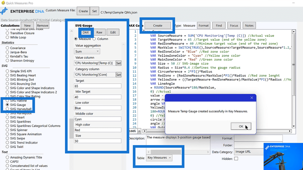
After completing the settings, click on DAX at the top and go to Table at the bottom and select Key Measures. And finally, click Create and then OK to finish our first SVG.
SVG Blinking Dot In A Power BI Report
The second one we’re going to create is an SVG Blinking Dot. We’ll follow the same steps and start by selecting our settings.
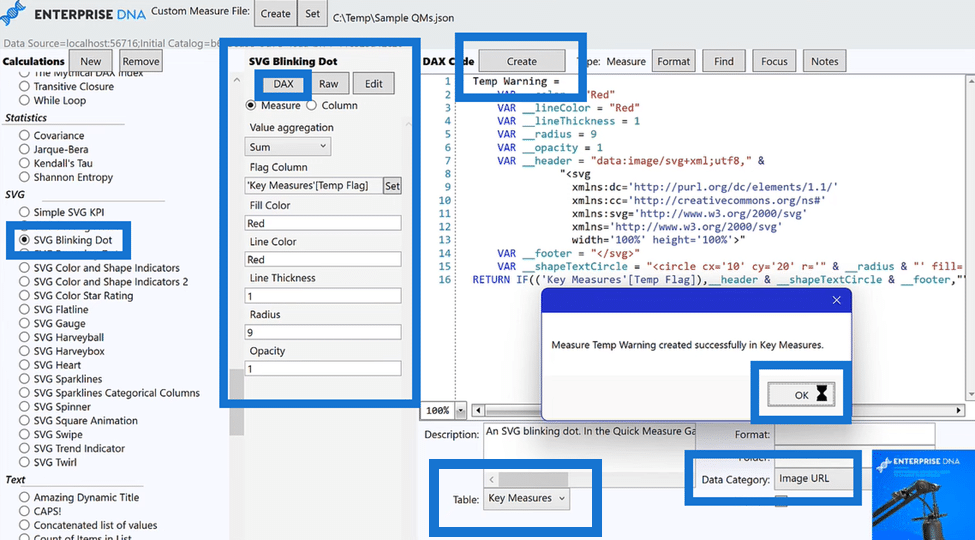
For Flag Column, we’ll choose Key Measure (Temp Flag) or temperature flag and hit OK. We’ll then select red for Fill Color and Line Color, choose 1 for Line Thickness and Opacity, and go with 9 for Radius.
We will again go to DAX, select Key Measures in Table, and add a new action by selecting Image URL in Data Category at the bottom beside Table.
SVG Flat Line In A Power BI Report
The third and final one we’ll create is called a Flat Line. In this SVG, we will choose our Monitor Flag as the Base value.
And like before, we’ll go to DAX, select Key Measures in Table and choose Image URL in Data Category at the bottom. After all the settings are complete, click Create and OK.
Dynamic Visual Results
Now let’s create our Temperature Gauge by dragging it from the Key Measures field in the left side into the table.
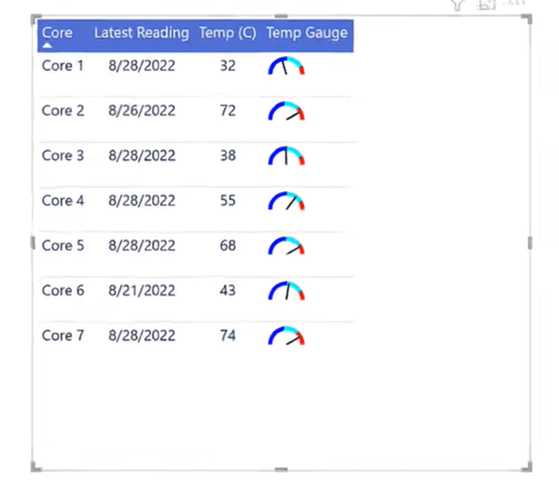
As you can see from the image above, the new table now has a Temp Gauge column that shows high and mid-temperature levels.
Next, we create our Sensor Status or Flat Line by dragging it from the Key Measures and dropping it below our gauge in the Columns section.
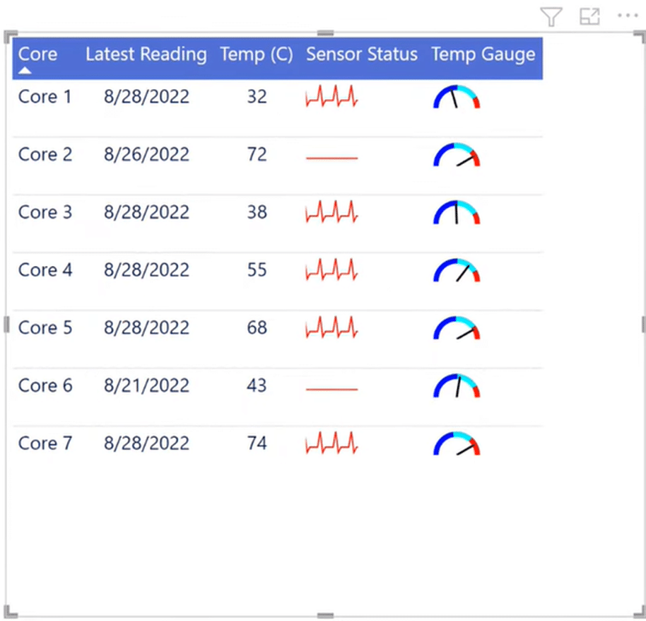
Now you can see which sensors are inactive, including Core 2, which has not been updated since yesterday and Core 6, which hasn’t been updated in a week. The rest, however, are actively monitoring temperature readings.
And finally, let’s create the Temperature Warning, which monitors overheating or temperatures over 73 degrees. So we drag it from the Key Measures field and into the table, and now we have the final results.
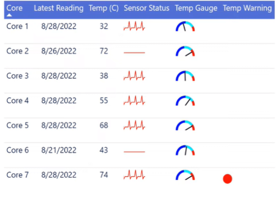
We can see that it’s providing a good alert on overheating Core units. It detects that Core 7’s temperature is above 73 degrees and sends a warning signal through a red blinking dot.
Now we have a pretty eye-catching table with great visuals. As a finishing touch, we can also put a border around it.
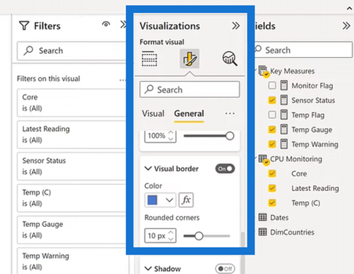
Go to Visualizations, select Format visual, and click on General. In the General section, click on Effects, turn on Visual border, and choose a color for your border. And now your table visualizations are complete!
***** Related Links *****
Power BI Report Designs: How to Get Inspiration Through Enterprise DNA
Power Query: How To Merge Tables W/Different Columns
Report Builder In Power BI: Formatting Objects & Visualizations
Conclusion
That’s how you can quickly add dynamic SVG visuals to your Power BI reports. We can generate these nice graphics in just a few minutes and drop them on the table.
Creating SVG visuals from scratch is generally complex, but with the help of our Quick Measures Pro, it becomes a whole lot easier. Just pick your columns and then drop them into your table!
[youtube https://www.youtube.com/watch?v=Bd5-_n5hGR0&t=509s&w=784&h=441]


