
In this tutorial, I’m going to show you the significant update on data bars in visualization tables, which is really something cool in Power BI. You may watch the full video of this tutorial at the bottom of this blog.
Microsoft is doing an amazing job around table visualizations in Power BI. There has been a lot of updates recently and I’m just going to showcase one of them, which I think is really awesome.
It has great applications across many of your reports that you could utilize to make your analysis pop. There are so many different ways that you could utilise it.

I will show one that I thought I could demonstrate effectively and showcase the potential.
Feature Highlights
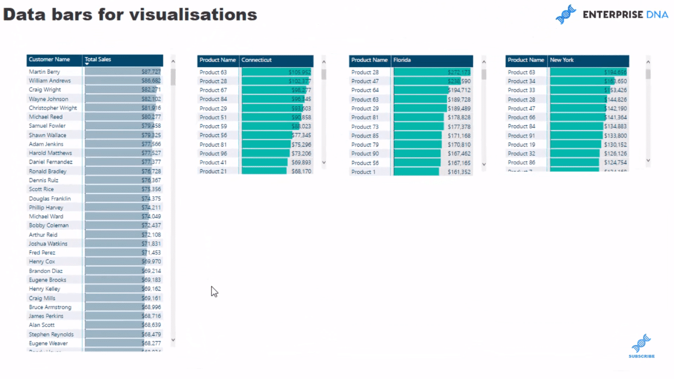
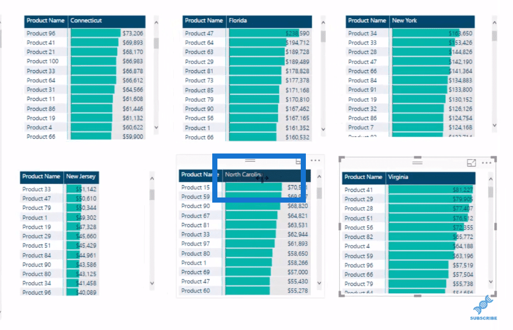
So we have a data model here, which is just a Sales organization, wherein they are selling a lot of products across the east coast of the states.
Here’s what I’ve done so far.
Instead of using a column chart, we now have a lot of flexibility on how we’ll utilize this data base inside of tables now. They can represent results effectively as well.
They look good in a row here and they all align in the context of your calculations or the filters that you put in your calculations.
So in this case, we want to dive into customers. We want to find out where they are buying products from us, for example; We might be selling at an online store.

Just click through here and we’ll see that the visual of that is really cool and it’ll show us some quick insights as well.
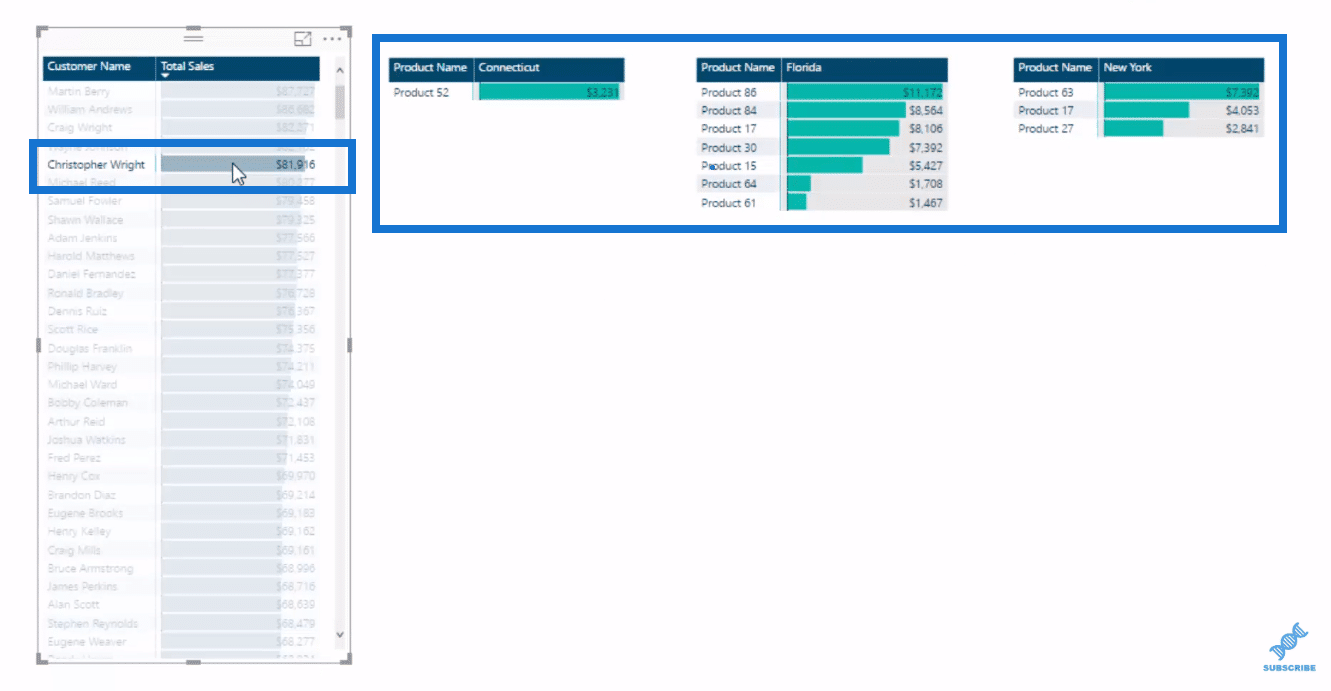
Say we want to add another layer in here, it’s easy and effective to get it down into another layer.
All we have to do is put an additional filter, and change it around a bit to make sure that they are looking at a different sub-set of clients or a different region.
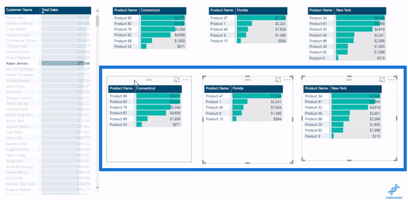
We can also adjust them inside the table in terms of size like so.
What’s great about this feature is its flexibility. You can actually fit a lot more information into a page than you would in a normal bar chart.
You can change the title headers. Also, there’s a lot of elements within the table so you could change the font color and the data bar color, etc.
So this is a really cool new feature inside Power BI. Depending on the data set obviously, you might want to implement a different way.
How To Use The Feature
I’ll show you quickly how I utilise the feature. I’ll create one table and I’ll show you how to do it.
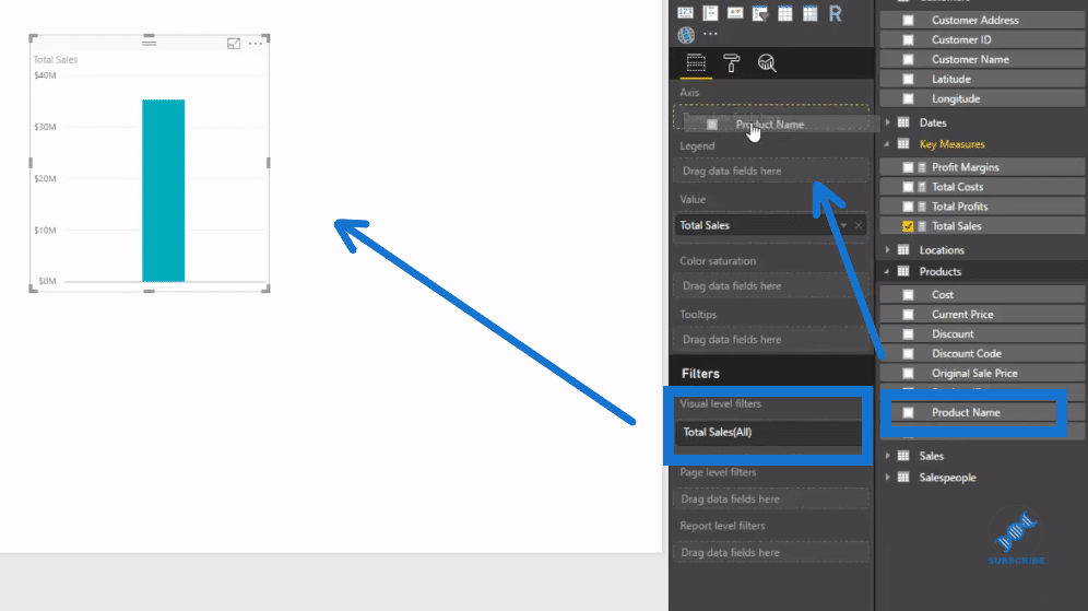
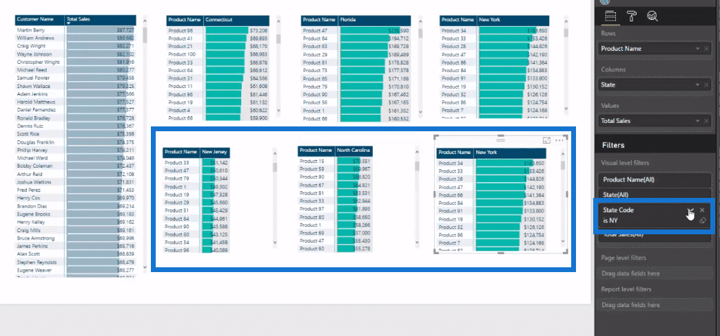
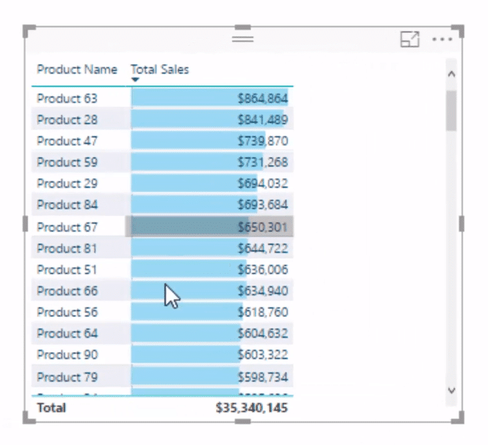
I simply bring in Total Sales here and I’ll also bring in my Product Name into the axis here, then create the table by clicking the table icon under Visualizations.
It’s really simple. It’s where you traditionally have done some formatting. You’ll just have more options now.
In this little drop-down arrow under Product Name, we can go Conditional Formatting, then Data Base, and we have the option to change the colors.
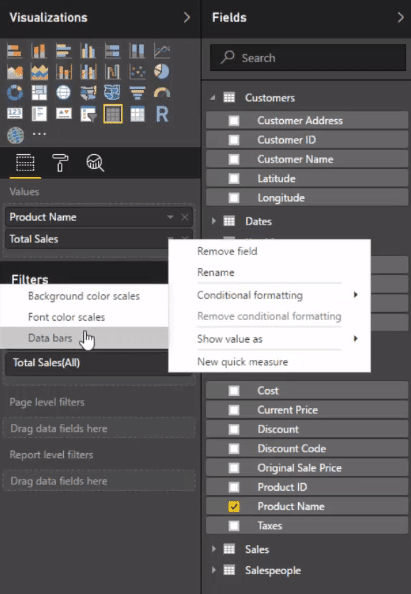
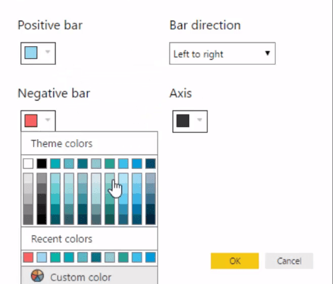
The data bars can be positive or negative, say difference in forecast or something like that. This way we can maneuver them around and choose our desired color.
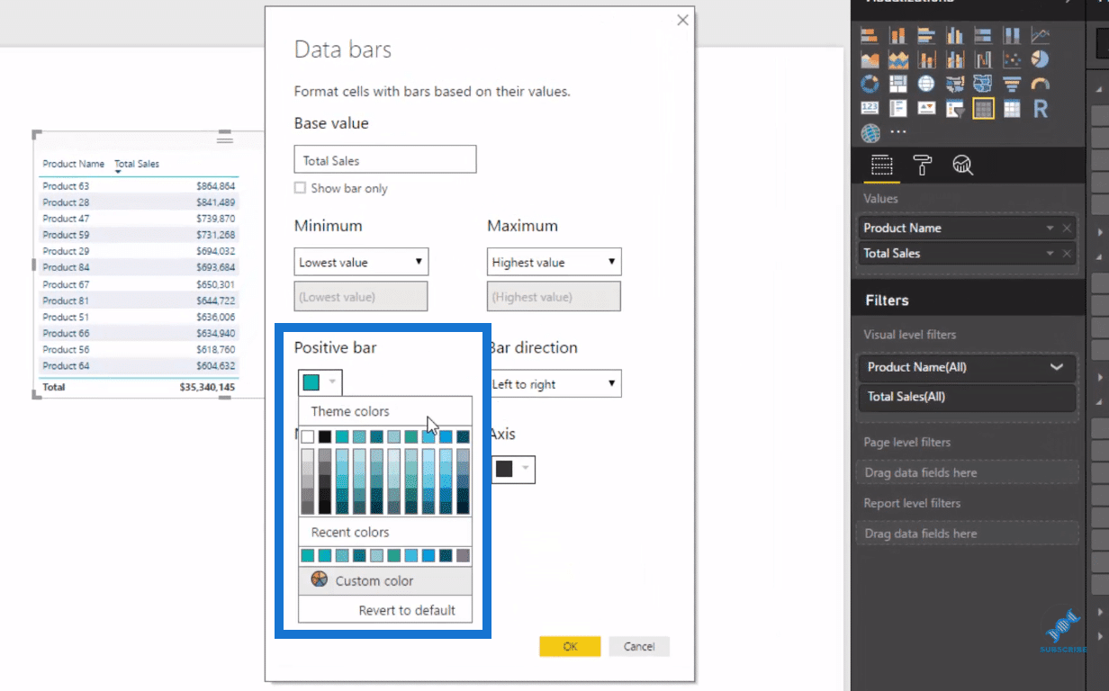
You can adjust the color of each of them, including the axis.
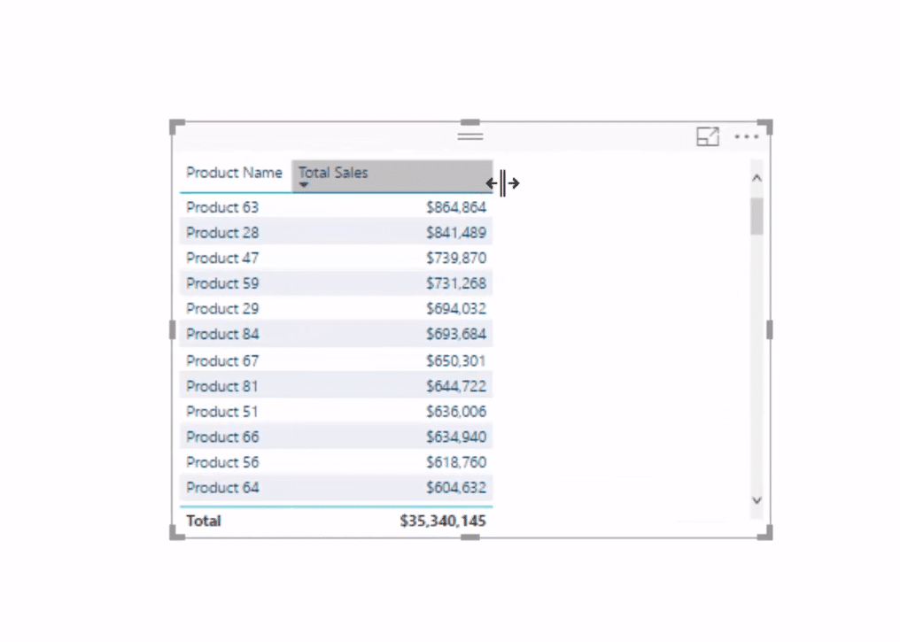
An we see here that now have our bars inside the table.
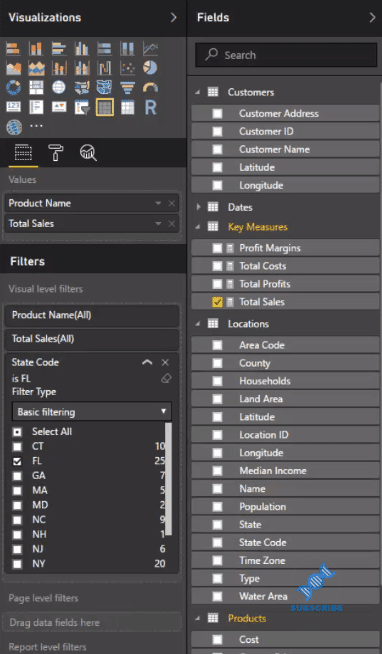
Moreover, we could use these filters as well just like we would in any visualization.
Bring those filters in and associate those to a particular state code, for example, that we want to look at, say Florida here for FL.

It also gives us the ability to change the headers like so, in terms of background color, font color, etc.
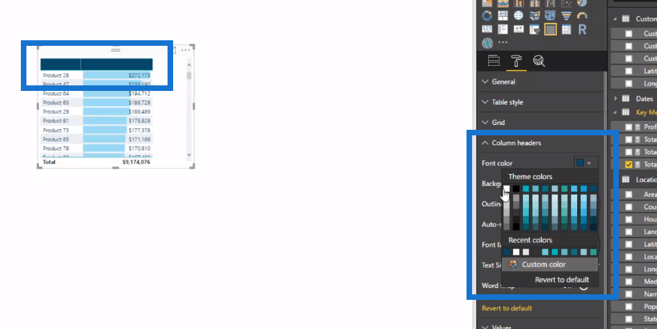
We can also change the background to the actual rows.
It might sound so simple, but we couldn’t make it look somewhat like this if we use the standard bar chart obviously.
***** Related Links *****
Background Design Plates – Power BI Visualization Technique
Using Great Color Schemes In Your Power BI Data Visualization
How To Create Compelling Reports & Dashboards In Power BI
Conclusion
There are lots of different options with this really cool new feature. I, myself will start using this feature more. I’ll integrate it in my visualisations and make it look very effective and compelling.
This feature is really good for small visualizations, such as when you want to layer small visualizations one after the other in a row in your report. This is a really good application for this.
So I’ve shown you the opportunities that you now have with tables. I hope you enjoyed this one!
Cheers,
Sam


