In this tutorial, we’ll talk about the small multiples chart, which is a new preview feature introduced by Microsoft. This is also one of the best features for visualization in Power BI. We’ll also be discussing some of its limitations when it comes to visualization.
A small-multiples chart is a data visualization that consists of a series of similar graphs or charts arranged in a grid. It uses multiple views to show different partitions of a dataset. It is often used to compare the entirety of the data. For scenarios with a wide range of data presentations, small multiples are the best design solution.
This is what a small multiples chart looks like.
Enabling The Small Multiples Chart Preview
To enable the small multiples preview, click File from the menu bar.
Go to the Options and settings, and click Options.
Click the Preview features, then enable the Small multiples.
In order to apply the changes and use this feature, you need to restart the Power BI application.
The Small multiple visual is only available in column charts, bar charts, line charts, and area charts. It’s not available in pie charts and any other charts.
Creating A Small Multiples Visual
First, let’s use a line chart and resize it as shown in the image.
Let’s utilize the Total Defects measure, and place it into the Values field.
For this example, we’ll analyze the total defects by vendor. Therefore, we need to add the Vendor to the Axis field.
Right now, you can see that it’s just a descending line chart.
To enable the small multiples chart visual feature, we need to bring in some data over the Small multiples field. So, let’s place the Vendor into the Small multiples field.
Then, within the Axis field, let’s change the Vendor to Date.
As you can see, we now have small multiple visuals in our visualization.
Modifying The Small Multiples Chart
Let’s turn off the Title and the Background under the Formatting tab.
Then, change the color to yellow under the Data colors.
Right now, we can’t see the title on our small multiple visual because its color is dark. So, let’s change the title color to white. Just change the Font color under the Small multiple title.
Then, let’s change the font size of the title.
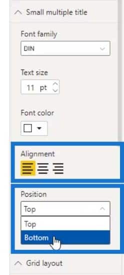
Let’s also change the alignment of the title horizontally and vertically by using the Alignment (for horizontal) and Position (for vertical) settings. The best title alignment I found for line charts is positioning them at the bottom. So, let’s change the Position to bottom.

The output should now look like this.
Setting Up The Grid Layout
The most important section for a small multiple visual is the Grid layout. The Grid layout setting sets the amount of small multiple visuals that we can display on our rows and columns.
For example, if we increase the Rows and Columns to 6, it’ll display 6 items for rows and columns as well.
However, the downside of this is that we can only increase the rows and columns up to 6.
To make this look better, let’s just use 4 rows.
As a result, we can now see the lines more clearly. Let’s then remove these categories.
To do that, just turn off the Title for both X and Y Axis.
Then, turn off the X and Y axis as well.
We can also hide or display the grid lines by enabling or disabling them on the Y and X axis. For this example, let’s leave this turned on as it defines the borders around the visual and makes it look better.
Note that we currently don’t have conditional formatting for line charts. But you can certainly try doing it by using bar or column charts.
Adding Secondary Values For A Small Multiples Chart
The small multiples visual can also handle secondary values. For example, let’s add another measure in the Secondary values field.
As you can see, it can handle secondary data which makes it a great feature for visualization.
We can also change the color for the second measure (Total Downtime (Hrs)).
Small Multiples Visual For Different Charts
Another cool feature is that we can analyze our data by using column charts.
And this is how it looks like if we convert our line visual to a bar chart.
For bar charts, it would be better to change the Axis to Month & Year instead of Date.
Just remember that if we want to make it look better, we can play with the various settings that are available in Power BI. For example, we can reduce the Rows and Columns on the Grid layout to make the bar chart look better.
For the bar height, we can just edit the Inner padding.
Don’t forget to check the other settings in the X and Y axis as well.
As for the sorting, we can only sort them by categories and not by values.
We can also use the area chart for our small multiples visual as shown in the image below.
***** Related Links *****
Small Multiples With Calculation Groups In Power BI
Power BI Small Multiples Visual – New Feature
Power BI Conditional Formatting For Chart Visuals – What’s Possible?
Conclusion
To sum up, we’ve seen how the small multiples chart allows the viewer to focus on changes in the data rather than on changes in graphical visualization. We’ve also discussed the limitation of this visual when it comes to sorting and the limited number of options for rows and columns. Hopefully, they can make it better in the future.
It’s a relatively new feature introduced by Microsoft Power BI. You can play around with the different visuals that you can use with the small multiples chart.
Until next time,
Mudassir


