This blog highlights the Power BI small multiples, which is a new visual feature. At first, I really didn’t like it. But when I tried to explore it in detail, I was surprised by what it could do. You can watch the full video of this tutorial at the bottom of this blog.
Although there are some small limitations, the Power BI small multiples is a very good feature and I’ll show you what it’s capable of.
Enabling The Power BI Small Multiples Feature
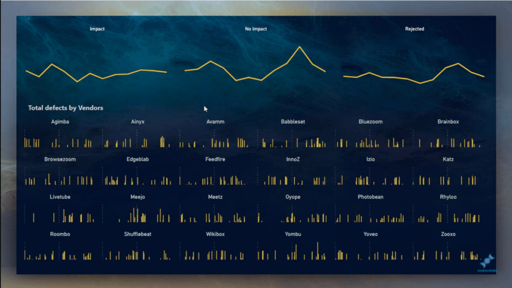
This is the result you can achieve with the Power BI small multiples visual. To use this feature, you have to update your Power BI Desktop to the December 2018 version.
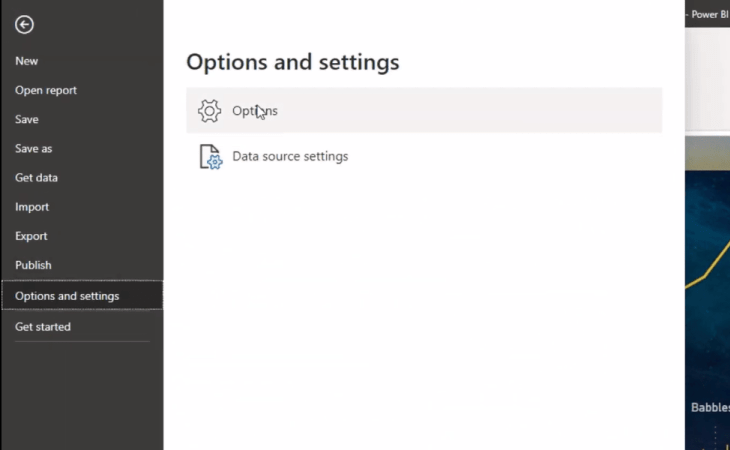
After doing that, you have to go to File then Options and settings, and then select Options.
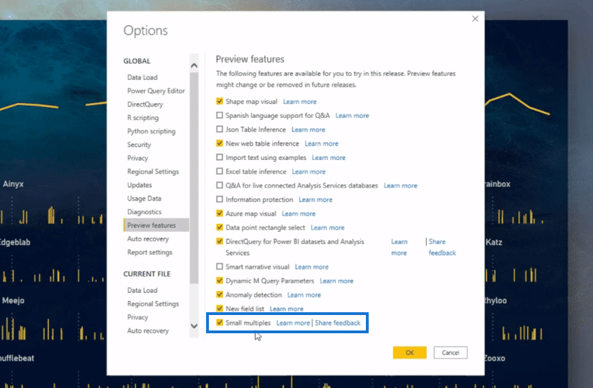
Go to Preview features, and then enable it from here by clicking its box. Then, click OK. Then, you need to restart your Power BI Desktop to actually use it.
Power BI Small Multiples In Bar Charts
The small multiples visual is available in bar charts, column charts, line charts, and area charts. First, I’ll demonstrate how you can use it in bar charts, then we’ll move on to column charts, and so on.
The functions available for bar charts and column charts are almost the same, but they’re different from those in the line charts.
To use this feature in bar charts, you need to bring a bar chart into the canvas. The data that I’m using in this demonstration is from the recent challenge that I participated in the Enterprise DNA. First, I put my measure, Total Defects, into the Values.
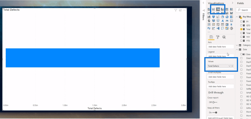
I want to see how many defects are related to the vendors, so I’m bringing the Vendor into the Small multiples section. I want to analyze it by month, so I’ll drag the Month name into the Axis.
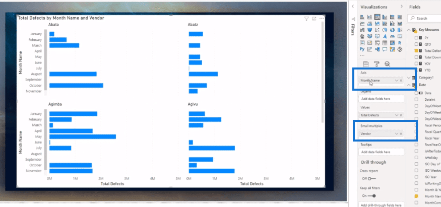
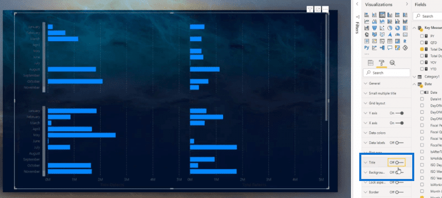
Then, what I do is turn off the background and title to give it a more compelling look.
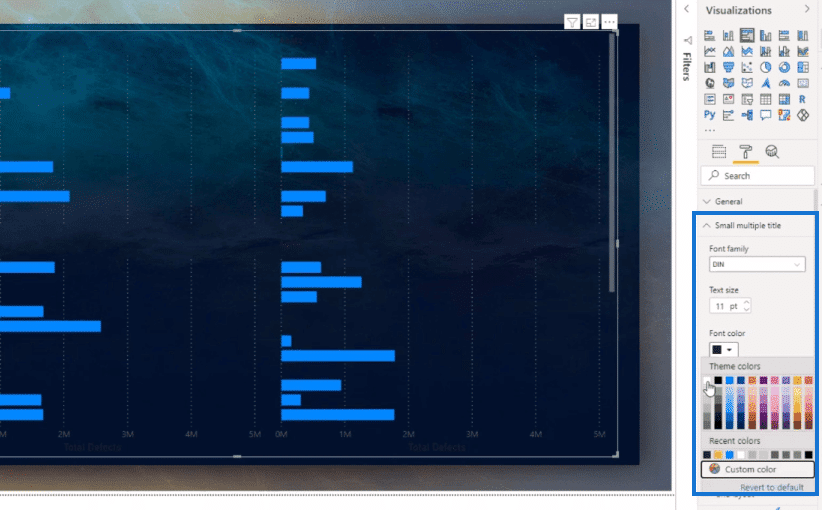
To change the size and color of the title font, I go to the Small multiple title section.
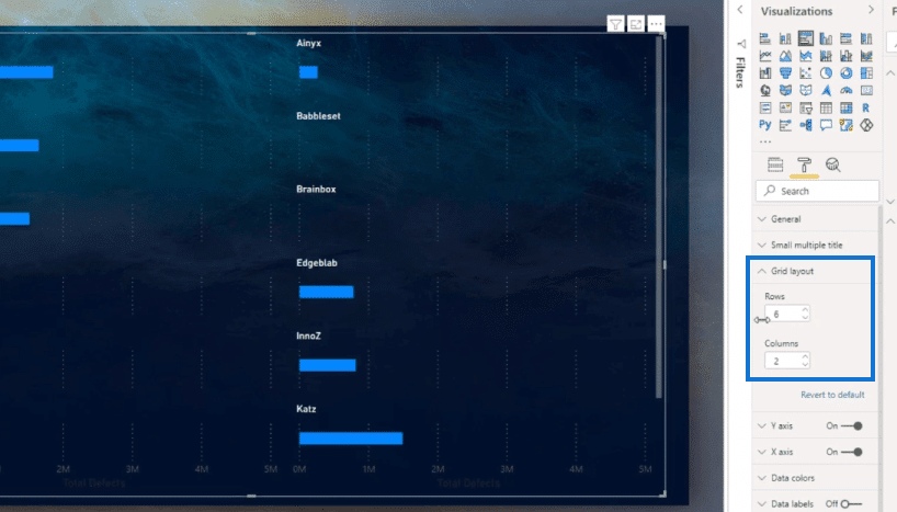
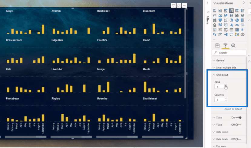
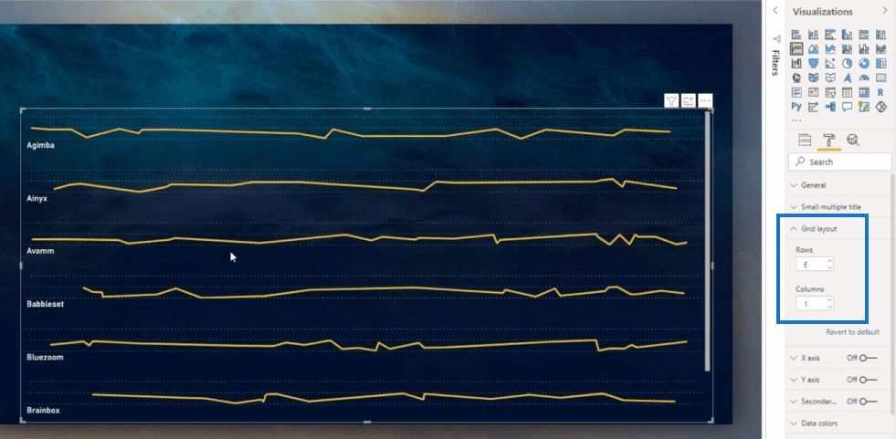
I can also choose the number of rows and columns in the Grid layout. You can adjust the layout however you like.
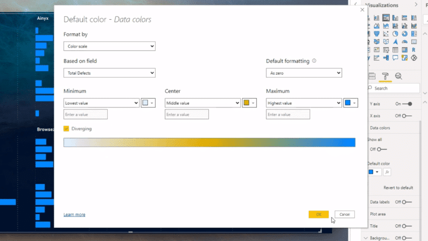
Conditional formatting is also available here. I can change the default color based on field.
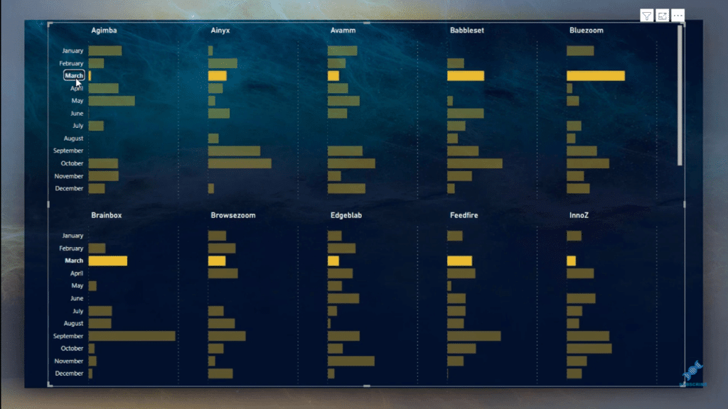
Like other visuals, the Power BI small multiples visual is highly interactive. I can click on the titles and the categories to dive into the data.
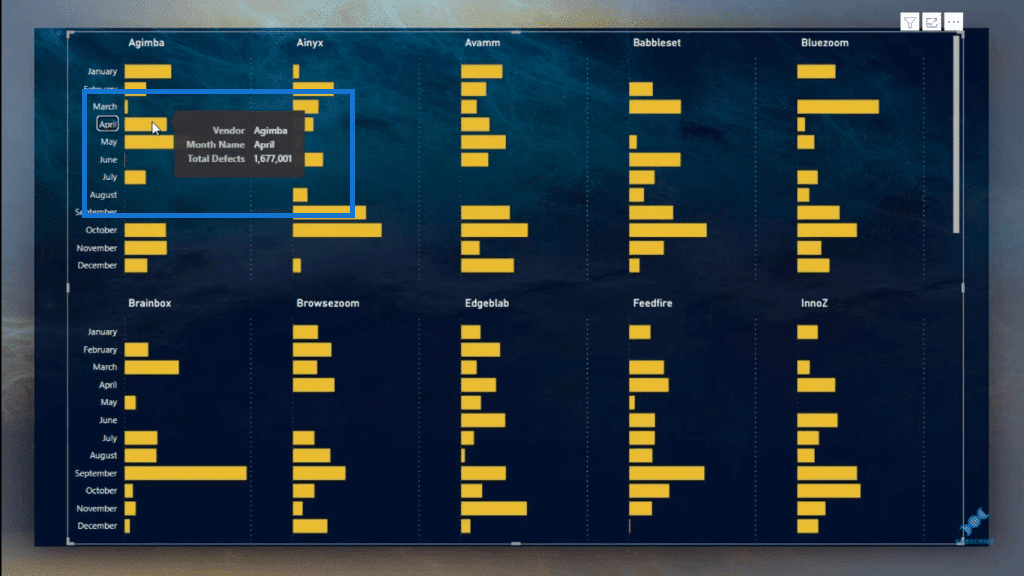
It also has the same functionality of tooltips.
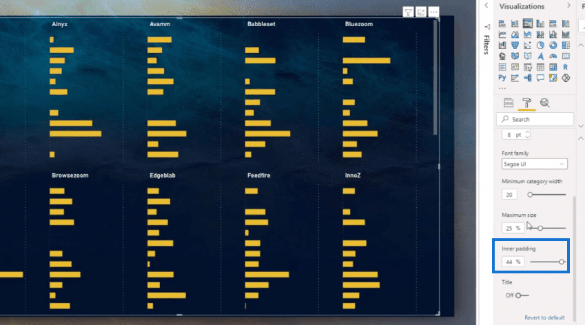
I can also adjust the size of the bar charts. To do this, I just go to the Y-axis and change the Inner padding.
Power BI Small Multiples In Column Charts & Line Charts
This is how small multiples feature looks like when used in column charts.
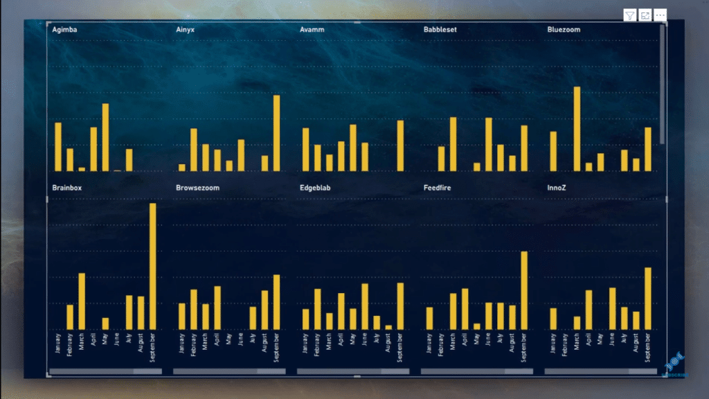
I can change the grid layout here as well and adjust the rows and columns.
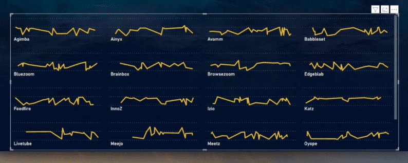
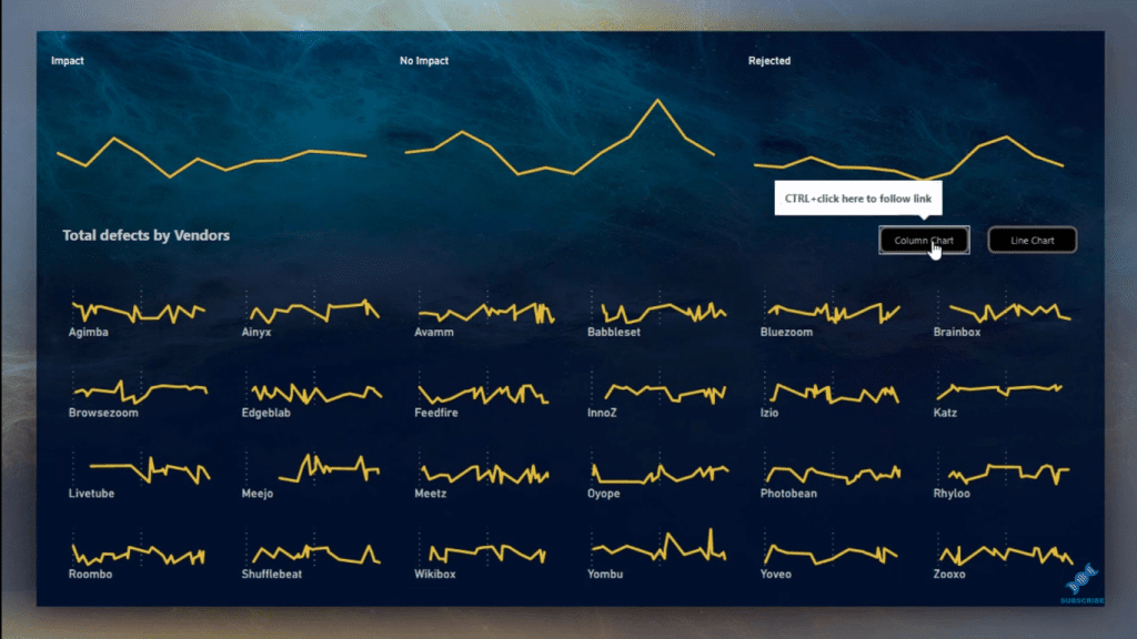
And here’s how it looks with line charts. You can also change the position of the titles, which really looks amazing when placed at the bottom.
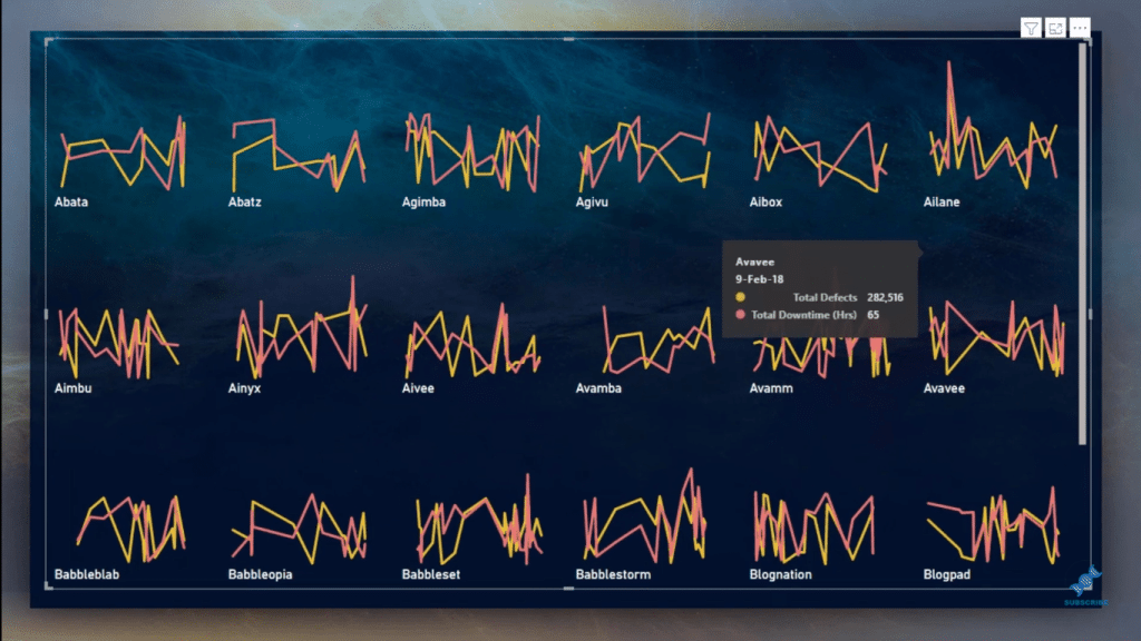
I can also overlay the Total Downtime and Total Defects using the line chart, which makes the analysis pretty insightful.
I can also have two charts on the report page by using bookmarks.
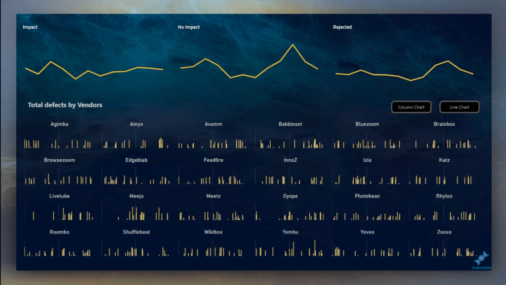
I can just click on the chart I want to see on the page.
One limitation that I noticed though with the Power BI small visuals is that I cannot create a one-column chart with most of the data on the Y-axis like in the picture (how the column would look like) below.
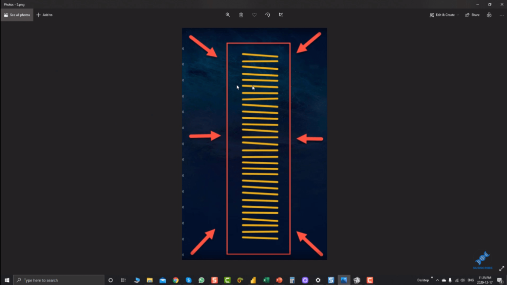
This is because the maximum number of rows is only 6.
***** Related Links *****
Dynamic Tooltip In Power BI With Embedded Charts
Power BI Bookmarks To Change Views On Report Page
Power BI Custom Visuals – Build A Reporting Application
Conclusion
The Power BI small multiples is a fresh feature and it’s still a preview feature, so we’re hoping that they’ll have the updated version with the limitations removed (although they’re not too bothersome) before it’s full release.
Have a look at this new feature in Power BI Desktop and I recommend that you explore it and see how you can utilize this with your own data.
All the best,
Mudassir


