In this tutorial, I’ll discuss distance calculation on map in Power BI based on forward stock location (FSL) and delivery point. This is just one of the various ways on how you can efficiently use distance calculation for geospatial analysis.
In this example, I’ll display and analyze customers within a radius from an existing forward stock location at a depot or a hub.
The Dataset For Distance Calculation On Map
Let’s now discuss the dataset that I used for this instance of distance calculation. Here’s the data that contains the Customers data table.
It also contains the Forward Stock Locations table.
The Depots table has been appended to the Customers data table. This is to allow simultaneous display.
As you can see, there’s no connection between the two tables.
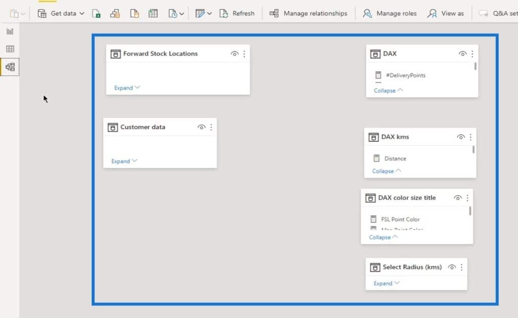
Furthermore, the DAX measures that I used are in three separate tables.
When modeling, I keep my measures at hand. Once my report is completed, the measure tables will be hidden.
I used three sets of measures to calculate and display the distance for this demonstration.
Dax Measures For Distance Calculation On Map
I transformed the distance calculation (Haversine formula) into a DAX measure (Distance measure). I’ve discussed the Haversine formula in an article about Distance And Bearing Calculation in Power BI (I’ll link this once it’s published).
This formula is slightly different from the Power Query function because I just made this as a workaround.
I used the Distance measure to calculate the distance based on a selection from the Select Distance slicer.
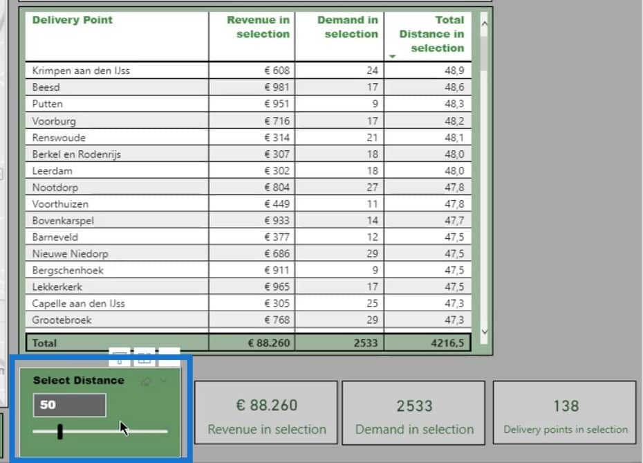
I used the Total Distance in the selection measure to calculate the total distance from the selection. Then, I displayed it on the table.
Moreover, I used the Distance in selection measure as a supporting measure for the Total Distance in selection measure.
DAX Measures For Map Visual
The next set of measures contains the measures for the color, size, and title.
The first measure for this set is the FSL Point Color (Forward Stock Location Point Color).
This measure creates the green point in this smaller map.
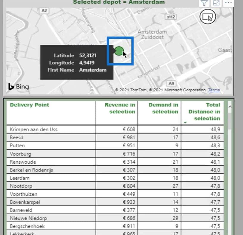
It is used to zoom in on the selected location from the slicers.
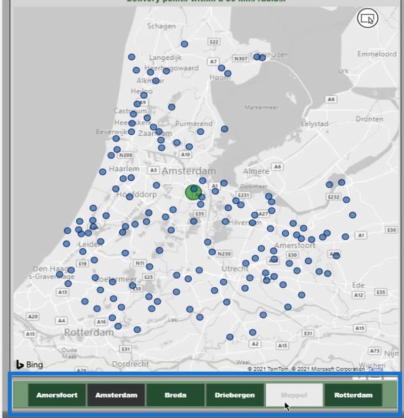
Next is the Map Point Color measure.
The Map Point Color measure displays the green or blue color on the bigger map.
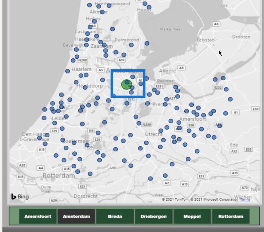
Additionally, I used the Size measure to display the customer’s bubbles and selected depots in different sizes on the map.
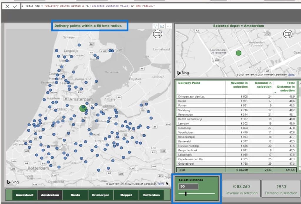
Last is the Map measure. I used this to create a dynamic title.
This dynamic title changes based on the selection from the Select Distance slicer.
DAX Measures For Demand And Revenue Calculations
The third measure table contains some standard calculations for Revenue and Demands. It also has measures that show the results of these calculations associated with the selected distance.
I created a Select Radius table with the distances from 0 to 250 km. I used a what-if parameter for this one.
That table is then used to create this special slicer with a slider.
After getting all the measures ready, I can now start building the report.
The Output
As a result, here’s the map with the points from the distance selection.
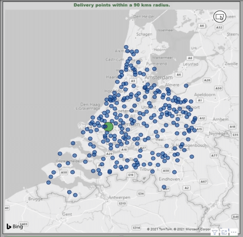
In this report, I can select a depot.

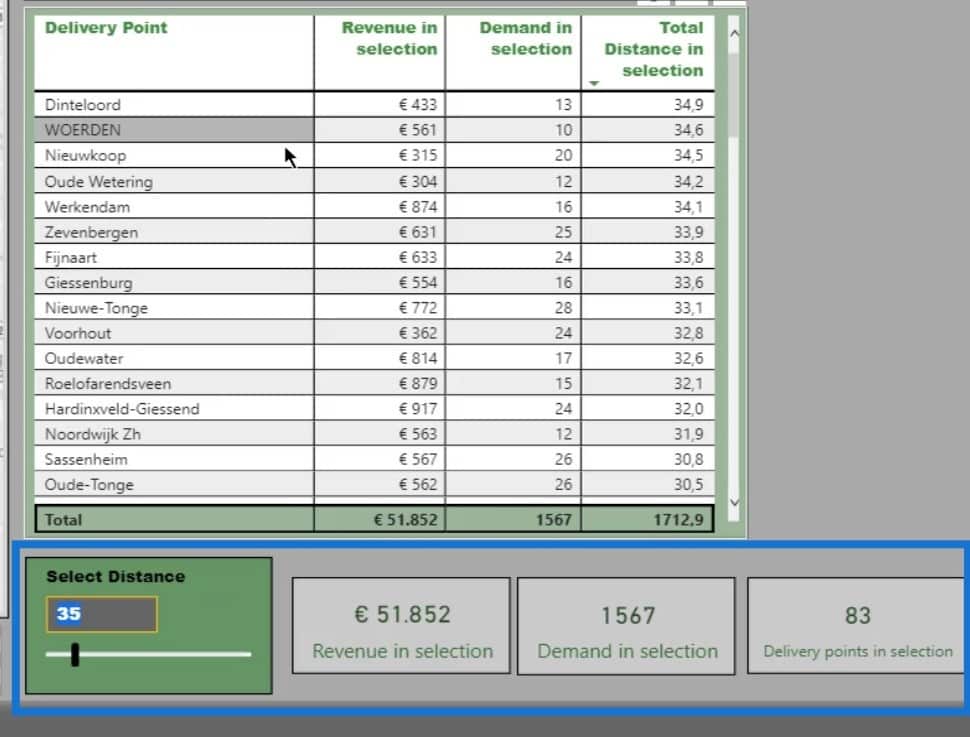
I can also change the distance on the Select Distance slicer. Then, I’ll be able to see the results in the table like the Revenue in selection, Demand in selection, and the Total Distance in Selection.
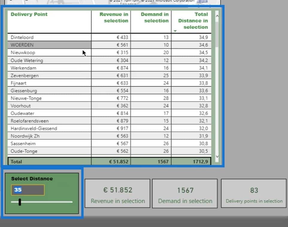
The smaller map zooms in on the selected location. This will move based on the selected depot.
These cards also show the results based on the selection from the Select Distance slicer.
***** Related Links *****
Power BI Data Visualization Technique: Creating A Dynamic Heading Or Title
Geospatial Analysis – New Course on Enterprise DNA
Data Visualizations Power BI – Dynamic Maps In Tooltips
Conclusion
In this tutorial, I didn’t focus on building the most attractive dashboard. It is merely for demonstrating one of the many ways to do distance calculation on the map in Power BI.
Hopefully, you were able to understand how to dynamically create visual reports in geospatial analysis where you need to analyze and display data based on a selected distance. Keep in mind that properly doing the measures and creating the dataset is essential for this to work.
Check out the links below for more examples and related content.
Cheers!
Paul


