In this tutorial, I’m going to run through a number of great analytical techniques that you can combine and use within Power BI. For your organization, you may want to understand what’s happening or what is causing the underlying adjustments or changes to your data and results. I will show you in this tutorial some techniques like calculated columns, which you can use to examine why your results may be changing. You may watch the full video of this tutorial at the bottom of this blog.
This is not an analysis that can be completed easily. It’s about combining many of the key pillars & features of Power BI together to find and discover these types of insights. That’s the key thing that I want to get across in this video tutorial.
For this blog post, I want to run through a number of formulas in DAX and combine them one on top of the other. In doing so, I’ll be able to calculate why there are certain changes in my data sets. I’m going to show how you can do this yourself and layer or spread these formulas to get quality insights.
Creating The Quarter & Year Slicer
First, I want to see from a cumulative perspective how we are performing from a certain time period compared to another time period. Then, I want to break down why that change is occurring.
In this case, I’m going to grab my Quarter & Year dimension and turn that into a slicer, then select Q2. I also bring in my Dates and Total Profits.

Then I want to compare the profits from this quarter to last quarter. I will use a time intelligence calculation, use DATEADD, and Date column, then minus 1 and Quarter. This is all you have to do to jump back in time to any time period.

We’ll drag that formula into our table and see the comparison between the Total Profits in Q2 and Q1.

If we turn the table into a chart, you’ll see it’s a little bit busy and it doesn’t actually show us any real insight. You can actually change this to a lower granular detail; however, if you want to identify trends, cumulative is the way to do it. What we’re trying to do here is to see the change or spot the trend. When is that trend occurring, and why is it occurring?

Calculating Cumulative Profits
To do this, we need to come up with the cumulative total. We’ll create a measure and call it Cumulative Profits using this formula:

I’m going to bring in my Cumulative Profits in the table and then from there, we can jump to the Cumulative Profits for Last Quarter.

We will then drag the Cumulative Profits LQ into our table and turn this into a Cumulative Totals chart.

Difference Between Cumulative Totals
The next thing to do is to know the difference between these cumulative totals using this formula:

And then I’m just going to copy this measure and place it beside the first chart.

Now we can really see the cumulative difference, but now I want to extract even more information. We need to look even deeper and go to other dimensions. We need to look at our customers and at our products. Why are these changes occurring there?
Let’s use the calculations we already have such as our Total Profits and Profits from Last Quarter. We will then grab our Products (bottom left chart) and Customers (bottom right chart) into our table as well.
We might want to rearrange these a little bit or change the colors so that they stand out. The key is to make them more visible so it’s intuitive and easy to understand what we’re looking at.

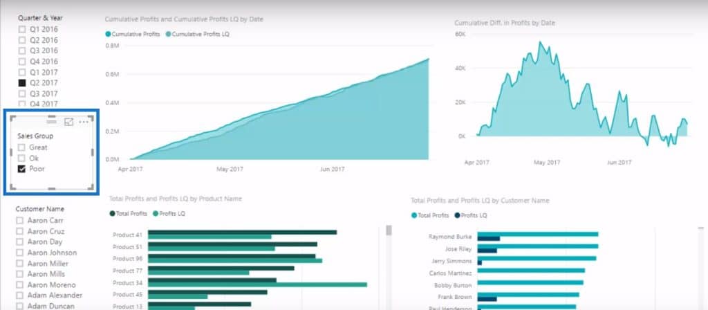
If we make a selection in the slicer, you’ll quickly see why these big differences are occurring, or when a trend is going up or down.
Using Calculated Columns
What we have is already good. But what if we want to understand which customers are causing this change? We can create a slicer out of our customers and then select a customer or multiple customers.

Unfortunately, there’s a lot of customers and this list can go on and on, especially if we are a high frequency sales organization. So we might want to break these customers down even more using calculated columns.
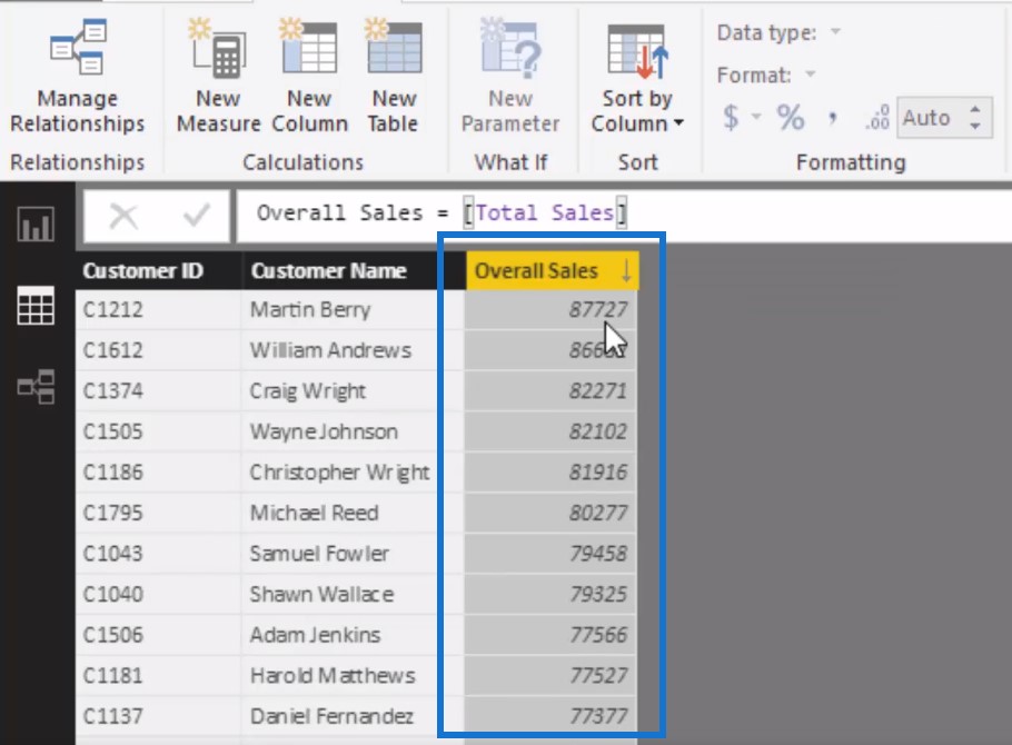
This is where calculated columns are really powerful – by putting them into our LOOKUP tables. Let’s take a look at our customers. You can see here that there’s a lot and they could even get to about a hundred. We can actually break this down even further by creating another column here and naming this Overall Sales. You’ll see now that we have a number and we can sort from highest to lowest.

Then we can create another column in here and name it Sales Group. We will use the SWITCH function where if overall sales is greater than $68,000, it is a Great customer, if it’s greater than $55,000, it is an Ok customer, and then if it’s less than or equal to $55,000, it is a Poor customer.

This logic is great to have inside your calculated columns because we can create another customer filter.

Using this technique, I was able to dive even further into our client datasets by breaking it down and adding this additional dimension. I can jump in between these customers, see trends, and come up with insights using the customer filter. For example in Great Customers, we can see the divergence in trends happened early on where the sales were good but their profits aren’t as good as the prior year. This is quite interesting.

***** Related Links *****
Comparing Calculated Columns And Measures In Power BI
Calculate Financial Year To Date (FYTD) Sales In Power BI Using DAX
Show Results Up To Current Date Or A Specific Date In Power BI
Conclusion
By combining lots of different techniques around modeling and DAX formulas in Power BI is how you’ll extract these really meaningful insights.
By understanding how this all comes together, you’ll be in a much better position to make the right decisions and take the right actions for your business. With the right analytics and insights you can certainly improve your decision making which can improve your productivity or profitability and much more.
I hope by reviewing the example I have shown, you will be able to see quite clearly that high-quality analytical work can be done in Power BI and also be inspired to somehow use the techniques I run through in your own reports and models.
If you want to learn how to develop detailed Power BI reports end to end, then I highly recommended going through the Dashboarding & Visualization Intensive course module at Enterprise DNA Online. There is no training out there that covers Power BI development techniques as in-depth as just this one course.
All the best
Sam

***** Learning Power BI? *****
FREE COURSE – Ultimate Beginners Guide To Power BI
FREE COURSE – Ultimate Beginners Guide To DAX
FREE – 60 Page DAX Reference Guide Download
FREE – Power BI Resources
Enterprise DNA Membership
Enterprise DNA Online
Enterprise DNA Events


