In this tutorial, I’ll show you how to design a report in Power BI that looks and feels like a web-based report application. You’ll learn how to create unique navigation experiences within your reports, use Enterprise DNA’s new theme generator to double your development speed, and develop re-usable templates to scale report creation across your teams. You can watch the full video of this tutorial at the bottom of this blog.
Recently, Power BI has added features and functionality that have enabled us to create very compelling reports and web-based reporting applications. I want to show you how you can take an old report or even start from scratch and make it look much better and much more interactive.
Those of you who know us quite well know we have the four pillars approach. This is our framework for developing Power BI reports. The first pillar is loading and transforming data. The second pillar is data modelling. The third pillar is DAX calculations, and the fourth one is reports and visualizations. Today, we’re skipping the first three pillars and we’re really diving into pillar four.
How To Create A Web-Based Report In Power BI
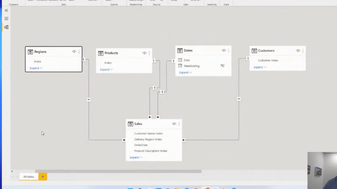
In this example, I created a simple model using the waterfall technique, where we have our lookup tables at the top flowing down to our fact table. This is a simple dataset. We’ve got an organization that sells things and a fact table with all of the different transactions that have been occurring within the business.
Report Color Theme
The first thing that I think is just absolutely essential when developing these reporting applications is that you’ve got to get your theming right. You’ve got to get a seamless and coherent color theme within your reports.
You may already have a theme that aligns with your organization and that’s great. Maybe someone has created a template for you. But if you haven’t, I’ll show you how you can create something quite effective inside of Power BI in combination with some of the tools that we have in our own application called the Analyst Hub.
In the View ribbon, we have this dropdown with our theme selection, and you’ll see that we have a whole range of out-of-the-box themes. However, I think these are all not-so-compelling color themes, so I don’t really use any of them.
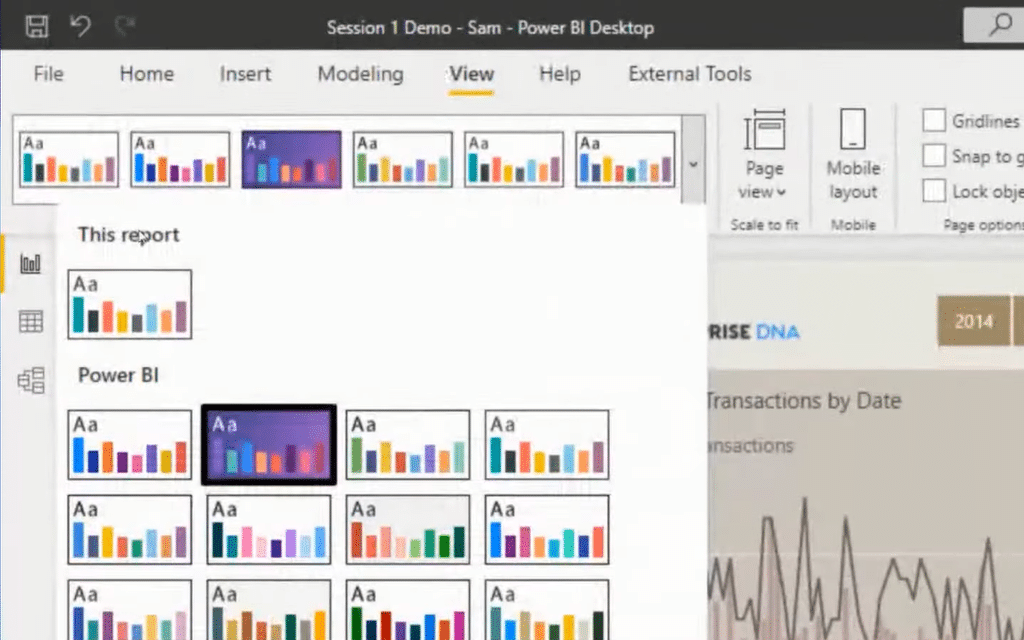
You need to really make your colors stand out and they need to really work well together. I used to individually change the colors to each of these different elements, but now I customize my color theme. In the View ribbon, just scroll down and you’ll see the Customize Current Theme option. Click on that, and you’ll get this popup.
You have a ton of ways of customizing your theme here. You can change the general theme colors, but you can also change the different elements, such as your titles, your data labels, text, visuals, etc. You can also create colors for the Filter Pane.
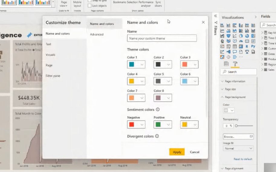
This is a great option for you to do theming, but another way to do this quickly is through the Analyst Hub, and it’s free! Everyone has access to the Analyst Hub. We aim to keep it much simpler and easier to understand for all of our users.
In the Analyst Hub, we have a Colour Theme Generator. There are a few ways that you can create your color theme here. I personally love the Colour Fan. The thing with themes is that you don’t want to overcomplicate the colors in your report to create a seamless theme. Having a similar palette, but just different shades actually works really well in reporting designs.
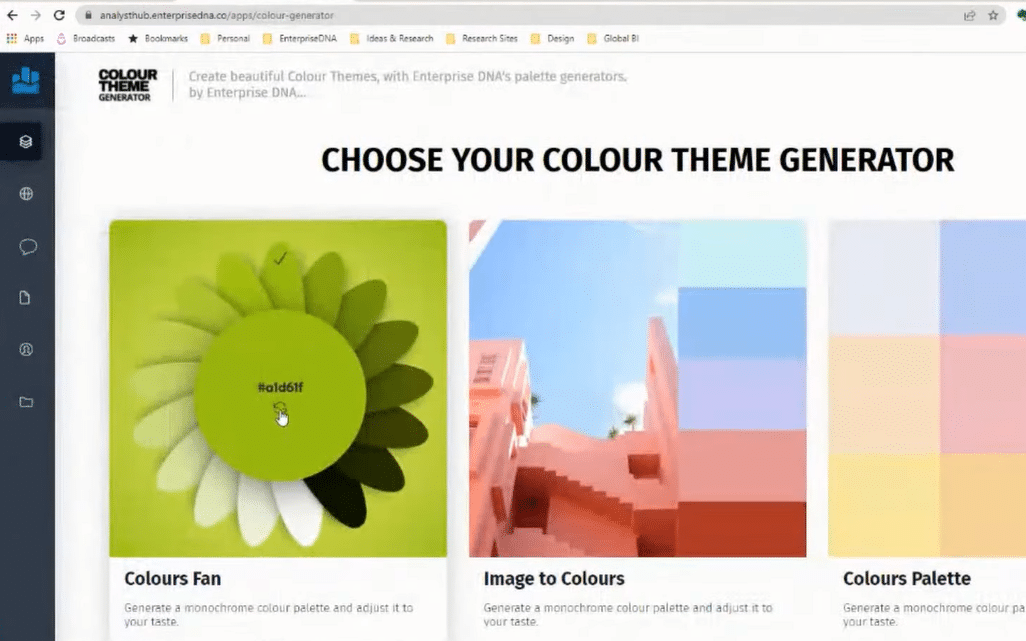
Once you have chosen your color theme, you can simply copy the color and paste it into your report. I personally like to have a darker background and white lettering.
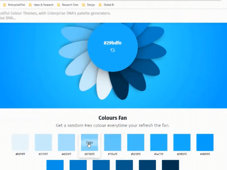
So, you can click on the color of your choice, and then copy-paste it to the Customize Theme colors option in Power BI.
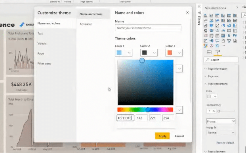
You have all the flexibility of customization here for your report in terms of theming, including the text, fonts, tooltips, headers, etc. And then, in your report, you can make more adjustments like the colors, transparency, and so on. I love to use the Format Painter as well, and you can also do multi-select to speed things up.
Now that we have our theme set up, let’s proceed to page navigation.
Web-Based Report Page Navigation
When building a report, you want to enable the user to navigate around your report exactly how you want them to. Don’t just dump everything on a page and then let the user click around all these different slicers and pages. You want to take the user through the story that you want to tell them by using navigation techniques that can really enable that.
The first thing that I would do is add shapes and icons. I usually get my icons from a website called Flaticons. I got a subscription and I’ve downloaded some of the icons, which are quite useful when I’m making reports like this.
You can then bring these icons into the report. You are able to format them, change the color, resize them, and drag it to where you want to place them.
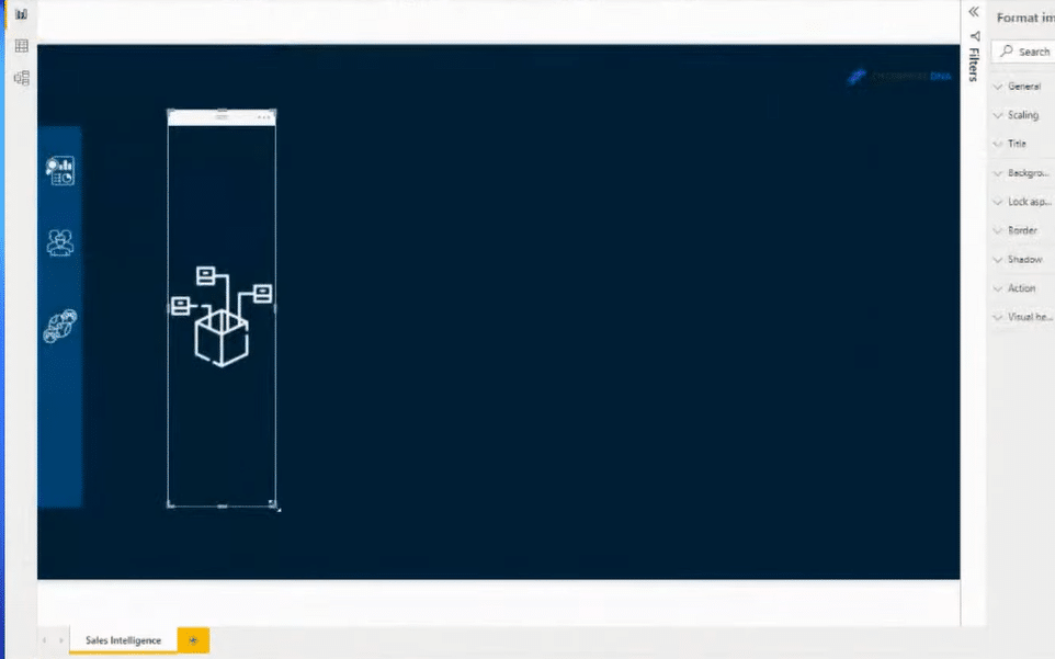
Next, you need a way of signifying what page you are actually on at any given time. To demonstrate this, I’ll create another rectangle or simply copy and paste the one that I’ve already created. I can layer the shapes on each other. Then, I just duplicate the page and put similar functionality into the next page and the next page, etc.
I personally don’t want to have all my filters just thrown down on my page. I want to be a lot smarter about how I utilize the filters. So, I usually create a dynamic filtering box that will appear based on a click. To do that, we need to use bookmarks and selections.
I’m going to add an icon, which is going to be my filtering image. So, when someone clicks on this, I want a box to appear. And then, I want that box to enable me to filter by the date, for example. I’m going to start building this box before I do anything else. I can customize it to how I like.
The selection pane is giving us a list of every element in our report. We can manipulate this as well. We can isolate some parts of our report. We can show them and hide them.
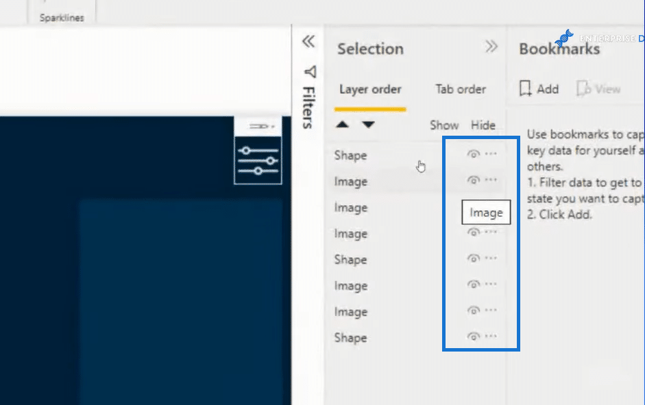
Now, I can add some slicers, images, or any visual into the box. I can also group these elements together, say as my Filter group. By doing so, I can just select the group rather than selecting the elements individually.
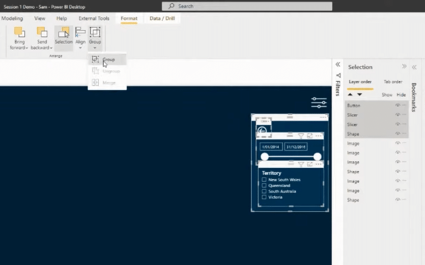
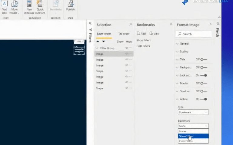
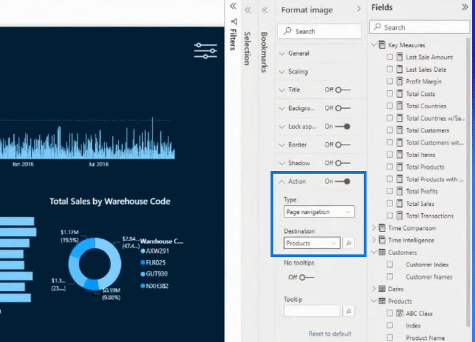
Next, I’m going to create two bookmarks. One is Show filters and the other is Hide filters. All I need to do at this point is link up these bookmarks to the selections of these images. To do that, I’m going to click on the image and then go to Action under the Format Image pane and turn it on. I’ll select Bookmarks for Type and Show Filters for Bookmark.
I can then quickly add some visuals and create insights for the report.
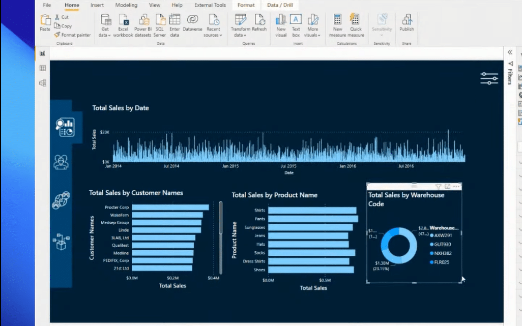
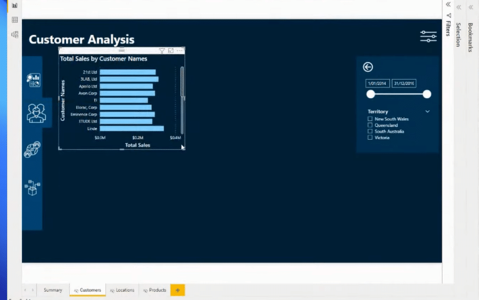
After that, I’ll duplicate this page as Customers, Locations, and Products. I also make sure to hide these pages because I don’t want my users to see these pages down the bottom of our report. I want them to navigate directly through the navigation bar that I’ve created.
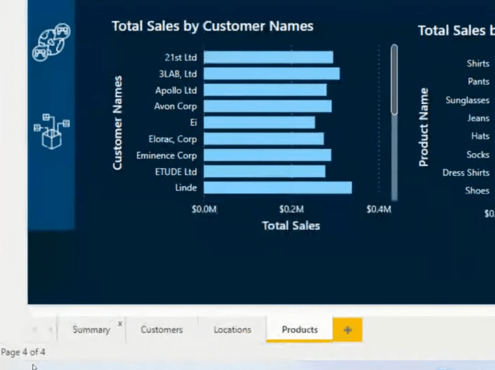
To embed the navigation in the navigation bar, just select the icon, then go to Format Image, and place the actions accordingly.
Now, I’m going to make the necessary changes for each page that we duplicated. For example, for the Customers page, I’ll change the page title to Customer Analysis. I’ll also adjust the icon for customers on the navigation bar and remove or place the relevant visuals.
Tooltips On A Web-Based Report
These are just a few of the techniques that you can do in Power BI. Another great thing you can use for your web-based report is tooltips. It’s an amazing feature. You can customize it to align it with our theme. Utilizing tooltips is a great way for the users to drill down efficiently and quickly as possible to the details of the report.
So, let’s create a simple tooltip. To do so, create a new page and name it. For this example, we’ll call it Customer Tooltip. I’m going to hide it as well because I don’t want to show these tooltips as a page in the report. The key thing to note here is that you need to turn on Tooltip.
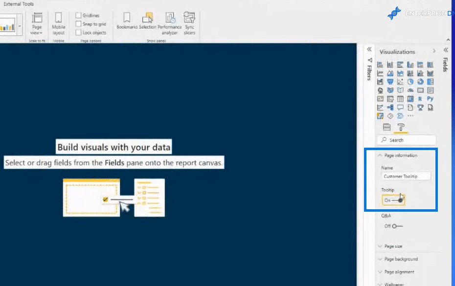
You can also customize your tooltips. You can adjust the size and colors and make them as fancy as you like. You can make tables and charts, depending on how you want the details to appear as your users drill down to your report.
Once you’re done creating your tooltips, you can then embed them in the visuals of your report. Just click on the visualization, go to the Paint Roller, and then click on Tooltip down the bottom.
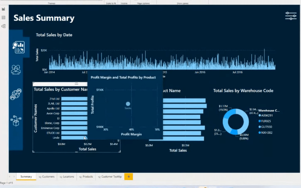
The customization possibilities are extensive. You can create more complex tooltips and you can even create a page within a page if you like. You can have a much greater degree of information, and a whole range of different visualizations, all within one tooltip.
More Techniques & Visualization Tips For A Web-Based Report
Another thing that I’d like to do when I’m creating a web-based report is to create a homepage, where I can make a lot of settings. I love having a homepage that is the central navigation point, which allows users to easily navigate around the rest of my report.
You can be creative in building your homepage. Use icons or images as buttons to take your users to different pages and then back to your homepage.
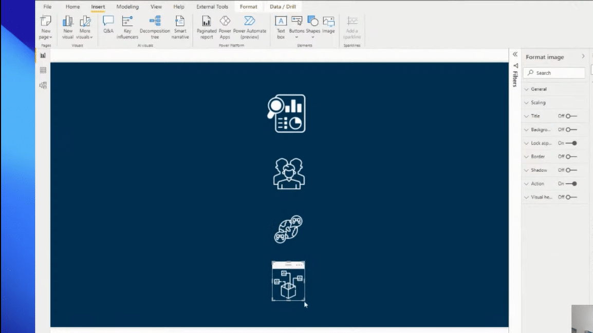
Within minutes, you can create an excellent web-based report in Power BI with a superb navigation experience and a compelling look.
In terms of visualization, colors are important. Make sure you don’t overuse colors. Another important tip for visualization is to always think in grids around how you design your reports and where you place your visualizations.
Make sure you have good navigation, taking the user through the story that you want to tell them. Think outside the box and be more creative around that. However, don’t overuse your visuals. You may utilize other features to save room on your page. Utilize the ability to hide filters if you want. Utilize the ability to use tooltips and drill-through.
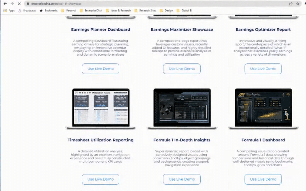
If you want to get more ideas about report designs, go to our website and visit our Showcase. Here, you’ll find some of the best-designed Power BI reports. There is nothing like this anywhere online. A lot of these reports have been created internally by Enterprise DNA recently. Many of these are from our community and our challenges.
***** Related Links *****
Power BI Design Tips: Creating Application-Like Reports
Power BI Reporting Techniques: Setting Up Application-Like Reports
Best Power BI Reports Examples | Formula 1 Reporting Apps
Conclusion
This tutorial was based on a recent summit we had at Enterprise DNA. You can watch the full video below to see the details of how I created this report.
In this tutorial, we went over things like page navigation techniques, theming, bookmarks, tooltips, drill-through, homepage creation, etc. Moreover, I’ve shown you how to create reporting application templates that you could use through a wider audience among more users or developers within your organization.
Some use PowerPoint and some use Canva, which are also great tools to create backgrounds and compelling looks for your reports. We have available tutorials around these tools as well on our website.
Cheers,
Sam


