I’m going to start this tutorial with one basic question. Do you really need advanced DAX skills to create visual reports?
Well, most of the time, no. If you think that you can’t create good-looking reports because you’re not good at DAX, then you’re wrong. I didn’t use advanced DAX codes for most of the creative visualizations that I created.
Even if you don’t know DAX that much, you can still be as creative as you want. In fact, you can be more creative than people who are more knowledgeable in DAX. This is because you can look for examples and different ways on how to create your visualizations.
Sample Visual Reports Scenario: Complaints Distribution
The first example we’re going to look at is the report I created in Challenge #6. It’s related to insurance companies. If you’re a member of Enterprise DNA, you probably know that we run challenges twice a week. You may download the dataset from the forum so you can play with it.
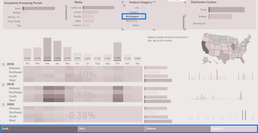
Here’s the heatmap that I created.
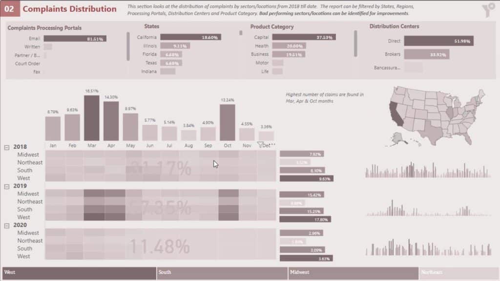
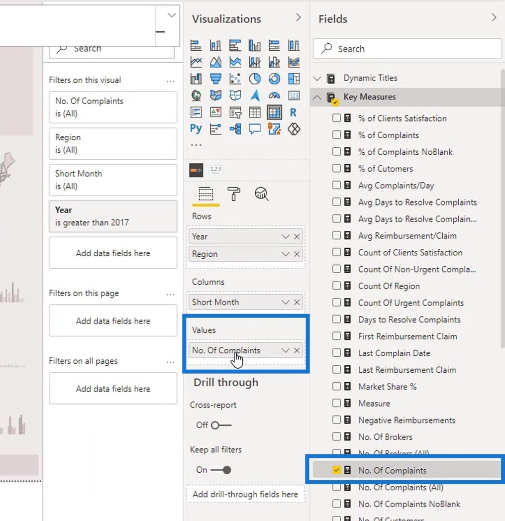
In this report, I created a measure to count the number of complaints that I have in this report.

After that, I placed that measure from the Fields section into the Values field.
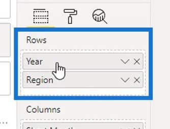
Then, I categorized it by Year and Region.
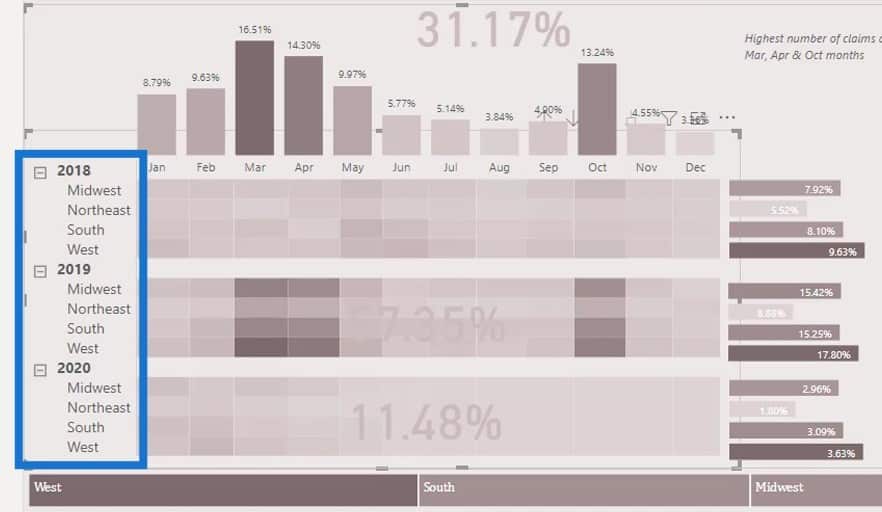
I also used a filter pane here. In this instance, I want to tell the audience how much complaints we are having in certain regions categorized by year.
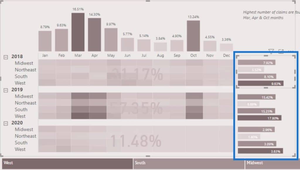
To do that, I limited the Year section to 1 year. I did that for each of these sections or filter (2018, 2019, 2020).
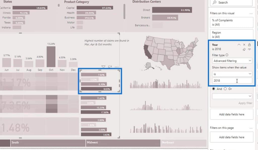
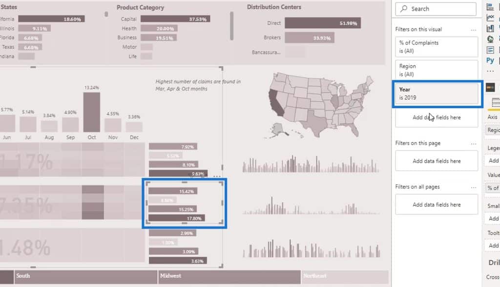
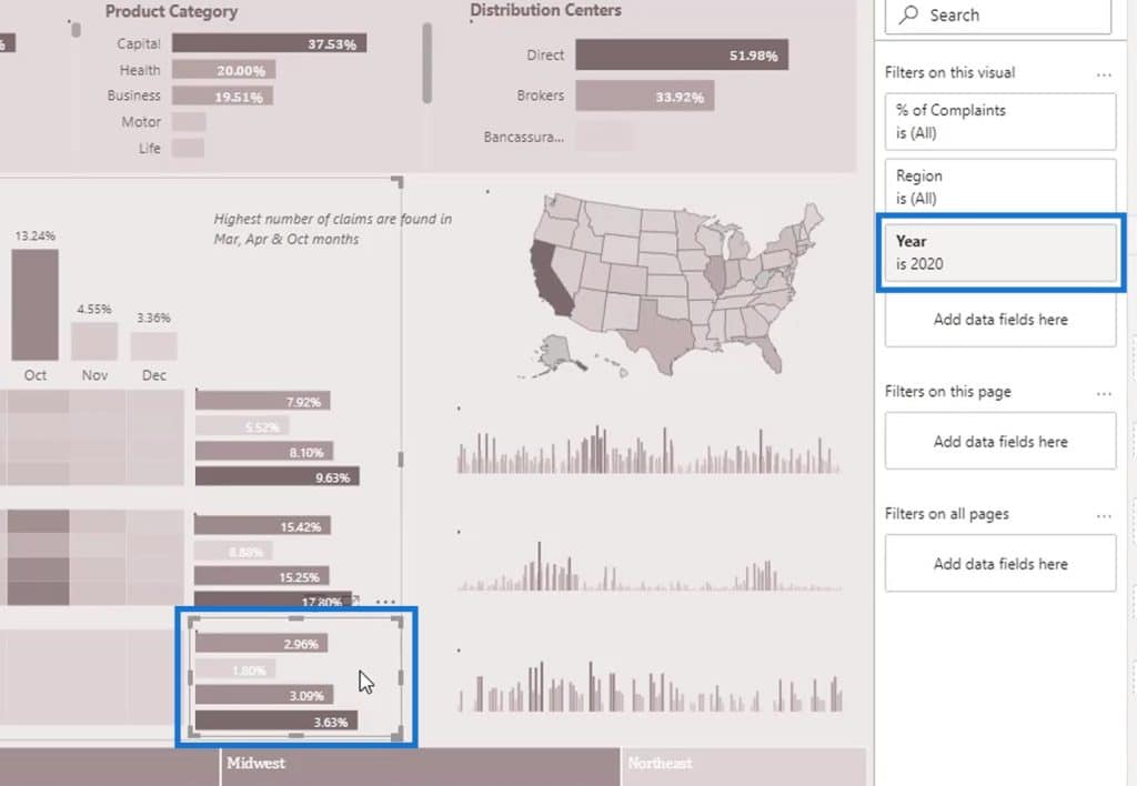
That’s basically how you can create creative reports even if you don’t know much about DAX.
Using Treemap In Visual Reports
For this part, I could’ve used a slicer as well.
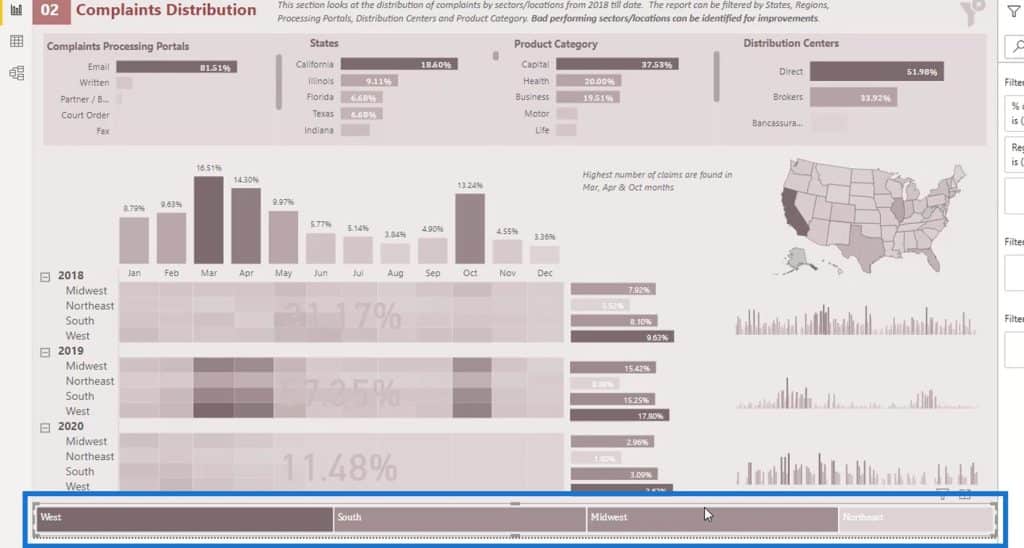
But if I used a slicer, it will only look like this.
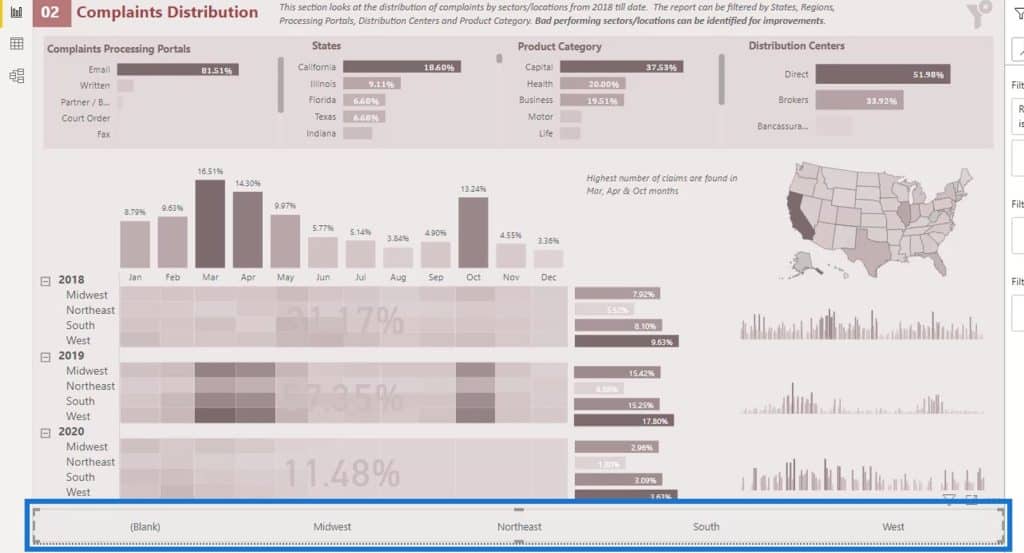
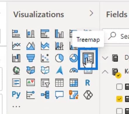
So, I used the Treemap visualization, instead.
By using the Treemap, we can see that the Region with the most numbers of complaints in this particular example is the West region.
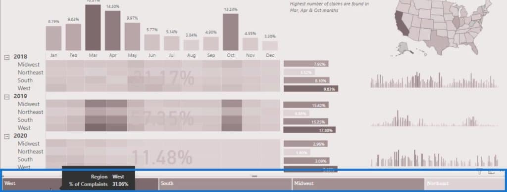
As you can see, it’s doing an increment. I used conditional formatting where the higher the number of complaints, the darker the color is.
It’s dynamic as well. For example, I’ll select Mortgaged from the Product Category. Now, you’ll see that the highest number of complaints for Mortgaged Product Category is in the South region, followed by the West, Midwest, then Northeast.
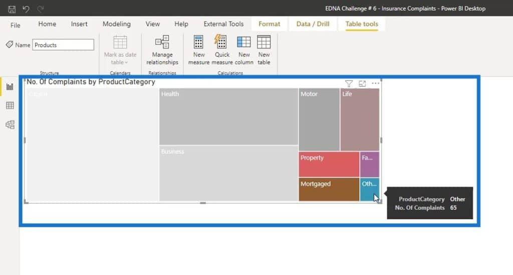
However, I don’t particularly like Treemap because if you don’t have a large number of values in a particular category, then the displayed output on the report will not be that good.
In this example, I used the Treemap and the same measure I used in the other report (number of complaints and the product category). As a result, the lowest number of values in a particular category is not even showing up.
I recommend that you experiment and play around with the visualizations in the report to see what visual works best for you.
Sample Visual Reports Scenario: Currency Conversion
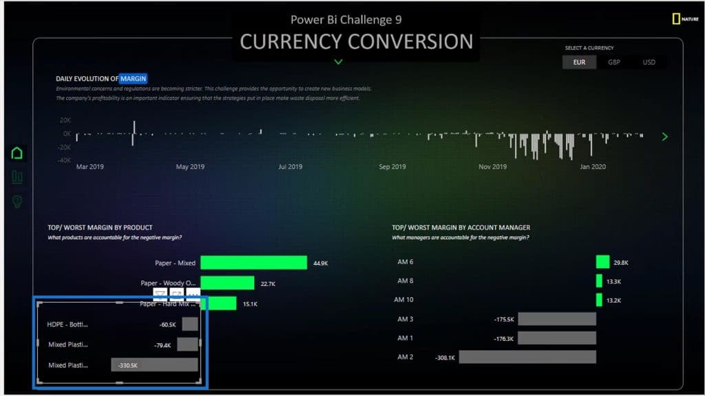
The next example that I’ll be showing is a report created by the winner of Challenge #9.
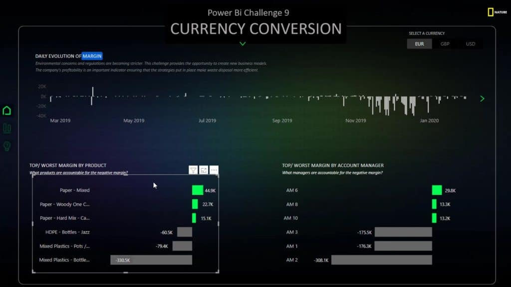
The visual that he used is totally unique. He also used a slightly complex DAX code to create this look in the visual. However, what happens if I don’t know DAX?
Well, it’s still possible to achieve this type of visual without knowing DAX.
First, for the Product Details field, set the filter type to Top N. Then, under the Show items, use Top 3.
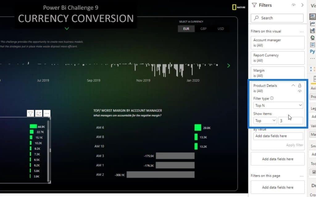
Next is to drag and drop the Margin measure from the Fields section onto the By value input. Then click Apply filter.
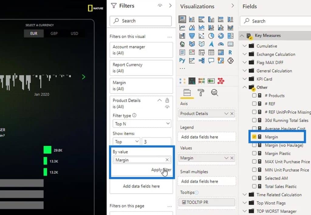
I now have the top 3 items here.
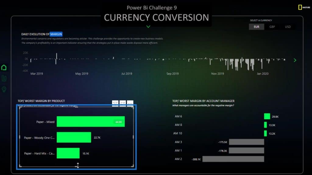
Then, I’ll recreate the first set. I’ll duplicate and put it at the bottom.
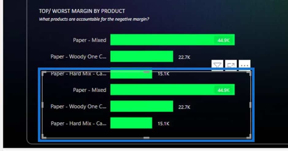
After that, I’ll change the filter criteria from Top to Bottom. Then, click Apply filter.
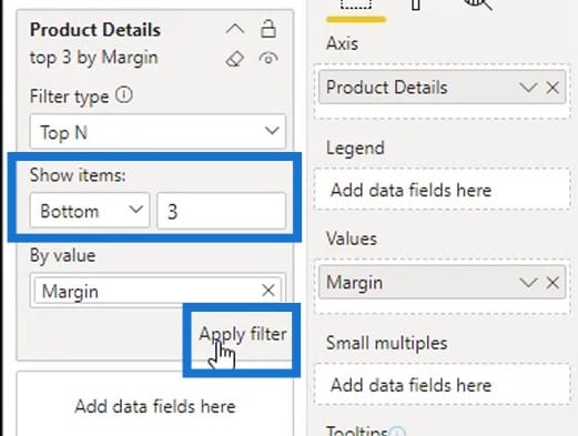
Lastly, I adjusted it to fit into the report.
***** Related Links *****
Use Power BI Visual Interactions For Compelling Reports
Data Visualization Tips For Your Power BI Reports
Simple Visualization Techniques For Your Power BI Reports
Conclusion
And that’s how you can create visual reports without advanced DAX skills. Obviously, it’s not that difficult. You just have to be creative, and you just have to find a way to make it work.
I highly suggest that you explore the things that you can do with the visualizations. It’s not just dragging and dropping the visual. You have to spend some time on a visual to achieve good-looking charts in your report.
Check out the links below for more examples and related content.
Cheers!
Mudassir


