In Power BI, there are many visualization options. One of them is custom visuals. I personally do not use custom visuals that much since they are not as reliable as the inbuilt features in Power BI.
They don’t transfer very well to tablets, mobiles, and other devices. Also, they don’t enable you to have custom colors.
Because they’re outsourced, there’ll also be a delay when Power BI gets updated. This is one of the setbacks of custom visuals. You may watch the full video of this tutorial at the bottom of this blog.
Custom visuals are tricky to use since they don’t adhere to certain standards within Power BI.
Depending on what custom visual you’ll use, you can potentially create an insightful report. So, I’ll show you how to utilize them and put them into your model
AppSource For Custom Visuals
First, download a custom visual using Appsource in the Insert ribbon.
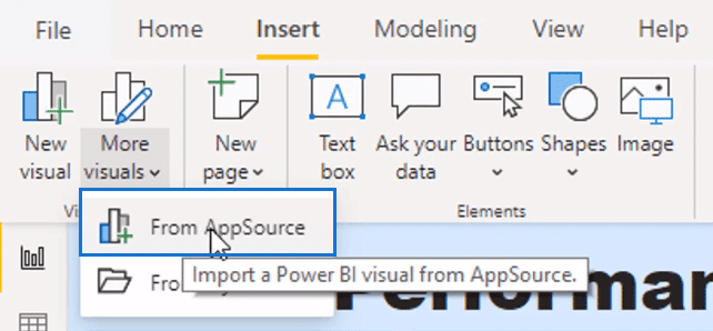
A pop-up will appear where you can import a range of visuals.
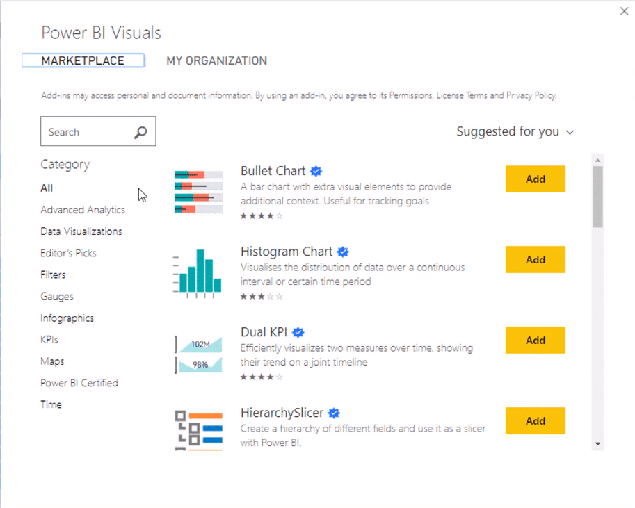
There’s a variety of visuals to choose from and they’re all categorized according to their types.
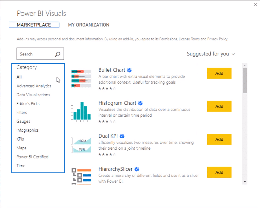
Some of these need to be paid to be able to use them.
But once you download them, you don’t have to pay and download it again to use it on a new report. The file for the visual can be reused and can be updated when needed.
I’ll use this Synoptic Panel as an example.
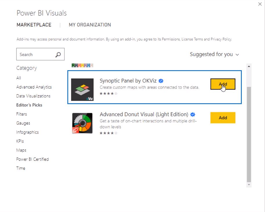
I’m going to add it and the system will import it into Power BI.
Now it’s brought the visual into my visualization pane.
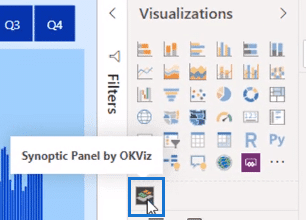
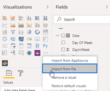
And then we can use it just like any visual once downloaded on your machine. If you have other custom visuals in your files, select import from file. Then select the custom visual you want to use.
There are some excellent custom visuals that I’ve seen in financial reports. There are fancy donut charts, eyesight charts, and more. So not all custom visuals are terrible.
It depends on which custom visuals you use and whether it is appropriate for your reports.
But from a visualization perspective, you can get everything in the visualization palette in Power BI.
Custom Visuals in Enterprise DNA Showcases
If you look at our showcases in the Enterprise DNA website, we’ve only used a few custom visuals…
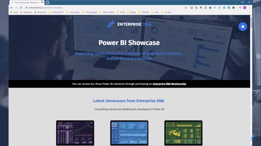
…like here in Inventory Management, where we could create a custom map.
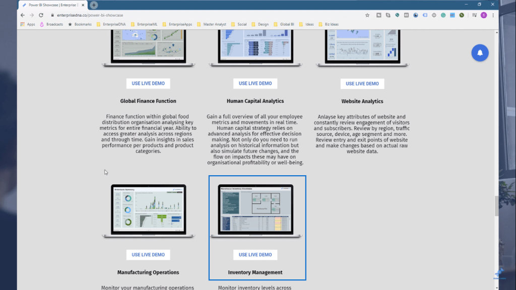
But most of our showcases and reports use mainly the in-built visualizations of Power BI.
In Enterprise DNA, we have our own way of doing things. You can see that we have a certain pattern or format in making our reports.
*****Related Links*****
How To Add Custom Icons Into Your Power BI Reports
Advanced Power BI: How To Create Multi Threaded Dynamic Visuals
Custom Conditional Formatting Techniques In Power BI
Conclusion
I won’t explain how to use different custom visuals because I don’t use them that much.
But I don’t want to dissuade you from using it yourself. I also want to show you that you can extend the visualization possibilities in Power BI.
You can make things look very compelling and very consumer friendly without using custom visuals. But if that’s what helps you make your reports look better, utilize them.
Power BI can accommodate many custom visuals, giving you freedom to make your reports your own.
I hope you’ve picked up some great tips and learnt
Sam


