In this blog, we will be continuing our series about the techniques to create complex custom visuals. Today, using R in Power BI, we’ll learn how to create complex visuals with a single line of code. You can watch the full video of this tutorial at the bottom of this blog.
Overview
For the recap, Part 1 of this series focused on using the Quick Measures Pro external tool to create SVG graphics for the dashboard. Here’s our output for our custom SVG graphics tutorial.


And today, we’ll learn how to create these fairly complex visuals shown below, and we’ll do that with only one line of code. These visuals are not easy to do using any other custom visual, but with this technique, we can make a whole page in just five minutes.

We can certainly do them via Deneb, but that will take a lot more than one line of code. And for some of these such as the histograms, we can use a custom visual, but the way we’ll divide these up is beyond their capabilities.
Using R and RStudio in Power BI
The first thing to know is that we’re doing this through R. R gets a bad reputation as hard to use because people look at it and immediately think it requires a lot of coding and it’s complex but it’s really not.

R could be complex when doing a lot of statistical analysis but in terms of visuals, particularly the package we’ll use today called GGPUBR, it is really simple.
For this tutorial, it is assumed that you have already installed R and RStudio in your machine. But if not and you don’t know how to do it, George Mount has a great tutorial on how to get this all set up. You can access this video as an Enterprise DNA member.
Now if you’re not a member, there are tons of other videos on YouTube on how to get R and RStudio loaded on your machine.
R Packages
R handles visuals primarily through packages. The good thing is that R has a lot of analogs to Power BI, and the way it handles visuals is very similar to Power BI’s custom visuals.

There are two commands that are relevant to packages in R, one of which is install. Install is only run one time and it’s the equivalent of downloading our custom visual from the App Store.
In this case, what we would do the first time in RStudio (we can also do it right within Power BI) is just run install(“ggpubr”) and hit return. This will run through, download from the repository, and load that in your R installation.

The second command is library. This is something we have to run in each report that we create. This is the equivalent of loading the custom visual into your report once we’ve downloaded them from the App Store.

There are two packages we need for this tutorial. One is called ggplot2, which is the primary charting engine for R.
The second package is the ggpubr, which is a simplified version of ggplot. It has what’s called publication radiographics with minimal configuration and is set up to look good with about 15 different chart types.
Creating Graphics With RStudio
Now, we’ll see how the packages work right within Power BI.
The Data Set
We’ll use the Titanic data set for this tutorial. This data set contains information for all the passengers who were on the Titanic—who survived, who died, what passenger class they were in, their gender and age, the fare they paid, and where they boarded.

There are three locations for the last column—Southampton, Cherbourg, and Queenstown. There are also a couple of passengers whose point of origins are Unknown.

So that’s the simplified version of the data set that we’ll be using for our visualization today. Let’s start and create from this scratch.

Using R In Power BI: Box Plot 1
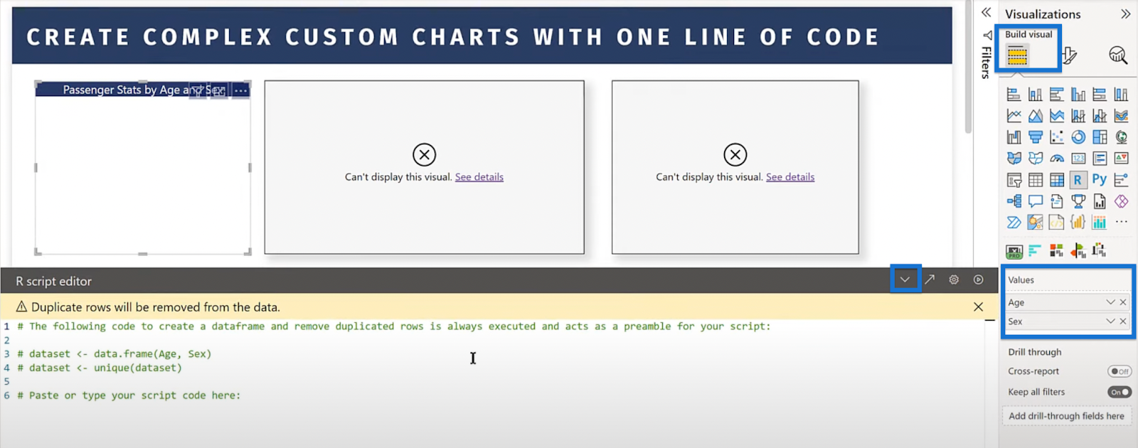
First, click the R Script icon under the Visualizations pane. A visual will appear on the screen.

Then, choose the fields that we’ll be using and drag them from the Fields pane into Values under the Visualizations pane. In this case, let’s drag Age and Sex.

Change the title, align it, change the text and background colors, and so on to improve the template. We can make these changes by going to the Format visual tab in the Visualizations pane.

For the title, write “Passenger Stats by Age and Gender” for this example. These preferences would give us a visual that looks like this.

Then, go back to the Build visual tab in the Visualizations pane. We should still see the fields we dragged under Values earlier. We can now open the R script editor by clicking the arrow up icon.
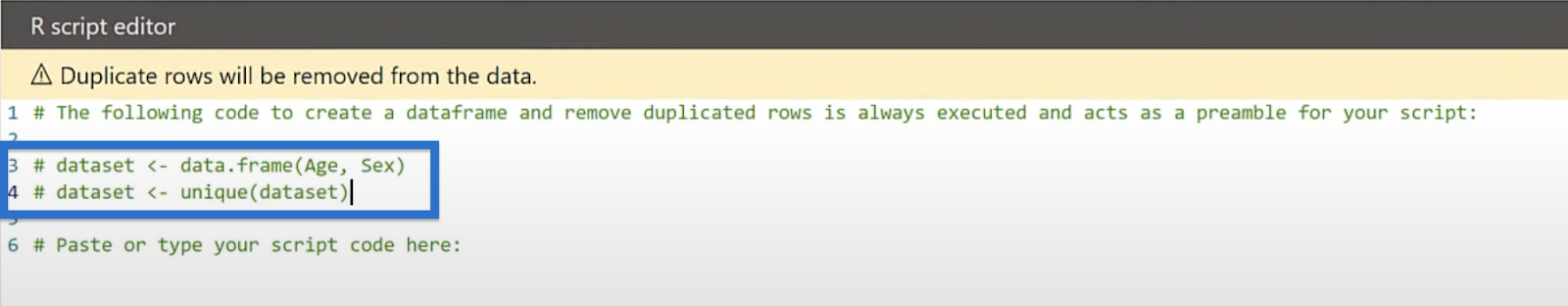
R has this really unique call called dataset which takes the data you enter from Power Query, or in this case, from our two fields—age and sex. So that will be our data set.

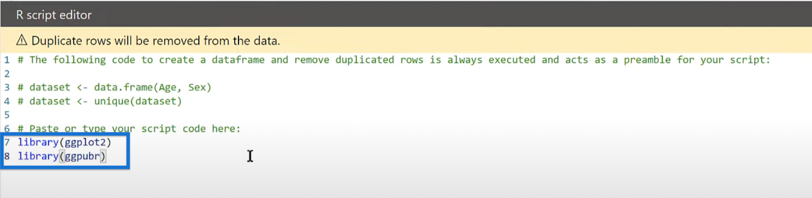
Then, we’ll call our two libraries—ggplot2 and ggpubr.
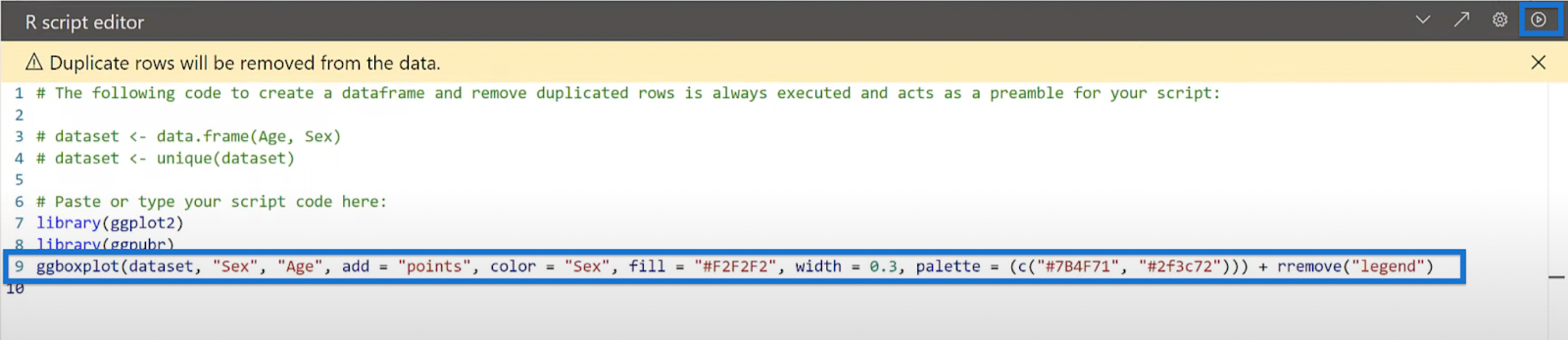
Finally, here’s our one line of code. We’re gonna paste it, or in your case, type it in, and that is it.
If we hit Run, the code creates this box plot visual.

Basically, we can think of R as the text version of the Format pane in Power BI. In this case, Power BI is all about the graphic user interface.
For example, if we go to the Visualizations pane, we can set our preferences for the effects, backgrounds, borders, and so on.

In R, what we do is use code to set these preferences. For example, we can use code to turn on the effects and background or turn off the visual border.
For the background, we can do color = white and transparency = 100, which is a text version of the graphic user interface in Power BI.
To know what code to enter, we use this document that every R package has. We can go through this document and browse what they call vignettes.
These vignettes show us the different types of visuals to create and then give examples of the different parameters. This is an example for a histogram plot.
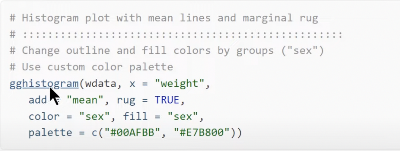
Under the Reference tab is a list of all the different parameters that we can use, such as the color, outline fill, color palette, line type, size, and many more. We can set these parameters equal to how we want our visual to look.

Let’s go back to Power BI and dissect the content of our code. We start with our dataset containing our two variables, sex and age. We add points for the minimum, maximum, and other important points.
Color = Sex means that the color of the plot will be based on gender. We then set our fill color to #F2F2F2, the line width of the box to 0.3., and choose our color palette. Finally, we remove our legend, and that completes our one line of R code.

Using R In Power BI: Box Plot 2
Let’s proceed with our second visual. We’ll start by replacing our first code with a different command that looks like this.

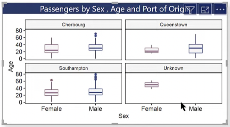
In this example, what we’re doing is pretty much the same thing, but we’re faceting by this time. The function facet.by is the equivalent of small multiples, and based on our code, we’re faceting by Embarked.
This means that we’re taking the same visual but now, we’re creating a small multiples version based on the ports of origin. Now if we click Run, we’ll get four box plots that show exactly what we want.
Using R In Power BI: Histogram 1
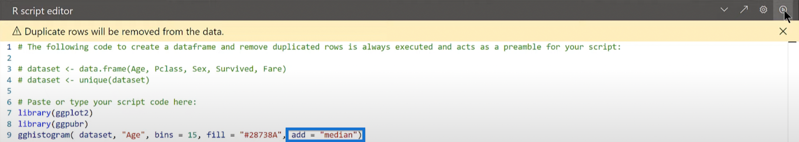
Let’s move to histograms for our third example using the following code.
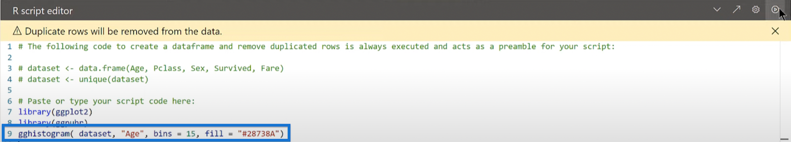
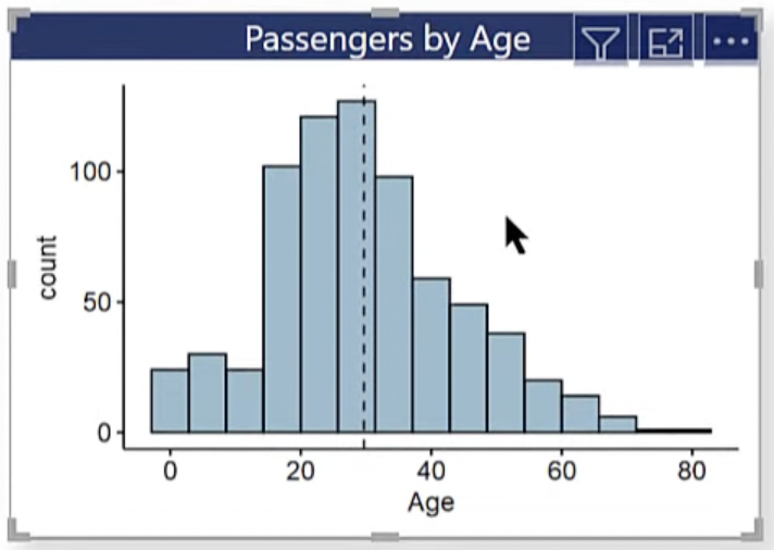
We are creating a simple histogram based on our code. We only have our dataset, the age variable, the number of bins for our histogram, and the fill color. Then, click on Run.
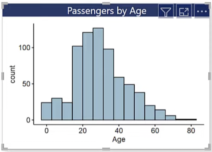
We can now see our passengers grouped by their age.
Another thing we can do is use the command called add. Let’s add the median line using add = “median”.
Click Run and that shows us the median.


We can also change that to mean using add = “mean”.
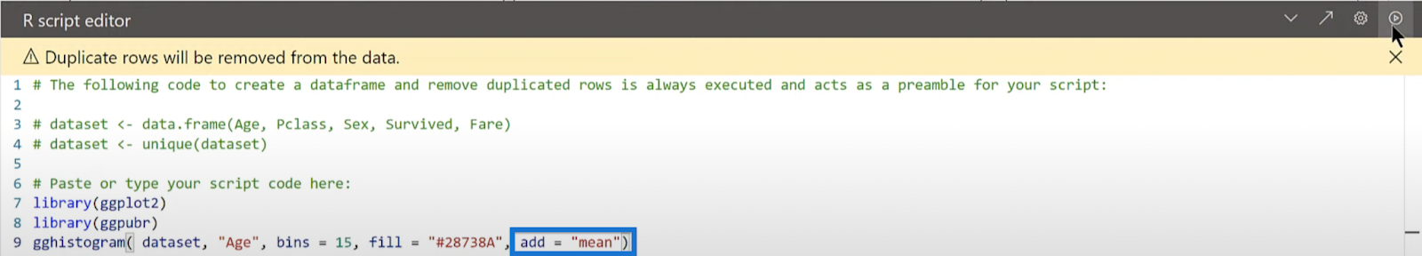
Click Run, and the line will move from median to mean.
As we’ve seen, we have a lot of options in these visuals. We can change colors, titles, and axes, for example. There’s really no parameter that we can’t alter to fit our theme or the way we want our visual to look.
Using R In Power BI: Histogram 2
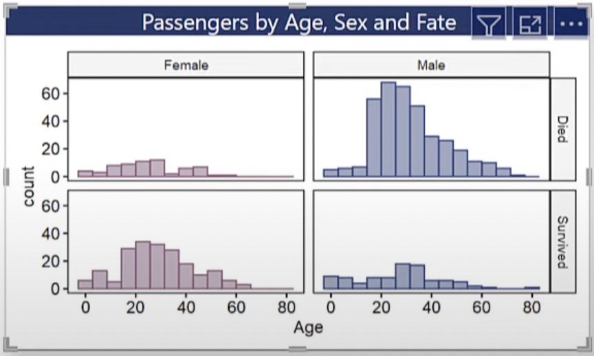
Let’s run down quickly on our next example. Histogram 2 is a faceted histogram, and in this case, we facet.by both gender and whether they survived or not. We’ll use the following code for this visual.
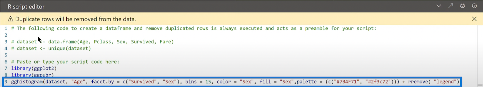
We can see this is a type of visual that would be quite hard to create in any other way. Again, we can do it through Deneb, but it would take a fair amount of code to do it. Whereas here, it’s just one simple line.
Using R In Power BI: Histogram 3
Let’s do one more histogram and we’ll facet it a little differently. This time, we’ll facet it by what passenger class the passengers were in, and add a median line too.
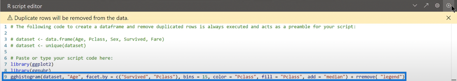
Click Run.
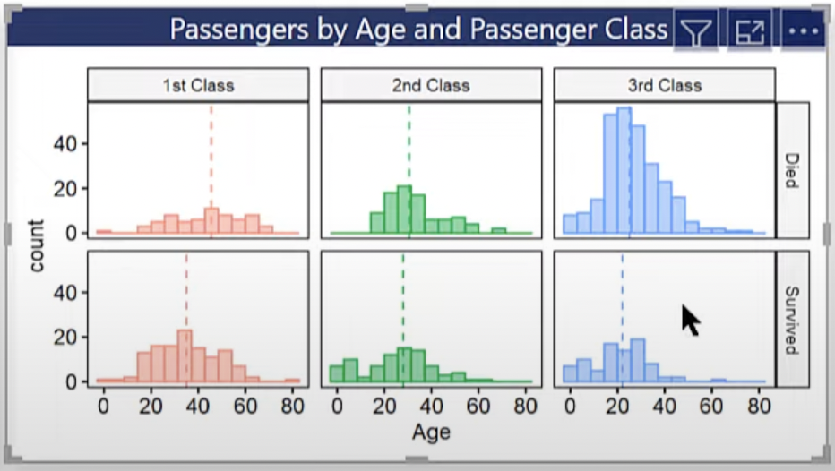
Looking at the visual, we can also see that the 3rd class men had the most number of casualties in this disaster.
Notice that in this example, we used the default color scheme, so it doesn’t really match our theme. We intentionally did that to illustrate how it automatically picks a color scheme if we don’t enter one.
Using R In Power BI: Q-Q Plot
Finally, we are down to our last type of chart.
Again, there are about 15 types of charts you can run here, and this one is called the Q-Q plot. If you have done a fair amount of work in statistics, you would probably have heard or seen a Q-Q plot before.
Our next code helps us determine whether a given field is distributed according to a particular distribution. So in this case, we’re looking at whether it’s normally distributed by plotting the actual distribution against the theoretical distribution.

Same as the previous examples, this is a difficult thing to do in any other way. But using our technique, it will take a couple parameters to create our Q-Q plot with a theoretical against sample.

***** Related Links *****
R For Power BI | A Beginner’s Guide
Power BI Custom Visuals – Build A Reporting Application
Custom Visual Reports In Power BI
Conclusion
In today’s blog, we learned the simple way to create powerful and complex visuals in Power BI using R.
It offers tremendous applicability and flexibility for creating charts that are hard to get using any other way. It also gives you the flexibility to adjust the parameters to your preferences. There’s a lot more you can do in terms of background color and font and all sorts of formatting.
Using a single line of code, there is little you need to know to create insightful charts, which we hope inspires you to use this technique in your future reports.
In the next part of this series, we will discuss the easy ways to create great KPI cards.
All the best,
Brian Julius