
Using DAX measures to dynamically group data in Power BI is so powerful. You’re building out your data models and creating many different filters and ways to slice your data. You may watch the full video of this tutorial at the bottom of this blog.
This is slightly more advanced today, but I love this type of stuff in Power BI.
Remember, these likely don’t exist in your original datasets, so you’re creating brand new insights that consumers of your content will really appreciate.

In this example, I show you how you can retrieve results inside a calculated column. You can then evaluate each of those results by running them through some parameters that you have in another ‘supporting table’.
We might want to be able to see which ones are our high margin products, mid-range margin products, and low range margin products.
Creating Average Margins
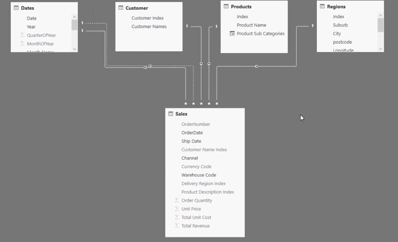
Let us first take a look at our data model.
With the tables that we have here, there is actually no way for us to group our products dynamically.
So what we have to do is to create a supporting table with the low, mid, and high margin product groups.

To do that, we’re going to start with our Average Margins calculated column.
In this model, we already have Total Profits which is the Total Sales minus Total Costs.
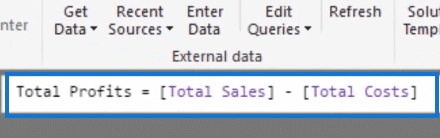
So, if we want to get Average Margins, we just have to create a calculated column and divide Total Profits by Total Sales.
Take note that in this image below, I have already changed the format of the Average Margins column into a percentage and sorted the column so that they are arranged from the highest to the lowest percentage.
Creating A Supporting Table
Now that we have created our Average Margins, we can proceed to creating our supporting table that will allow us to segment our products by the margins.
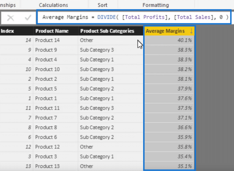
To do that, click on Enter Data at the upper left corner of the screen.

A pop up window like this will appear. We need to change the name and input columns.
In this case let’s call this supporting table Product Margin Group. And we’re going to have a Group column with Low, Mid, and High. Let’s also have a Min and a Max column.
So our low margin products will range from 30% up to 36%. For the mid-range margin products that would be from 36% to 38%. Then our high margin products will be from 38% up to 100%.
After entering all the necessary data, click Load.

Now we have a supporting table.
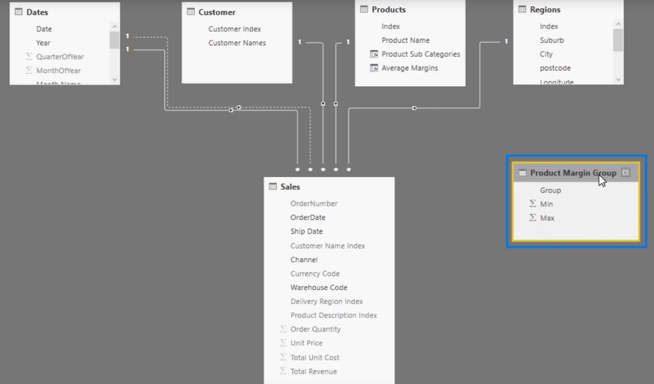
And we can also now use this Group with Low, Mid, High in our logic.
How To Segment and Group Data In Power BI
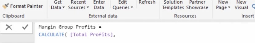
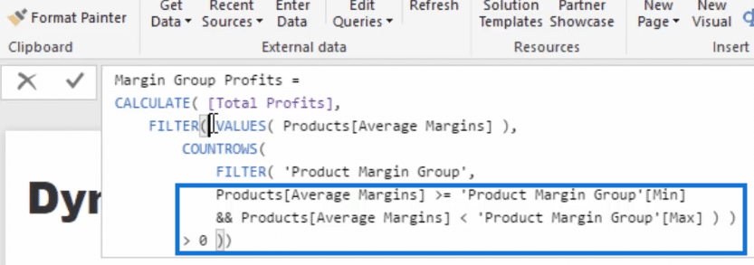
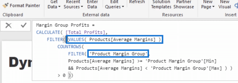
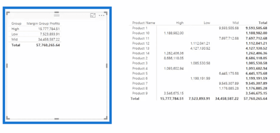
To work on our formula, let us create a new measure and call it Margin Group Profits.
We’re going to use CALCULATE here and then Total Profits so that we can have the total profits within the groups.
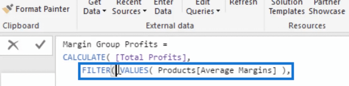
Let’s jump down to another row and use FILTER to iterate the Average Margins table for us.

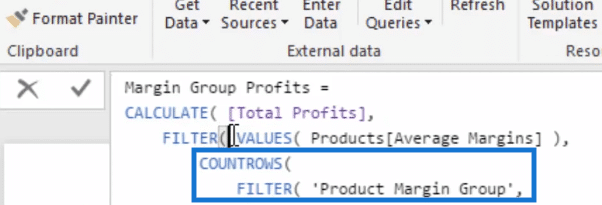
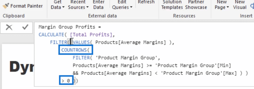
We’ll jump down one row again then go COUNTROWS and then put in another FILTER. This time we’re filtering over our Product Margin Group.
Now, let’s go if Average Margins is greater than or equal to the Min and is less than the Max then we put in that table.
We’ll jump down to another row and add greater than zero.
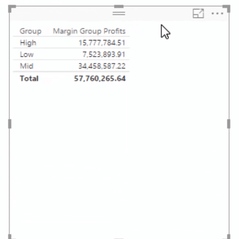
After closing off our formula, we can drag in our Group and add our Margin Group Profits.
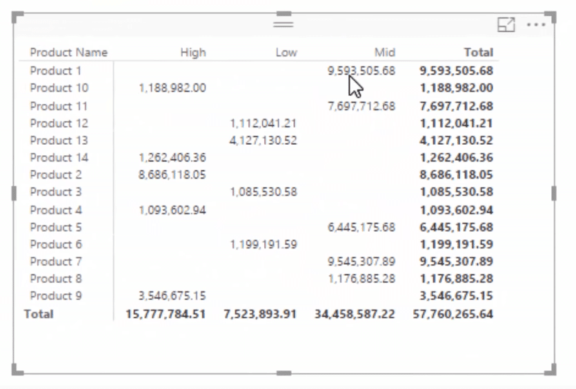
As you can see, we’re now getting results here. We have total profits for our low, mid-range, and high margin products. And the overall total profits is 57.7 Million.
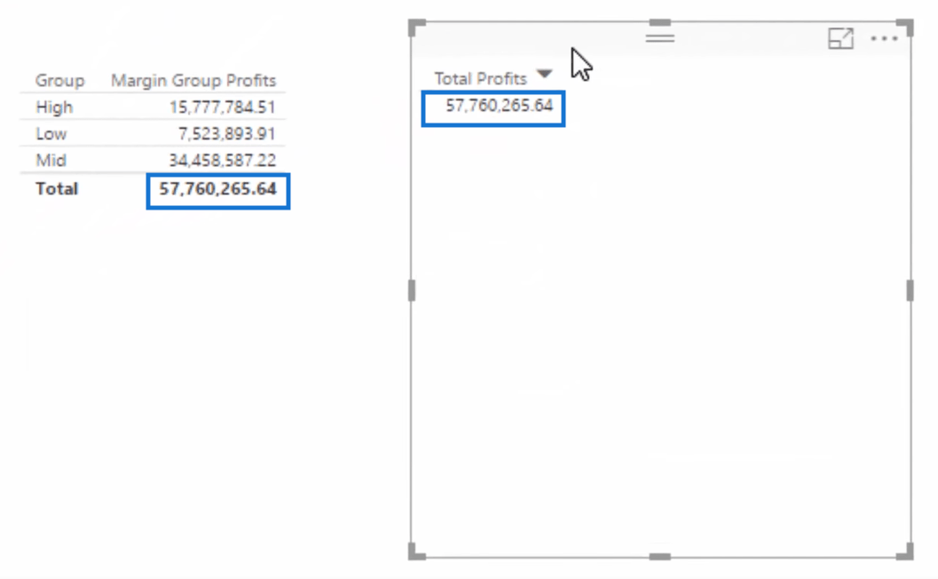
We can do a quick look if that total is accurate by dragging in our Total Profits measure.
Both tables show the same value which somehow assures us that our formula is correct.
But to be perfectly sure, we need to understand the logic.
Checking The Logic
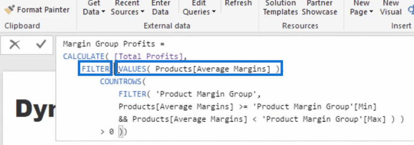
Let us take a look again at the formula we created.
So first, we’re going to try to understand what FILTER does. This FILTER here created a table of every Average Margin Column.
Then for every single row of that table, look through every single row of this table which is the supporting table that we created.
For every single row, check if it is greater than the Min and less than the Max. If it is, we’re going to retain that row.
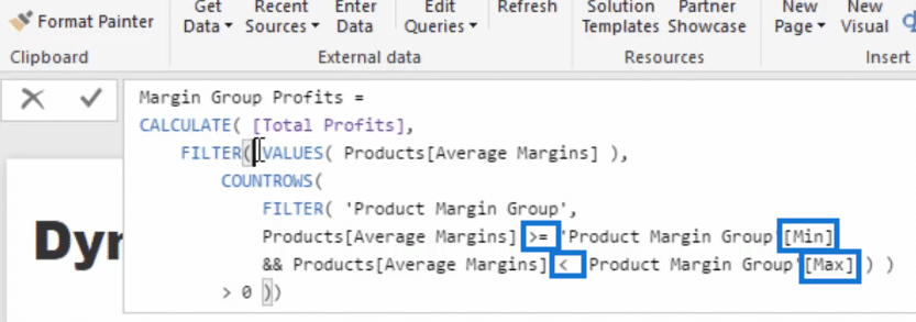
Now, COUNTROWS is greater than zero here is saying that if that row is retained, it must be within that group.
Then this process is repeated for the next average margins.
This allows us to create these groups.
To better see which products are low margin, mid-range and high margin, we can turn the table we have created into a matrix.
And then we’re going to add Product Name into the Rows and the Group into the Columns.
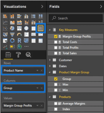
Our matrix will then look like this one below.
Creating The Visualizations
Now, we can create our visualizations.
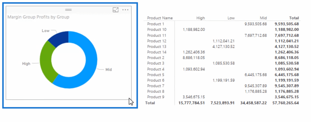
Let us drag our Group and Margin Group Profits.

And then let us turn this table into a donut chart.
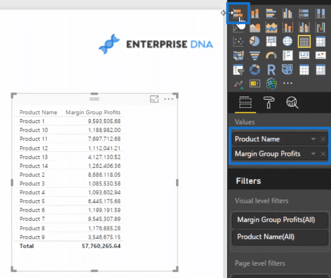
Then let us drag in our Product Name and Margin Group Profits and turn this table into a stacked bar chart.
Now, after putting Group into the Legend, our visualization will look like this.
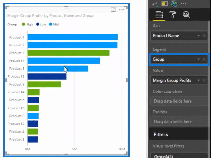
So the green bars are the high margin products, the light blue are the mid-range and the dark blue are the low margin products.
We can also make our visuals dynamic. Let us click Edit Interactions.
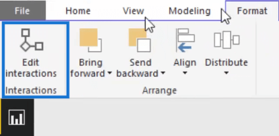
And then click on filter in the images that you want to be impacted.
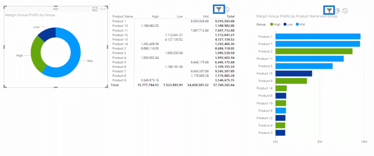
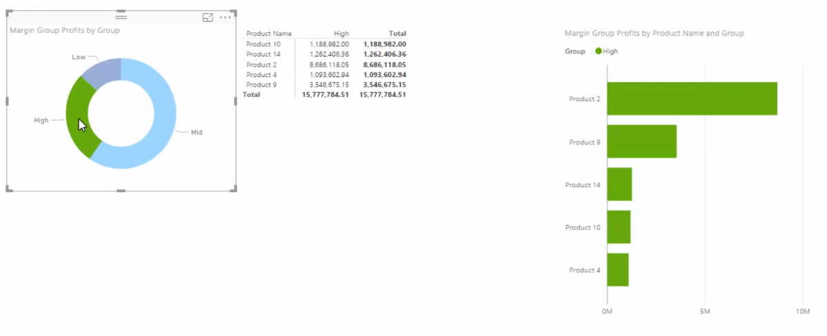
Then, if we click on High in our donut chart, our matrix and stacked bar chart will show the high margin products.
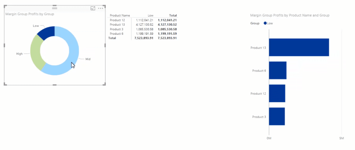
And if we click Low, our matrix and stacked bar chart will then show the low margin products.
***** Related Links *****
Advanced Segmentation Example Using DAX in Power BI
Group Customers Dynamically By Their Ranking w/DAX In Power BI
Learn Which Customer Groups Experienced The Greatest Growth – Power BI & DAX
Conclusion
In this post, we discussed how we can dynamically group data in Power BI using DAX.
After creating our Average Margins, we were able to create a supporting table and then we worked on our Margin Group Profits formula using CALCULATE. This enabled us to create really cool dynamic visuals.
When I use this type of technique my mind explodes with the opportunities to take your analysis to the next level.
Think about all the initial core calculations you might create like sales, costs, profits, margins, growth etc, and then think how you can segment your attributes or dimensions by any of these results.
All you have to do is create and run them through some type of logic using a similar technique that I showcase here.
This DAX logic isn’t easy, there’s no doubt about that, but I definitely want you to see how DAX can be applied to discover these insights.
Any thoughts or questions, let me know in the comments.
Good luck with this one.
Sam


