In this tutorial, I’m going to do a deep dive into Time Based Cohort Analysis in Power BI.
This is a short breakout session from a recent event for Enterprise DNA members. You may watch the full video of this tutorial at the bottom of this blog.
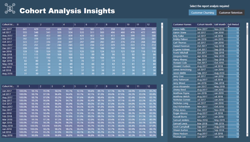
I want to show you how I set up this Cohort Analysis in Power BI. This is the most difficult task when you’re starting to run more advanced calculations.
You want to know how to properly set up your data models to avoid confusion and make sure the Power BI model works.
Quick Review On Cohort Analysis
Before I discuss this technique, I want to first show the insights you can get out of it along with a quick review on Time Based Cohort Analysis.
Cohorts are a fancy way to call segments or groupings of your dimensions or variables in your data.
For example, you want to look at groups of your customers.
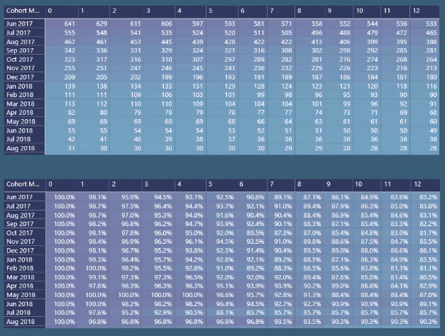
You want to create cohorts of when your customers first joined or started using your software or application.
For this case, I’ve created cohorts of particular months. So, if your customers started in June 2017, that’s their particular cohort.
It’s not a grouping on the amounts or the number of times they’ve transacted with you. You’re grouping is based on time.
For this example, it’s when they joined.
Now, I’m going to show you how to create these cohorts and then work it into your model.
Creating Cohorts In Power BI
Let’s have a look at the model.

This is a pretty generic model. This is how you want to make your models look.
You can see that I have another layer of my lookup tables.
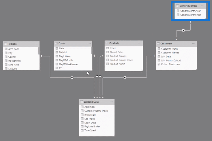
But before I show you its purpose, I’ll first work on creating these cohorts inside the lookup table.
The lookup table is where you want to group a certain dimension. In this case, it’s the customers.
So, let’s see my Customers table.
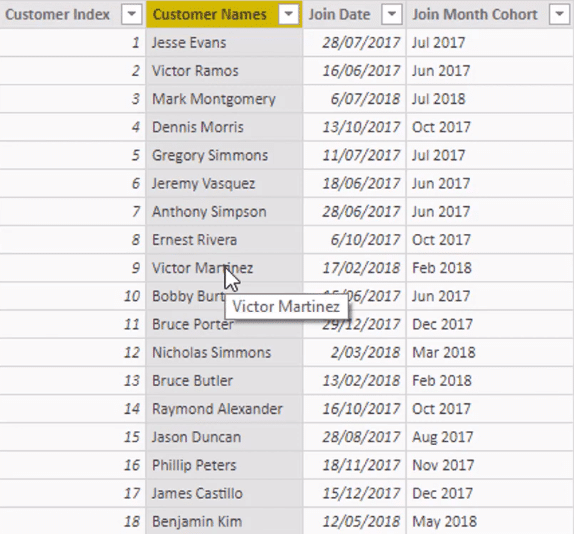
Originally, my Customers table only included the Customer Index and Customer Names.
But if you want to create the cohorts inside the lookup tables, you need to put them where you want the segmenting to happen.
Now, I want to work out the customer’s Join Date. In my demo data, the Join Date is when the customer first logged in.
The first log in could be when the customer signed up using an e-mail or when they first used the trial version of the application.
You need to find out the first time a connection was initiated by a customer.
I got this information using this formula:

It’s using MIN of the LogIn Date. Then, I wrapped it in the CALCULATE function to make sure I get the correct filter context. This gives me the first date.
I now need to work out the month. I want to create my cohorts based on what month the customer joined.
This technique is very flexible since you can create different cohorts.
But again, for this example, I’ll be using a Month Cohort which shows the month and year.
This is the formula I used for the Join Month Cohort:

I grabbed the Month & Year column from the Date table by using this logic:

I worked out through ALL of the Date table and what date equals the Customer Join Date. Then once it equals to TRUE, it will return the Month & Year column of the same table.
With this, I now have my Join Month Cohort.
Setting Up The Cohort Months Table
Now, I want to show you why I set up a Cohort Months table.

Let’s go back to the Customer table.

If you left it with this information and logic, you might not get every iteration of the Month & Year.
This is because a customer might not have joined in any Month & Year. So, to get a good visualization, you need to make sure that every single Month & Year is referenced in a certain table.
Also, it could be because the information you need might not be within the dynamic calculation of all the customers.
Remember that there are new customers coming on board all the time. So, this information should theoretically always get updated.
This is why I created another table using the Cohort Months formula:

I grabbed the Index and the Month & Year columns from the Dates table. These two columns became the Cohort MonthnYear.
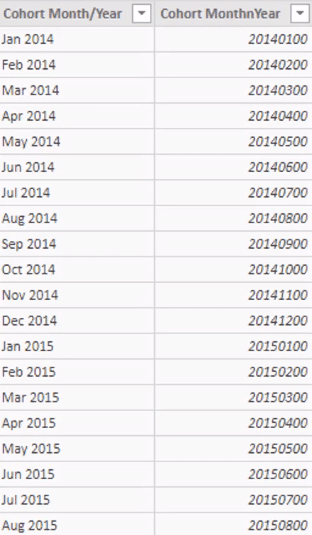
This is the Dates table:

You can see that it has many columns containing a lot of information. But for this example, I only needed the Index and Month & Year columns. So, I summarized the Dates table using Cohort Months.
I now have every iteration, which also became unique values.
Now, if this information was retrieved from the Dates table, it would’ve been referenced a lot. But because it’s now a column containing unique values, it has become a simple lookup table.
You can create a one-to-many relationship from the Cohort Months table to the Customer table.

This relationship will continue to filter until the Website Data table. The CALCULATE logic is going to be in this table because of its relationship with the Customer table.
Once you have this all set up, you now have a dimension that you can place into a matrix. This matrix will give you every single month.
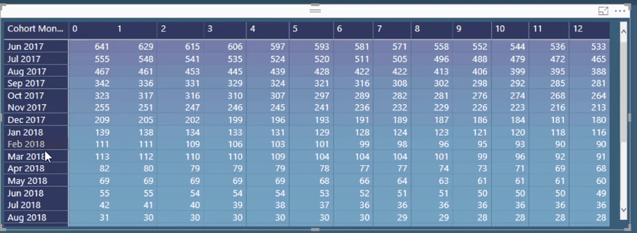
Cohort Analysis Insights
Another interesting thing about Cohort Analysis in Power BI is you can analyze the trends within the cohorts.
For this example, I wanted to work out my Customer Churning.

You can see that I have a dynamic visualization. I’ve got 641 customers which joined in the Jun 2017 cohort. However, 12 customers left during the first period.
You need to generate a generic table which showcases the periods you’ve devised.
For this case, I’ve created a table in my model called Cohort Periods.
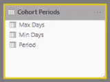
I’ve also created a supporting table in it.
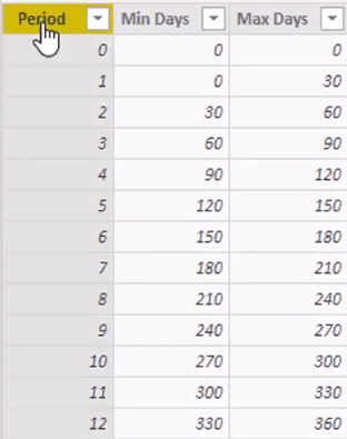
You can see how I’ve created the Min and Max days for every single period. This is specifying the time window that you want to analyze for each individual cohort.
Going back to the example, you can see that in Period 2, there were 14 customers who churned within the period of 30 and 60 days.
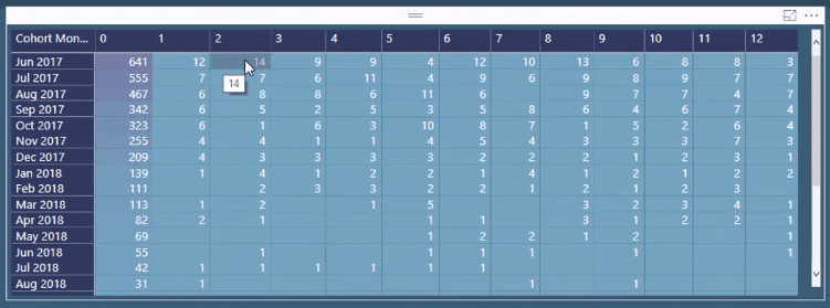
And as you go down the table, you can see how this value changes for different cohorts.
In another table, it shows the values in percentages.
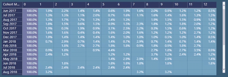
Percentages are better compared to numbers because you can get valuable insights from them. You can identify the trend of the customers leaving within a particular period.
You can identify the issues that caused this trend. It could be because you dropped off on marketing and advertising, or that you’re not getting as many sales from your clients.
Other Cohort Analysis Formulas Used
These are the other formulas I used for this Time-Based Cohort Analysis technique in Power BI.

This dynamic churning formula enabled me to get insights from the data.
Once you understand dynamic grouping techniques using DAX, you’ll be able to get more from your report.
More Cohort Analysis Examples
To show the capabilities of this technique, I want to add another example.
Let’s say I want to individually look at customers in this specific cohort that churned.

I can select a value in my table and it will automatically show individual customer levels in another table based on how I set it up.
***** Related Links *****
How To Implement Cohort Analysis In Power BI – Advanced DAX Concepts
Segmentation Example Using Advanced DAX In Power BI
Power BI Customer Segmentation: Showcasing Group Movement Through Time
Conclusion
You can use this strategy for whatever cohort you’re trying to devise. It could be cohorts on products, regions, or customers.
However, the example in this tutorial is the most relevant. Cohort Analysis has been popularized by SAS applications. So, you should group your customers based on when they’re churning.
You can create incredible analysis in Power BI using this technique.
I hope that this tutorial has given you a good idea of what Cohort Analysis is and how to implement it.
All the best,
Sam


