
Using a calendar table in Power BI allows you to filter your reports by time intelligence attributes like Year, Quarter, Month, and any other time aggregation using non-standard columns that your organization might need.
In this tutorial, I’m going to talk about some considerations related to the calendar table, more specifically on what data types are best when displaying certain things on various visual axis. You can watch the full video of this tutorial at the bottom of this blog.

Using A Calendar Table In Power BI For Visuals
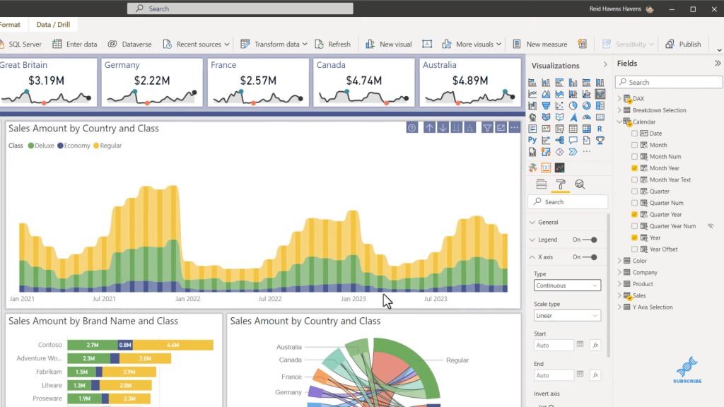
Let’s hop into Power BI and get started. We’ll start by looking at the problem that I’ve seen a lot of people experience when they create custom columns.
Let’s go to our calendar table. Very often I see a column displaying the month or the month and year level, where the format for the calendar date field is mmm (month) and yyyy (year).
This type of visual displays well, and it’s compact. It keeps all the longer and shorter month names down to three letters, which I approve of.
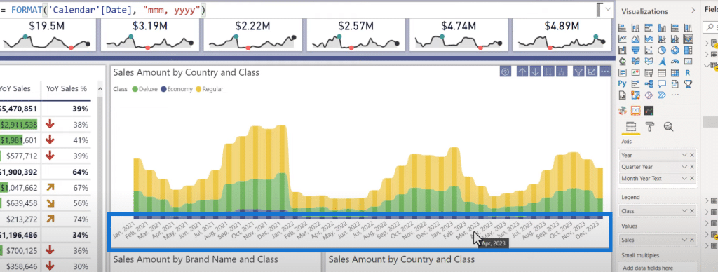
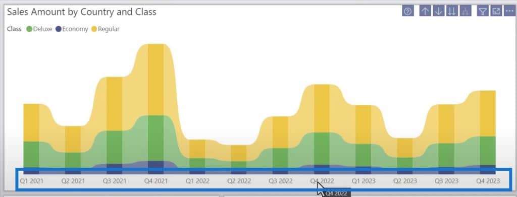
However, one of the issues that we can see here is the fact that it displays it for every category. And because it’s a text field, when I come to the format painter and go to the X-axis, I do not have any option here to change it to a contiguous axis.
So, I have to display every single category here because it is showing as text field as the data type. There’s no way for it to be continuous because the model does not understand this as a date field type.
We’ll go to the Date Data Type, select the Quarter and Year visual, and go down another level.
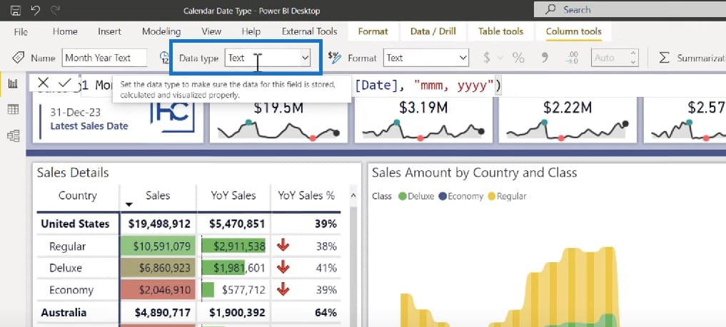
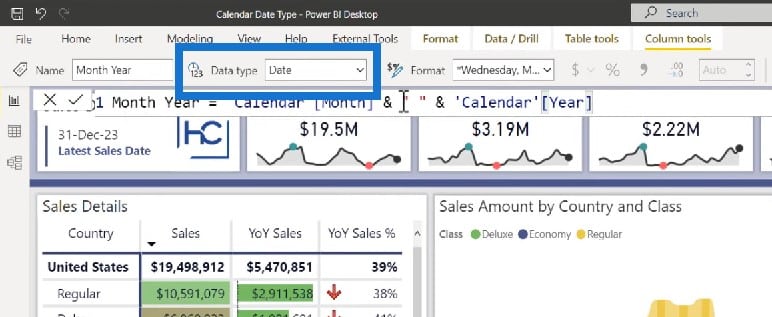
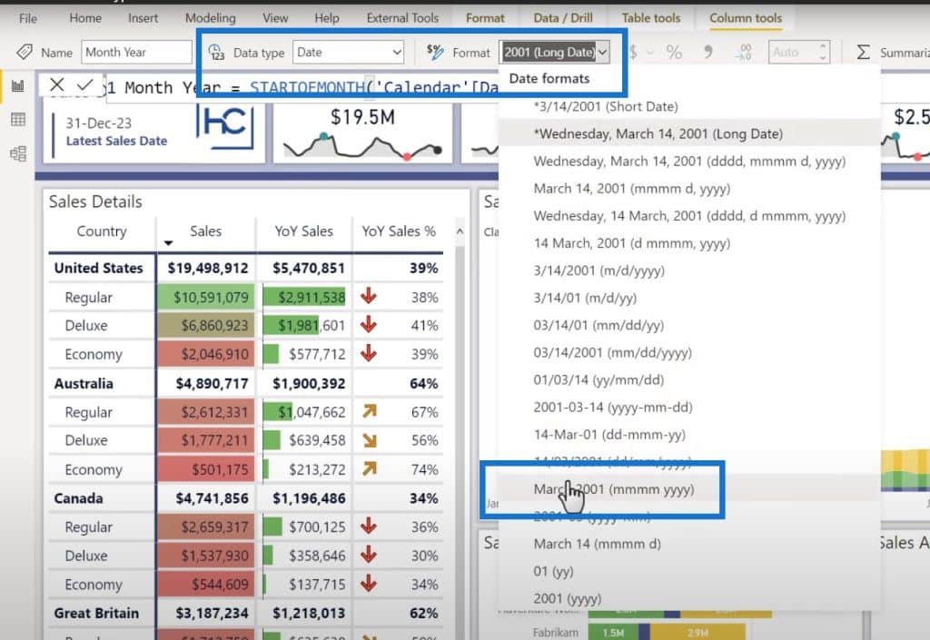
Note that I have a column called month and year. That does not mean it is a month and year text. It is in fact month and year as a date data type.

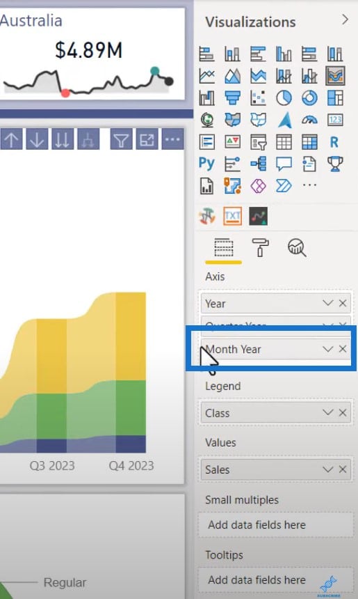
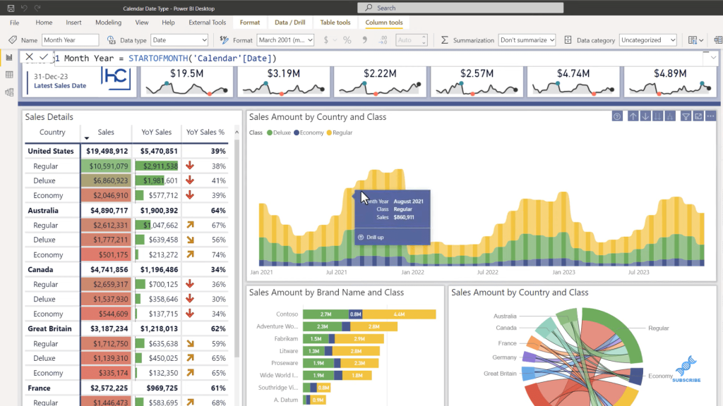
When we move down the hierarchy level, we have a nice and clean visual. Each of these is a specific month and year formatted here.
To create this, one thing to make sure of is to have it converted into a date data type.
Creating The Measures For The Calendar Table In Power BI
There are a few ways to write this measure. The first one is to combine it like this:
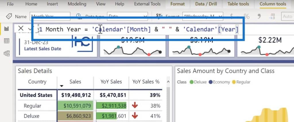
You can also use the STARTOFMONTH function, and then reference the date field in the calendar table.
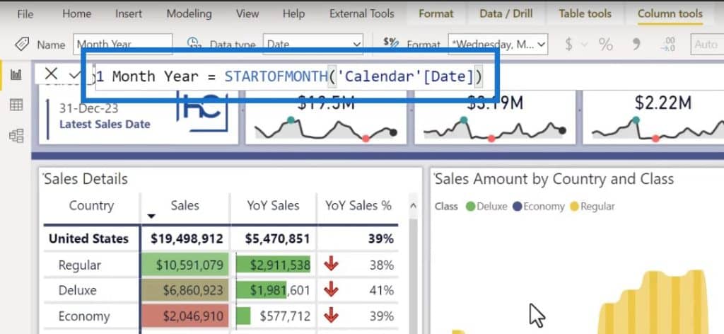
Any of these two measures will work. Then, we can set the data type to date. We can also set the tooltip to display better by going to Format and assigning it to the month and year level.
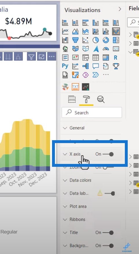
Changing The X Axis Setting
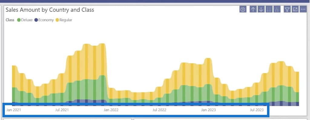
We still have the month and year level. However, because it is now set as a date data type, when we come over to the formatting pane and the X-axis, you will see that we now have a Type setting for either continuous or categorical.
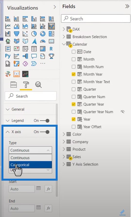
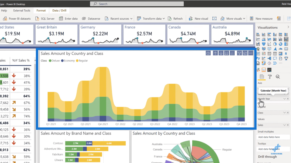
Notice how much cleaner the axis is here because it knows your logic can fill in the gaps in the visual. It’s my recommendation that if you want to display your monthly data at this level, this is the way to do it.
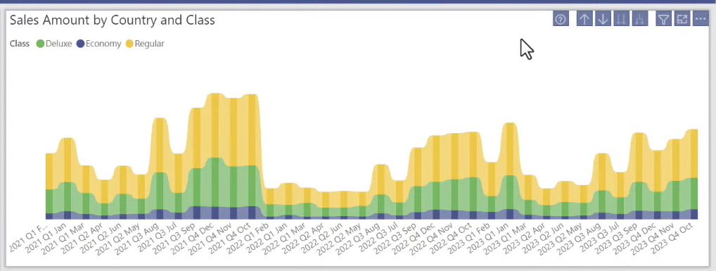
Making The Access All-Inclusive
Another thing that I want to point out is I generally like my access to be all-inclusive. Each level should have the full context of all the levels that are needed to be a unique identifier.
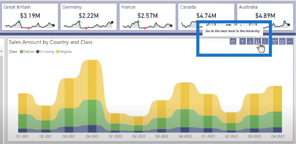
This is an example of a visual showing the quarter and year combined. It is able to show the data for all periods because I’ve concatenated together the quarter and the year into this.
I did the same thing for month and year.
Both visuals are cleaner, as opposed to this visual which can get too busy and crowded.
When at the top level, I just simply move down to the next. We have a quarter from Q1 through Q4, but it is now obviously adding those up for all the years. The same thing is happening at the month level.
I’m not a huge fan of this one. The only way to get the full year, quarter, and month context is if you have to expand, but you need to watch how noisy that access becomes.
This can be done for the quarter itself, while the year can be set as a whole number. The quarter and year is a concatenated custom string that will, unfortunately, be text, but will still display well.
Normally you don’t have that many unique values at the quarter level. By the time you get to the month level, that continuous access really does come into play.

I really do prefer the self-contained visual, but even that self-contained scenario can be optimized by making sure that at least one of the levels is set to a date data type.
***** Related Links *****
Creating A Calendar Table For Holidays In Power BI
Creating A Date Table In Power BI The Fastest Way Possible
Build A Comprehensive Date Table In Power BI Really Fast
Conclusion
Using a calendar table in Power BI can be a powerful way to enhance the visual representation of time-based data. By incorporating a calendar table, you can create a wide variety of visuals that are clear and intuitive for your audience.
I hope this gives you ideas on how to design the calendar table in Power BI. As you can see, not all column data types, especially those with calendar fields, are created equal. So hopefully this is something you can implement and use in your reports.
All the best,
Reid Havens


