
Every so often we’ll be needing the availability of a custom visual of a bar chart or line chart that gives an option to plot the chart either weekly, monthly, quarterly, or yearly. In this tutorial, I’m going to demonstrate how you can create a dynamic temporal scale, using calculated columns that can let you change the level of granularity depending on your date or time basis. You can watch the full video of this tutorial at the bottom of this blog.
A temporal scale allows you to show a granular level of detail at the most important current information. It shows less granularity for previous dates.

This is useful in a lot of cases. I’ve seen this in manufacturing, for example, they want to get a long history of the information. This allows them to display a lot more information on the screen and get the whole history of what’s going on. But for the current quarter, it allows them to see exactly what’s going on at a level of detail by week.
How To Create A Dynamic Temporal Scale
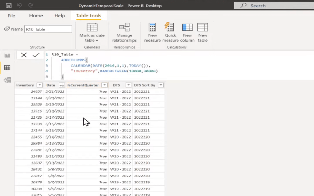
As you can see here, I’ve got my R10 Date table, where I’m just using the calendar function for 2016 to today. And then, I’m randomly generating some inventory levels.
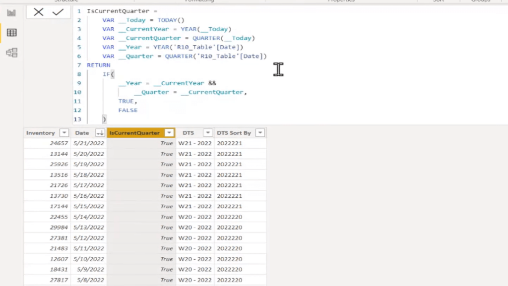
The first step is to create this IsCurrentQuarter. There are different ways of doing this. In this measure, I’m grabbing what is the date today, what is my current year, and my current quarter. And then, I’m grabbing the year of the current row I’m in, driving the quarter of the current row I’m in.
If the year matches the current year and the quarter matches the current quarter, return true. Otherwise, return false. So that’s all that this does. For any date in the current quarter, it’s going to return true. As we get past the current quarter, we’re going to start returning false.
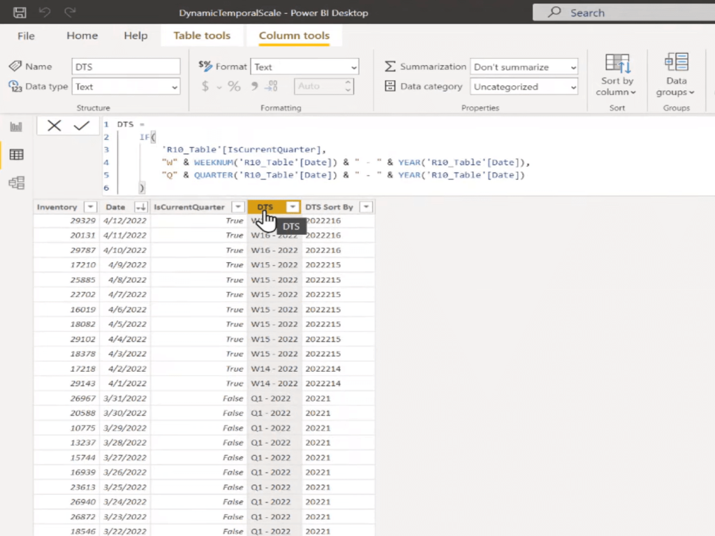
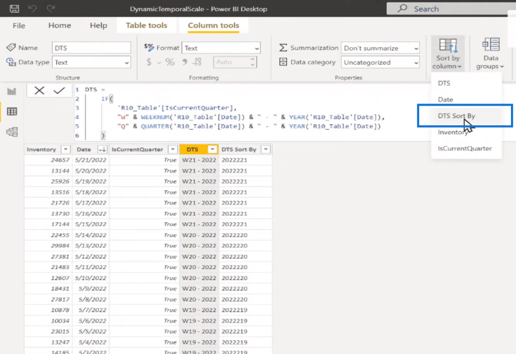
The next step is to create what I’m calling the DTS Column, which is pretty simple. All we’re doing is saying if it’s the current quarter, then we’re going to return a value that starts with the letter W for week. We grab the weeknum of the current row’s date, and we grab the year, and then we put it in this format, e.g. W16-2022.
And then once we start going back past the current quarter, if it’s not in the current quarter, then we’re returning just the Q for quarter, then the quarter and the year. So, we’ll have Q1-2022, Q2-2022, etc.

The last step is that we need to sort this correctly. We’re going to do something similar and we’re going to create this DTS Sort By column. And again, we’re just checking if it’s the current year. If it is, then we return a value of just the year, the quarter, and then the week number. If it’s not in the current quarter, we return just the year and the quarter.
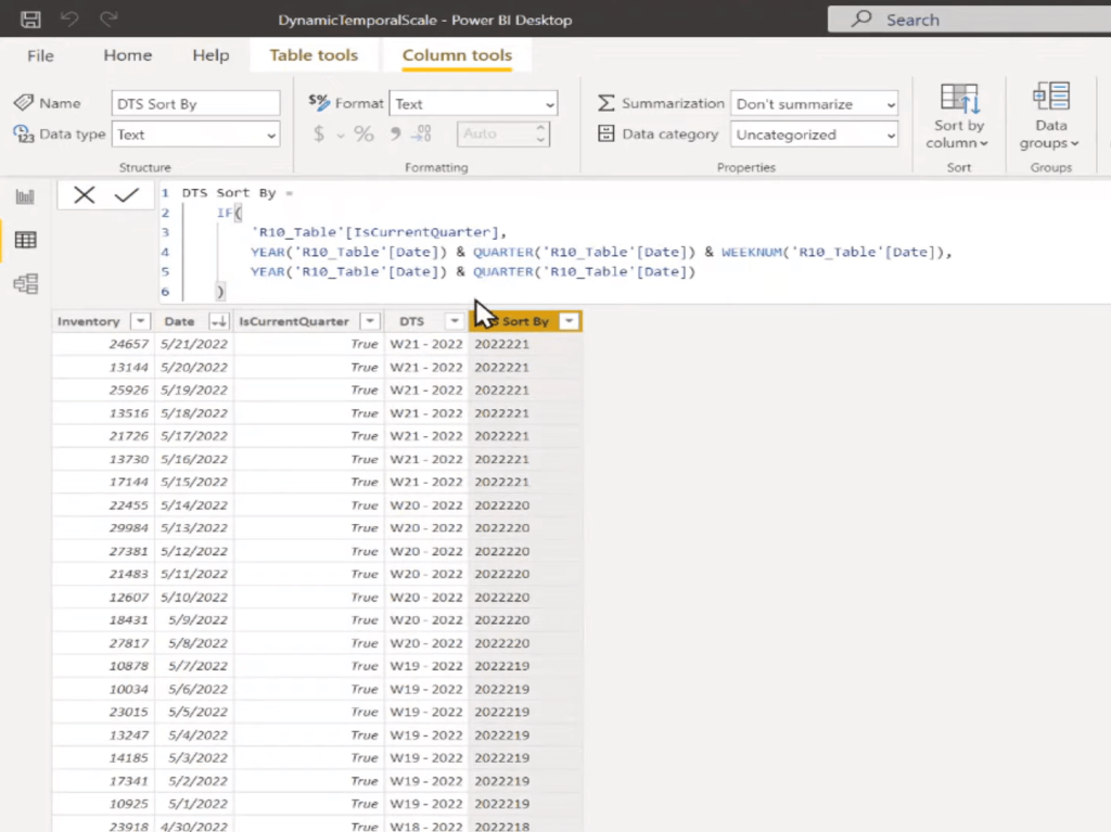
Then we would set this sort by column to be our DTS Sort By column.
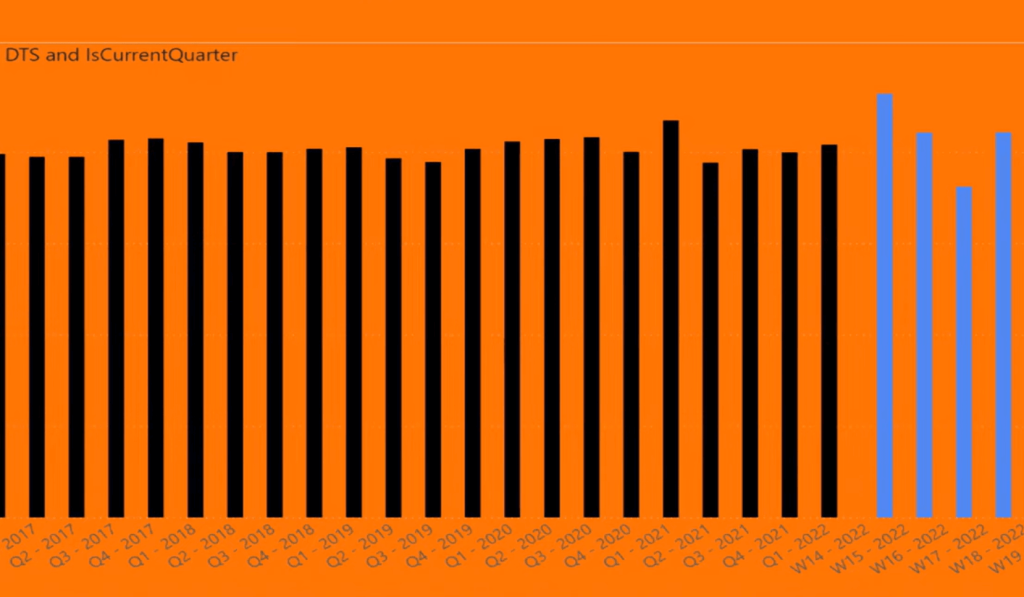
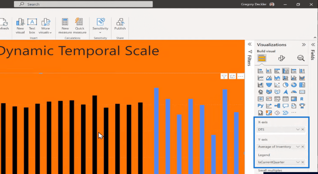
Once we do that, then we can use the DTS column on our X-axis. So, here our X-axis is the DTS. Our Y-axis is the Average of the Inventory. The other nice thing about having that calculated column is that we can use that to differentiate the colors on this column chart, for example. So, I can use the IsCurrentQuarter as my legend.
***** Related Links *****
See Changing Results Using Calculated Columns In Power BI
Comparing Calculated Columns And Measures In Power BI
Calculated Table And Column In Tabular Editor 3
Conclusion
You could extend this dynamic temporal scale technique with a few additional columns. Let’s say, if it’s the current week, you want to show it by day. If it’s the current month, show it by week. If it’s the current quarter, show it by month, and if it’s the current year, show it by quarter. And then if it’s been past years, just show up by a year, for example. So, you can have a lot of different variations on how you can do this.
If you added additional columns, you’d need a few additional columns to get different levels of granularity, like to the day, to the month, week, and year. But all are possible using the same technique, you just need a little extra DAX code.
Probably we would replace this IF with a SWITCH statement because otherwise we’re going to get into Nested IFs and nobody likes those.
A downside to implementing this as quarters is that you’re adding data into your data model and all the ills that people claim with calculated columns (which I agree with, some of which I don’t).
But it’s not that bad. There’s not a high level of cardinality with these additional columns that we have here. This only has just one or two values. It’s not like we are adding thousands of unique items with these different columns that we have.
This is probably the most straightforward way to implement this dynamic temporal scale. I hope this has been valuable. Check out the links below for more related content.
All the best!
Greg


