
In this example, we’re going to get quite advanced in Power BI using DAX. We are going to focus on segmenting dimensions based on its ranking on that particular table. You may watch the full video of this tutorial at the bottom of this blog.
This is an amazing concept of how you can utilize calculated columns within Power BI. This can bring additional insights that would have never been possible with traditional tools like Excel.
Utilizing these techniques effectively and then implementing great visualizations around them, which I will also dive into, can really showcase your data in a compelling way.

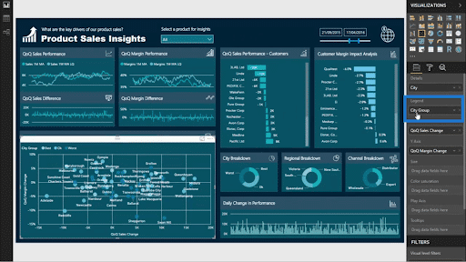
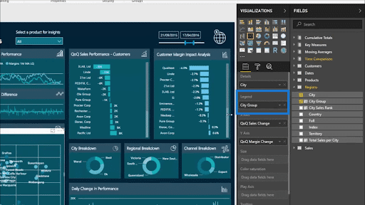
Visualization Of Segmented Data
I’ve always talked about the amazing analytical power of Power BI but you won’t see this level of analysis if you’re using DAX formulas one by one. Its true power comes out when you’re using a combination of different formulas and techniques stacked together.
That’s what I’m going to show you through the visualization below.

Again, the data shown here cannot be analyzed as deeply as this if you don’t layer multiple formulas. I call this technique measure branching. To add to that, I also overlaid some calculated column logic to break down the results further. It’s the best way to get a really great insight in a case like this.
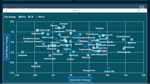
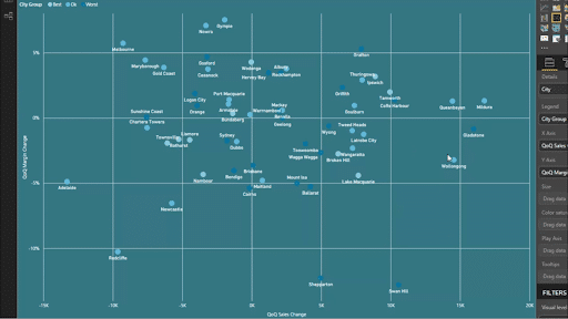
In this scatter chart found in the lower right part of the report, for example, you’ll see that there are different colors representing different data groups. In this case, the dots represent cities, with each color showing you the best, the worst, and the ones whose rankings are just okay.
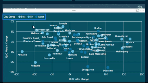
You’ll also see that our y axis shows the quarter-on-quarter margin change. The x axis, on the other hand, shows quarter-on-quarter sales change.

This is the type of insight we get when we segment our data by measure branching. It shows you whether a large increase in sales was derived from a big increase in margin, and vice versa. It shows you the correlation among these data points.
Of course, this is just a demo data set so you won’t see a huge cluster. But once you apply this technique to your own data, you can get even more advanced insights.
With all these formula and techniques combined, you’ll also notice a difference in the overall look and feel of the visualization. I’ll show you what I mean by removing the legend for City Group.
Note that I created the City Group legend using calculated column logic. So when I remove that legend, the way the data is showcased changes. It doesn’t bring as much insight as we need.

All we see now are general data points. It doesn’t show us where our worst or best clients are. That alone takes out a whole lot of insight we should be getting.
We see now that these additional layers of logic actually allow us to see things in a much better light.
Now, let me drag City Group back as a legend.
As you can see, the visualization greatly improves.
Segmenting And Ranking Your Data
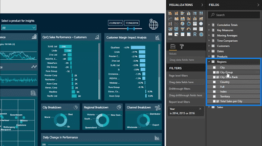
This time, I want to show you how I segmented these groups of customers to create that legend.
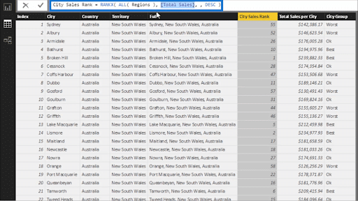
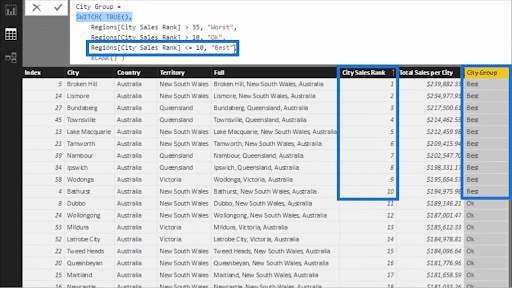
Inside the calculated column, I used RANKX to get the rank of each city based on the dimensions given. In this case, we’re ranking them based on sales.
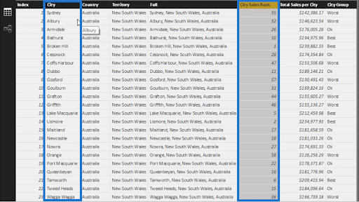
In the formula, I included ALL the Regions in our table and their Total Sales.
RANKX is extremely helpful here because it gives us a way to organize all that data and gain some insight into them.
We can check not only which cities are doing well, but also which ones are not performing as well, which is why they are found way down at the bottom of the column.
This function is also the foundation of the next logic I’m going to use.
So on top of the RANKX, I also used SWITCH TRUE to create an additional dimension.

With that additional layer, I can see now what my best performing cities are, as well as the worst performing ones. So, if the City Sales Rank is lower than or equal to 10, they are tagged as part of the “Best”.

This is a really great technique you can utilize to create more ways to segment your data. Note that this is not only useful in a scatter chart. This can also be applied to different types of visualization.
For example, you can also use it in a donut chart as shown below.
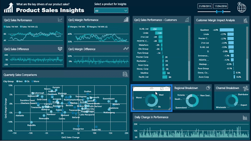
You’ll also see that the donut chart and the scatter chart move alongside each other. So if I click on the part that represents the Worst numbers on the donut chart, the scatter chart adjusts as well.

This allows us to zero in on subsets of data or other dimensions.
***** Related Links *****
Customer Segmentation Techniques Using The Data Model – Power BI & DAX
Use DAX To Segment & Group Data In Power BI
Data Segmentation Based On Percentage Groups – Advanced DAX In Power BI
Conclusion
Try diving into these techniques and implementing some of them into your own models. I’m confident that you’ll see good results and you’ll be happy with the results in terms of what you’ll get in your reports and dashboard.
Hopefully you can see how combining these different techniques can get you some really advanced levels of analysis. Doing this on Power BI can give you really detailed reports and high-quality visualizations just like the one in our example.
All the best.
Sam


