In this tutorial, you’ll learn how to create a scatter plot visualization using an R script. This is based on a report submitted for the Enterprise DNA Challenge #16. You can watch the full video of this tutorial at the bottom of this blog.
What Is Scatter Plot
A scatter plot is a type of data visualization that’s used to display the relationship between two continuous variables. It’s a graph where each data point is represented by a dot, and the position of the dot on the horizontal and vertical axes corresponds to the values of the two variables.
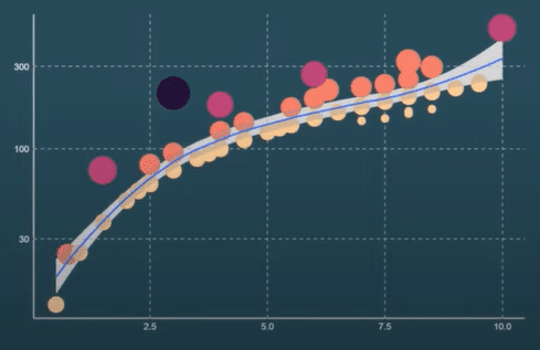
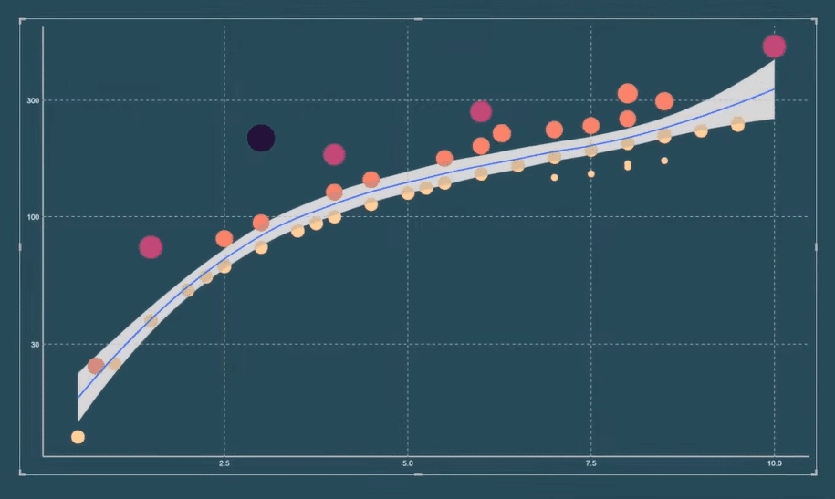
Scatter plots are useful tools for identifying patterns and trends in the data. Adding this visual to your Power BI reports will add more insight to the data you’re presenting. And by the end of this tutorial, you’ll be able to create an R scatter plot that looks like this:
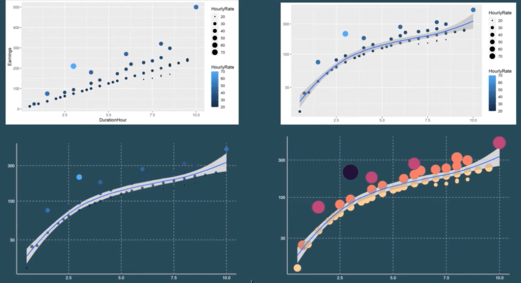
This discussion is broken down into four steps. You’ll first learn how to create a basic scatter plot. Then, you’ll apply a smooth line to show the trend of the data in the plot. The third and fourth steps are mainly focused on themes and formatting changes you can apply to the scatter plot.
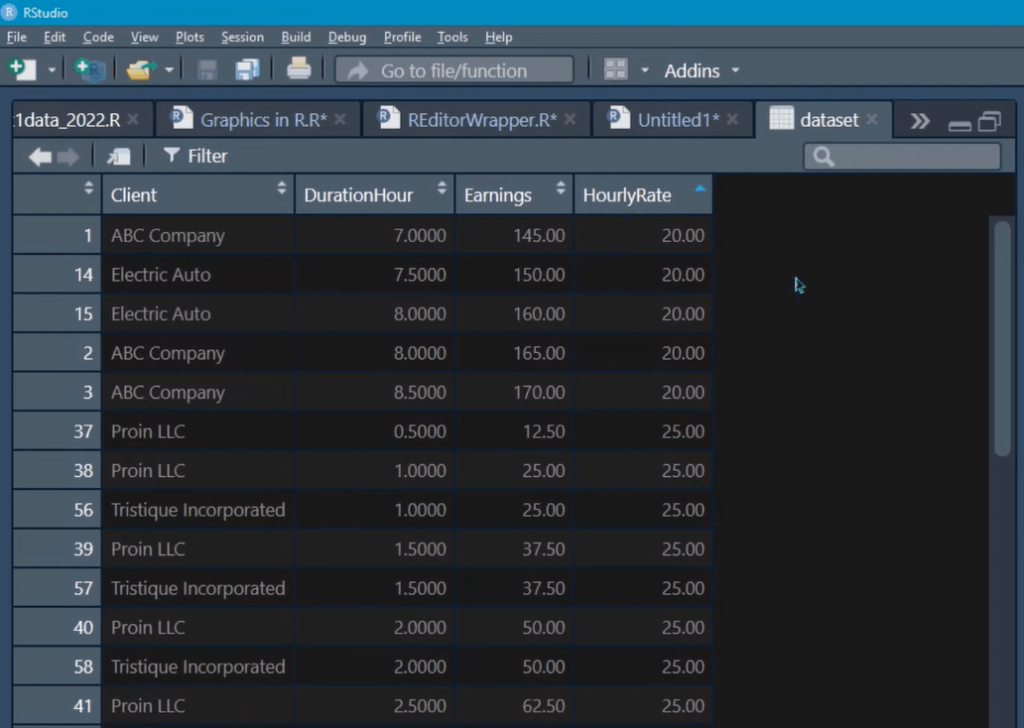
The dataset used in this example is a table containing the Client name, Duration, Earnings, and Hourly Rate.
Create The Basic Scatter Plot In The R Script Visual
Open your RStudio program.
To start, you need to have three packages installed in your RStudio program, the tidyverse, ggthemes, and ggpubr.
If you don’t have them installed, use the install.packages( ) function. Once done, you need to use the library( ) function to load them into the R environment.
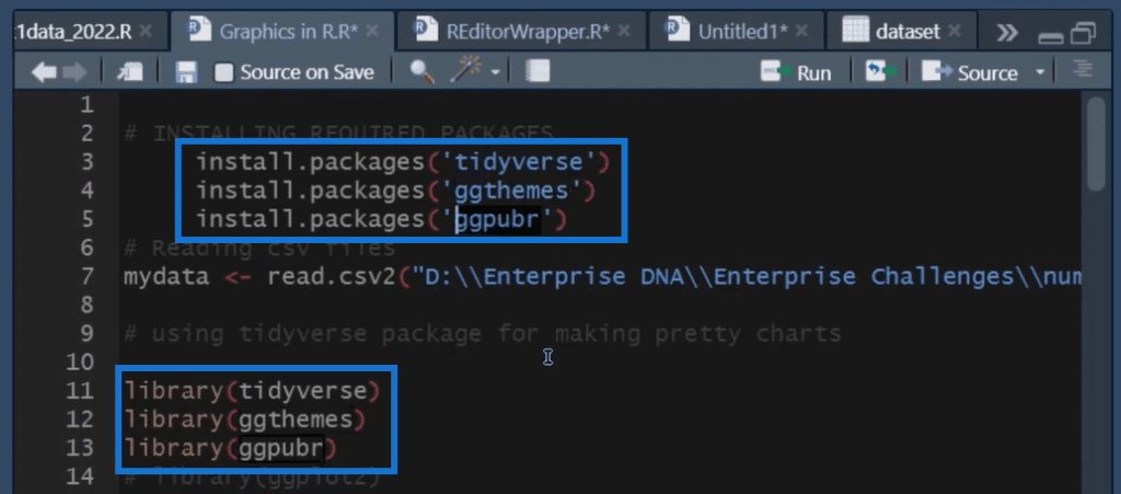
Copy the library R codes and go to Power BI. Open the R Script editor and paste the code. You can continue to build the R code there.
Next, use the ggplot( ) function to create a scatter chart. You need to first specify the dataset that will be used in the chart hence, the database %>% command. In this case, a pipe operator is used instead of a filter function.

To specify the dataset, you need to use the aes( ) argument and then specify your x- and y-axis. In this case, it’s duration hour and earnings, respectively. Then, use the geom_point( ) function to show the points on the chart.
You can further make formatting changes to your scatter plot by using a variety of functions, such as “color” or “shape.” If you want to apply a dynamic look to your chart, you can set the color and point size to a specific value as seen in the example.
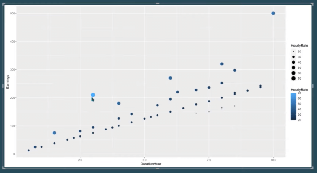
When you run the code, you’ll get this scatter plot in Power BI. Notice that you get bigger and darker-colored circles when their equivalent hourly rate value is higher.
Add A Smooth Line To The Chart
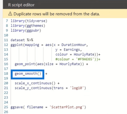
In this next step, you’ll learn how to add a smooth line to the chart. A smooth line is a line that’s fitted to the data to help you explore the potential relationships between two variables.
To add a smooth line, use the geom_smooth( ) function.
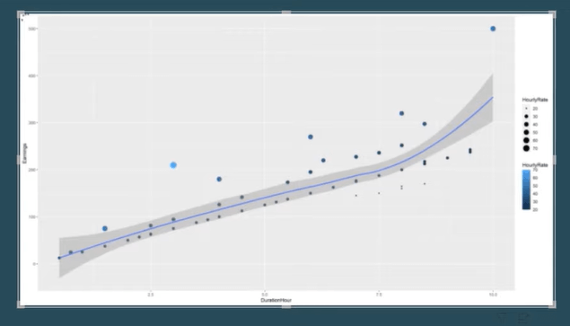
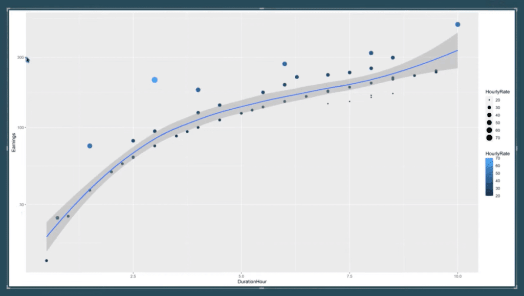
When you run the R script, the scatter plot will look like this. The smooth line now shows the trend of the data at a 95% confidence interval.
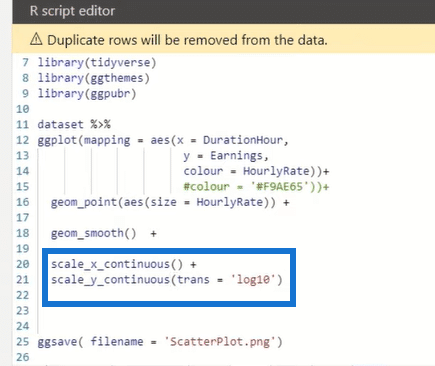
You can change the scale of the x- and y-axis using the scale_x_continuous( ) and scale_y_continuous( ) functions.
In this case, the y-axis is transformed into a log scale while the x-axis remains the same.
When you run the R code, the results will now appear logarithmically. The smooth line also changes.
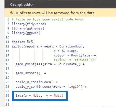
Moreover, since the chart automatically places labels on the axes, you can remove them by using the labs( ) function.
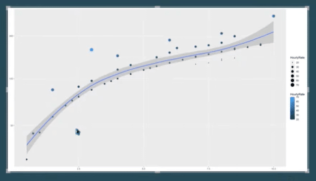
Format The Appearance Of The R Scatter Plot
After you’ve created the basic form of your scatter plot, the next step is to customize its theme and appearance.
Use the theme( ) function to format the scatter plot in the R Script editor. And within this function, you can add in other arguments to customize.
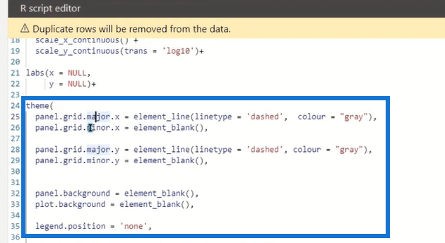
The panel.grid.major( ) and panel.grid.minor( ) allow you to edit the linetype and colour of the chart’s gridlines. If you want to remove a gridline, use the element_blank( ) function.
The panel.background and plot.background are removed to make the scatter chart transparent. This allows you with the flexibility to place your chart anywhere in your report. If you want to remove the legend in your chart, set the legend.position function to ‘none’.
You can also format the line and text of the x- and y-axis. You can make the line thicker or thinner, or the text bigger or smaller.
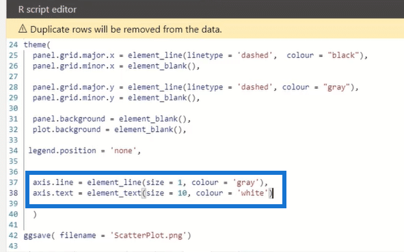
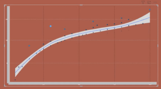
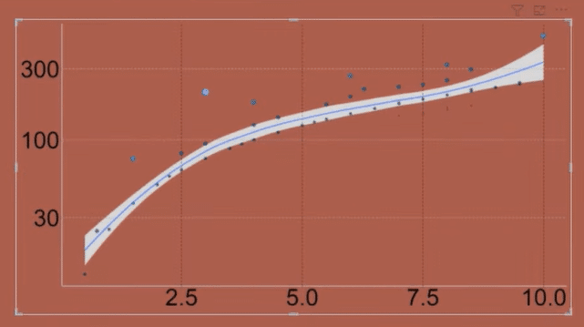
If you want to learn about other formatting functions that you can use in your chart, you can go to the Help section in RStudio. Enter “theme” in the search bar and a list of formatting functions will appear.
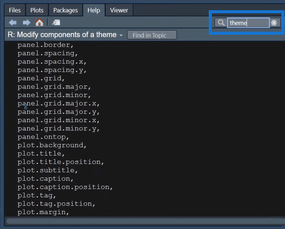
There are a variety of formatting functions you can use in R. Remember to use what you need and don’t overdo it.
Adjust The Color And Range Of The Data Points
In the last section of this tutorial, you’ll learn how to format the color scale and size range of the points in your scatter plot.
The scale_colour_viridis_b( ) function provides colour maps that are perceptually uniform in both colour and black-and-white. They are also designed to be perceived by viewers with common forms of colour blindness.
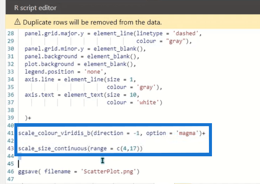
If you search it in the Help section in RStudio, you’ll see the different arguments you can use to format your charts. You can toggle between the options to find out which result best fits your report.
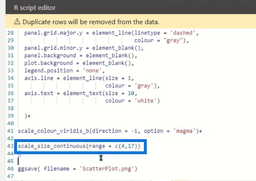
For example, the scale_size_continuous( ) function scales the size of points or shapes in a plot according to a continuous variable. It allows you to specify the minimum and maximum point sizes that should be used in the plot.
In this case, 4 is the minimum while 17 is the maximum.
This is now what the final R scatter plot looks like.
***** Related Links *****
R And RStudio Download And Installation Guide
Visualizing Missing Data In R w/ GGMICE
ggplot2 Plots In Excel For Advanced Data Visualizations
Conclusion
In this tutorial, you learned how to create an R scatter plot in Power BI. A scatter plot is a type of data visualization used to display the relationship between two continuous variables. In Power BI, you can create a scatter plot using the ggplot package and the R Script visual.
Scatter plots are useful tools for visualizing and identifying the patterns and trends in the data. They are also useful for identifying outliers or anomalies.
Overall, creating a scatter plot in Power BI using R is a straightforward process and allows you to take advantage of the powerful data visualization capabilities of the ggplot package.
All the best,
Hossein Seyedagha


